Creating visually striking 4th of July flyers requires thoughtful application of colors psychology and typography principles. The right colors combinations and Typography choices not only establish the patriotic theme but also significantly impact readability, response rates, and overall effectiveness of your 4th of July flyers.
This guide explores research-backed strategies for selecting and implementing colors and typography in your 4th of July flyers. This is part of our comprehensive 4th of July flyer design resource, which focuses on helping you create effective and eye-catching holiday flyers.
What Colors Work Best for 4th of July Flyers?
For 4th of July flyers, colors and typography should balance patriotic themes with readability and brand consistency. The most effective color schemes extend beyond the traditional red, white, and blue by incorporating complementary accent colors like gold (for sophistication), silver (for a modern feel), or navy (for deeper contrast).
While the traditional American flag colors form the foundation of most 4th of July designs, the most effective flyers use these colors strategically rather than exclusively. Let’s explore proven color strategies that enhance your flyer’s impact while maintaining the patriotic spirit.
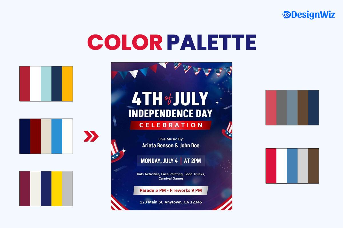
Beyond Basic Red, White, and Blue: Modern Patriotic Color Palettes
Looking to break away from traditional red, white, and blue? Explore these modern patriotic color palettes that offer fresh, stylish alternatives while maintaining the holiday spirit.
| Color Palette | Primary Colors | Accent Colors | Best For |
|---|---|---|---|
| Classic Americana |
Deep Red (#B22234)
White (#FFFFFF)
Navy Blue (#3C3B6E)
|
Gold (#FFD700)
|
Traditional events, government functions |
| Modern Patriotic |
Bright Red (#E63946)
Off-White (#F1FAEE)
Light Blue (#A8DADC)
|
Navy (#1D3557)
Yellow (#FFB703)
|
Contemporary retail, younger audiences |
| Elegant July 4th |
Burgundy (#7D1D3F)
Cream (#F2F1E8)
Indigo (#1E2761)
|
Gold (#FFD700)
Silver (#C0C0C0)
|
Upscale events, luxury retail |
| Rustic Patriotic |
Faded Red (#D44D5C)
Antique White (#F0EAD6)
Dusty Blue (#6E8898)
|
Brown (#634832)
|
Community events, small businesses |
| Minimalist Celebration |
Crimson (#DC143C)
White (#FFFFFF)
Steel Blue (#4682B4)
|
Light Gray (#D3D3D3)
|
Modern brands, tech companies |
These palettes provide sophisticated alternatives to standard flag colors while maintaining the patriotic feel that connects with audiences during the holiday period.
How Does Color Psychology Impact 4th of July Flyer Effectiveness?
Understanding the psychological impact of colors helps create more effective flyers:
- Red: Excites emotions, creates urgency, stimulates appetite (especially valuable for food-related promotions)
- Blue: Builds trust, conveys stability, reduces stress
- White: Suggests purity, simplicity, and cleanliness
- Gold: Adds sophistication, luxury, and importance
- Silver: Creates a modern, technological feel
- Navy: Increases perception of authority and dependability
According to a 2024 ACM study, professional designers consistently consider emotional response, context, and user goals when selecting color palettes, emphasizing that color decisions are rooted in psychology as well as aesthetics.1
For example, a retail sale flyer might emphasize red for urgency in price points, while a community event might lean more heavily on blue to create a sense of community trust and togetherness.
Discover the power of color psychology in 4th of July flyer design—check out this short video:
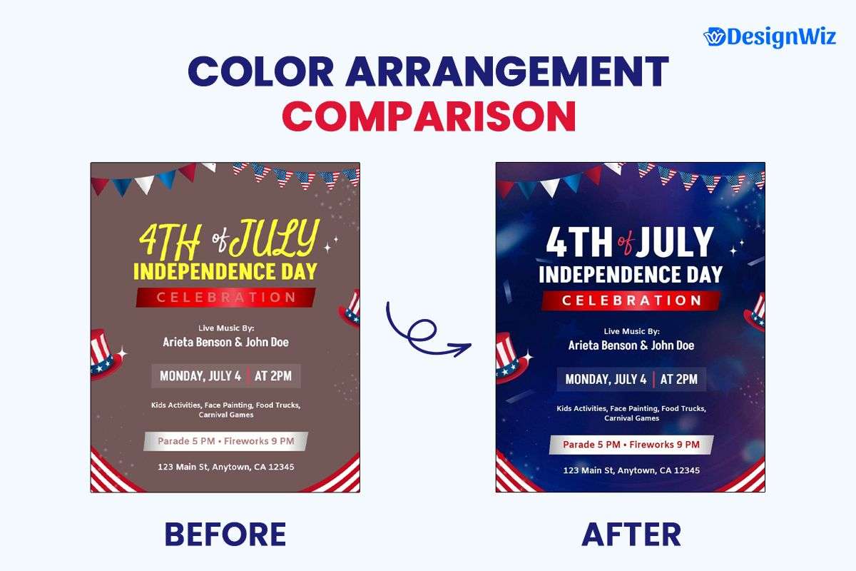
What Are the Most Effective Color Arrangement Strategies?
The way you arrange colors significantly impacts readability and effectiveness:
60-30-10 Rule: Use your dominant color for 60% of the design, secondary color for 30%, and accent color for 10%. For a traditional 4th of July flyer, this might mean:
- 60% white (background and text areas)
- 30% blue (headers and graphic elements)
- 10% red (call-to-action, highlights, and accents)
Contrast for Readability: Maintain high contrast for text elements (minimum 3:1 ratio, ideally 4.5:1). Poor contrast examples to avoid:
- Red text on blue background
- Light blue text on white background
- Navy text on dark red background
Strategic Color Blocking: Use color to differentiate information sections. Effective implementation:
- Blue header section with white text
- White content section with dark text
- Red call-to-action section with white text
Gradients for Modernity: Subtle red-to-blue gradients can create contemporary patriotic feels. Best practices:
- Keep gradients subtle (20-30% opacity difference)
- Use for background elements, not text areas
- Maintain readability across the gradient
Color for Hierarchy: Use brighter colors for primary information, more muted tones for secondary details. Implementation example:
- Bright red for headline and main discount
- Navy blue for event details
- Muted blue or gray for terms and conditions
How Should You Apply Color to Different Flyer Elements?
When designing a flyer, color choices play a crucial role in ensuring readability and impact. Here’s how to strategically apply color to different flyer elements for maximum effectiveness and visual appeal.
| Flyer Element | Recommended Color Approach | Example |
|---|---|---|
| Headline | High-contrast color against background | White headline on blue background or red/blue on white |
| Background | Lighter colors for text-heavy flyers | White or cream background with colored elements |
| Call-to-Action | Contrasting color that stands out | Red button on white background or white on red |
| Important Information | Highlight with bright red or surrounded by contrast color | Date and time in red or within a red border |
| Decorative Elements | Full patriotic palette including accent colors | Stars and stripes in traditional colors with gold accents |
| Body Text | Dark text on light background | Navy or black text on white background |
For essential design elements that complement effective color usage, see our guide to essential design elements and information organization.
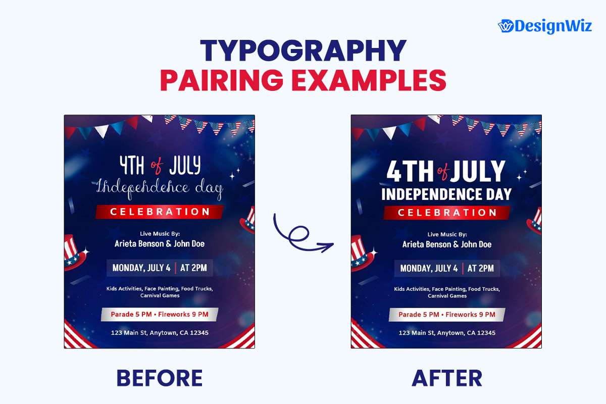
What Typography Works Best for 4th of July Flyers?
Typography choices significantly impact both the aesthetic and functional aspects of your 4th of July flyer. For your 4th of July flyer, pairing a bold display font for the headline (like Americana or Liberty) with a clean, easy-to-read sans-serif font (like Helvetica or Open Sans) will make the text much more legible and visually appealing.
What Are the Most Effective Patriotic Font Pairings?
The most effective approach combines a distinctive display font for headlines with a highly readable font for body text:
| Style | Headline Font | Body Text Font | Best For |
|---|---|---|---|
| Classic American | Americana, Liberty, Stars & Stripes | Georgia, Charter, Times | Traditional events, historical celebrations |
| Modern Patriotic | Monument, Freedom, Manifest | Helvetica, Open Sans, Roboto | Contemporary retail, urban events |
| Elegant Celebration | Landmark, Declaration, Eagle | Baskerville, Garamond, Didot | Upscale events, luxury promotions |
| Friendly Community | Good Times, Homestead, Hometown | Proxima Nova, Avenir, Source Sans | Family events, casual celebrations |
| Rustic Americana | American Captain, Wilderness, 1776 | Rockwell, Courier, Clarendon | Small town events, historical themes |
Maintain a 3:1 minimum contrast ratio between text and background colors to ensure accessibility and readability.
According to the Harrisburg Area Community College’s guide, Typography is crucial in flyer design, as the right fonts improve readability and can boost message clarity by up to 20%. Using contrasting typefaces and creating a clear visual hierarchy ensures the viewer focuses on the most important information.2
What Typography Principles Should Guide Your 4th of July Flyer Design?
Contrast: Create a clear distinction between headline and body fonts. Effective contrast comes from pairing fonts with different characteristics:
- A decorative, patriotic display font with a simple sans-serif
- A bold, heavy headline font with a lighter body text font
- A serif headline with sans-serif body text (or vice versa)
Readability: Body text should be minimum 10pt (12pt preferred) and maintain high contrast with background. Readability factors to consider:
- Font size (minimum 10pt for body text, 24pt+ for headlines)
- Line spacing (120-150% of font size)
- Letter spacing (slightly increased for all-caps text)
- Color contrast (4.5:1 minimum ratio)
Hierarchy: Use size, weight, and color to establish clear typographic hierarchy. A clear typographic hierarchy might include:
- Level 1: Main headline (largest, boldest, most prominent color)
- Level 2: Subheadlines (medium size, bold or semibold)
- Level 3: Feature points (slightly larger than body text, possibly bold)
- Level 4: Body text (standard size, regular weight)
- Level 5: Supporting information (slightly smaller, possibly italic)
Consistency: Limit your design to 2-3 font families maximum. Typical font distribution:
- 1 distinctive patriotic/display font for headlines
- 1 readable font for body text
- Possibly 1 additional font for special elements (not required)
Spacing: Ensure adequate letter spacing (tracking) and line spacing (leading) for readability. Spacing guidelines:
- Line spacing: 120-150% of font size
- Letter spacing: Normal for body text, slightly increased for all-caps
- Paragraph spacing: Equal to font size or slightly larger
What Typography Do’s and Don’ts Should You Follow?
Typography can make or break your flyer design, especially for themed events like the 4th of July. Follow these do’s and don’ts to maintain clarity, consistency, and a professional look.
| Do | Don’t |
|---|---|
| Use patriotic display fonts for headlines and short phrases | Use decorative fonts for body text or extensive content |
| Create contrast between headline and body text styles | Mix too many different fonts in one design |
| Ensure text is legible over images with adequate contrast | Sacrifice readability for thematic appropriateness |
| Align text thoughtfully (typically left-aligned for body text) | Center-align long blocks of text |
| Use bold or italic sparingly to emphasize key points | Use all caps for lengthy text blocks |
How Can You Integrate Brand Typography with Patriotic Elements?
For businesses, maintaining brand consistency while embracing patriotic themes requires thoughtful typography integration:
Primary Approach: Maintain your brand fonts for logo and key messaging. This creates consistent brand recognition while allowing for holiday-specific elements elsewhere in the design.
Secondary Approach: Pair brand fonts with complementary patriotic fonts.
Example implementation:
- Keep brand font for company name, logo, and contact information
- Use complementary patriotic fonts for headlines and event-specific information
- Ensure visual harmony between both font families
Special Version Approach: Create patriotic versions of brand typography
For businesses with custom typography:
- Develop a special patriotic version of your logotype for the holiday
- Add subtle patriotic elements to your standard typography
- Create a consistent system that maintains brand recognition
For guidance on crafting effective calls-to-action using these typography principles, see our guide to compelling 4th of July calls-to-action.
How Can You Balance Patriotic Design with Brand Identity?
One of the most challenging aspects of 4th of July flyer design is integrating patriotic elements while maintaining your brand’s visual identity. Here are strategies for achieving this balance:
Color Integration Strategies
Blending your brand identity with patriotic themes can enhance recognition while celebrating the holiday. Here are three smart color integration strategies to keep your flyer festive and on-brand.
Use brand colors as accents within a patriotic palette
Implementation:
- Use traditional red, white, and blue as primary colors (60-70% of design)
- Incorporate brand colors as accents (30-40% of design)
- Use brand colors for logo, contact information, and specific calls-to-action
Adjust brand colors to patriotic shades
Execution:
- Shift brand blues to navy or royal blue
- Shift brand reds to a more traditional flag red
- Maintain white/neutral elements as they are
- Example: If your brand uses burgundy, shift temporarily to a more traditional red
Use brand colors primarily with subtle patriotic elements
Integration:
- Maintain your primary brand color palette (70-80% of design)
- Add subtle patriotic elements like star patterns, small flags, or red/white/blue accents
- Create a balanced design that feels both on-brand and holiday-appropriate
Typography Integration Strategies
Balancing brand identity with festive flair starts with smart typography choices. Here are three effective strategies to integrate brand and patriotic fonts seamlessly into your flyer design.
Brand Font Priority
Implementation:
- Maintain your brand fonts for all text
- Add patriotic feel through color and graphic elements instead
- Use font weights, sizes, and colors to create patriotic impact
Hybrid Approach
Execution:
- Use brand fonts for body text and information
- Use patriotic display fonts for headlines and key promotional elements
- Ensure the fonts complement each other visually
Contextual Separation
Integration:
- Create clear “zones” within your design
- Use brand typography in brand-focused areas (logo, contact, etc.)
- Use patriotic typography in event/promotion-focused areas
Visual Element Integration
Incorporating patriotic visuals without overshadowing your brand is key to effective flyer design. These integration strategies help blend holiday spirit with consistent branding through thoughtful visual elements.
Patriotic Overlays
Implementation:
- Maintain brand imagery and design elements
- Add subtle patriotic overlays like star patterns or red/white/blue color filters
- Create a cohesive look that respects both patriotic themes and brand standards
Balanced Composition
Execution:
- Allocate specific areas for patriotic elements (typically headers/borders)
- Reserve other areas for brand-focused elements (typically information sections)
- Create visual harmony between the two through color and style connections
Branded Patriotic Icons
Integration:
- Develop patriotic versions of your brand icons or graphics
- Incorporate brand elements into patriotic symbols
- Create a unique visual language that merges both identities
Need more deep ideas for small businesses and restaurants promotion with 4th of July flyers, then explore the guides below.
Affordable 4th-of-July flyers for small businesses.
4th-of-July restaurant flyers to promote the menu and events.
Conclusion: Creating Visually Impactful 4th of July Flyers
Effective color and typography choices can dramatically increase the impact and response rates of your 4th of July flyers. By thoughtfully applying the principles outlined in this guide, you can create designs that:
- Capture attention with strategic color combinations
- Enhance readability with proper typography choices
- Establish clear information hierarchy
- Balance patriotic themes with brand identity
- Create a professional, cohesive visual presentation
For industry-specific implementations of these principles, check out our guide to 4th of July flyer approaches for different businesses.
Remember that the most effective designs balance aesthetic appeal with practical communication goals. Your colors and typography choices should always support your primary objectives, whether that’s driving event attendance, increasing sales, or building brand awareness in you 4th of july flyers. Explore specific aspects like essential design elements or effective calls-to-action.
Ready to create your own visually striking 4th of July flyers? Explore our professional 4th of July flyer templates or download our free starter template below.
Reference
- “Palette, Purpose, Prototype: The Three Ps of Color Design and How They Matter for Designers.” Archived from the original on March 15, 2024. Retrieved April 24, 2025. Gomes, T., Fitzmaurice, G., & Isbister, K. (2024).
- “Brochures, Flyers, and Posters.” Archived from the original on March 15, 2024. Retrieved April 23, 2025. LibreTexts, Harrisburg Area Community College.