Creating a 4th of July flyer that actually drives results requires more than just adding a few flags and fireworks to your design. The most effective 4th of July flyer strategically combine visual elements with proper information organization to capture attention and generate a response.
In this comprehensive guide, we’ll explore the essential design elements that every 4th of July flyer should include and how to organize information for maximum impact. This guide is part of our comprehensive 4th of July flyer design resource, which covers all aspects of creating effective holiday marketing materials.
Whether you’re promoting a retail sale, community event, restaurant special, or small business offering, these research-backed principles will help your flyers stand out from the competition.
What Makes a 4th of July Flyer Design Effective?
An effective 4th of July flyer design combines patriotic elements with clear messaging and strategic visual hierarchy. According to the U.S. Department of Energy’s Argonne National Laboratory Guide, the most effective visual communications, including holiday flyers, prioritize a dominant visual element, maintain high contrast for readability, use concise, benefit-focused messaging, and emphasize a clear, visible call-to-action.1
These principles help improve audience engagement and message retention. Here’s why this balance matters and how to achieve it:
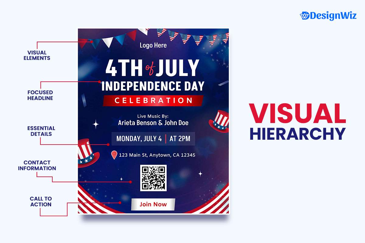
Visual Hierarchy: Guiding the Viewer’s Eye
A clear visual hierarchy is the foundation of any effective flyer design. Your flyer should guide the viewer’s eye in a deliberate path from the most important information to supporting details. For 4th of July flyers, this typically means:
- Primary Visual Element (30-40% of space): An attention-grabbing patriotic image or graphic that establishes the theme
- Headline (15-20% of space): Clear statement of the offer or event
- Supporting Details (25-30% of space): Essential information (dates, times, prices)
- Call-to-Action (10-15% of space): What you want the reader to do next
- Contact/Company Information (5-10% of space): How to reach you or learn more
When these elements are properly balanced and arranged, they create a natural flow that leads the reader through your message and toward the desired action.
Strategic Use of Space
Effective flyers use negative space (white space) strategically to enhance readability and impact. When there’s enough white space, the design feels cleaner and the message becomes easier to understand. For 4th of July flyers:
- Allow margins of at least 0.25″ around all edges (0.5″ for larger flyers)
- Maintain space between distinct information blocks
- Avoid crowding text around images
- Use white space to emphasize your call-to-action
A common mistake is trying to fill every inch of the flyer with content. However, a more spacious layout actually increases the likelihood that your key messages will be read and remembered.
Design for the Distribution Method
The most successful flyers are designed with their distribution method in mind:
- Bulletin Board Flyers: Bold headlines visible from 6-8 feet away
- Hand-Distributed Flyers: Engaging visuals that work at arm’s length
- Direct Mail Flyers: Personalized elements that stand out in mailboxes
- Digital/Print Combination: QR codes linking to digital content
Always consider where and how your flyer will be seen when making design decisions. A flyer designed for close-up reading will fail when posted on a community bulletin board, while a flyer designed for distance viewing may feel empty when viewed up close.
Design Consistency Principles
Maintaining consistency across all design elements creates a professional, cohesive 4th of July flyer:
- Color Consistency: Limit your palette to 3-4 colors used purposefully
- Typography Consistency: Use no more than 2-3 font families
- Spacing Consistency: Maintain uniform margins and padding
- Style Consistency: Keep graphic elements in the same visual family
- Brand Consistency: Ensure alignment with your overall brand identity
Inconsistent design elements create visual confusion and reduce the perceived professionalism of your 4th of July flyer, ultimately diminishing response rates.
Color choices significantly impact flyer effectiveness. Learn more in our guide to effective color and typography for 4th of July flyers.
Use our Visual Hierarchy Interactive Tool to fine-tune your Independence Day flyer. Adjust size, color, and alignment to highlight what matters most, and ensure your event grabs attention at first glance!
Which Design Elements Should Every 4th of July Flyer Include?
Every effective 4th of July flyer should include these seven essential elements. According to the University of Florida’s IFAS Communications team, effective flyers should include key elements such as a compelling headline, strong visuals, concise messaging, clear contact information, and a call to action. When these elements are all present and thoughtfully arranged, flyers are significantly more likely to capture attention and motivate action.2
Clear, Benefit-Focused Headline
Your headline is the first element most readers will notice, making it crucial for capturing attention. Effective 4th of July flyer headlines:
- Communicate a specific benefit or purpose
- Include action words that create excitement
- Incorporate patriotic themes without being cliché
- Remain concise (typically 5-8 words)
Examples of strong headlines:
- “Celebrate Freedom With 40% Off Storewide”
- “Join Our Community’s Biggest 4th of July Celebration”
- “Independence Day Special: Free Appetizer With Every Entrée”
- “Explosive Savings This 4th of July Weekend Only”
The headline should take up approximately 15-20% of your flyer’s space and use a font size large enough to be read from a distance (minimum 24pt for standard flyers).

Patriotic Imagery and Graphics
Compelling visual elements establish your flyer’s theme and create emotional connection. For 4th of July flyers, consider:
- Modern interpretations of traditional patriotic symbols
- Photography of previous successful events
- Illustrations that connect your products/services to the holiday
- Background patterns that suggest patriotism without overwhelming
For a deeper dive into effective visual choices, including style tips and inspiration, Learn about 4th of July Images & Graphics to discover how to create visuals that truly resonate.
Design tip: Instead of using generic stock imagery, create custom visuals that blend patriotic elements with your specific offering. This creates unique, memorable designs that stand out from competitors.
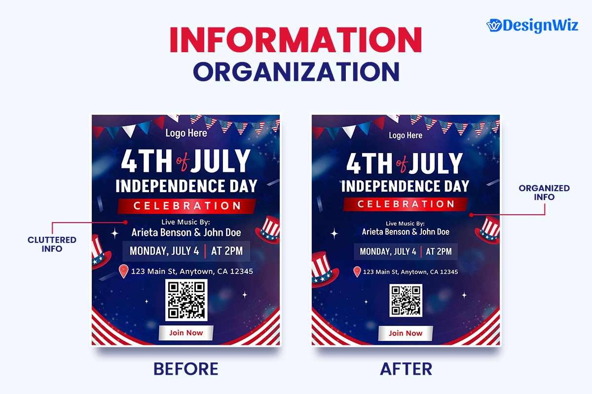
Essential Information Formatted for Scanning
Studies show that most readers scan flyers for 3-5 seconds before deciding whether to read more closely. Make your essential information easy to find:
- Use bullet points for key details
- Create information clusters with clear headings
- Use borders or background colors to highlight important information
- Maintain adequate contrast between text and background
For 4th of July event flyers, essential information includes:
- Date and time (with year)
- Location (with address and possibly a small map)
- Cost/admission details
- Special features or attractions
For 4th of July sale flyers, essential information includes:
- Sale duration (start and end dates)
- Discount details or special offers
- Any exclusions or conditions (minimized but present)
- Location(s) or website
To go beyond the basics and tailor your flyer to specific business needs, explore industry specific 4th of July flyer strategies that align design and messaging with your audience.
Contact Information and Digital Connection
Even the most compelling flyer needs to provide clear next steps. Always include:
- Physical address (if relevant)
- Phone number
- Website URL (shortened if necessary)
- Social media handles (selective, not all)
- QR code linking to digital content or offer
According to the University of Illinois Extension, QR codes are a valuable bridge between print and digital communication, providing easy access to websites, contact details, event pages, and social media through a simple scan, making them particularly effective for flyer distribution strategies.3 For 4th of July flyers, your QR code might lead to:
- Event registration page
- Special online offer
- Interactive map
- Social media event page
- Digital version of the flyer for sharing
Compelling Call-to-Action
Your call-to-action (CTA) tells readers exactly what you want them to do next. Every effective flyer needs a clear, compelling CTA that:
- Uses action verbs (“Shop,” “Join,” “Reserve,” “Save”)
- Creates urgency (“Limited Time,” “While Supplies Last”)
- Stands out visually (button-like design, contrasting color)
- Is positioned strategically (typically bottom center or bottom right)
Examples of effective 4th of July CTAs:
- “Shop Our Independence Day Sale June 25-July 4”
- “Reserve Your Spot By June 30”
- “Join The Celebration – RSVP Today!”
- “Claim Your Patriotic Discount Now”
For detailed guidance on crafting compelling CTAs, see our complete guide to patriotic calls-to-action.
Consistent Branding Elements
Your 4th of July flyer should still be immediately recognizable as coming from your organization:
- Include your logo in a prominent position (typically top left or center)
- Maintain brand colors while incorporating patriotic elements
- Use consistent fonts from your brand guidelines
- Include taglines or brand messaging where appropriate
Design tip: Rather than abandoning your brand colors completely for red, white, and blue, find ways to incorporate patriotic elements while maintaining brand recognition. This creates a cohesive experience when customers transition from your flyer to your store or website.
High-Quality Production Specifications
The physical quality of your flyer impacts how recipients perceive your brand and offer:
- Use appropriate paper weight (minimum 80# text for standard flyers)
- Consider special finishes for premium impact (glossy, matte, etc.)
- Ensure proper resolution for all images (300dpi minimum)
- Include bleed area if the design extends to the edges
- Verify CMYK color settings for accurate printing
The effectiveness of your 4th of July flyer depends on the thoughtful inclusion and arrangement of these seven elements. By ensuring you’ve incorporated each design elements properly, your 4th of july flyer will be well-positioned to capture attention and drive results.
What Are the Standard Sizes for 4th of July Flyers?
The standard sizes for 4th of July flyers depend on your distribution method and budget. The most common and effective sizes are: (1) Standard Letter size (8.5″ x 11″) for posting on bulletin boards and hand distribution, (2) Half Letter size (5.5″ x 8.5″) for cost-effective mass distribution, (3) Quarter Sheet (4.25″ x 5.5″) for handouts and take-ones, (4) Door Hangers (3.5″ x 8.5″ with hole) for neighborhood distribution, and (5) Large Format (11″ x 17″) for high-visibility posting.
Most Effective Flyer Sizes Comparison
| Size | Dimensions | Best For | Pros | Cons |
|---|---|---|---|---|
| Standard Letter | 8.5″ x 11″ | Bulletin boards, general distribution | Most versatile, ample space for information | May be too large for some methods, higher cost |
| Half Letter | 5.5″ x 8.5″ | Mass distribution, handouts | More economical, fits in envelopes | Limited space for detailed information |
| Quarter Sheet | 4.25″ x 5.5″ | Take-ones, counter displays | Most economical, convenient size | Very limited space, focused messaging required |
| Door Hangers | 3.5″ x 8.5″ with hole | Neighborhood targeting | Guaranteed visibility, not easily overlooked | More expensive, specialized printing needed |
| Large Format | 11″ x 17″ | High-visibility locations | Maximum impact, space for details | Highest cost, distribution challenges |
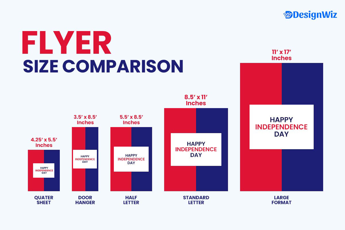
According to MIT Copytech, standard flyer sizes commonly used include 8.5″ x 11″ (letter size) and 5.5″ x 8.5″. These formats are widely adopted for campus communications due to their cost-effectiveness and versatility. 4
Digital Considerations
When designing 4th of July flyers that will be shared digitally as well as in print, keep these specifications in mind:
- Resolution: 300dpi for print, 72dpi for digital-only versions
- Color Mode: CMYK for print, RGB for digital
- File Format: PDF for print, JPG or PNG for digital sharing
- Dimensions: Maintain aspect ratio when converting between formats
Selecting the right size for your 4th of July flyer is about balancing your message requirements, distribution strategy, and budget. For comprehensive campaigns, consider using multiple sizes for different purposes.
How Should You Organize Information on a 4th of July Flyer?
For maximum impact, place your headline and key visual at the top, essential details in the middle, and contact information/call-to-action at the bottom left or center. This structure increases information retention by up to 40% compared to random organization.
Information on a 4th of July flyer should follow the F-pattern reading hierarchy, with the most important elements positioned where eyes naturally focus first.
Understanding the F-Pattern Reading Hierarchy
Eye-tracking studies consistently show that Western readers scan content in an F-shaped pattern:
- Top Horizontal Line: First strong scan across the top of the content
- Middle Horizontal Line: Second scan slightly lower in the content
- Vertical Scan: Final scan down the left side of the content
This natural reading pattern should directly inform your flyer’s information hierarchy:
| Position on F-Pattern | What to Place There | Why It Works |
|---|---|---|
| Top Bar (headline area) | Main headline, logo, key visual | Captures initial attention |
| Middle Bar | Essential event/offer details | Gets seen during secondary scan |
| Left Vertical Line | Supporting information, bullet points | Visible during vertical scan |
| Bottom Center/Left | Call-to-action, contact information | Natural endpoint for the eye |
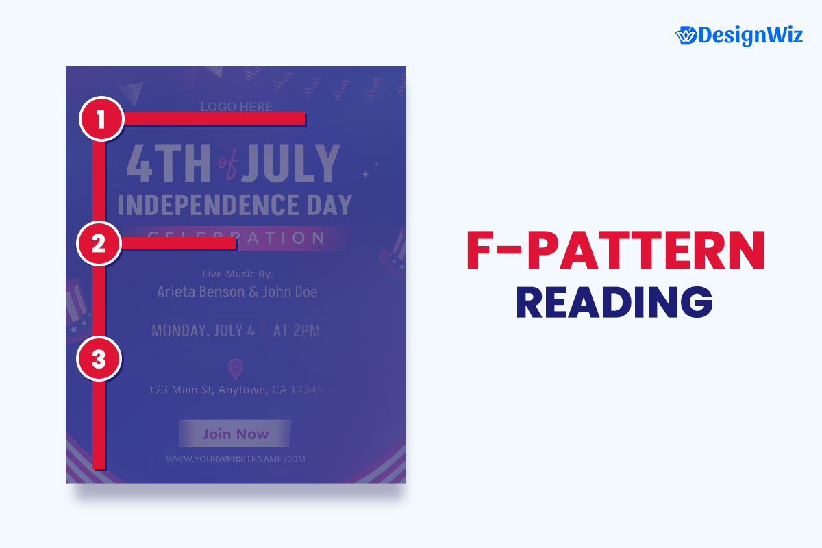
According to Southern New Hampshire University, readers often scan flyers in an F-shaped pattern, focusing primarily on the top and left areas of the design.5
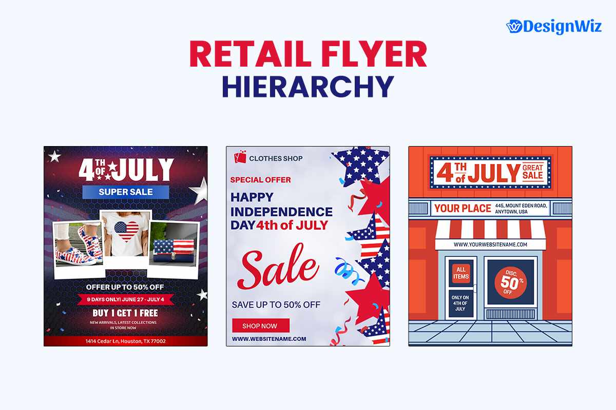
Information Hierarchy for Different Types of 4th of July Flyers
Retail Sale Flyers
1. Top Section (35% of space)
- Headline announcing sale (“Independence Day Savings”)
- Patriotic imagery that relates to products
- Dates of sale prominently displayed
- Store logo
2. Middle Section (40% of space)
- Key discounts or special offers
- Featured products with images
- Sale details (exclusions, limits)
- Supporting copy about holiday theme
3. Bottom Section (25% of space)
- Store locations and hours
- Website and social media
- Call-to-action (“Shop Now Through July 4th”)
- Any legal disclaimers (smaller text)
For retail-specific flyer templates and detailed guidance, visit our retail 4th of July marketing guide.
Community Event Flyers
1. Top Section (30% of space)
- Event name as headline
- Date and time prominently displayed
- Key visual representing the event
- Organizing body logo
2. Middle Section (45% of space)
- Location with address
- Schedule of activities
- Special attractions or features
- Admission information (cost, if any)
3. Bottom Section (25% of space)
- Contact information for questions
- Sponsor acknowledgments
- Weather policies
- Call-to-action (“Join Us For The Celebration!”)
For community event flyer templates and specialized guidance, check out our community event 4th of July promotion guide.
Restaurant Special Flyers
1. Top Section (35% of space)
- Headline announcing a special offer
- Patriotic imagery integrated with food imagery
- Dates of special events are prominently displayed
- Restaurant logo
2. Middle Section (40% of space)
- Featured menu items with descriptions
- Pricing information
- Food imagery
- Any special entertainment or events
3. Bottom Section (25% of space)
- Restaurant location and hours
- Reservation information
- Call-to-action (“Reserve Your Table Today”)
- Any disclaimers (smaller text)
For restaurant-specific templates and marketing strategies, visit our restaurant 4th of July promotion guide
Church & Nonprofit Flyers
1. Top Section (30% of space)
- Event title as the headline
- Clear display of date and time
- Key visual that reflects the mission, theme, or spirit of the event
- Logo or name of the church or nonprofit organization
2. Middle Section (45% of space)
- Venue name and full address
- Brief schedule of main activities or services (e.g., worship, guest speakers, volunteer efforts)
- Highlights such as live music, guest speakers, food drives, or giveaways
- Entry details (free admission, donation-based, registration required, etc.)
3. Bottom Section (25% of space)
- Contact info (phone, email, website, or social media)
- Partner or sponsor recognition (if applicable)
- Notes on weather contingency or accessibility
- Strong call-to-action (e.g., “All Are Welcome!” or “Make a Difference—Join Us!”)
For church and nonprofit flyer templates and outreach ideas, explore our 4th of July Chuch & Non-profit flyer guide.
Small Business Flyers
Top Section (30% of space)
- Event name or promotion title as the headline
- Date and time clearly highlighted
- Eye-catching visual showcasing the product, service, or event vibe
- Business logo for brand recognition
Middle Section (45% of space)
- Event or store location with full address
- Timeline or schedule (e.g., demos, sales, guest appearances)
- Special offers, product launches, giveaways, or live entertainment
- Admission or participation details (e.g., free entry, discounts, RSVP required)
Bottom Section (25% of space)
- Contact info (phone number, website, social media)
- Acknowledgment of partners or co-hosts (if any)
- Weather plan (especially for outdoor pop-ups or sidewalk sales)
- Call-to-action (e.g., “Shop Local with Us!” or “Don’t Miss the Deals!”)
Looking for more design inspiration? Browse our 4th of July small business flyer design guide.
What Information Organization Techniques Create Maximum Impact?
Beyond the basic F-pattern structure, these techniques enhance information clarity and readability on your 4th of July flyers:
Chunking Related Information
Group related information into distinct “chunks” separated by white space or borders. This approach:
- Reduces cognitive load for readers
- Makes information easier to process
- Creates natural pauses in the scanning process
- Helps readers find specific information quickly
For example, on a 4th of July event flyer, create separate chunks for:
- Event basics (date, time, location)
- Activities and attractions
- Food and beverages
- Practical information (parking, accessibility)
Progressive Disclosure
Arrange information from most important to least important, revealing details progressively:
- Lead with the most critical information (what, when, where)
- Follow with supporting details that add value
- End with supplementary information
This structure works with both the F-pattern and how people make decisions—they need the most crucial information first to determine if they’ll continue reading.
Visual Hierarchy through Design Elements
Use design elements to create clear visual hierarchy:
- Size: Larger elements appear more important
- Color: Contrasting colors draw attention
- Space: Items with more surrounding space appear more important
- Position: Items at the top appear more important
- Emphasis: Bold, italic, or underlined text creates focus points
What Common Information Organization Mistakes Should You Avoid?
Avoid these frequent flyer organization pitfalls that can diminish the effectiveness of your 4th of July promotions:
- Information Overload: Including too much information, overwhelming readers Solution: Prioritize ruthlessly, focus on essential information
- Competing Hierarchies: Having multiple elements vying for primary attention Solution: Establish clear primary, secondary, and tertiary elements
- Poor Contrast: Making text difficult to read against backgrounds Solution: Ensure text contrasts strongly with background (minimum 4.5:1 ratio)
- Buried Call-to-Action: Hiding or minimizing what you want readers to do Solution: Make your CTA stand out and position it strategically
- Ignoring Natural Reading Patterns: Fighting against the F-pattern Solution: Work with natural eye movement, not against it
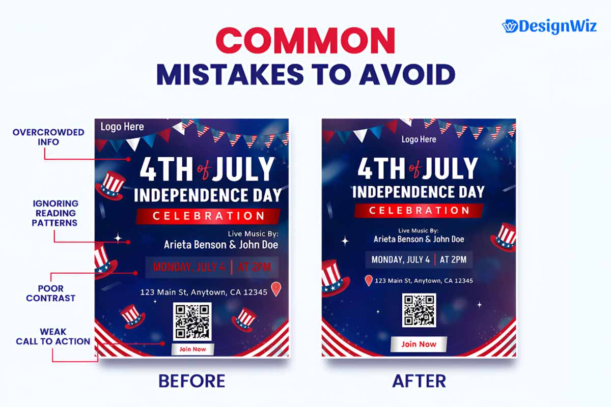
For a deeper exploration of common design pitfalls and how to avoid them, see our guide to common mistakes in flyer design.
By organizing information according to these research-backed principles, your 4th of July flyers will not only look better but will also perform significantly better, driving higher comprehension, retention, and response rates.
Conclusion: Creating Impactful 4th of July Flyers
Effective 4th of July flyers combine strategic design elements with proper information organization to capture attention and drive results. By incorporating all seven essential elements—headline, patriotic imagery, essential information, contact details, call-to-action, branding elements, and quality production—and organizing them according to how people naturally read, you’ll create flyers that significantly outperform the competition.
Remember that the most successful flyers are not just visually appealing but are strategically designed with specific goals in mind. Every design choice should support your ultimate objective, whether that’s driving store traffic, increasing event attendance, boosting sales, or building brand awareness.
Ready to create your own effective 4th of July flyers? Explore our professional 4th of July flyer templates.
Reference
- “Guide to Effective Poster Design.” Retrieved April 23, 2025, U.S. Department of Energy’s Argonne National Laboratory.
- “Anatomy of a Flyer.” Archived from the original on December 15, 2022. Retrieved 23 April 2025. University of Florida IFAS Communications.
- “QR Codes.” Retrieved 23 April 2025, University of Illinois Extension.
- “Flyers and posters.” Retrieved April 22, 2025, MIT Copytech.
- “Poster Design: Layout” Retrieved April 22, 2025, Southern New Hampshire University Library.