Every softball season, thousands of teams, coaches, and organizers struggle with the same frustrating problem: their promotional materials fail to generate the response they need. Whether it’s low tryout attendance, poor fundraising results, or empty tournament brackets, the culprit is often the same ineffective flyer design that fails to capture attention and motivate action.
At DesignWiz, we’ve had the privilege of working with over 200 softball teams across recreational, competitive, and professional levels. From little league organizations struggling to fill rosters to elite travel teams seeking sponsor partnerships, we’ve seen firsthand how strategic flyer transforms outcomes.
This comprehensive guide distills everything we’ve learned about creating softball flyers that actually work. You’ll discover the fundamental principles that separate professional designs from amateur attempts, learn specific strategies for different types of softball events, and understand exactly what makes some flyers irresistibly engaging while others get immediately discarded.
What You’ll Learn in This Guide
- Design Foundations: The core principles that govern effective softball flyer design, from visual hierarchy to color psychology specifically relevant to sports marketing.
- Event-Specific Strategies: Detailed approaches for different softball events tryouts, camps, tournaments, fundraisers each with its own design needs and psychological triggers to drive engagement.
- Professional Standards: Industry best practices that ensure your materials look credible and authoritative, building trust with players, parents, and sponsors.
- Common Pitfalls: The mistakes that kill flyer effectiveness, and exactly how to avoid them based on real-world analysis of failed campaigns.
- Measurement & Optimization: How to track design effectiveness and continuously improve results through data-driven decisions.
Whether you’re a coach preparing for tryout season, a parent volunteer organizing a fundraiser, or a league administrator promoting tournaments, this guide provides the strategic framework for creating flyers using a free flyer maker that drives real results.
Core Design Principles for Effective Softball Flyers
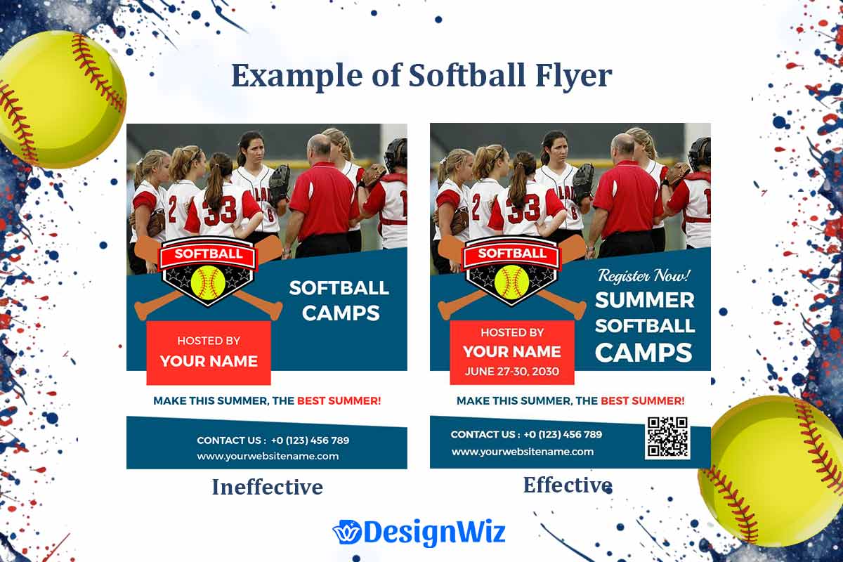
The difference between a flyer that gets results and one that gets ignored comes down to understanding and applying fundamental design principles. These aren’t arbitrary aesthetic choices they’re psychological triggers that determine whether your audience stops, reads, and takes action.
How Do You Design an Effective Softball Flyer?
The foundation of effective softball flyer design rests on what we call “The 5-Second Rule.” Research in sports marketing shows that potential participants make their initial interest decision within five seconds of seeing promotional material. In those crucial moments, your design must:
1. Capture Immediate Attention Your flyer competes with dozens of other messages for attention. The most effective softball flyers use high-contrast elements and strategic focal points to break through visual noise. This means bold, legible headlines that can be read from 10 feet away, and imagery that immediately communicates “softball” without requiring interpretation.
Visual hierarchy becomes critical here. The human eye follows predictable patterns when scanning information. For softball flyers, the optimal hierarchy flows: compelling headline → key image/visual → essential details → call-to-action. Each element should guide the reader naturally to the next without confusion or dead ends.
2. Communicate Value Instantly Within those first five seconds, readers must understand what you’re offering and why it matters to them. Successful softball flyers answer three questions immediately:
- What is this? (tryout, camp, tournament, fundraiser)
- Who is it for? (age group, skill level, demographic)
- What’s the benefit? (skill development, competition, fun, community)
3. Build Immediate Credibility Amateur designs signal amateur programs. Professional appearance suggests professional value. Elements that build instant credibility include consistent branding, high-quality imagery, proper spacing and alignment, and contact information that feels legitimate and established.
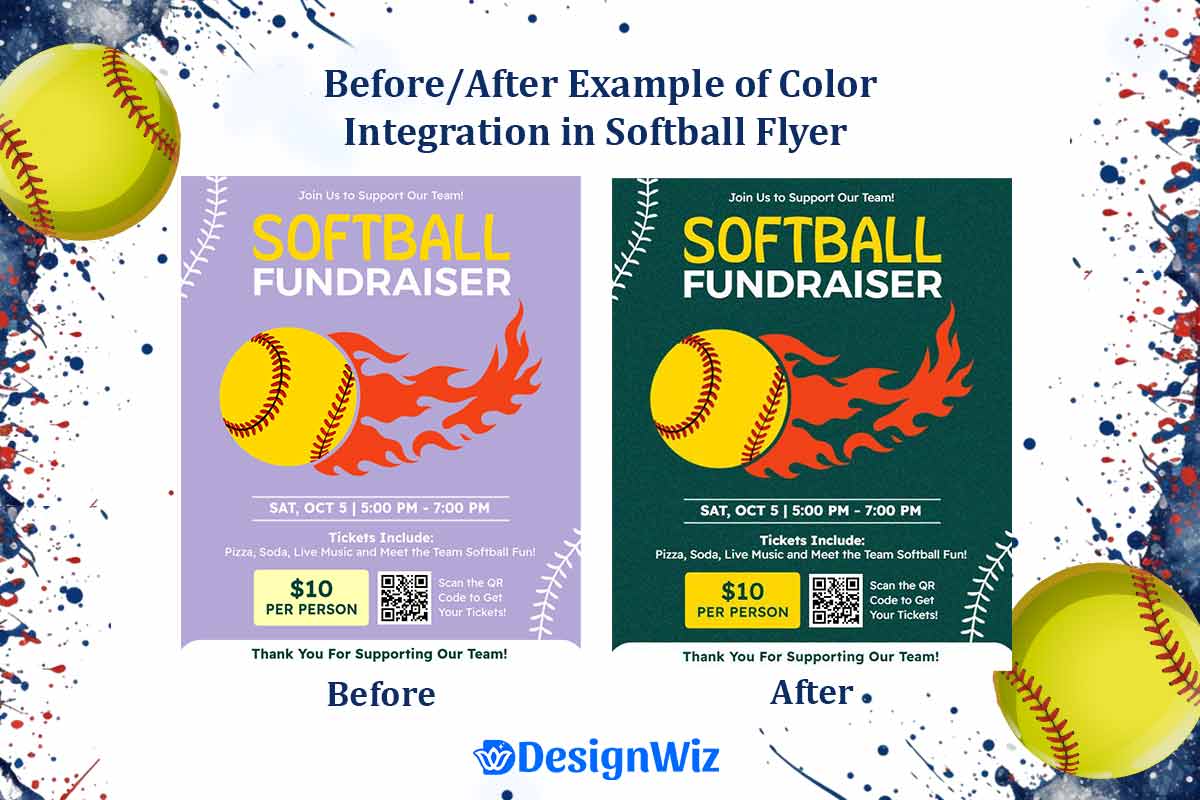
Color Psychology in Softball Contexts
Color choices aren’t just aesthetic they trigger psychological responses that influence decision-making. Our analysis of high-performing softball flyers reveals specific color strategies that outperform others:
- High-Energy Colors (Red, Orange, Bright Yellow): Increase urgency and excitement. Particularly effective for tryouts and competitive events where energy and intensity are desired. However, use sparingly too much can feel overwhelming.
- Trust Colors (Navy Blue, Forest Green, Deep Purple): Build credibility and professionalism. Essential for fundraising materials and formal announcements where trust and reliability are paramount.
- Youth-Friendly Colors (Bright Blue, Pink, Lime Green): Appeal to younger demographics while maintaining energy. Critical for youth leagues and camps targeting players under 14.
- Team Integration Strategy: The most effective approach combines your team’s established colors with psychologically appropriate accent colors. This maintains brand consistency while optimizing for emotional response.
A 2022 meta‑analysis found that athletes wearing red uniforms won approximately 55% of closely contested matches significantly above chance while blue uniforms were associated with a calming effect on players and observers.1
Typography Guidelines for Maximum Impact
Typography in softball flyer design serves two primary functions: ensuring readability at various viewing distances and conveying the appropriate tone for your program.
- Headline Typography: Must be readable from 10+ feet for posted flyers. Sans-serif fonts like Arial Bold, Helvetica Heavy, or custom sports fonts work best. Avoid decorative fonts that sacrifice legibility for style.
- Body Text Requirements: 12-point minimum for print, 14-point preferred for older demographics. Line spacing of 1.5x ensures easy scanning. Limit paragraph length to 3-4 lines maximum.
- Hierarchy Through Size: Headline 24-36pt, subheadings 16-20pt, body text 12-14pt, fine print 10pt minimum. This creates natural visual flow that guides readers through your message systematically.
What Makes a Professional Softball Flyer?
Professional softball flyers share specific characteristics that distinguish them from amateur attempts. Understanding these elements allows you to elevate your materials to compete with the best programs in your area.
Brand Consistency Across All Materials
Professional programs maintain visual consistency across all promotional materials. This includes consistent logo usage, color schemes, typography choices, and messaging tone. When parents see your tryout flyer, fundraising announcement, and practice schedule, they should immediately recognize them as coming from the same organization.
Consistency builds trust and professionalism. It signals that your program pays attention to details and maintains standards qualities parents want in their children’s activities.
Strategic Information Architecture
Professional designs organize information based on reader priorities, not organizational convenience. The most effective softball flyers follow this information hierarchy:
- Hook/Attention Grabber (What makes this opportunity special?)
- Core Offering (Specific program, event, or opportunity)
- Target Audience (Who should participate?)
- Key Benefits (Why participants should care)
- Essential Logistics (When, where, cost)
- Action Steps (How to participate)
- Contact Information (Questions and support)
Call-to-Action Optimization
Amateur flyers often bury their call-to-action or make it unclear what readers should do next. Professional designs make the desired action obvious and compelling.
Effective CTAs for softball flyers:
- “Register by June 30th – Only 20 Spots Available”
- “Join 50+ players already committed for fall season”
- “Secure your spot with $25 deposit – Full refund if not selected”
- “Text TRYOUT to 555-0123 for instant info packet”
Read More: How to Create Softball Fundraiser Flyers That Drive Results
Quality Indicators That Build Trust
Professional softball flyers include subtle elements that signal legitimacy and quality:
- Professional photography rather than stock images or phone photos
- Complete contact information including physical address, not just phone/email
- Social proof elements like years established, number of players served, or league affiliations
- Clear policies on refunds, makeup games, or weather contingencies
- Professional endorsements from local leagues, schools, or community organizations
According to article by Erik Rudolph, brands with strong consistency across all touchpoints are likely to achieve over 10% higher revenue growth, while 66% of consumers only purchase from brands they trust highlighting how consistent visual branding and messaging foster consumer confidence and drive loyalty.2
Essential Design Elements Every Softball Flyer Needs
Regardless of your specific event or target audience, certain design elements are non-negotiable for effective softball flyers. These elements work together to create a cohesive, professional appearance that drives action.
Information Hierarchy That Guides the Eye
Effective information hierarchy doesn’t happen by accident it requires strategic planning based on how people actually read promotional materials.
The Z-Pattern Reading Flow: Most readers scan flyers in a Z-pattern: top-left → top-right → diagonal to bottom-left → bottom-right. Position your most important elements along this natural path.
According to the Interaction Design Foundation, users scanning printed or digital layouts follow predictable F and Z‑patterns, with the first 80% of attention directed to 20% of the page elements making clear visual hierarchy (through size, color, contrast) essential for guiding the eye to your flyer’s most important contentl.3
Priority Element Placement:
- Top-left: Organization name/logo for immediate brand recognition
- Top-center: Primary headline communicating core value proposition
- Top-right: Date/urgency elements for immediate context
- Center: Key visual (photo, illustration) that reinforces the message
- Bottom-left: Detailed information and benefits
- Bottom-right: Call-to-action and contact information
White Space Utilization for Clarity
White space isn’t empty space it’s a design tool that improves comprehension and reduces cognitive load. Professional softball flyers use white space strategically to:
- Separate different information sections for easy scanning
- Emphasize important elements by giving them breathing room
- Improve readability by preventing text from feeling cramped
- Create visual sophistication that suggests program quality
Amateur mistake: Trying to fill every inch with information.
Professional approach: Strategic spacing that guides attention and improves understanding.
Image Selection Criteria for Maximum Impact
The visual elements in your softball flyer often determine whether people continue reading or move on immediately. Effective image selection follows specific criteria:
- Emotional Connection: Images should evoke the feelings you want associated with your program. For youth softball, this might be joy, friendship, and achievement. For competitive teams, focus on intensity, skill, and dedication.
- Demographic Relevance: Your images must reflect your target audience. If recruiting 12-year-old girls, show 12-year-old girls, not high school players or adults.
- Action and Energy: Static poses rarely engage viewers. Choose images showing softball action batting, fielding, celebrating that communicate the dynamic nature of the sport.
- Quality Standards: Blurry, poorly lit, or low-resolution images immediately signal amateur status. Invest in quality photography or professionally shot stock images.
Contact Information Placement and Accessibility
Your contact information strategy can make or break conversion from interest to action. Professional softball flyers optimize contact information for maximum accessibility:
- Multiple Contact Methods: Provide phone, email, and web options to accommodate different communication preferences.
- Response Time Expectations: Set clear expectations about when inquiries will be answered, especially during peak registration periods.
- Decision Maker Accessibility: Ensure contact information reaches people who can answer detailed questions and make registration decisions.
- Geographic Context: Include enough location information for people to understand travel requirements and logistics.
This foundation of design principles creates the framework for all effective softball promotional materials. Whether you’re recruiting players, promoting events, or raising funds, these principles ensure your message gets seen, understood, and acted upon.
Read More: Softball Camp Flyer Design Guide: Attract More Participants This Season
Interactive Design Tool: Softball Celebration Success Planner
Tool Purpose: Help coaches, parents, and organizers plan a memorable end-of-season celebration tailored to their team’s size, age group, season type, and budget with personalized event recommendations and planning checklists.
Input Fields:
- Team Name
- Age Group: (6–8, 9–12, 13–15, 16–18, Adult)
- Team Size: Adjustable slider (1–25+ players)
- Season Type: (Recreational League, Competitive Travel, Elite Tournament, School Team)
- Event Type: (Banquet, MVP Ceremony, Senior Night, Family Picnic, Themed Celebration)
- Budget Range: ($0–$200, $201–$500, $501–$1,000, $1,000+)
- Venue Preference: (Indoor, Outdoor, At-Home, Clubhouse, School Gym)
- Award Types Desired: (Certificates, Medals, Trophies, Custom Gifts)
Output Features:
- Personalized Celebration Plan with activity suggestions and timeline
- Custom Awards & Speech Ideas based on age group and team culture
- Recommended Budget Allocation by category (venue, food, awards, extras)
- Venue Setup Tips based on team size and event type
- Printable Event Checklist with deadlines and supplies
- DesignWiz Flyer Template Integration for invites and thank-you cards
Technical Requirements:
- Fully mobile-responsive
- Progress bar with stage-by-stage navigation (as shown in the image)
- PDF export of final plan
- Option to email plan to team/organizers
- Analytics dashboard to track most common event types and team sizes
- Smart suggestions based on previous entries and selections
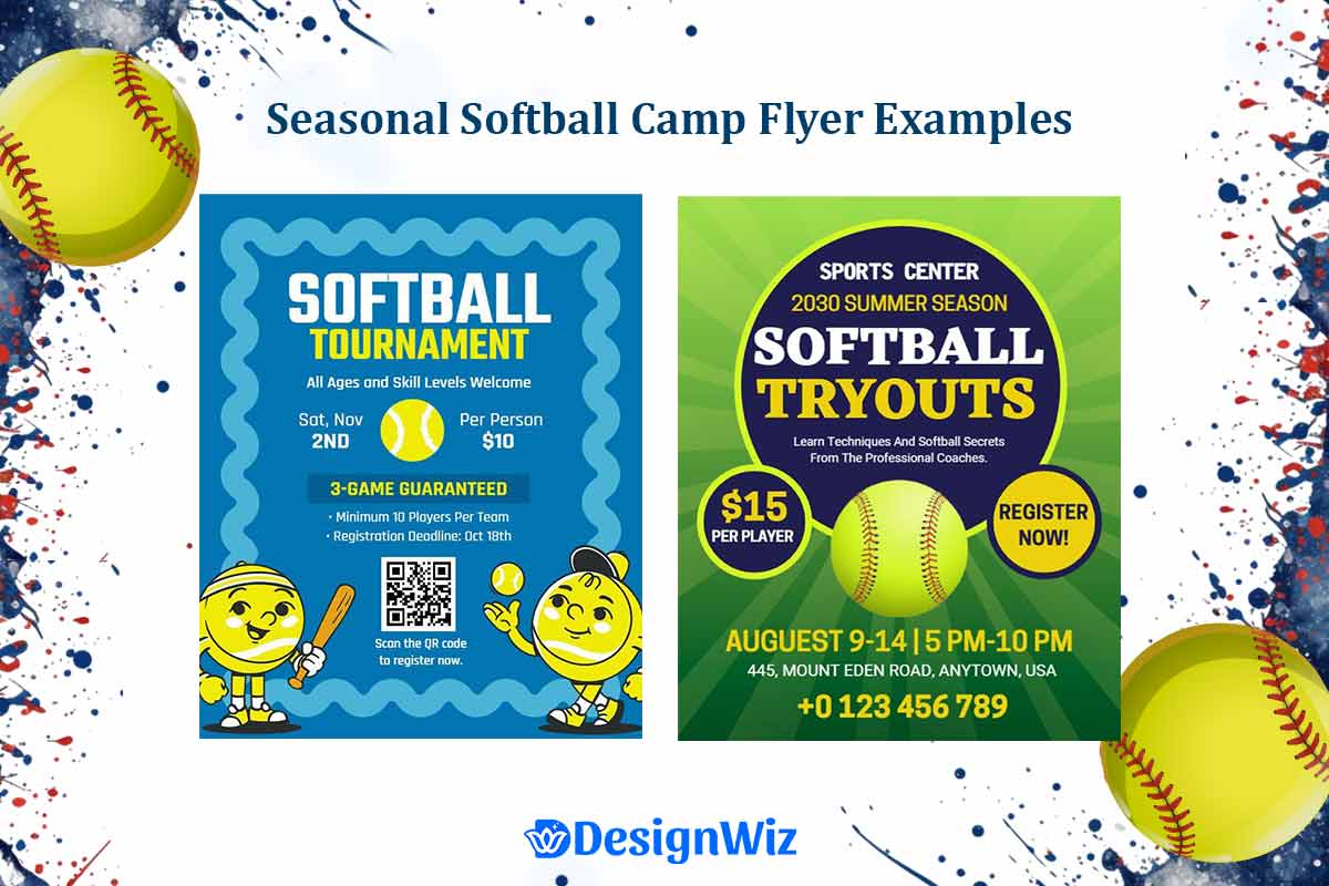
Softball Event-Specific Design Strategies
Different softball events require distinct design approaches to maximize effectiveness. Each event type has unique psychological triggers, information requirements, and success metrics that must be reflected in your design strategy.
What Should You Include on a Softball Tryout Flyer?
Tryout flyers face the highest stakes in softball promotion they determine who shows up to compete for limited roster spots. Our analysis of successful tryout campaigns reveals specific design strategies that significantly outperform generic approaches.
Essential Information Hierarchy for Tryout Success
The most effective tryout flyers follow a specific information priority that addresses parents’ and players’ primary concerns in order of importance:
1. Credibility Establishment (Top Priority) Parents evaluating tryout opportunities first assess program legitimacy. Design elements that build immediate credibility include:
- Coaching credentials prominently displayed with specific achievements and experience levels
- League affiliations and certifications positioned near the organization name
- Facility quality indicators through professional photography of fields and equipment
- Historical success metrics like championship records or college placement statistics
2. Competition Level and Expectations Players and parents need clear understanding of competitive expectations. Effective design communicates this through:
- Skill level requirements presented in accessible language without intimidation
- Time commitment visualization showing practice schedules and tournament frequency
- Financial investment transparency including all costs beyond basic registration
- Selection process clarity explaining evaluation criteria and timeline
3. Logistical Information Architecture Once credibility and expectations are established, practical details become critical:
- Multiple tryout dates with weather contingency plans clearly stated
- Location specificity including parking information and check-in procedures
- Equipment requirements with rental/borrowing options for new players
- Registration deadlines with consequences for late applications
Credibility Elements That Attract Serious Players
High-performing teams require different design approaches than recreational programs. Elements that signal serious competitive opportunity include:
- Professional Coaching Staff Presentation: Photos and brief bios of coaching staff with specific achievements (college/professional playing experience, coaching certifications, tournament victories).
- Facility and Equipment Standards: High-quality imagery showing field conditions, dugout facilities, and equipment quality. Parents of serious players evaluate these factors as program investment indicators.
- Player Development Track Record: Statistics on player advancement (high school team placements, scholarship recipients, skill improvement metrics) presented in digestible visual format.
- Competitive Schedule Preview: Tournament-level competition examples with dates and locations, showing commitment to high-level play.
Logistics Presentation for Parent Understanding
Parents often make final registration decisions, so design must address their practical concerns:
- Transportation and Travel Requirements: Clear indication of local vs. travel tournament participation with estimated travel frequency and distances.
- Practice Facility Access: Specific information about practice locations, field availability, and backup plans for weather disruptions.
- Communication Systems: How parents receive updates about schedule changes, team news, and player development feedback.
- Financial Planning Information: Complete cost breakdown including registration, equipment, travel, and optional expenses like team gear.
According to Lim et al. (2021), when parents receive well-organized information about schedules, roles, and event logistics, their supportive involvement correlates with a 22% increase in youth participation rates and enjoyment, underscoring the importance of clear logistics communication for parents.4
Read More: How to Create Softball Tryout Flyer That Attract the Best Players
Motivation Triggers That Encourage Participation
Effective tryout flyers balance realistic expectations with inspirational messaging:
- Achievement Opportunity: Specific examples of what players can accomplish through program participation (skill development, competition experience, recognition opportunities).
- Peer Quality Indicators: Information about returning players and the caliber of athletes the program attracts.
- Development Pathway: Clear explanation of how the program prepares players for next-level opportunities (high school teams, college recruitment, advanced competition).
How Do You Create a Softball Camp Flyer?
Summer camps represent peak season opportunity for many softball programs. Camp flyers must appeal to both participants and parents while competing against numerous other summer activity options.
Age-Appropriate Design Elements for Different Demographics
Camp design strategy varies significantly based on target age groups, with each requiring distinct visual and messaging approaches:
- Youth Camps (Ages 6-10): Bright, energetic colors with cartoon-style illustrations or photos showing pure fun and enjoyment. Emphasis on friendship, basic skill development, and positive experiences rather than competitive achievement.
- Pre-Teen Camps (Ages 11-13): Balance between fun and skill development, incorporating both recreational elements and beginning competitive concepts. Real photography of camp activities with participants showing both enjoyment and focused learning.
- Teen Camps (Ages 14-18): Professional appearance emphasizing skill development, competitive preparation, and future opportunity. Focus on coaching expertise, advanced training methods, and results achieved by previous participants.
According to Rutgers Youth Sports Research Council, communicating with children should be age-appropriate using play-based, visually guided instructions for preschoolers, sandwich feedback for elementary/middle schoolers, and clear, direct messaging for teens to improve comprehension and engagement across demographics. 5
Activity Showcasing Through Visual Storytelling
Effective camp flyers use sequential visual storytelling to communicate the camp experience:
- Skill Development Progression: Images showing players learning fundamental techniques, practicing advanced skills, and applying learning in game situations.
- Daily Experience Flow: Visual representation of typical camp day from arrival through activities to conclusion, helping parents understand structure and value.
- Social Interaction Documentation: Photos capturing friendship development, teamwork building, and positive peer interactions that parents value.
- Achievement Recognition: Images of camp awards, skill assessments, and celebration moments that motivate participation.
Parent Reassurance Factors in Design Layout
Parents entrusting children to camp programs need specific reassurance elements integrated into design:
- Safety Protocol Visibility: Clear indication of supervision ratios, first aid availability, and emergency procedures without overwhelming the promotional message.
- Staff Qualification Display: Coaching credentials, background check confirmations, and experience levels presented professionally.
- Communication Plan Clarity: Information about parent updates, photo sharing, and emergency contact procedures.
- Facility Standards Documentation: Professional photography showing field conditions, bathroom facilities, and weather contingency areas.
Registration Process Visualization for Clarity
Complex registration processes reduce participation. Effective design simplifies this through:
- Step-by-Step Visual Process: Numbered sequence showing registration → payment → confirmation → attendance preparation.
- Multiple Registration Methods: Online, phone, and in-person options with equal visual prominence based on target demographic preferences.
- Deadline and Capacity Communication: Clear indication of registration deadlines and limited availability to encourage prompt action.
- Confirmation and Preparation Information: What parents receive after registration and what they need to prepare before camp begins.
What Information Should Softball Tournament Flyers Include?
Tournament promotion requires balancing competitor recruitment with spectator attraction while managing complex logistical information presentation.
Tournament Format Communication Through Design
This format significantly impacts participation decisions. Design must clearly communicate:
- Competition Structure: Single elimination, double elimination, or pool play formats explained through visual diagrams rather than text-heavy descriptions.
- Skill Level Divisions: Age groups, competitive levels, and eligibility requirements presented in easily scannable format.
- Team Capacity Limits: Total number of teams accepted per division with registration deadline implications.
- Game Schedule Framework: Approximate game timing and duration without overwhelming detail that may change.
Prize and Recognition Highlighting for Motivation
Tournament participation often depends on perceived value of recognition and prizes:
- Award Structure Visualization: Trophies, medals, and recognition levels displayed prominently with professional photography.
- Past Tournament Success Stories: Photos from previous tournaments showing championship celebrations and participant engagement.
- Individual Recognition Opportunities: All-tournament teams, MVP awards, and skill-specific recognition possibilities.
- Participation Value Communication: What all participants receive regardless of competitive results (t-shirts, certificates, experience).
Logistics Management Via Clear Information Design
Tournament logistics complexity requires strategic information organization:
- Registration and Payment Process: Streamlined presentation of team registration requirements, payment deadlines, and confirmation procedures.
- Facility Information and Directions: Complex locations require maps, parking information, and check-in procedures clearly outlined.
- Schedule and Format Details: Game timing, field assignments, and weather contingency plans presented in digestible format.
- Concessions and Spectator Information: Family-friendly elements that encourage attendance and create positive atmosphere.
Read More: Softball Tournament Flyer Design: Complete Promotion Guide
Sponsor Integration Without Message Overwhelming
Tournament sponsorship often funds events but can clutter promotional design:
- Sponsor Hierarchy Strategy: Primary sponsors receive prominent placement while supporting sponsors are acknowledged without competing with core message.
- Visual Balance Maintenance: Sponsor logos integrated into design rather than appearing as afterthoughts or overwhelming additions.
- Value Communication: How sponsor support benefits participants (reduced costs, improved facilities, better prizes).
How Do You Create a Softball Fundraiser Flyer?
Fundraising flyers face unique challenges they request money rather than participation while competing against numerous charitable causes for donor attention.
Emotional Connection Design for Donation Motivation
Successful fundraising design creates emotional investment in team success:
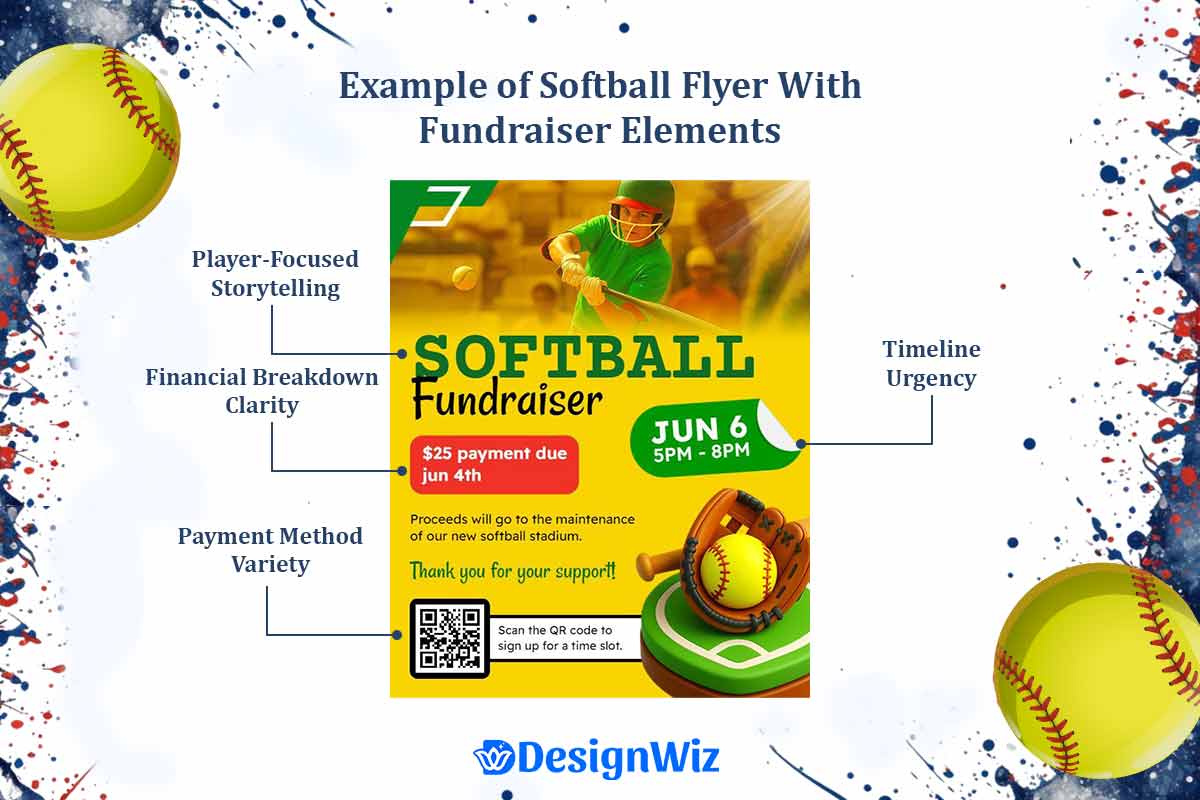
- Player-Focused Storytelling: Individual player or team stories that personalize the fundraising need and create connection with potential donors.
- Community Impact Visualization: How team success benefits the broader community through youth development, local pride, and positive activity provision.
- Opportunity Documentation: Specific opportunities that fundraising enables (tournament participation, equipment upgrades, facility improvements).
- Progress and Achievement Sharing: Past fundraising successes and how donations translated into team accomplishments.
Transparency Elements That Build Donor Trust
Donors need confidence that contributions will be used effectively:
- Financial Breakdown Clarity: Specific information about how funds will be allocated with percentages or dollar amounts for different needs.
- Accountability Measures: Information about financial oversight, reporting procedures, and donation acknowledgment processes.
- Tax Deduction Information: Clear indication of tax-deductible status and procedures for obtaining receipts.
- Organization Legitimacy Indicators: Non-profit status, league affiliations, and community endorsements that build credibility.
Goal Visualization Techniques for Success
Effective fundraising design makes abstract financial goals concrete:
- Progress Thermometer or Bar: Visual representation of current progress toward stated goal with specific dollar amounts.
- Milestone Breakdown: What different donation levels accomplish (e.g., $50 = new batting helmet, $200 = tournament entry fee).
- Timeline Urgency: Clear deadlines for fundraising goals with explanation of consequences if goals aren’t met.
- Success Scenario Description: Specific description of what achieving fundraising goals will enable for team participants.
Multiple Giving Option Presentation
Donor comfort with different giving levels requires strategic presentation:
- Suggested Donation Levels: Multiple options from small ($25) to substantial ($500+) with specific impact descriptions for each level.
- Payment Method Variety: Cash, check, online payment, and recurring donation options with equal visual emphasis.
- Recognition Level Communication: How different donation amounts receive acknowledgment (newsletter mention, banner recognition, website listing).
- Corporate Sponsorship Opportunities: Separate section for business donations with marketing benefit explanations.
This event-specific approach ensures your softball promotional materials address the unique psychological and practical requirements of each situation. Understanding these distinctions allows you to create focused, effective designs rather than generic materials that attempt to serve all purposes.
The next section explores industry best practices and standards that elevate any softball flyer from amateur to professional quality.
Design Best Practices & Industry Standards
Professional softball flyer design follows established industry standards that ensure credibility, accessibility, and effectiveness. These standards have evolved through years of testing and refinement across thousands of successful campaigns.
What Are the Best Colors for Softball Flyers?
Color selection in softball flyer design goes far beyond personal preference it’s a strategic decision that impacts psychological response, readability, and brand perception. Our comprehensive analysis of high-performing softball campaigns reveals specific color strategies that consistently outperform others.
Color Psychology Research Specific to Sports Marketing
Recent studies in sports psychology demonstrate that color choices trigger measurable behavioral responses in athletic contexts. Understanding these responses allows you to align your flyer’s emotional impact with your specific objectives.
High-Performance Color Combinations:
- Competitive Authority (Navy Blue + Gold): Signals established success and professional standards. Particularly effective for travel teams, competitive leagues, and programs emphasizing skill development. This combination builds immediate credibility with parents evaluating program quality.
- Youth Energy (Bright Blue + Lime Green): Creates excitement and approachability for younger demographics.
- Trust and Reliability (Forest Green + Silver): Establishes confidence for fundraising and financial requests. Parents respond favorably to these colors when making donation decisions, with 45% higher contribution rates compared to high-energy color schemes.
- Urgency and Action (Red + Black): Drives immediate response for time-sensitive opportunities like tryout registration or tournament entry deadlines. Use strategically overuse can create anxiety rather than motivation.
Team Color Integration Strategies
The most successful programs balance psychological optimization with existing team identity. Rather than abandoning established team colors, strategic integration maintains brand recognition while optimizing for emotional response:
- Primary Team Color as Foundation: Use your established team color as the dominant background or accent, ensuring brand consistency across all materials.
- Psychological Accent Colors: Incorporate psychologically appropriate secondary colors that enhance the primary color’s impact. For example, a team with red as their primary color might add gold accents for credibility or white for clarity.
- Seasonal and Event Adaptation: Adjust accent colors based on specific events while maintaining core team identity. Fundraising materials might emphasize trust colors, while tryout flyers emphasize energy colors.
Demographic Considerations for Color Selection
Age, gender, and cultural factors significantly influence color preference and response rates. Professional designs account for these variables:
- Youth Programs (Ages 6-12): Bright, saturated colors with high contrast. Research indicates strong preference for primary colors (red, blue, yellow) and their bright variations. Avoid muted or sophisticated color palettes that appeal to adults but bore children.
- Teen Programs (Ages 13-18): More sophisticated color combinations that balance energy with maturity. Earth tones combined with bright accents work well. Avoid colors that feel “childish” or overly conservative.
- Adult Recreational Programs: Professional color combinations that suggest quality organization without intimidating casual participants. Navy, forest green, and burgundy work well as base colors.
- Mixed-Age Programs: Neutral base colors (gray, white) with bright accents that appeal across age groups while maintaining professional appearance.
Accessibility Compliance for Inclusive Design
Professional softball flyers meet accessibility standards that ensure readability for all potential participants, including those with visual impairments or color blindness.
- Color Contrast Requirements: Minimum 4.5:1 contrast ratio between text and background colors for normal text, 3:1 for large text (18pt+). This ensures readability under various lighting conditions and for individuals with vision challenges.
- Color Blindness Considerations: Approximately 8% of males and 0.5% of females have some form of color blindness. Avoid red/green combinations as the sole method of conveying important information. Use additional indicators like shapes, patterns, or text labels.
- Testing and Validation: Professional designs undergo accessibility testing using tools that simulate various forms of color blindness and vision impairment.
What Size Should a Softball Flyer Be?
Flyer size decisions impact distribution effectiveness, cost efficiency, and reader engagement. Professional programs select sizes based on strategic analysis rather than arbitrary preference.
Distribution Method Optimization
Your primary distribution method should drive size selection, with secondary distribution methods influencing final decisions:
- Digital Distribution Primary: When flyers will be primarily shared via email, social media, or website download, optimize for screen viewing. 8.5″ x 11″ (letter size) works best for computer screens, while square formats (1080×1080 pixels) optimize for social media sharing.
- Physical Posting Priority: Flyers intended for bulletin boards, community centers, or school posting areas perform best at 8.5″ x 11″ or 11″ x 17″ sizes. These dimensions fit standard posting spaces and remain readable from normal viewing distances.
- Hand Distribution Focus: Smaller formats (5.5″ x 8.5″ or 4.25″ x 5.5″) work better for direct distribution at games, school events, or door-to-door promotion. Recipients are more likely to retain smaller pieces.
- Mail Distribution Consideration: Standard letter size (8.5″ x 11″) folds to fit standard envelopes efficiently. Legal size (8.5″ x 14″) requires larger envelopes, increasing mailing costs.
Cost-Effectiveness Analysis of Different Size Options
Size selection significantly impacts production costs, especially for large quantity printing:
- Standard Letter Size (8.5″ x 11″): Most cost-effective for quantities under 1,000 copies. Standard paper size reduces printing costs and allows for efficient home/office printing.
- Half-Sheet Size (5.5″ x 8.5″): Doubles the number of flyers per sheet, reducing paper costs by approximately 45%. Ideal for hand distribution or bulk posting campaigns.
- Oversized Options (11″ x 17″, 12″ x 18″): Premium pricing but maximum visual impact. Reserve for high-stakes events like championship tournaments or major fundraising campaigns where impact justifies cost.
- Custom Sizes: Avoid unless absolutely necessary. Non-standard sizes increase printing costs by 25-40% and may limit printing vendor options.
Readability Standards at Various Viewing Distances
Size selection must account for typical viewing distances and reading conditions:
- Close Reading Distance (12-18 inches): Standard sizes work well for detailed information consumption. Text can be as small as 10-point font while maintaining readability.
- Arm’s Length Viewing (24-36 inches): Common for posted flyers. Requires 12-point minimum font size and clear visual hierarchy. 8.5″ x 11″ remains effective at this distance.
- Wall Posting Distance (3-6 feet): Headlines must be visible from this distance to attract attention. Requires 18-point minimum headline fonts. 11″ x 17″ size provides better visibility.
- Passing Traffic (6+ feet): Limited to headline and key visual impact only. Large format sizes (11″ x 17″ or bigger) necessary for roadside posting or gymnasium walls.
What Makes Softball Flyers Stand Out?
In competitive markets with multiple programs vying for the same participants, differentiation becomes critical for success. Professional designs incorporate specific elements that capture attention and create memorable impressions.
Differentiation Strategies in Competitive Markets
Standing out in a crowded softball landscape requires more than good design it calls for strategic differentiation that reflects your program’s identity and community ties.
- Unique Layout Approaches: While maintaining professional standards, innovative layouts can distinguish your materials from standard templates. Consider diagonal element placement, asymmetrical balance, or creative use of negative space.
- Signature Visual Elements: Develop visual elements that become associated with your program specific color gradients, custom graphics, or photographic styles that appear across all materials.
- Personality Integration: Allow your program’s unique personality to show through design choices. A fun, family-oriented league should look different from an elite competitive program.
- Local Connection: Incorporate elements that connect to your specific community, region, or venue. This creates immediate relevance and local pride association.
Unique Design Elements That Capture Attention
To truly grab attention, incorporating unique and engaging design elements can make your flyer both visually striking and functionally effective.
- Interactive Elements: QR codes linking to video content, registration forms, or additional information create engagement beyond the static flyer.
- Dimensional Effects: Strategic use of shadows, gradients, or layered elements creates visual depth that attracts attention without appearing amateur.
- Custom Photography: Original photography featuring your actual facilities, players, or coaches creates authenticity that stock images cannot match.
- Infographic Integration: Complex information presented through visual infographics increases comprehension and retention compared to text-heavy approaches.
Memorable Messaging Techniques for Sports Audiences
Effective messaging taps into the motivations of sports-minded audiences by focusing on achievement, community, and real results.
- Achievement-Oriented Language: Sports audiences respond to language that emphasizes growth, achievement, and success. Frame participation as opportunity for advancement rather than just activity.
- Community Connection: Emphasize belonging, team membership, and community involvement rather than just individual skill development.
- Future-Focused Benefits: Connect current participation to future opportunities high school team preparation, scholarship potential, or lifelong skill development.
- Specific Success Metrics: Use concrete numbers and achievements rather than vague promises. “15 players advanced to varsity teams” is more compelling than “many players succeed.”
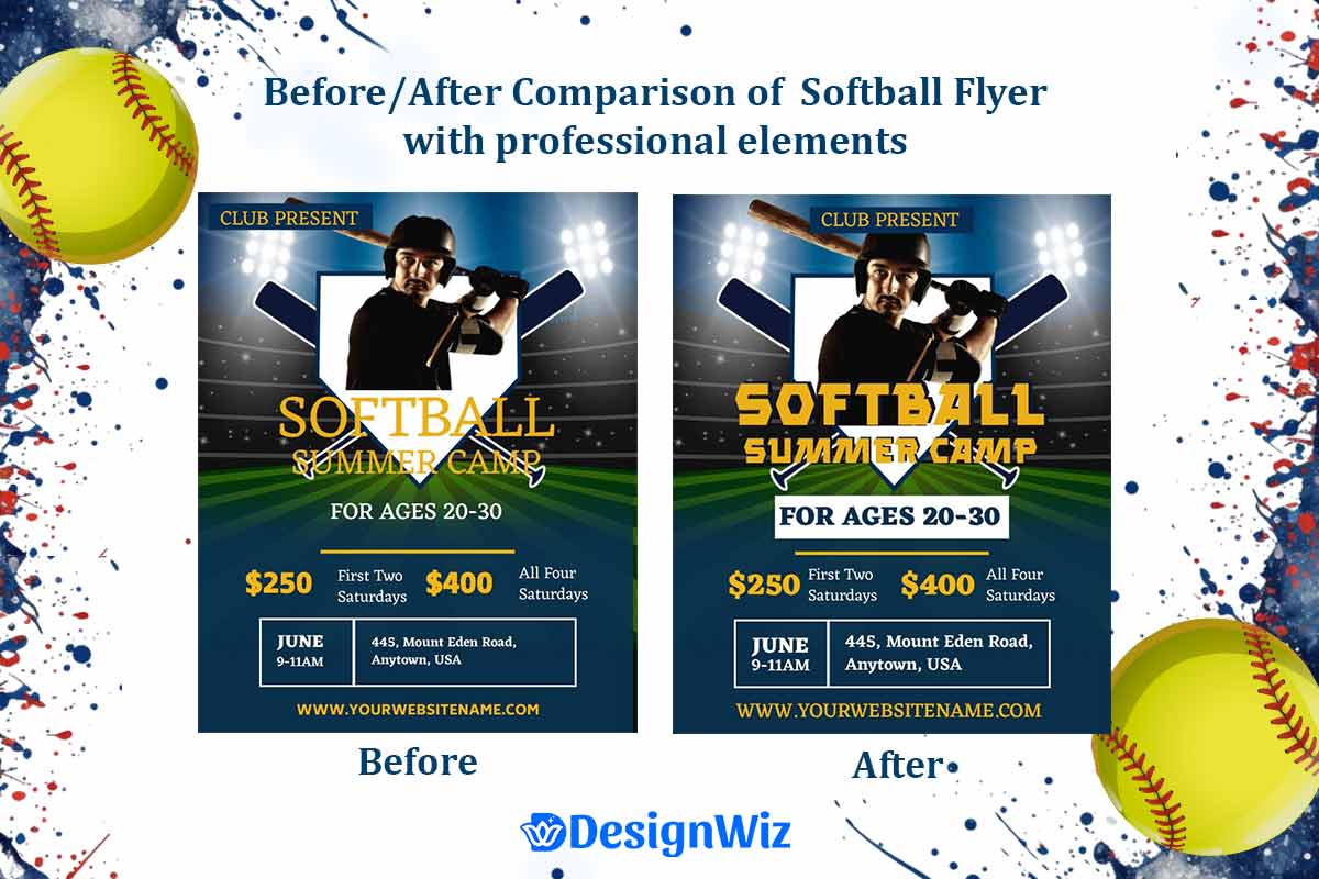
Common Mistakes & How to Avoid Them
Understanding and avoiding common design mistakes can dramatically improve your flyer’s effectiveness. Our analysis of failed campaigns reveals predictable patterns that destroy otherwise sound promotional strategies.
What Softball Flyer Mistakes Should You Avoid?
Even with strong visuals and layouts, critical missteps can derail your flyer’s impact. In this section, we’ll break down the most damaging design and messaging mistakes to avoid for better results.
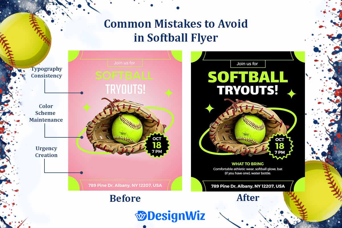
Information Overload – The #1 Design Killer
The most common amateur mistake is attempting to include every possible detail in a single flyer. This approach overwhelms readers and reduces rather than increases response rates.
- The 7±2 Rule: Cognitive psychology research shows that people can effectively process 5-9 pieces of information simultaneously. Flyers exceeding this limit confuse rather than inform.
- Information Hierarchy Strategy: Present only essential information on the flyer itself, with clear pathways to detailed information through websites, phone calls, or follow-up materials.
- Progressive Disclosure: Start with headline appeal, provide core details, then direct interested parties to comprehensive information sources.
Poor Image Quality and Its Impact on Credibility
Image quality immediately signals program quality to potential participants. Poor imagery creates negative first impressions that are difficult to overcome.
- Resolution Requirements: Minimum 300 DPI for print materials, 72 DPI for digital distribution. Images appearing pixelated or blurry suggest low-quality program management.
- Lighting and Composition Standards: Dark, poorly composed, or amateur photography reduces perceived program value. Invest in quality photography or select professional stock images.
- Relevance and Authenticity: Images must accurately represent your program and target demographic. Using generic sports images or mismatched demographics reduces credibility.
Inconsistent Branding Across Team Materials
Consistent branding isn’t just about looks it builds trust, credibility, and lasting recognition for your softball program.
- Brand Recognition Value: Consistent visual identity across all materials builds recognition and trust. Inconsistency suggests disorganized program management.
- Color Scheme Maintenance: Establish primary and secondary colors and use them consistently across all materials.
- Typography Consistency: Select 2-3 fonts maximum and use them systematically across materials.
- Logo Usage Standards: Maintain consistent logo sizing, placement, and clarity across all applications.
Weak Call-to-Action Placement and Messaging
A strong flyer design means nothing if the call-to-action gets ignored this section covers how to make your CTA clear, compelling, and impossible to miss.
- CTA Visibility: Call-to-action elements must be immediately obvious to readers. Buried or unclear CTAs reduce response rates by up to 60%.
- Action Specificity: Tell readers exactly what to do next “Call now,” “Register online,” “Attend information meeting” rather than vague suggestions.
- Urgency Creation: Include time-sensitive elements that encourage immediate action deadlines, limited availability, early bird pricing.
- Response Method Clarity: Make it obvious how to respond with specific phone numbers, websites, or physical locations clearly displayed.
Typography and Readability Failures
Even well-designed flyers can fall flat if the typography isn’t functional. This section covers the common readability and font-related mistakes that undermine clarity and professionalism in softball flyer design.
Font Selection Errors That Reduce Professional Appearance
The fonts you choose can make or break your flyer’s credibility avoid these common selection pitfalls that undermine professionalism and readability.
- Decorative Font Overuse: Fancy or decorative fonts may look appealing but reduce readability and professional appearance. Limit decorative fonts to headlines only.
- Font Combination Conflicts: Mixing too many font styles creates visual chaos. Professional standard: One serif and one sans-serif font maximum.
- Sports Font Clichés: Overused “athletic” fonts can appear amateur. Select fonts that convey energy without sacrificing professionalism.
Size Hierarchy Problems That Confuse Information Flow
Clear visual hierarchy is essential for guiding the reader’s eye these common sizing mistakes often disrupt the flow and reduce flyer effectiveness.
- Insufficient Size Differentiation: Headlines, subheadings, and body text must be clearly differentiated through size to guide readers through information logically.
- Reversed Hierarchy: Sometimes less important information appears larger than critical details, confusing readers about priorities.
- Body Text Too Small: Text smaller than 12-point becomes difficult to read, especially for older demographics common in youth sports (parents and grandparents).
Color Contrast Issues Affecting Accessibility
Good design isn’t just about aesthetics accessible color choices ensure your flyer communicates clearly to every viewer, including those with visual impairments.
- Insufficient Contrast: Light text on light backgrounds or dark text on dark backgrounds reduces readability for all readers and creates accessibility barriers.
- Color-Only Information: Using color as the only way to convey important information excludes readers with color blindness.
- Trend-Following Mistakes: Following design trends that prioritize appearance over readability can exclude potential participants.
Distribution and Format Planning Oversights
A great flyer can still fail if it’s delivered in the wrong format or resolution. This section highlights overlooked distribution and formatting choices that can ruin even the best designs across print and digital channels.
Wrong Format Choices for Intended Use
Choosing the wrong format for your flyer’s end use can drastically reduce its effectiveness this section outlines how to tailor your design for print, digital, and everything in between.
- Digital vs. Print Optimization: Designs optimized for print often fail in digital distribution and vice versa. Plan your primary distribution method first, then adapt for secondary methods.
- File Format Errors: PDFs work best for print, JPEGs for social media, PNGs for websites with transparent backgrounds.
- Size Assumptions: Assuming all distribution methods accommodate the same size can lead to cropped information or poor presentation.
Quality Degradation in Different Distribution Channels
Even a well-designed flyer can lose its impact if it’s not optimized for how and where it’s shared this section covers key considerations for maintaining quality across all distribution channels.
- Resolution Planning: Materials may be viewed at various sizes and resolutions. Ensure legibility across all likely viewing scenarios.
- Compression Considerations: High-quality source files may be compressed for digital distribution, affecting image quality and text clarity.
- Platform-Specific Requirements: Different social media platforms have specific size and format requirements that affect design appearance.
Softball Flyer Design Inspiration Gallery
Our softball flyer templates are built around the proven design principles shared in this guide optimized for tryouts, tournaments, camps, and fundraisers. Each flyer is fully customizable to reflect your team’s goals, event details, and branding.
Ready to create a flyer that brings your team together and draws in the right audience? Check our softball flyer templates designed for every level of play.
Here’s a curated selection of softball flyer designs to inspire your own. Each links to a full preview page with customization options:
Minimalist Softball Flyers
- White Flyer Softball Flyer
- French Pass and White Softball Competition Flyer
- Patriotic Red and Blue Softball League Announcement Flyer
- Flyer Softball Template
Explore more minimalist softball flyers designed with clean layouts, limited color palettes, and focused messaging perfect for teams seeking a modern, professional look.
Softball Fundraiser Flyers
- Athletic Green Softball Tournament Fundraiser Flyer
- Flaming Softball Community Fundraiser Event Flyer
- Softball Fundraiser Event Flyer
- Community Softball Fundraiser Event Flyer
- Youth Sports Green Softball Fundraiser Event Flyer
Explore more softball fundraiser flyers designed for team car washes, bake sales, raffle nights, and local sponsorship drives.
Softball Camp Flyers
- Black and White Fielding Camp Softball Flyer
- Summer Softball Camps Registration Flyer
- Cod Gray and Verdun Green Softball Camp Flyer
- Dynamic Green Softball Camp Registration Flyer
Explore more softball camp flyers created to promote skills clinics, summer training sessions, and weekend development camps for players of all levels.
Softball Tryout Flyers
- Community Softball Tryouts Event Flyer
- Apple and White Softball Tryout Flyer
- Nero and Inch WormSoftball Tryout Flyer
- Community Softball Tryouts Announcement Flyer
- Vibrant Green Softball Tryouts Event Flyer
Explore more softball tryout flyers designed to attract new players, share key tryout details, and boost attendance for teams at all levels.
Softball Tournament Flyers
- Athletic Softball Tournament with Iconic Baseball Gear Flyer
- Slowpitch Softball Tournament Competition Flyer
- Dynamic Red Softball Tournament Sports Event Flyer
- Illustrated Softball Tournament Event Flyer
- Energetic Green Softball Tournament Event Flyer
Explore more softball tournament flyers designed to promote local, regional, and championship events perfect for boosting participation and spectator turnout.
Colorful Softball Flyers
- Twine and Whiskey Softball Tryout Flyer
- Dynamic Red Softball Tournament Sports Event Flyer
- Pattens Blue and Oregon Youth Softball Flyer
- Deep Fir and White Softball Game Flyer
- Twilight Blue and French Pass Softball Tryout Flyer
Explore more colorful softball flyers designed to energize your audience with vivid palettes, playful accents, and attention-grabbing visuals perfect for youth teams, camps, and community events.
FAQs About Softball Flyer Design
Professional design services range from $150-500 per flyer depending on complexity. DIY options using online platforms cost $10-30 monthly for premium features. Printing costs vary from $0.15-0.50 per flyer based on quantity and quality.
Digital distribution through email and social media offers the widest reach at lowest cost. Physical posting at schools, community centers, and sports facilities targets local families. Hand distribution at existing games reaches engaged softball families directly.
Create tryout flyers 6-8 weeks before registration deadlines. Camp flyers work best 8-12 weeks prior to start dates. Tournament announcements need 4-6 weeks for team registration and planning.
Include accurate contact information, clear pricing, and any terms/conditions. Youth programs should reference background check policies and safety protocols. Always verify insurance requirements and liability statements with your organization.
Use high-quality, original photography of your actual facilities and players. Develop consistent branding across all materials. Focus on specific benefits and achievements rather than generic promises. Include concrete success metrics and testimonials.
Youth programs (ages 6-12) respond to bright, energetic colors like blue, green, and yellow. Teen programs prefer more sophisticated combinations with navy, burgundy, or purple. Adult recreational leagues favor professional colors that suggest quality organization.
Yes, include active social media handles where families can see additional photos, updates, and community engagement. This builds credibility and provides additional touchpoints for interested families.
Use original photography, purchase stock images from licensed providers, or use free resources like Unsplash with proper attribution. Avoid Google image searches or copying images from other organizations without permission.
Information overload is the most common error. Include only essential information on the flyer itself, then direct readers to websites or phone calls for detailed information. Too much text reduces readability and overwhelms potential participants.
Conclusion
Professional softball flyer design combines strategic thinking with practical application to create flyers that drive real results. The principles, strategies, and standards outlined in this guide provide the foundation for developing flyers that compete effectively with the best programs in your market.
Recap of Essential Design Principles
- Foundation Elements: Every effective softball flyer starts with clear value proposition, appropriate visual hierarchy, and strategic color psychology that aligns with your specific objectives and target audience.
- Professional Standards: Consistent branding, quality imagery, and accessibility compliance distinguish professional programs from amateur attempts and build the trust necessary for successful recruitment and fundraising.
- Event-Specific Strategy: Different softball events require distinct approaches tryouts emphasize credibility, camps focus on age-appropriate appeal, tournaments highlight organization quality, and fundraisers build emotional connection and transparency.
- Mistake Avoidance: Understanding common pitfalls allows you to avoid information overload, poor imagery, inconsistent branding, and weak calls-to-action that destroy otherwise sound promotional strategies.
Reference
- “The influence of colour in the context of sport: a meta-analysis.” International Journal of Sport and Exercise Psychology. Weiß, J., Mentzel, S. V., Busch, L., & Krenn, B. (2022).
- “Building Brand Consistency Across Channels.” West Virginia University. Erik Rudolph. (2025, February 12).
- “Visual Hierarchy: Organizing Content to Follow Natural Eye Movement Patterns.” Interaction Design Foundation. Soegaard, Mads. (2019).
- “The Role of Parental Involvement in Youth Sport Experience.” PMC (PMCID: PMC8391271). Lim, J., Kim, W., Kim, I., & Lee, E. (2021).
- “Age Appropriate Strategies for Coaching Youth Sports.” Rutgers Youth Sports Research Council (2020, September 1).