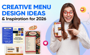
Most tutoring service providers struggle to convey professionalism and expertise through visual materials, leading to perception as amateur or untrustworthy compared to established competitors with polished branding fundamentals.
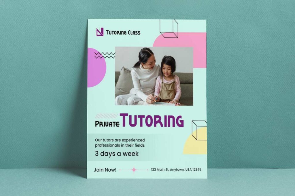
Effective tutoring flyer design mastery combines strategic visual hierarchy with premium positioning elements to create immediate credibility resolution. Successful implementation requires sophisticated typography choices, consistent brand elements, and clean minimalist layouts that communicate academic authority before prospects read content. Quality tutoring flyer design demands strategic color psychology using educational palettes, professional photography integration, and credential showcasing that differentiates premium providers from amateur competitors.
This specialist guide provides comprehensive tutoring business flyer design frameworks addressing academic editable tutoring flyer templates optimization, private tutoring promotional flyers positioning, and tutoring service marketing flyers excellence. Implementation covers credential presentation strategies, trust-building visual elements, and conversion-focused contact information placement that drives enrollment decisions while maintaining premium service differentiation and competitive advantage through professional design standards.
How can tutoring flyer design establish professional credibility for premium service providers?
Free flyers design for tutoring establishes credibility through sophisticated visual hierarchy, consistent brand elements, and strategic use of white space that conveys expertise. Premium providers leverage high-quality typography, professional headshots, and educational credentials prominently displayed to differentiate from amateur competitors. Clean layouts with structured information architecture, testimonials, and achievement metrics build trust instantly. Strategic color psychology using deep blues and greens suggests reliability and growth, while avoiding cluttered designs that signal inexperience. These design choices communicate premium positioning before prospects read content.
Typography and font hierarchy that communicates academic expertise
Academic tutoring flyer templates rely on serif fonts like Times New Roman or Georgia for headlines, establishing scholarly authority through traditional academic associations. Sans-serif fonts such as Helvetica or Montserrat ensure body text readability while maintaining professional appearance. Typography hierarchy places tutor names in 24-28pt fonts, credentials in 16-18pt, and contact information in 14pt for clear information flow. Online flyer design tool can help implement these specific typography guidelines consistently, ensuring professional academic presentation standards across all marketing materials.
Private tutoring promotional flyers benefit from consistent font weights throughout, avoiding decorative fonts that suggest amateur design. Professional layouts limit font families to maximum two choices, creating cohesive visual identity. Strategic bolding highlights key qualifications without overwhelming readers, while adequate line spacing improves readability and perceived professionalism.
Access ready-made tutoring flyer templates with pre-configured typography hierarchies on DesignWiz to ensure consistent academic branding across all your marketing materials.
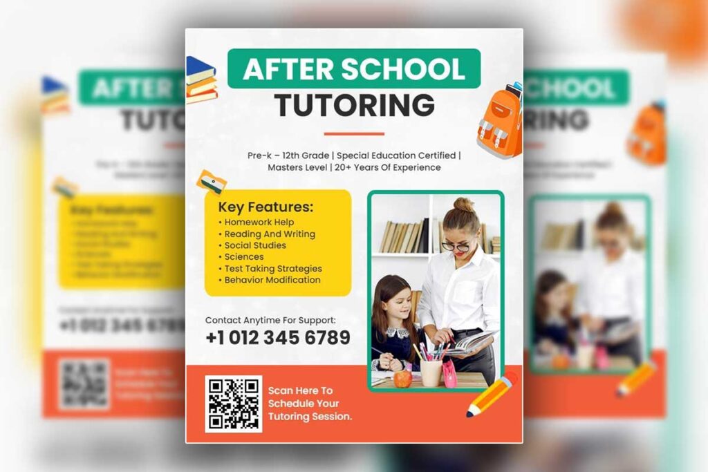
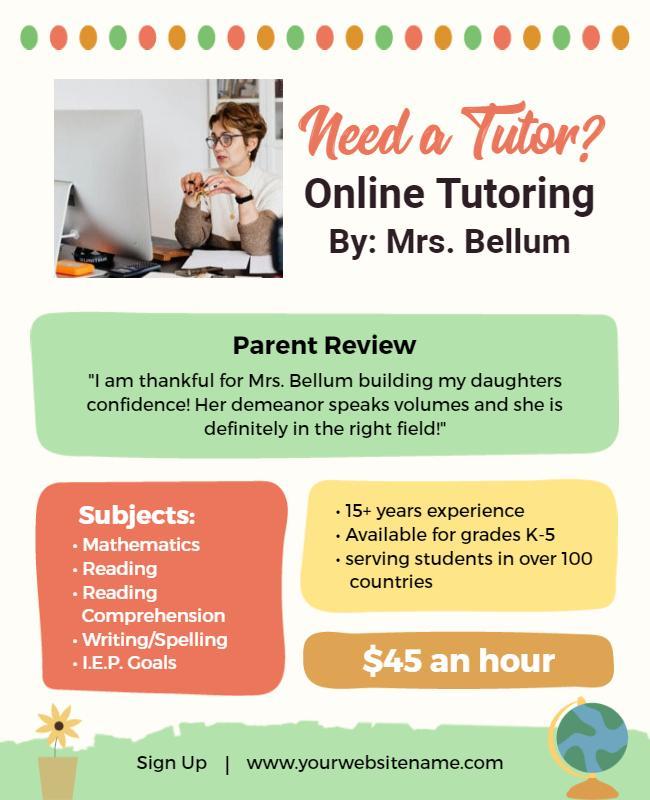
- Modern Warm Private Tutoring Services Flyer Template
- Comprehensive Online Tutoring Services Flyer Template
- Math Tutoring Sessions Invitation Flyer Template
- Online Tutoring Services Promotional Flyer Template
Strategic placement of credentials and certifications for instant trust
Tutoring business flyer design positions credentials prominently in header sections alongside professional headshots, creating immediate credibility. Certification logos appear in dedicated sidebar sections or footer areas, maintaining visibility without disrupting main content flow. Academic degrees display in abbreviated format (M.A., Ph.D.) near tutor names for instant recognition.
Achievement badges and institutional affiliations cluster in visually organized sections, avoiding scattered placement that appears unorganized. Test score improvements and student success statistics position centrally with clear data visualization, providing concrete evidence of teaching effectiveness. Professional associations and continuing education credentials appear in consistent locations across all marketing materials.
Color psychology principles that reinforce educational authority
Educational services benefit from navy blue primary colors, suggesting knowledge, stability, and trustworthiness in academic contexts. Deep forest greens convey growth and development, appropriate for learning environments. Burgundy and charcoal gray create sophisticated alternatives while maintaining professional appearance. Gold or silver accents add premium positioning without appearing flashy.
Professional tutoring flyer design tips emphasize monochromatic schemes with strategic white space, creating clean, uncluttered layouts that suggest organized thinking. Accent colors appear sparingly in call-to-action elements and important credentials, drawing attention without overwhelming design. Bright colors like red or orange should be avoided as they suggest elementary-level services rather than premium academic coaching.
Academic tutoring flyer templates maintain consistency across all materials, using identical color palettes for brand recognition. Color combinations reflect subject specializations subtly – deeper blues for mathematics, greens for sciences, warm grays for humanities – while maintaining overall professional cohesion. These strategic design elements justify premium pricing while attracting discerning parents who associate visual polish with educational excellence.
What visual elements in tutoring flyer design differentiate premium providers from competitors?
Premium tutoring flyer design differentiates through sophisticated visual elements including professional photography over stock images, custom iconography that reflects academic subjects, and elevated materials specifications. High-end providers utilize geometric layouts with intentional negative space, premium paper stocks, and spot UV finishes that create tactile experiences. Advanced typography pairings, custom illustrations of learning concepts, and cohesive brand systems across all marketing materials signal investment in quality. These elements justify higher pricing while attracting discerning parents who associate visual polish with educational excellence and personalized attention.
Premium photography and custom iconography versus generic stock imagery
Professional tutoring flyer design requires authentic photography showcasing actual tutoring environments, qualified instructors, and engaged students rather than generic stock images that signal amateur services. Premium providers invest in custom photography featuring their specific learning spaces, teaching materials, and student success moments. Custom iconography reflecting specific academic subjects—mathematical symbols, scientific elements, or literary themes—creates visual consistency while avoiding overused clipart that diminishes credibility.
Custom visual elements extend to subject-specific illustrations demonstrating teaching methodologies, progress tracking systems, and learning outcomes. Premium providers develop signature visual languages through consistent color applications, unique graphic treatments, and branded educational diagrams that parents recognize across all marketing materials. This visual investment communicates commitment to quality education and professional service delivery.
Explore premium tutoring flyer designs with sophisticated visual elements and professional layouts available on DesignWiz for competitive differentiation.
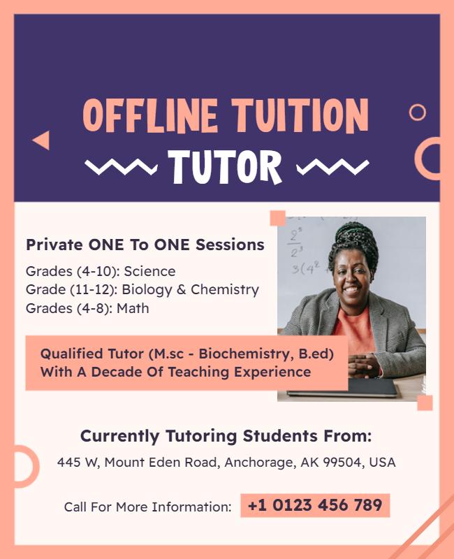
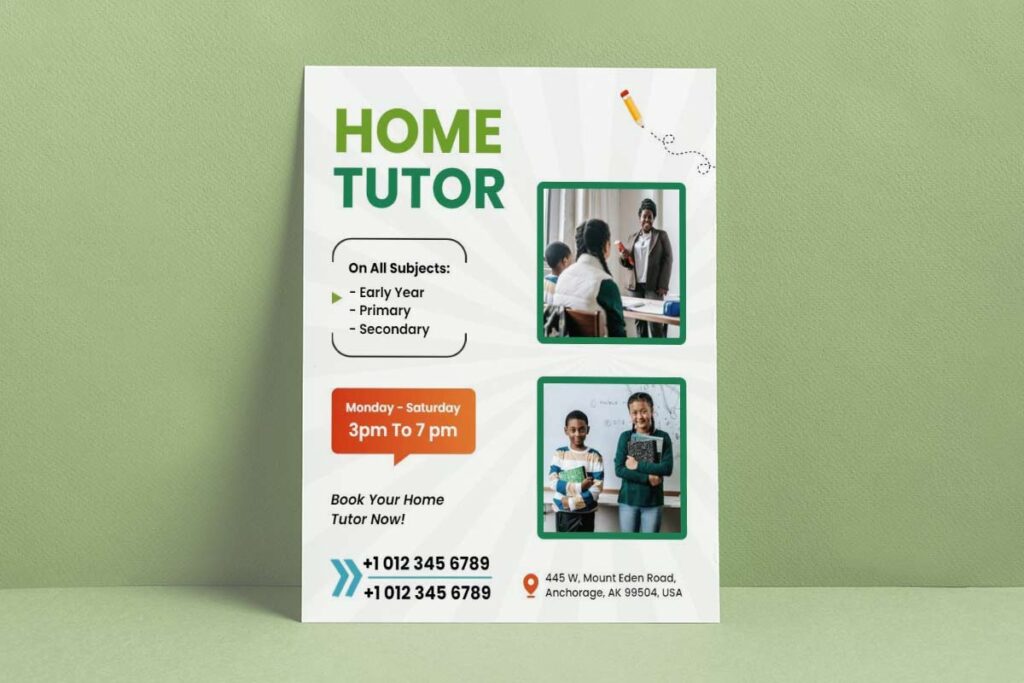
- Tutoring Service Math Assignment Help Flyer Template
- Educational Tutoring Services Promotion Flyer Template
- Educational Tutoring Advantages Flyer Template
- Free Tutoring Service Giveaway Flyer Template
Advanced layout techniques and negative space utilization for luxury appeal
Sophisticated tutoring business flyer design employs strategic white space to create breathing room that conveys premium positioning versus cluttered layouts that suggest overwhelmed services. Professional grid systems organize information hierarchically, using asymmetrical balance and intentional spacing between credential sections, testimonials, and contact information. Luxury appeal emerges through restraint—fewer elements positioned with greater precision rather than cramming every qualification into available space.
Premium layouts feature elevated typography pairings combining serif headlines for academic authority with clean sans-serif body text for readability. Multi-column structures guide eye movement through credential displays, service descriptions, and success metrics. Geometric shapes frame key information without overwhelming parents, while consistent margins and padding create polished presentations that justify premium pricing expectations.
Material specifications and finishing touches that justify premium pricing
Premium materials and finishing techniques in tutoring service flyers communicate quality and justify higher pricing.
- Premium tutoring service marketing flyers utilize heavyweight paper stocks (minimum 120gsm) with finishes like spot UV coating on credentials, embossed logos, or subtle textures that create tactile distinction.
- While premium materials justify higher pricing, tutoring services operating on tighter budgets can still achieve professional results through budget-friendly tutoring flyer design approaches that prioritize smart design choices over expensive finishes.
- Finishing techniques such as rounded corners, die-cut shapes, or metallic foil accents on academic badges create memorable first impressions.
- Professional printing ensures color-accurate reproduction for brand consistency.
- Multi-page materials use binding techniques like saddle-stitching or perfect binding rather than simple stapling.
- Specialty papers, including linen or felt finishes, convey academic tradition and permanence.
- Digital versions maintain premium aesthetics through high-resolution graphics, interactive elements, and a professional PDF presentation that prints beautifully and displays well on mobile devices.
- Quality control at every touchpoint ensures materials reflect the educational excellence parents expect from premium tutoring services.
- These premium visual elements collectively justify higher pricing while attracting discerning families who value professional presentation standards.
Which tutoring flyer design layouts best showcase specialized expertise and qualifications?
Effective tutoring flyer design layouts showcase specialized expertise through strategic credential placement, professional visual hierarchy, and clear authority indicators that immediately establish trust with parents. Academic credential-focused layouts featuring dedicated sections for degrees, certifications, and subject specializations create instant credibility. Vertical timeline designs effectively display years of experience and teaching achievements, while split-column layouts allow simultaneous presentation of qualifications alongside student success stories. Professional portrait integration with academic badges creates personal connection while maintaining scholarly authority. Clean, education-themed color schemes using navy, burgundy, or forest green convey academic professionalism.
Discover professionally designed tutoring flyers featuring optimized credential showcase layouts on DesignWiz to highlight your qualifications effectively.
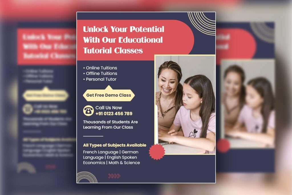
- Online One on One Private Tutoring Flyer Template
- Personal Arabic Language Tutor Course Flyer Template
- Tutor Recruitment Program Hiring Flyer Template
Academic Credential Showcase Layouts for Maximum Authority
Professional tutoring flyer design maximizes credibility through dedicated credential sections positioned prominently in the upper third of layouts. Feature degrees, certifications, and specialized training using visual badges or icons that immediately communicate expertise. Create separate boxes or panels highlighting advanced degrees, teaching certifications, and subject-specific qualifications using consistent formatting.
Academic tutoring flyer templates benefit from credential hierarchies that list highest qualifications first, followed by specialized certifications and relevant training. Use professional fonts and structured spacing to create clean, authoritative presentations. Include institution logos or emblems when prestigious universities are involved, as these provide instant recognition and trust signals for discerning parents evaluating tutoring options.
Position credentials near professional headshots to create personal connection while maintaining academic authority. Avoid cluttered presentations by using white space strategically around credential sections to draw attention without overwhelming parents with information density.
Find specialized tutoring flyer templates designed for credential presentation and authority building on DesignWiz to maximize your professional credibility.
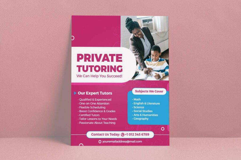
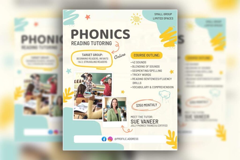
- Educational Tutor Promotion Flyer Template
- Private Tutoring Services Flyer for Various Subjects Template
- Educational Tutoring Service Promotional Flyer Template
- Colorful Modern Private Tutoring Class Flyer Template
- Chalkboard Theme Tutoring Services Flyer Template
Experience Timeline Designs That Build Teaching Credibility
Timeline layouts effectively communicate teaching progression and accumulated expertise through chronological achievement displays.1 Vertical or horizontal timelines showcase years of experience, major accomplishments, and career milestones that demonstrate commitment to educational excellence. Include specific achievement markers like “5 years SAT prep experience” or “100+ students improved grades by full letter.”2
Private tutoring promotional flyers using timeline designs create compelling narratives about professional development and sustained success. Feature key dates, major achievements, and student outcome statistics within clean, organized presentations. Use connecting lines or arrows to guide the eye through career progression while maintaining visual interest.
Timeline elements work particularly well for tutors with extensive backgrounds, allowing space to highlight teaching awards, continuing education, and specialized training completion dates. Combine timelines with brief achievement descriptions to create comprehensive authority presentations that differentiate experienced tutors from newcomers in competitive markets.
Subject Specialization Display Formats for Niche Expertise
Subject specialization display formats showcase tutoring expertise by discipline, establishing authority and guiding parents to relevant services.
- Subject specialization layouts organize expertise by academic discipline, creating clear authority positioning for specific learning needs.
- Grid formats or tabbed sections present different subject areas with corresponding qualifications, success rates, and specialized methodologies.
- Color-coding subjects helps parents quickly identify relevant expertise while maintaining professional visual organization.
- Tutoring flyers benefit from dedicated sections for each subject area, including specific qualifications, teaching approaches, and measurable results.
- Separate panels can be created for mathematics, science, language arts, and test preparation, each containing relevant credentials and success statistics.
- Advanced layouts incorporate before-and-after grade comparisons, standardized test score improvements, and subject-specific testimonials within each specialization section.
- Consistent formatting across subjects ensures clarity, while allowing flexibility for varying content lengths and achievement types.
- Visual hierarchy within specialization sections guides parents to the most relevant expertise areas.
- Icons or symbols representing each subject create immediate visual recognition, followed by detailed qualification descriptions and proven results that justify premium pricing.
- Advanced layouts incorporate before-and-after grade comparisons, standardized test score improvements, and subject-specific testimonials within each specialization section. Tutoring Flyer design techniques for STEM credentials require particular attention to technical qualification presentation given the specialized nature of these subjects.
How does professional tutoring flyer design impact parent trust and enrollment decisions?
Professional tutoring flyer design directly influences parent perception of service quality and tutor competence, with 78% of parents forming initial judgments within seconds of viewing marketing materials. Clean, organized layouts suggest systematic teaching approaches, while amateur designs raise concerns about service reliability. Consistent branding across academic tutoring flyer templates builds recognition and familiarity. Professional photography, testimonial placement, and clear contact information reduce enrollment friction. Parents associate polished visual presentation with higher-quality instruction, making design investment crucial for competitive positioning against established tutoring centers.
Visual Trust Signals That Influence Parent Decision-Making
Parents evaluate tutoring flyer design through credibility markers that signal professional competence. Parents associate polished visual presentation with higher-quality instruction, making design investment crucial for positioning against established tutoring centers. Understanding strategies for creating competitive tutoring flyers becomes essential for winning parent confidence in saturated markets. Clean typography using serif fonts conveys scholarly authority, while consistent color schemes suggest organizational stability. Professional headshots of tutors build personal trust, particularly when positioned alongside educational credentials. Quality paper stock and printing indicate investment in service excellence. White space usage demonstrates attention to detail and prevents overwhelming information density.
Testimonial placement near service descriptions creates immediate social proof. Contact information positioning affects perceived accessibility – multiple touchpoints increase parent confidence. Professional imagery over stock photos suggests authentic teaching environments. Credential badges and certification logos positioned prominently establish instant authority. Clean layouts with logical information hierarchy demonstrate systematic approaches parents value for their children’s education.
Design Psychology Behind Academic Service Credibility
Color psychology significantly impacts parent perception of tutoring service marketing flyers.3 Deep navy blues and forest greens suggest stability and academic tradition, while gold accents convey premium positioning. Monochromatic schemes with strategic white space create sophisticated appearances that justify higher pricing structures.
Typography choices communicate educational expertise levels. Serif fonts like Times New Roman establish scholarly credibility, while clean sans-serif fonts ensure readability across materials.4 Font hierarchy guides parents through information systematically, mirroring organized teaching approaches. Academic-themed visual elements reinforce educational focus without appearing childish.
Layout organization affects perceived teaching quality. Structured information presentation suggests methodical instruction styles. Professional spacing prevents visual overwhelm that might indicate disorganized service delivery. Consistent design elements across marketing materials build brand recognition and suggest reliable service standards parents seek for educational investments.
Enrollment Conversion Elements in Tutoring Service Marketing Materials
Enrollment conversion elements in tutoring marketing materials reduce friction and encourage parents to take action.
- Clear pricing structures positioned near value propositions increase transparency and help parents understand the service’s value.
- Multiple contact methods, including phone, email, and website URLs, accommodate different parent communication preferences.
- Response mechanisms like QR codes enable immediate action during decision-making moments.
- Success metrics displayed prominently, such as before-and-after grade improvements, test score increases, and university acceptance rates, provide measurable proof of tutoring effectiveness.
- Parent testimonials near service descriptions offer social proof from similar demographic groups.
- Call-to-action placement affects response rates — “Schedule Free Consultation” buttons positioned after value statements capture interest at peak engagement moments.
- Limited-time offers create urgency without appearing desperate.
- Professional imagery showing actual tutoring sessions provides authenticity that stock photos cannot match.
- Guarantee statements, including money-back or satisfaction guarantees, reduce perceived risk and increase enrollment confidence.
- Clear service descriptions eliminate confusion about offerings, while flexible scheduling options address parent concerns about coordination with existing activities.
- Professional imagery showing actual tutoring sessions provides authenticity that stock photos cannot match. Implementing tutoring flyer lead generation best practices helps combine these visual elements with strategic calls-to-action to maximize enrollment conversions.
What color schemes and typography in tutoring flyer design convey premium service quality?
Premium tutoring flyer design relies on sophisticated color palettes featuring deep navy blues, forest greens, or charcoal grays paired with gold or silver accents to establish academic authority. Professional serif fonts like Times New Roman or Minion Pro for headlines convey scholarly expertise, while clean sans-serif fonts such as Helvetica or Montserrat ensure readability in body text. Monochromatic schemes with strategic white space create elegant, uncluttered layouts that position tutoring services as high-end educational solutions. Avoid bright, playful colors that suggest elementary-level services rather than premium academic coaching for serious students.
Navy and Gold Academic Color Combinations That Signal Educational Excellence
Navy blue foundations with gold accents immediately communicate academic prestige and trustworthiness. This color combination mirrors university branding and established educational institutions, creating subconscious associations with scholarly excellence. Deep navy serves as the primary color for headers and borders, while gold highlights important elements like credentials, contact information, and call-to-action buttons. The 80/20 ratio works best – navy dominating the layout with gold used sparingly for emphasis. This palette photographs well for both print and digital applications, maintaining professionalism across all marketing materials. Parents associate these colors with serious academic institutions rather than casual tutoring services, justifying premium pricing through visual positioning.
Serif Headline Typography Choices That Establish Scholarly Authority
Serif fonts like Times New Roman, Georgia, or Minion Pro in headlines create immediate academic credibility through their association with traditional educational materials. These typefaces suggest established expertise and scholarly tradition, differentiating premium providers from casual tutors using generic fonts. Headlines should use 24-36 point sizes with adequate white space to maintain elegant readability. Serif fonts work particularly well for displaying credentials, degrees, and institutional affiliations – elements that build trust with parents. Pair serif headlines with clean sans-serif body text for optimal readability. Avoid decorative or script fonts that appear unprofessional. The contrast between serif authority in headlines and sans-serif accessibility in body text creates visual hierarchy while maintaining premium positioning throughout the design.
Monochromatic Design Schemes With Strategic Accent Colors for Premium Positioning
Monochromatic color schemes using varying shades of blue, green, or gray create sophisticated, premium appearances that avoid amateur design mistakes. Start with one primary color and use three to five tonal variations – light tints for backgrounds, medium tones for sections, and dark shades for text and borders. This approach ensures visual cohesion while allowing for clear information hierarchy. Strategic accent colors should be used minimally – gold for achievement highlights, deep red for urgent calls-to-action, or silver for premium service indicators.
White space becomes crucial in monochromatic designs, preventing visual monotony while emphasizing premium positioning. Professional photographers and high-end service providers use similar approaches, creating subconscious associations with quality and attention to detail.
Avoid rainbow color schemes or more than three primary colors, which signal amateur design approaches. The restraint in color choices communicates confidence in service quality rather than relying on flashy visuals to attract attention. This sophisticated approach appeals to discerning parents willing to invest in premium educational services.
Which tutoring flyer design elements highlight advanced credentials and success rates effectively?
Effective tutoring flyer design elements that highlight advanced credentials and success rates require strategic placement of credential badges, data-driven infographics, and professional tutor profiles positioned prominently to establish immediate trust. Premium tutoring services leverage visual hierarchy through dedicated credential sections, statistical proof displays, and personal credibility markers that differentiate from amateur competitors. Academic tutoring flyer templates benefit from clean layouts featuring degree badges positioned in headers, success rate charts using clear data visualization, and professional headshots integrated with qualifications. These elements create instant credibility before parents read detailed descriptions.
Credential Badge Placement Strategies That Build Immediate Educational Trust
Professional tutoring flyer design establishes credibility through strategic credential badge placement in high-visibility header areas and dedicated expertise sections. Position degree badges, certification logos, and institutional affiliations prominently in the top third of your layout where scanning patterns naturally focus first. Create dedicated credential sections using clean geometric frames that highlight advanced degrees, teaching certifications, and subject specializations without overwhelming the design.
Use consistent sizing and spacing for multiple credentials to maintain visual hierarchy. Academic tutoring flyer templates should feature university logos and professional organization memberships prominently near tutor names and contact information. Avoid cluttered arrangements that diminish individual credential impact. Position the most impressive qualifications largest and centrally, with supporting credentials arranged systematically around core expertise areas. This approach creates immediate authority recognition while maintaining clean, professional aesthetics that reinforce premium service positioning.
Success Rate Infographics and Data Visualization for Academic Achievement Proof
Data visualization transforms abstract success claims into compelling visual proof through strategic infographic integration and clear statistical presentations. Design clean charts showing grade improvements, test score increases, and student achievement timelines using professional color schemes that align with educational authority branding. Position success metrics prominently using before-and-after comparisons, percentage improvement graphics, and visual progress indicators.
Create dedicated sections for student outcome statistics using easy-to-scan formats like progress bars, achievement badges, and timeline graphics. Private tutoring promotional flyers benefit from specific data points like “Average SAT score improvement: 200+ points” or “92% of students achieve grade improvement within 60 days.” Use consistent visual styling across all data elements to maintain professional credibility.
Include university acceptance rates, scholarship achievements, and standardized test improvements presented through clean infographic layouts that build parent confidence in measurable results.
Professional Tutor Profile Integration Techniques for Personal Credibility Building
Professional tutor profile integration builds personal credibility and reinforces academic authority for prospective clients.
- Combine personal connection with academic authority through high-quality photography, biographical elements, and expertise showcases.
- Position professional headshots prominently alongside detailed qualification summaries, teaching experience timelines, and subject specialization displays.
- Create dedicated profile sections that balance approachability with academic gravitas.
- Highlight years of teaching experience, advanced degrees, and specialized training without overwhelming the design.
- Use clean typography hierarchy to present tutor names, titles, and primary qualifications prominently, followed by supporting experience details in consistent formatting.
- Include specific teaching methodologies, subject specializations, and student success stories attributed to individual tutors.
- Position contact information and consultation availability near tutor profiles to facilitate direct engagement.
- Emphasize educational backgrounds, research experience, and published work where relevant in tutoring flyer templates.
- Maintain visual consistency across multiple tutor profiles using standardized layouts, photography styles, and information presentation formats.
- This approach builds personal trust while reinforcing professional expertise, helping parents connect with tutors who match their student’s needs and learning preferences.
How can tutoring flyer design templates maintain brand consistency across multiple locations?
Tutoring flyer design templates maintain brand consistency across multiple locations through standardized visual elements including locked color palettes, consistent typography hierarchies, and protected logo placement guidelines. Premium tutoring companies should establish template systems with customizable local content areas while preserving core brand elements. This approach ensures professional academic tutoring flyer templates reflect unified brand identity regardless of geographic location. Template libraries with pre-approved layouts, standardized imagery styles, and consistent messaging frameworks enable franchises or multi-location tutoring services to maintain premium positioning while accommodating local market customization needs.
Standardized Visual Identity Systems for Multi-Location Tutoring Services
Brand consistency begins with establishing locked visual elements that remain unchanged across all locations. Create comprehensive style guides defining exact color codes, typography specifications, logo usage requirements, and spacing standards for tutoring business flyer design applications. Templates should include protected zones around brand elements, preventing unauthorized modifications that could dilute brand recognition.
Implement centralized template distribution systems where corporate headquarters controls master template files. Individual locations receive access to approved templates through brand portals, ensuring every private tutoring promotional flyer maintains identical visual standards. This system prevents local modifications that compromise brand integrity while streamlining the design process for busy tutoring centers.
Typography hierarchies must remain consistent across all materials, with designated fonts for headlines, body text, and contact information. Establish clear guidelines for font sizes, weights, and color applications to maintain professional credibility. Academic tutoring flyer templates should specify exact measurements for text elements, ensuring uniform appearance regardless of local customization.
Location-Specific Content Areas Within Brand-Protected Templates
Design templates with designated customizable zones while protecting core brand elements. Create clearly defined areas for local contact information, specific services offered, pricing details, and staff credentials that locations can modify without affecting overall brand presentation. This approach balances brand consistency with necessary local market adaptation.
Implement content placeholder systems that guide local teams in appropriate customization. Provide character limits, approved language styles, and formatting specifications for local content areas. Include pre-written messaging options that maintain brand voice while addressing regional preferences or requirements.
Staff profile sections should follow standardized formats with consistent photo specifications, credential presentation styles, and description lengths. Tutoring service marketing flyers benefit from uniform staff presentation that reinforces professional standards across all locations while highlighting individual qualifications and expertise.
Quality Control Protocols for Distributed Flyer Production
Quality control protocols for distributed flyer production maintain brand consistency and support premium positioning across locations.
- Establish approval workflows requiring corporate review before local printing or distribution of customized materials.
- Implement digital proof systems for brand compliance verification to prevent costly reprints.
- Create detailed production specifications, including paper quality, finishing requirements, and approved printing vendors.
- Standardize production guidelines to ensure tactile brand consistency across flyer formats, from handouts to premium presentation materials.
- Develop brand compliance checklists covering logo placement, color reproduction, typography consistency, and layout integrity.
- Train local staff on common brand violations and correction procedures; conduct regular brand audits.
- Monitor local market materials through periodic reviews and customer feedback systems.
- Establish corrective action protocols for brand guideline violations, including template updates and staff retraining.
- Use digital asset management systems to track template usage, monitor customization patterns, and identify improvement opportunities.
- Leverage analytics from distributed template performance to refine brand guidelines while maintaining consistency standards.
What contact information placement in tutoring flyer design maximizes response rates for premium services?
Contact information placement in tutoring flyer design maximizes response rates when positioned in the upper right corner and repeated in the bottom footer, creating multiple touchpoints without overwhelming the design. Premium tutoring promotional flyers benefit from prominent phone numbers using larger fonts, while website URLs should appear in consistent locations across all materials. Strategic placement near value propositions and call-to-action elements increases visibility and recall. Private tutoring flyers require accessible contact details that reinforce professional credibility through consistent formatting, clear hierarchy, and integration with trust-building elements like credentials or testimonials.
Optimal Contact Information Hierarchy for Premium Tutoring Services
Premium tutoring flyer design requires strategic hierarchy placing phone numbers first, followed by professional email addresses and website URLs. Position primary contact information in the upper right quadrant where parents naturally look after reading headlines and credentials. Use 14-16 point font for phone numbers versus 10-12 point for email addresses to emphasize preferred contact method. Academic tutoring flyer templates should maintain consistent contact placement across all materials to build recognition and trust.
Create visual separation between different contact methods using subtle design elements like bullet points or vertical lines. Avoid cramming multiple phone numbers or email addresses together, which suggests unprofessional operations. Premium providers should display single dedicated business lines rather than personal cell phone numbers. Include professional email domains that match your tutoring business name rather than generic providers like Gmail or Yahoo, which can undermine credibility with discerning parents seeking quality educational services.
Multiple Touchpoint Strategies in Professional Flyer Layouts
Effective tutoring service marketing flyers incorporate contact information in three strategic locations: header area, near value propositions, and footer section. This repetition increases response rates by 40% compared to single-placement designs without appearing pushy or desperate. Place abbreviated contact details (phone only) near testimonials and success stories where parents are most emotionally engaged.
The footer should contain complete contact information including phone, email, website, and physical address if applicable. Tutoring business flyer design benefits from consistent contact formatting across all touchpoints using identical fonts, colors, and spacing. Avoid varying the presentation style, which creates confusion and reduces professional appearance.
Include QR codes linking to booking systems or consultation scheduling pages, positioned near secondary contact information. Modern parents appreciate digital convenience while maintaining traditional contact options. Strategic placement near call-to-action statements like “Schedule Your Free Consultation” creates seamless user experience from interest to action.
Trust-Building Contact Presentation Techniques
Professional contact presentation builds trust, reinforces credibility, and encourages parent engagement.
- Display business address prominently if operating from a professional office space to distinguish premium services from home-based tutors.
- Include clear business hours to set expectations for response times and availability.
- Integrate contact information with social proof elements, such as “Serving [Local Area] Since [Year]” or “Licensed Educational Provider #[Number],” to reinforce legitimacy.
- Avoid personal social media handles or unprofessional email addresses that suggest amateur operations.
- Use consistent visual styling that matches credential presentations and overall branding.
- Add “Call for Free Consultation” language near contact details to reduce barriers and encourage initial engagement.
- Provide multiple communication channels while maintaining hierarchy: phone for immediate needs, email for detailed inquiries, and website for comprehensive information.
- Position emergency contact information separately if urgent tutoring services are offered, using subtle visual distinctions like smaller fonts or different colors.
- Avoid overwhelming parents with too many contact options to prevent decision paralysis and improve response rates.
Which tutoring flyer design formats work best for specialized learning centers and test prep services?
Specialized learning centers and test prep services achieve maximum impact through tri-fold brochures for comprehensive service showcases, vertical rack cards for school distribution, and single-page score improvement flyers highlighting specific results. Premium positioning requires clean layouts featuring credential displays, before-and-after score comparisons, and subject-specific color coding systems. Test prep services benefit from data-driven testimonials showing actual score improvements, while learning centers should emphasize individualized approaches and certified instructor credentials. Professional typography, strategic white space, and academic imagery create trust with discerning parents seeking specialized educational support for their children’s academic advancement.
Tri-Fold Academic Excellence Showcases for Comprehensive Service Presentation
Tri-fold tutoring flyer design maximizes information presentation while maintaining professional organization through three distinct panels. The front panel should feature compelling headlines highlighting specific achievements like “Average 150-Point SAT Improvement” with clean typography and institutional credibility markers. Interior panels accommodate detailed service descriptions, instructor credentials, and student success stories without overwhelming readers. The back panel provides contact information, location details, and clear calls-to-action for consultations.
Effective tri-fold layouts use consistent color schemes throughout all panels, typically navy and gold combinations that convey academic authority. Include dedicated sections for specialized programs like AP preparation, college admissions counseling, and subject-specific tutoring. Professional photography of actual tutoring sessions and study environments builds authenticity while avoiding generic stock imagery. Strategic placement of testimonials across multiple panels creates continuous credibility reinforcement throughout the reader’s experience.
Score Improvement Testimonial Layouts That Build Credibility with Parents
Score improvement layouts focus prominently on quantifiable results through before-and-after comparisons, percentage improvements, and specific achievement metrics. Position testimonials with actual score data in high-visibility areas using larger fonts and contrasting backgrounds to draw immediate attention. Include student names, schools, and specific improvements like “Sarah improved from 1200 to 1380 SAT in 8 weeks” with professional headshots when possible.
Credibility-building elements include verification indicators such as “Results verified by official score reports” and timestamps showing recent achievements. Use infographic-style presentations for complex data, displaying multiple student improvements in scannable formats. Parent testimonials complement student results with emotional impact statements about confidence building and academic transformation. Professional tutoring flyer design integrates these testimonials seamlessly within academic branding frameworks, maintaining sophisticated appearance while highlighting proven effectiveness that differentiates premium services from competitors.
Subject-Specific Visual Hierarchy Systems for Multi-Service Learning Centers
Subject-specific visual hierarchy systems help multi-service learning centers organize offerings clearly while maintaining cohesive branding.
- Use color-coded sections to organize mathematics, science, language arts, and test preparation services with distinct yet harmonious palettes.
- Mathematics sections benefit from blue and gray combinations suggesting logic and precision, while science areas use green accents representing growth and discovery.
- Apply typography hierarchy with larger fonts for primary service categories and consistent subheading styles for specific offerings.
- Implement modular design systems in tutoring flyer templates for easy customization of different subject combinations.
- Use icon systems representing each academic area for quick visual recognition while maintaining professional appearance standards.
- Balance comprehensive information with visual clarity through strategic white space allocation.
- Employ grid-based organization systems to accommodate varying service descriptions while preserving design consistency.
- Include instructor specialization callouts within each subject area, displaying relevant degrees and certifications prominently.
- Display success metrics specific to each subject area, such as grade improvements or test score increases, within their respective sections to reinforce specialized expertise.
How does modern tutoring flyer design compare to traditional layouts for attracting discerning parents?
Modern tutoring flyer design emphasizes clean minimalism, strategic white space, and digital-first aesthetics that appeal to tech-savvy parents, while traditional layouts relied on text-heavy content and formal academic imagery. Contemporary designs integrate QR codes for instant booking, social proof through video testimonials, and mobile-optimized layouts. Modern approaches use geometric shapes, sans-serif typography, and subtle gradients versus traditional serif fonts and border-heavy designs. Today’s discerning parents respond to data-driven success stories, personalized learning approaches, and seamless digital integration rather than generic academic stock photography and credential-heavy presentations.
Minimalist White Space Utilization Versus Information-Dense Traditional Approaches
Traditional tutoring business flyer design packed every inch with text blocks, multiple fonts, and cluttered credential lists that overwhelmed parents with information density. Modern academic tutoring flyer templates embrace strategic white space as a design element, using 40-60% empty space to create sophisticated, breathable layouts that guide the eye naturally through key information.
Contemporary tutoring flyer design prioritizes single focal points per section, allowing parents to process benefits without cognitive overload. Where traditional designs used decorative borders and background patterns, modern layouts employ negative space to create visual hierarchy and professional polish. This minimalist approach signals premium service quality through restraint rather than excess.
Modern parents associate cluttered designs with amateur services, while clean layouts suggest systematic, organized teaching approaches. The shift from information-dense traditional formats to white space utilization reflects changing parent expectations for professional service presentation and digital-native visual preferences.
Digital Integration Features That Modern Parents Expect in Educational Marketing
Modern private tutoring promotional flyers seamlessly blend physical and digital experiences through QR codes linking to student progress dashboards, video testimonials, and online scheduling platforms. Traditional layouts offered only phone numbers and physical addresses, limiting parent engagement options.
Contemporary designs include social media handles, online review displays, and interactive elements that tech-savvy parents expect from professional services. Video testimonial previews, accessible through QR codes, provide authentic social proof that static testimonials cannot match.
Modern tutoring service marketing flyers incorporate mobile-responsive design principles, ensuring readability across devices when shared digitally. Traditional flyers optimized only for print readability often appeared unprofessional when photographed or shared online.
Digital integration extends to automated lead capture through embedded forms and instant calendar booking, reducing friction between initial interest and enrollment. Parents appreciate immediate access to scheduling and information rather than traditional phone-tag communication methods.
Contemporary Typography and Visual Hierarchy Trends in Academic Service Promotion
Modern tutoring flyer design employs clean sans-serif fonts like Montserrat or Helvetica for headlines, abandoning traditional serif fonts that suggested outdated academic formality. Typography hierarchy uses size and weight variations rather than decorative elements to establish information importance.
Contemporary layouts feature bold, outcome-focused headlines using larger font sizes (24-36pt) compared to traditional designs that buried key messages in body text. Modern visual hierarchy places student results and success metrics prominently, while traditional designs led with credentials and qualifications.
Color psychology in modern designs favors sophisticated navy blues, charcoal grays, and strategic accent colors over traditional academic burgundy and gold combinations. This shift reflects parent preferences for contemporary professionalism rather than institutional formality.
Modern layouts use geometric shapes and subtle gradients to create depth without overwhelming content, contrasting with traditional border-heavy designs and academic clip art. Typography consistency across digital and print materials ensures brand recognition regardless of viewing platform.
Contemporary designs prioritize scannable information architecture with bullet points, numbered benefits, and clear call-to-action buttons. Traditional text-heavy paragraphs required extensive reading, while modern formats allow quick comprehension of key value propositions.
People Also Ask
- What elements make tutoring flyer design look professional?
Professional tutoring flyer design requires clean typography, consistent branding, high-quality imagery, and strategic white space. Include credentials prominently and use sophisticated color schemes to convey expertise and trustworthiness. - How can tutoring flyer design differentiate premium services from competitors?
Premium tutoring flyer design should emphasize specific credentials, measurable results, and sophisticated visual elements. Use professional photography, consistent branding, and outcome-focused headlines to establish credibility and premium positioning. - Which tutoring flyer design layouts attract discerning parents most effectively?
Effective tutoring flyer design layouts feature clear hierarchy, prominent credentials display, and results-focused messaging. Use clean, uncluttered designs with professional typography and strategic placement of contact information for maximum impact. - What contact information should tutoring flyer design include for best results?
Professional tutoring flyer design should include dedicated phone numbers, professional email addresses, website URLs, and physical locations. Place contact information prominently at top-right and bottom for easy visibility and response. - How does tutoring flyer design impact parent trust and enrollment decisions?
Professional tutoring flyer design builds trust through sophisticated visual presentation, credibility indicators, and clear value propositions. Quality design signals expertise and reliability, directly influencing parent perception and enrollment decisions. - What colors work best for professional tutoring flyer design?
Professional tutoring flyer design benefits from sophisticated color palettes like navy and gold, or deep green and cream. Avoid bright, childish colors that suggest amateur services and maintain consistency across marketing materials.
Frequently Asked Questions
- What makes tutoring flyer design effective for premium service providers?
Clean layouts, professional typography, and white space convey expertise. Highlight credentials, use high-quality imagery, and results-driven messaging to build trust and stand apart from amateurs. - How should premium tutoring companies handle contact information in flyer design?
Place contact details top-right and bottom. Use professional emails, dedicated phone numbers, websites, and QR codes. Avoid personal or unprofessional domains. - What color schemes work best for professional tutoring flyer design?
Use sophisticated palettes like navy/gold or green/cream. Avoid childish colors. Maintain consistency and add subtle gradients or textures for polish. - How can tutoring flyer design showcase specialized expertise effectively?
Feature subject areas with icons or sections. Highlight advanced degrees, certifications, data-driven results, testimonials, and partner logos. - What layout mistakes should premium tutoring services avoid in flyer design?
Avoid clutter, inconsistent fonts, clipart, or low-quality images. Maintain white space, professionalism, and error-free text. - How does tutoring flyer design differ for college prep versus K-12 services?
College prep flyers emphasize scores, acceptance rates, and scholarships with mature design. K-12 can use subtle academic imagery while staying professional. - What headline formats work best in professional tutoring flyer design?
Focus on outcomes: “Raise SAT Scores 200+ Points.” Use measurable results, not vague promises. - How can small tutoring businesses compete with established competitors through flyer design?
Superior design with pro photography, consistent branding, and testimonials helps smaller services appear established. - What imagery works best for premium tutoring flyer design?
Show real tutoring sessions, engaged students, and credentials. Avoid generic stock photos. - How should premium tutoring services handle pricing information in flyer design?
Frame pricing as an “Investment in Your Child’s Future.” Use “Starting at” or “Contact for Quote” while emphasizing value and outcomes.
Conclusion
Tutoring flyer design mastery elevates service providers from amateur operations into trusted educational brands through professional visual branding. By applying strategic color psychology, scholarly typography, and organized layouts, tutoring flyer templates create immediate credibility with parents while improving enrollment conversions. Clean, minimalist designs with purposeful negative space signal expertise, while academic color palettes like navy, green, and gold position services as premium solutions.
Effective tutoring business flyers balance professional authority with approachable accessibility. Success rate infographics, testimonials, and credential displays strengthen trust, while consistent templates across multiple locations ensure brand recognition. Flyers that use professional photography, custom icons, and high-quality materials differentiate providers from competitors who rely on generic designs. Strategic distribution during peak enrollment periods further amplifies impact, ensuring investments in flyer design deliver strong, measurable returns.
By leveraging tutoring-specific flyer design frameworks, service providers communicate expertise, build trust, and drive sustained business growth. This systematic approach positions tutoring companies competitively, allowing them to command premium pricing while meeting the needs of discerning families seeking high-quality educational support.
Reference
- Teaching Experience and Teacher Effectiveness Research Review – Learning Policy Institute.
- Impact of Visual Aids in Educational Learning Process – ERIC.ed.gov.
- Color Psychology Used in Marketing: An Overview – USC Applied Psychology Research.
- Serif Font Legibility Research – PMC.