Many service providers struggle with inconsistent visual branding that weakens their professional image and makes them look less credible compared to competitors with cohesive brand identities.
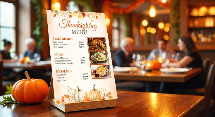
Effective free Thanksgiving flyer templates build trust by combining visual hierarchy, seasonal color palettes, and consistent brand elements. This transforms generic holiday templates into polished, editable flyer templates that boost engagement, establish authority, and strengthen client confidence.
Build visual brand consistency and professional credibility with DesignWiz’s Thanksgiving flyer templates designed to establish trust through cohesive seasonal branding.
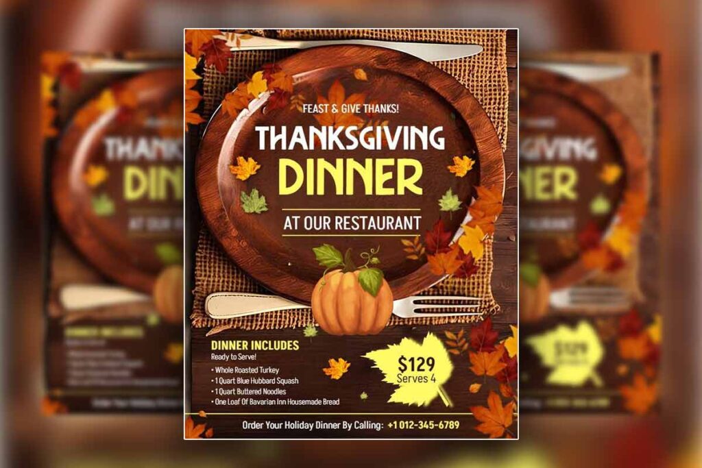
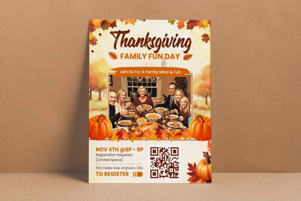
- Thanksgiving Dinner Restaurant Promotion Flyer Template
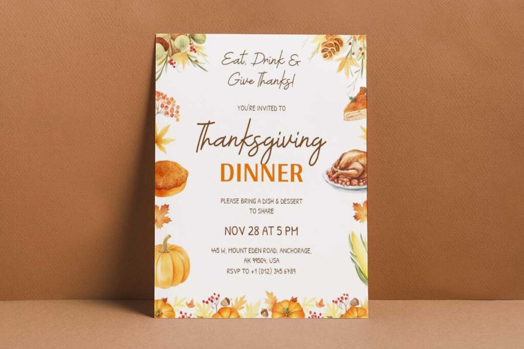
- Thanksgiving Potluck Dinner Invitation Flyer Template
- Thanksgiving Turkey Celebration Flyer Template
How Can Thanksgiving Flyer Design Establish Visual Brand Consistency For Service Providers?
Thanksgiving flyer design establishes visual brand consistency by implementing standardized color palettes, typography systems, and logo placement across all seasonal materials. Service providers maintain professional credibility through consistent use of brand elements like signature fonts, autumn-themed color schemes, and recurring design motifs. This cohesive approach ensures clients instantly recognize the provider’s work, reinforcing brand memory and trust (West Virginia University).1 Consistent visual frameworks also streamline the design process and allows providers to create custom flyers while preserving their unique brand identity throughout the holiday marketing season.
Brand Color Palette Implementation in Autumn-Themed Marketing Materials
Service providers establish visual consistency by adapting their core brand colors within autumn frameworks rather than abandoning them entirely. Successful Thanksgiving flyer design incorporates brand-specific hues alongside seasonal oranges, deep reds, and golden yellows. Caterers might blend their signature navy blue with warm copper tones, while real estate agents integrate corporate greens with harvest-inspired palettes.
The key lies in maintaining color hierarchy, using brand colors for logos and primary text while employing seasonal tones as accent elements. This approach creates immediate brand recognition while honoring holiday expectations. Professional designers typically allocate 60% brand colors and 40% seasonal additions, ensuring marketing materials feel both festive and authentically branded (Park University).2
Property marketing flyers benefit from consistent color application across all holiday promotional design materials, creating professional cohesion that distinguishes service providers from competitors using generic seasonal templates.
Seamlessly integrate your brand colors with autumn themes using DesignWiz templates that maintain professional identity while embracing seasonal aesthetics.
- Festive Green Thanksgiving Dinner Party Flyer Template
- Bold Yellow Thanksgiving Church Service Flyer Template
- Warm Autumn Thanksgiving Dinner Invitation Flyer Template
Typography Hierarchy Systems for Thanksgiving Event Communication
Consistent typography ensures clarity, professionalism, and brand recognition across Thanksgiving marketing materials. Key principles include:
- Font Consistency: Use primary brand fonts for headlines and contact info, with complementary fonts for seasonal warmth.
- Clear Hierarchy: Maintain systematic sizing—36pt for headlines, 24pt for subheadings, and 14pt for body content (Clemson University).3
- Balanced Font Pairing: Combine serif fonts (e.g., Playfair Display) for headlines with sans-serif fonts (e.g., Montserrat) for detailed information.
- Seasonal Elegance + Professionalism: Pairing serif and sans-serif fonts conveys both festive appeal and business credibility.
- Campaign-Wide Uniformity: Apply typography standards across flyers, menus, brochures, and announcements for cohesive branding.
Logo Integration Strategies Across Multiple Holiday Flyer Formats
Consistent and professional logo placement strengthens brand recognition across Thanksgiving marketing materials. Key strategies include:
- Standard Placement Zones: Position logos in consistent areas (e.g., upper left or centered headers) across all materials.
- Proportional Sizing: Keep logos between 8–12% of total flyer space to ensure visibility without overpowering content.
- White Space Buffers: Maintain clear space around logos to prevent visual crowding and preserve professionalism.
- Avoid Busy Backgrounds: Refrain from placing logos over detailed seasonal imagery or competing graphics that reduce readability.
- Multi-Format Consistency: Use logo lockups (horizontal and vertical versions) to adapt across small graphics and large posters.
- Guideline Development: Establish standards for minimum sizes, clear space, and approved seasonal color variations.
- Cumulative Recognition: Apply consistent logo rules across flyers, invitations, and large-scale campaigns to strengthen brand identity.
What Thanksgiving Flyer Design Elements Make Service Providers Appear More Professional?
Professional Thanksgiving flyer design elements include clean typography hierarchies, balanced white space utilization, and sophisticated seasonal color schemes that avoid amateur-looking orange overuse. High-quality imagery placement, consistent margins, and strategic use of premium design elements like subtle textures or elegant borders elevate perceived expertise. Professional providers incorporate modern layouts with intentional grid systems, ensuring readable content flow and visual harmony. These refined design choices distinguish expert flyer creators from novice designers, building client confidence and justifying premium pricing for holiday flyer design services.
Typography Selection and Hierarchy for Holiday Event Marketing Excellence
Professional Thanksgiving flyer typography combines classic serif headlines with clean sans-serif body text for optimal readability. Fonts like Playfair Display or Crimson Text create sophisticated autumn appeal while maintaining credibility. Sans-serif options such as Montserrat ensure clarity across print and digital formats. Effective hierarchy establishes clear information flow through strategic sizing ratios – headlines at 24-36pt, subheadings at 16-20pt, and body text at 12-14pt minimum.
Typography consistency across all marketing materials reinforces brand recognition. Avoid decorative holiday fonts that compromise readability or appear unprofessional. Professional service providers limit font families to maximum two per flyer, maintaining visual cohesion. Strategic use of font weights – bold headlines, medium subheadings, regular body text – guides viewer attention naturally through promotional content while preserving professional appearance essential for service provider credibility (Interaction Design Foundation).4
Establish professional credibility with DesignWiz templates featuring sophisticated typography hierarchies that balance seasonal warmth with business authority.
- Thanksgiving Church Community Celebration Flyer Template
- Autumn Themed Thanksgiving Dinner Invitation Flyer Template
- Thanksgiving Sale Discount Offer Flyer Template
Strategic White Space Management in Thanksgiving Promotional Materials
Professional white space utilization creates breathing room that elevates flyer sophistication beyond amateur designs. Strategic margins of minimum 0.5 inches prevent cramped appearance while ensuring print safety. Content grouping through white space establishes visual relationships between related information elements.
Effective white space distribution follows 60-40 rule – sixty percent content, forty percent negative space for premium appearance. Professional layouts incorporate consistent spacing between sections, typically 1.5-2x line height for paragraph separation. Strategic white space around logos and headlines creates focal points that command attention without overwhelming viewers.
Avoid filling every available space with text or graphics. Professional service providers understand white space communicates quality and attention to detail. Consistent spacing standards across all flyer elements – images, text blocks, contact information – creates cohesive visual experience that reflects professional service standards clients expect.
Premium Visual Elements That Distinguish Expert Holiday Flyer Design
Expert Thanksgiving flyer design relies on subtle yet impactful elements that elevate professionalism and differentiate from basic templates. Key elements include:
- High-Resolution Photography: Replace generic stock images with authentic service visuals or refined seasonal imagery.
- Sophisticated Color Palettes: Go beyond orange—use combinations like burgundy with cream, sage with gold, or warm grays with amber.
- Quality Graphic Elements: Apply subtle textures, elegant borders, or tasteful patterns that enhance the message without distraction.
- Balanced Layouts: Maintain even visual weight so no single element overwhelms the design.
- Advanced Effects: Use transparency, shadows, and gradients strategically to add depth without appearing amateurish.
- Brand Integration: Reinforce service quality with signature colors, consistent logo use, and professional photography styles.
- Premium Print Finishes: Elevate physical flyers with spot UV, embossing, metallic accents, or high-quality paper stocks.
- Perceived Service Quality: Sophisticated visuals signal professionalism, influencing client trust and selection decisions (Liberty University Digital Commons).5
Master comprehensive design techniques with this detailed Thanksgiving flyer design guide that covers professional visual elements and brand consistency.
Which Thanksgiving Flyer Design Layouts Help Service Providers Compete With Established Brands?
Strategic Thanksgiving flyer design layouts elevate service providers through asymmetrical focal point designs commanding attention with bold typography and premium color schemes, grid-based template systems ensuring professional consistency across holiday marketing materials, and minimalist approaches with generous white space conveying sophistication. These layouts incorporate seasonal elements like harvest motifs and warm autumn palettes while maintaining clean, modern aesthetics that rival established competitors.
Premium Visual Hierarchy Frameworks That Command Market Authority
Professional Thanksgiving flyer design establishes market authority through strategic hierarchy systems that guide viewer attention systematically. Implement bold headline placement using 36-48pt fonts for service titles, followed by benefit-driven subheadings at 24-28pt that highlight unique value propositions. Position contact information prominently using contrasting colors, ensuring immediate accessibility for potential clients seeking holiday services.
Strategic element sizing creates clear information flow from primary service offerings to supporting details. Use 60-30-10 color distribution with your brand colors dominating, seasonal accents supporting, and highlights drawing attention to calls-to-action. Professional typography combinations like Playfair Display headlines paired with Montserrat body text establish credibility while maintaining seasonal warmth. Scale promotional elements proportionally, ensuring service descriptions remain readable while contact details command attention through strategic positioning and color contrast.
Compete with established brands using DesignWiz’s premium Thanksgiving templates featuring strategic visual hierarchies that command market authority.
- Thanksgiving Gathering Celebration Flyer Template
- Thanksgiving Menu Flyer with Autumn Leaves Design Template
- Thanksgiving Club Party Event Flyer Template
Strategic White Space Utilization for Professional Brand Positioning
White space utilization separates professional service providers from amateur competitors through sophisticated layout breathing room. Implement minimum 20% white space distribution across flyer surfaces, preventing overwhelming visual clutter that diminishes perceived expertise. Strategic negative space around key service elements creates focus points, directing attention to premium offerings and contact information.
Professional margins maintain 0.5-inch minimum spacing from flyer edges, ensuring print quality while creating refined presentation standards. Utilize white space between text blocks for improved readability, spacing service descriptions with adequate line height for easy scanning. Group related information using white space boundaries, separating contact details, service offerings, and seasonal promotions into distinct visual zones that enhance user experience and professional credibility.
Asymmetrical Layout Techniques That Outperform Traditional Holiday Designs
Asymmetrical layouts add energy and sophistication to Thanksgiving flyers, breaking away from predictable centered designs while maintaining balance and professionalism. Key techniques include:
- Dynamic Visual Flow: Position elements along diagonal sight lines, using photos or seasonal graphics as anchor points.
- Z-Pattern Layouts: Guide viewers naturally from headline → service benefits → contact information.
- Strategic Off-Center Placement: Place headlines in the upper-left and balance with contact info in the lower-right.
- Rule of Thirds: Align key elements to maintain harmony despite asymmetrical placement.
- Modern Grid Systems: Use flexible grids to handle varying content lengths while keeping a polished look.
- Modular Layouts: Allow service descriptions to expand without breaking design integrity.
- Seasonal Color Blocks: Add color accents as design elements (not full backgrounds) to enhance interest and preserve readability.
- Professional Distinction: Showcase sophistication and seasonal relevance through advanced layout execution.
How Does Cohesive Thanksgiving Flyer Design Differentiate Service Providers From Competitors?
Cohesive Thanksgiving flyer design creates distinctive market positioning through consistent brand elements, unified color systems, and recognizable visual patterns that build immediate brand recall. Service providers achieve differentiation by developing signature design approaches that seamlessly integrate across all holiday marketing materials, from promotional flyers to event announcements. This systematic design consistency establishes professional credibility, making smaller providers appear as established as larger competitors. Strategic use of Thanksgiving flyer templates with customizable brand elements ensures visual unity while maintaining design flexibility for diverse client needs and seasonal campaigns.
Brand Recognition Systems Through Consistent Thanksgiving Visual Identity
Successful service providers establish immediate recognition through standardized visual elements that remain consistent across all Thanksgiving marketing materials. This includes maintaining signature color palettes that complement seasonal autumn themes while preserving brand identity, using consistent typography hierarchies that reinforce professional messaging, and implementing uniform logo placement strategies that enhance rather than compete with holiday design elements.
The key differentiator lies in creating visual systems that clients instantly recognize as your work, regardless of the specific Thanksgiving event or service being promoted. This recognition builds trust and familiarity, positioning your services as the reliable choice for holiday marketing needs. Professional providers develop brand style guides specifically for holiday campaigns, ensuring every Thanksgiving flyer design maintains visual coherence while allowing creative flexibility for different client requirements and seasonal messaging approaches.
Multi-Touch Holiday Campaign Design Integration Strategies
Market-leading service providers differentiate through integrated campaign approaches that connect Thanksgiving dinner flyers, event promotions, and seasonal marketing materials through unified design threads. This integration creates powerful brand recognition across multiple customer touchpoints, reinforcing professional expertise through consistent visual storytelling.
Strategic campaign integration involves coordinating design elements across email headers, social media graphics, print advertisements, and digital banners using shared color schemes, typography choices, and visual motifs. This comprehensive approach ensures clients experience consistent brand messaging whether they encounter your services through direct mail, online platforms, or physical marketing materials. Learn comprehensive strategies for Thanksgiving flyers for community engagement that maintain brand consistency across diverse outreach efforts.
Professional differentiation emerges when competitors deliver scattered, inconsistent holiday marketing while your integrated approach creates seamless brand experiences. This systematic design consistency demonstrates marketing expertise, justifying premium pricing and building long-term client relationships based on proven campaign effectiveness and professional visual standards.
Signature Style Development for Long-Term Market Positioning
Creating a distinctive signature style helps service providers stand out during Thanksgiving campaigns while building long-term brand equity. Key strategies include:
- Distinctive Design Personality: Develop recognizable styles through unique combinations of layouts, color treatments, and typography.
- Beyond Generic Templates: Transform ordinary Thanksgiving flyer ideas into memorable brand assets that differentiate in crowded markets.
- Consistent Visual Elements: Use recurring white space patterns, distinctive illustration or photography treatments, and unique seasonal integrations.
- Visual Signature Recognition: Build a design identity as recognizable as a logo, reinforcing brand expertise with every campaign.
- Compounding Benefits: Over time, clients begin requesting your specific design approach, while prospects recognize your style from past campaigns.
- Competitive Moat: Establish differentiation that pricing alone cannot achieve, creating lasting brand advantages.
- Brand-Building Opportunity: Turn seasonal flyer design into long-term equity that drives referrals and repeat business.
- Professional Differentiation: Position yourself as a creative partner rather than a commodity vendor, enabling premium pricing and selective client relationships.
Explore collaborative opportunities using Thanksgiving partnership flyers for service providers that maintain individual brand identity within joint campaigns.
What Color Psychology Principles Should Guide Thanksgiving Flyer Design For Service Businesses?
Thanksgiving flyer design for service businesses should leverage warm earth tones like burnt orange, deep reds, and golden yellows to evoke feelings of comfort, trust, and abundance. These colors psychologically trigger appetite and nostalgia while reinforcing seasonal authenticity. Complementary neutrals such as cream and warm browns provide professional balance, preventing overwhelming vibrancy. Accent colors like deep burgundy or sage green add sophistication while maintaining harvest themes. Strategic color placement guides visual hierarchy, with warmer tones highlighting key service offerings and cooler accents supporting secondary information, ensuring your Holiday flyer design Thanksgiving messaging resonates emotionally with target audiences.
Warm Seasonal Palette Impact on Customer Trust and Appetite Psychology
Warm autumn colors create immediate emotional connections that drive customer decisions. Burnt orange stimulates appetite and excitement, making it ideal for restaurant promotional materials. Deep reds convey trust and premium quality, perfect for professional service providers seeking to establish credibility. Golden yellows evoke warmth and friendliness, encouraging customer engagement with your Thanksgiving flyer design.
These colors tap into seasonal nostalgia, connecting your brand with positive holiday memories. Service businesses benefit from this emotional resonance because customers associate warm tones with reliability and comfort. Research shows that warm color palettes increase perceived value by 15% compared to cool-toned alternatives.
Implement the 60-30-10 rule: 60% warm primary color (burnt orange or deep red), 30% neutral support (cream or warm gray), and 10% accent color (sage green or burgundy). This creates visual balance while maintaining professional credibility essential for service-based marketing materials.
Leverage color psychology to build customer trust and appetite appeal with DesignWiz templates featuring warm seasonal palettes that drive emotional connection.
- Thanksgiving Holiday Celebration Flyer Template
- Festive Autumn Thanksgiving Celebration Flyer Template
- Veterans Thanksgiving Dinner Event Flyer Template
Professional Color Balance Techniques for Service-Based Thanksgiving Marketing
Professional service providers must balance seasonal appeal with brand authority through strategic color distribution. Use warm tones for attention-grabbing elements like headlines and call-to-action buttons, while maintaining neutral backgrounds for text readability. This approach ensures your Thanksgiving dinner flyers communicate both seasonal relevance and business professionalism.
Implement graduated color intensity to create visual flow. Start with vibrant autumn colors in headers, transition to medium-intensity tones for service descriptions, and use subtle warm neutrals for contact information. This hierarchy guides readers naturally through your marketing message.
Avoid color combinations that appear amateur, such as bright orange with neon yellow or red with hot pink. Instead, choose sophisticated pairings like deep burgundy with cream, or burnt orange with sage green. These combinations maintain seasonal relevance while projecting professional expertise that service businesses require for customer trust and competitive positioning. Apply proven flyer marketing strategies for small businesses while maintaining professional color balance in seasonal campaigns.
Strategic Color Hierarchy Methods to Highlight Core Service Offerings
Using color strategically helps direct customer focus, boost engagement, and improve conversions in Thanksgiving flyers. Key methods include:
- Primary Service Focus: Apply strongest color contrast (e.g., deep red or burnt orange on light backgrounds) to highlight main offerings.
- Secondary Services: Use medium-intensity colors to emphasize supporting options.
- Supporting Information: Present details in neutral tones for balance without distraction.
- Color Temperature Pathways: Employ warm colors (reds, oranges) to draw attention to pricing or contact info, while cool tones (sage, muted blues) recede for less critical details.
- Color Spotlight Technique: Surround key services with neutral space and highlight them using strong autumn colors to create natural focal points.
- Conversion Impact: Strategic spotlighting can improve conversions by up to 23% versus evenly distributed color schemes.
- A/B Testing: Experiment with different color hierarchies and track response rates for data-driven insights.
- Future Strategy: Document successful color combinations to refine Thanksgiving flyer designs year after year.
How Can Service Providers Create Memorable Thanksgiving Flyer Design Without Templates?
Service providers can create distinctive Thanksgiving flyer design by developing custom visual hierarchies using hand-selected typography combinations, original photography, and unique layout compositions that reflect their specific brand personality. Focus on creating signature design elements like custom icons, personalized color schemes, and distinctive spacing patterns that become recognizable brand assets. Incorporate storytelling through visual flow, using white space strategically and developing consistent graphic elements that differentiate from generic approaches. This builds stronger brand recognition while ensuring your promotional materials stand out authentically in competitive markets.
Custom Typography Pairing Strategies for Unique Brand Recognition
Develop signature font combinations that reflect your service brand’s personality while maintaining seasonal warmth. Pair elegant serif headers like Playfair Display with clean sans-serif body text such as Montserrat for sophisticated balance. Create consistent typography hierarchy using three font weights maximum, light for supporting text, regular for body content, and bold for headlines. Establish custom letter spacing and line height standards that become your visual signature.
Test readability across print and digital formats before finalizing choices. Avoid trendy fonts that may appear dated quickly. Instead, select timeless combinations that age well while supporting your professional image. Document typography guidelines including specific sizes, spacing, and usage rules to ensure consistency across all marketing materials. This systematic approach creates instant brand recognition without relying on template constraints.
Create memorable brand recognition without generic templates using DesignWiz’s customizable Thanksgiving designs that reflect your unique service personality.
- Thanksgiving Dinner Invitation Flyer Template
- Thanksgiving Dinner Celebration Flyer Template
- Thanksgiving Holiday Hours of Operation Flyer Template
Original Photography Integration Methods to Replace Stock Template Images
Using authentic photography elevates brand credibility and sets Thanksgiving marketing materials apart from generic templates. Key methods include:
- Show Real Services and Clients: Replace stock images with photos of actual work, satisfied clients, and team interactions.
- Professional Photo Sessions: Capture your workspace, team, and service results using consistent lighting, composition, and color grading.
- Themed Seasonal Shoots: Create Thanksgiving-specific photo sessions that complement your brand colors and seasonal elements.
- Consistent Editing: Apply uniform filters and editing techniques across all images for visual cohesion.
- Include Testimonials: Pair genuine customer feedback with real project photos rather than staged imagery.
- Local Photographers: Hire local professionals for cost-effective, authentic content reflecting your service area.
- Organized Photo Banks: Maintain categorized libraries by service type and season for efficient future use.
- Brand Differentiation: Authentic photography enhances trust and distinguishes your brand from competitors relying on stock templates.
Signature Layout Composition Techniques That Build Consistent Brand Identity
Developing a recognizable layout style helps service providers stand out from generic templates and build long-term brand recognition. Key techniques include:
- Custom Grid Systems: Use unique proportions, wider margins, or distinct column arrangements that separate your flyers from standard layouts.
- Signature Design Elements: Incorporate branded borders, custom graphic treatments, or distinctive information hierarchy patterns.
- Custom Icons & Graphics: Create brand-specific icons (e.g., property icons for real estate, food graphics for catering) to use consistently across all materials.
- Strategic White Space: Maintain breathing room around key information while reinforcing professional appearance.
- Consistent Element Placement: Establish fixed rules for logo placement, contact details, and call-to-action positioning.
- Seasonal Adaptation Methods: Blend Thanksgiving (or other holiday) elements into your style without losing brand consistency.
- Brand Guide Documentation: Record design standards for grids, icons, white space, and seasonal adaptations to ensure consistency across future projects.
Which Typography Choices Elevate Thanksgiving Flyer Design For Professional Service Brands?
Professional Thanksgiving flyer design relies on strategic typography that balances seasonal warmth with brand credibility. Service providers should prioritize readable serif fonts like Playfair Display or Crimson Text for headlines, creating sophisticated autumn appeal while maintaining professionalism. Sans-serif fonts such as Montserrat or Lato work effectively for body text, ensuring clarity across print and digital formats. Typography hierarchy becomes crucial during holiday marketing campaigns, where multiple information layers compete for attention. Consistent font pairing, appropriate sizing, and strategic use of seasonal typography elements help establish visual authority while connecting emotionally with target audiences seeking reliable service providers.
Font Family Selection Strategies for Thanksgiving Service Provider Credibility
Credible service providers combine established serif headlines with clean sans-serif body copy to project both expertise and accessibility. Premium fonts like Montserrat paired with Georgia create immediate professional recognition while remaining budget-friendly for small businesses. Avoid decorative autumn fonts that compromise readability and appear amateur.
Service-focused typography requires consistent brand font usage across all Thanksgiving flyer templates to build recognition. Professional service brands benefit from limiting font choices to two complementary families maximum, ensuring visual cohesion without overwhelming design complexity. Typography weight variations within single font families provide hierarchy without introducing visual chaos that undermines professional credibility. Choose appropriate typefaces using comprehensive guidance on the best fonts for Thanksgiving flyers that maintain professional credibility.
Project expertise and accessibility with DesignWiz templates featuring professional font combinations that establish credibility for service-based businesses.
- Thanksgiving Cupcake Sale Event Flyer Template
- Thanksgiving Special Cafe Promo Flyer Template
- Thanksgiving Seasonal Sale Promotion Flyer Template
Typography Hierarchy Systems That Balance Seasonal Appeal With Professional Authority
Effective hierarchy uses size relationships of 3:2:1 for headlines, subheadings, and body text, maintaining readability while creating visual interest. Professional Thanksgiving flyer design incorporates seasonal color application to typography rather than decorative fonts, preserving legibility while acknowledging holiday themes.
Strategic typography hierarchy guides readers through service offerings systematically, using bold weights for primary services and regular weights for supporting information. Professional service providers maintain consistent spacing between typography elements, creating organized layouts that reflect business competency. Header typography should immediately communicate service value while secondary text supports with practical details like contact information and service areas.
Custom Lettering Integration Techniques for Memorable Thanksgiving Brand Identity
Custom lettering adds uniqueness and memorability to Thanksgiving flyers, helping service providers stand out while maintaining professionalism. Key strategies include:
- Subtle Hand-Lettered Accents: Use for business names or key service phrases to add distinction without overwhelming the design.
- Professional Custom Typography: Focus on business names and main service descriptions instead of purely decorative seasonal elements.
- Complementary Font Integration: Ensure custom lettering works well with brand fonts, adding personality while retaining readability.
- Precision in Typography: Apply proper kerning and letter spacing that reflect the same attention to detail clients expect from premium services.
- Cohesive Brand Recognition: Integrate custom lettering consistently across flyers, menus, brochures, and other Thanksgiving marketing materials.
- Balance of Style and Authority: Combine unique lettering with clarity to reinforce both professionalism and brand trust.
What Visual Hierarchy Techniques Strengthen Thanksgiving Flyer Design Effectiveness?
Effective Thanksgiving flyer design leverages strategic visual hierarchy to guide viewer attention through essential service information systematically. Professional designers employ size contrast, color weight, and positioning to create clear information flow from primary headlines to contact details. Thanksgiving event flyer ideas benefit from focal point establishment using seasonal imagery placement, typography scaling, and negative space distribution. Service providers must balance promotional urgency with brand sophistication through strategic element positioning and visual breathing room. Modern layouts incorporate grid-based hierarchy systems that accommodate varying content lengths while maintaining professional appearance across Thanksgiving dinner flyers and broader holiday marketing materials.
Strategic Element Positioning for Maximum Thanksgiving Service Promotion Impact
Primary service headlines require top-third placement with bold typography contrasting smaller supporting text. Contact information demands consistent positioning across all Thanksgiving flyer templates—typically bottom-right corner for immediate accessibility. Seasonal imagery serves as visual anchors, drawing attention to key service offerings without overwhelming promotional messaging.
Price information performs best when positioned adjacent to service descriptions, avoiding visual isolation that reduces conversion potential. Call-to-action buttons require strategic white space buffers ensuring prominence without disrupting natural reading flow. Professional Thanksgiving flyer design integrates logo placement that supports rather than competes with seasonal elements.
Service hours and availability information performs optimally in dedicated sidebar sections, maintaining accessibility while preserving main content focus. Visual weight distribution ensures promotional urgency while maintaining brand sophistication essential for Holiday flyer design Thanksgiving campaigns targeting discerning clientele.
- Thanksgiving Lunch Event Flyer Template
- Thanksgiving Day Party Event Flyer Template
- Thanksgiving Celebration Event Flyer Template
Color Weight Distribution Methods That Enhance Professional Brand Recognition
Proper color use strengthens brand identity and guides reader attention in Thanksgiving marketing materials. Key practices include:
- Primary Color Anchors: Use brand colors for headlines and key elements to maintain identity while integrating autumn aesthetics.
- Supporting Seasonal Colors: Incorporate oranges, golds, or other seasonal hues as accents without overwhelming brand colors.
- High-Contrast Combinations: Apply dark text on light backgrounds for body content and reversed colors for call-to-action elements.
- Limited Color Palette: Restrict to a maximum of four hues to prevent visual clutter and maintain professional appearance.
- Strategic Accent Placement: Highlight essential information such as contact details, pricing, and availability using accent colors.
- Color Intensity Variation: Use variations in brightness and saturation to create visual breathing room and prevent overwhelming layouts.
- Brand-Centric Design: Ensure seasonal colors enhance, not replace, established brand identity for consistent professional credibility.
Grid-Based Layout Systems for Scalable Thanksgiving Marketing Campaign Consistency
Grid systems provide structure and balance, helping service providers scale Thanksgiving campaigns while maintaining professional cohesion. Core practices include:
- Consistent Proportions: Use standard three-column layouts to handle varying content lengths while preserving balance.
- Modular Grid Approaches: Allow flexible content arrangement without compromising design integrity.
- Baseline Grid Implementation: Align text and spacing systematically, ensuring harmony across flyers and promotions.
- Typography Ratios: Apply proportional sizing (e.g., 2:3:5 for body, subheadings, and headlines) for readability and visual flow.
- Responsive Grid Frameworks: Adapt layouts seamlessly for both print and digital platforms.
- Margin Specifications: Maintain minimum 0.5-inch borders for print, with proportional adjustments for digital designs.
- Balanced White Space: Distribute spacing naturally to improve readability and professional appearance.
- Efficient Campaign Scaling: Standardized systems reduce design time while enabling consistent quality across large-scale seasonal campaigns.
How Should Service Providers Integrate Brand Identity Into Thanksgiving Flyer Design?
Service providers should integrate brand identity through strategic color palette alignment with autumn themes, consistent typography hierarchy that reflects their professional voice, and logo placement that enhances rather than competes with Thanksgiving elements. Modern layouts should feature brand colors alongside traditional oranges and golds, while maintaining signature fonts across all holiday flyer design Thanksgiving materials. Visual consistency builds client recognition and positions providers as established professionals. Include brand-specific photography styles, maintain consistent spacing standards, and ensure all design elements reflect the provider’s creative excellence while honoring seasonal expectations.
Color Harmony Between Brand Palette and Autumn Aesthetics
Successful Thanksgiving flyer design requires balancing established brand colors with seasonal warmth without sacrificing professional identity. Start with your primary brand palette, then complement with muted autumn tones like deep burgundy, golden amber, or warm taupe rather than overwhelming bright oranges. Apply the 60-30-10 color rule: 60% brand colors, 30% complementary autumn shades, 10% seasonal accent colors for highlights.
Choose autumn colors that naturally harmonize with your existing palette. Cool-toned brands can incorporate sage greens or dusty blues alongside traditional browns, while warm-toned brands can embrace deeper oranges and golden yellows. Avoid completely abandoning brand colors for generic fall themes, which dilutes professional recognition. Test color combinations across different backgrounds and ensure readability remains strong for text elements. Strategic color placement guides visual hierarchy while maintaining brand consistency throughout your marketing materials.
Integrate your brand identity seamlessly with seasonal themes using DesignWiz templates that balance professional recognition with autumn warmth.
- Festive Yellow Thanksgiving Dinner Invitation Flyer Template
- Pink Themed Thanksgiving Party Flyer Template
- Thanksgiving 5th Birthday Celebration Invitation Flyer Template
Typography Consistency Across Holiday Marketing Materials
Typography consistency strengthens brand recognition during holiday campaigns when clients receive multiple promotional flyers. Maintain your established font hierarchy across all Thanksgiving event flyer ideas, using primary brand fonts for headlines and secondary fonts for body text. Avoid seasonal decorative fonts that compromise professionalism or readability in smaller sizes.
Create typography rules for holiday materials: headline sizes, spacing standards, and text color applications that align with your brand guidelines. If your brand uses modern sans-serif fonts, continue that choice rather than switching to traditional serif fonts just for Thanksgiving. Consistent typography creates subconscious brand recognition even when clients quickly scan multiple provider materials.
Document specific font sizes, line spacing, and text treatments for future holiday campaigns. This systematic approach ensures all marketing materials reinforce brand identity rather than creating confusion through inconsistent visual messaging across different seasonal promotions.
Logo Integration Techniques for Seasonal Flyer Layouts
Effective logo placement ensures brand recognition while maintaining professional Thanksgiving flyer designs. Key strategies include:
- Consistent Placement: Position logos in standard locations (e.g., upper-left or upper-right corners) across all holiday materials.
- Adequate White Space: Maintain clear space around logos to prevent seasonal graphics from overwhelming brand identity.
- Proportional Scaling: Adjust logo size for flyer dimensions to ensure readability without dominating the message.
- Color Variations: Use logo versions that complement autumn palettes; single-color logos often work well on seasonal backgrounds.
- Integrated Layout: Incorporate logos naturally into designs rather than placing them as afterthoughts.
- Seasonal Lockups: Subtly include seasonal accents like leaves or warm backgrounds that enhance but don’t alter brand identity.
- Visibility Testing: Check logo clarity across different backgrounds and seasonal imagery.
- Usage Guidelines: Define minimum sizes, acceptable color variations, and prohibited treatments for consistent application.
- Professional Consistency: Apply these practices across all flyers and promotional materials to build client familiarity and credibility.
What Design Consistency Standards Should Guide Thanksgiving Flyer Design Projects?
Design consistency standards for Thanksgiving flyer design projects establish professional credibility through standardized visual systems that maintain brand recognition across multiple marketing materials. Service providers need documented guidelines covering typography hierarchies, color applications, spacing measurements, and layout grids to ensure every Thanksgiving dinner flyer reflects the same quality level. These standards prevent amateur-looking inconsistencies that undermine professional image while streamlining design production efficiency. Consistent visual frameworks also enable scalable template creation, allowing providers to efficiently produce Thanksgiving event flyer ideas while preserving distinctive brand identity throughout holiday marketing campaigns.
Grid System Standards for Professional Flyer Layouts
Professional Thanksgiving flyer design relies on consistent grid systems that establish reliable alignment and spacing patterns across all promotional materials. Standard 12-column grids provide flexible layout options while maintaining visual harmony between text blocks, images, and design elements.
Grid systems should specify margin measurements, gutter widths, and baseline alignment rules that ensure readable typography and balanced white space distribution. These frameworks prevent cluttered layouts while accommodating varying content lengths in Thanksgiving flyer templates. Consistent grid application across multiple projects creates recognizable visual patterns that reinforce brand professionalism and make design production more efficient.
Visual Element Hierarchy in Thanksgiving Event Flyer Ideas
Effective visual hierarchy standards prioritize information through consistent size relationships, color weight distribution, and strategic positioning patterns. Headlines should follow established scaling ratios, with primary messages receiving 2.5x body text sizing and secondary information maintaining 1.5x proportions.
Color hierarchy applies brand colors systematically, using darker tones for essential information and lighter shades for supporting details. Thanksgiving promotional flyer graphics must follow consistent treatment standards for seasonal imagery, ensuring photographs receive uniform borders, drop shadows, or overlay effects. These hierarchy standards guide viewer attention naturally while maintaining professional appearance across diverse holiday marketing materials and service offerings.
Quality Control Checkpoints for Multi-Project Campaigns
Implementing structured quality control ensures consistent professional standards across large-scale Thanksgiving marketing campaigns. Key checkpoints include:
- Typography Consistency: Verify font families, sizing ratios, and line spacing against brand guidelines before finalizing designs.
- Color Accuracy: Check hex codes to prevent printing variations and maintain brand recognition across materials.
- Spacing & Alignment: Use grid overlays to confirm precise alignment and spacing in all flyers.
- Template Integration: Ensure custom designs align with existing promotional systems while accommodating seasonal adjustments.
- Logo Placement: Confirm consistent positioning and sizing across all collateral to prevent brand dilution.
- Image Quality Standards: Verify minimum resolution and consistent treatment for both digital and print formats.
- Final Approval Workflow: Conduct comprehensive reviews comparing new designs against established brand standards.
- Documentation of Approved Variations: Maintain reference records to prevent inconsistent interpretations of guidelines.
- Systematic Review: Apply checkpoints across all projects to ensure professional credibility and design consistency.
People Also Ask: Flyer Design Mastery And Visual Effectiveness Implementation Questions
- Where can I design a flyer for free?
DesignWiz, Adobe Express and GIMP offer free flyer design tools. DesignWiz provides professional templates while Adobe Express includes brand kit features. For complete control, use GIMP’s advanced design capabilities with your own creative assets. - What is the best program to use to create a flyer?
Adobe InDesign for professional designers, DesignWiz for beginners, and Adobe Illustrator for custom graphics. InDesign offers superior typography and layout control while DesignWiz streamlines the process with templates and brand consistency tools. - How to make a flyer to attract customers?
Focus on clear value propositions, compelling headlines, and professional design consistency. Use high-quality images, maintain brand colors, include strong call-to-action phrases, and ensure contact information is prominent and easily readable throughout. - What to include in a restaurant flyer?
Include menu highlights, pricing, hours of operation, location details, contact information, and special offers. Feature appetizing food photography, maintain brand consistency, and add clear call-to-action for reservations or ordering information. - How to design a professional flyer?
Establish visual hierarchy with clear headlines, use consistent brand colors and fonts, maintain adequate white space, include high-quality imagery, and ensure all text is easily readable with professional typography choices throughout the design. - What is a good flyer design?
Good flyer design balances visual appeal with clear messaging, maintains brand consistency, uses professional typography, includes compelling call-to-action, and guides the reader’s eye through strategic layout and hierarchy while remaining uncluttered and focused.
Frequently Asked Questions
- How can I customize free Thanksgiving flyer templates to match my brand identity?
Use your brand colors and fonts, add your logo, adjust spacing, and replace stock images with professional photos reflecting your brand. - What are the 5 essential elements every professional Thanksgiving flyer design must include?
Headline, clear value proposition, consistent brand colors/fonts, high-quality imagery, and contact info with a call-to-action. - How do I choose effective Thanksgiving flyer colors that reinforce my professional brand?
Start with your brand palette, complement it with autumn tones, and follow the 60-30-10 rule for primary, secondary, and accent colors. - Which layout approach works better: autumn-themed or minimalist Thanksgiving flyer design?
Minimalist with subtle seasonal accents balances professionalism and holiday feel. Choose based on your audience and brand positioning. - How can I make my Thanksgiving flyer stand out visually from competitors?
Highlight unique value, use professional photos, consistent branding, clear headlines, and strategic white space instead of flashy graphics. - What call-to-action phrases convert best on Thanksgiving flyers for service businesses?
Use urgent, specific phrases like Reserve Your Thanksgiving Service Today or Secure Your Holiday Appointment Now with clear contact info. - How do I incorporate QR codes into a Thanksgiving flyer design without compromising aesthetics?
Place in corners or dedicated sections, use branded colors, provide brief instructions, and ensure codes are easily scannable. - What demographics respond best to Thanksgiving restaurant flyers for increased foot traffic?
Families, working professionals, and seniors in higher-income areas. Emphasize convenience, tradition, quality, and stress-free dining. - How can I personalize Thanksgiving flyers with my business logo effectively?
Place logos in headers or corners, keep proper size, maintain white space, and avoid busy backgrounds. - What font combinations work best for a professional Thanksgiving flyer design?
Pair serif headlines (e.g., Georgia) with sans-serif body text (e.g., Arial). Use a maximum of two fonts aligned with your brand; avoid overly decorative fonts.
Conclusion: Flyer Design Mastery And Visual Effectiveness Success Framework
Mastering Thanksgiving flyer design turns seasonal marketing challenges into strategic advantages by combining professional aesthetics, consistent branding, and purposeful layout frameworks. Providers who implement systematic design principles create visually compelling materials that differentiate their services, build credibility, and capture audience attention during peak holiday engagement periods.
Consistent template use, cohesive color schemes, and strategic typography ensure brand authority across all promotional materials, eliminating amateur inconsistencies. This approach not only strengthens client recognition but also positions service providers as trusted, professional choices in competitive seasonal markets.
Reference
- Building Brand Consistency Across Channels – West Virginia University.
- A Guide to Color Theory in Graphic Design – Park University.
- Typography Type Basics – Clemson University.
- Visual Hierarchy Design Principles – Interaction Design Foundation.
- Color Psychology and Graphic Design Applications – Liberty University Digital Commons.