Creating your first event flyer can feel overwhelming if you’ve never designed one before. Should you start with colors, images, or text? What information is truly essential, and how do you make sure people notice it? You don’t need design experience to put together a flyer that gets attention.
In this beginner-friendly guide, you’ll learn simple steps to put together an effective event flyer, covering what details to include, how to choose a layout, and easy design tricks that instantly create your own flyer look more professional. By following these tips, create your own flyer that grabs attention and encourages more people to show up at your event.
The Simple 4-Step Process Every Beginner Should Follow
Most people approach flyer design backwards, starting with colors and fonts before they’ve even organized their information. Professional designers always follow a systematic process that ensures clarity before creativity.
Step 1: Gather Your Event Essentials
Before touching any design software, collect these five critical elements to create your own flyer:
- What: Your event name and one-sentence description that explains the benefit
- When: Date, time, and duration (include timezone for virtual events)
- Where: Complete address for physical events, platform details for virtual ones
- Why: The compelling reason people should attend (solve a problem, gain knowledge, have fun)
- Who: Target audience and any featured speakers or performers
Write these details in plain text first. If you can’t explain your event clearly in writing, no amount of design magic will save your flyer.
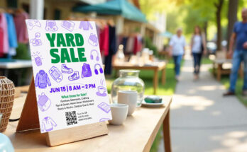
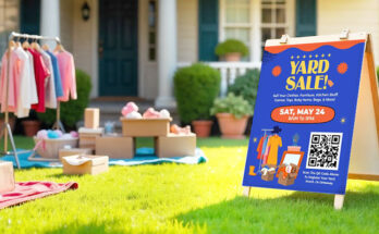
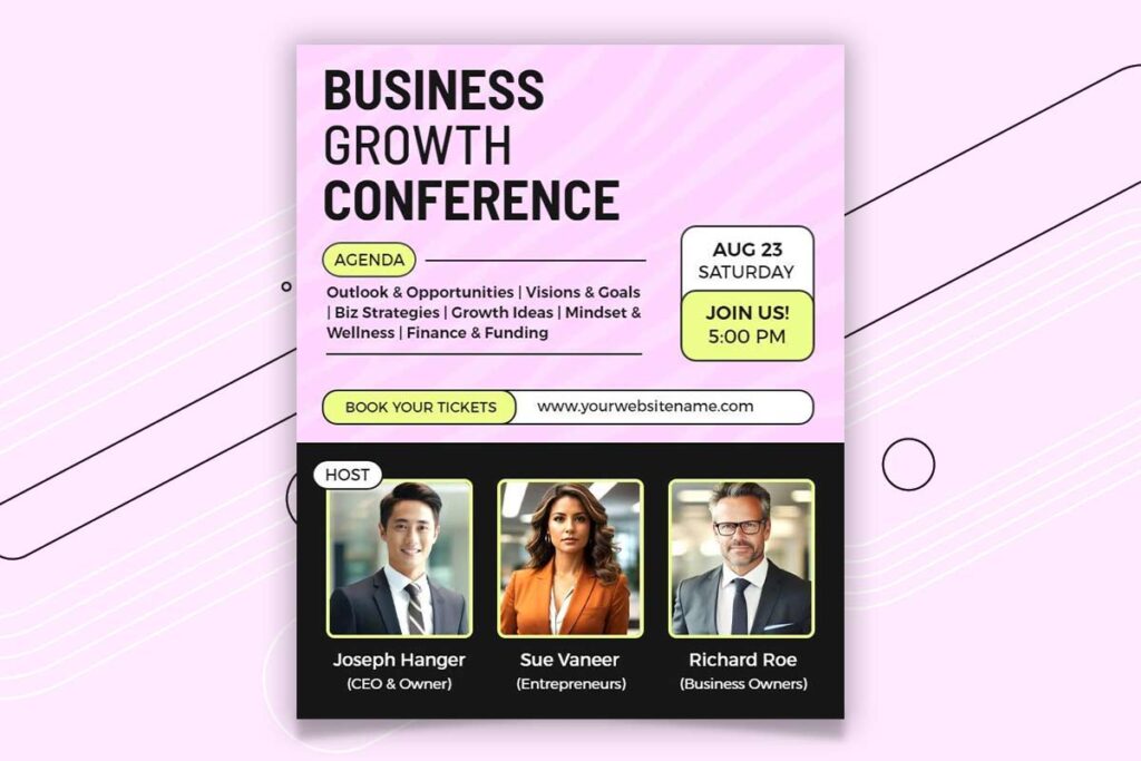
Step 2: Select the Best Template for Your Event’s Style and Guests
Different events require different visual approaches. Professional conferences need clean, authoritative layouts while music festivals can embrace bold, energetic designs. Select editable flyer templates based on these categories:
Professional events: Clean lines, plenty of white space, conservative colors
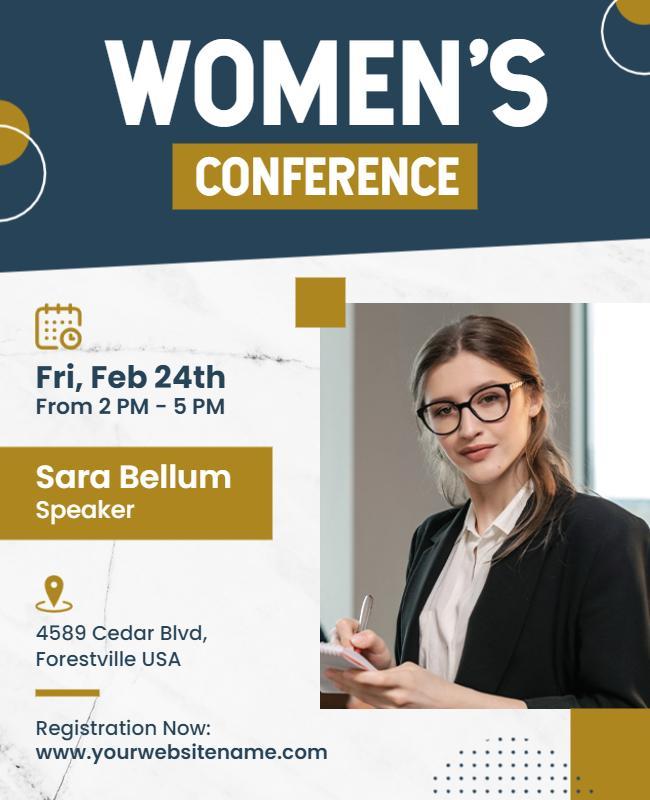
Browse DesignWiz’s professional conference flyer templates designed with clean layouts and authoritative styling perfect for corporate events and business gatherings.
- Globalization Conference Speaker Announcement Flyer Template
- Modern Technology Business Conference Networking Flyer Template
- Corporate Business Conference Meeting Flyer Template
Social gatherings: Warm colors, friendly fonts, community-focused imagery
Discover warm and inviting community event flyer templates on DesignWiz that create the perfect friendly atmosphere for social gatherings and local meetups.
- Family Community Outdoor Event Flyer Template
- Community Summer Event Celebration Flyer Template
- Community Artisan Market Event Flyer Template
Entertainment events: Bold graphics, dynamic layouts, high-energy color schemes
Explore DesignWiz’s high-energy entertainment flyer templates featuring bold graphics and dynamic layouts that capture the excitement of concerts, festivals, and performances.
- Dinner and Dance Event Invitation Flyer Template
- Dj Performance Music Event Flyer Template
- Live Music Entertainment Flyer Template
Educational workshops: Trustworthy design, clear hierarchy, benefit-focused content
Find trustworthy educational seminar flyer templates on DesignWiz designed to highlight learning benefits and establish credibility for workshops and training sessions.
- Educational Workshops Enrollment Flyer Template
- Educational Seminar on Learning Improvement Flyer Template
- Hands-on Animation Workshop Event Flyer Template
Step 3: Add Your Content Using Proven Placement Techniques
Information hierarchy determines whether people understand your event quickly or get confused and move on. According to research from the University of Hull Library, “The principle of hierarchy has been used to order the sections and create a logical flow of information” which helps create unity and clear information flow throughout design materials.1 Place elements in this order of importance:
- Event name (largest text, top third of flyer)
- Date and time (second most prominent)
- Key benefit or featured attraction
- Location details
- Registration information
- Supporting details
Step 4: Test with the “Friend Check” Method for Clarity
Show your flyer to someone unfamiliar with your event for exactly five seconds, then ask them to repeat back what they remember. If they can’t tell you the essential details (what, when, where), your hierarchy needs adjustment. This quick check helps you spot any confusion before publishing. This testing approach aligns with findings from the Interaction Design Foundation, which emphasizes that “the organization of the design elements on the page so that the eye is guided to consume each design element in the order of intended importance” is crucial for effective communication.2
Image Selection Hacks That Make Events Look Irresistible
Most people choose images based on literal event activities, but professional designers select images based on emotional outcomes. This psychological shift transforms amateur flyers into professional-looking promotions.
The Emotion-First Selection Method
Instead of searching for “conference room” or “networking event,” search for emotions your attendees want to feel:
- Professional events: Search “confidence,” “success,” “achievement”
- Social events: Search “connection,” “joy,” “belonging”
- Educational events: Search “discovery,” “insight,” “transformation”
- Entertainment: Search “excitement,” “energy,” “celebration”
This approach finds images that show outcomes rather than activities, making your event more appealing.
The Aspiration Test for Image Validation
Before finalizing any image, ask yourself: “Does this show who my attendees want to become?” Strong event images show transformation, success, or positive emotions. Academic research from the University of Florida supports this principle, finding that “photos or graphics accompanying social media posts have repeatedly yielded greater results, in terms of engagement and success” when they effectively connect with audiences.They make viewers think, “I want to be like those people.”3
Why Stock Photos Kill Credibility
Avoid these obvious stock photo red flags that immediately signal amateur design:
- Overly posed handshakes with fake smiles
- People pointing at blank whiteboards enthusiastically
- Stock-style shots of teams smiling around laptops.
- Anyone wearing a headset while gesturing dramatically
- Diverse groups arranged in obviously staged formations
Free Resources for Authentic Event Imagery
Professional-looking images don’t require expensive subscriptions. These platforms offer genuine photos that build trust.
- Unsplash.com for lifestyle and professional photography
- Pexels.com for event and activity photos
- Freepik.com for custom graphics and illustrations
- Your own event photography from previous years
- Local photographer partnerships for unique imagery
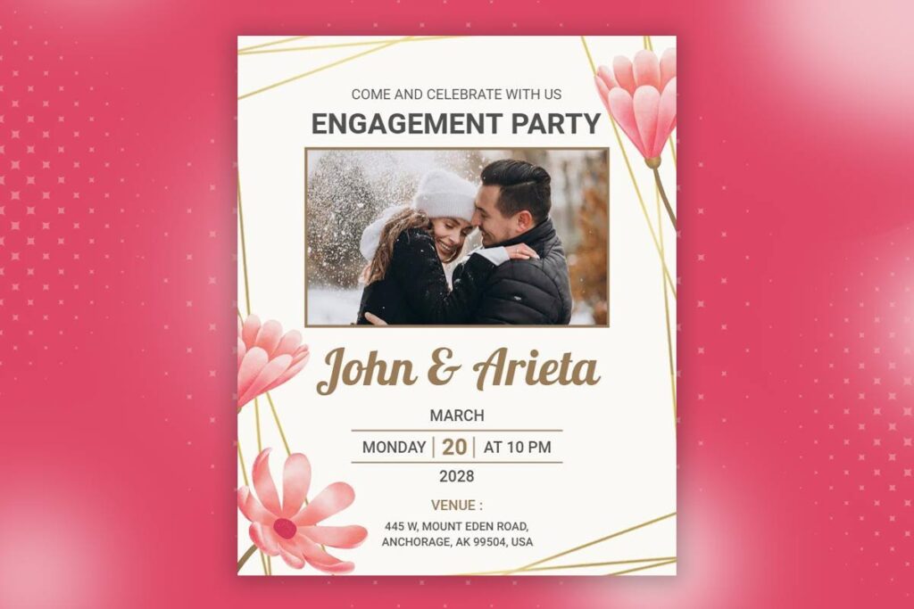
Combine authentic imagery with professionally designed layouts using DesignWiz’s event flyer templates that include placeholder areas optimized for real photos rather than generic stock images.
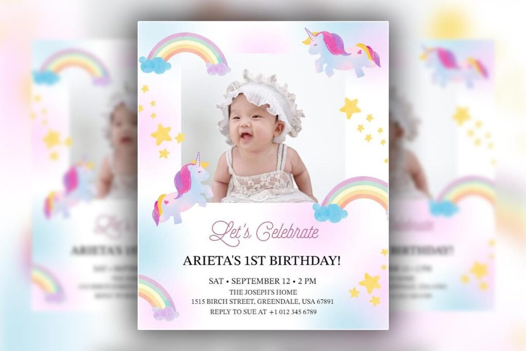
- Annual Family Reunion Gathering Flyer Template
- Elegant Birthday Celebration Flyer with Live Music Template
- Business Event Seminar Invitation Flyer Template
The 2-Font Rule That Instantly Makes Any Event Flyer Look Professional
Typography separates amateur flyers from professional ones faster than any other design element. The 2-font rule eliminates the chaos of multiple typefaces while creating sophisticated visual hierarchy.
Why the 2-Font Rule Works
Your brain processes familiar patterns faster than chaotic information. When create your own flyer use multiple fonts, readers experience cognitive overload and abandon reading. The 2-font rule creates predictable patterns that guide attention exactly where you want it. MIT research on typography and cognitive processing confirms that “we are also reading in new ways as we multi-task through life” and that designers must address how people “perceive and process information” in today’s fast-paced environment.4
Professional designers use one font for headlines and impact text, another for body content and details. This creates clear distinction between different types of information while maintaining visual cohesion.
Professional Font Pairing Formula
Follow this proven combination strategy for instant professional results:
Formula: Contrasting Weight + Complementary Style = Professional Appeal
- Headline font: Bold, confident, attention-grabbing
- Body font: Clean, readable, supportive
Perfect Combinations for Different Event Types
Professional Events:
- Headlines: Montserrat Bold + Body: Open Sans Regular
- Headlines: Roboto Condensed + Body: Lato Regular
Social Events:
- Headlines: Playfair Display + Body: Source Sans Pro
- Headlines: Raleway SemiBold + Body: Nunito Regular
Creative Events:
- Headlines: Oswald + Body: Merriweather Light
- Headlines: Bebas Neue + Body: Roboto Regular
Read more: Flyer Design Etiquette: Fonts, Texts, and Messaging Guide
4-Step Application Process
- Choose your headline font first based on event personality
- Select contrasting body font that’s highly readable
- Apply consistently throughout entire flyer
- Test readability at actual viewing sizes
See these professional typography principles in action with DesignWiz’s expertly designed flyer templates that demonstrate perfect font pairings for maximum impact and readability.
- Star Themed Entertainment Event Flyer Template
- School Reunion Planning Meeting Flyer Template
- Community Outreach Event with Free Food Flyer Template
Common Font Mistakes That Scream Amateur
Avoid these typography errors that immediately signal unprofessional design:
- Using more than two font families anywhere on the flyer
- Script fonts for body text (save decorative fonts for headlines only)
- All caps text longer than three words
- Font sizes below 12pt for any text
- Poor contrast between text color and background
Read more: Comman Flyer Design Mistake To Avoid
The Event Flyer Color Trick That Uses “Fear of Missing Out” to Double Response Rates
Color psychology triggers emotional responses faster than conscious thought. Strategic color choices create urgency and desire that compel people to register immediately rather than “thinking about it later.”
Scarcity Color Psychology Explanation
Certain color combinations signal limited availability and exclusive opportunities. Retailers have used these psychological triggers for decades, and the same principles apply to event marketing. Red creates urgency, gold suggests value, and deep blues convey trust and exclusivity.
FOMO-Triggering Color Combinations
High-Urgency Events (Limited Seating):
- Deep red backgrounds with bright yellow accents
- Orange gradients with white text for maximum contrast
- Bold purple with gold highlights for premium positioning
Professional Exclusivity:
- Navy blue with metallic gold accents
- Charcoal gray with electric blue highlights
- Forest green with cream text for sophistication
Social Energy:
- Coral pink with navy blue contrast
- Turquoise with warm orange accents
- Bright lime with deep purple backgrounds
Apply urgency-driven color psychology instantly with DesignWiz’s FOMO-optimized event flyer templates featuring pre-selected color schemes designed to trigger immediate action and boost registration rates.
- Charming Pink Faith-Focused Women’s Ministry Event Flyer Template
- All White Affair DJ Event Flyer Template
- Green and Blue Music and Golf Harmony Event Flyer Template
Contrast Urgency Technique for Action Items
Make registration buttons and deadline information impossible to ignore using high-contrast color combinations:
- Place bright call-to-action buttons on dark backgrounds
- Use complementary colors (opposite on color wheel) for maximum visual pop
- Reserve highest contrast combinations exclusively for action items
- Ensure text readability with 4.5:1 minimum contrast ratios
Color Temperature Psychology
Warm colors (reds, oranges, yellows) create excitement, urgency, and social energy. Use these for:
- Entertainment events and parties
- Limited-time offers and early bird pricing
- Community gatherings and celebrations
Cool colors (blues, greens, purples) convey professionalism, trust, and exclusivity. Use these for:
- Business conferences and professional development
- Educational workshops and training sessions
- Premium events with higher ticket prices
The 80/20 Color Rule
Successful event flyers use one dominant color for 80% of the design and a contrasting accent color for 20%. This creates visual cohesion while ensuring important elements stand out. Apply accent colors only to:
- Call-to-action buttons and registration links
- Event dates and deadlines
- Featured speaker names or headline acts
- Special pricing or early bird offers
Testing Methods
5-Second Test: Show your flyer for five seconds and ask viewers what action they should take. If they can’t identify the next step immediately, increase color contrast on your call-to-action elements.
Urgency Perception Test: Ask viewers to rate the event’s urgency on a scale of 1-10 based purely on color choices. Events requiring immediate action should score 7 or higher.
Read more: The Impact of Colorful Flyers on Marketing Success
The Layout Trick That Makes People Read Every Event Detail
Eye movement patterns are predictable. Professional designers leverage natural reading behaviors to guide attention through information in order of importance, ensuring critical details get noticed while supporting information enhances rather than distracts.
F-Pattern for Information-Heavy Events
Conferences, festivals, and multi-day events require extensive information. The F-pattern layout mirrors natural reading behavior for text-heavy content:
- Top horizontal: Event name, dates, and primary headline
- Second horizontal: Key speakers, performers, or main attractions
- Left vertical: Supporting details, schedule highlights, location information
- Bottom section: Registration details and contact information
This pattern works because people naturally scan horizontally across the top, then vertically down the left side, reading more horizontally as they find interesting content.
Z-Pattern for Single-Focus Events
Keynote speeches, single performances, or simple networking events work better with Z-pattern layouts:
- Top-left: Event name and main attraction
- Top-right: Date, time, and location
- Center diagonal: Compelling benefit or featured content
- Bottom-right: Strong call-to-action for registration
The Z-pattern guides eyes naturally from start to finish, perfect for events with one clear message.
Information Sandwich Technique
Structure content in three layers that work together:
- Hook Layer (Top): Attention-grabbing headline or benefit
- Details Layer (Middle): Essential event information organized clearly
- Conclusion Layer (Bottom): Strong call-to-action with urgency elements
This technique ensures people get excited first, find practical information second, and know exactly what action to take third.
White Space Psychology for Premium Perception
Empty space around elements makes events appear more valuable and exclusive. Crowded flyers signal amateur organization and low-quality experiences. Apply these white space principles:
- Leave breathing room around all text blocks
- Separate different information types with consistent spacing
- Use margins that are at least 10% of your total flyer width
- Group related information with shared white space boundaries
Read more: Business Flyer Layout
The Event Flyer Call-to-Action Position That Doubles Registration Rates
Here’s a shocking statistic that will change how create your own flyer forever: 67% of event flyers fail to drive registrations not because of poor design, but because of weak call-to-action placement. People might love your event concept, but if they can’t figure out how to register quickly, they’ll move on and forget about it entirely.
Why Bottom-Right CTAs Are Dead in 2026
Traditional design advice puts registration information at the bottom-right corner, but this placement strategy died with desktop-only internet browsing. Mobile usage fundamentally changed how people interact with promotional content.
The “thumb zone” theory explains why bottom placement fails on mobile devices. People hold phones in their non-dominant hand and navigate with their thumb. The bottom-right corner is actually the hardest area to reach comfortably, making traditional CTA placement counterproductive for mobile users who represent 70% of social media engagement.
The 3-Zone CTA Strategy
Professional event marketers use multiple call-to-action placements to catch people at different decision stages. This triple-threat approach recognizes that people need different types of encouragement depending on how interested they already are.
Zone 1: Primary CTA (Maximum Impact Positioning) Place your strongest call-to-action in the upper-third to create your own flyer where initial attention focuses. This catches highly motivated people who decide quickly. Use action phrases like “Reserve Your Spot Now” or “Join Exclusive Event” with high-contrast buttons.
Zone 2: Secondary CTA (Different Decision Stages) Position a softer call-to-action in the middle section for people who need more convincing. Use phrases like “Learn More About This Event” or “See Full Schedule” that provide additional information before asking for commitment.
Zone 3: Emergency CTA (Last Chance Positioning) Include a final registration opportunity near the bottom for people who read everything before deciding. This catches methodical decision-makers who process all information before taking action.
Event-Specific CTA Positioning
Different event types require different psychological approaches to call-to-action placement.
Professional Events need authority-based positioning strategies. Place primary CTAs near speaker credentials or agenda highlights. Decision-makers want to see value before committing, so position registration opportunities immediately after benefit explanations.
Social Events work better with emotion-driven placement techniques. Put calls-to-action near images showing happy attendees or exciting activities. Social proof drives these decisions, so link registration with community benefits.
Entertainment Events should match energy levels with CTA locations. High-energy events need bold, prominent registration buttons that match the excitement level. Place multiple CTAs throughout the design to catch people when excitement peaks.
Community Events require trust-building positioning approaches. Place registration information near organizer credentials or community partner logos. Local events depend on perceived legitimacy and community connection.
The CTA Power Words That Force Action
Psychology research reveals specific phrases that trigger immediate action responses. These power words create emotional urgency that compels registration:
- “Secure your spot” creates scarcity perception versus generic “Register now”
- “Join exclusive group” appeals to social status versus simple “Attend event”
- “Reserve limited seating” motivates with scarcity versus basic “Buy tickets”
- “Claim your place” suggests ownership versus passive “Sign up”
- “Lock in early pricing” emphasizes financial benefit versus “Purchase tickets”
The CTA Design Elements That Command Attention
Your call-to-action design determines whether people notice and click registration links. These elements make CTAs impossible to ignore:
Button Size and Color Contrast Rules: CTAs should be large enough to tap easily on mobile devices (minimum 44 pixels) and use colors that contrast sharply with background elements. Test contrast ratios to ensure accessibility while maximizing visual impact.
Shape Psychology: Rounded buttons feel friendlier and more approachable for social events, while rectangular buttons convey professionalism for business gatherings. Match button shapes to event personality.
White Space Buffer Technique: Surround call-to-action buttons with empty space to make them stand out from surrounding content. CTAs need breathing room to command attention effectively.
Typography Weight for Maximum Impact: Use bold or semi-bold fonts for CTA text to ensure readability at all sizes. Avoid decorative fonts for action items since clarity trumps creativity for conversion elements.
Read More: Proven Call To Action Strategies to Make Your Flyers More Effective
How to Research Winning Event Flyers in Your Category (and improve them)
Professional designers never start from scratch. They research successful flyers in their category, identify winning patterns, and create unique improvements. This 15-minute research process reveals what works in your specific event type.
15-Minute Competitor Research Process
Minutes 1-3: Locate Successful Events Search social media and event platforms for well-attended events similar to yours. Look for events with high engagement, sold-out status, or multiple successful iterations.
Minutes 4-8: Collect Visual Examples Screenshot flyers from 5-7 successful events. Focus on recent examples (within the last year) since design trends and audience preferences evolve rapidly.
Minutes 9-12: Pattern Recognition Identify common elements across successful flyers:
- Color schemes used most frequently
- Typography choices and hierarchy patterns
- Image styles and subject matter
- Call-to-action placement and language
- Information organization methods
Minutes 13-15: Improvement Opportunities Note elements that could be enhanced:
- Clearer information hierarchy
- Stronger calls-to-action
- Better mobile optimization
- More compelling benefit statements
Where to Find Successful Event Flyers
Design Template Libraries:
- DesignWiz offers a curated collection of proven event flyer templates with real-world success metrics
- Browse industry-specific designs that have generated high engagement and attendance rates
- Access professionally designed templates optimized for both digital sharing and print distribution
Social Media Platforms:
- Instagram hashtags for your event type + location
- Facebook event pages with high attendance numbers
- LinkedIn event promotions in your industry
- Twitter event announcements with high engagement
Event Listing Sites:
- Eventbrite successful events in your category
- Meetup groups with consistent attendance
- Industry association event archives
- Local venue websites showcasing past events
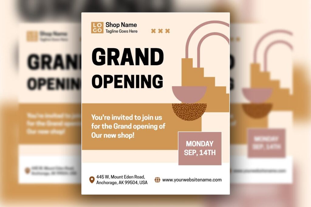
Skip the research phase and access proven event flyer designs with DesignWiz’s template collection, featuring layouts based on successful real-world event promotions across multiple industries.
- Family Gathering Event Flyer Template
- Elegant Grand Opening Event Flyer Template
- Friday Night Event Club Party Flyer Template
Success Pattern Identification Techniques
Look for repeated design choices across multiple successful flyers. Common success patterns include:
- Color psychology: What emotions do winning flyers trigger?
- Visual hierarchy: How do successful designs guide attention?
- Content focus: What information gets emphasized most?
- Action orientation: How do effective flyers motivate registration?
Legal Adaptation Methods
Never copy designs directly, but adapt successful strategies ethically:
- Use similar color psychology with different specific combinations
- Apply successful hierarchy principles with your unique content
- Implement effective CTA strategies with your original language
- Adapt layout principles while creating original visual elements
Creating Unique Angles from Competitor Analysis
Use research insights to differentiate your event flyer:
- If competitors use cool colors, consider warm alternatives
- Where others use generic stock photos, invest in authentic imagery
- If standard layouts dominate, experiment with creative arrangements
- When everyone emphasizes features, focus on attendee benefits instead
Why Your Event Flyer Fails on Mobile (and the 3-Minute Fix)
Mobile optimization isn’t optional anymore. With 78% of people discovering events through social media on their phones, flyers that don’t work on mobile devices essentially don’t exist to most potential attendees.
Mobile Viewing Behavior Statistics and Problems
People spend an average of 2.3 seconds evaluating content on mobile devices before scrolling past. Desktop-designed flyers fail on mobile because text becomes too small to read, buttons become too small to tap, and layouts require zooming that interrupts the viewing experience.
Critical mobile viewing facts that impact flyer success:
- 85% of mobile users abandon content requiring horizontal scrolling
- Text smaller than 14pt becomes unreadable for 60% of users
- Users expect mobile content to load within 3 seconds
- Poor mobile experience reduces event credibility by 40%
3-Minute Mobile Fix Process
Minute 1: Text Size Adjustment Increase all text to minimum 14pt size. Headlines should be 24pt or larger. This single change improves readability dramatically and ensures information remains accessible at typical viewing distances.
Minute 2: Layout Simplification Convert any side-by-side layouts to single-column arrangements. Stack information vertically rather than horizontally. This eliminates zooming requirements and creates smooth scrolling experiences.
Minute 3: Contrast Enhancement Increase contrast between text and background colors. Use online contrast checkers to ensure 4.5:1 minimum ratios. High contrast improves readability in various lighting conditions and for users with visual impairments.
Mobile-First Design Approach Priorities
When designing new flyers, start with mobile limitations and expand to larger formats:
- Design for smallest screen first then scale up for larger formats
- Prioritize essential information since mobile space is limited
- Use vertical layouts that work naturally on phone screens
- Test constantly on actual devices rather than computer simulations
Social Media Story Optimization Specifications
Optimize flyer dimensions for social media story formats where many people will encounter your event:
- Instagram/Facebook Stories: 1080 x 1920 pixels (9:16 aspect ratio)
- Text safe zone: Keep important information in center 1080 x 1420 pixel area
- File size: Under 30MB for optimal loading speed
- Duration consideration: Design for 3-5 second viewing windows
Get started with mobile-optimized social media flyer templates on DesignWiz, pre-sized for Instagram Stories and Facebook posts to ensure your event looks perfect on every device.
- Creative Art Exhibition Event Flyer Template
- Digital Marketing Event Promotion Flyer Template
- Floral College Reunion Party Flyer Template
Read More: Digital Flyers vs. Print Flyers: Pros, Cons, and Best Uses
People Also Ask Section
- What software should beginners use to Create Your Own event Flyer?
DesignWiz is the easiest with templates, drag-and-drop editing, and free features. Adobe Express offers similar tools with more advanced options. Google Slides works for simple, collaborative designs. Avoid Photoshop or InDesign unless trained, as they slow beginners down. - How far in advance should I create and distribute my event flyer?
Start once details (date, venue, speakers) are confirmed. Distribute based on type: 6–8 weeks for conferences, 3–4 weeks for social events, 2–3 weeks for entertainment, and 4–6 weeks for local/community events. Adjust for audience planning habits. - What’s the biggest mistake beginners make when designing event flyers?
Adding too much information without hierarchy. Focus on essentials (what, when, where, why attend) and direct readers to a site or registration page for extras. Clear, simple flyers always outperform cluttered ones. - How do I make my event flyer stand out on social media?
Design mobile-first with bold visuals, high contrast, and large readable text. Create platform-specific versions: square for Instagram, vertical for stories, horizontal for Facebook. Use compelling images, event hashtags, and ensure info stays visible even if cropped. - Should I hire a professional designer or create my own event flyer?
DIY works if you have more time than budget and can learn as you go. Hire a pro if your event has high stakes, strict timelines, or brand visibility at risk. A hybrid option is using professional templates and customizing them.
FAQs
- What file format should I use for printing event flyers?
Use PDF at 300 DPI with embedded fonts to keep colors, fonts, and layouts consistent. JPG works for home printing but may lose quality. Avoid PNG, since it’s screen-optimized. Always request print proofs for big events. - How many colors should I use in my event flyer design?
Stick to 3–4 colors: 60% dominant, 30% secondary, 10% accent. This keeps designs professional, balanced, and cost-efficient. More colors can clutter the flyer and raise printing costs. - What information is absolutely essential on every event flyer?
Include: event name, date/time, location (or link), main benefit, registration method, and contact info. Extra details (like agendas or bios) should be linked instead of crowding the design. - How do I choose the right size for my event flyer?
8.5 x 11 works for most events, while 11 x 17 suits premium/detailed flyers. For digital, use social sizes (1080×1080 for posts, 1080×1920 for stories, 1200×630 for Facebook covers). Create multiple sizes for flexibility. - Can I use photos from Google Images in my event flyer?
No. Most require paid licenses. Use royalty-free sources like Unsplash, Pexels, or Freepik—or original photos. Always check licensing and keep usage records. - How do I make my event flyer accessible for people with disabilities?
Use high-contrast colors, clear fonts, and alt text for images. Do not rely only on color for key info. Provide contact details for accommodations and consider large-print versions when needed. - What is the best way to test my event flyer before printing hundreds of copies?
Print one test copy on your paper stock and check readability, colors, and impact in real conditions. Share digital versions for feedback and proofread carefully fixing errors after bulk print is costly.
Conclusion
Creating professional event flyers doesn’t require design school or expensive software. It requires understanding psychology, following proven processes, and avoiding common mistakes that signal amateur work.
The techniques in this guide work because they’re based on how people actually behave, not how we wish they behaved. The 4-step process ensures clarity before creativity. Image selection hacks trigger emotional responses. Typography rules create professional credibility. Color psychology motivates immediate action. Layout techniques guide attention naturally. CTA positioning converts interest into registrations. Research methods reveal winning patterns. Quality control prevents costly mistakes. Mobile optimization reaches today’s audiences.
Start with one technique from this guide for your next event flyer. Master that element, then add another. Within a few events, you’ll be creating promotional materials that consistently drive higher attendance and establish your reputation as a professional event organizer who understands marketing fundamentals.
Reference
- Infographics: Visual hierarchy – University of Hull Library.
- Visual Hierarchy – Interaction Design Foundation.
- Choosing the Right Visual for Social Media: Comparing the Engagement of Stock Photos Versus Natural Photos – University of Florida Stock Photo Effectiveness Study.
- Glance-Based Legibility – MIT Typography Cognitive Processing Research.