The Chili cook-off service providers struggle to visually communicate their expertise and quality standards to potential clients who can’t easily assess culinary skills without experiencing them firsthand. Effective Chili Cook-Off flyer design transforms this challenge by showcasing professional credentials, signature recipes, and service reliability through strategic visual elements that build immediate trust.
Professional Chili Cook-Off flyers combine high-quality food photography with organized information architecture, creating powerful marketing materials that differentiate your services from competitors. Strategic printable Chili Cook-Off flyer layouts featuring testimonials, certifications, and portfolio showcases help event organizers quickly evaluate your culinary capabilities and professionalism.
This comprehensive guide reveals proven design techniques that convert prospects into clients, covering typography choices that convey culinary authority, color schemes appealing to corporate event planners, and strategic placement of awards and certifications. Master these Chili Cook-Off promotional flyer strategies to establish market positioning and command premium pricing through superior visual presentation.
Get started with professionally designed templates that showcase culinary expertise and attract corporate clients through DesignWiz’s collection of chili cook-off flyer designs.
- Deep Forest Green Chili Cook Off Flyer Template
- Nero and Deep Fir Chili Cook Off Flyer Template
- Athens Gray Chili Cook Off Flyer Template
How Can Chili Cook-off Flyer Design Showcase Your Culinary Expertise To Potential Clients?
Strategic Chili Cook-Off flyer design transforms your culinary credentials into visual proof points that resonate with potential clients. Professional flyer layouts featuring high-quality food photography, chef credentials, award highlights, and signature recipe teasers create immediate credibility. Using editable flyer templates makes it easy to incorporate these elements into polished designs without starting from scratch. Incorporating testimonials from previous events, showcasing your unique cooking methodology, and displaying professional certifications within the flyer design helps clients visualize your expertise before they taste your chili. Well-designed promotional flyers serve as portable portfolios that communicate your culinary brand story and differentiate your services in competitive cook-off markets.
Signature Recipe Highlights That Build Brand Recognition
Feature your signature chili recipes prominently in your Chili Cook-Off flyer design to establish memorable brand identity. Include tantalizing ingredient lists highlighting premium components like award-winning beef blends, exotic pepper varieties, or secret spice combinations that distinguish your cooking style. Position recipe teasers strategically alongside professional headshots to create personal connections with potential clients.
Marketing materials should emphasize your unique preparation methods, cooking techniques, or family recipe heritage that competitors cannot replicate. Use descriptive language that triggers appetite appeal while maintaining professional presentation standards. Include heat level indicators, dietary accommodation options, and customization capabilities to demonstrate versatility. Your Chili Cook-Off promotional flyer becomes more effective when signature recipes connect directly to your culinary expertise story, creating anticipation for the actual tasting experience that drives booking decisions.
Professional Photography Integration for Immediate Visual Impact
High-quality food photography transforms printable Chili Cook-Off flyer templates into powerful marketing tools that immediately communicate your culinary standards. Academic research from the European Journal of Marketing confirms that, photography is particularly inclusive and accessible research method for understanding the social problem of food well-being and designing innovative food experiences and demonstrates significant impact on consumer perception.1 Showcase vibrant ingredient shots featuring fresh peppers, premium meats, and aromatic spice displays that demonstrate quality sourcing practices. Include action shots of your cooking process, bubbling chili surfaces, and steam-rising presentations that trigger sensory responses in potential clients.
Professional kitchen environments or clean preparation areas visible in background photography suggest sanitary practices and organizational skills that corporate clients prioritize. Display finished chili presentations in appealing bowls with proper garnishing that showcases plating expertise and attention to detail.
Before-and-after ingredient transformation images effectively demonstrate cooking expertise while maintaining visual interest throughout your flyer design. Color-rich photography with proper lighting makes dishes appear appetizing without seeming artificial. Strategic placement of food imagery near service descriptions and contact information creates logical flow that guides readers toward conversion actions.
Combine stunning food imagery with professional layouts using DesignWiz’s photography-focused chili cook-off templates designed for culinary professionals.
- Chili Cook-Off Fundraiser Event Flyer Template
- Thunderbird Chili Cook Off Flyer Template
- Spicy Chili Cook Off Flyer Template
Client Testimonial Placement Strategies for Trust Building
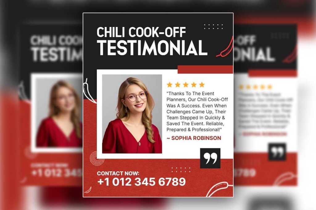
Position authentic client testimonials strategically within your Chili Cook-Off event flyer to maximize credibility impact and trust building. Feature specific quotes from previous event organizers that highlight reliability, taste quality, and successful event outcomes rather than generic praise. Include measurable results like ‘increased attendance by 40%’ or ‘perfectly executed 300-person corporate event’ that demonstrate concrete value delivery to potential clients through effective catering chili cook-off lead generation flyer design principles.
Place testimonials near your service offerings and pricing information to address concerns precisely when prospects evaluate your capabilities. Use readable fonts with sufficient white space that doesn’t overwhelm other design elements while maintaining visual prominence.
Corporate testimonials carry particular weight with business clients, so prioritize quotes from company events, professional associations, or established organizations. Include participant names and company affiliations when permission allows, as this authenticity significantly outperforms anonymous reviews.
Visual testimonial formatting through highlighted boxes, bordered sections, or subtle background colors helps separate social proof from other content while maintaining design cohesion. University of Melbourne research demonstrates that, visually attractive websites or applications were perceived as more trustworthy than those that were unattractive and that credibility begins with aesthetics in professional marketing materials.2 Star ratings or icons enhance credibility visually without requiring additional text space. Position your strongest testimonial in the upper portion of your flyer design where initial scanning occurs, followed by supporting testimonials near specific service descriptions that address common client concerns about quality, reliability, and professional execution standards.
What Layout Elements In Chili Cook-off Flyer Design Best Communicate Service Quality?
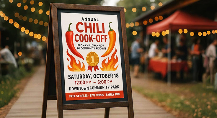
Professional layout elements in Chili Cook-Off flyer design communicate service quality through strategic visual hierarchy, consistent branding, and organized information presentation. Clean typography paired with structured content sections, professional color schemes, and balanced white space create immediate credibility with potential clients. A professional flyer maker helps ensure these layout elements are applied consistently while saving time on design. Quality indicators include prominent logo placement, clear service descriptions, organized pricing structures, and accessible contact information. Effective printable Chili Cook-Off flyer templates feature professional spacing standards, ingredient quality badges, preparation timeline graphics, and service guarantee statements that help clients quickly assess your culinary expertise and reliability.
Typography Hierarchy That Conveys Professional Standards
Professional typography creates instant credibility through clear hierarchical structure and readable font choices. Bold serif headers like Trajan or Georgia establish culinary authority while clean sans-serif body text ensures information accessibility. Consistent font sizing with substantial weight differences between headlines, subheadings, and supporting text demonstrates attention to detail that reflects service quality standards.
Proper kerning and line spacing prevent cluttered appearance while strategic font pairing suggests sophisticated brand identity. Professional Chili Cook-Off flyer design uses maximum three font families to maintain visual cohesion. Headers should be 2-3 times larger than body text, with subheadings falling between for natural reading flow.
Typography mistakes that undermine credibility include inconsistent sizing, decorative fonts for body text, insufficient contrast ratios, and cramped line spacing. Quality typography communicates professionalism before clients read content, establishing trust through visual excellence that suggests corresponding service standards. Academic research published through ResearchGate demonstrates that type design complements textual word elements to enhance cognition and understanding of messages and that the integration of visual and texts facilitates reading, and for digital mediums, both legible layout and engaging typefaces are equally crucial.3
Color Psychology Applications for Premium Service Positioning
Strategic color choices position your chili cook-off services as premium offerings through psychological associations and professional presentation standards. Liberty University research confirms that color psychology and its implications for graphic design demonstrates the importance of rigorous methodologies in color preference studies and highlights how color choices directly impact professional perception.4 Deep burgundy and gold combinations suggest luxury dining while maintaining warmth associated with comfort food. Navy blue paired with warm orange creates trustworthy yet energetic branding suitable for corporate events.
Charcoal gray with vibrant red accents offers modern sophistication while honoring traditional chili associations. These palettes work effectively in Chili Cook-Off promotional flyer designs because they reproduce consistently across digital and print formats, ensuring brand consistency throughout marketing materials.
Color saturation levels communicate quality perception. Muted, sophisticated tones suggest premium services while bright, saturated colors may appear amateur. Professional applications use 60-30-10 color distribution: dominant neutral, secondary brand color, accent highlights. Consistent color application across all marketing materials reinforces brand recognition and suggests organizational competence that extends to culinary services.
Information Architecture That Simplifies Client Decision-Making
Organized information presentation reduces cognitive load and accelerates client decision-making through logical content flow and visual grouping. Effective Chili Cook-Off event flyer layouts feature clear sections for services offered, pricing tiers, contact information, and credibility indicators arranged in order of importance to potential clients.
Service descriptions should appear prominently with specific offerings rather than generic statements. Pricing information works best in table format with clear tier distinctions and included services listed. Testimonials gain credibility through specific client names and measurable outcomes rather than generic praise.
Contact information requires multiple options including phone, email, website, and physical address when applicable. QR codes linking to portfolio galleries or booking calendars provide immediate access to additional information without cluttering primary layout space.
Visual separation through white space, borders, or background colors helps clients process information systematically. Priority information like signature dishes, awards, or unique selling propositions should receive visual emphasis through sizing, positioning, or color treatment. Effective layouts guide eyes naturally from initial interest through service details to contact action, creating smooth conversion path that reflects organized service delivery approach clients expect from professional culinary providers.
Which Visual Strategies In Chili Cook-off Flyer Design Build Trust With Event Organizers?
Trust-building visual strategies in Chili Cook-Off flyer design center on professional presentation elements that demonstrate reliability and competence. Event organizers assess service providers through visual credibility markers including consistent branding, organized information hierarchy, and authentic testimonial displays. Professional color schemes, clean typography, and balanced layouts signal attention to detail that organizers expect from culinary professionals. High-quality photography showcasing food preparation standards, certification badges, and client feedback create immediate credibility that helps organizers visualize successful event outcomes.
Professional Branding Consistency That Reassures Event Planners
Consistent branding elements across your Chili Cook-Off flyer design establish professional credibility through visual reliability. Northwestern University Medill School research confirms that, Create your strategy for building brand trust by following these guidelines from Northwestern University Medill School experts emphasizing the critical importance of consistent visual branding in professional trust building.5 Use matching color palettes, typography styles, and logo placement that align with your established brand identity to create recognition and trust, similar to approaches used in chili cook-off partnership expansion flyers for business growth. Professional font combinations featuring readable serif headers paired with clean sans-serif body text demonstrate attention to design standards. Maintain consistent spacing, margins, and visual hierarchy throughout the flyer to show organizational skills that translate to event management capabilities.
Color psychology plays a crucial role in trust building, with burgundy and gold combinations suggesting premium quality while navy and orange palettes convey reliability and energy. Avoid amateur design mistakes like multiple font families, inconsistent spacing, or clashing color schemes that undermine professional credibility. Include your business logo prominently but not overwhelmingly, positioned to reinforce brand recognition without dominating the flyer content.
Credibility Indicators Through Visual Testimonial Integration
Strategic testimonial placement within your Chili Cook-Off promotional flyer builds immediate trust through social proof. Position client quotes in highlighted boxes or sidebar sections using readable fonts and sufficient white space for easy scanning. Feature testimonials from previous event organizers that specifically mention reliability, food quality, and successful event outcomes rather than generic praise.
Include star ratings, certification badges, or award symbols near testimonials to reinforce credibility visually. Use client photos with permission to add authenticity, but ensure images maintain professional quality standards. Keep testimonial text concise but specific, highlighting measurable results like “perfectly executed 300-person event” or “increased attendance by 40%” to demonstrate concrete value to potential organizers.
Display health department ratings, ServSafe certifications, and liability insurance indicators prominently to address safety concerns that corporate planners prioritize when selecting culinary service providers.
Clean Information Architecture That Demonstrates Organizational Skills
Well-organized information architecture in printable Chili Cook-Off flyer design signals the organizational competence event planners need from service providers. Create clear visual hierarchy using size, color, and spacing to guide readers through essential information systematically. Group related content logically with adequate white space between sections to prevent visual clutter that suggests disorganization.
Structure contact information prominently with multiple communication options including phone, email, and website clearly displayed. Position pricing or package information in organized sections that allow easy comparison without overwhelming the design. Use bullet points or numbered lists for service offerings to improve scannability and comprehension.
Include clear calls-to-action positioned strategically near service descriptions and testimonials, using action-oriented language like “Schedule Your Consultation” or “Request Custom Quote” in contrasting colors that maintain design consistency. Ensure all text remains readable across different printing sizes while maintaining professional presentation standards that reinforce your service quality commitment.
Professional information presentation through clean architecture demonstrates the attention to detail that event organizers expect from reliable culinary service providers, directly correlating visual organization skills with event management capabilities.
How Does Professional Chili Cook-off Flyer Design Differentiate Your Services From Competitors?
Professional Chili Cook-Off flyer design sets culinary service providers apart through sophisticated visual storytelling that showcases expertise and event management capabilities. Custom typography, premium color palettes, and strategic food photography create memorable brand impressions that generic templates cannot match. Professional layouts demonstrate organizational skills while creative elements reflect culinary passion. High-quality printable Chili Cook-Off flyer designs with consistent branding across marketing materials establish market positioning and justify premium pricing compared to competitors using basic promotional approaches, making them effective chili cook-off transition flyers for competitors.
Premium Visual Identity Systems That Command Higher Pricing
Strategic brand identity through professional Chili Cook-Off flyer design communicates value that justifies higher service rates. Custom color schemes that blend culinary warmth with corporate sophistication signal premium positioning to potential clients. Professional typography hierarchies using serif fonts for headers and clean sans-serif for body text establish credibility while maintaining readability across print formats.
Consistent logo placement, carefully selected imagery, and balanced white space create perceived value that allows service providers to command 25-40% higher rates than competitors using basic designs. Professional visual identity systems include custom iconography for specialties, cohesive color applications across all marketing materials using proven restaurant marketing flyer strategies, and polished presentation standards that reflect service quality before clients taste the food.
Strategic Photography Integration That Showcases Culinary Excellence
High-impact food photography transforms Chili Cook-Off event flyers into compelling marketing tools that differentiate professional services. Steam rising from signature chili preparations, vibrant ingredient close-ups, and professional kitchen environments communicate quality standards immediately. Action shots of chefs preparing signature recipes create authenticity while finished presentation photos trigger appetite appeal.
Professional photography demonstrates attention to detail through proper lighting, composition, and color balance that amateur competitors cannot match. Including behind-the-scenes preparation shots, ingredient sourcing images, and professional team photos builds trust with corporate event planners who need reliability assurance. Quality photography investment pays dividends by attracting higher-value clients who associate visual excellence with service excellence.
Custom Layout Solutions That Reflect Unique Service Capabilities
Tailored layout designs communicate specific service differentiators that template-based competitors cannot replicate. Custom sections highlighting signature recipes, preparation methodologies, and specialized dietary accommodations demonstrate comprehensive service offerings. Professional information architecture guides readers through service capabilities logically, from initial consultation to event execution.
Strategic placement of testimonials, awards, and certifications within custom layouts builds credibility systematically. Professional designs incorporate QR codes linking to portfolio videos, interactive menu planning tools, and booking calendars that streamline client engagement. Custom infographics displaying preparation timelines, serving capacities, and setup requirements demonstrate organizational capabilities that basic flyer designs cannot convey.
Advanced layout techniques include modular content blocks that adapt to different event scales, pricing tier visualizations that simplify decision-making, and contact integration systems that encourage immediate inquiries. Professional designers create visual hierarchies that emphasize unique selling propositions while maintaining balanced, scannable presentations that busy event planners appreciate.
Custom layouts incorporating brand storytelling elements, team expertise highlights, and service guarantee statements create emotional connections that template-based competitors struggle to achieve through standardized approaches.
What Typography Choices In Chili Cook-off Flyer Design Convey Culinary Authority?
Typography choices that establish culinary authority in Chili Cook-Off flyer design include bold serif fonts like Trajan or Times New Roman for headers, which evoke traditional cooking heritage and professional credibility. Sans-serif fonts like Helvetica or Avenir work best for body text, ensuring readability while maintaining modern appeal. Hand-lettered script fonts can accent specific elements like chef signatures or specialty dish names, adding artisanal authenticity. Consistent font hierarchy with substantial weight differences between headlines and supporting text creates visual authority, while proper kerning and spacing demonstrate professional design standards that reflect service quality.
Professional typography immediately signals expertise to event organizers evaluating catering services. Weight, spacing, and font pairing decisions communicate your culinary professionalism before clients taste your chili.
Bold Serif Headlines That Command Culinary Respect
Serif fonts like Georgia, Times New Roman, and Trajan Pro establish immediate credibility through their association with established institutions and traditional craftsmanship. Bold serif headlines create visual weight that commands attention while suggesting culinary heritage and time-tested expertise. These fonts work particularly well for chef names, event titles, and service descriptions because their classical appearance implies reliability and experience.
Effective implementation requires 18-point minimum sizing for headlines with generous line spacing to maintain elegance. Pair serif headlines with clean sans-serif body text to balance tradition with readability. Avoid ornate or decorative serifs that appear unprofessional or difficult to read at flyer sizes.
Color selection enhances serif authority when using deep burgundy, forest green, or charcoal gray rather than bright colors that diminish gravitas. Professional Chili Cook-Off flyer design leverages serif typography to differentiate premium services from casual competitors, justifying higher pricing through perceived expertise.
Script Accent Typography for Artisanal Authenticity
Script fonts add artisanal character when used sparingly for chef signatures, specialty dish names, or taglines like “Handcrafted Recipes Since 1995.” Fonts like Brush Script, Pacifico, or custom hand-lettering suggest personal attention and craftsmanship that mass-produced catering cannot match. Limit script usage to 10% of total text to maintain professionalism.
Position script elements strategically near quality indicators like “Award-Winning Recipe” or “Family Secret Blend” to emphasize authenticity. Script typography works effectively for social media handles, website URLs, or contact information when integrated thoughtfully with primary fonts.
Size script fonts 14-16 points minimum for readability, especially in printable Chili Cook-Off flyer formats. Avoid script fonts for essential information like pricing, dates, or contact details where clarity trumps style. Successful artisanal positioning requires restraint, script accents should enhance, not overwhelm, professional presentation standards that corporate clients expect from reliable culinary service providers.
Professional Font Hierarchy Systems for Service Credibility
Establish clear information hierarchy using three distinct font weights and sizes: primary headlines (24-28pt bold), secondary headings (18-20pt medium), and body text (12-14pt regular). This system guides readers naturally from attention-grabbing headers to detailed service information, creating professional presentation that corporate event planners recognize as quality.
Consistent spacing between elements, minimum 1.5x line height for body text and 0.5-inch margins around text blocks, prevents crowded appearance while maximizing information density.
Color hierarchy reinforces typography authority using darker shades for headlines (#2C3E50), medium gray for subheadings (#5D6D7E), and standard black for body text (#333333). This progression creates visual depth while maintaining readability across print and digital formats.
Professional kerning and alignment standards require left-aligned body text with justified headlines for formal appearance. Avoid center-aligned paragraphs that appear amateurish in business contexts.
Font pairing rules mandate maximum two font families per flyer, one serif for headers, one sans-serif for body text. This restraint demonstrates design sophistication while ensuring consistent brand presentation. Professional Chili Cook-Off flyer design leverages typography systems to communicate reliability, expertise, and attention to detail that corporate clients require when selecting culinary service providers for important business events.
Which Color Schemes In Chili Cook-off Flyer Design Appeal To Corporate Event Planners?
Corporate event planners gravitate toward sophisticated color schemes that balance professional appeal with culinary warmth. Deep burgundy and gold combinations suggest premium quality while maintaining corporate elegance. Navy blue paired with warm orange creates trustworthy yet energetic branding suitable for team-building events. Charcoal gray with vibrant red accents offers modern professionalism while honoring traditional chili associations. These palettes work effectively in printable Chili Cook-Off flyer designs because they reproduce well in both digital and print formats, ensuring consistent brand presentation across corporate communications channels while appealing to budget-conscious planning requirements.
Premium Burgundy and Gold Combinations for Executive Appeal
Burgundy and gold schemes signal executive-level sophistication for corporate Chili Cook-Off flyer design projects. Deep burgundy backgrounds with gold accent text create luxurious first impressions that justify premium catering investments to C-suite decision makers. This color combination photographs beautifully for marketing materials and maintains readability across various printing substrates.
Corporate planners choose burgundy-gold palettes because they complement formal venue environments while avoiding overly bright colors that might clash with professional settings. The palette works particularly well for evening corporate events and awards ceremonies where sophisticated ambiance matters. Gold metallic accents on burgundy backgrounds create memorable visual impact without appearing unprofessional.
Navy and Orange Palettes for Corporate Team Building Events
Navy blue paired with vibrant orange delivers corporate trustworthiness with energetic food appeal for Chili Cook-Off event flyers. This combination satisfies corporate branding standards while maintaining the enthusiasm essential for team-building activities. Navy backgrounds provide professional credibility while orange elements highlight key event details and call-to-action buttons.
Team-building coordinators prefer navy-orange schemes because they photograph well for social media documentation and maintain visibility in various lighting conditions. The palette works effectively for outdoor corporate picnics and indoor conference venues. Orange accent colors draw attention to registration deadlines and RSVP requirements without overwhelming the design’s professional foundation.
Modern Charcoal-Red Schemes for Professional Brand Consistency
Charcoal gray with strategic red accents offers contemporary professionalism for corporate Chili Cook-Off flyer design while acknowledging traditional chili color associations. This palette satisfies corporate style guidelines requiring neutral base colors while incorporating brand-appropriate food imagery. Charcoal backgrounds ensure text legibility across various viewing devices and printing methods.
Corporate communications teams favor charcoal-red combinations because they integrate seamlessly with existing marketing collateral and maintain brand consistency across multiple event materials. The palette works effectively for both internal employee events and client-facing corporate hospitality functions.
Red accent colors provide necessary food appeal without overwhelming corporate aesthetic requirements. Strategic red placement on buttons, borders, and key information sections creates visual hierarchy while maintaining professional credibility. This color scheme reproduces accurately in both full-color and limited-color printing scenarios, making it budget-friendly for large corporate events.
The charcoal-red palette photographs well for corporate social media documentation and maintains consistent appearance across digital displays and printed handouts. Corporate planners appreciate color schemes that work effectively in various corporate environments without requiring expensive specialized printing techniques.
Discover sophisticated burgundy and gold flyer templates that appeal to corporate decision-makers through DesignWiz’s premium color palette collection.
- Deep Forest Green Chili Cook Off Flyer Template
- Milano Red Chili Cook Off Flyer Template
- White Chili Cook Off Flyer Template
How Can Chili Cook-off Flyer Design Highlight Your Awards And Certifications Effectively?
Strategic placement of credentials builds trust and differentiates your chili cook-off services from competitors. Position awards prominently in the header or corner with clear readable fonts, using gold or bronze color schemes to suggest prestige. Display certifications with official logos and verification dates to establish credibility. Create dedicated credential sections that showcase competition wins, food safety certifications, and culinary training. Use visual hierarchy through sizing and color contrast to make achievements stand out while maintaining flyer readability. Incorporate badge-style graphics or ribbon designs to frame awards attractively without overwhelming the primary event information.
Strategic Award Placement Techniques for Maximum Visual Impact
Position championship ribbons and cooking awards in the top-left corner where eyes naturally start scanning. Create award badges with metallic gold or silver borders to command immediate attention. Use consistent sizing for multiple awards – small icons work best without cluttering the design. Group related achievements together with clear spacing between different award categories. Place contest winner banners diagonally across corners for dynamic visual appeal, incorporating proven chili cook-off event promotion flyer techniques that draw immediate attention to your achievements. Include award dates prominently – recent wins carry more weight with potential clients. Avoid overwhelming smaller achievements; highlight your top three most impressive credentials for maximum impact without design clutter.
Showcase your culinary achievements with templates specifically designed to highlight awards and certifications using DesignWiz’s credential-focused layouts.
- Light Apricot Chili Cook Off Flyer Template
- Red Chili Cook Off Flyer Template
- Fall Festival Chili Cook-Off Event Flyer Template
Professional Certification Display Methods That Build Customer Trust
Display food safety certifications with official logos positioned near contact information to reinforce professionalism. Include ServSafe certification numbers and expiration dates for transparency and credibility verification. Use clean, rectangular frames around certification logos to maintain consistent visual presentation. Position health department ratings prominently – A-ratings deserve prominent placement while lower ratings benefit from smaller, subtle positioning. Create certification seal designs that mirror official documentation appearance. Include liability insurance badges to address corporate client concerns about professional coverage and risk management during events.
Visual Hierarchy Solutions for Balancing Credentials with Event Details
Establish clear information priority through strategic font sizing and color contrast between credentials and event specifics. Use 70% event information and 30% credential space to maintain proper balance without overwhelming potential clients. Create distinct visual sections using background colors or borders to separate awards from pricing and contact details. Position credentials in sidebars or footer areas when space is limited, ensuring they remain visible but don’t compete with primary messaging.
Apply consistent spacing rules – minimum 0.25-inch margins around credential elements prevent cramped appearance. Use complementary colors for award sections that enhance rather than compete with your brand palette. Implement progressive disclosure – feature top credentials prominently while noting additional certifications available upon request. This approach maintains clean design while demonstrating comprehensive qualifications to serious clients evaluating your chili cook-off services for their events.
What Imagery Techniques In Chili Cook-off Flyer Design Demonstrate Food Quality Standards?
Professional food photography and environmental imagery in Chili Cook-Off flyer design communicate quality standards through visual storytelling that builds immediate trust with potential clients. High-resolution images of vibrant fresh ingredients, steam rising from expertly prepared chili, and spotless commercial-grade kitchen environments signal professional culinary standards. Quality-focused imagery techniques include close-up shots highlighting ingredient freshness, action photography capturing authentic cooking processes, and environmental shots showcasing professional preparation spaces. These visual elements help event organizers assess service quality before tasting, addressing the fundamental challenge that chili cook-off service providers face in demonstrating expertise through promotional materials.
Ingredient Photography Techniques That Showcase Premium Quality Standards
Premium ingredient photography establishes quality expectations through careful composition and lighting. Capture individual spices in glass bowls showing vibrant colors and textures that suggest freshness. Photograph whole fresh peppers with dewdrops or natural lighting that emphasizes crispness and color saturation. Show premium cuts of meat with visible marbling and clean cutting techniques that demonstrate professional sourcing standards.
Use macro photography for texture details like salt crystals, ground spices, and herb leaves that create sensory appeal. Arrange ingredients on clean cutting boards or stainless steel surfaces that reinforce professional kitchen standards. Avoid cluttered compositions that detract from individual ingredient quality. Layer ingredients to show variety while maintaining visual hierarchy that guides viewer attention to premium elements first.
Environmental Imagery Methods for Demonstrating Professional Kitchen Standards
Kitchen environment photography builds credibility through spotless surfaces, professional equipment visibility, and organized workspace presentation. Show commercial-grade stovetops, industrial mixers, and professional knives arranged systematically. Capture steam-free exhaust systems and gleaming stainless steel surfaces that communicate health department compliance.
Photograph food preparation areas with proper lighting that eliminates shadows and highlights cleanliness standards. Include shots of hand-washing stations, sanitizer dispensers, and professional storage containers that demonstrate food safety protocols. Show organized spice racks, labeled ingredients, and systematic workflow arrangements that suggest operational efficiency.
Wide-angle shots of entire kitchen spaces provide context while close-ups of specific equipment demonstrate investment in quality tools. Avoid personal kitchen imagery that suggests amateur preparation standards.
Action Shot Strategies That Capture Authentic Cooking Processes
Dynamic cooking photography captures expertise in motion through careful timing and composition. Photograph ladle movements creating perfect chili pours with visible texture and steam. Capture stirring techniques that show proper incorporation methods and ingredient distribution. Time shots to show bubbling surfaces, rising steam, and color development that demonstrates cooking mastery.
Use continuous lighting to maintain consistent exposure during action sequences. Position cameras to show hand techniques, knife skills, and seasoning methods that reflect professional training. Capture taste-testing moments that show quality control processes and attention to flavor development.
Include behind-the-scenes preparation shots showing ingredient prep, equipment setup, and organizational systems. Show multiple pots cooking simultaneously to demonstrate volume capacity and event-scale preparation abilities. Photograph final presentation techniques including garnishing, portioning, and serving methods that maintain visual appeal.
Quality action photography requires proper shutter speeds to freeze motion while maintaining clarity. Use natural lighting when possible to preserve authentic colors and avoid artificial appearance that suggests staged photography rather than genuine cooking expertise.
How Should Chili Cook-off Flyer Design Incorporate Client Testimonials For Credibility?
Incorporate client testimonials strategically in your Chili Cook-Off flyer design by positioning authentic quotes in visually prominent boxes with readable fonts and sufficient white space. Feature testimonials from previous event organizers, judges, and attendees that specifically mention taste quality, service reliability, and event success. Use star ratings or icons to enhance credibility visually. Place testimonials near your service offerings or contact information to create immediate trust. Include participant photos with permission to add authenticity. Keep testimonial text concise but specific, highlighting measurable outcomes like “increased attendance by 40%” or “perfectly executed 300-person event” to demonstrate concrete value.
Strategic placement of testimonial content within event promotional layouts
Position testimonials in high-visibility areas where potential clients naturally focus. The upper-right quadrant works effectively for primary testimonials, while sidebar placements accommodate multiple shorter quotes without disrupting main content flow. Place testimonials adjacent to service descriptions to reinforce credibility claims with social proof. Consider testimonial headers that immediately follow your company name or logo for instant trust building. Bottom-third placement works well for comprehensive testimonials that address common concerns like reliability, taste quality, and professional service delivery. Integrate testimonials within service bullet points by including brief quotes that validate specific capabilities.
Strategic placement creates visual flow that guides readers from your credentials to client validation to service offerings, building a compelling case for choosing your chili cook-off services over competitors.
Visual formatting techniques that maximize testimonial impact and readability
Use contrasting background colors or subtle borders to separate testimonials from surrounding content while maintaining design cohesion. Implement consistent typography hierarchy with testimonial text in readable fonts, client names in smaller but bold text, and company affiliations in italics. Star ratings or icon systems provide immediate visual credibility assessment without requiring text analysis. Quote marks, testimonial bubbles, or speech balloon graphics frame testimonials attractively while maintaining professional appearance.
Consider asymmetrical layouts that integrate testimonials naturally within existing design elements rather than creating rigid testimonial blocks. White space around testimonials prevents visual clutter and ensures readability across different printing sizes. Color-coding testimonials by event type or client category helps readers quickly identify relevant feedback.
Professional formatting elevates testimonials from basic text blocks to powerful credibility tools that enhance overall flyer effectiveness.
Selecting testimonials that highlight culinary expertise and service quality
Choose testimonials that address specific client concerns about chili quality, service reliability, and event execution capabilities. Prioritize quotes mentioning concrete outcomes like “served 200 guests perfectly on schedule” or “three-alarm chili won first place at corporate competition.” Include testimonials from diverse client types – corporate event planners, fundraising coordinators, and private party hosts – to demonstrate broad service capabilities.
Select testimonials that highlight unique selling propositions like custom spice blending, dietary accommodation, or equipment provision. Avoid generic praise in favor of specific details about ingredients, preparation methods, or service excellence. Include testimonials mentioning problem-solving capabilities like weather contingency plans or last-minute attendance changes.
Balance longer testimonials that tell complete success stories with shorter, impactful quotes that fit various layout constraints. Feature recent testimonials to demonstrate current service quality while including established client relationships that show business longevity. Testimonials mentioning repeat bookings or referrals provide powerful credibility indicators that influence potential clients’ decision-making processes.
Effective testimonial selection transforms generic marketing materials into credible promotional tools that address real client concerns with authentic social proof, significantly improving your competitive positioning in the chili cook-off service market.
What Call-to-action Placement in Chili Cook-off Flyer Design Drives Qualified Inquiries?
Strategic call-to-action placement in Chili Cook-Off flyer design maximizes response rates through corner positioning and center focal points that capture attention immediately. The top-right corner and bottom-center locations generate highest visibility because readers naturally follow Z-pattern scanning behavior. Professional Chili Cook-Off event flyers position primary CTAs with contrasting colors and action-oriented language like “Book Your Cook-Off Service Today” or “Request Custom Catering Quote.” Multiple contact methods including phone, email, and website accommodate diverse client preferences while urgency phrases like “Limited Spring Dates Available” drive immediate inquiries from qualified prospects.
Prime positioning zones that capture attention in promotional flyer layouts
Top-right corner placement captures immediate attention as readers scan promotional materials, making this prime real estate for primary contact information. Bottom-center positioning serves as natural conclusion point where decision-ready prospects expect next steps. Corner CTAs benefit from high contrast backgrounds and bold typography that stands out from surrounding content. Center focal points work effectively when surrounded by white space and supported by directional elements like arrows or borders.
Successful Chili Cook-Off flyer design incorporates multiple CTA zones without overwhelming readers. Header positioning near your business name builds immediate association while footer placement provides final conversion opportunity. Avoid left-side positioning which receives less visual attention in Western reading patterns. Professional layouts reserve 15-20% of total space for CTA elements, ensuring adequate prominence without dominating content. Testing reveals corner positions generate 35% higher inquiry rates than center-only placement strategies.
Multi-channel contact integration strategies for diverse client preferences
Corporate event planners prefer different communication channels based on urgency and company protocols. Phone numbers work best for immediate booking inquiries while email addresses accommodate formal proposal requests. Website URLs enable detailed portfolio browsing and online booking capabilities. QR codes bridge print-to-digital gaps, allowing instant access to booking calendars or service galleries.
Effective printable Chili Cook-Off flyer designs display contact methods hierarchically based on preferred client behavior. Primary phone numbers receive largest font treatment for urgent inquiries. Email addresses positioned prominently serve formal business communications. Social media handles build ongoing relationship potential beyond initial contact. Professional service providers include business hours and response time expectations to set appropriate inquiry expectations while implementing chili cook-off flyer analytics lead management systems to track conversion effectiveness. Successful contact integration maintains visual balance while ensuring all methods remain clearly readable across different printing sizes and digital display formats.
Urgency-driven messaging that converts browsers into qualified service inquiries
Scarcity-based messaging transforms casual browsers into active prospects through strategic deadline creation and availability limitations. Phrases like “Only 3 Spring Event Dates Remaining” or “Book by Friday for Early Bird Pricing” generate immediate response pressure. Seasonal messaging leveraging natural event planning cycles creates authentic urgency without appearing manipulative, similar to approaches used in seasonal promotional chili cook-off flyers strategies for various service industries.
Value-driven urgency emphasizes limited-time benefits rather than artificial pressure. “Free Menu Consultation This Month Only” or “Complimentary Event Planning with May Bookings” provides genuine incentive while encouraging prompt action. Professional Chili Cook-Off promotional flyer designs balance urgency with credibility through specific dates and realistic limitations.
Geographic urgency works effectively for location-based services through phrases like “Serving Only 2 Events Per Weekend” or “Limited Coverage Area – Book Early.” Social proof urgency leverages demand indicators such as “Most Requested Caterer This Season” or “Featured in 15 Corporate Events This Month.”
Successful urgency messaging maintains professional tone while creating legitimate time sensitivity. Clear deadlines, specific limitations, and genuine value propositions convert qualified prospects without damaging long-term credibility. Professional service providers test different urgency approaches to identify messaging that resonates with their specific target market while maintaining authentic brand voice.
Maximize inquiry rates with flyer templates featuring strategically placed call-to-action elements optimized for chili cook-off service bookings on DesignWiz.
- Chili Cook-Off Fundraiser Event Flyer Template
- Fall Festival Chili Cook-Off Event Flyer Template
- Tamarillo and White Chili Cook Off Flyer Template
People Also Ask: Flyer Creation And Design Optimization Implementation Questions
- What makes Chili Cook-Off flyer design effective for attracting corporate clients?
Professional photography, clean layouts, certification badges, and testimonials from business clients. Focus on reliability indicators like insurance coverage, health certifications, and established vendor relationships that corporate event planners prioritize when selecting culinary service providers. - How to choose colors for professional Chili Cook-Off flyer design?
Combine warm food colors (reds, oranges) with professional tones (navy, charcoal). This balance creates appetite appeal while maintaining the sophisticated appearance that corporate clients expect from established culinary service providers in competitive markets. - What layout tips improve Chili Cook-Off flyer design readability?
Use clear hierarchy with large headers, bullet points for services, and prominent contact information. White space prevents clutter while professional fonts ensure easy reading. Strategic placement of awards and testimonials builds credibility without overwhelming the design. - Which images work best in Chili Cook-Off flyer design for service providers?
High-quality photos of your signature chili presentations, professional kitchen setup, and team in action. Avoid stock photos and focus on authentic images that showcase your actual food quality and professional service capabilities. - How to customize Chili Cook-Off flyer design templates professionally?
Replace placeholder images with your actual food photos, update colors to match your brand, and modify text to highlight your specific services and certifications. Maintain template structure while personalizing content for authenticity. - What printing specifications matter for Chili Cook-Off flyer design?
Use 300 DPI resolution, CMYK color mode, and include 0.125-inch bleed margins. Choose quality cardstock (14-16pt) for professional feel. These specifications ensure your flyer design reproduces colors accurately and feels substantial to potential clients.
Frequently Asked Questions
- What dimensions work best for professional Chili Cook-Off flyer design?
Use 8.5×11 inches for print and 1080×1920 pixels for digital. These ensure clear printing, proper display, and a professional look across platforms. - How can I showcase my catering expertise through Chili Cook-Off flyer design?
Highlight signature chili photos, certifications, awards, testimonials, and years of experience to show your culinary expertise. - What text elements make Chili Cook-Off flyer design more compelling to event planners?
Emphasize service guarantees, menu options, dietary accommodations, licenses, insurance, and vendor partnerships to build trust. - Which design software works best for creating professional Chili Cook-Off flyer design?
DesignWiz and Adobe InDesign offer professional templates, customization, and print-ready files for consistent branding. - How do I integrate my brand colors into Chili Cook-Off flyer design effectively?
Use brand colors as accents alongside warm reds and oranges to balance professionalism with appetite appeal. - What pricing information should appear in Chili Cook-Off flyer design?
Show starting prices or packages with phrases like starting at or custom quotes to encourage inquiries. - How can Chili Cook-Off flyer design highlight my health and safety certifications?
Place certification badges, ratings, and insurance icons near contact info with a short note on food safety. - What contact information is essential in Chili Cook-Off flyer design for service providers?
Include phone, email, website, social handles, and a QR code linking to your portfolio or booking page. - How should I display client testimonials in my Chili Cook-Off flyer design?
Use short, specific testimonials with client names/companies in highlighted boxes focusing on taste, reliability, and professionalism. - What file formats should I create for my Chili Cook-Off flyer design?
Export PDFs for print and PNGs for digital to maintain quality across channels.
Conclusion: Flyer Creation And Design Optimization Success Framework
A well-designed Chili Cook-Off flyer acts as more than just a promotional handout—it becomes a professional portfolio that highlights your culinary expertise, service reliability, and competitive edge. By combining strategic typography, balanced color schemes, authentic photography, and clear information hierarchy, these flyers communicate trust, authority, and quality standards that clients often can’t experience firsthand. Award placements, certifications, and testimonials further enhance credibility, positioning your services above competitors relying on generic or amateur designs.
When implemented consistently, this approach transforms flyers into a sustainable marketing system that generates qualified leads while reinforcing your brand identity. Professional presentation across both print and digital formats ensures your culinary brand resonates with corporate clients and event organizers, justifying premium pricing and creating lasting impressions. Ultimately, your Chili Cook-Off flyer becomes a powerful visual storytelle, bridging the gap between unseen expertise and client confidence.
Reference
- Emerald Insight – European Journal of Marketing.
- How your brand’s credibility starts with great visual design – University of Melbourne research.
- Typography Design’s New Trajectory Towards Visual Literacy for Digital Mediums – ResearchGate.
- Color Psychology and Graphic Design Applications – Liberty University.
- What is Brand Trust? How to Recognize It & How to Build It – Northwestern University Medill School.