Many people create a flyer to share offers, events, or important messages. But if the flyer design is not done well, people may ignore it or throw it away. This can waste your time and money. Often, small design mistakes like using too much text, poor image quality, or messy layouts can make a big difference in how your flyer is received. By understanding where things usually go wrong, you can avoid these mistakes and ensure your flyer gets noticed and read.
Designing Flyers? Don’t Make These Mistakes
You have ideas about how to make a flyer; still, what things affect your flyers? Let’s dive into what common flyer design mistakes you need to avoid:
Mistake 1: Too Much Text
Why it happens?
Flyers often get overloaded with long paragraphs and excessive information, which overwhelms readers. Since most people skim flyers rather than reading every word, important details get lost or ignored.
How to avoid?
Keep your content material easy and focused. Include the subsequent crucial elements:
A Clear, Bold Headline
This grabs interest and conveys the primary message at a glance.
The Essentials
Clearly kingdom the important thing information:
- What? (Event or promoting)
- When? (Date and time)
- Where? (Location or platform)
- How? (Instructions or information on participation)

Lilac & Finn Essential Oils Flyer
Pro Tip: If your flyer resembles a singular, it’s time to cut it down. Stick to the “five seconds rule” if someone cannot grasp the primary message in five seconds, your flyer is probably too cluttered. Aim for readability and conciseness to make certain your target market can quickly recognize the reason and take movement.
Mistake 2: Poor Font Choices
Why it happens?
Using fancy or ornamental fonts can make your flyer difficult to read. While unique fonts might look attractive, they often distract from the message and frustrate your audience. Overusing different fonts can also make the flyer appear unprofessional and amateurish.
How to avoid?
- Stick to a maximum of two to three fonts to maintain consistency and clarity.
- Use bold, eye-catching fonts for headlines to grab attention.
- Choose simple, readable fonts for body text and important details. Tools like AI font pairing generators can help select complementary fonts that enhance readability.
- Ensure your font choices reflect the tone of your message while being easy to read at a glance.
| Good Font Choices | Avoid |
|---|---|
| Montserrat | Comic Sans |
| Poppins | Papyrus |
| Open Sans | Overly Script-like Fonts |
| Roboto | Curlz MT |
Thoughtful font selection improves the flyer’s overall impact and ensures your message is communicated clearly and effectively.message is communicated effectively.
Mistake 3: Bad Color Combinations
Why it happens?
Applying clashing colors will make your flyer difficult to read and even uncomfortable to view. Improper color selection will draw attention away from your message and create a somber effect on it.
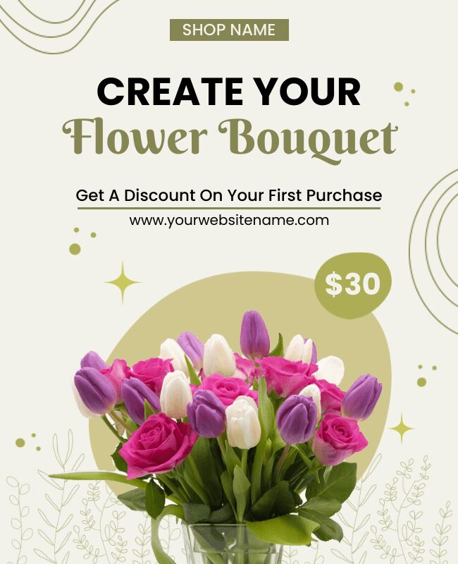
Flower Bouquet Flyer
How to avoid:
- Employ a balanced color scheme with high contrast to provide good readability and a visually pleasing design.
Use Contrasting Colors:
- Choose contrasting colors to stand out and make the text easily readable. This makes the important records draw attention.
Maintain a Single Color Scheme:
- Select a color palette that is compatible with your brand image. Consistency in color helps you direct your emblem image and create a professional appearance.
Steer Clear of Neon Colors:
- Except when you’re specifically creating a 90s retro flyer, avoid overwhelming neon sunglasses that are painful to the eyes.
Examples of Good vs. Bad Combinations
- Good: Black text on a white or moderate history is simple to study and offers clean visibility.
- Bad: Yellow text on a white historical past is hard to examine and may encourage frustration in your target market.
By selecting proper color schemes, you may be able to adorn the exposed be exposed beauty of your flyer as well as ensure that your message is delivered absolutely and precisely.
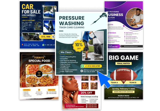
Mistake 4: Low-Quality Images and Graphics
Why it happens?
Using photos that are blurry, stretched, or pixelated can make your flyer look much less professional. Poor visuals take attention away from your message and can make people dislike your brand.
How to avoid?
Employ high-resolution, appropriate photos that support your message to assure professionalism and interest.
Use High-Resolution Images:
- Ensure that the pictures are fantastic; the purpose is to produce 300 DPI (dots per inch) for print substances and at least one hundred fifty DPI for digital formats. This ensures readability and sharpness to your visuals.
Ensure Relevance:
- Select photographs that might be pertinent to the flyer’s purpose. Relevant pictures decorate your message and interaction with your target audience efficiently.
Avoid Cheesy, Overused Stock Photos:
- Steer clear of clichéd pix, just like the regularly occurring handshake photo, that may make your flyer seem unoriginal and uninspired.

Bold Furniture Flyer Template
Pro Tip: Not every time need images; explore flyer background ideas that could raise the effectiveness of your flyer design while maintaining originality.ground ideas that could raise the effectiveness of your flyer design while maintaining originality.
Mistake 5: Unclear Call-to-Action
Why it happens?
Forgetting to tell people what to do next can cause missed opportunities. Without a clear CTA, your target audience can be uncertain about how to interact further, lowering the effectiveness of your flyer.
How to avoid?
Use a strong, action-oriented CTA in a prominent location with explicit directions to direct your audience on the next steps.
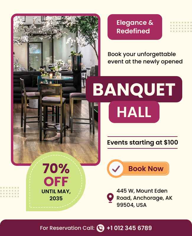
Creative Banquet Hall Flyer
Placement Matters:
Position your CTA in a visible spot where it stands proud. Consider placing it near the pinnacle or backside of the flyer, or inside a colored container to attract interest.
Make Your CTA Bold and Action-Driven:
Use sturdy, persuasive language that encourages on-the-spot movement. Examples include:
- “Buy Now—Limited Offer!”
- “Scan the QR Code to Register!”
- “Call Now for More Details!”
Design Tips: When crafting your flyer, especially for events consider these design tips for banquet flyers to enhance engagement:
- Use bigger font sizes for your CTA than those for the de-stressing of the text material to make it grab the reader’s attention.
- Use a QR code on the flyer that enables the reader to access important information and promotions instantly.
With an included clean and productive call-to-action, you guide your intended market through what action to take, increasing the odds of involvement and conversions.
As per studies making use of particular and action-oriented language in CTAs ca
Mistake 6: Poor Flyer Layout and Spacing
Why it Happens?
Trying to fit too much information in one flyer makes it look crowded and hard to follow. A messy layout overwhelms the reader, causing them to lose interest quickly.
How to Avoid?
Keep your flyer layout clean and easy to follow. Use proper spacing, a clear structure, and a simple visual order so people can quickly understand the message. If you’re unsure where to start, looking at some flyer layout ideas can help you find the best way to organize your content.
Use a Grid System:
- Implement a grid format to align elements smartly. This creates an established look, making it less difficult for readers to navigate the content material.
Leave White Space:
- Incorporate white areas strategically to enhance readability and decrease clutter. Ample spacing facilitates highlighting key records and allows the design to breathe.
Highlight Key Details:
- Place crucial data, together with the headline, date, and speak-to-action at the top of the flyer. This ensures that these elements grab interest first.

Car Dealership Flyer
Pro Tip: A properly prepared flyer keeps readers engaged and encourages them to absorb the facts. By exploring flyer layout ideas and specializing in format, you enhance the general effectiveness of your flyer.r.
Mistake 7: Ignoring Branding
Why it Happens?
Many flyers fail to follow a consistent brand identity, which weakens brand recognition and trust. Without clear branding, your audience may not connect the flyer with your business, making your message feel less meaningful or memorable

Green & Red Christmas Cake Sale Flyer
How to Avoid?
Use your brand’s logo, color palette, fonts, and tone throughout your flyer to build a strong, recognizable identity.
Add Your Logo
Position your logo centrally on the flyer. It builds brand identity and helps recipients immediately recognize your brand.
Use Consistent Fonts and Colors
Ensure your flyer design is consistent with your brand standards. AI color palette generator and font give your brand a consistent look that creates brand familiarity.
Maintain a Consistent Tone
Regardless of whether your brand voice is formal or relaxed, apply the same tone across all marketing messages. Consistency builds familiarity and trust with your customers.
Recall: Effective branding makes your flyer not only recognizable but also credible to your target audience. Effective brand imagery can get your flyer noticed and leave a memorable mark.
According to Northwestern University emphasizes, simplicity and readability in flyer design. They advise using no more than two fonts to maintain legibility and suggest creating a visual hierarchy with a strong headline and high-quality images. 2le mark.
Mistake 8: Overuse of Special Effects
Why it Happens?
Using too many design effects like shadows, gradients, or 3D elements can make a flyer look outdated and unprofessional. These extras often distract from the core message instead of enhancing it.
How to Avoid?
Stick to clean, minimal effects that support your design not steal the spotlight.
Avoid Overuse of Effects
Minimal use of effects that complement your design instead of overwhelming it is key. It’s all about simplicity to get a clean, classy look.
Keep It Readable
Steer clear of dense shadows or gradients that cover up text. Keep all content readable and easy to read, as readability is essential for good communication.
Adhere to Current Design Trends
Adopt clean, flat designs that are likely to work better and look more professional. Keeping up with design trends can make your flyer connect with modern audiences.

Streaming Podcast Flyer
Remember
A clean and minimal flyer is one that catches attention without overwhelming the viewer with exce
Mistake 9: Ignoring Customer Needs
Why it Happens?
When you create a flyer without considering your audience’s interests, struggles, and preferences, it’s unlikely to make an impact. A generic message often fails to connect and leads to poor engagement.
How to Avoid?
Understand your audience and tailor your flyer’s message, visuals, and layout to speak directly to their needs.

Sky Blue Pet Flyer
Know Your Audience
Research your target audience to make sure your flyer addresses their interests and pain points directly. Knowing your audience is the key to successful communication.
Use Customer-Focused Language
Word your message to emphasize the advantages to your audience instead of just cataloging features. This way, your flyer becomes more attractive and meaningful.
Design for Readability
Select fonts, colors, and arrangements that match your audience’s expectations and likings. A readable and good-looking flyer maximizes user experience.
Test and Improve
Test your flyer on a sample audience to improve it before mass distribution. Adding actual user feedback will make you produce a better marketing tool.
One-line takeaway: A flyer that fails to serve customer needs is nothing but a piece of paper make it useful, and it becomes an effective material.
What Are the Benefits of a Well-Designed Flyer, and Why Does It Matter?
A well-designed flyer can be a powerful marketing tool that grabs attention, delivers the message clearly, and prompts action from your target audience. When designed properly, flyers stand out and make an immediate impact, whether displayed in a storefront, handed out at an event, or sent through the mail.
1. Increased Visibility
A flyer with a clean and attractive design ensures that your message doesn’t go unnoticed. With the right balance of colors, fonts, and images, your flyer can easily attract attention and make a lasting impression.
2. Effective Communication
The key to a successful flyer is clear, concise communication. Well-designed flyers use bold headlines and essential details to convey important information quickly. This helps the audience understand the purpose of the flyer in seconds, making it more likely they will take action.
3. Boosts Credibility
A professional-looking flyer boosts your credibility. When potential customers see a polished design, they associate your brand with quality and trust. It shows that you put thought into your marketing materials and care about how your business is presented.
4. Encourages Engagement
Flyers with an effective call to action (CTA) are more likely to engage readers. Whether it’s signing up for an event, scanning a QR code, or making a purchase, a strong CTA guides the audience on what to do next, increasing conversions.
5. Cost-Effective Marketing
Flyers are a budget-friendly option for businesses, especially small ones. When designed well, they can deliver a high return on investment (ROI). Printing and distributing flyers can be done inexpensively while reaching a wide audience in various locations.
6. Brand Consistency
A well-designed flyer helps reinforce your brand’s identity by incorporating consistent colors, fonts, and logos. This consistency helps build brand recognition, making your business more memorable to potential customers.
FAQS
If your flyer feels busy or hard to scan quickly, it may be too cluttered. Stick to one main message, use white space wisely, and limit the amount of text to only what’s necessary.
Too many fonts can make your flyer look messy. Stick to one or two readable fonts to keep your design clean and professional.
Use bold text, contrasting colors, or larger fonts for important info like dates or offers. Place key details where the eye naturally goes usually the top or center.
Yes. Poor color choices can affect readability and mood. Use colors that contrast well and match your brand or event vibe.
Always include a call to action or contact info. Without it, people won’t know how to respond—even if they’re interested.
Use professional templates, check for typos, and preview your flyer before sharing. Tools like Flyerwiz help you get a polished look with minimal effort.
People Also Ask
1. What are the most common mistakes in flyer design?
Common flyer design mistakes include overcrowding the layout, using too many fonts or colors, and not maintaining visual hierarchy. These issues make it hard for the viewer to focus on the key message. Keeping the design simple, consistent, and readable is crucial for effectiveness.
2. How do you design a flyer that grabs attention?
To make a flyer stand out, use a bold headline, high-quality visuals, and strong contrast. Strategic placement of text and white space helps draw attention to key elements. The design should immediately communicate the purpose and include a compelling call-to-action.
3. What makes a flyer look unprofessional?
A flyer can appear unprofessional if it includes pixelated images, inconsistent fonts, poor alignment, or spelling errors. These flaws reflect badly on your brand and can lower trust. A polished, well-organized layout helps create a strong first impression.
4. How important is white space in flyer design?
White space improves readability and emphasizes the most important elements in your flyer. It helps the design breathe, guiding the viewer’s eye naturally through the content. Without white space, the flyer can feel cluttered and overwhelming.
5. How many fonts should be used in a flyer?
It’s best to use only one or two fonts in flyer design to maintain consistency and clarity. Too many fonts can look messy and distract from your message. A simple and readable font combination enhances professionalism and visual appeal.
6. Why is a call to action important on a flyer?
A clear call to action tells readers what step to take next like visiting a website, making a call, or attending an event. It boosts engagement and ensures the flyer serves its purpose. Without a CTA, even a great design might not lead to results.
Conclusion: Key Takeaways
To make sure your flyer stands out and works, it’s important to avoid common mistakes. Keep it simple and focused so your message gets across clearly.
Key Takeaways
- Keep it short and simple: Don’t overload your flyer with too much text make it easy to read quickly.
- Choose easy-to-read fonts. Use 2-3 fonts that are clear and match your style.
- Pick the right colors. Use colors that make the text easy to read and look good together.
- Add a clear call to action (CTA): Tell people exactly what to do next.
- Think about your audience: Design your flyer based on what your audience cares about and needs.
By following these tips, your flyer will grab attention and help you get the results you want.
References
- “Best practices for designing flyers”, Northwestern University Brand Tools. Retrieved April 25, 2025, from Northwestern University+4
- Promotional posters and flyer design considerations. Retrieved April 25, 2025, from the University of Tennessee.