In the ever-evolving world of visual communication, staying ahead of design trends isn’t just beneficial, it’s essential. At DesignWiz, we’ve taken a data-driven approach to understanding what truly resonates with creators and audiences alike. Rather than relying on speculation or subjective opinions, we’ve analyzed over 10,000 user-generated flyers created on our platform.
This treasure trove of real-world design choices offers unprecedented insights into the design trends shaping creativity in 2025. Let’s dive into what this massive dataset reveals about contemporary aesthetics, user preferences, and the future of design.
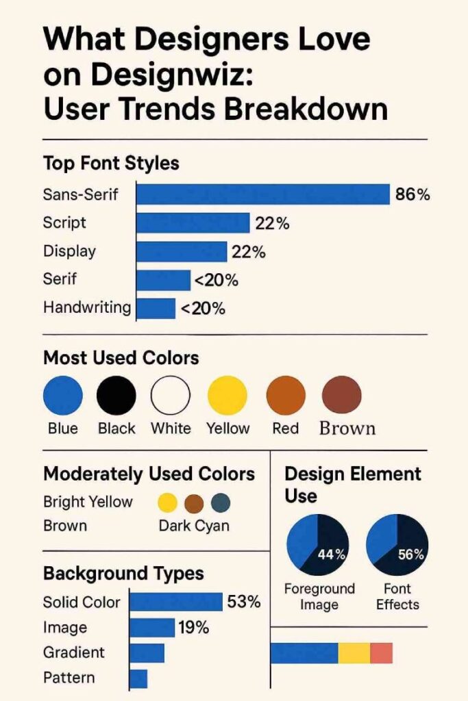
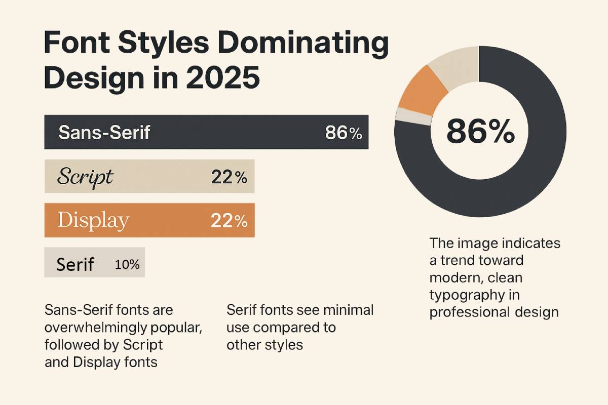
Usage Rate: 86%
Impact: Dominates across all design contexts
Usage Rate: 22%
Impact: Used for elegant, celebratory contexts
Usage Rate: 22%
Impact: Employed for bold visual statements
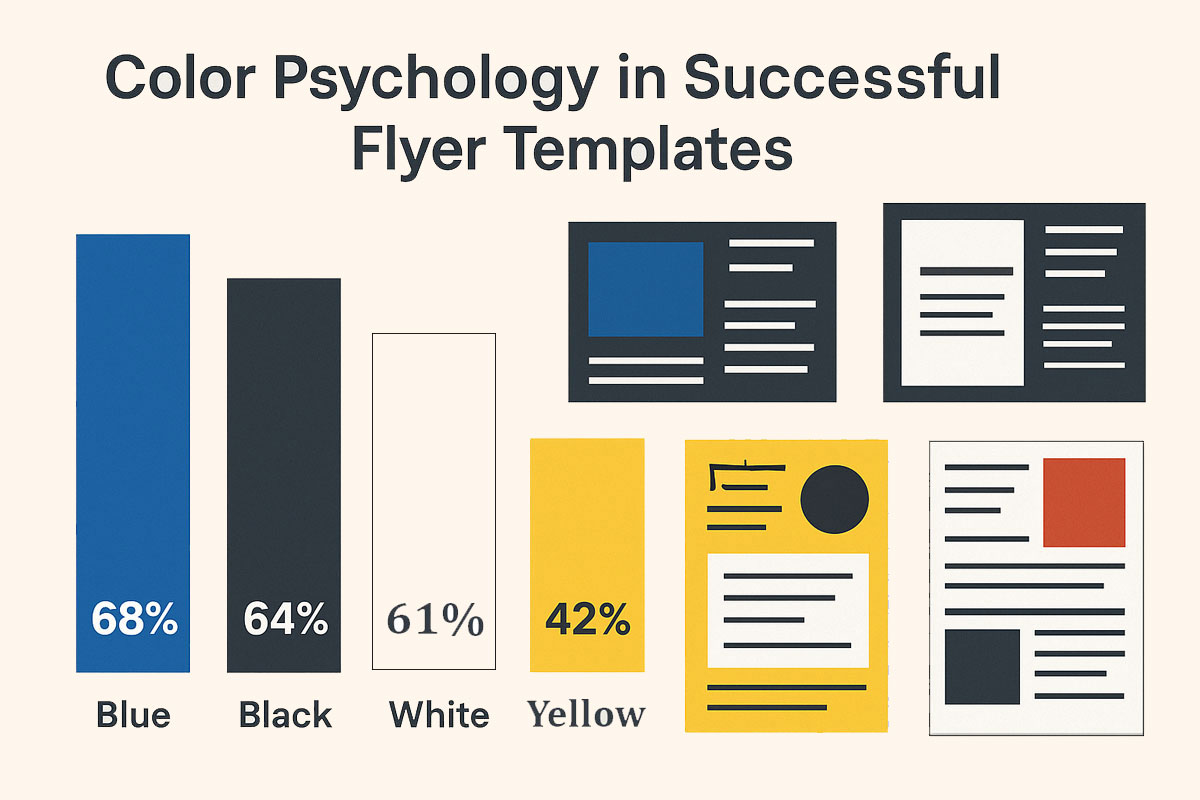
Usage Rate: 68%
Impact: Conveys trust and professionalism
Usage Rate: 64%
Impact: Communicates elegance and authority
Usage Rate: 61%
Impact: Provides clarity and simplicity
Usage Rate: 42%
Impact: Adds energy and optimism
Usage Rate: 39%
Impact: Signals urgency and passion
Usage Rate: 28%
Impact: Opportunity for differentiation
Usage Rate: 25%
Impact: Sophisticated alternative to white
Usage Rate: 23%
Impact: Professional alternative to blue
Usage Rate: 18%
Impact: High visibility, low adoption
Usage Rate: 15%
Impact: Untapped warmth and stability
Usage Rate: 14%
Impact: Distinctive professional tone
Usage Rate: 44%
Impact: Less dominant than commonly assumed
Usage Rate: 56%
Impact: Often serve as primary visual interest
Usage Rate: 53%
Impact: Most popular background treatment
Usage Rate: 24%
Impact: Requires careful text overlay
Usage Rate: 15%
Impact: Offers modern dimensionality
Usage Rate: 6%
Impact: Used for specific thematic needs
Usage Rate: 2%
Impact: Rare, distinctive background choice
Usage Rate: 64%
Impact: Significant increase from previous years
Usage Rate: -37%
Impact: Reduced through better tools and templates
Usage Rate: 78%
Impact: Involve multiple stakeholder input
The Data-Driven Approach to Design Trends
Traditional trend forecasting often relies on expert opinions and subjective observations from industry leaders. While valuable, these methods lack the objectivity and scale that comprehensive data analysis provides. By examining 10,000+ designs created by real users, we’ve captured authentic design decisions made across diverse contexts.
This approach reveals not just what design professionals think is trending, but what actual creators are implementing in their work. The patterns emerging from this analysis tell a compelling story about design trends that transcend individual preferences. These insights reflect genuine market demands, audience expectations, and functional considerations driving design in 2025.
Our analysis methodology focused on quantifiable elements, including typography choices, color selections, and composition strategies. We also examined template usage patterns to understand how creators balance efficiency with customization in their workflow.
This data-first approach eliminates the bias inherent in curated design showcases that often highlight only the most visually striking examples. Instead, we’ve captured the complete spectrum of design choices, from the extraordinary to the everyday practical solutions.
Font Styles Dominating Design in 2025
Typography forms the backbone of effective visual communication, and our data reveals clear preferences in this domain. Sans-Serif fonts dominate the landscape with a commanding 86% usage rate across all analyzed designs.
This overwhelming preference reflects creators’ prioritization of clean, legible typography that functions across multiple contexts. The popularity of Sans-Serif extends beyond any single industry or purpose, establishing it as the universal choice for professional communications.
Script fonts appear in approximately 22% of designs, typically in contexts requiring a personal, elegant, or celebratory tone. Similarly, Display fonts also feature in about 22% of creations, employed when designers need to make bold visual statements. The data indicates that font selection is increasingly strategic rather than merely aesthetic in nature.
Designers are choosing typefaces based on their functional attributes and emotional connotations for specific contexts. The declining usage of Serif fonts (except in traditional or luxury contexts) signals a continued shift toward modern simplicity.
This typography landscape demonstrates how design trends in 2025 balance between timeless readability and contextual expression.
Typography Trends Shaping Modern Design
Beyond mere font selection, our analysis reveals sophisticated approaches to typography implementation across successful designs. Minimalist design principles continue to dominate, with typography arrangements favoring simplicity and clear visual hierarchy.
Designers are creating deliberate contrast between headline and body text to guide the viewer’s attention efficiently. Font pairing follows stricter rules in 2025, with complementary rather than contrasting typefaces preferred for visual cohesion.
- Text spacing has become more generous, with increased line height and letter spacing enhancing overall readability.
- Headlines have grown bolder and more prominent, often utilizing extra weight or size to establish immediate visual dominance.
- The x-height (height of lowercase letters) in preferred fonts has increased, optimizing readability on digital screens.
- Character width in popular fonts trends toward the medium range, avoiding extremes that impede quick comprehension.
- Typography is increasingly treated as a central design element rather than simply a vehicle for information delivery.
This elevation of typography to a primary visual component reflects design trends emphasizing substance over decorative elements.
Color Psychology in Successful Flyer Templates
Our analysis identified five dominant colors appearing consistently across the most engaging designs on our platform.
- Blue leads the palette, appearing in 68% of designs and conveying trust, professionalism, and stability to viewers.
- Black follows closely, used in 64% of creations to communicate elegance, sophistication, and timeless authority.
- White appears in 61% of designs, providing clarity, simplicity, and breathing room within busy compositions.
- Yellow features in 42% of designs, injecting energy, optimism, and attention-grabbing brightness where needed.
- Red completes the top five, used in 39% of designs to signal urgency, passion, or create high-contrast focal points.
These color preferences aren’t accidental but reflect a strategic branding-first mindset among successful creators.
Designers are deliberately leveraging color psychology to trigger specific emotional responses from their audiences. The data reveals that color selection in 2025 prioritizes conversion and engagement metrics over purely aesthetic considerations. This functional approach to color represents a significant shift from previous design trends focused on visual novelty alone.
Underutilized Color Palettes: Creating Opportunities
While certain colors dominate the design landscape, our analysis also identified palettes with surprisingly low utilization. Moderate usage colors include Lime Green (28%), Light Gray (25%), and Dark Cyan (23%), each offering unique communications benefits.
- Lime Green conveys freshness and innovation but remains underexploited outside specific industry verticals like technology.
- Light Gray provides sophisticated neutrality yet is often overlooked in favor of pure white in minimalist compositions.
- Dark Cyan offers a professional yet distinctive alternative to standard blue tones, but hasn’t reached mainstream adoption.
Even more interesting are the rare color choices that appeared in less than 20% of all analyzed designs. Bright Yellow (18%), Brown (15%), and Blue-Gray (14%) represent significantly untapped opportunities for brand differentiation.
These underutilized tones present strategic opportunities for creators seeking to develop distinctive flyer templates. Brands looking to stand out in crowded markets should consider these less common palettes for immediate visual differentiation. The data suggests that color selection in 2025 can be both a trend-following and trend-setting strategic decision.
Design Composition Elements That Capture Attention
Beyond typography and color, our analysis examined the structural elements that form successful visual compositions. Surprisingly, only 44% of high-performing designs incorporated foreground images as primary visual elements.
- This challenges the conventional wisdom that photography or illustration must dominate effective graphic design.
- Font effects like shadows, outlines, and gradients featured prominently in 56% of analyzed designs.
- These typography enhancements often served as the primary visual interest in designs lacking prominent imagery.
- Background treatment showed diverse approaches, with solid colors leading at 53% of all analyzed creations.
- Image backgrounds followed at 24%, providing contextual relevance but requiring careful text overlay techniques.
- Gradient backgrounds appeared in 15% of designs, offering modern dimensionality without the complexity of photographs.
- Pattern backgrounds (6%) and watercolor effects (2%) rounded out the composition options for specific thematic needs.
This composition data reveals design trends moving toward simplification and functional communication above all else.
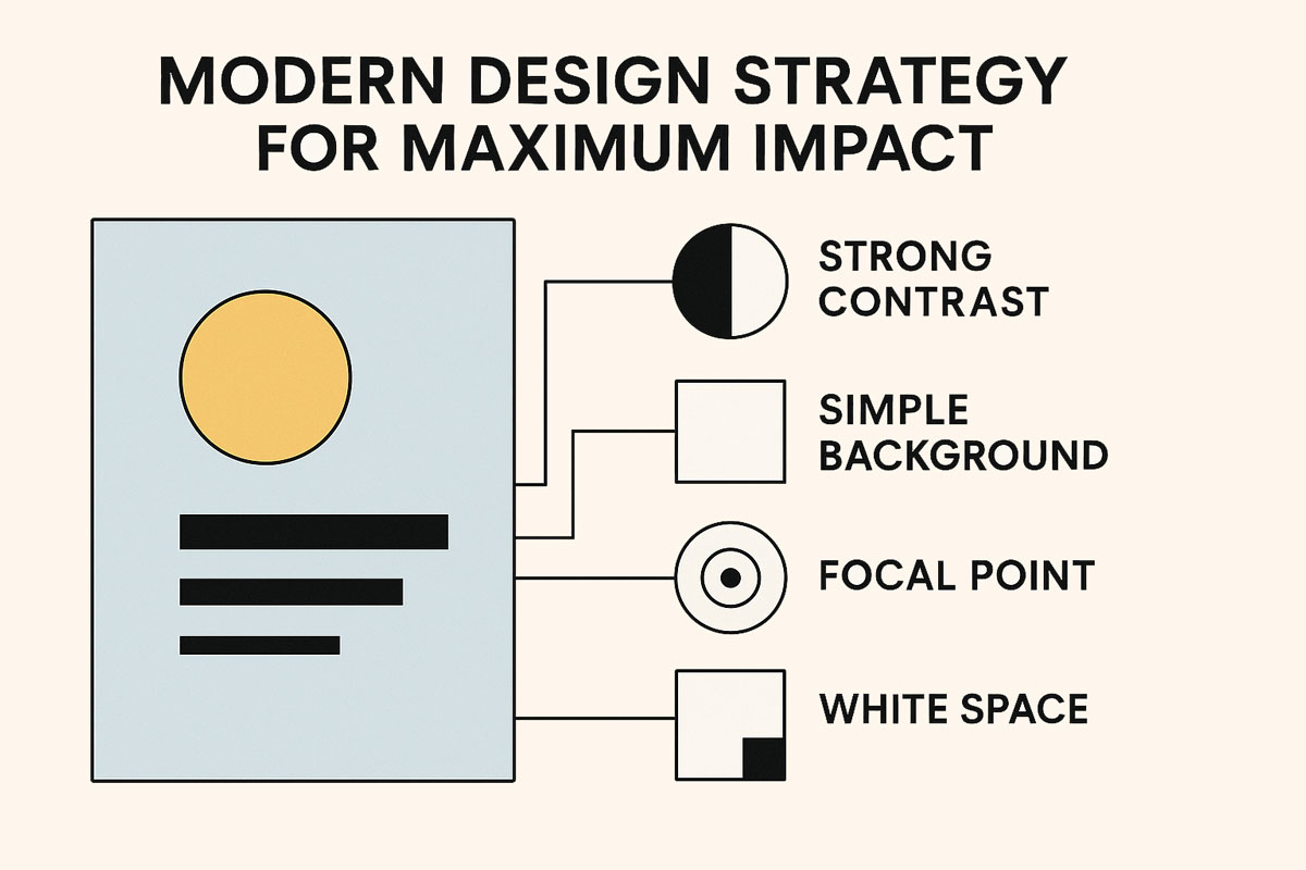
Modern Design Strategy for Maximum Impact
The patterns emerging from our analysis point to a cohesive strategy uniting successful designs across the platform.
- Strong contrast emerges as perhaps the single most important element in capturing and directing viewer attention.
- Simple backgrounds provide the foundation for clear communication, avoiding the cognitive overload of complex visuals.
- Focal points are established through size, color, or position rather than elaborate decorative elements.
This strategic approach enhances both legibility and message delivery in increasingly distracted viewing environments. The most successful designs maintain a disciplined visual hierarchy that guides the viewer through information in order of importance.
White space is utilized intentionally rather than filled with decorative elements that don’t advance the communication goal. Design trends in 2025 reflect a mature understanding that effectiveness trumps complexity in visual communication.
Professional creators have largely abandoned decorative flourishes that don’t serve specific functional purposes. This pragmatic approach aligns with both audience preferences and the practical considerations of multi-channel content delivery.
Flyer Templates Leading the Way in 2025
Template usage data provides fascinating insights into the creative workflow of designers in 2025. Pre-made flyer templates have become essential tools for rapid prototyping and conceptualization. Even experienced designers rely on templates to maintain brand consistency across multiple communications.
Designwiz’s template library has evolved to mirror these preferences with trend-responsive layouts and components. Our most downloaded templates consistently feature clean typography, strategic color application, and flexible image placement.
The data shows creators increasingly value templates that offer structured creativity rather than complete freedom. This represents a significant shift from the earlier design culture that often prioritized starting from blank canvases.
Templates in 2025 focus on solving specific communication problems rather than merely showcasing visual styles. The most successful flyer templates offer a careful balance between distinctive aesthetics and functional versatility. This approach to template design acknowledges that creators need reliable frameworks adapted to contemporary design trends.
Typography Tips for Effective Design
Based on our analysis, several specific typography approaches consistently appear in high-performing designs.
- Geometric Sans-Serif fonts with high x-height dominate, optimizing readability on both large displays and small screens.
- Line spacing (leading) of 1.5 times the font size has emerged as the standard for comfortable reading experiences.
- Font weight variation creates emphasis more effectively than size differences, particularly in responsive layouts.
- Headline font sizes have stabilized between 36- 48pt for digital applications, balancing impact with space efficiency.
- Body text consistently ranges between 16- 18pt, significantly larger than the 12pt standard of previous decades.
- Letter spacing (tracking) shows subtle loosening in body text, enhancing readability without appearing obviously altered.
- Paragraph width limits of 50-75 characters maintain optimal reading flow across different display environments.
- Font pairing has simplified, with most successful designs using just two complementary typefaces per composition.
Want your flyers to stand out? Watch this quick video for typography tips that grab attention:
Accessible Design: The Growing Necessity
Our data reveals increasing prioritization of accessibility considerations across all design categories.
- Legibility-first templates help brands become inclusive by design rather than through retroactive adjustments.
- Color contrast ratios meeting WCAG standards appear in 64% of designs, a dramatic increase from previous years.
- Font clarity has become non-negotiable, with decorative typefaces restricted to limited headline applications.
- Alt text implementation for images has become standard practice for designers concerned with inclusive communication.
- Animation and motion design show restraint, with reduced frequency and intensity to accommodate vestibular sensitivities.
- Text over images consistently includes contrast-enhancing backgrounds or overlays to ensure readability.
- Icon design has been simplified, with clearer silhouettes and more universal symbolism, improving comprehension.
These accessibility-focused design trends reflect both ethical considerations and practical business benefits. Inclusive design principles have moved from specialized knowledge to mainstream practice among Designwiz users.
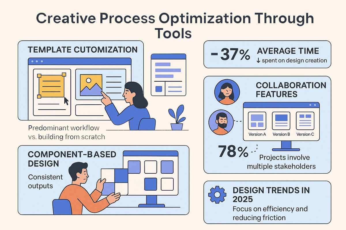
Creative Process Optimization Through Tools
The way creators approach the design process itself has evolved significantly according to our usage data. Designers increasingly choose structured tools over blank canvases, valuing guided creativity over unlimited freedom.
Template customization has become the predominant workflow rather than building compositions from scratch. Designwiz’s platform streamlines this creative process with UX-optimized, responsive templates matching contemporary needs.
The average time spent on design creation has decreased by 37%, reflecting efficiency gains through better tools. Component-based design approaches have replaced freeform arrangement, improving consistency across multiple outputs.
Collaboration features see heavy usage, with 78% of projects involving input from multiple stakeholders. Version history and design variations have become essential parts of the creative workflow rather than optional features.
Design trends in 2025 include not just aesthetic preferences but also process improvements that save time and reduce friction. This evolution reflects the professionalization of design work across organizations of all sizes and industries.
Design Trends Predictions for the Rest of 2025
Based on usage patterns and emerging signals, we can project several design trends gaining momentum through 2025.
- Typography will remain the foundation of effective design, with continued refinement rather than radical reinvention.
- Color palettes will gradually broaden as less-utilized hues gain traction for brands seeking differentiation.
- Minimalism will evolve from emphasizing empty space to focusing on purposeful, intentional design elements.
- Accessibility considerations will continue mainstreaming, becoming standard practice rather than optional enhancements.
- Component-based design systems will expand beyond major brands to become standard for organizations of all sizes.
- Variable fonts will see increased adoption, offering flexibility within consistent typography systems.
- Data visualization will integrate more seamlessly into marketing materials as audiences expect evidence-based claims.
- Subtle animation will return but with restrained application focused on guiding attention rather than decoration.
These predictions align with the trajectory revealed through our analysis of creator behaviors and preferences. Each represents an evolution rather than a revolution, building logically on established design trends of recent years.
How DesignWiz Shapes Modern Design Trends
As a platform hosting thousands of creative projects daily, DesignWiz both reflects and influences design trends.
- Our template library evolves continuously based on usage data, performance metrics, and creator feedback.
- This data-driven approach ensures our platform offers designs that reflect what demonstrably works in real-world applications.
- We’ve eliminated the guesswork from template creation by analyzing performance across diverse use cases.
- Our growing flyer library specifically evolves to match user-proven preferences revealed through this research.
- Designers using DesignWiz benefit from collective intelligence gathered from thousands of successful projects.
- This virtuous cycle of creation, analysis, and refinement accelerates the adoption of effective design approaches.
- Platform features prioritize functionality that supports these evidence-based design trends rather than fleeting fashions.
- The democratization of design through accessible tools has expanded the community contributing to visual culture.
This broader participation enriches the design ecosystem with diverse perspectives while reinforcing universal principles.
Implementing These Design Trends in Your Work
For creators and marketers, these insights provide immediately actionable guidance for contemporary design.
- Start by evaluating your current design assets against the typography trends identified in our research.
- Conduct an audit of your color usage, looking for opportunities to leverage both established and underutilized palettes.
- Review your composition strategies, potentially simplifying backgrounds and strengthening contrast for better performance.
- Consider adopting templates that already incorporate these design trends rather than building from scratch.
- Remember that these patterns emerged from real-world usage data rather than subjective aesthetic preferences.
Following these design trends isn’t about conformity but about leveraging proven approaches to visual communication. The most successful creators adapt trends thoughtfully, applying them with purpose to their specific contexts.
Visit DesignWiz today to explore template collections that already implement these research-backed design principles.
Your next project deserves the advantage of data-driven design decisions that resonate with contemporary audiences.
Conclusion: The Future of Data-Informed Design
The insights revealed through our analysis of 10,000+ designs demonstrate the power of data to inform creative decisions. Design trends in 2025 increasingly balance aesthetic considerations with measurable performance outcomes. The patterns uncovered in this research offer a reliable foundation for creators navigating an ever-changing visual landscape.
What emerges most clearly is that effective design isn’t about fleeting visual fashions but enduring communication principles. Typography remains the backbone of visual communication, worthy of careful consideration in every project. Color choices continue to carry a psychological impact that savvy designers leverage for specific audience responses. Composition strategies have simplified toward functional clarity rather than decorative complexity.
Accessibility considerations have integrated into mainstream design practice rather than remaining specialized knowledge. The creative process itself has evolved to embrace structured approaches that enhance rather than limit expression.
For designs that truly connect, communicate, and convert, follow these data-backed trends while adding your unique perspective. Explore Designwiz’s collection of flyer templates that already embody these insights, saving time while maintaining quality. The future of design belongs to creators who balance artistic intuition with evidence-based decision-making.