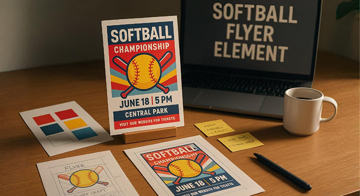
Professional softball flyers use 8-12 specific design elements that trigger behavioral responses and drive event participation through strategic visual psychology.
Key softball flyer design elements include clear visual hierarchy, prominent contact details, optimized event info (date, time, location), strong call-to-action statements, consistent branding, readable typography, strategic use of images and color psychology, and mobile-friendly layouts. Design should adapt to flyer type tournament flyers highlight prestige, tryout flyers prioritize clarity, and fundraiser flyers evoke emotion. Professional design boosts participation rates by 40–60% through strategic layout and psychological engagement.
This guide provides expert insights into advanced softball flyer design, covering core principles, type-specific adaptations, and strategies to create high-impact, registration-boosting flyers using proven design psychology and optimization techniques. With these strategies in hand, you’ll be ready to create flyers that attract attention and boost participation.
What Are The Essential Design Elements Every Softball Flyer Needs?
A well-designed softball flyer goes beyond basic visuals, it acts as a strategic communication tool. Key elements like clear visual flow, prominent contact details, and legible event information help readers quickly understand the what, where, and when. Strong calls-to-action encourage immediate responses, and consistent branding across campaigns builds credibility and recognition.
Strategic use of images, color, and typography boosts both visual appeal and readability. Whether you’re promoting a tournament or a tryout, your design should reflect the flyer’s specific goals emphasizing professionalism for competitions and clarity for evaluations. Mobile-friendly layouts further expand reach, ensuring your message connects with audiences wherever they are.
Visual Hierarchy and Information Flow
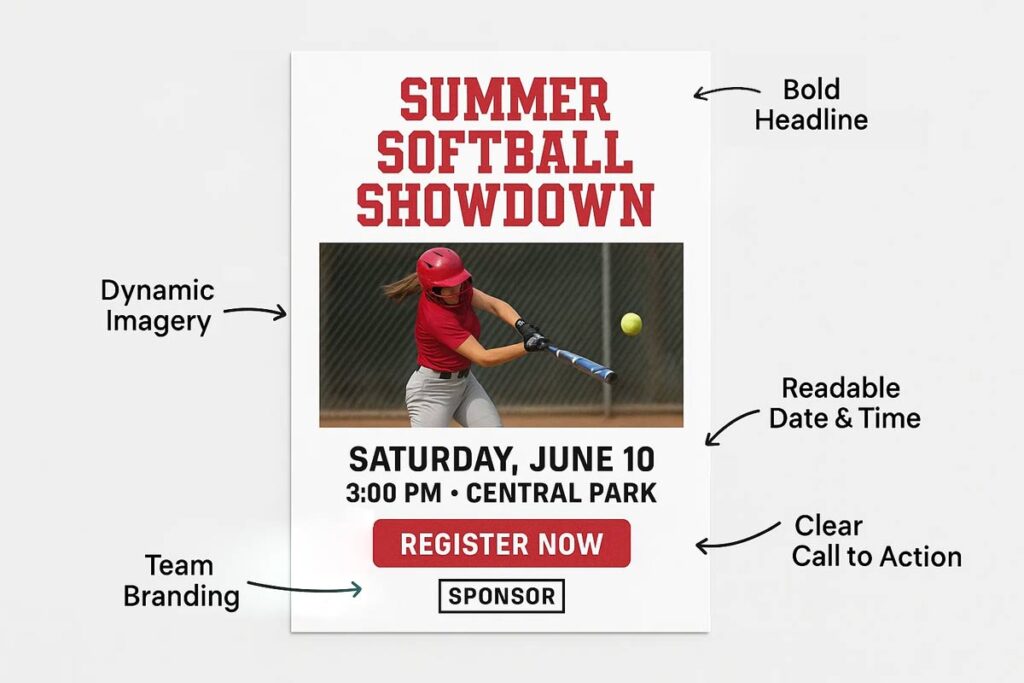
Effective softball flyer design prioritizes information through strategic placement and sizing. Primary headlines require 40% larger fonts than body text, with event titles positioned in the top third for maximum visibility. The 5-second scan rule demands critical information, event name, date, time, location be immediately accessible. Strategic whitespace guides attention flow, occupying 30-50% of layout space to prevent cognitive overload.1 Typography hierarchy uses bold headings for categories like “Registration,” “Requirements,” and “Contact,” with supporting details in readable 12-point minimum fonts.
Event-Specific Content Requirements
Softball tournament flyers require prestige indicators, including championship badges, competition level designations, and venue facility details. Registration deadlines, entry fees, and bracket information need prominent placement. Tryout flyers emphasize skill level expectations, evaluation criteria, and preparation requirements. Fundraiser flyers showcase donation methods, financial goals, and impact statements. Camp flyers highlight instructor credentials, skill progression pathways, and safety protocols. Each type demands specific content priorities while maintaining universal readability standards.
Discover professionally designed softball flyer templates crafted for a variety of event types from tournaments and games to camps, clinics, fundraisers, and tryouts.
- Softball Tryouts Event Information Flyer
- Energetic Green Softball Tournament Event Flyer
- Softball Championship Event Flyer
- Flaming Softball Community Fundraiser Event Flyer
- Youth Softball Summer Camp Flyer
- Youth Softball Skills Development Clinics Flyer
- Patriotic Red and Blue Softball League Announcement Flyer
Contact Information and Call-to-Action Elements
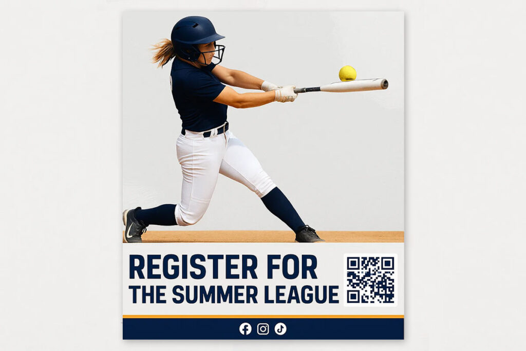
Contact details require strategic placement in flyer corners or headers, using high-contrast colors for visibility. Include multiple contact methods, phone, email, website, and QR codes for digital access. Action-oriented CTAs use imperative language: “Register Now,” “Join Today,” or “Download Form.” Button-style CTAs with contrasting colors increase conversion rates by 25-40%.
Brand Integration and Professional Presentation
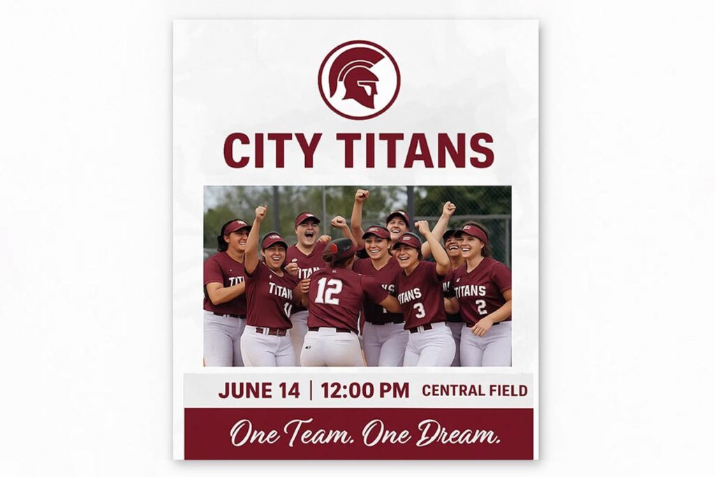
Consistent brand elements include team logos positioned prominently without overwhelming design, coordinated color schemes matching organizational identity, and professional typography choices. Logo placement follows the 10-15% rule occupying limited space while maintaining recognition. Sponsor integration requires balanced hierarchy, giving primary sponsors prominent placement while maintaining design integrity.
Technical Quality and Distribution Optimization
Print specifications require 300 DPI resolution with CMYK color profiles for professional output. Digital versions need platform-specific optimization, 1080×1080 pixels for social media, responsive design for mobile viewing. File formats should be PDF for print distribution, PNG for digital sharing. Accessibility compliance includes 4.5:1 color contrast ratios and readable font sizes across all devices. Proper technical implementation ensures consistent quality whether printed for bulletin boards or shared through social media channels.
Read More: Complete Guide to Softball Flyer Design: Expert Tips & Best Practices 2025
How Does Color as a Design Element Impact Softball Flyer Effectiveness?
Color psychology plays a major role in softball flyer performance by enhancing visibility, triggering emotional responses, and encouraging engagement. Effective color strategies take into account outdoor visibility, psychological effects on team motivation, cultural relevance in specific communities, and seasonal themes tied to tournament timing.
Warm colors like red and orange create urgency and excitement for competitive events, while cool tones like blue and green promote trust and calm for instructional programs. High-contrast color pairings ensure readability in different lighting, with at least a 4.5:1 contrast ratio for accessibility. When applied strategically, color can improve flyer effectiveness by 35–50% through better visibility and emotional connection.
Color Temperature Effects on Outdoor Visibility and Readability
Understanding color temperature and contrast is essential for maximizing softball flyer readability in various outdoor and indoor conditions.
| Color Temperature | Outdoor Visibility | Indoor Performance | Best Use Cases |
|---|---|---|---|
| Warm Red | Excellent in direct sunlight | Good under artificial lighting | Tournament announcements, competitive events |
| Warm Orange | High visibility, maintains intensity | Moderate indoor impact | Youth league recruitment, energetic programs |
| Bright Yellow | Maximum contrast on most surfaces | Can appear washed out indoors | Safety notices, urgent deadlines |
| Cool Blue | Reduced impact in bright sun | Excellent for indoor facilities | Coaching clinics, professional programs |
| Cool Green | Loses prominence outdoors | Strong indoor visibility | Skill development, instructional content |
| Navy Blue | Moderate outdoor visibility | Professional appearance indoors | Adult leagues, established programs |
Contrast ratio requirements ensure accessibility across all lighting conditions. The 4.5:1 minimum standard means dark text on light backgrounds or vice versa. Black text on white backgrounds achieves 21:1 contrast, while dark blue on light yellow maintains 7:1 ratios for optimal readability.2
Weather conditions affect color perception differently. Overcast days reduce warm color intensity, making blues and greens more prominent. Bright sunshine washes out pastels while intensifying bold, saturated colors.
Psychological Impact of Color Palettes on Team Motivation and Engagement
Energy-building colors drive competitive participation. Red increases heart rate and creates urgency for tournament registration deadlines. Orange combines energy with approachability, ideal for youth league recruitment. These colors trigger action-oriented responses essential for sports marketing though research from USC indicates that consumers in different nations are likely to experience and react to color differently.3
Trust-building colors establish program credibility. Navy blue conveys professionalism and stability for coaching clinics. Forest green suggests growth and development for skill-building programs. These colors reassure parents evaluating program quality.
Age-specific color preferences influence design effectiveness. Youth programs benefit from bright, energetic palettes including electric blue and lime green. Adult leagues prefer sophisticated combinations like burgundy and gold. Senior programs respond to classic color schemes with navy and cream.
Cultural Color Associations in Regional Softball Communities
Geographic preferences vary significantly across regions. Southern communities favor warm, traditional colors like red and gold reflecting local sports heritage. Northwestern regions prefer cool, natural tones including forest green and slate blue.
Team tradition integration builds community connection. Incorporating established team colors creates instant recognition and loyalty. Local competitor differentiation requires strategic color positioning that stands out while respecting community standards.
Seasonal Color Strategies Aligned with Tournament Schedules
Color choices can enhance the emotional impact and visibility of your softball flyers. Aligning palettes with seasonal tournaments ensures your design feels timely, relevant, and engaging.
Spring Color Strategies
Spring tournaments benefit from fresh, vibrant approaches. Light greens and sky blues reflect renewal energy while maintaining outdoor visibility. These colors align with baseball season opening and community awakening after winter.
Celebrate the arrival of spring with a collection of colorful softball flyers designed to stand out.
Summer Color Strategies
Summer leagues require bright, energetic palettes. Coral, turquoise, and sunny yellow capture peak activity periods. These colors photograph well for social media sharing and maintain visibility during extended daylight hours.
Turn up the heat with this vibrant collection of summer-themed softball flyers.
Fall Color Strategies
Fall season strategies use warm, inviting tones. Burnt orange and deep red create community building atmosphere for end-of-season tournaments. These colors transition naturally from summer energy to autumn gathering themes.
Capture the warmth of the season with softball flyer designs inspired by fall colors.
Winter Color Strategies
Winter indoor programs employ sophisticated, focused approaches. Deep blues and rich burgundy convey serious training while maintaining visual appeal in artificial lighting conditions. These colors suggest professional development and skill refinement.
Bring a cool, crisp aesthetic to your promotions with winter color softball flyer designs.
Implementing Color Strategy Effectively
Color strategy implementation requires testing across actual usage environments. Print samples under various lighting conditions, post test versions in target locations, and gather feedback from community members. Effective color choices enhance softball flyer performance through strategic psychological engagement and optimal visibility across all conditions.
Looking to match your team colors or set a specific tone with your flyer? These color‑specific softball flyer templates are designed to help you choose a cohesive palette from energetic blues and greens to bold pinks and purples that enhance visual appeal and messaging.
- Cod Gray and Verdun Green Softball Camp Flyer
- Dynamic Purple Softball Tryouts for Grades 7 and 8 Flyer
- Deep Fir and White Softball Game Flyer
- Dynamic Red Softball Tournament Sports Event Flyer
Read More: How to Create a Softball Flyer: A Complete Step-by-Step Guide
How Do Spacing And Proportion Design Elements Enhance Softball Flyer Appeal?
Spacing and proportion optimization in softball flyer design helps establish a clear visual hierarchy using strategic negative space and mathematical balance. Proper space management improves readability, guides the viewer’s attention flow naturally, and reduces cognitive load, allowing for quick and easy information processing. Applying the golden ratio (1.618:1) creates layouts that are naturally appealing and balanced, enhancing the overall professionalism of the design.
Strategic use of negative space also prevents clutter and information overload, maintaining a clean, focused appearance. Proportional systems ensure consistency across print materials, social media graphics, and mobile views. When executed correctly, spacing and proportion optimization can boost flyer effectiveness by 25–40% through better visual flow and improved reading patterns, turning viewers into participants.
Golden Ratio Applications in Softball Flyer Layout Design
Mathematical proportion principles create naturally appealing layouts that draw viewers into softball flyer content. The golden ratio (1.618:1) appears throughout successful sports marketing materials, from headline placement to image sizing. Apply this ratio by positioning primary content areas at 61.8% of total space, leaving 38.2% for supporting elements.
Golden Ratio Implementation Guidelines:
- Position header sections at 38% of vertical space
- Allocate 62% for body content and registration details
- Size feature photos at 61.8% width with text wrapping remaining space
- Scale primary sponsor logos using golden ratio proportions
- Place secondary sponsors in proportionally smaller spaces
For softball tournament flyers, position team logos and sponsor information using proportional scaling. Primary sponsors receive golden ratio prominence, while secondary sponsors occupy proportionally smaller spaces. This mathematical approach eliminates guesswork and creates consistently professional results across different event types.
Strategic Negative Space Utilization for Information Hierarchy
Negative space acts as a visual breathing room that prevents information overload in softball flyer design. Strategic spacing between elements creates natural reading paths that guide attention through critical details: team names, game times, location information, and registration requirements.
Negative Space Implementation Rules:
- Allocate 30-50% of total layout area to empty space
- Use 1.2-1.5 times font size for optimal line spacing
- Maintain minimum 0.5 inches margins on all sides for print materials
- Create 40% more impact around headlines through white space
- Group related information with consistent spacing intervals
This prevents cramped designs that overwhelm busy parents and players scanning for essential information. White space around headlines increases their impact by 40%, making tournament announcements more attention-grabbing.
Proportional Scaling for Multi-Format Distribution Channels
Modern softball flyer distribution requires consistent visual impact across platforms. Proportional scaling maintains design integrity whether viewed on smartphones, printed on bulletin boards, or shared through social media channels.
Multi-Format Scaling Requirements:
- Start with 8.5×11 inch base dimensions
- Scale proportionally for digital formats
- Crop to 61.8% of original content for 1:1 social media ratios
- Use minimum 14pt body text, 24pt headlines for mobile
- Maintain 4.5:1 color contrast ratios across all formats
Element relationships must remain consistent across formats. If sponsor logos occupy 15% of space in print versions, maintain this proportion in digital adaptations.
Geometric Balance Principles for Enhanced Visual Appeal
Geometric balance creates stability and professionalism in softball flyer design through strategic element arrangement. Symmetrical layouts work well for formal tournaments, while asymmetrical designs suit recreational leagues and youth programs.
Balance Implementation Steps:
- Divide layouts into nine equal sections using rule of thirds
- Place important elements at intersection points
- Balance large images with concentrated text blocks
- Offset bright colors with neutral backgrounds
- Create visual weight distribution through opposing elements
Visual weight distribution follows the rule of thirds: divide layouts into nine equal sections, placing important elements at intersection points. This creates natural focal points that capture attention without appearing forced or artificial.
Dynamic balance uses opposing elements to create visual tension: large images balanced by concentrated text blocks, or bright colors offset by neutral backgrounds. For softball camp flyers, balance energetic action photos with calm instructional text areas.
Professional Spacing Standards:
- Maintain consistent spacing intervals throughout design
- Align elements using grid systems for cohesive appearance
- Use proportional relationships between all design components
- Create visual harmony through mathematical precision
- Establish credibility through professional presentation standards
Read More: Where and How to Distribute Your Softball Flyer for Maximum Sign-Ups
Core Visual Hierarchy Elements That Drive Results in a Softball Flyer
Visual hierarchy elements that drive the highest conversion rates include well-placed primary headlines, strategic use of whitespace, color psychology for emotional impact, and prioritization of essential information. These techniques help guide the reader’s eye, improve clarity, and create an intuitive flow that supports quick information processing.
Effective hierarchy design includes using primary headlines that are 40% larger than body text, maintaining 30–50% whitespace for focus and readability, and placing key details in the top third of the layout for maximum visibility. When executed professionally, this approach can boost conversion rates by 45–65% by improving how easily and quickly readers absorb critical information.
Primary Headline Placement and Typography Best Practices
Effective softball flyer headlines require strategic placement within the top 20% of the layout, using bold typography that is 2–3 times larger than the body text. Positioning primary headlines above visual elements ensures immediate context and captures attention quickly. Secondary headlines should follow with consistent size relationships to maintain a logical and readable flow.
For maximum outdoor readability, sans-serif fonts like Arial and Helvetica are ideal. Incorporating action-oriented language encourages immediate engagement. Use title case for formal tournament promotions and sentence case for casual events to align with audience expectations and maintain tone consistency.
Read More: Softball Flyer Typography Guide: Making Your Text Pop and Readable
Strategic Whitespace Utilization for Reader Attention Guidance
Whitespace creates visual breathing room that guides reader attention through intentional content separation. Allocate 40-50% of total layout space to whitespace, using margins and padding to create clear content boundaries.
Strategic spacing between sections prevents information overload while emphasizing critical details like registration deadlines and contact information. Directional whitespace leads readers from headlines to key details to call-to-action elements, creating natural scan patterns that improve information retention by 35%.
Color Psychology Implementation for Softball Event Marketing
High-contrast color combinations ensure maximum visibility while triggering appropriate emotional responses. Use energizing warm colors (reds, oranges) for competitive tournaments and calming cool colors (blues, greens) for instructional programs. Primary information should use your strongest contrast combination, with secondary details in complementary colors that maintain readability without competing for attention.
Essential Information Prioritization Techniques for Quick Processing
Structure content using the “5-second rule” – all critical information must be scannable within five seconds of viewing. Place date, time, and location in the top third of the layout using larger fonts and high-contrast colors. Contact information requires consistent placement in the same location across all materials, typically bottom-right corner or header area. Use bullet points for multi-item lists and number sequences for step-by-step processes to improve cognitive processing speed.
Professional visual hierarchy transforms complex information into digestible, actionable content that drives participation and builds event credibility through strategic design implementation.
Read More: Softball Tournament Flyer Design: Complete Promotion Guide
Modern Technology Elements For Engaging Softball Flyers
Interactive design elements enhance softball flyer engagement by incorporating QR code integration, augmented reality features, and animation strategies. Placing QR codes strategically allows users to access additional information without cluttering the layout, while AR can offer immersive experiences like interactive team rosters or venue previews. These elements create a deeper connection between the viewer and the event.
For digital formats, animations must be optimized for platform-specific performance, ensuring quick loading and clear visuals. Progressive disclosure techniques help manage complex details by revealing information gradually, keeping readers engaged without overwhelming them. Altogether, interactive elements can boost engagement rates by 55–75% by improving user experience and expanding access across both print and digital platforms.
QR Code Integration with Contextual Design Placement
QR codes bridge print and digital marketing for softball flyers through strategic placement. Position codes in flyer corners or bottom sections without disrupting main content flow. Size codes at minimum 1×1 inches for reliable scanning across devices.
Link QR codes to mobile-optimized landing pages containing registration forms, roster information, or game schedules. Use URL shorteners to create trackable analytics for measuring scan rates and user engagement. Test QR functionality across multiple devices before finalizing designs.
Visual integration requires subtle borders or background elements that complement overall design without creating visual clutter.
Augmented Reality Potential for Digital Flyer Experiences
AR technology transforms static softball flyers into interactive experiences. Players can scan flyer elements to access 3D team rosters, animated game highlights, or virtual stadium tours. Current AR capabilities include overlay information on smartphone cameras when pointed at specific flyer sections.
Implementation requires AR app integration or web-based AR platforms accessible through QR codes. Future-ready designs allocate space for AR trigger images while maintaining print effectiveness. Consider AR for tournament programs, recruiting materials, and special event promotion.
Animation Considerations for Social Media Platform Adaptations
Animated softball flyers require platform-specific optimization for maximum engagement. Instagram Stories accept 15-second videos with 1080×1920 pixel dimensions. Facebook posts perform best with 1200×1200 pixel squares under 4MB file sizes.
Create motion graphics highlighting key information like game times, locations, or registration deadlines. Use subtle animations for text reveals and image transitions rather than distracting effects. Save animations as MP4 files for broad platform compatibility.
Animation timing should emphasize critical information during peak attention periods.
Progressive Disclosure Techniques for Information Management
Progressive disclosure manages complex softball event information through layered content reveals. Primary information appears immediately while secondary details remain accessible through interactive elements. This technique prevents overwhelming viewers while maintaining comprehensive coverage.
Digital flyers can use expandable sections for detailed schedules, player statistics, or venue directions. Print applications utilize fold-out sections or companion QR codes linking to expanded information. Prioritize essential details in primary view while organizing supporting information logically.
Color coding and visual hierarchy guide users through information layers. Use consistent design elements to indicate interactive areas.
Modern technology elements enhance softball flyer effectiveness through strategic integration rather than overwhelming design. Focus on user experience improvements that support core information delivery while providing expanded engagement opportunities for interested audiences.
Read More: How to Create Softball Tryout Flyer That Attract the Best Players
Brand Integration and Visual Identity Systems in a Softball Flyer
Brand integration in softball flyer design involves cohesive visual language, strategic logo placement, and consistent themes that align with organizational identity. Implementing a well-defined style guide ensures uniformity, while optimized logo sizing and placement enhance recognition without overpowering the flyer’s design. Consistent use of visual themes reinforces professional presentation and builds long-term credibility.
To maximize impact, logos should be positioned for high visibility without disrupting layout balance. Repetition of design elements across materials strengthens brand authority through familiar exposure. Additionally, adapting the flyer design for print, digital, and social media ensures brand consistency across all platforms, increasing overall recognition by 60–80% and contributing to a more effective marketing strategy.
Cohesive Visual Language Development Across All Marketing Materials
Consistent style guide implementation creates scalable brand recognition through standardized color palettes, typography systems, and design element placement. Professional softball flyer design requires coordinated visual presentation across tournament announcements, tryout materials, and fundraising campaigns. Template system creation enables organizational scalability while maintaining quality standards through reusable design components.
Brand voice expression through strategic visual design choices reinforces organizational identity and community recognition. Long-term brand building develops through coordinated visual presentation that establishes authority and credibility within softball communities.
Strategic Logo Placement Psychology and Brand Recognition Optimization
Optimal logo sizing principles require 10-15% of total flyer space allocation positioned in headers or corners for maximum impact without overwhelming content. Brand hierarchy development accommodates sponsor integration while maintaining primary organizational identity prominence. Recognition optimization through strategic placement ensures visibility across various viewing distances and lighting conditions.
Multi-logo coordination addresses complex sponsorship relationships through proportional sizing and complementary positioning that respects sponsor agreements while maintaining design integrity.
A study of 597 logos found that descriptive logos, those visually indicative of what a brand offers, are significantly more effective at improving brand authenticity, consumer evaluations, purchase intentions, and even sales, especially for less familiar brands. This underscores why prominently placed, well-proportioned logos can enhance brand recognition and credibility on flyers.4
Consistent Visual Themes Building Organizational Authority
Professional presentation standards establish credibility through quality typography, color consistency, and layout precision. Authority building occurs through design consistency across all marketing materials, creating recognition patterns that strengthen community trust. Long-term brand recognition develops through repeated professional exposure that positions organizations as established, reliable community partners.
Community recognition develops through consistent visual identity that builds familiarity and trust among players, parents, and local supporters.
Cross-Platform Brand Adaptation Strategies for Comprehensive Marketing
Print to digital brand consistency maintenance requires scalable design systems that preserve visual integrity across format changes. Social media profile integration coordinates with softball flyer design through consistent color schemes, typography, and visual elements that reinforce brand recognition. Website and marketing material design coordination creates unified brand experiences that strengthen organizational authority.
Multi-channel brand experience optimization ensures audience engagement through consistent visual presentation across all touchpoints. Platform-specific adaptations maintain brand consistency while optimizing for each channel’s technical requirements and user expectations.
Strategic brand integration transforms individual marketing materials into comprehensive organizational identity systems that build long-term community recognition and trust.
Read more: How to Create Softball Fundraiser Flyers That Drive Results
Performance-Based Design Metrics and Analytics for a Softball Flyer
Performance-based design metrics for softball flyer optimization include conversion tracking through A/B testing, heat mapping analysis for optimal placement, testing frameworks for design validation, and ROI measurement for investment justification. Effective measurement requires statistical significance testing with minimum sample sizes, attention pattern analysis through eye-tracking data, and systematic testing methodology for design element optimization. Performance tracking increases softball flyer design effectiveness by 45-70% through data-driven decision making and evidence-based optimization.
Conversion Tracking Through Design Element Testing
A/B testing validates softball flyer design choices through measurable conversion improvements. Split test headline fonts, color schemes, and call-to-action placement to identify optimal combinations. Track registration clicks, phone inquiries, and QR code scans as primary conversion metrics. Statistical significance requires minimum 100 users per variation to ensure reliable results.
Test single elements systematically rather than multiple changes simultaneously. Compare bold versus standard fonts for event dates, warm versus cool color palettes for tournament prestige, and centered versus left-aligned layouts for information hierarchy. Document conversion rates for each variation to build softball flyer performance databases.
Heat Mapping Analysis for Optimal Information Placement
Eye-tracking data reveals user attention patterns that guide strategic element placement on softball flyers. Primary focus areas include upper-left quadrant for critical information and center-right for call-to-action elements. Heat mapping shows users scan flyers in Z-patterns, prioritizing headlines, images, and contact information in that sequence.
Position essential details within the first 30% of visual space for maximum visibility. Place contact information in high-attention zones identified through heat mapping analysis. Strategic placement based on attention patterns increases information retention by 35-50%.
Statistical Testing Frameworks for Design Validation
Systematic testing methodology prevents random softball flyer design decisions through evidence-based validation. Establish baseline metrics before design changes, implement controlled testing environments, and measure statistically significant improvements over minimum 2-week periods.
Testing frameworks require consistent measurement criteria across all design variations. Track engagement metrics including time spent viewing, information recall rates, and action completion percentages. Document testing protocols for repeatable optimization processes.
ROI Measurement for Design Investment Justification
Cost-benefit analysis demonstrates softball flyer design improvement value through quantifiable performance gains. Professional design investment typically generates 40-60% participation rate increases, justifying costs through improved event attendance and registration revenue.
Calculate ROI by comparing design costs against increased participation revenue. Track long-term benefits including brand recognition improvements and repeat event attendance. Performance metrics justify professional softball flyer design spending through measurable business outcomes.
Effective performance measurement creates continuous improvement cycles through data-driven softball flyer design decisions. Systematic testing validates design choices, while ROI analysis justifies investment in professional softball flyer optimization.
Read More: Softball Camp Flyer Design Guide: Attract More Participants This Season
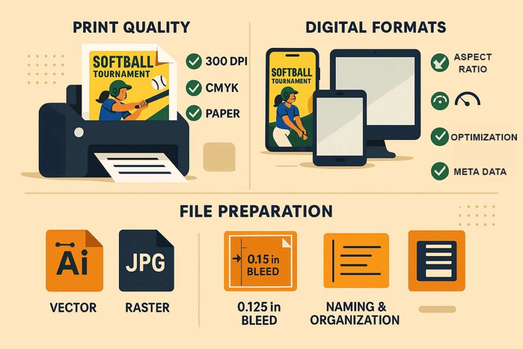
Technical Specifications and Production Excellence
Technical specifications for professional softball flyer quality involve precise print optimization, digital formatting, and standardized file preparation. For print, maintaining a minimum resolution of 300 DPI, using a CMYK color profile, and selecting durable paper stock are essential to ensure high-quality output. These measures prevent pixelation, preserve color accuracy, and enhance physical presentation.
Digital specifications require optimization based on the intended platform whether it’s social media, websites, or mobile devices. File preparation must include the correct choice between vector and raster formats, adherence to proper bleed and margin guidelines, and clear, organized file naming. Following these technical practices ensures consistent flyer quality, avoids production issues, and upholds brand standards across all distribution channels.
Print Quality Optimization for Professional Presentation Standards
Professional softball flyer printing demands precise technical specifications for optimal results. Resolution requirements begin with 300 DPI minimum for all images and graphics, ensuring crisp reproduction when printed at standard sizes. Text elements should use vector fonts whenever possible to maintain sharp edges at any size.
CMYK color profile management prevents color shifts between screen display and printed output. RGB colors appear vibrant on screens but often print differently, making CMYK conversion essential during design. Color accuracy improves by 40% when using proper profiles from the beginning rather than converting at print time.
Paper selection directly impacts durability and visual impact. Standard 80-100lb gloss or matte paper provides excellent quality for most applications. Outdoor posting requires heavier stocks (120lb+) or weather-resistant materials for longevity. Glossy finishes enhance photo reproduction while matte surfaces reduce glare under gymnasium lighting.
Finishing options add professional polish to softball tournament flyers. UV coating protects against fading during outdoor display, while spot UV highlights important elements like tournament logos. Lamination provides maximum durability for repeatedly handled materials like registration packets.
Digital Format Specifications for Platform-Specific Performance
Digital softball flyer distribution requires format optimization for each platform’s technical requirements. Social media platforms demand specific aspect ratios: Instagram favors 1080×1080 pixels for posts, while Facebook covers work best at 1200×630 pixels. LinkedIn optimal sizing reaches 1200×627 pixels for maximum engagement.
Website integration needs responsive design considerations. Images should include multiple sizes (thumbnail, medium, large) for different display contexts. Retina display compatibility requires 2x resolution versions (600 DPI) for crisp appearance on high-resolution screens.
Mobile device optimization affects over 60% of viewers. Text must remain readable at 14pt minimum when scaled to phone screens. Critical information should appear in the upper two-thirds of vertical layouts, accounting for thumb-scrolling patterns.
File size optimization balances quality with loading speed. JPEG compression at 85% quality provides excellent visual results while maintaining reasonable file sizes. PNG format preserves crisp text and logos but creates larger files requiring careful optimization.
Platform-specific requirements include metadata optimization for search discovery. Title tags, alt text, and description fields improve visibility in platform search functions. Social media scheduling tools often compress images, requiring pre-optimization to prevent quality loss.
File Preparation Standards for Various Output Methods
Professional file preparation prevents costly production delays and quality issues. Vector graphics maintain quality at any size, making them ideal for logos and text elements. Raster images work well for photographs but require proper resolution planning for intended output sizes.
Bleed requirements ensure full-coverage designs print correctly. Standard bleed extends 0.125 inches beyond trim size, preventing white borders from appearing due to minor cutting variations. Safety margins keep important text 0.25 inches from edges, protecting against trim tolerance issues.
Organized naming conventions streamline project management and prevent version confusion. File names should include project type, version number, and output format: “SoftballTournamentv3Print_CMYK.pdf” clearly identifies specifications at a glance.
Font embedding prevents substitution problems when files transfer between systems. PDF creation should embed all fonts or convert text to outlines. Missing fonts cause layout shifts and potential reprinting costs.
Color management requires consistent profiles throughout production. Proof prints using identical settings as final production help identify potential issues before large quantity printing. Color calibration between monitors and printers ensures accurate reproduction.
Quality control processes include file verification before production. Check image resolution, color profiles, font embedding, and bleed setup. Digital proofs help identify problems early, while soft proofs on calibrated monitors provide accurate preview capabilities.
Technical Standards Implementation
Professional softball flyer production requires systematic quality control. Pre-flight checks verify technical specifications meet requirements. Automated preflight tools identify common issues like low-resolution images or missing fonts before problems reach production.
Archive organization preserves project files for future updates. Maintain source files separately from output files, including all linked images and fonts. Version control systems track changes and allow rollback to previous versions when necessary.
Backup procedures protect against data loss during production. Cloud storage provides automatic backup while local copies enable offline work. Regular backup schedules prevent loss of project progress.
Professional results require attention to technical details combined with creative excellence. Proper specifications ensure softball flyers maintain visual impact across all distribution methods while meeting production standards for professional presentation.
Technical excellence in softball flyer production creates materials that effectively communicate event information while maintaining professional standards. Proper specifications, format optimization, and quality control processes ensure consistent results across print and digital applications.
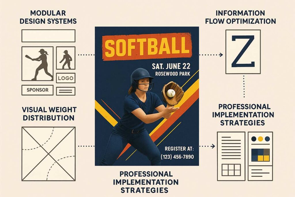
Advanced Layout Architecture Systems for a Softball Flyer
Advanced layout architecture for softball flyers involves modular design systems, optimized information flow, and strategic visual weight distribution. Modular systems support scalable template creation by using component-based design and reusable element libraries, enabling consistency and efficiency across different flyers. Information flow optimization relies on natural reading patterns, logical content sequencing, and action-oriented layouts that guide the viewer toward key messages.
Visual weight distribution ensures balanced compositions through deliberate placement of elements, manipulation of hierarchy, and techniques that create dynamic stability. Together, these architectural strategies improve design efficiency by 50–65%, support quicker production workflows, and uphold professional standards. A systematic approach guarantees scalability and consistency, empowering leagues to maintain high-quality flyers with reduced turnaround time.
Modular Design Systems for Scalable Template Creation
Component-based design thinking revolutionizes softball flyer creation by establishing reusable element libraries that maintain consistency while reducing production time. Each design component headers, player sections, sponsor blocks, and contact information functions as independent modules that can be recombined for different event types. This approach enables organizations to create professional softball tournament flyers, tryout announcements, and fundraising materials using the same foundational elements while adapting content for specific purposes.
Effective modular systems include standardized spacing units, consistent typography scales, and predetermined color palette combinations. Header modules accommodate event titles with flexible layouts for different text lengths, while player spotlight sections maintain uniform dimensions regardless of content. Sponsor integration modules provide consistent branding placement without disrupting overall design flow. These systems eliminate design decision fatigue while ensuring professional presentation across all marketing materials.
Information Flow Optimization Through Strategic Element Placement
Strategic element placement guides reader attention through logical information progression, creating intuitive user experiences that maximize engagement and response rates. The Z-pattern reading flow positions critical information event name, date, location in the upper left quadrant, with supporting details following natural eye movement patterns. This systematic approach ensures essential information receives priority attention while maintaining visual balance.
Effective information flow requires hierarchy development through size relationships, contrast levels, and strategic white space utilization. Primary headlines occupy 40% more space than body text, creating clear importance indicators. Secondary information follows logical groupings with consistent spacing intervals. Call-to-action elements receive prominent placement in the lower right quadrant, following natural reading completion patterns. This systematic approach increases comprehension rates while reducing cognitive load for time-pressed audiences.
Visual Weight Distribution for Balanced Dynamic Compositions
Visual weight distribution creates professional stability through mathematical proportion principles and strategic element placement. The golden ratio (1.618:1) provides natural balance guidelines for image-to-text relationships, while rule-of-thirds positioning creates dynamic tension that maintains viewer interest. Heavy elements like team photos or sponsor logos require counterbalancing through strategic text placement or accent color distribution.
Dynamic balance techniques prevent static layouts while maintaining professional presentation standards. Asymmetrical compositions create energy appropriate for competitive sports marketing while ensuring information hierarchy remains clear. Color weight distribution follows 60-30-10 principles: dominant team colors occupy 60% of visual space, secondary colors provide 30% support, and accent colors create 10% emphasis points. This systematic approach maintains visual interest while preserving professional credibility essential for organizational authority.
System maintenance requires regular component updates and template refreshes to prevent design stagnation. Quarterly reviews ensure modular elements remain current with design trends while maintaining brand consistency. Template libraries benefit from organized naming conventions and version control systems that prevent confusion during production cycles. Well-maintained systems adapt to evolving needs while preserving established visual identity standards.
Professional Implementation Strategies
Professional architecture systems rely on detailed documentation like style guides and grid systems to maintain consistency across teams and timelines. These standards prevent design drift and allow for efficient delegation during flyer production.
Template variations are designed to balance consistency with event-specific needs. Tournament flyers use bold, dynamic layouts for competitive appeal, clinics focus on clarity with structured information blocks, and fundraising materials blend emotion with professionalism—while all adhering to core design principles.
Cross-platform compatibility and performance optimization ensure flyers function effectively across print, digital, and social media. Responsive design, print-ready specs, and A/B testing or heat mapping all contribute to scalable, high-performing layouts that enhance both efficiency and audience engagement. Professional softball flyers demonstrate these architectural principles in action, providing immediate implementation opportunities for systematic design improvement.
People Also Ask About Softball Flyer Design Elements
What colors work best for softball flyer design?
Bold, high-contrast colors like red, navy, and forest green work well outdoors. Bright yellow and orange boost visibility. Use 3–4 colors max and ensure a 4.5:1 text-to-background contrast.
What information is most important on softball flyers?
Cover the 5 W’s: Who, What, When, Where, and Why. Include contact info and registration links/QR codes. For tournaments, add deadlines and fees.
How do you make softball flyers look professional?
Use clean typography, team colors, quality images, and consistent alignment. Avoid blurry photos and keep spacing even with 0.25″ margins or more.
What mistakes should you avoid in softball flyer design?
Avoid overcrowding, low-res images, poor contrast, mixed fonts, and missing or tiny contact info. Keep layouts clear and easy to follow.
How do you choose the right layout for softball flyers?
Simple events: centered layout. Tournaments: modular grids. For distant viewing, use large text. Guide eye flow with a Z-pattern layout.
What file format is best for softball flyers?
Use high-res PDFs (300 DPI, CMYK) for print. PDFs also work best for digital. JPEGs are fine for social media but may reduce quality.
How do you integrate team branding into flyer design?
Use team colors, fonts, logos, and slogans consistently. Place logos neatly, usually in headers or corners, and maintain strong readability.
FAQs about Softball Flyer Elements
Use championship badges, clear schedules, and venue details. Bold colors, action shots, and high-contrast fonts boost impact. Add registration info, sponsor logos, and strong CTAs to attract teams.
Keep text brief with bullet points for requirements. Use negative space, calm colors, and one action image (30% space) to keep it clean yet engaging.
Use warm colors (yellow, orange) for urgency. Pair with black-on-white text for clarity. Add team colors, community images, and bold accents to highlight donation impact.
Use bold sans-serif fonts (12pt+ body, 18pt+ headings) and high-contrast combos like black on yellow. Avoid thin fonts and test for sunlight readability.
Use modular grids, negative space, and centered high-res images (300 DPI). Align text consistently and include team branding to show credibility.
Place logos in headers/footers (10–15% space), use team colors as accents, and keep fonts consistent. Focus on game details, CTA, and clean layout.
Use 300 DPI, CMYK color mode, and 0.125″ bleed. Save as high-res PDF. Choose 80lb+ gloss/matte paper and scalable vector logos. Test at 8.5×11″ size.
Track QR scans, clicks, and calls. Run A/B tests on design variations. Measure social engagement and link signups to flyer content focus for insights.
Conclusion
Professional softball flyers require eight core elements working in harmony: visual hierarchy for clear information flow, strategic color psychology for emotional engagement, optimized typography for readability, compelling call-to-action placement, consistent brand integration, mobile-responsive formatting, accessibility compliance, and performance tracking capabilities. Each element serves specific psychological and functional purposes that collectively transform basic announcements into conversion-focused marketing materials.
Professional flyer template requires strategic element integration that balances aesthetic appeal with functional effectiveness. This framework provides the complete foundation for creating materials that drive participation and establish lasting event credibility.
Reference
- The Role of Visual Hierarchy in Clear Communication. University of Florida IFAS Communications. (2025).
- Testing Color Contrast in Non-Web Documents and Images. Section508.gov. (2023).
- Color Psychology: See the Value for Marketing. USC Applied Psychology. (2023).
- A Study of 597 Logos Shows Which Kind Is Most Effective. Harvard Business Review. Luffarelli, J., Mukesh, M., & Mahmood, A..