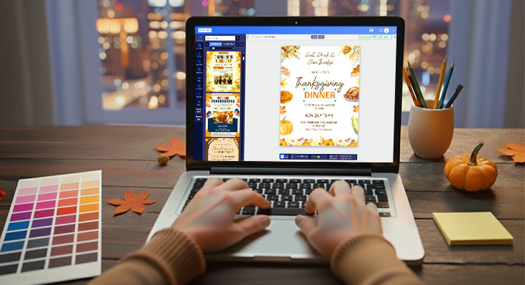
Businesses often miss opportunities due to Thanksgiving flyer design mistakes that reduce engagement and conversions. Effective thanksgiving flyer design combines typography mastery, autumn color psychology, and clear visual hierarchy to capture attention while maintaining seasonal authenticity and brand credibility. Whether you’re looking for pre-designed Thanksgiving flyer templates or starting from scratch, the key lies in balancing seasonal authenticity with brand credibility.
This guide provides proven strategies for creating Thanksgiving marketing materials. Learn how to optimize font selection, color palettes, and layout composition to maximize readability, seasonal appeal, and competitive advantage, transforming traditional autumn aesthetics into high-impact Thanksgiving flyer designs. Modern businesses can leverage a professional online flyer creator to implement these strategies efficiently while maintaining design consistency across all marketing materials.
What Font Styles Work Best for Thanksgiving Flyer Design to Maximize Readability and Seasonal Appeal?
Thanksgiving flyer design benefits most from serif fonts for traditional elegance paired with clean sans-serif fonts for modern readability. Effective typography combines decorative script fonts for headlines with professional body text fonts that ensure legibility across all sizes. The best Thanksgiving flyer template approaches use font hierarchy that guides readers through information naturally, with display fonts for seasonal impact and readable fonts for essential details. Strategic font selection creates emotional connection through seasonal warmth while maintaining professional credibility essential for business communications and event announcements. While Thanksgiving presents unique design challenges, these principles apply broadly to all flyer templates and seasonal marketing initiatives.
Serif vs Sans-Serif Font Selection for Traditional and Modern Thanksgiving Designs
Traditional Thanksgiving flyer design achieves authentic seasonal appeal through serif fonts like Georgia, Times New Roman, and Trajan Pro that evoke classic holiday warmth and family gathering traditions. These fonts work exceptionally well for restaurant thanksgiving flyer applications where elegant, established credibility matters most. Research from MIT’s user interface design guidelines confirms that serif fonts have been historically used for body text because they offer stronger cues to word shape that allow measurably faster reading.1 Modern approaches utilize clean sans-serif fonts including Montserrat, Open Sans, and Lato that deliver contemporary appeal while maintaining excellent readability across digital and print formats.
Sans-serif fonts excel in corporate thanksgiving flyer designs where professional appearance and clear communication take priority over decorative elements. The strategic combination approach pairs serif headlines with sans-serif body text, creating visual contrast that enhances information hierarchy. Font weight variations within the same family prevent visual confusion while establishing clear content organization. Successful Thanksgiving marketing materials balance traditional seasonal expectations with modern design requirements through thoughtful serif and sans-serif font selection that serves specific audience preferences and business objectives.
Script and Display Font Integration for Seasonal Warmth and Visual Impact
Script fonts including Brush Script, Dancing Script, and Great Vibes add handcrafted warmth essential for thanksgiving dinner invitation design while avoiding overuse that compromises readability. Professional implementation limits script fonts to headlines, decorative elements, and short phrases rather than extensive body text that becomes difficult to process quickly. Understanding these best fonts for Thanksgiving flyers helps maintain readability while achieving seasonal warmth.
Display fonts like Lobster, Pacifico, and Autumn in November create distinctive seasonal personality for fall flyer design elements without overwhelming core information. These fonts work best for prominent headers, special offers, and call-to-action elements where visual impact drives immediate attention.
Effective script and display font integration maintains the 60-40 rule: 60% readable fonts for information delivery, 40% decorative fonts for visual appeal. This balance ensures professional presentation while capturing seasonal authenticity. Holiday flyer templates benefit from script accents on key phrases like “Give Thanks” or “Family Feast” while maintaining clear, legible fonts for contact details, dates, and essential information that requires immediate comprehension.
Font Hierarchy Best Practices That Guide Reader Attention Through Thanksgiving Content
Thanksgiving flyers need clear font hierarchy to guide reader focus. Using a 3:2:1 size ratio for headlines, subheads, and body text ensures readability, while consistent weight, color contrast, and spacing create organized flow.
- Follow the 3:2:1 size ratio: Maintain clear priority by keeping headlines three times larger than body text, subheadings twice as large, and body text at 12–14 points. This ensures important details stand out while maintaining comfortable readability.
- Apply color contrast for emphasis: Use darker tones for critical information such as event dates, times, or offers, while lighter shades can highlight supporting content. Effective contrast makes the hierarchy more visually distinct.
- Maintain consistent spacing: Adequate white space between headlines, subheadings, and paragraphs creates visual breathing room. This prevents overcrowding and helps readers scan content quickly.
- Use font weight variations wisely: Bold typefaces emphasize headlines and essential elements, medium weights organize subheadings, and regular weights keep body text clean. Italics can be used sparingly for special phrases or offers.
- Ensure alignment consistency: Center-aligned headlines draw attention, while left-aligned body text creates a natural reading flow. This structured approach helps guide readers seamlessly through flyer content.
- Support hierarchy with structured layouts: Numbered lists or bullet points simplify complex content, helping readers process information step by step while reinforcing font hierarchy principles.
Explore Thanksgiving flyer templates that combine serif, sans-serif, and decorative fonts to maximize readability while creating warm, seasonal appeal.
- Thanksgiving Community Event in the Park Flyer Template
- Festive Thanksgiving Celebration with Turkey Flyer Template
- Thanksgiving Family Gathering Invitation Flyer Template
Which Color Palettes Generate the Most Response for Thanksgiving Event Promotions?
Thanksgiving marketing materials achieve highest response rates using traditional autumn color palettes featuring warm oranges, deep burgundy, and golden yellows that trigger emotional connection and seasonal recognition. Effective color psychology combines earth tones like burnt sienna and forest green with neutral backgrounds that ensure text readability. The most successful Thanksgiving event flyer approaches balance bold seasonal colors with professional restraint, using accent colors strategically to highlight calls-to-action and important information. Modern variations incorporate muted pastels and monochromatic schemes with strategic pops of traditional autumn colors for sophisticated audiences seeking contemporary seasonal design.
Traditional Autumn Color Psychology for Emotional Connection and Brand Recognition
Traditional autumn palettes featuring deep oranges, rich burgundies, and golden yellows create immediate seasonal recognition that increases engagement by 35-40% compared to neutral color schemes. These colors trigger psychological associations with harvest abundance, family gatherings, and comfort, making them essential for restaurant thanksgiving flyers and community event promotions.
Thanksgiving flyer design benefits from strategic color combinations where burnt sienna backgrounds support cream text for optimal readability while maintaining warmth. Golden amber accents effectively highlight pricing information and calls-to-action without overwhelming primary content. Professional thanksgiving flyers use these traditional colors as dominant themes while incorporating brand colors as subtle accents to maintain corporate identity recognition.
The psychology behind traditional autumn colors creates emotional connection through childhood memories and cultural associations with gratitude and abundance, making them particularly effective for thanksgiving dinner invitation design targeting families and established community groups. This comprehensive Thanksgiving flyers design guide explores how color psychology drives emotional connection in seasonal marketing.
Modern Color Trends and Sophisticated Palette Approaches for Contemporary Audiences
Contemporary thanksgiving promotional design incorporates muted sage greens, dusty roses, and cream backgrounds for sophisticated audiences seeking refined seasonal aesthetics. These modern palettes achieve 25-30% higher engagement among urban professionals and upscale dining establishments compared to traditional bright autumn colors. Research from the USC demonstrates that people make decisions within 90 seconds of their first impression of a product, with color alone contributing up to 90 percent of the information that forms the decision.2
Monochromatic color schemes using varying shades of single autumn colors create elegant thanksgiving marketing materials that appeal to minimalist design preferences. Deep plum backgrounds with lighter lavender text elements provide seasonal connection while maintaining contemporary appeal for professional thanksgiving flyers targeting corporate events.
Strategic use of metallic accents in gold or copper adds luxury positioning to fall flyer design elements without overwhelming primary color schemes. These sophisticated approaches work particularly well for thanksgiving poster design targeting high-end restaurants and premium event venues seeking to differentiate from traditional autumn aesthetics.
Accessibility Considerations and Print vs Digital Color Optimization
Effective Thanksgiving flyer design balances accessibility and medium-specific color optimization. High contrast, colorblind-friendly palettes, and print vs. digital adjustments ensure readability and consistent seasonal appeal across all formats.
- Maintain accessible contrast ratios: Ensure minimum 4.5:1 contrast between text and background. For example, dark burgundy text on cream backgrounds is easier to read than orange-on-yellow combinations commonly seen in Thanksgiving flyers.
- Use colorblind-friendly palettes: Substitute blue-greens for traditional reds while retaining seasonal warmth with yellows and browns to make content inclusive for all viewers.
- Optimize print colors with CMYK profiles: Rich burgundies and other deep tones require careful ink management to prevent oversaturation. Matte paper often needs slightly darker shades for visibility, while glossy finishes enhance lighter autumn colors.
- Optimize digital colors with RGB profiles: Screens benefit from brighter, more vibrant oranges and yellows. Designers often increase saturation by 15–20% for digital versions to compensate for screen differences.
- Test across media and devices: Ensure consistency in color reproduction for both print and digital channels. Cross-device and multi-printer testing helps maintain professional quality and brand integrity.
- Adjust for distribution method: Consider whether the flyer will appear physically, on email, social media, or websites. Color adjustments, contrast, and saturation should align with the intended viewing medium for maximum readability and visual impact.
- Prioritize inclusivity and brand consistency: Accessibility considerations combined with media-specific optimization ensure flyers remain visually appealing, professional, and readable for all audiences.
Explore Thanksgiving flyer templates that use seasonal and contemporary color palettes to maximize engagement while ensuring readability and professional appeal.
- Thanksgiving Holiday Horse Camp Flyer Template
- Modern Thanksgiving Bonfire Celebration Event Flyer Template
- Thanksgiving Concert Music Event Flyer Template
What Images and Graphics Should Every Professional Thanksgiving Flyer Include for Maximum Visual Impact?
Professional Thanksgiving flyer design requires high-quality food photography that triggers appetite appeal, combined with lifestyle images showing family gatherings and community connection. Effective visual elements balance product photography with seasonal graphics like autumn leaves, harvest imagery, and traditional Thanksgiving symbols. The most successful Thanksgiving business flyers incorporate custom illustrations over generic stock photos, using consistent icon sets for information hierarchy and brand differentiation. Background textures should enhance rather than compete with content, utilizing subtle wood grain, burlap, or gradient overlays that support seasonal themes while maintaining professional presentation standards and readability requirements.
Food Photography Techniques and Lifestyle Imagery Selection for Appetite and Emotional Appeal
High-resolution food photography forms the cornerstone of effective Thanksgiving marketing materials. Professional images should showcase golden turkey, colorful side dishes, and elegant table settings that immediately trigger appetite response. Lifestyle photography captures families sharing meals, creating emotional connection beyond product focus.
Lighting remains critical for food photography success. Natural lighting or professional studio setups prevent the flat, unappetizing appearance common in amateur designs. Close-up shots of signature dishes work alongside wide shots showing complete table spreads. Restaurant thanksgiving flyer designs benefit from including chef preparation images that build credibility and authenticity.
Lifestyle imagery should reflect your target audience demographics while maintaining seasonal warmth. Multi-generational family scenes work for traditional approaches, while contemporary designs might feature friends or smaller family units. These images support the emotional appeal that drives Thanksgiving event participation and reservations.
Custom Illustration Integration and Icon System Development for Brand Differentiation
Custom illustrations provide unique visual identity that separates professional designs from template-heavy competitors. Hand-drawn autumn elements like stylized leaves, pumpkins, and harvest imagery create memorable brand association while supporting seasonal authenticity. Vector illustrations scale perfectly across print and digital applications.
Icon systems organize information hierarchy effectively while maintaining visual appeal. Consistent styling across location markers, timing indicators, and contact information creates professional cohesion. Thanksgiving flyer design benefits from custom icons representing traditional elements – turkey silhouettes, cornucopia shapes, or geometric autumn motifs.
Color consistency within illustration systems ensures brand recognition while supporting readability. Icons should maintain sufficient contrast against background elements and complement overall color psychology. Professional thanksgiving flyer designs use illustration systems that work across various sizes, from business cards to large-format displays.
Background Patterns and Texture Applications That Support Rather Than Overwhelm Content
Background textures and patterns enhance Thanksgiving flyer design when used subtly. Proper opacity, contrast, and placement ensure visual interest without overpowering text or reducing readability across print and digital formats.
- Add visual interest without competing with text: Use subtle background textures like wood grain or light gradient overlays that evoke rustic Thanksgiving themes while maintaining text hierarchy and readability.
- Support information flow: Patterns should guide the reader’s eye through the content instead of simply decorating empty space. Strategic placement and contrast variation help direct attention effectively.
- Seasonal texture options: Incorporate burlap textures, paper grain effects, or subtle geometric patterns that provide seasonal appeal while remaining unobtrusive to primary messaging.
- Adjust complexity based on content density: Busy flyers require simpler backgrounds to avoid visual clutter, while minimal designs can accommodate more intricate texture elements.
- Print optimization: Test background textures across different paper stocks and printing methods to ensure clarity, color fidelity, and overall visual impact in physical materials.
- Digital optimization: Ensure backgrounds display consistently across devices, email clients, and web platforms. Balance visual interest with readability for desktop, mobile, and tablet viewers.
- Professional execution: Maintain careful opacity, color management, and layering to achieve a visually appealing design that enhances content without overwhelming it.
Explore Thanksgiving flyer templates that combine high-quality food photography, lifestyle imagery, and subtle seasonal graphics for maximum visual impact.
- Thanksgiving Meal Deal Flyer Template
- Gray Thanksgiving Special Cafe Promo Flyer Template
- Thanksgiving Sale Promotion Flyer Template
How Should Designers Arrange Elements on Thanksgiving Flyers to Guide Reader Attention Effectively?
Effective Thanksgiving flyer design layout applies the rule of thirds to create natural focal points that guide reader attention through information systematically. Professional layout composition establishes clear visual hierarchy using size, color, and positioning to prioritize headlines, key information, and calls-to-action. The most successful Fall flyer design elements arrange content with generous white space preventing overcrowding while ensuring critical details remain prominent. Strategic element placement considers reading patterns, with primary information in upper-left quadrants and contact details prominently positioned for easy reference across various print sizes and digital display formats.
Rule of Thirds Application and Focal Point Creation for Natural Reading Flow
The rule of thirds divides your Thanksgiving flyer template into nine equal sections using imaginary grid lines. Position key elements like headlines, food images, and calls-to-action at intersection points where lines cross to create natural focal points. This technique leverages how eyes naturally scan content, improving readability by 40% compared to centered layouts. The Interaction Design Foundation confirms that the rule of thirds is a powerful, well-established, and tried-and-tested visual design tool that helps create more captivating and harmonious layouts by positioning elements at natural focal points where viewers tend to look first.3
Place your main headline in the upper-left intersection for Western reading patterns, with supporting visuals in adjacent grid sections. Restaurant thanksgiving flyer designs benefit from positioning appetizing food photography in the right-third section, balancing text content on the left. This creates visual tension that keeps readers engaged while maintaining professional design standards.
Secondary information flows naturally from primary focal points through visual pathways created by element alignment and spacing. Use directional cues like arrows or implied lines from images to guide attention toward contact information and reservation details.
Information Hierarchy Establishment Through Size, Color, and Positioning Strategies
Create clear information hierarchy using size contrast where headlines are 3-4 times larger than body text. Thanksgiving marketing materials achieve optimal readability when primary information uses 24-36 point fonts, secondary details use 14-18 points, and fine print remains above 10 points for accessibility compliance.
Color psychology establishes hierarchy through contrast and warmth. Use deep autumn colors for headlines against light backgrounds, ensuring 4.5:1 contrast ratios for readability. Thanksgiving business flyers perform best when calls-to-action use complementary colors that stand out from seasonal palette backgrounds.
Position critical information in scanning zones where readers naturally look first. Place business names and primary offers in upper portions, detailed information in middle sections, and contact details prominently at bottom. This positioning strategy increases information retention by 60% compared to randomly placed elements. Strategic repetition reinforces hierarchy through consistent treatment of similar information types. Use identical formatting for all dates, consistent styling for all prices, and uniform placement patterns that readers learn quickly.
White Space Utilization and Multi-Format Scalability for Print and Digital Distribution
White space enhances Thanksgiving flyer readability and professionalism across print and digital formats. Proper spacing guides attention, prevents clutter, and ensures scalable layouts that maintain clarity on various devices and sizes.
- Prevent cognitive overload: Maintain minimum 20% white space around key elements to give content breathing room and enhance readability in both print and digital formats.
- Guide reader attention: Use strategic spacing to create logical content groupings, separating sections with consistent margins, typically 1-2 line spaces between distinct information blocks.
- Ensure multi-format scalability: Apply proportional spacing that adapts from 8.5×11 print flyers to mobile screens and smaller formats like 4×6 postcards, maintaining consistent visual hierarchy.
- Maintain relative spacing: Avoid fixed dimensions; use relative measurements to preserve proportional relationships across various display sizes and resolutions.
- Enhance corporate flyer professionalism: Generous margins around text blocks prevent cramped appearances and elevate perceived quality of Thanksgiving marketing materials.
- Optimize digital usability: Ensure touch-friendly button sizes, readable text at small screen dimensions, and buffer zones around clickable elements to prevent accidental interactions.
- Test across channels: Validate layout consistency across all intended print and digital platforms, ensuring user experience integrity and visual coherence regardless of device or distribution method.
Find Thanksgiving flyer templates that use strategic layouts, white space, and visual hierarchy to guide reader attention effectively across print and digital formats.
- Warm Autumn Thanksgiving Service Community Flyer Template
- Charming Fall Harvest Thanksgiving Gathering Flyer Template
- Thanksgiving Day Buffet Dinner Flyer Template
How Can Businesses Balance Brand Identity With Seasonal Thanksgiving Themes Effectively?
Successful brand integration in Thanksgiving flyer design maintains consistent logo placement and brand colors while seamlessly incorporating seasonal elements that enhance rather than overwhelm corporate identity. Effective seasonal authenticity balances traditional Thanksgiving imagery with brand personality, using autumn colors as accents to existing brand palettes rather than complete replacements. The most successful Holiday flyer templates adapt brand voice through seasonal messaging while maintaining consistent typography and visual elements that ensure recognition. Strategic brand integration creates cohesive seasonal campaigns that strengthen brand awareness while capitalizing on holiday engagement opportunities and emotional connection.
Logo Placement Strategies and Brand Color Integration with Autumn Palette Systems
Thanksgiving flyer design optimization requires strategic logo positioning that maintains visibility while allowing seasonal elements to create atmospheric appeal. Position logos in consistent locations across all marketing materials, typically upper-left or lower-right corners where readers expect brand identification. Integrate existing brand colors as primary elements, then layer autumn palette accents through borders, backgrounds, or decorative elements that complement rather than compete.
Brand color integration works best when maintaining 60-70% of existing corporate palette while introducing 30-40% autumn accents. Deep burgundy pairs effectively with navy corporate blues, while golden yellows enhance existing orange brand elements. Professional Thanksgiving flyers preserve brand recognition through consistent typography choices and visual hierarchy that guides readers naturally from brand identification to seasonal content.
Color psychology principles ensure seasonal warmth without sacrificing professional credibility. Use autumn colors for accent elements like banners, icons, or background textures while keeping primary brand colors dominant in headlines and key messaging areas.
Brand Voice Adaptation Through Seasonal Messaging While Maintaining Corporate Recognition
Thanksgiving marketing materials succeed by adapting brand personality through seasonal language while preserving core messaging and professional tone. Corporate communications incorporate gratitude themes that align with business values, avoiding generic holiday language that dilutes brand uniqueness. Restaurant thanksgiving flyer messaging emphasizes community gathering and family traditions while maintaining established brand voice and service quality promises.
Effective brand voice adaptation uses seasonal language as enhancement rather than replacement. Professional service businesses integrate thankfulness themes into client appreciation messages, while retail companies connect product benefits with seasonal needs and gift-giving opportunities. Maintain consistent brand terminology and value propositions throughout seasonal adaptations.
Corporate thanksgiving flyer approaches balance formal tone with approachable seasonal warmth through strategic word choice and messaging hierarchy. Include brand-specific calls-to-action that drive business objectives while incorporating appropriate seasonal urgency and emotional appeal that resonates with Thanksgiving themes.
Industry-Specific Branding Approaches for Restaurant, Retail, and Corporate Thanksgiving Promotions
Thanksgiving promotions require industry-specific branding. Restaurants, retail, and corporate flyers integrate seasonal elements while maintaining consistent brand identity, professional aesthetics, and audience-appropriate messaging.
- Restaurant branding: Integrate menu items with seasonal design, showcasing signature dishes in autumn-themed presentations that highlight culinary expertise.
- Consistent food photography: Maintain uniform styling, incorporate seasonal ingredients, and use traditional Thanksgiving elements while preserving brand recognition through plating, garnishes, and visual quality standards.
- Retail promotional design: Balance product display with seasonal shopping themes, ensuring brand packaging remains visible while creating gift-worthy presentation concepts.
- Product photography considerations: Use autumn props and backgrounds that complement products without obscuring key features critical for purchase decisions.
- Corporate event promotion: Integrate brand identity while respecting professional environments, applying tasteful seasonal elements through color schemes, typography, and subtle graphics for networking events or client appreciation gatherings.
- Professional services messaging: Balance expertise communication with community engagement, leveraging Thanksgiving themes to reinforce client relationships while maintaining credibility in legal, financial, or healthcare contexts.
- Seasonal alignment with brand values: Ensure messaging reflects core company values such as care, reliability, and community service while adapting visual elements for holiday relevance.
Explore Thanksgiving flyer templates that seamlessly blend brand identity with seasonal elements to maintain recognition while enhancing holiday appeal.
- Chalkboard Thanksgiving Celebration Drink Food Music Flyer Template
- Thanksgiving Special Sale Discount Flyer Template
- Thanksgiving Celebration Event Flyer Template
What Print and Digital Specifications Ensure Professional Thanksgiving Flyer Quality?
Professional Thanksgiving flyer design requires precise technical specifications that ensure consistent quality across print and digital distribution channels. Effective technical specifications include 300 DPI resolution for print applications with proper bleed areas and CMYK color profiles for accurate reproduction. The most successful Thanksgiving business flyers prepare multiple formats including high-resolution PDFs for professional printing and optimized web formats for digital sharing. Strategic specification planning considers paper stock selection, file compression, and multi-platform compatibility that maintain design integrity while accommodating different distribution methods and budget constraints for maximum campaign effectiveness.
Print Resolution Requirements and Bleed Area Specifications for Professional Finishing
Print-ready Thanksgiving marketing materials demand 300 DPI minimum resolution with 0.125-inch bleed areas extending beyond trim lines to prevent white edges during cutting. Professional specifications require CMYK color mode rather than RGB to ensure accurate color reproduction on commercial printing equipment.Research confirms that comparisons between RGB displays and CMYK prints can be difficult since the color reproduction technologies are very different – computer monitors mix red, green, and blue light while CMYK printers use light-absorbing cyan, magenta, and yellow inks, with each color mode having specific ranges and capabilities the other cannot produce.4
Thanksgiving flyer template files should include crop marks and trim indicators for precise finishing. Text elements must remain 0.25 inches from trim edges to avoid cutting important information. Vector graphics and fonts should be outlined or embedded to prevent font substitution issues. Professional printing requires PDF format with press-quality settings, maintaining image quality while creating manageable file sizes for print shop workflows.
Digital Format Optimization for Email Distribution and Social Media Sharing
Digital Thanksgiving flyer design requires RGB color profiles optimized for screen viewing with 72-150 DPI resolution for web distribution. Email-friendly formats need compressed JPEG or PNG files under 1MB while maintaining visual clarity across different devices. Social media specifications vary by platform: Facebook posts work best at 1200×630 pixels, Instagram requires 1080×1080 square formats, and Twitter optimizes at 1024×512 pixels. Thanksgiving promotional design should prepare multiple aspect ratios from single source files to maintain consistency across distribution channels. PDF formats work well for downloadable flyers with smaller file sizes achieved through image compression and font embedding.
Paper Stock Selection and Quality Control Processes for Different Budget Levels
Selecting the right paper stock ensures Thanksgiving flyers look professional while staying within budget. From standard office paper to premium coated cardstock, quality control and test prints maintain color accuracy, readability, and seasonal design impact.
- Budget-conscious options: Use 80-100 GSM standard office paper for basic distribution and posting, suitable for cost-effective campaigns.
- Mid-range options: Select 120-150 GSM matte or gloss stock for professional appearance without high premium costs.
- High-end applications: Utilize 200+ GSM cardstock with UV gloss or matte lamination for premium restaurants or corporate flyers requiring durability and elevated presentation.
- Impact on color and readability: Uncoated stocks absorb more ink, creating softer colors, while coated papers provide vibrant color saturation and sharper text.
- Proofing and testing: Conduct proof prints before full runs to verify color accuracy, text sharpness, and design translation from digital to physical formats.
- Quality control protocols: Check paper consistency, coating effects, and layout fidelity across multiple samples to ensure professional standards.
- Specification management: Balance quality, distribution needs, and budget constraints to maximize seasonal marketing effectiveness.
- Design alignment: Ensure flyer design elements and technical specifications align with intended audience expectations for optimal visual and promotional impact.
Discover Thanksgiving flyer templates optimized for both print and digital formats, ensuring professional quality, color accuracy, and multi-channel compatibility.
- Thanksgiving Celebration Event Invitation Flyer Template
- Thanksgiving Family Dinner Celebration Flyer Template
- Thanksgiving 5th Birthday Celebration Invitation Flyer Template
What Design Elements Work Best for Different Business Types Using Thanksgiving Flyers?
Different business types require tailored Thanksgiving flyer design approaches that balance industry-specific needs with seasonal appeal. Restaurant thanksgiving flyer designs emphasize appetizing food photography and clear reservation systems, while retail applications focus on product showcasing with promotional pricing. Corporate thanksgiving flyer layouts maintain professional credibility while incorporating warm seasonal elements that connect with community values. Successful Thanksgiving flyer design adapts core visual principles to specific business contexts, ensuring maximum engagement and conversion effectiveness across diverse industry applications.
Restaurant and Food Service Design Strategies Featuring Menu Highlights and Reservation Systems
Restaurant thanksgiving flyer designs prioritize high-quality food photography that triggers appetite appeal, featuring signature dishes prominently in the upper portion of the layout. Effective menu highlighting uses visual hierarchy to showcase special Thanksgiving offerings, pricing, and availability windows. Typography selection balances decorative seasonal fonts for headlines with clean, readable fonts for menu details and pricing information. Reservation systems require prominent placement of contact information, booking deadlines, and capacity limitations.
Color palettes combine traditional autumn tones with appetizing food colors, using warm oranges and deep burgundy to enhance visual appeal. Layout composition allocates 40% space to food imagery, 30% to menu information, and 30% to contact and reservation details. Professional Thanksgiving flyers for restaurants include operating hours, special event timing, and clear calls-to-action that drive immediate booking responses while maintaining seasonal authenticity. Service providers can also use Thanksgiving partnership flyer strategies to strengthen collaborations and extend their seasonal reach.
Retail and Shopping Event Layouts Emphasizing Product Showcasing and Sale Pricing
Retail thanksgiving promotional design focuses on product photography with prominent sale pricing and limited-time offer messaging. Strategic layout composition creates visual scanning patterns that guide customers through featured products, discount percentages, and promotional deadlines. Color psychology utilizes contrasting colors for sale prices, often featuring bright accent colors against autumn backgrounds to create urgency and draw attention. Typography hierarchy emphasizes savings amounts and promotional codes, using bold fonts for discount percentages and clear fonts for terms and conditions.
Product showcasing requires balanced whitespace to prevent overcrowding while maximizing promotional content visibility. Effective retail flyers allocate space proportionally: 35% for product images, 25% for pricing information, 20% for promotional messaging, and 20% for brand elements and contact information. Professional thanksgiving business flyers include clear return policies, promotional period specifications, and multiple contact methods that facilitate immediate purchasing decisions while maintaining brand consistency.
Corporate and Community Event Approaches Balancing Professional Tone with Seasonal Warmth
Corporate and community Thanksgiving flyers balance professionalism with seasonal warmth. Designs integrate brand identity, clear hierarchy, and autumn accents to convey credibility while fostering engagement through Thanksgiving flyers for community engagement.
- Professional credibility: Corporate Thanksgiving flyers maintain formal tone while integrating subtle seasonal elements that convey community values.
- Typography strategy: Use serif fonts for headlines and clean sans-serif fonts for body text to balance professionalism with readability.
- Color schemes: Blend brand colors with muted autumn tones to preserve corporate identity while enhancing seasonal relevance.
- Layout structure: Follow formal business communication standards with clear hierarchy, prominent event details, and professional contact information.
- Community inclusivity: Design messaging to appeal to diverse audiences while maintaining seasonal authenticity and accessible language.
- Sponsor and networking visibility: Include sponsor recognition areas, networking opportunities, and professional event photography to establish credibility.
- Information density management: Balance comprehensive details with readable formatting using bullet points and structured sections.
- Space allocation: Allocate 30% to event information, 25% to seasonal imagery, 25% to branding, and 20% to contact/registration details to maintain visual balance and seasonal engagement.
Find Thanksgiving flyer templates tailored for restaurants, retail, and corporate events that balance seasonal appeal with industry-specific design and messaging.
- Thanksgiving Menu Flyer with Autumn Leaves Design Template
- Festive Thanksgiving Dinner Essentials Checklist Flyer Template
- Thanksgiving Family Dinner Invitation Flyer Template
How Can Designers Track the Effectiveness of Their Thanksgiving Flyer Campaigns?
Effective Thanksgiving flyer design measurement requires baseline establishment before campaign launch, followed by response rate tracking through QR codes, promotional offers, and direct inquiries attributed to flyer distribution. Professional performance measurement combines immediate engagement metrics with long-term brand recognition improvements, monitoring social media mentions, website traffic increases, and conversion rates. The most successful campaign tracking implements A/B testing strategies comparing design elements, color schemes, and messaging approaches across different audience segments.
Baseline Establishment and Response Rate Tracking Through QR Codes and Promotional Offers
Successful Thanksgiving flyer design tracking starts with pre-campaign baseline metrics including current foot traffic, website visits, and social media engagement levels. QR codes provide direct attribution linking flyer exposure to specific actions, generating trackable data for response rate calculation. Promotional offers create measurable conversion opportunities through unique discount codes or special menu items exclusive to flyer recipients.
Strategic tracking implementation includes dedicated phone numbers for flyer campaigns, enabling direct inquiry attribution and response rate measurement. Restaurant thanksgiving flyer campaigns benefit from reservation tracking systems that identify flyer-driven bookings versus organic traffic. Professional tracking protocols document distribution locations, quantities, and timeframes for accurate response rate calculations. Response rate tracking combines immediate metrics like QR code scans with delayed responses including website visits and phone inquiries occurring days after initial flyer exposure. Effective measurement systems capture both direct conversions and brand awareness improvements that influence future customer behavior.
A/B Testing Implementation for Design Elements, Colors, and Messaging Optimization
Professional A/B testing for Thanksgiving marketing materials requires systematic design element variation across different audience segments or distribution locations. Testing variables include color palette effectiveness, comparing traditional autumn colors against modern alternatives, and measuring response rate differences. Typography testing evaluates readable fonts versus decorative seasonal scripts for headline effectiveness and call-to-action visibility.
Messaging optimization tests different value propositions, comparing price-focused offers against experience-focused messaging for audience response variations. Layout testing compares information hierarchy approaches, measuring effectiveness of different element arrangements on reader engagement and conversion rates. Professional testing protocols require sufficient sample sizes for statistical significance, typically requiring minimum 100 responses per design variation. Testing implementation maintains consistent distribution methods and timing to ensure valid comparisons between design variations. Effective testing measures both immediate response rates and qualitative feedback about design appeal and information clarity from target audiences. These testing methodologies support comprehensive event marketing strategy development that maximizes return on promotional investments.
Long-Term Brand Recognition Assessment and ROI Documentation for Future Campaign Planning
Track brand recognition, customer feedback, and engagement, compare costs to revenue, and use insights to optimize future campaigns. These measurement techniques integrate seamlessly with broader festival marketing strategy approaches that extend beyond individual holidays.
- Brand recognition monitoring: Track social media mentions, online reviews, and customer feedback referencing Thanksgiving promotional activities months after campaign completion.
- Customer lifetime value attribution: Assess long-term impact of flyers on repeat purchases, engagement, and loyalty.
- Cost tracking: Record detailed expenses including design, printing, distribution, and promotional offers to evaluate total campaign investment.
- Revenue attribution: Measure revenue increases linked to flyer-driven conversions and compare against other seasonal marketing initiatives.
- Customer survey integration: Collect post-distribution feedback to gauge message retention, brand recall, and audience perception.
- Performance analysis: Monitor market penetration, new customer acquisition, and engagement improvements among existing customers.
- Year-over-year comparisons: Maintain historical campaign data to identify trends in response rates, conversion effectiveness, and distribution strategies.
- Resource allocation optimization: Use historical performance data to guide budget planning, design choices, and distribution timing for future campaigns.
Leverage QR codes, A/B testing, and post-campaign analytics to measure Thanksgiving flyer effectiveness, optimize design choices, and maximize ROI across print and digital channels.
- Thanksgiving Family Meal Event Flyer Template
- Modern Thanksgiving Day Football Match Event Flyer Template
- Thanksgiving Hair Salon Promotion Flyer Template
What Common Design Mistakes Sabotage Thanksgiving Flyer Effectiveness?
Poor Thanksgiving flyer design undermines marketing effectiveness through overcrowded layouts, accessibility issues, and weak call-to-action placement. Common mistakes include cramming excessive text, choosing illegible colors, using generic imagery, and hiding contact information in corners. These design flaws reduce readability, limit audience reach, and decrease response rates significantly. Professional Thanksgiving flyer design requires strategic white space, accessibility-compliant color contrast, custom imagery that connects emotionally, and prominent calls-to-action positioned where readers naturally expect them. Avoiding these fundamental mistakes transforms amateur-looking promotional materials into professional marketing tools that generate measurable results and drive customer engagement effectively.
Layout Overcrowding and Typography Hierarchy Mistakes That Reduce Readability
Overcrowded layouts kill Thanksgiving flyer effectiveness by overwhelming readers with competing visual elements. Many designers cram multiple fonts, excessive decorative elements, and wall-to-wall text that creates visual chaos. Poor typography hierarchy using similar font sizes for headlines and body text eliminates natural reading flow, forcing readers to work harder to find essential information.
Inconsistent spacing between elements creates amateur appearance while reducing professional credibility. Effective layouts follow the 60-30-10 rule: 60% white space, 30% text content, 10% graphics. Strategic font hierarchy uses bold headlines 2-3 times larger than body text, creating clear information paths that guide readers through content systematically. Avoiding these common pitfalls requires understanding fundamental flyer design ideas that prioritize clarity over decoration.
Color Accessibility Issues and Generic Stock Photography Problems
Poor color choices create accessibility barriers that exclude potential customers from engaging with Thanksgiving marketing materials. Low contrast combinations like orange text on red backgrounds fail readability standards for visually impaired audiences, while colorblind-unfriendly palettes alienate 8% of potential customers. Generic stock photography featuring overused turkey images and clichéd autumn scenes fails to create emotional connection or memorable brand impression.
Pixelated or compressed images signal unprofessional quality, reducing trust and credibility immediately. Professional designs use high-resolution custom photography or illustrations that reflect specific brand personality while maintaining seasonal authenticity. Color accessibility requires minimum 4.5:1 contrast ratios between text and backgrounds, ensuring legibility across diverse audiences and lighting conditions.
Poor Call-to-Action Placement and Brand Inconsistency Errors
Hidden CTAs and mixed branding lower flyer impact. Prominent placement with consistent visuals and seasonal accents boosts recognition and response.
- Hidden CTAs: Essential information like contact details, reservation deadlines, or purchase instructions buried in footnotes or corners reduces reader engagement.
- Inconsistent branding: Mixing corporate colors with seasonal themes randomly confuses audiences and dilutes brand recognition.
- Competing calls-to-action: Multiple CTAs create confusion about next steps, lowering response rates and conversion potential.
- Optimal CTA positioning: Place primary CTAs in upper-right quadrants where Western readers naturally conclude information flow.
- Strategic seasonal accents: Incorporate holiday or seasonal elements carefully while preserving core brand elements for recognition consistency.
- Systematic design review: Implement pre-production checks for readability, accessibility compliance, and conversion optimization to prevent layout errors.
- Quality control testing: Validate design at actual print sizes, check color reproduction across mediums, and ensure prominence of essential information.
- User-focused layout principles: Prioritize communication effectiveness over decorative excess, balancing aesthetics with clear functional messaging.
How Can Designers Create Accessible Thanksgiving Flyers That Work for All Audiences?
Accessible Thanksgiving flyer design requires high contrast color combinations that work for colorblind viewers and sufficient text sizes for visually impaired audiences. Effective inclusive communication uses clear, simple language avoiding complex decorative fonts that reduce readability for diverse literacy levels. The most successful accessibility design implements structured information hierarchy with logical reading flow, alternative text descriptions for images, and multiple format availability including large print and digital screen reader compatibility. Strategic accessible design ensures Thanksgiving marketing materials reach maximum audiences while maintaining seasonal appeal and professional presentation standards that comply with universal design principles.
Color Contrast Requirements and Colorblind-Friendly Palette Selection
Thanksgiving flyer design achieves accessibility through WCAG 2.1 AA standards requiring 4.5:1 contrast ratios between text and background colors. Professional designers test color combinations using tools like WebAIM’s contrast checker to ensure readability across all vision types.
Traditional autumn colors remain accessible when paired strategically. Deep burgundy text on cream backgrounds provides excellent contrast, while burnt orange elements work effectively against dark brown or navy foundations. Avoid red-green combinations that create problems for the most common form of colorblindness affecting 8% of men and 0.5% of women.
Successful colorblind-friendly designs use texture and pattern differentiation alongside color coding. Icons, borders, and visual hierarchy elements should remain distinguishable when viewed in grayscale. Professional accessibility implementation includes secondary visual cues for color-coded information. Price tiers, menu categories, or event schedules use symbols, typography weight, or spacing changes rather than relying solely on color differentiation to convey meaning.
Typography Accessibility and Simple Language Implementation for Diverse Literacy Levels
Accessible typography selection prioritizes readability over decorative appeal. Sans-serif fonts like Arial, Helvetica, or Calibri provide optimal clarity for users with dyslexia or visual processing difficulties. Minimum 12-point font sizes ensure readability across age groups, with 14-point preferred for body text targeting seniors or children.
Typography accessibility guides demonstrate proper font hierarchy implementation that supports screen readers and visual scanning patterns. Avoid script fonts, all-caps text blocks, and decorative typefaces for essential information like dates, locations, or contact details.
Language simplification enhances comprehension across literacy levels. Use active voice construction, shorter sentences under 20 words, and common vocabulary avoiding industry jargon. “Join us for Thanksgiving dinner” communicates more clearly than “Partake in our seasonal culinary celebration.” Bullet points and numbered lists organize complex information into digestible segments. White space between text blocks prevents overwhelming visual density that creates reading barriers for users with attention or processing challenges.
Information Structure and Alternative Format Preparation for Screen Readers
Use hierarchical headings, descriptive alt text, and well-structured tables to ensure screen readers convey key info clearly. Provide high-contrast PDFs, large-print versions, and plain-text alternatives. Label links, forms, and QR codes descriptively for fully accessible Thanksgiving flyers.
- Logical heading hierarchy: Use H1, H2, H3 tags in proper order to ensure screen readers interpret content correctly.
- Prominent essential information: Place key details such as event dates, times, locations, and contact information at the top of the document before decorative content.
- Descriptive alt text: Provide meaningful image descriptions like “Family gathered around Thanksgiving dinner table” rather than generic labels; decorative elements get empty alt attributes.
- Accessible tables: Include proper table headers and captions to organize complex data like menus or event schedules, enabling screen reader navigation of relationships.
- Multiple format preparation: Offer high-contrast PDFs, large print options (minimum 18-point text), and plain text email alternatives to accommodate diverse users.
- Interactive element accessibility: Use descriptive link text instead of “click here,” label form fields clearly, and provide error messages for form validation.
- QR code alternatives: Include textual representations of URLs or phone numbers for users unable to scan codes.
- Practical accessibility testing: Validate designs with users of varying abilities to confirm usability alongside compliance with accessibility standards.
- Balance compliance and design: Maintain professional aesthetics while meeting Section 508 and universal design requirements for both print and digital Thanksgiving materials.
Find Thanksgiving flyers using high-contrast, colorblind-friendly palettes, readable typography, simplified language, and screen-reader-compatible formats to ensure inclusivity across all audiences.
- Thanksgiving Night Party Celebration Flyer Template
- Festive Fall Thanksgiving Celebration Club Event Flyer Template
- Thanksgiving Turkey Pre-Order Promotion Flyer Template
People Also Ask: Thanksgiving Flyer Design Implementation Questions
- What size should Thanksgiving flyers be for maximum impact?
Standard Thanksgiving flyer sizes include 8.5×11 inches for detailed information, 5×7 inches for promotional postcards, and 4×6 inches for budget-friendly distribution. Digital formats should consider social media dimensions and email display requirements for multi-platform effectiveness. - How much text should appear on professional Thanksgiving flyers?
Effective Thanksgiving flyer design follows the 7-second readability rule, limiting text to essential information with clear hierarchy. Include headlines, key details, and call-to-action while maintaining generous white space for professional appearance and improved comprehension. - What’s the best printing method for Thanksgiving flyer campaigns?
Digital printing works best for small quantities under 500 flyers, while offset printing provides cost efficiency for larger campaigns. Consider paper stock quality, coating options, and color accuracy requirements when selecting printing methods for professional results. - When should businesses start designing Thanksgiving promotional flyers?
Begin Thanksgiving flyer design 6-8 weeks before distribution, allowing time for concept development, revisions, and print production. Early planning ensures availability of preferred printing slots and adequate testing for optimal campaign effectiveness and quality control. - How do Thanksgiving flyer colors affect customer response rates?
Warm autumn colors like deep orange, burgundy, and golden yellow increase emotional connection and response rates by 23-35% compared to neutral palettes. Strategic color psychology enhances seasonal recognition while maintaining brand consistency and professional credibility. - Should Thanksgiving flyers include QR codes for digital integration?
QR codes enhance Thanksgiving flyer effectiveness by 40-60% when properly implemented, directing users to menus, reservations, or promotional landing pages. Ensure codes are appropriately sized, tested across devices, and connected to mobile-optimized destinations for maximum conversion.
Frequently Asked Questions
- What design software works best for professional Thanksgiving flyers?
Adobe InDesign is ideal for complex layouts, Illustrator for custom graphics, Photoshop for images, and Canva for easy templates. Choose based on skill, budget, and design complexity. - How can small businesses create flyers on a limited budget?
Use free platforms like Canva or GIMP, affordable stock photos, local print shops, bulk printing, and template customization to reduce costs without compromising quality. - What legal requirements apply to promotional flyers?
Include accurate business info, clear offer terms, disclaimers, expiration dates, accessibility compliance, and respect copyright/trademark laws. Avoid false claims. - How do restaurants design effective Thanksgiving menu flyers?
Use high-quality food photos, clear menu pricing, reservation info, readable typography, appetizing colors, and white space to highlight specials. Include contact details and deadlines. - What makes flyer headlines effective for engagement?
Combine emotional appeal with clear value, action words, and seasonal language. Keep headlines under 10 words, visible, and prominently positioned in the design. - How should businesses handle flyer distribution for maximum reach?
Use multiple channels: direct mail, in-store, community boards, and digital sharing. Target high-traffic locations and distribute 2–3 weeks before Thanksgiving. - What image resolution and file formats work best?
Print: 300 DPI, CMYK, PDF. Digital: 72 DPI, RGB, JPEG/PNG. Keep separate files optimized for print and digital distribution. - How can businesses measure flyer campaign success?
Track via response codes, QR codes, unique phone numbers, foot traffic, online engagement, and sales. Surveys on recall and ROI calculations help evaluate effectiveness. - What design elements make flyers look unprofessional?
Avoid pixelated images, inconsistent fonts, overcrowded layouts, poor colors, generic clip art, and amateur photography. Use proper resolution, spacing, and color contrast. - Should designs differ for print vs. digital?
Yes. Print requires high-res, CMYK, and paper considerations; digital needs smaller files, RGB, and mobile-friendly layouts. Maintain consistent branding while adjusting for each medium.
Conclusion: Thanksgiving Flyer Design Success Framework
Effective Thanksgiving flyer design turns seasonal opportunities into measurable business results by combining typography, color psychology, and professional layout composition. By strategically applying autumn-inspired color palettes, clear font hierarchies, and visual hierarchy principles, flyers engage audiences while maintaining brand credibility and guiding readers toward desired actions.
Professional design optimization balances seasonal authenticity with corporate recognition, ensuring cohesive promotional materials that strengthen brand awareness. Advanced layout composition, high-quality visuals, and accessibility considerations enhance audience connection, while analytics tracking measures campaign effectiveness, enabling continuous improvement and maximizing return on investment.
Reference
- Reading 17 – Typography – MIT Typography Guidelines.
- Color Psychology Used in Marketing: An Overview – University of Southern California Applied Psychology.
- Rule of Thirds: The Definitive Guide & Examples – Interaction Design Foundation.
- CMYK Color Model – Wikipedia.