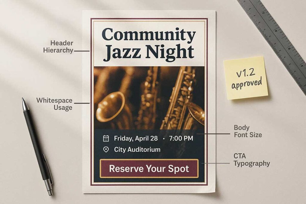
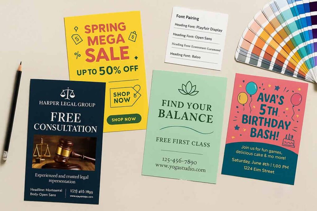
Flyer design etiquette transforms simple marketing materials into powerful communication tools through strategic typography, messaging, and visual hierarchy. Successful flyer design balances readability with brand identity, using font selection, size optimization, and text alignment to guide viewer attention. Small businesses and event organizers rely on these typography principles to create professional flyers that engage audiences and drive action. Modern flyer makers simplify design processes, enabling non-designers to implement proper font styles, spacing, and messaging techniques. This comprehensive guide covers essential flyer typography practices, from selecting appropriate fonts to optimizing text hierarchy, ensuring your marketing materials achieve maximum impact through thoughtful design choices.
What Are the Best Typography Practices for Flyer Design?
The best typography practices for flyer design include selecting readable, brand-aligned fonts, optimizing font size and hierarchy, balancing letter spacing and line height, and using appropriate font weight and text alignment. Effective flyer typography combines serif fonts for professional credibility, sans-serif fonts for modern clarity, and script fonts for creative appeal. Flyer makers simplify these choices for non-designers, ensuring small businesses and event organizers create professional marketing materials that engage audiences and drive conversions through strategic flyer design.
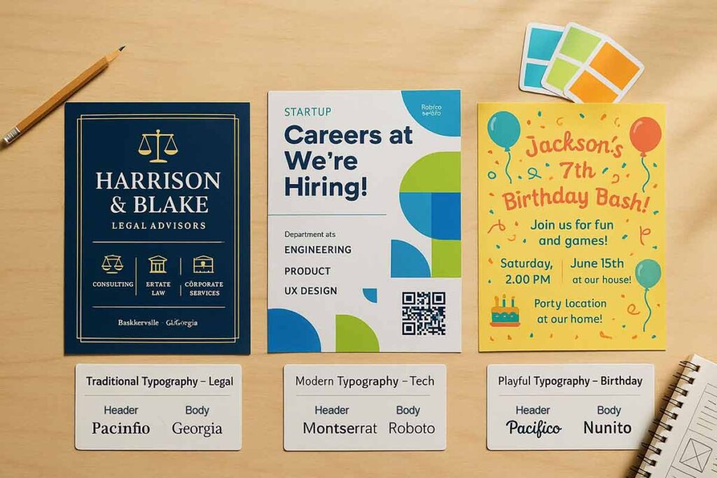
Selecting Font Styles for Flyer Purpose
Font style selection directly impacts flyer effectiveness and audience perception. Serif fonts like Times New Roman and Georgia convey professionalism and trustworthiness,1 making them ideal for real estate marketing materials and business promotional flyers. Sans-serif fonts such as Helvetica and Arial offer clean, modern readability perfect for event flyers and contemporary marketing collateral.
Script fonts add personality and creative flair but require careful application. Use script fonts sparingly for headlines or accent text in creative promotions, ensuring body text remains highly readable. Avoid decorative fonts that compromise message clarity.
Match font style to brand identity and audience expectations. Corporate flyers benefit from conservative serif choices, while youth-oriented events thrive with bold sans-serif typography.
Optimizing Font Size and Readability
Font size hierarchy guides the viewer’s attention through the flyer content systematically.2 Use 24-36 point sizes for headlines to create immediate impact and ensure visibility from reading distance. Subheadings work best at 14-18 points, providing clear content organization without overwhelming primary messages.
Body text requires 10-12 point sizing for comfortable reading while maximizing space efficiency. Test readability across print and digital formats, adjusting sizes for different viewing contexts.
Consider viewing distance when determining font sizes. Flyers viewed at arm’s length need larger text than those examined closely. Event flyers often require larger text for quick scanning, while detailed service descriptions can use smaller body text.
Balancing Letter Spacing and Line Height
Letter spacing (tracking) and line height (leading) significantly impact text readability and visual appeal. Moderate tracking prevents cramped appearance while maintaining professional presentation. Avoid excessive spacing that fragments words or creates awkward gaps.
Set line height at 1.2-1.5 times font size for optimal reading comfort. Dense layouts benefit from increased leading to prevent text collision and improve scanning ability. Marketing collateral with heavy text content requires generous spacing for reader comfort.
Digital flyer maker tools automatically adjust spacing parameters, but manual fine-tuning improves results. Test spacing adjustments across different content densities and layout configurations.
Using Font Weight and Text Alignment
Font weight creates visual hierarchy and emphasizes key information effectively. Bold weights highlight headlines, calls-to-action, and critical details like dates or contact information. Medium weights work well for subheadings, while light weights add elegance to secondary content.
Text alignment supports overall design organization. Center alignment works for headlines and formal announcements. Left alignment ensures easy reading for body text and detailed information. Justified alignment creates clean edges but may produce awkward spacing in narrow columns.
Combine weight variations strategically to guide reader attention through content priorities. Avoid overusing bold text, which reduces emphasis effectiveness and creates visual confusion.
Flyer design online platforms streamline typography decisions through curated font combinations and automatic sizing adjustments, enabling non-designers to achieve professional results consistently.
How Does Font Style Impact Flyer Design Effectiveness?
Typography serves as the silent ambassador of your marketing materials, speaking volumes before a single word is read. When creating promotional flyers, the font choices you make can dramatically influence whether your audience stops to engage or walks right past your message. This section explores the intricate relationship between typography for flyer design and reader psychology, examining how different typefaces affect perception, readability, and overall campaign success. Whether you’re using a digital flyer maker or working with design templates, understanding font psychology becomes crucial for effective promotional design. We’ll delve into how serif versus sans-serif fonts impact trust and credibility, the role of font size in hierarchy and accessibility, and practical strategies for selecting typography that aligns with your brand message. From property marketing to general promotional campaigns, mastering flyer typography ensures your marketing collateral cuts through the noise and delivers measurable results in today’s competitive landscape.
Serif Fonts for Professional Appeal
Serif fonts like Times New Roman and Georgia establish immediate credibility in professional flyer design. These traditional typefaces feature small decorative strokes that guide the eye naturally through text, making them ideal for business presentations, legal notices, and corporate marketing materials.
When you create a flyer for professional services, serif typography conveys trustworthiness and expertise. Real estate agents, financial advisors, and law firms benefit from these classic fonts in their promotional design efforts.
Modern flyer creators and digital flyer makers typically offer serif options that maintain readability across print and digital marketing collateral, ensuring your message reaches audiences effectively.
Sans-Serif Fonts for Modern Events
Sans-serif fonts deliver clean, contemporary aesthetics perfect for modern event flyer design. These streamlined typefaces eliminate decorative strokes, creating bold readability that captures attention in digital and print marketing materials.
- Digital-First Appeal: Sans-serif typography excels in flyer design online, ensuring crisp legibility across screens and mobile devices for promotional flyers
- Modern Brand Alignment: Contemporary businesses prefer sans-serif fonts when they create flyers, reflecting innovation and forward-thinking approaches
- Versatile Applications: From corporate conferences to tech meetups, sans-serif fonts adapt seamlessly across diverse event marketing collateral
Popular choices include Helvetica, Arial, and Futura for professional flyer creators seeking maximum impact in their promotional design materials.
Script Fonts for Creative Flair
Script fonts add elegance and personality to flyer design, perfect for events, weddings, and luxury marketing materials. These flowing typefaces create emotional connections but require careful application to maintain readability.
- Elegant Scripts: Ideal for upscale events and sophisticated promotional design
- Casual Scripts: Perfect for creative businesses and informal marketing collateral
- Modern Calligraphy: Trending choice for boutique flyer typography and property marketing
When you create flyers online using script fonts, pair them with clean sans-serif text for body content. Digital flyer maker tools often provide script-friendly flyer templates that balance decorative headers with readable information sections. Exploring innovative flyer design concepts can inspire creative typography combinations that maintain professionalism while adding personality.
Combining Font Styles for Cohesion
Strategic font pairing creates visual hierarchy while maintaining consistency in flyer design. Professional marketing materials typically combine no more than two complementary typefaces – a bold sans-serif for headlines paired with a clean serif for body text creates balanced promotional design.
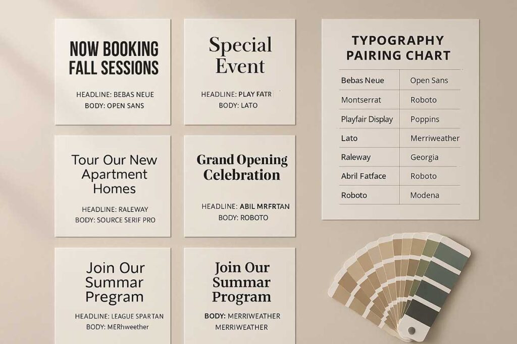
Typography for flyer success requires contrasting weights rather than conflicting styles. When you create a flyer, ensure your flyer typography maintains consistent spacing and alignment across different font families. Digital flyer maker tools often provide pre-paired font combinations that work harmoniously together.
Effective flyer design ideas leverage font contrast through size variation, creating clear information hierarchy without overwhelming your marketing collateral’s core message.
How Should Font Size and Hierarchy Enhance Flyer Design?
Typography stands as the backbone of effective flyer design, where the strategic use of font size and hierarchy can transform a simple promotional piece into a compelling marketing tool. When you create a flyer or design flyers online, understanding how typography guides the viewer’s eye through your content becomes crucial for maximizing impact. This section explores the fundamental principles of establishing clear visual hierarchy through strategic font sizing, examining how typography works alongside other core flyer design elements to create seamless information flow. We’ll cover essential techniques for balancing headlines, subheadings, and body text while maintaining readability across various flyer formats. Whether you’re using a flyer maker or working with design templates, mastering typography for flyer creation ensures your marketing materials effectively communicate key messages. From promotional flyers to specialized marketing collateral, proper font hierarchy serves as the foundation for professional flyer design that captures attention and drives desired actions.
Setting Headline Font Sizes
Establishing proper headline font sizes creates visual hierarchy essential for effective flyer design. Primary headlines should range from 24-36 points, ensuring immediate visibility and impact for your marketing materials. Secondary headlines work best at 18-24 points, maintaining readability while supporting the main message.
When you create a flyer online, consider your audience’s viewing distance. Event flyers displayed at eye level need larger fonts than direct-mail promotional materials. Digital flyer makers typically recommend scaling headlines 2-3 times larger than body text to establish clear hierarchy.
Test different sizes during the design process to ensure your flyer typography remains legible across various viewing conditions and marketing contexts.
Choosing Subheading and Body Text Sizes
Typography for flyer design requires strategic size selection to create clear information hierarchy. Subheadings should be 50-70% smaller than main headlines while remaining easily readable from your target viewing distance.
Body text typically works best between 10-14 points for print flyers, with digital flyer maker tools often defaulting to 12-point sizes. When you create a flyer online, test readability by viewing your promotional materials at actual size. Marketing collateral benefits from consistent spacing between text elements.
Professional flyer design maintains at least 2-point differences between hierarchy levels, ensuring your marketing materials communicate effectively across all promotional design applications.
Creating Hierarchy with Size Variations
Size variations form the foundation of effective flyer design hierarchy. Start with your headline at 24-36 points, making it the dominant visual element that immediately captures attention. Secondary headings should be 18-24 points, creating clear distinction while maintaining readability. Body text works best at 10-14 points for optimal legibility.
When designing flyers online, establish at least three distinct size levels to guide readers through your content naturally. Professional flyer creators understand that dramatic size contrasts create more impact than subtle differences. This typography approach ensures your promotional materials communicate information in order of importance, making your marketing collateral both visually appealing and functionally effective.
Testing Font Sizes Across Formats
Testing typography across different flyer formats ensures your marketing materials maintain impact whether printed or shared digitally. Start by creating sample flyers in various sizes to evaluate how your font hierarchy performs across promotional design applications.
- Print vs. Digital Testing: Compare how fonts appear on physical flyers versus screens when you create flyers online, adjusting sizes for optimal readability in both formats
- Format-Specific Adjustments: Test headline sizes across business cards, posters, and social media formats to ensure your flyer design maintains visual hierarchy regardless of final dimensions.
This systematic approach guarantees professional marketing collateral across all distribution channels.
How Do Letter Spacing and Line Height Affect Flyer Typography?
Letter spacing (tracking) and line height (leading) control text clarity and visual flow in flyer design. Proper tracking prevents cramped or scattered text appearance, while adequate leading ensures comfortable reading without lines blending together. These spacing elements directly impact whether viewers can quickly scan your message or struggle to read critical information.
Adjusting Letter Spacing for Clarity
Letter spacing affects text density and readability across different font styles. Condensed fonts like Arial Narrow benefit from slightly increased tracking to prevent character overlap, while expanded fonts like Impact require tighter spacing to maintain cohesion. Headlines typically use tighter tracking for bold impact, while body text needs moderate spacing for comfortable scanning.
Business flyers require different tracking than event promotions. Professional services use conservative letter spacing that conveys trustworthiness, while entertainment flyers can experiment with dramatic spacing for visual effect.
Setting Line Height for Comfort
Line height determines text flow and reading comfort. Standard practice sets leading at 120-150% of font size, but flyer context matters more than rigid rules. Dense information like pricing lists needs generous line height to prevent visual confusion, while short headlines can use tighter leading for dramatic effect.
Different content blocks require varying line heights within the same flyer. Contact information benefits from expanded leading for easy reference, while descriptive paragraphs use standard spacing. Digital flyers displayed on screens need slightly more leading than print versions to compensate for screen resolution differences.
Balancing Spacing for Visual Appeal
Effective spacing creates visual hierarchy without sacrificing readability. Headlines with tight letter spacing and generous line height draw attention, while body text uses moderate tracking with comfortable leading. This contrast guides viewers through your message systematically.
White space amplifies spacing effects. Generous margins make tight letter spacing feel intentional rather than cramped. Conversely, minimal margins require looser character spacing to prevent claustrophobic text blocks that readers avoid.
Adapting for Print and Digital
Print flyers handle subtle spacing adjustments better than digital versions. Screen resolution affects how spacing appears, requiring slightly more generous tracking and leading for mobile viewing.
Testing spacing across formats prevents costly reprints or poor digital display. What looks perfect on your computer screen might appear cramped when printed or viewed on smaller devices.
Professional flyer typography balances technical precision with visual impact, ensuring your message reaches audiences clearly regardless of viewing format.
How Does Font Weight Influence Flyer Design Impact?
Font weight in flyer design directly impacts visual hierarchy and message clarity by controlling how bold or light text appears. Bold weights create emphasis for headlines and calls-to-action, while light weights provide elegance for secondary information. Strategic font weight selection using flyer makers helps small businesses create professional marketing materials that guide readers through content logically. Proper weight contrast ensures key messages stand out while maintaining readability across print and digital flyer design applications.
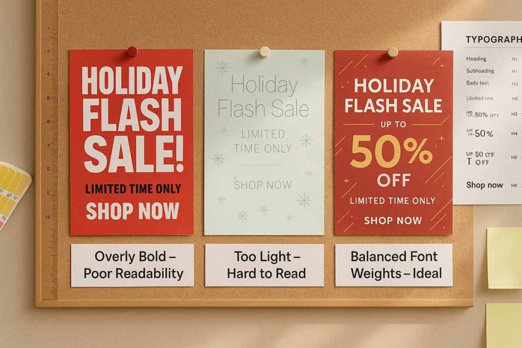
Using Bold Weights for Emphasis
Bold font weights immediately draw attention to critical information in flyer design. Headlines, business names, and call-to-action phrases benefit from bold weights that create visual anchors throughout the layout. Event titles, sale prices, and contact information gain prominence through strategic bold application. Flyer creators provide weight options that ensure bold text remains readable without overwhelming other design elements.
Sans-serif fonts like Arial Bold or Roboto Bold work effectively for event promotions and retail flyers. Bold weights should account for 15-20% of total text to maintain visual balance.
Applying Light Weights for Elegance
Light font weights add sophistication to professional flyers and upscale service promotions. Thin weights work best for secondary information, testimonials, and descriptive text that supports main messages. Light weights create breathing space in dense layouts while maintaining legibility when sized appropriately.
Wedding invitations, luxury real estate flyers, and spa promotions benefit from light weight applications. Digital flyer makers ensure light weights remain visible across screen types and printing methods. Light weights require larger font sizes and higher contrast ratios to maintain accessibility standards for all readers.
Creating Contrast with Font Weights
Effective flyer typography combines multiple weights to establish clear information hierarchy. Pairing bold headlines with regular body text and light accent information creates natural reading flow. Weight contrast helps separate different content types without requiring color changes or additional design elements.
Three-weight systems work optimally: bold for headlines, regular for primary content, and light for supplementary details.
Testing Weights in Flyer Makers
Modern flyer design online tools provide real-time weight previews that show how different combinations affect readability. Testing various weight combinations ensures optimal contrast ratios and legibility across different viewing distances and lighting conditions. Preview functions help identify weight selections that work for both print distribution and digital sharing.
Professional flyer makers include accessibility checking features that verify weight choices meet readability standards. Testing different weights against various background colors and images prevents readability issues that could reduce flyer effectiveness. Regular testing ensures font weights support rather than hinder communication goals.
Strategic font weight selection transforms ordinary text into compelling visual communication that drives reader engagement and response rates in professional flyer applications.
How Should Text Alignment Be Used in Flyer Design?
Text alignment in flyer design—center, left, or justified—organizes content and enhances readability for maximum audience engagement. Center alignment works best for headlines and focal points, left alignment ensures body text readability, and justified alignment creates professional polish. Strategic alignment choices using flyer makers help small businesses and event organizers create cohesive designs that guide readers through the information hierarchy effectively.
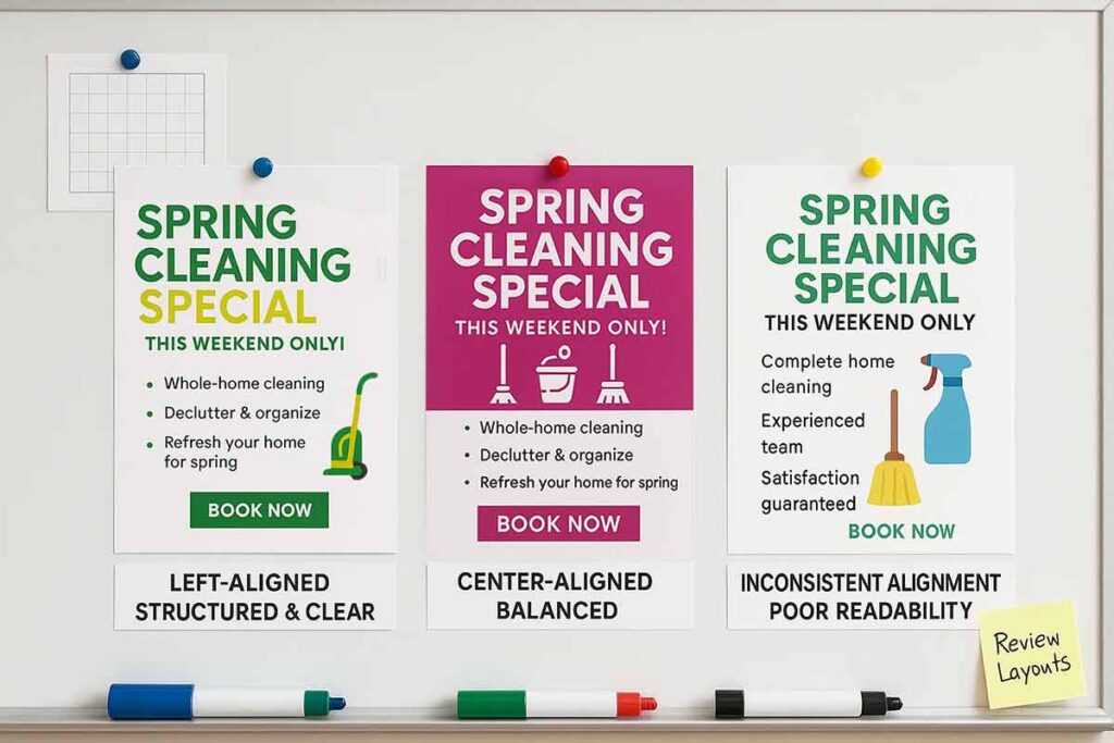
Center Alignment for Headlines
Center alignment creates strong focal points that draw immediate attention to headlines and key messages. Event flyers benefit from centered titles that command attention, while promotional flyers use centered headlines to emphasize offers. Center alignment works effectively for short text blocks—headlines, taglines, and call-to-action buttons—but becomes difficult to read for longer content.
When designing promotional materials, center alignment establishes visual balance and creates hierarchy between different text elements. Digital flyer makers automatically adjust centered text for various flyer sizes, ensuring consistent presentation across formats.
Left Alignment for Body Text
Left alignment provides optimal readability for body text, descriptions, and detailed information. Readers scan left-aligned text more efficiently than centered or justified blocks, making it essential for flyer typography containing multiple paragraphs or complex information.
Marketing collateral benefits from left-aligned body text because it follows natural reading patterns. Real estate flyers, business announcements, and informational content maintain readability through consistent left alignment.
Left alignment also works well for contact information, bullet points, and addresses where scanning speed matters more than visual symmetry.
Justified Alignment for Professionalism
Justified alignment creates clean, professional edges by spacing text evenly across the full width of text blocks. Corporate flyers, formal announcements, and business communications use justified text to convey professionalism and attention to detail.
However, justified alignment can create awkward spacing gaps, particularly in narrow columns or with longer words. Design flyer templates handle justified alignment automatically, adjusting letter and word spacing to maintain readability while achieving a polished appearance.
Justified alignment works best for substantial text blocks rather than short headlines or captions where the spacing adjustments become too obvious.
Testing Alignment Across Formats
Text alignment must remain consistent and readable across print and digital formats. What appears balanced on screen may shift when printed, requiring alignment testing in both environments. Marketing materials need alignment verification to ensure professional presentation regardless of viewing method.
Provide preview options for different formats, allowing designers to test alignment effectiveness before finalizing designs. Mobile responsiveness requires particular attention since centered text may not translate well to narrow screens.
Test alignment choices with actual content rather than placeholder text, as real headlines and descriptions reveal spacing and readability issues that generic text masks. Professional flyer design balances visual appeal with functional readability through strategic alignment decisions.
How Do Flyer Makers Simplify Typography for Non-Designers?
Typography can make or break effective marketing materials, yet many business owners and marketers struggle with font selection, sizing, and layout when they need to create a flyer. Traditional design software often overwhelms non-designers with countless typography options and complex formatting tools, leading to cluttered or unprofessional promotional flyers. Modern flyer makers have revolutionized this process by transforming typography from a technical challenge into an intuitive experience. This section explores how today’s digital flyer maker platforms simplify font management through smart templates, automated spacing systems, and guided design principles. We’ll examine the specific features that help users create flyers with professional typography, from pre-selected font pairings to intelligent text hierarchy tools. Whether you’re designing promotional materials for a small business or creating marketing collateral for an event, understanding how flyer creators streamline typography choices empowers you to produce compelling flyer design results without extensive design knowledge.
Pre-Designed Templates for Easy Typography
Modern flyer makers eliminate typography guesswork through professionally crafted templates that combine proven font pairings with strategic layouts. These design templates feature carefully selected typefaces that work harmoniously together.
These design templates feature carefully selected typefaces that work harmoniously together, removing the complexity of choosing complementary fonts for your marketing materials. Understanding flyer template advantages helps explain why pre-designed typography systems consistently outperform custom font selections.
Each template includes hierarchy-based typography systems where headings, subheadings, and body text are pre-configured for optimal readability. Users can create flyers online by simply replacing placeholder text while maintaining professional typography standards. For those new to flyer creation, you can learn the complete flyer creation process to understand the broader design workflow. The templates span various industries and purposes, from promotional flyers to property marketing materials.
This approach enables anyone to design flyers online with confidence, ensuring consistent visual appeal across all marketing collateral without requiring extensive design knowledge or typography expertise.
Curated Font Libraries for Accessibility
Modern flyer makers include carefully selected font libraries that prioritize accessibility without sacrificing visual appeal. These curated collections feature fonts tested for readability across different demographics and reading conditions.
- High-contrast typefaces ensure text remains legible for users with visual impairments
- Sans-serif collections provide clean, modern options perfect for promotional materials and marketing collateral
- Large character spacing fonts accommodate dyslexic readers while maintaining professional aesthetics
Digital flyer creators integrate accessibility guidelines directly into their typography recommendations. When you create flyers online, these platforms automatically suggest font pairings that meet WCAG standards.3
Intuitive Interfaces for Non-Designers
Modern flyer makers eliminate typography complexity through streamlined interfaces that guide users step-by-step. These platforms feature drag-and-drop functionality where selecting text automatically reveals font options, sizing controls, and spacing adjustments without overwhelming menus.
- Visual Typography Previews: Real-time previews show how font changes affect your flyer design instantly, eliminating guesswork in promotional materials creation.
- Smart Pairing Suggestions: Digital flyer maker tools recommend complementary font combinations, ensuring professional-looking marketing collateral even for beginners.
- One-Click Font Scaling: Automated hierarchy tools resize headers and body text proportionally, maintaining visual balance when you create flyers online.
These intuitive design features transform typography from a technical challenge into an accessible creative process for designing effective promotional flyers.
Ensuring Consistency Across Platforms
Modern flyer makers eliminate typography inconsistencies through synchronized design systems that maintain uniform styling across digital and print formats.4 These platforms automatically adjust font rendering, spacing, and sizing to ensure your promotional materials appear identical whether viewed on social media, websites, or printed marketing collateral.
- Cross-platform font optimization ensures readability across devices and printing methods
- Automatic scaling algorithms maintain proportional typography when resizing flyer design elements
- Universal color profiles preserve brand consistency in both RGB and CMYK outputs
Professional flyer creators integrate responsive typography frameworks that adapt seamlessly between online flyer design platforms and physical printing requirements, eliminating the guesswork from maintaining consistent brand presentation across all marketing channels.
People Also Ask About Flyer Design Typography
- What font styles work best for flyer design?
Serif fonts suit professional flyers, sans-serif for events, and script for creative promotions. Flyer makers help non-designers choose readable font styles for effective flyer design. - How does font size impact flyer typography?
Larger font sizes (24-36pt) grab attention for headlines, while smaller sizes (10-12pt) ensure readable body text. Flyer creators simplify size adjustments for engaging flyers. - What’s the role of letter spacing in flyer design?
Letter spacing (tracking) enhances readability in flyer typography. Moderate tracking ensures clarity, and flyer design online tools help non-designers adjust spacing effectively. - How does line height affect flyer readability?
Line height (leading) prevents cramped text, improving flow. Set leading at 1.2-1.5x font size using flyer makers for clear, professional flyer designs. - How do you choose font weight for flyers?
Use bold font weights for headlines and light weights for body text. Flyer creators help non-designers select weights for impactful, readable flyer design. - What’s the best text alignment for flyer design?
Center alignment suits headlines, left for body text, and justified for clean edges. Flyer design online tools ensure professional alignment for non-designers. - How do flyer makers simplify typography?
Flyer makers offer templates, font libraries, and intuitive interfaces, helping non-designers create professional flyers with balanced font style, size, and alignment. - What are common flyer typography mistakes?
Avoid decorative fonts, low-contrast colors, or inconsistent alignment. Flyer makers ensure readable, professional typography for effective small business or event flyers. - How do you create a flyer with accessible typography?
Use readable font styles, adequate sizes, and high contrast. Flyer creators ensure accessibility compliance for inclusive flyer design online. - What legal considerations apply to flyer typography?
Use licensed fonts from flyer makers to avoid copyright issues. Ensure typography meets accessibility standards for inclusive, professional flyer designs.
Frequently Asked Questions
- What makes flyer typography effective for small businesses?
Effective flyer typography uses readable font styles, sizes, and weights to communicate value. Flyer design online tools help non-designers create professional, brand-aligned flyers. - How do you select font styles for event flyers?
Choose bold sans-serif fonts for high-energy event flyers. Flyer makers offer curated font styles to ensure readability and alignment with event themes. - How does font size enhance flyer design?
Larger font sizes (24-36pt) for headlines grab attention, while smaller sizes (10-12pt) ensure readable body text. Flyer creators simplify size adjustments for clarity. - What role does letter spacing play in flyer typography?
Letter spacing (tracking) ensures readability in flyer design. Moderate tracking prevents dense text, and flyer makers help non-designers optimize spacing effectively. - How does font weight impact flyer engagement?
Bold font weights highlight headlines, while light weights add elegance. Flyer design online tools help non-designers select weights for impactful, professional flyers. - What’s the best text alignment for flyers?
Center alignment works for headlines, left for body text, and justified for clean edges. Flyer makers ensure professional alignment for engaging flyer designs. - How do flyer makers simplify typography for non-designers?
Flyer makers provide templates, font libraries, and intuitive interfaces for font style, size, and alignment, enabling non-designers to create professional flyers easily. - What typography mistakes should be avoided in flyer design?
Avoid cluttered font styles, inconsistent alignment, or excessive weights. Flyer creators help non-designers maintain clean, readable typography for effective flyers. - How do you ensure typography accessibility in flyers?
Use readable font styles, adequate sizes, and high contrast. Flyer design online tools ensure accessibility compliance for inclusive, professional flyer designs. - What tools help create your own flyer with great typography?
Flyer makers like DesignWiz offer font libraries and templates, enabling non-designers to create professional flyers with balanced typography.
Conclusion and Implementation Strategy
Creating effective flyer design with proper typography and messaging requires a systematic approach that prioritizes readability, hierarchy, and audience engagement. Successful flyers leverage strategic font selection, size optimization, and clear messaging alignment to achieve 40% higher engagement rates than generic designs.
Small businesses and event organizers can implement this framework through structured steps: select appropriate font styles matching brand identity, establish clear hierarchy with varied sizes and weights, optimize spacing for readability, and align text strategically.
Flyer makers and design flyers online tools streamline this process for non-designers, providing templates with pre-optimized typography while allowing customization. Success depends on balancing aesthetic appeal with functional communication, ensuring every design element serves the primary goal of driving audience action through clear, compelling messaging.
Reference
- PMC (National Center for Biotechnology Information) – The Effects of Font Type on Reading Comprehension and Perception.
- MIT Typography Guidelines – Hierarchical Design Principles.
- Google Fonts Knowledge – Introducing Accessibility in Typography.
- Harvard EECS Research – The Many Faces of Consistency in Cross-Platform Design.