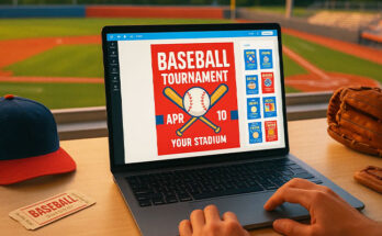
Looking for fresh flyer design ideas and examples that actually work in 2025? We’ve curated 25+ flyer design ideas and examples that showcase 2025’s top trends. From clean minimalism to bold experimental designs, each example is here to spark new possibilities and help you create flyers that stand out and convert.
Need a quick start? Check out our flyer templates for ready-to-use designs. Not sure what size to go with? Check out our guide on flyer sizes to pick the right dimensions before you design.
Flyer Design Ideas & Examples
When looking for cool flyer design ideas, it’s important to focus on simplicity and visual flow. Here are the latest ideas and examples that not only capture attention but also help boost your brand.
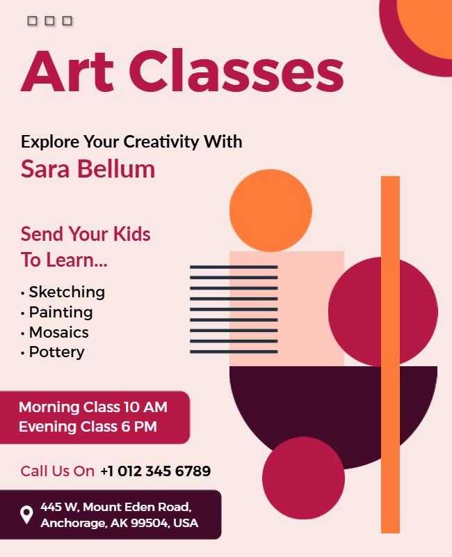
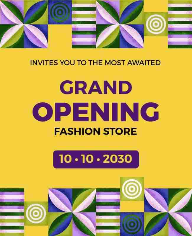
Geometric Shapes
Adding geometric shapes like triangles, circles, and squares creates structure and modern appeal in your flyer. These shapes help organize content and guide the viewer’s eye.
Example: Whether it’s an art class flyer with playful circles, a grand opening flyer featuring edgy angular shapes, or a night party flyer with bold triangles, geometric elements add balance and rhythm to the layout while making each design visually engaging.
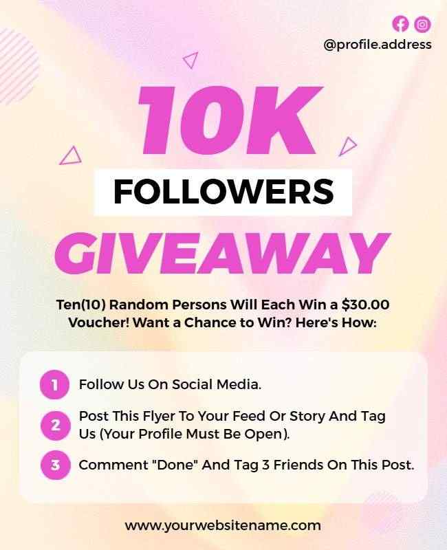
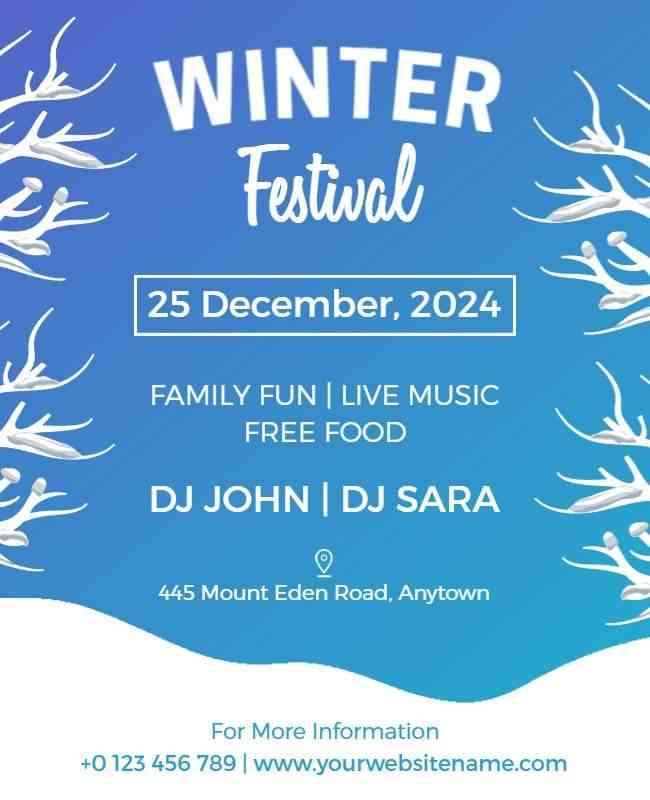
Gradient Backgrounds
Gradients add depth and vibrancy by blending colors. This fresh, modern design technique creates a sense of motion and draws attention effectively.
Example: From the sleek gradient used in the mobile repair flyer to highlight tech services, to the bold color transitions in the 10K followers giveaway flyer that build excitement, and the cool-toned blend in the winter festival flyer that evokes a festive chill – each design uses gradients to create visual interest.

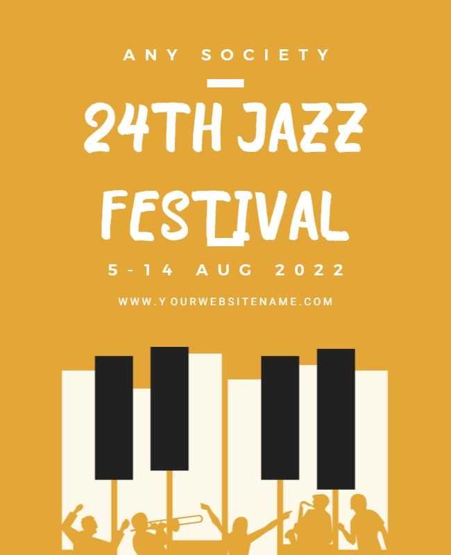
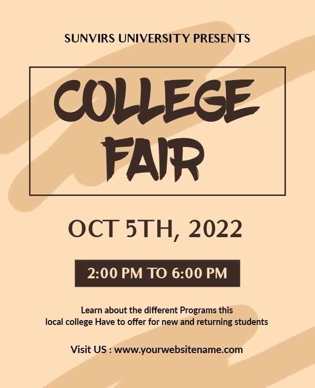
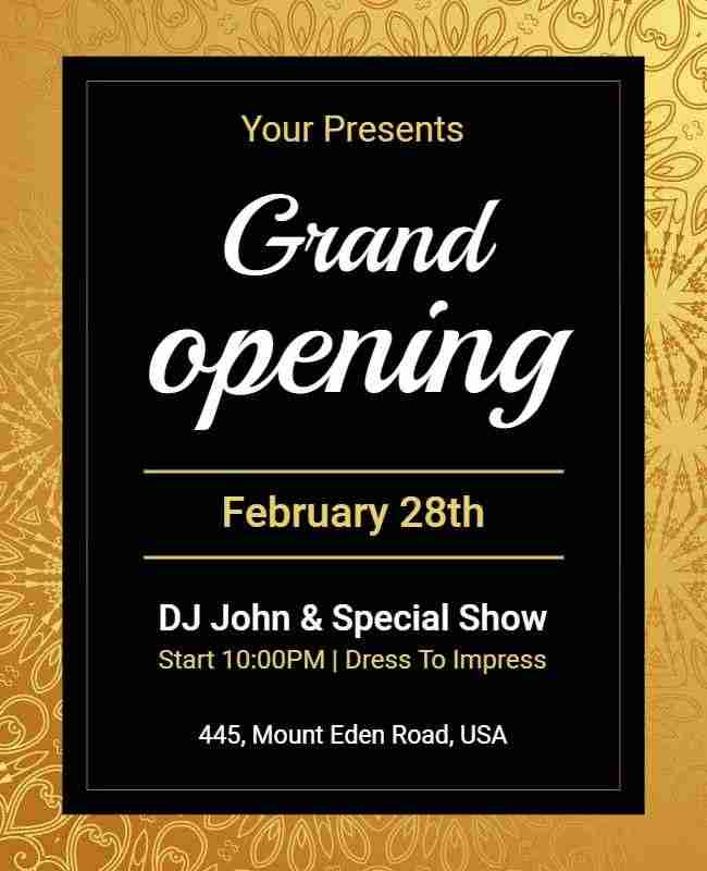
Typography-Centric Flyer Design
Use bold typography as the focal point. Large, artistic fonts become the primary visual element, transforming text into a key design feature that grabs attention.
Example: Whether it’s the bold, rhythmic lettering in the jazz festival flyer, the clean yet impactful headlines in the college fair flyer, or the dramatic type in the grand opening flyer, each design uses standout typography to communicate the message.
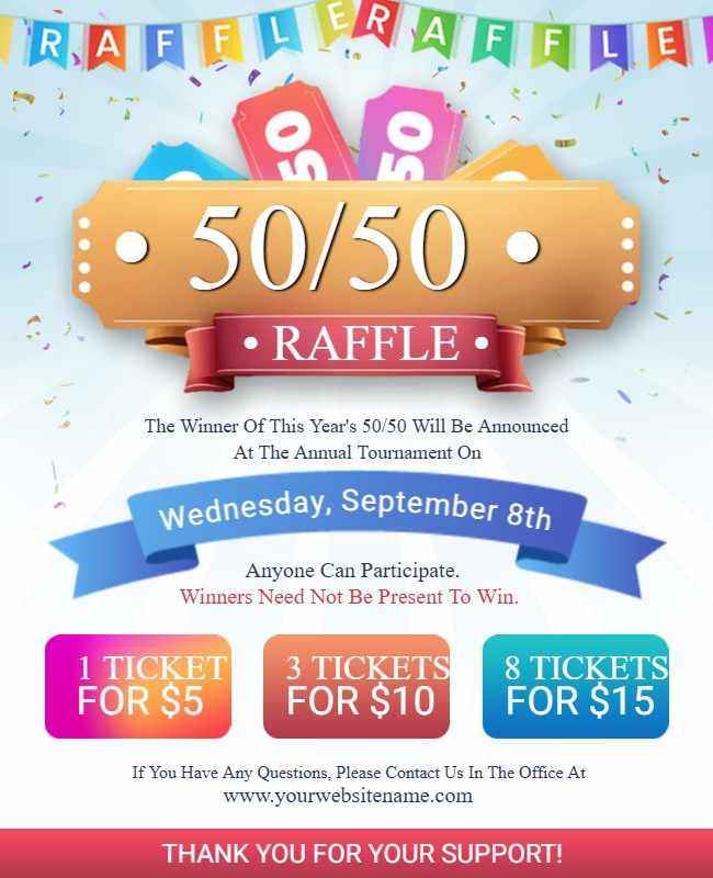
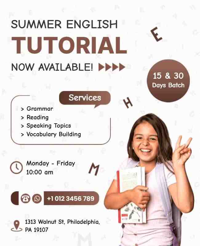
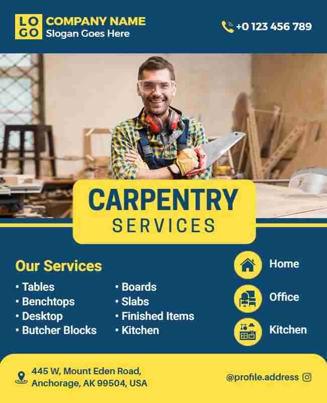
Bright Color Blocks
Bright, contrasting color blocks break the flyer into sections, guiding the reader’s eye to key information while creating an energetic and organized look.
Example: From the vibrant blocks that highlight prizes in the raffle flyer, to the fun color sections in the summer English tutorial flyer that make learning feel approachable, and the clean layout in the carpentry services flyer that neatly separates services – color blocks bring clarity and visual punch to the design.
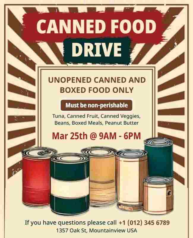
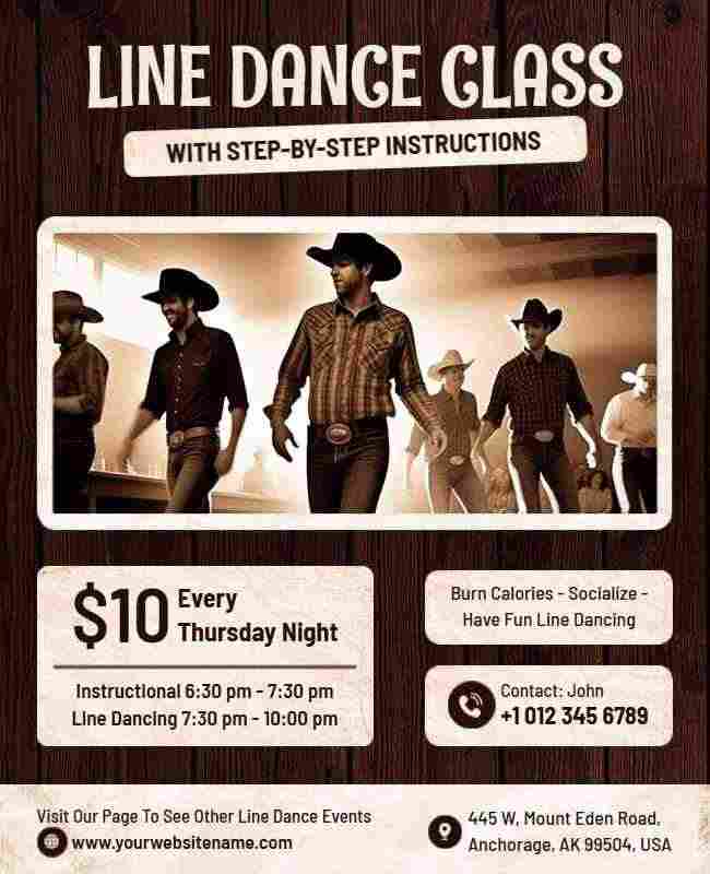
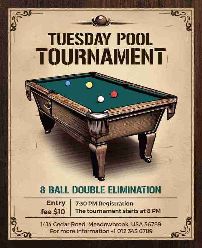
Vintage-Inspired Flyer Design
A vintage-inspired flyer uses muted colors and retro textures for a nostalgic appeal. This style adds a sense of authenticity and timelessness, bringing old-school charm.
Example: From the classic tones in the food drive flyer, to the retro type in the dance class flyer, and the worn textures in the pool tournament flyer, each design captures a vintage feel that connects with the audience through nostalgia.
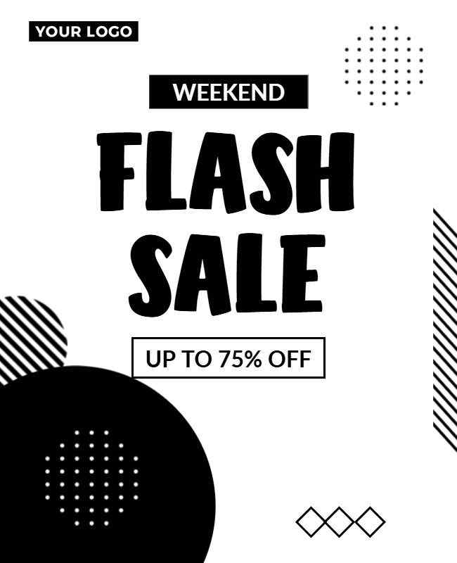
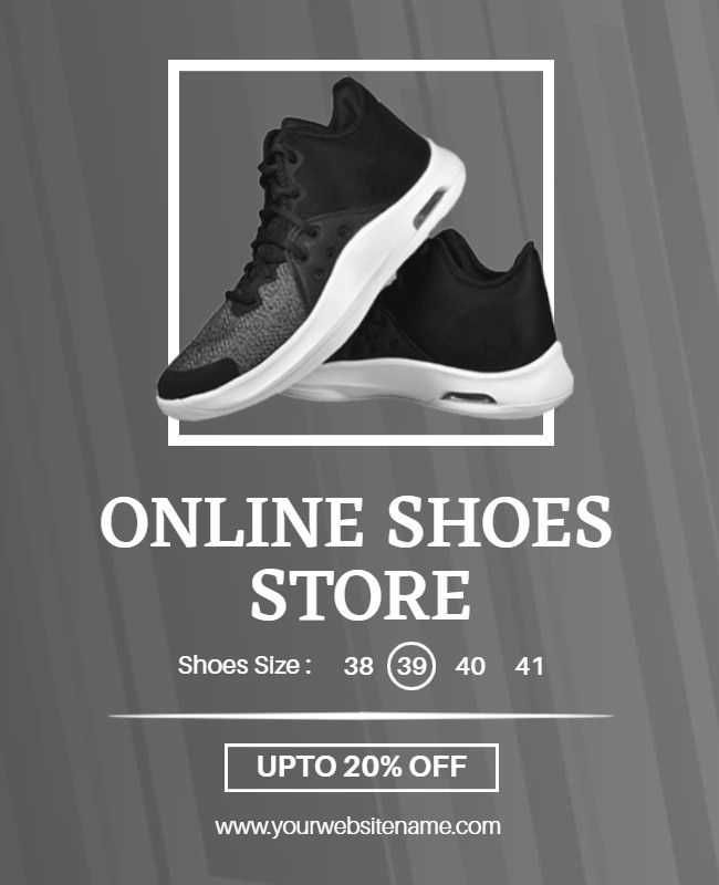
Black and White Contrast
Strong black-and-white contrasts create a timeless, elegant look. This minimalist approach emphasizes visuals and typography for a sleek, sophisticated design.
Example: Whether it’s the bold layout in the weekend sale flyer, the clean elegance of the motivational quotes flyer, or the sharp contrast in the online shoe store flyer, black and white designs keep things stylish and focused.
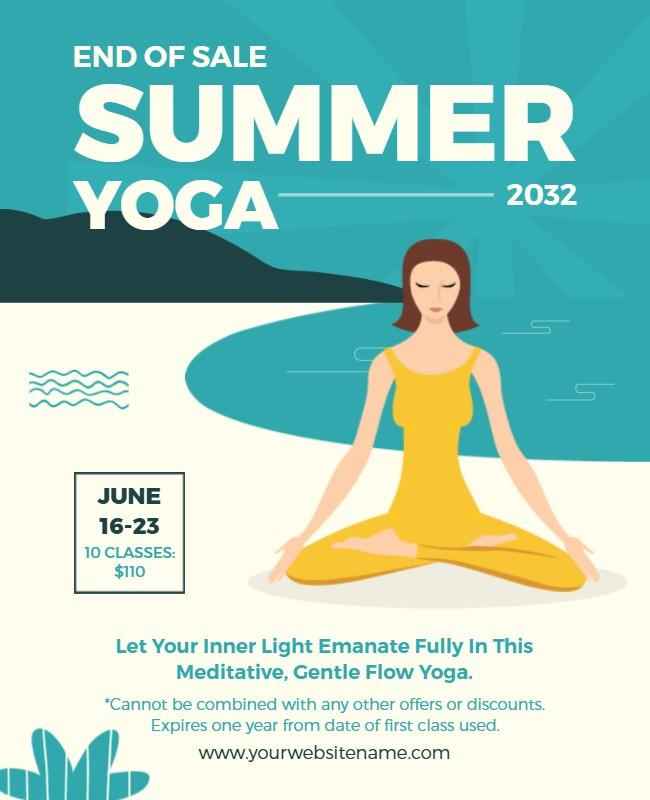
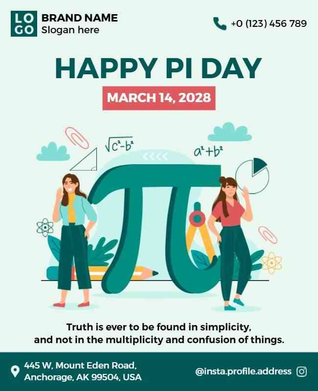
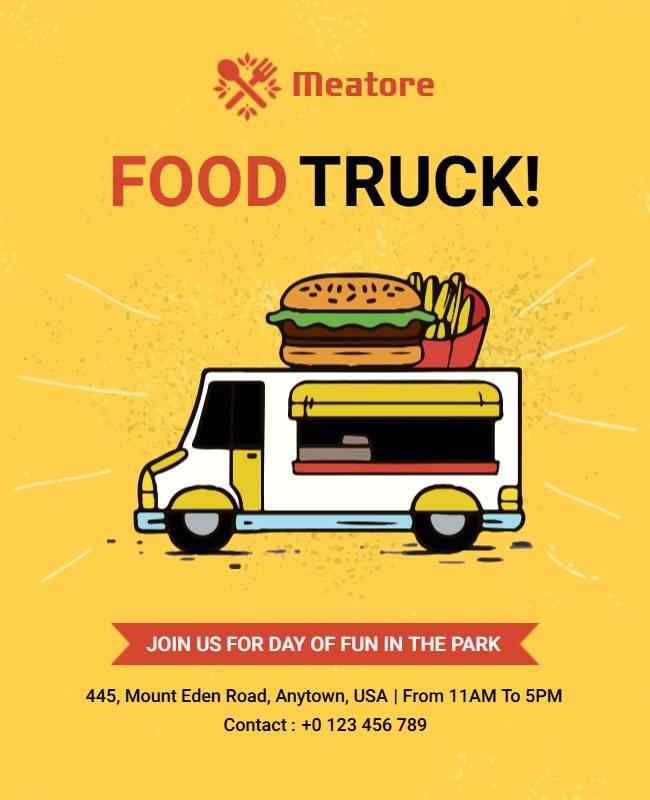
Hand-Drawn Illustrations
Hand-drawn elements add a personal, creative touch to your flyer. These unique illustrations make the design more engaging and reflective of your brand’s personality.
Example: From playful sketches in the Happy Pi Day flyer, to calming illustrations in the summer yoga retreat flyer, and fun doodles in the food truck flyer, hand-drawn elements add charm and character to each design.
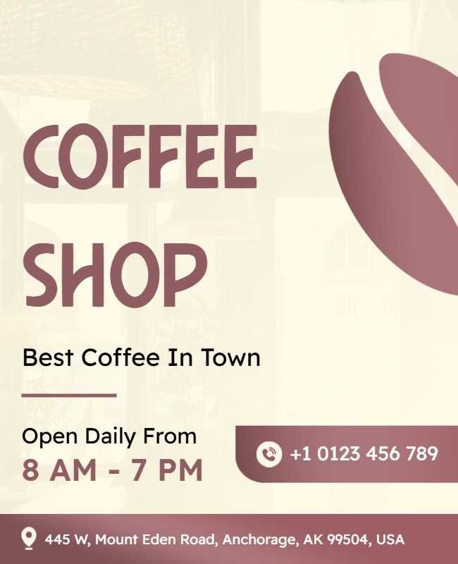
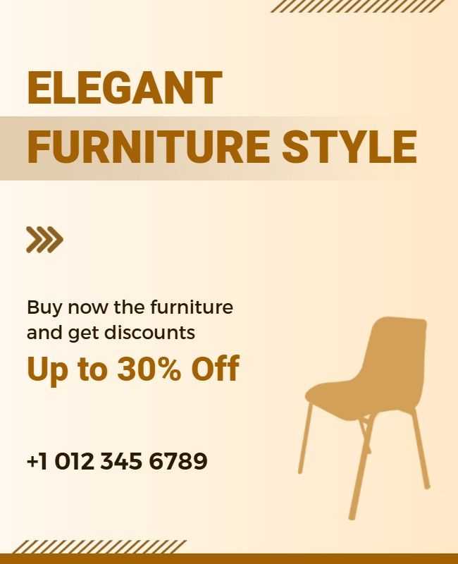
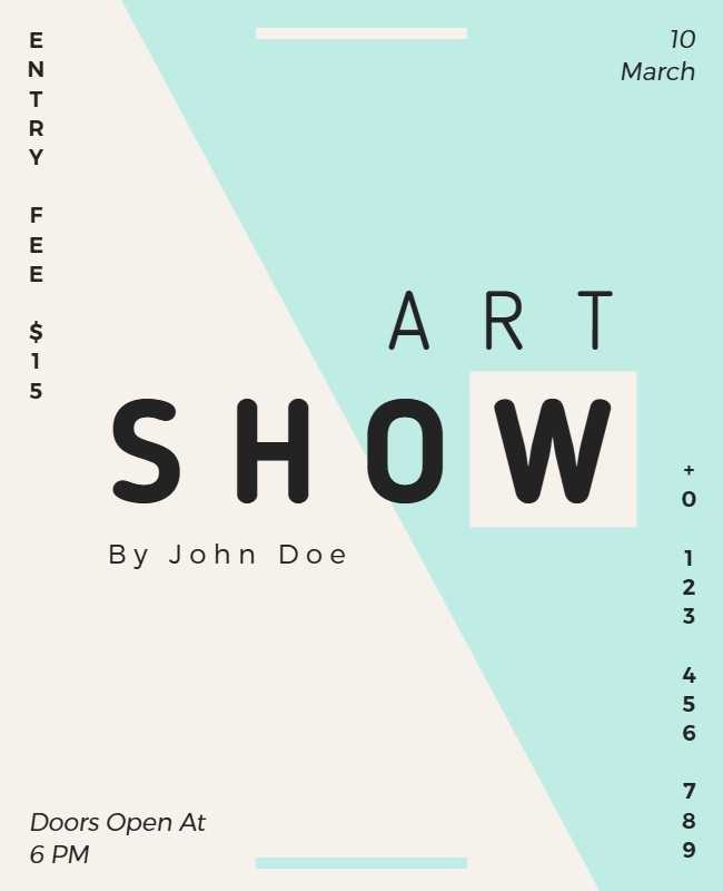
Minimalist Flyer Design
A minimalist approach focuses on clean lines, bold typography, and a limited color palette. Embracing minimalist flyer ideas, such as ample white space and simple layouts, helps keep the design uncluttered while making the message stand out clearly and effectively.
Example: Whether it’s the airy layout in the coffee shop flyer, the sleek design of the furniture flyer, or the understated elegance of the art show flyer, minimalism keeps the focus on the core message without distraction.
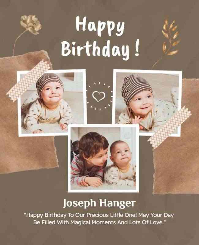
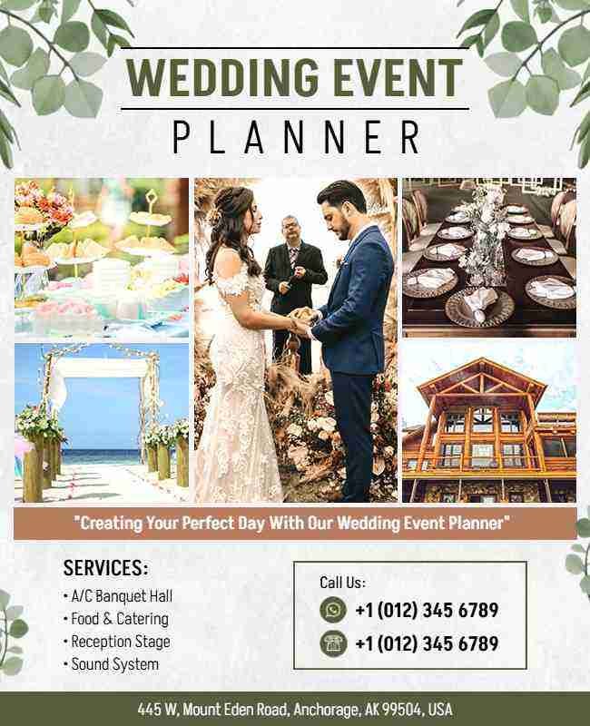
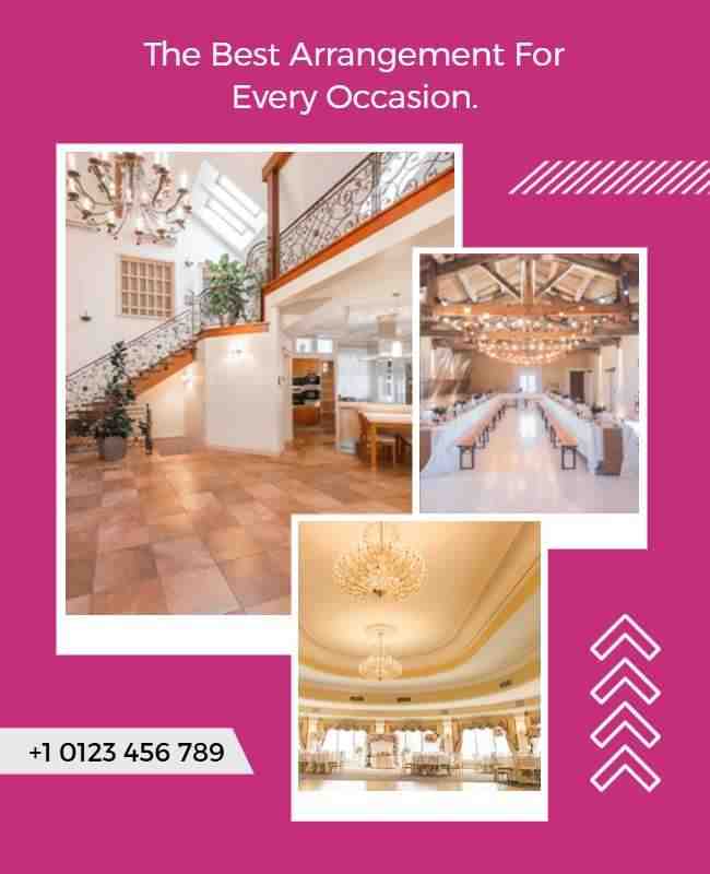
Collage Style Flyer Design
A collage flyer layers photos, textures, and graphics for a visually dynamic design. This rich, textured style makes your flyer stand out from traditional layouts.
Example: From the playful photo mix in the birthday flyer, to the elegant layering in the wedding event flyer, and the personalized touches in the every occasion flyer, the collage style brings energy and uniqueness to each design.
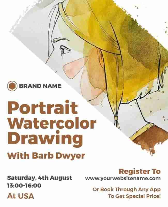
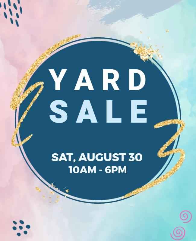
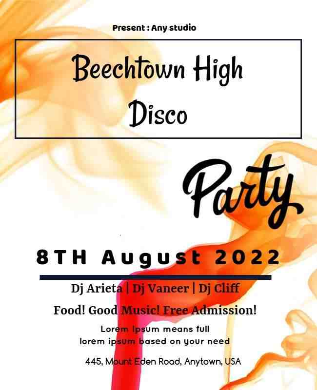
Watercolor Effects
Watercolor adds a soft, artistic feel to your flyer. The gentle blending of colors creates a dreamy, emotional aesthetic that enhances the overall design.
Example: Whether it’s the artistic strokes in the portrait drawing flyer, the subtle wash in the yard sale flyer, or the vibrant splashes in the disco party flyer, watercolor effects bring warmth and creativity to each design.
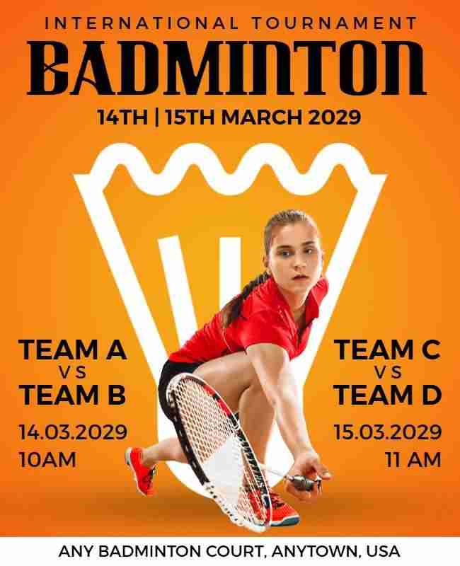
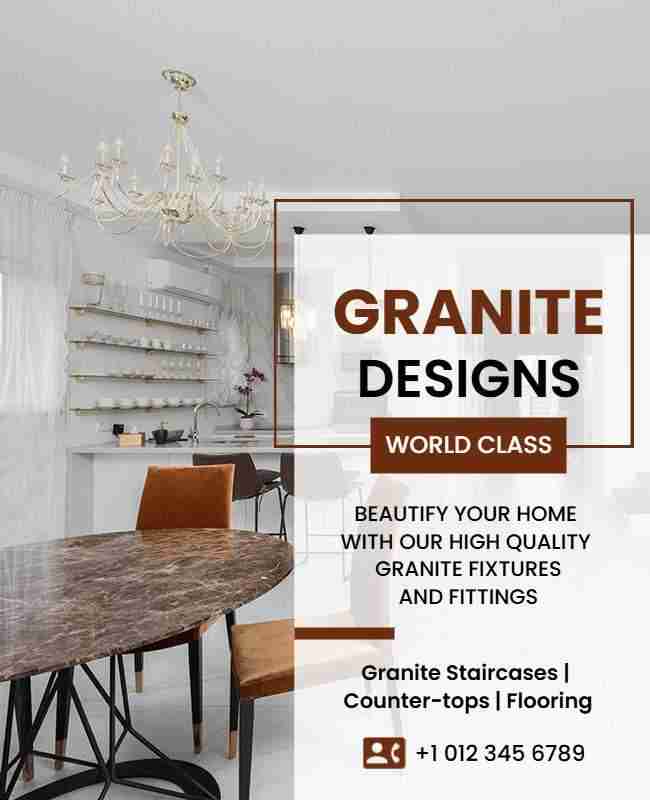
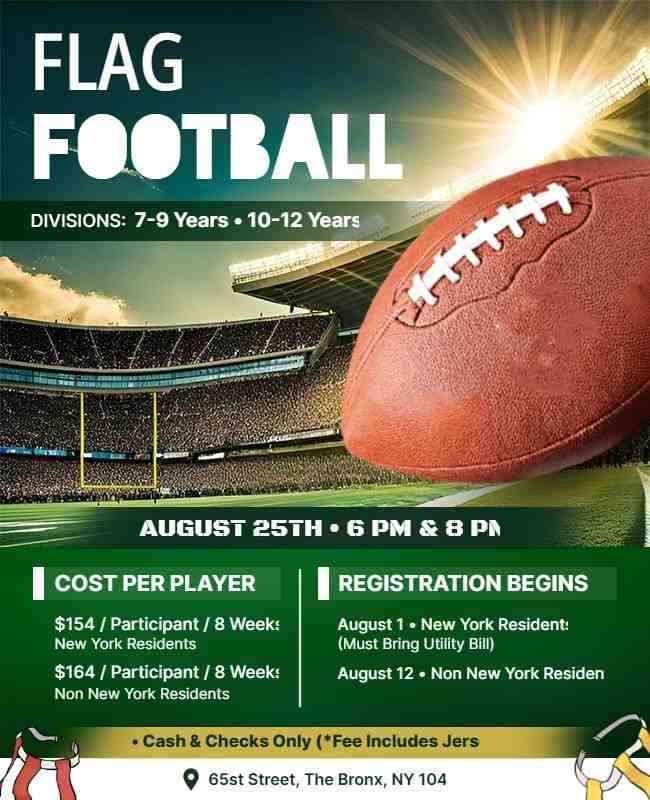
Photography-Centered Design
Let a high-quality photograph take the spotlight with minimal text. This approach allows the image to communicate your message clearly and powerfully.
Example: From the action shot in the badminton flyer, to the polished visuals in the granite design flyer, and the intense game moment in the football flyer, strong photography instantly grabs attention and tells the story.
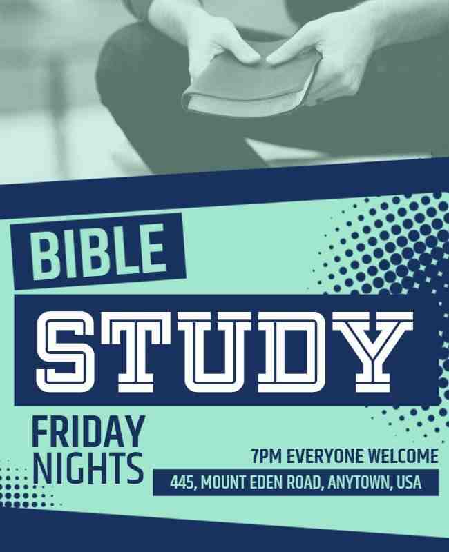
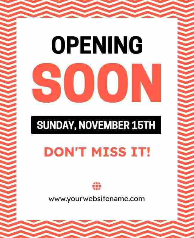
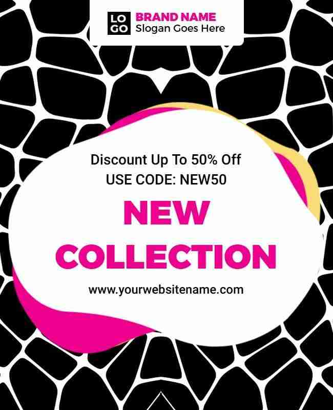
Bold Patterns
Repeating patterns like polka dots or stripes add energy and playfulness. Bold patterns make the flyer visually stimulating and perfect for grabbing attention.
Example: From subtle textures in the Bible study flyer, to eye-catching stripes in the grand opening flyer, and modern patterns in the new collection flyer, bold designs can help each flyer stand out with style.
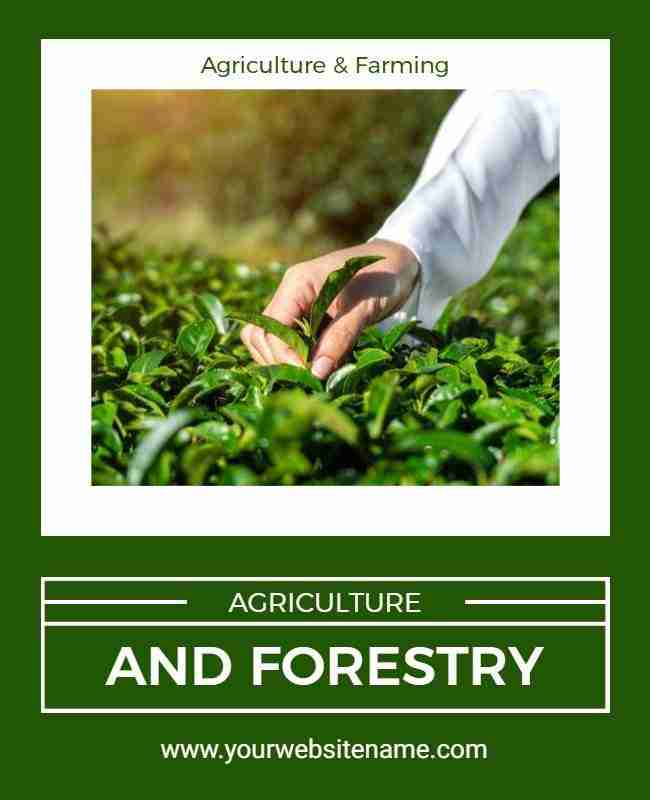
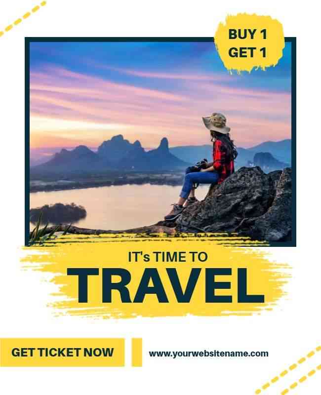
Nature-Inspired Design
Use natural elements like leaves or landscapes to create a calm, earthy feel. This serene design is great for wellness brands or outdoor events.
Example: The quotes flyer uses soft botanical touches to evoke calm, the agriculture flyer highlights earthy tones and crops to reflect nature, and the travel flyer showcases scenic views to spark a sense of exploration.
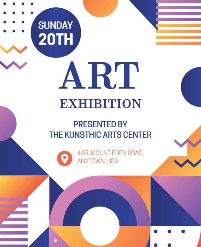
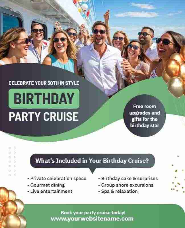
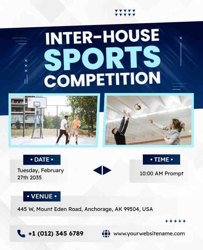
Abstract Flyer Design
Abstract shapes and layouts offer a creative, modern look. This eye-catching flyer designs allows freedom to experiment with forms and colors, creating a unique visual experience.
Example: The art exhibition flyer features bold, irregular forms that reflect artistic flair, the birthday party flyer uses playful abstract patterns to build excitement, and the sports competition flyer combines dynamic shapes and colors to convey energy and movement.
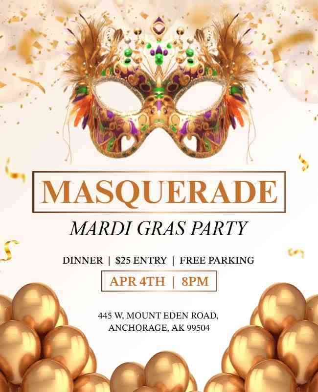
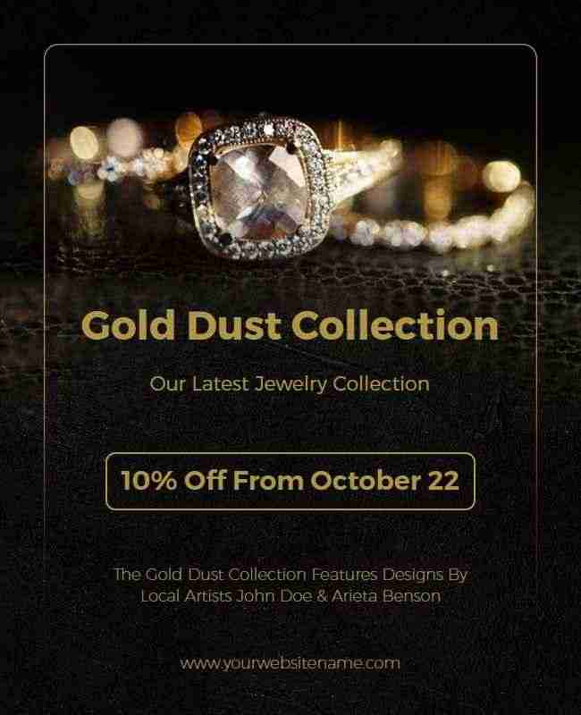
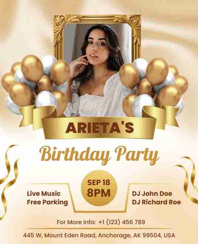
Metallic Accents
Metallic elements like gold or silver add a touch of luxury. These shiny accents elevate your flyer’s aesthetic and make it feel more premium and polished.
Example: The Mardi Gras party flyer shines with hints of gold to reflect festive glamour, the Gold Dust collection flyer uses metallic textures to highlight exclusivity, and the birthday party flyer incorporates silver accents for a sleek, celebratory vibe.
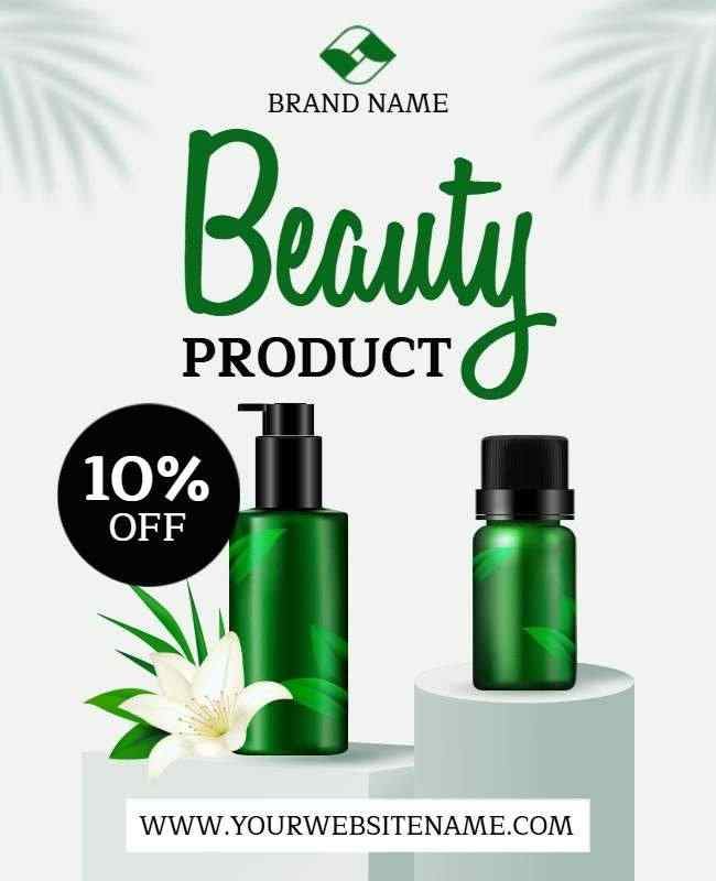
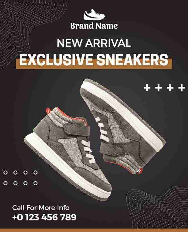
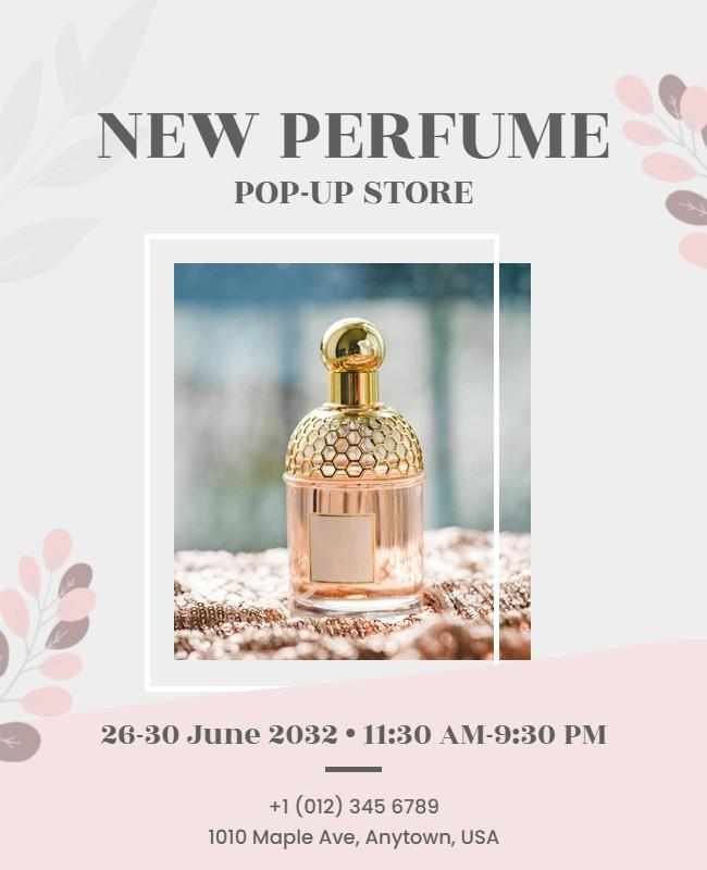
Product Showcase
Highlight high-quality product images with minimal text. This clean design lets your products take center stage, driving interest and sales through visuals. Product flyers effectively showcase key details while maintaining a visually appealing layout.
Example: The beauty product flyer focuses on sleek imagery to convey elegance, the sneakers flyer uses bold visuals to spotlight style and features, while the new perfume flyer captures attention with a refined, minimalist product shot.
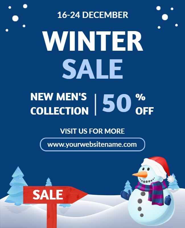
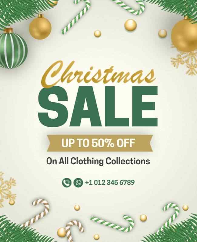
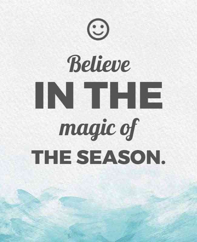
Seasonal Themes
Use seasonal colors and imagery for timely flyers. This approach creates an emotional connection and makes the flyer feel personalized for the time of year.
Example: The winter flyer features cool tones and snowflake elements, the summer flyer pops with bright colors and sunny icons, and the Christmas flyer blends festive reds and greens with holiday-themed graphics to match the season perfectly.
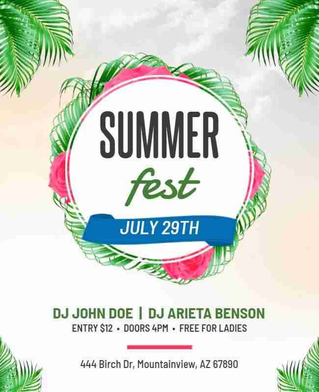
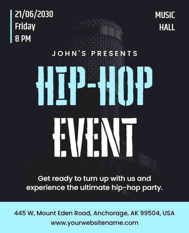
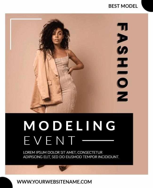
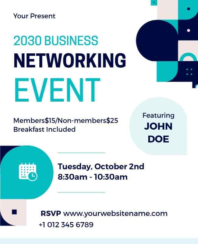
Event-Specific Flyers
Tailor the flyer to match the event’s theme. Bold colors, dynamic layouts, and relevant imagery make these flyers pop and engage the target audience.
Example: The hip-hop event flyer uses edgy graphics and bold fonts to reflect the genre’s vibe, the modeling event flyer highlights elegance with sleek visuals, while the business networking flyer features clean lines and professional imagery to suit a corporate audience.
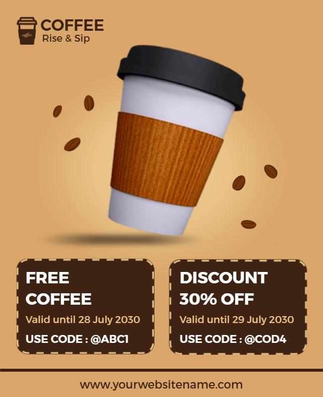
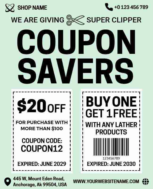
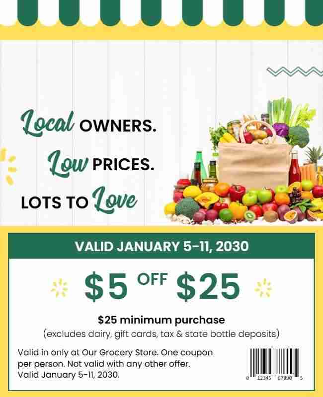
Interactive Flyers
Engage audiences with interactive elements like detachable coupons or tear-off sections. These features invite action and make your flyer functional and fun.
Example: The coffee shop flyer includes a loyalty stamp section to encourage repeat visits, the coupon savers flyer offers tear-away deals for instant savings, and the local owners flyer features a contact tab that makes it easy to connect with nearby businesses.
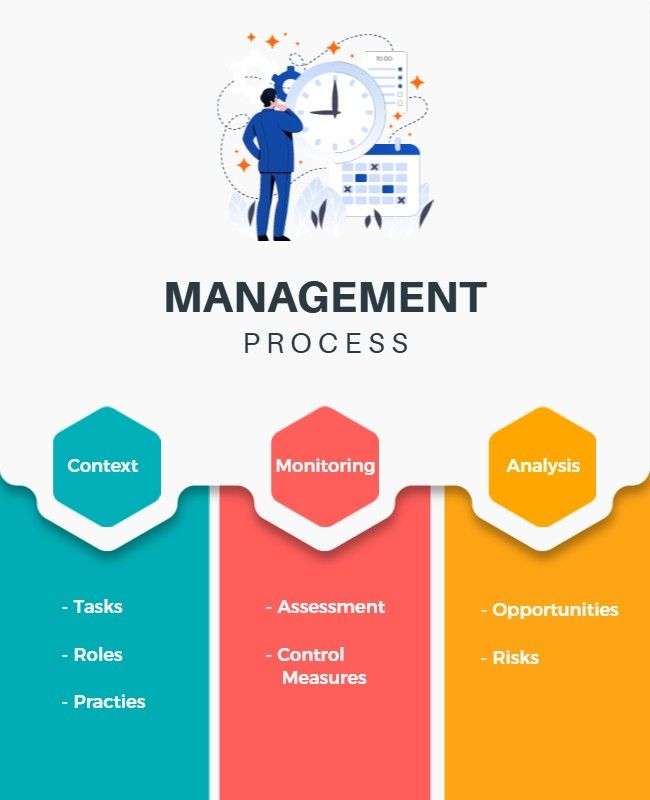
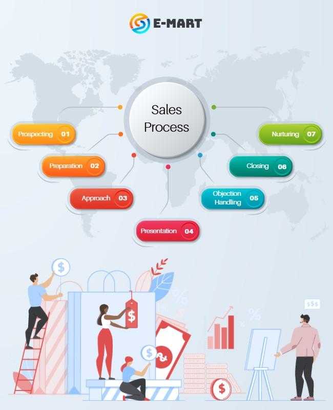
Flyer with Infographics
Combine graphics and text to simplify complex information. Infographics make educational flyers or reports more engaging and easier to understand.
Example: The HR planning flyer breaks down team structures with icons and timelines, the management process flyer uses flowcharts to outline key stages, and the sales process flyer presents data visually to communicate strategy at a glance.

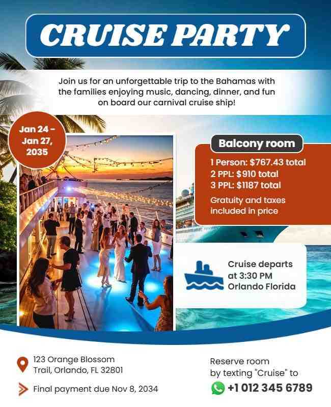
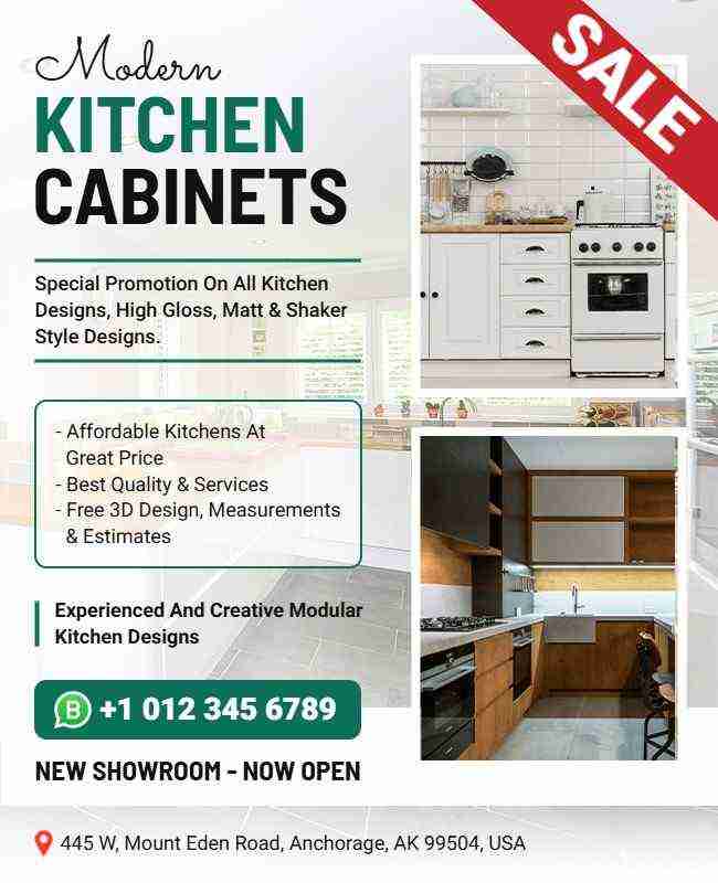
Transparent Elements
Use semi-transparent shapes to highlight content while maintaining a sleek, modern flyer design. Transparency adds depth without overwhelming the design.
Example: The cruise party flyer uses translucent overlays to create a layered ocean vibe, the new showroom flyer highlights key product details with semi-transparent blocks, and the church conference flyer uses subtle transparency to blend text with background imagery harmoniously.

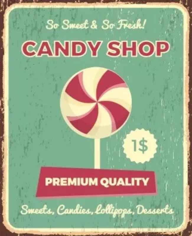
Textured Backgrounds
Subtle textures like paper grain or chalkboard add visual interest and a tactile feel. These backgrounds enhance your flyer design while keeping it sophisticated.
Example: The Rustic flyer uses a grungy texture to set a vibrant tone, the quotes flyer features a chalkboard-style background to match the inspirational theme, and the candy shop flyer includes soft pastel textures to create a playful, inviting vibe.
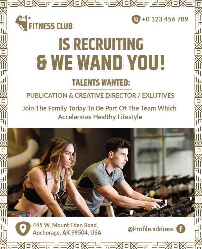
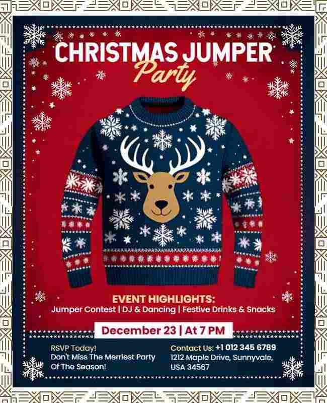
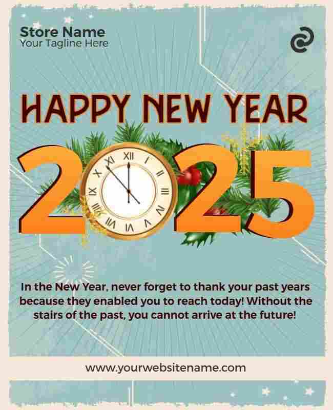
Flyers with Borders
A well-designed border frames the flyer content and adds structure. Borders help focus attention and give the flyer a polished, complete look.
Example: The fitness club flyer uses a bold border to highlight the key offer, the Christmas party flyer features festive decorative edges for a cheerful feel, and the New Year flyer incorporates a sleek gold border to add elegance and celebration.
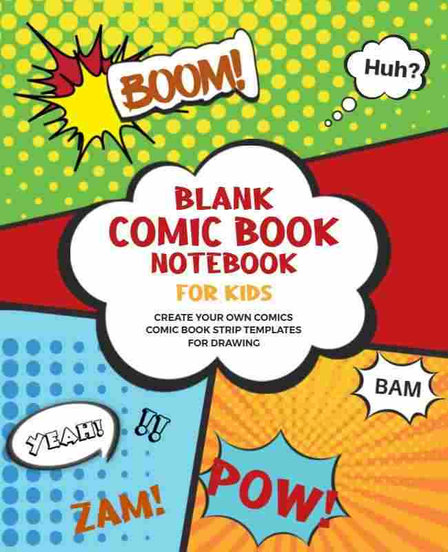
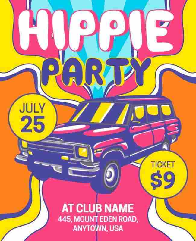
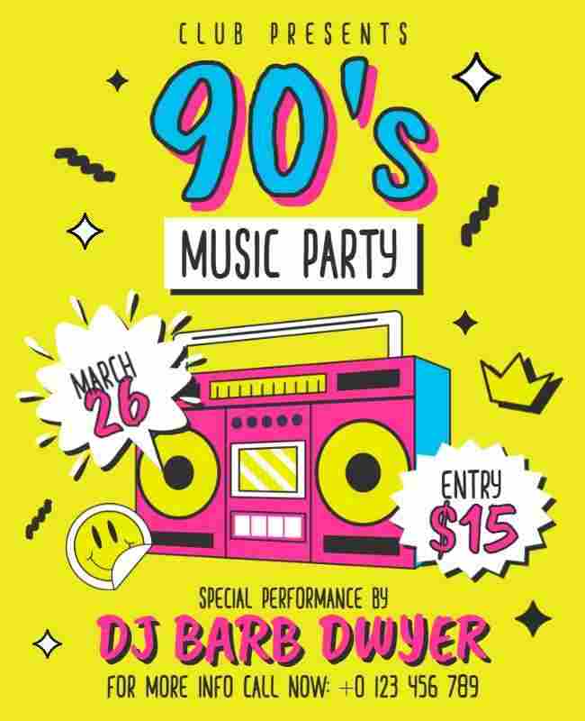
Pop Art Style
Bright, bold colors and comic book-style elements give your flyer a retro yet modern look. Pop art is playful, eye-catching, and perfect for trendy brands or events.
Example: The comic book flyer uses speech bubbles and halftone textures for a classic pop art vibe, the hippie party flyer mixes psychedelic patterns with bold type, and the 90’s music party flyer blends funky graphics to create nostalgic appeal.
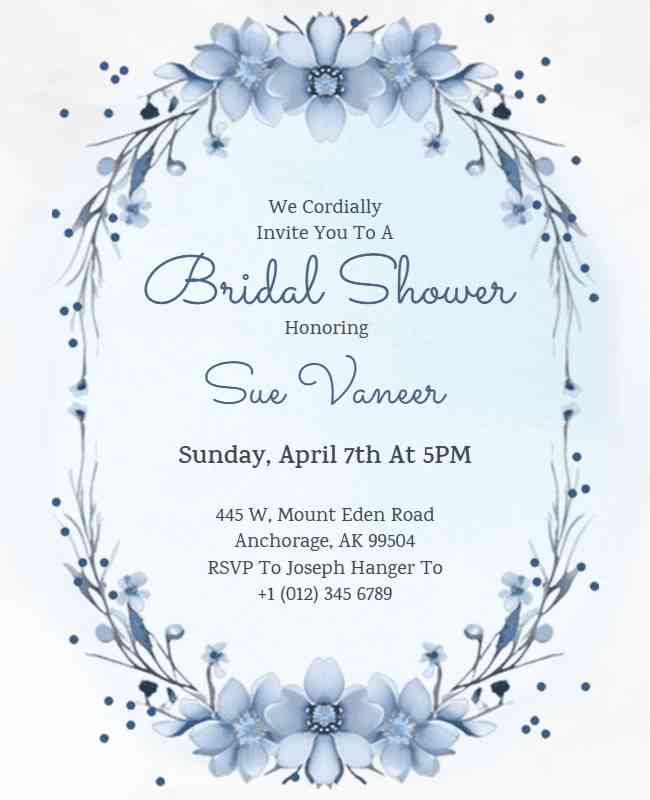
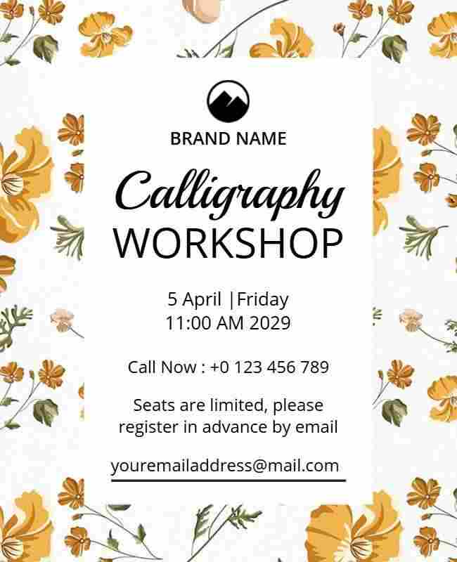
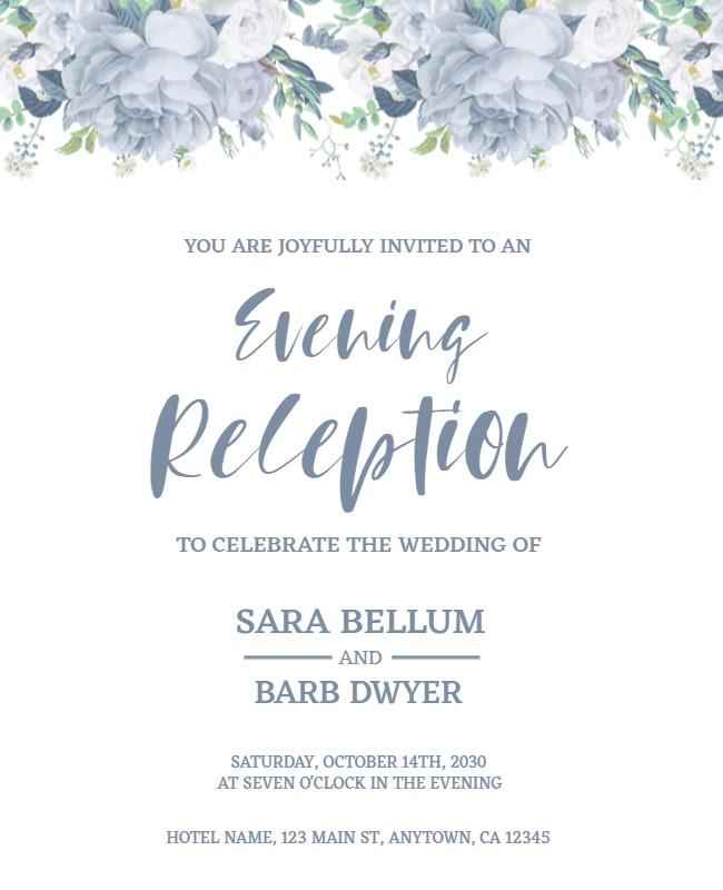
Floral Petal Design
Delicate and elegant, with floral motifs and soft pastel colors. Ideal for weddings, beauty salons, or spring events, they evoke a sense of grace and natural beauty.
Example: The bridal shower flyer uses light blue florals and gentle typography, the calligraphy workshop flyer blends floral borders with soft tones for a creative touch, and the evening reception flyer pairs subtle blooms with elegant layouts for a romantic vibe.
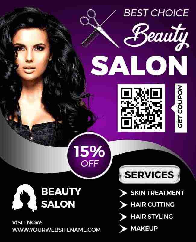
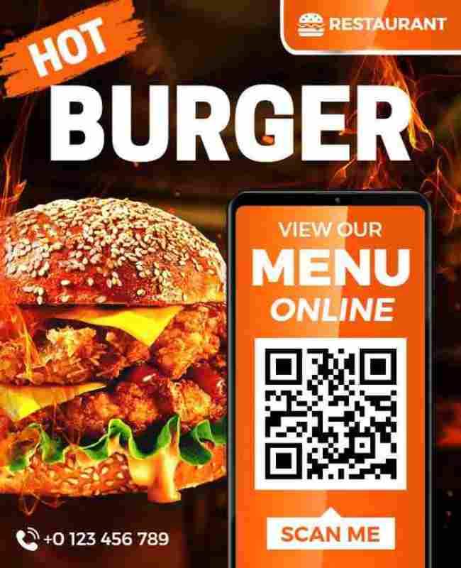
QR Code-Enhanced Flyer
Highlight QR codes for digital interaction, encouraging immediate engagement. This makes it easy for users to access additional content like videos or offers.
Example: The beauty salon flyer includes a QR code for booking appointments, the delivery flyer links directly to an ordering page, and the restaurant menu flyer lets customers view the full digital menu with one scan.

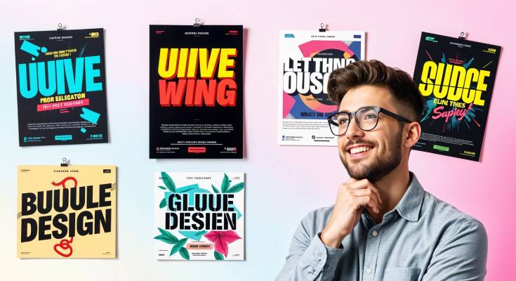
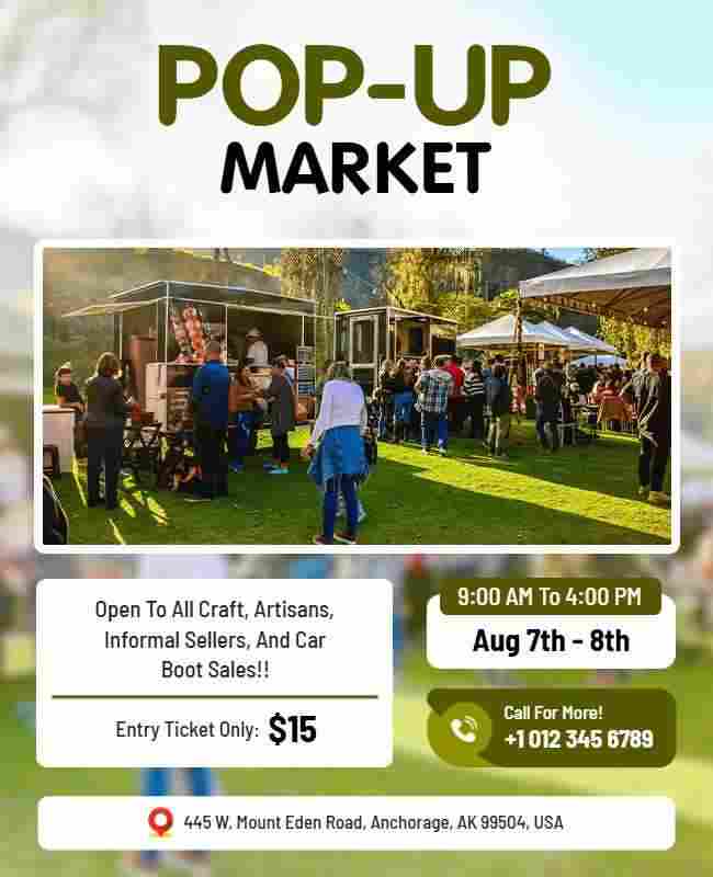
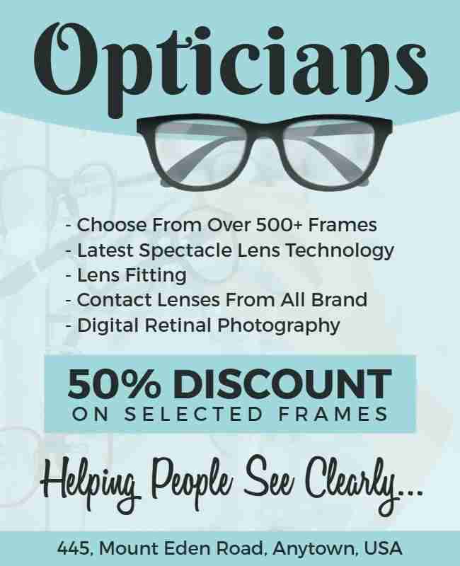
Text as a Visual Element
Turn text into a visual element by enlarging or layering it. This bold approach makes typography a striking design feature that grabs attention instantly.
Example: The pop-up market flyer features oversized text to highlight the event name, while the optician flyer uses layered fonts to creatively emphasize offers and services.
With these flyer design ideas and examples, you’re all set to create designs that truly connect with your audience. Let your flyer do more than inform – let it impress, inspire, and get results.
Essential Flyer Design Elements
To create an elegant flyer design, it’s important to focus on key design elements. These elements ensure your flyer not only looks great but also effectively communicates your message.
Headline:
- Make the headline bold and attention-grabbing. It should instantly convey the main message or purpose of the flyer.
- Consider using a catchy phrase, benefit-driven statement, or action-oriented language to captivate the reader.
Imagery:
- Use high-quality images or graphics to make your flyer visually appealing. Images should be relevant to the message and enhance the design.
- Make sure the images are sharp, professionally designed, and properly sized so they don’t distort or pixelate when printed.
Color Scheme:
- Choose a color palette that aligns with your brand. Bold and contrasting flyer background design can make your flyer pop, while muted tones convey a more professional look.
- Be mindful of readability—ensure there’s enough contrast between the text and background colors.
Typography:
- Your font choices should be legible and consistent with your brand style. Use different font sizes to establish hierarchy.
- Stick to no more than two or three fonts to keep the design cohesive and avoid clutter. Ensure text spacing and alignment are balanced for a polished look.
Whitespace:
- Don’t overcrowd your flyer. Leave enough whitespace, to make the design breathable and easy to read.
- Avoid filling every inch of the flyer with text or images—less is often more effective.
Call-to-Action:
- Always include a clear and compelling call-to-action (CTA) like “Buy Now,” “Register Today,” or “Visit Us.”
- Call to Action for Flyers helps make the message stand out by using strong action verbs and a contrasting color or bold font.
Flyer Design Tips
Designing an effective flyer requires a blend of creativity and strategy. Here are some essential tips to help you create a flyer that captures your attention and delivers your message.
Know Your Audience:
- Customize your modern flyer design to match the preferences of your target audience; a youthful, fun crowd will require a different style than a corporate event.
Balance Text and Images:
- Maintain a balanced design by pairing text with complementary images or graphics to create a visually appealing flyer without overwhelming the layout.
Keep It Simple:
- Keep the design clean and easy to understand by focusing on one main message, highlighting key details, and removing unnecessary information.
Use High-Quality Images:
- Always use high-resolution images or graphics. Poor-quality visuals can make your flyer look unprofessional and reduce its impact.
Use Consistent Branding:
- Ensure consistency in colors, fonts, and logos to align the flyer with your brand’s identity, reinforcing recognition and maintaining a cohesive design.
Experiment with Layouts:
- Experiment with different flyer layouts, including asymmetrical or unique designs, to make the flyer stand out while ensuring it remains easy to follow.
Pick the Right Size:
- Choose a common flyer size that suits your content and distribution method. Standard sizes like A5 or A4 work well for events, while smaller sizes like DL are ideal for mailers.
Types of Flyers
Flyers come in various formats, each designed to serve specific promotional purposes. Here are the different types of flyers for different purposes.
Handbills
Simple, one-page flyers distributed by hand. They are lightweight and cost-effective for mass distribution.
Digital Flyers:
Flyers created specifically for online use are often shared through email or social media. Explore Ai flyer generator tools to create flyers effortlessly.
Direct Mail Flyers
Sent through the postal system to reach specific households or businesses. These are targeted and often used for marketing campaigns, offering promotions or discounts.
Bi-Fold Flyers
Folded once in the middle, providing four panels for information. They are often used for brochures or more detailed content.
Door Hanger Flyers
Shaped to hang on door handles, these are typically used for local promotions like restaurant takeout menus or home service advertisements.
Conclusion
With these flyer design ideas, you can create a flyer that grabs attention and strengthens your brand’s presence. Whether you’re promoting an event, launching a product, or spreading awareness, a well-designed flyer can make a lasting impact.
Take these flyer design inspiration and start designing a flyer that truly stands out. The right combination of colors, fonts, and visuals can help you connect with your audience and leave a memorable impression.