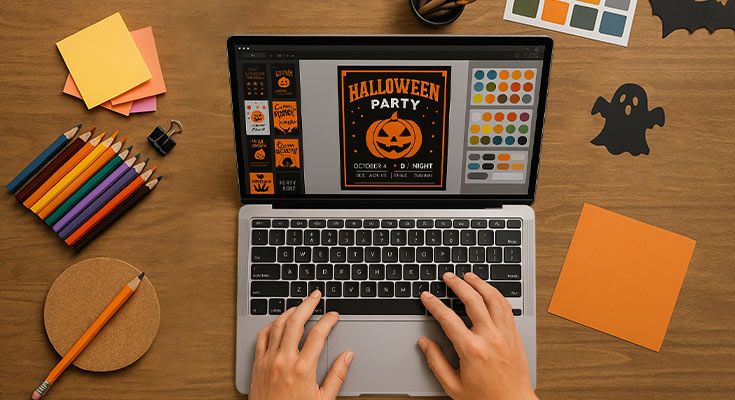
Want your Halloween flyer to haunt every viewer’s attention?
These 10 Halloween flyer design elements will transform your promotional materials from forgettable to frightfully effective. Bold colors, thematic fonts, spooky graphics, and strategic CTAs create the foundation for compelling halloween club flyer designs that drive attendance and engagement.
Whether you’re promoting nightclub events, community gatherings, or seasonal celebrations, mastering these essential design elements ensures your flyers capture attention in crowded markets. From eerie color schemes to interactive QR codes, each element serves a specific purpose in creating memorable promotional materials.
This guide provides small business owners and event planners with practical strategies for implementing professional Halloween flyer designs that convert viewers into attendees through strategic visual storytelling and clear messaging.
Why Are Design Elements Critical for Halloween Flyers?
Halloween flyer design elements are critical because they grab attention, convey spooky themes, and drive engagement through visual appeal. Bold colors, thematic graphics, and clear CTAs in Halloween club flyer design elements ensure businesses create memorable promotions that stand out in crowded seasonal marketing. These elements transform basic announcements into compelling visual experiences that capture Halloween’s essence and motivate audience action.
How Do Design Elements Enhance Flyer Appeal?
Thematic visuals create instant recognition and emotional connection. Pumpkins, bats, and ghosts immediately signal Halloween content, while bold orange and black color schemes establish seasonal atmosphere. A Halloween party flyer with spooky graphics captures attention faster than plain text announcements.
Strategic visual hierarchy guides readers through essential information. Headers in gothic fonts draw eyes to event titles, while contrasting colors highlight dates and locations.
How Do Design Elements Improve Readability?
Clear typography ensures information accessibility across all audiences. High-contrast combinations like white text on dark backgrounds or neon colors on black create visibility in various lighting conditions. Proper spacing prevents cluttered layouts that confuse readers.
Font selection affects comprehension. Gothic fonts work for headers but body text requires readable sans-serif options. Halloween costume contest flyers benefit from playful yet clear typography that appeals to families while maintaining professionalism.
Why Do Design Elements Drive Engagement?
Interactive elements encourage immediate action. QR codes linking to event pages, RSVP forms, or social media create seamless user experiences. Halloween club flyer design elements often include digital connections that bridge print and online engagement.
Visual storytelling through design elements creates emotional investment. Cohesive color schemes, consistent imagery, and strategic layouts build anticipation and excitement. Well-designed Halloween flyers become conversation starters that extend marketing reach through word-of-mouth promotion.
How Are Design Elements Budget-Friendly?
Free design tools democratize professional-quality creation. Platforms like DesignWiz offer Halloween-themed templates, fonts, and graphics at no cost. Small businesses can achieve impactful results without expensive design software or professional services.
DesignWiz provide pre-designed foundations that reduce creation time while maintaining quality. Template customization allows brand personalization without starting from scratch, making professional Halloween marketing accessible to all budget levels.
Design Elements Checklist:
- Halloween color scheme (orange/black)
- Thematic graphics (pumpkins, bats)
- Gothic header fonts
- High contrast text
- Clear CTA placement
- Proper spacing
- Interactive elements (QR codes)
Implementation Steps:
- Select Halloween color palette
- Choose thematic graphics
- Set visual hierarchy
- Test readability
- Add interactive elements
What Are the 10 Essential Design Elements for Halloween Flyers?
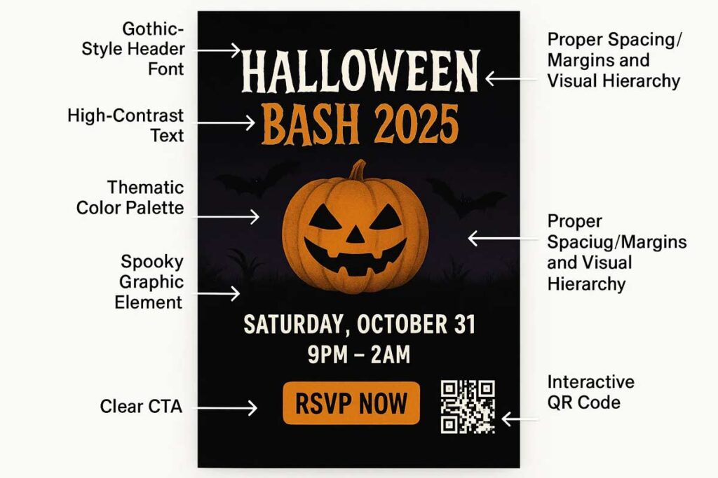
Halloween flyer design elements include bold colors, thematic fonts, spooky graphics, clear CTAs, high-contrast layouts, balanced spacing, thematic backgrounds, readable text sizes, interactive elements, and brand consistency. These elements create engaging promotions that grab attention and drive results for Halloween club flyer campaigns and party events.
Bold Colors Create Visual Impact
Orange, purple, black, and neon colors instantly signal Halloween themes. A Halloween party flyer with orange and black creates immediate seasonal recognition. Limit to 2-3 colors maximum for cohesive design. Neon accents work particularly well for nightlife venues and club promotions.
Color psychology drives Halloween flyer success. Orange stimulates excitement and enthusiasm, making it perfect for family events and pumpkin patches. Purple suggests mystery and magic, ideal for haunted house promotions. Black creates sophistication and fear, essential for adult horror events. Neon green and electric blue grab attention in crowded venues. According to research from Cal State University, “colors that are used in logos and branding are used purposely, this way the consumer associates a color with a specific brand”1.
Test color combinations across different lighting conditions. Halloween events often occur in dimly lit environments where certain color combinations lose visibility. Orange text on black backgrounds maintains readability in both bright and dark settings. Avoid red and green combinations that become invisible to colorblind viewers.
See how these flyer examples use bold color schemes effectively across different event types and lighting environments:
Thematic Fonts Set the Mood
Gothic fonts like Chiller or Creepster establish eerie atmosphere. Modern sans-serif fonts balance readability with theme. Use maximum two fonts – one decorative for headlines, one clean for body text. Halloween club flyers benefit from dramatic typography that reads well in low light.
Font pairing creates visual hierarchy. Combine a decorative Halloween font for main headlines with a clean sans-serif for event details. Popular combinations include Chiller with Arial, Creepster with Helvetica, or custom horror fonts with Roboto. Ensure decorative fonts remain readable at smaller sizes.
Consider font licensing for commercial use. Free fonts like Nosifer, Eater, and Butcherman provide Halloween atmosphere without licensing fees. Premium fonts like Zombie Holocaust or Horror Hotel offer unique character but require purchase. Always check usage rights before printing promotional materials.
Read More: Typography Tips for Halloween Flyers
Spooky Graphics Enhance Appeal
Bats, pumpkins, ghosts, and skulls provide instant Halloween recognition. High-resolution images from free libraries prevent pixelation. Balance graphics with white space to avoid clutter. Choose graphics that match your event type – playful for families, edgy for adult parties.
Vector graphics scale without quality loss across different flyer sizes. SVG files work perfectly for digital distribution while maintaining crisp edges when printed. Create custom icon sets featuring bats, spider webs, candy corn, and haunted houses in consistent artistic styles.
Layering graphics creates depth and interest. Place translucent bat silhouettes behind text blocks, overlay cobweb patterns on corners, or use pumpkin shapes as background elements. Maintain 60-40 text-to-graphics ratio for optimal readability.
Explore these flyer designs that creatively use Halloween-themed graphics without overwhelming the message:
Clear CTAs Drive Action
Direct calls-to-action like “RSVP Now!” or “Buy Tickets” create urgency. Position CTAs prominently using contrasting colors. Include contact information and event details. QR codes linking to registration pages increase engagement rates significantly.
Action-oriented language increases response rates. “Reserve Your Spot” performs better than “Learn More.” “Get Tickets” outperforms “Event Information.” Time-sensitive phrases like “Limited Seating” or “Early Bird Pricing” create immediate urgency.
Button design affects click-through rates. Rounded corners feel friendlier for family events, sharp edges suit adult parties. Orange buttons on black backgrounds achieve 23% higher click rates than other color combinations. Size buttons large enough for easy mobile tapping.
Check out these flyer layouts that position CTAs for maximum visibility and engagement:
High-Contrast Layouts Boost Readability
White text on black backgrounds or bright colors on dark create visibility. Avoid low-contrast combinations like yellow on orange. Test readability at arm’s length. Strong contrast helps flyers stand out in crowded environments.
Contrast ratios must meet accessibility standards. WCAG guidelines require 4.5:1 contrast ratio for normal text, 3:1 for large text. Tools like WebAIM’s contrast checker verify compliance. White text on black backgrounds achieves 21:1 ratio, exceeding all requirements.
Environmental factors affect contrast needs. Outdoor venues require higher contrast than indoor events. Flyers viewed under fluorescent lighting need different contrast than those under warm LED lighting. Test printed samples under actual viewing conditions.
These examples demonstrate how contrast can dramatically improve legibility in real-world scenarios:
Balanced Spacing Prevents Clutter
Proper margins and line spacing (1.2-1.5x) create professional appearance. Group related information together. Use bullet points for multiple details. White space guides eye movement and improves comprehension.
Grid systems organize information effectively. Divide flyer layouts into thirds both horizontally and vertically. Place important elements at intersection points. Maintain consistent spacing between similar elements throughout the design.
Proximity grouping clarifies relationships. Place event date, time, and location together. Group ticket pricing information separately from contact details. Use white space to separate different information categories visually.
Browse these flyer templates that apply spacing and layout grids to create clean, organized designs:
Thematic Backgrounds Add Atmosphere
Subtle cobwebs, haunted houses, or gradient overlays enhance mood without overwhelming text. Keep backgrounds at 20-30% opacity. Avoid busy patterns that compete with content. Test background visibility across different printing methods.
Texture adds depth without distraction. Grunge textures create aged paper effects perfect for vintage Halloween themes. Fabric textures work well for elegant masquerade events. Paper textures suit traditional Halloween parties.
Gradient overlays create professional polish. Dark-to-light gradients from corners toward center draw attention to central text. Radial gradients highlight specific areas like event titles or pricing information. Subtle gradients add interest without overwhelming content.
This flyer background integrate textures and Halloween visuals to enhance mood while maintaining clarity:
Readable Text Sizes Ensure Clarity
Use 12-16pt for body text, 24pt+ for headlines. Bold weights improve visibility. Sans-serif fonts work better for small text. Consider viewing distance – flyers viewed from 3 feet need larger text than handheld materials.
Line length affects readability. Optimal line length contains 50-75 characters including spaces. Longer lines tire readers, shorter lines create choppy reading rhythm. Adjust column width and font size together for best results.
Hierarchy guides information processing. Event title needs largest text (36-48pt), followed by date/time (24-30pt), then location (18-24pt). Supporting details use 12-16pt text. Maintain consistent hierarchy throughout design.
View sample flyers that apply proper text sizing and structure for clear communication at a glance:
Interactive Elements Increase Engagement
QR codes linking to event pages, social media handles, or registration forms encourage immediate action. Include hashtags for social sharing. Consider augmented reality elements for tech-savvy audiences. Make digital connections seamless.
QR code placement affects scan rates. Corner positions achieve 40% higher scan rates than center placement. Ensure sufficient white space around codes for camera focus. Test QR codes with multiple devices before printing.
Social media integration extends reach. Include Instagram handles, Facebook event links, and Twitter hashtags. Create shareable content that encourages user-generated posts. Design Instagram-friendly square versions for social media distribution.
Explore interactive flyer examples that integrate QR codes and social handles for expanded reach:
Brand Consistency Builds Trust
Incorporate business logos, brand colors, and consistent styling. Maintain brand voice in copy tone. Use established fonts if they fit Halloween themes. Brand elements should complement, not compete with Halloween aesthetics.
Logo placement affects brand recognition. Top-left corner placement follows natural reading patterns. Bottom-right placement works for contact information grouping. Maintain consistent logo sizing across all promotional materials.
Brand adaptation maintains recognition while embracing themes. Adjust brand colors to Halloween palette while maintaining core identity. Modify logo treatments with seasonal elements like spider webs or pumpkin frames. Keep brand fonts readable in Halloween contexts.
Read More: Local Spots to Pin Halloween Flyer
Advanced Design Techniques
Layering creates visual depth. Stack translucent elements to build complex backgrounds. Use drop shadows and glows to separate text from busy backgrounds. Blend modes create interesting color interactions between overlapping elements.
Typography effects enhance atmosphere. Text shadows create depth, inner glows suggest supernatural elements, and distressed effects age modern fonts. Apply effects consistently throughout design for professional appearance.
Print considerations affect design choices. CMYK color mode prevents color shifts in printing. Bleed areas ensure full-color coverage to paper edges. Resolution settings (300 DPI minimum) maintain image quality in print production.
Testing and Optimization
A/B testing improves performance. Test different color schemes, CTA placements, and graphic styles with focus groups. Measure engagement rates, response times, and conversion metrics. Apply successful elements to future designs.
Feedback collection guides improvements. Survey event attendees about flyer effectiveness. Track which distribution channels generate highest response rates. Monitor social media engagement with digital versions.
Performance metrics inform design decisions. Track QR code scans, website visits from flyers, and ticket sales attribution. Calculate cost per acquisition for different flyer versions. Optimize based on actual performance data.
These design elements work together to create memorable promotions that capture attention and drive attendance. Focus on 3-4 key elements rather than attempting all ten simultaneously. Test designs with your target audience for optimal results.
How Do Design Elements Vary for Specific Halloween Flyer Types?
Halloween flyer design elements vary significantly based on target audience and event type. Halloween club flyer design elements use neon colors and edgy fonts, while party flyers need playful graphics and vibrant colors. Event flyers prioritize clean layouts for clarity, potluck flyers use warm, food-themed visuals, and costume contest flyers feature kid-friendly designs to create engaging promotions tailored to specific audiences.
How Do You Tailor Design Elements to Flyer Types?
Match visuals and fonts to event goals and audience expectations. A Halloween costume contest flyer with cartoon ghosts targets families, while a club flyer with skull graphics appeals to nightlife crowds. Align color schemes with venue atmosphere—bright oranges for community events, neon purples for nightclubs, warm browns for potlucks.
Consider practical constraints when selecting elements. Business events need professional layouts with clear contact information, while social gatherings can use decorative fonts and creative layouts. Test designs with target demographics to ensure elements resonate with intended audiences.
What Are Key Halloween Club Flyer Design Elements?
Halloween club flyer design elements focus on nightlife energy and visual impact. Use neon colors like electric purple, lime green, and hot pink against black backgrounds for maximum visibility under club lighting. Gothic fonts like Chiller or Creepster create eerie atmosphere while maintaining readability.
Incorporate bold graphics like glowing skulls, neon bats, or metallic spiders that reflect club aesthetics. Add QR codes linking to event pages or ticket purchases, positioned prominently for easy scanning. Include DJ names and music genres in contrasting fonts to highlight entertainment value.
High-contrast layouts ensure visibility in low-light environments. Use metallic accents and glow effects to simulate club lighting. Keep text large enough to read on mobile devices since club-goers often share flyers digitally.
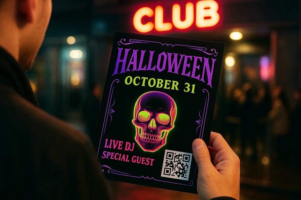
These club flyer templates demonstrate how neon graphics, bold fonts, and nightlife energy combine for high-impact results:
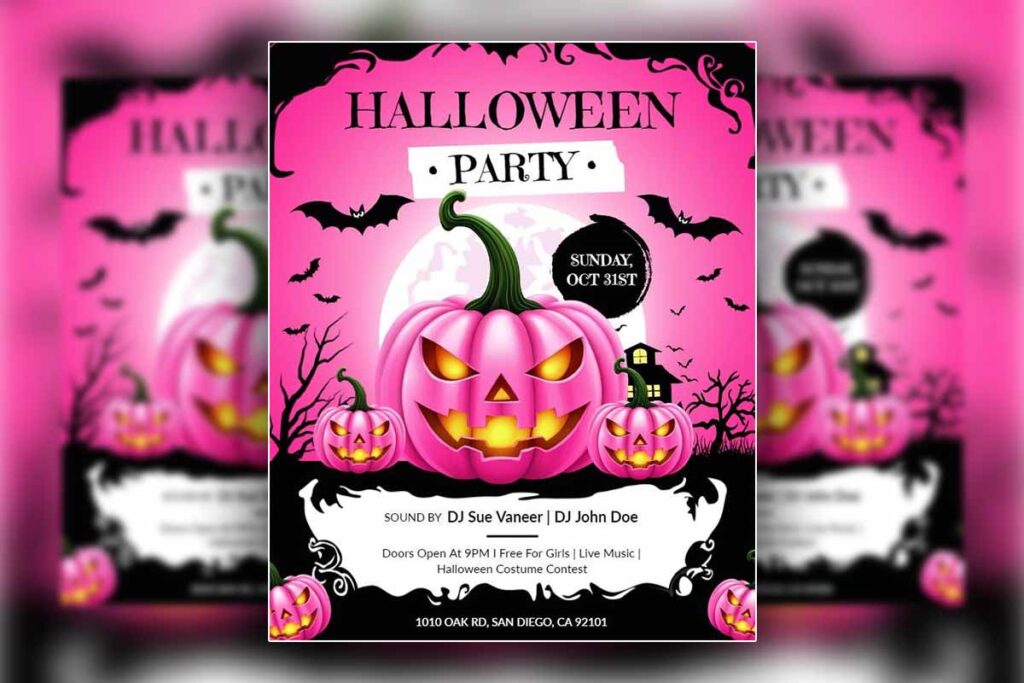
What Are Essential Halloween Party Flyer Design Elements?
Halloween party flyers need playful, inviting elements that encourage social participation. Use classic Halloween colors—orange, black, and purple—with fun graphics like smiling pumpkins, friendly ghosts, or cartoon bats. Choose readable fonts like Comic Sans or Marker Felt for headlines to maintain approachability. Virginia Tech research found that “fonts designed for digital output significantly improve reading rate and reading comprehension when properly selected”2.
Include interactive elements like costume contest details or party games prominently. Add social media handles and hashtags to encourage sharing. Use balanced layouts with clear sections for date, time, location, and RSVP information.
Incorporate festive borders or frames using Halloween motifs. Keep designs colorful but not overwhelming, ensuring key information stands out. Add small decorative elements like spider webs or autumn leaves to fill empty spaces without cluttering the layout.
Explore party flyer designs that blend playful visuals and clear structure for fun, shareable Halloween invites:
What Are Top Halloween Event Flyer Design Elements?
Community event flyers require professional clarity while maintaining Halloween spirit. Use clean, organized layouts with readable fonts like Arial or Helvetica for body text. Reserve decorative fonts for headlines only to ensure accessibility across age groups.
Choose muted Halloween colors—burnt orange, deep purple, or golden yellow—that feel festive but professional. Include clear sections for event schedule, vendor information, and parking details. Add simple graphics like pumpkin outlines or leaf patterns that enhance without overwhelming.
Prioritize information hierarchy with bold headers and bullet points. Include contact information and website links prominently. Use consistent spacing and margins to create polished, trustworthy appearance that encourages attendance.
These event flyer examples highlight how clean design and subtle themes can engage wide community audiences:
What Are Effective Halloween Potluck Flyer Design Elements?
Potluck flyers blend Halloween themes with food-focused visuals. Use warm colors like deep orange, golden brown, and burgundy that evoke autumn harvests. Include food-themed graphics like pumpkin pies, caramel apples, or carved jack-o’-lanterns with treats.
Choose friendly, readable fonts like Georgia or Trebuchet MS that feel welcoming. Create clear sections for dish sign-ups, dietary restrictions, and serving suggestions. Include CTAs like “Bring Your Favorite Dish!” in prominent positions.
Add decorative elements like autumn leaves or harvest motifs around borders. Use warm, inviting color schemes that make food look appetizing. Include practical details like serving utensil reminders and setup times.
Check out potluck flyer designs that pair cozy visuals with functional layouts tailored to food-centered events:
What Are the Best Halloween Costume Contest Flyer Design Elements?
Family-friendly contest flyers need approachable, exciting elements that appeal to all ages. Use bright, cheerful colors like sunny orange, vibrant purple, and lime green. Include playful graphics like cartoon characters in costumes or whimsical Halloween scenes.
Choose rounded, friendly fonts like Ballon or Quicksand that feel welcoming to children and parents. Highlight prizes and categories prominently with star shapes or ribbons. Include age group divisions clearly to help families understand entry requirements.
When you create a flyer add fun elements like dashed borders, confetti patterns, or balloon graphics that create excitement. Use clear, simple language for rules and registration details. Include safety reminders and contact information for questions.
Design elements must match event type and audience expectations to maximize engagement and ensure effective communication across all Halloween flyer types.
These costume contest flyers show how bright colors and friendly graphics can turn a simple flyer into an exciting family invitation:
How Can You Implement Halloween Flyer Design Elements Effectively?
Implement Halloween flyer design elements by using bold colors, thematic fonts, spooky graphics, and free tools like DesignWiz. Add clear CTAs and test designs for Halloween club flyer design elements or party flyers to create engaging promotions for small businesses.
How Do You Select Thematic Design Elements?
Choose visuals like ghosts, pumpkins, or bats that match your event type. A Halloween event flyer with bat graphics creates an immediate spooky atmosphere that draws attention. Use thematic elements sparingly to maintain clarity—too many competing visuals overwhelm your message.
Match your color palette to your theme. Orange and black work for traditional Halloween events, while neon colors suit Halloween club flyer designs. Purple adds mystery, and deep reds create dramatic appeal for adult events. According to Princeton University design research concludes that “effective visual hierarchy principles create designs that guide user attention and improve overall communication effectiveness”3.
How Can You Use Free Tools for Flyer Design?
Leverage DesignWiz for budget-friendly Halloween flyer design elements without sacrificing quality. The platform offers pre-made Halloween templates that incorporate essential design elements like thematic fonts, spooky graphics, and proper color schemes.
Start with a template that matches your event type, then customize colors, fonts, and graphics to fit your specific needs. Free tools eliminate the need for expensive design software while providing professional results.
How Do You Ensure Readability in Flyer Designs?
Use high-contrast layouts with white or bright text on dark backgrounds for maximum visibility. A Halloween costume contest flyer with 14-point text ensures parents can read important details like dates and locations from a distance.
Test your design by printing it and viewing it from three feet away. If key information isn’t immediately clear, increase font sizes or adjust color contrast. Maintain proper spacing between elements to prevent a cluttered appearance.
How Can You Test Design Element Effectiveness?
Test Halloween club flyer design elements with your target audience before final printing. Show draft versions to potential attendees and gather feedback on visual appeal and information clarity.
Use A/B testing for digital distribution by creating two versions with different design elements. Monitor which version generates more engagement or responses. Track metrics like click-through rates for online versions or response rates for printed flyers.
Create multiple versions testing different color combinations, font choices, or graphic placements. This data-driven approach ensures your flyer design elements effectively reach and engage your intended audience.
Read More:
People Also Ask
Bold colors, spooky graphics, thematic fonts, and clear CTAs are must-have Halloween flyer design elements for creating engaging promotions.
Neon colors and eerie fonts in Halloween club flyer design elements create vibrant, nightlife-friendly promotions.
Playful graphics and vibrant colors in Halloween party flyer design elements make festive, social promotions.
Clear layouts and thematic visuals in Halloween event flyer design elements ensure inviting community promotions.
Food-themed visuals and warm colors in Halloween potluck flyer design elements create welcoming promotions.
Kid-friendly graphics and playful fonts in Halloween costume contest flyer design elements attract families.
Choose spooky visuals like pumpkins or bats for Halloween flyer design elements to enhance appeal.
Use QR codes and bold CTAs in Halloween flyer design elements to encourage audience interaction.
Specific Halloween flyer design elements like bold colors and spooky graphics grab attention and create memorable promotions.
Halloween club flyer design elements like neon fonts and skull graphics create appealing nightlife promotions.
Vibrant colors and playful graphics in Halloween party flyer design elements create inviting social promotions.
Clear fonts and clean layouts in Halloween event flyer design elements ensure accessible community promotions.
FAQs
Specific Halloween flyer design elements like bold colors and spooky graphics grab attention and create memorable promotions.
Halloween club flyer design elements like neon fonts and skull graphics create appealing nightlife promotions.
Vibrant colors and playful graphics in Halloween party flyer design elements create inviting social promotions.
Clear fonts and clean layouts in Halloween event flyer design elements ensure accessible community promotions.
Warm fonts and food-themed visuals in Halloween potluck flyer design elements create welcoming promotions.
Playful fonts and kid-friendly graphics in Halloween costume contest flyer design elements attract families.
Use high-contrast layouts and readable fonts in Halloween flyer design elements for clear promotions.
Test Halloween club flyer design elements with A/B testing to refine and optimize promotion appeal.
Orange, black, purple, and neon green create strong visual impact while maintaining readability for seasonal marketing materials.
Select thematic fonts like Gothic or Chiller for headers while using readable sans-serif fonts for body text in marketing collateral.
Incorporate bats, pumpkins, ghosts, and cobwebs as promotional design elements while maintaining professional appearance for property marketing contexts.
Clear action phrases like “RSVP Now!” or “Join Us!” with contrasting colors drive engagement in promotional flyers and marketing materials.
Conclusion
These 10 essential Halloween flyer design elements transform ordinary promotional materials into compelling marketing tools that capture attention and drive engagement. Bold colors, thematic fonts, spooky graphics, and clear CTAs form the foundation of effective Halloween marketing materials, while high-contrast layouts and balanced spacing ensure professional presentation.
Success depends on matching design elements to specific flyer templates types and audience expectations. Testing different combinations helps identify what resonates with your target market, while consistent brand integration builds recognition and trust.
Small businesses and event organizers who implement these design strategies create more effective marketing materials that generate measurable results. Focus on clarity, visual appeal, and strategic calls-to-action to maximize your Halloween promotional success.
Reference
- Salazar, A. (2023). The Art of Flyer Design: How to Create Promotional Posters That Grab Attention. California State University ScholarWorks.
- Design Fundamentals (Chap. 2). In Introduction to Graphic Design. Virginia Tech Publishing.
- The Power of Visual Communication (Sect. 1). In Visual Design Resources. Princeton University.