Creating professional-quality baseball flyers without expensive design services requires strategic software selection, design workflow mastery, and systematic skill development that transforms beginner creators into competent marketing material producers.
Effective baseball flyer creation combines accessible design software utilization, copyright-compliant imagery selection, and typography hierarchy mastery that produces professional results through systematic workflow development. Successful DIY creation requires color theory application, information architecture understanding, and file optimization knowledge that ensures quality across digital and print applications.
This comprehensive guide provides complete framework for professional baseball flyer creation through software and tool selection strategies, design workflow systems enabling efficient creation and revision management, and skill development frameworks progressing from basic competency to advanced design capability for sustainable marketing success.
What essential design software and tools provide professional baseball flyer creation without expensive subscriptions?
Essential design software for professional baseball flyer creation includes free platforms like DesignWiz and GIMP alongside affordable options like Affinity Designer that provide comprehensive design capabilities without recurring subscription costs. Effective tool selection balances user-friendly interfaces with advanced feature availability while considering learning curve investment versus immediate productivity needs for consistent baseball flyer creation.
Free Platform Assessment Framework
DesignWiz leads free baseball flyer design with extensive sports templates, drag-and-drop functionality, and built-in baseball graphics that enable immediate professional results. The platform offers team color customization, text overlay tools, and direct social media sizing for comprehensive flyer creation without design experience requirements.
GIMP provides advanced image editing capabilities including layer management, custom graphics creation, and professional print preparation at zero cost. While requiring steeper learning curves, GIMP enables complete creative control over baseball imagery, typography effects, and complex layout designs that rival premium software capabilities.
Online platforms like Adobe Express and PicMonkey offer middle-ground solutions featuring professional templates with simplified interfaces. These tools balance advanced capabilities with accessibility, providing baseball-specific design elements, font libraries, and export options suitable for both digital sharing and professional printing applications.
Affordable Professional Tool Analysis
Affinity Designer delivers professional vector design capabilities through one-time purchase pricing, eliminating subscription dependencies while providing industry-standard features. The software includes advanced typography controls, custom shape creation, and professional color management essential for high-quality baseball marketing materials that compete with expensive alternatives.
Adobe alternatives like Sketch and Figma offer professional-grade functionality at reduced costs compared to Creative Suite subscriptions. These platforms provide collaborative features, advanced design tools, and template libraries specifically beneficial for baseball organizations requiring consistent branding across multiple flyer designs and marketing materials.
Specialized sports design tools including TeamSnap and LeagueApps provide baseball-focused templates with sport-specific graphics libraries. While more limited than general design software, these platforms offer pre-built baseball elements, team roster integration, and tournament bracket designs that streamline baseball flyer creation for specific organizational needs.
Tool Selection Strategy Development
Skill level assessment determines optimal software selection between beginner-friendly platforms and professional-grade tools requiring learning investment. New designers benefit from template-heavy platforms like DesignWiz for immediate results, while experienced users gain long-term value from professional tools offering advanced customization capabilities and creative freedom.
Project requirement evaluation considers output quality needs, collaboration demands, and budget constraints when selecting appropriate software solutions. High-volume baseball organizations requiring consistent branding benefit from professional tools, while occasional flyer creators achieve adequate results through free platforms with sufficient template variety and customization options.
Budget planning integrates software costs with learning time investment and productivity expectations for sustainable design capability development. Free platforms minimize initial investment while professional tools require upfront costs but deliver superior long-term value through advanced features, better output quality, and expanded creative possibilities for baseball marketing excellence.
Learning pathway consideration balances immediate productivity needs with skill development goals, enabling systematic progression from basic template customization to advanced design capability.
For more cost-effective strategies, see this guide on baseball flyer budget solutions that align professional results with financial constraints.
How do I choose appropriate baseball imagery and graphics that avoid copyright violations?
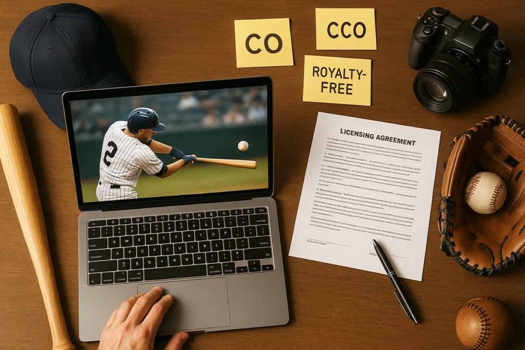
Choosing appropriate baseball imagery for flyer creation requires systematic source evaluation and licensing verification to avoid legal issues while maintaining professional visual quality. Effective image selection combines royalty-free platform utilization with quality assessment protocols that ensure copyright compliance without sacrificing design impact. Smart designers prioritize legal safety through documented source tracking while building comprehensive image libraries from verified platforms.
Copyright-Compliant Source Framework
Royalty-free platforms like Unsplash, Pexels, and Pixabay provide extensive baseball photography collections with clear commercial use permissions. These platforms offer high-resolution action shots, equipment photography, and stadium imagery suitable for professional flyers. Verify each platform’s licensing terms, as some require attribution for commercial applications.
Creative Commons resources expand source options but demand careful licensing review. CC0 licenses allow unrestricted use, while CC BY requires attribution. Stock photography services like Shutterstock offer premium options with comprehensive licensing protection and legal indemnification. Document every image source with licensing details for future reference and compliance verification.
Avoid Google Images without license verification, as search results include copyrighted material. Professional sports league imagery requires specific licensing agreements typically beyond individual creator budgets. Team logos and official merchandise imagery carry strict copyright restrictions requiring permission from rights holders.
Quality and Relevance Assessment
Image resolution assessment ensures print quality standards and digital display optimization. Select images with minimum 300 DPI for print applications and appropriate pixel dimensions for digital sharing. High-resolution photography maintains quality across various output formats while supporting professional presentation standards.
Visual consistency requires coordinated color schemes and photographic styles that complement flyer design elements. Action photography captures baseball excitement while equipment shots provide clean, professional aesthetics. Stadium imagery adds context and authenticity to promotional materials. Consider demographic representation and inclusive imagery that reflects your target audience.
Baseball authenticity verification prevents embarrassing mistakes like incorrect rules representation or outdated equipment depiction. Review images for accurate uniform details, proper field configurations, and realistic game scenarios. Poor quality or obviously staged photography undermines flyer credibility and professional appearance.
Legal Safety Protocol Development
Licensing documentation creates comprehensive records protecting against future legal challenges. Maintain spreadsheets tracking image sources, licensing terms, attribution requirements, and usage restrictions. Screenshot license agreements and save confirmation emails from royalty-free platforms as permanent documentation.
Commercial use confirmation requires careful review of licensing terms for promotional applications. Some “free” images restrict commercial usage or require upgraded licenses for business purposes. Educational use permissions differ from promotional use rights, creating potential compliance issues for marketing materials.
Risk mitigation strategies include maintaining alternative image options and establishing relationships with reliable stock photography providers. Consider investing in premium stock subscriptions for high-volume flyer creation needs. Legal consultation becomes necessary for complex licensing questions or when using images with unclear permissions.
Professional practice integration involves systematic verification procedures for every image selection. Create standardized workflows checking licensing terms, documenting sources, and maintaining organized asset libraries. Regular license review ensures ongoing compliance as terms change or usage rights expire.
Effective copyright compliance protects your design projects while building sustainable support that long-term business success through legal safety and professional quality standards.
Read More: Baseball Tournament Flyer Design Guide
What typography hierarchy and font selection create readable and professional baseball flyer layouts?
Typography hierarchy for professional baseball flyers requires strategic font pairing, visual contrast, and information prioritization that guides readers through essential details efficiently. Effective hierarchy combines size differentiation, weight variation, and spatial relationships that create clear information flow from headlines to contact details. Professional baseball flyer typography balances athletic authenticity with readability across different viewing distances and demographic groups while maintaining visual impact that captures attention in competitive promotional environments.
According to research from Rochester Institute of Technology, “typographic variables can distinguish kinds of information, reveal hierarchical emphasis (primary, secondary and tertiary information), and clarify associations between content elements1.
Hierarchy Development Framework
Information prioritization establishes clear visual order through systematic size and weight relationships. Headlines require 24-36 point fonts with bold weights to command immediate attention from potential participants. Event details need 14-18 point fonts with medium weights for secondary information like dates, times, and locations. Contact information and registration details perform best at 12-14 points with regular weights but strategic positioning for easy reference.
Visual flow creation guides reader attention through deliberate contrast and spacing decisions. Primary information receives maximum contrast through size and color differentiation while secondary details use consistent spacing relationships. White space around text blocks prevents visual crowding and improves readability across age groups.
Contrast establishment requires minimum 3:1 size ratios between hierarchy levels and strategic weight differentiation. Headlines benefit from condensed or semi-condensed fonts that maximize impact within space constraints. Body text needs expanded letter spacing for improved readability at smaller sizes.
Font Selection Strategy
Baseball-appropriate typography combines athletic authenticity with professional readability through strategic font categories. Sans-serif fonts like Oswald, Bebas Neue, or Impact create strong headlines with sports-appropriate boldness while maintaining modern professionalism. Traditional serif fonts like Times New Roman or Georgia work effectively for body text and formal event details.
Readability optimization considers viewing distance and demographic factors specific to baseball audiences. Youth-focused flyers benefit from larger font sizes and high-contrast combinations. Adult league materials can utilize more sophisticated typography with tighter spacing. Senior league flyers require enhanced readability through increased size and simplified font choices.
Professional pairing techniques combine maximum two font families per flyer design. Headline fonts require strong personality while body text fonts prioritize legibility. Successful combinations pair condensed sans-serif headlines with expanded serif body text or geometric sans-serif headlines with humanist sans-serif body text for contemporary appeal.
These baseball tryout flyer examples show how effective font pairings can convey athletic energy while keeping information easy to read:
Professional Layout Implementation
Spacing optimization creates professional appearance through systematic margin and padding relationships. Line height should equal 120-150% of font size for optimal readability. Character spacing increases by 5-10% for condensed fonts and decreases by 5% for expanded fonts. Paragraph separation requires minimum 1.5x line height spacing between text blocks.
Alignment system development establishes visual order through grid-based positioning. Left-aligned text provides optimal readability for detailed information while centered alignment works effectively for headlines and event titles. Right alignment serves specialized purposes like price displays or secondary contact information.
Mobile optimization ensures typography effectiveness across device sizes through responsive scaling. Font sizes require minimum 16-point rendering on mobile devices with proportional scaling for hierarchy maintenance. Touch-friendly spacing between interactive elements improves user experience for digital flyer versions.
Quality assurance includes systematic proofreading and consistency verification across all text elements. Typography standards documentation prevents inconsistencies in multi-flyer campaigns while brand guidelines ensure professional appearance across different baseball organizations and events.
Texas A&M University emphasizes that effective document design relies on “arrangement of visual elements such as columns, typography, and graphics on a page” where “components are formatted differently to visually reinforce relationships between sections2.
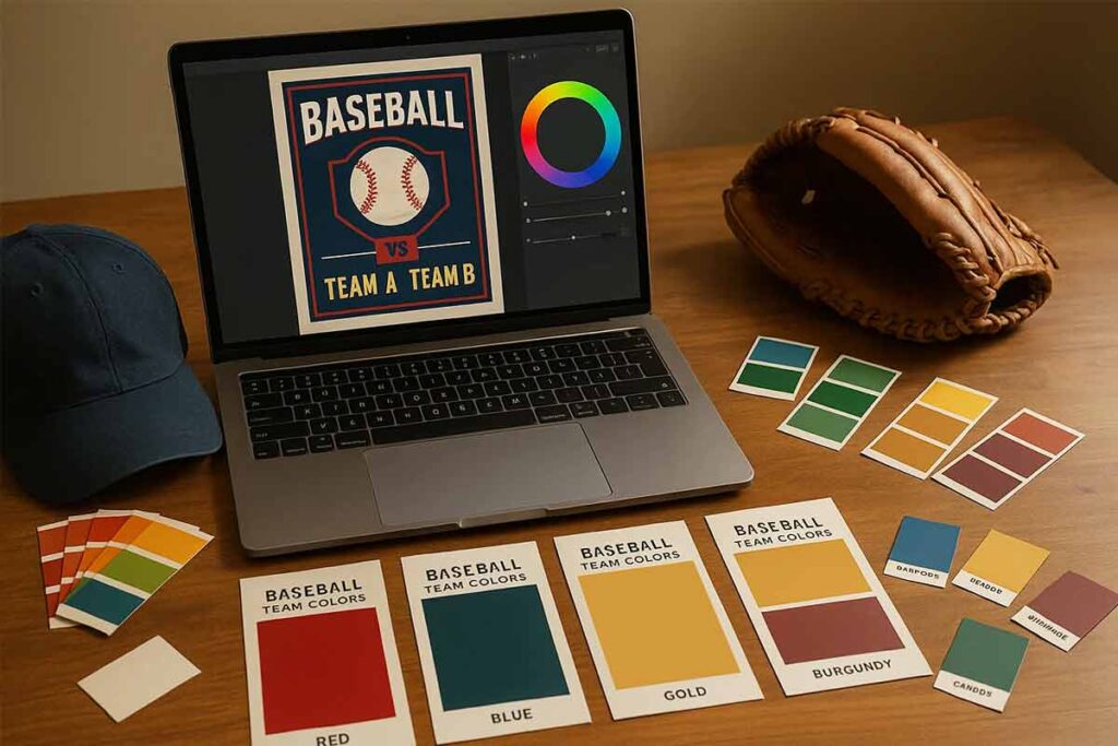
How can I develop effective color schemes that capture attention while maintaining baseball authenticity?
Effective color scheme development requires baseball tradition integration, audience psychology understanding, and visual impact optimization through systematic color theory application. Successful color selection balances attention capture with authenticity preservation through strategic palette development and contrast management that resonates with baseball audiences while standing out in competitive marketing environments.
Baseball Color Tradition Framework
Traditional baseball palettes center around classic red, white, and blue combinations that connect with American baseball heritage. These foundational colors create immediate sport recognition while allowing creative variation through tone and saturation adjustments. Team-inspired palettes offer regional relevance by incorporating local franchise colors like Yankees navy and gray or Cardinals red and cream.
Classic combinations include deep navy backgrounds with white text and red accents, creating high contrast for readability while maintaining authentic sport aesthetics. Forest green paired with gold reflects classic ballpark atmospheres, while burgundy and cream combinations evoke vintage baseball card designs that appeal to nostalgic audiences.
Seasonal adaptations enhance authenticity through spring training bright blues and greens, summer competition bold reds and oranges, and championship gold accents. These variations maintain baseball connection while providing visual freshness that captures attention in crowded marketing environments.
Attention Optimization Strategy
High-contrast color relationships maximize visibility and readability across different viewing conditions. Complementary color pairs like orange and blue or red and green create natural visual tension that draws attention while remaining professionally appropriate for baseball flyer applications.
Color psychology drives emotional responses that support marketing objectives. Red creates urgency and excitement for registration deadlines, blue builds trust for league information, green suggests growth for youth programs, and orange generates enthusiasm for competitive events. Strategic accent colors add personality without overwhelming primary messaging.
Competitive differentiation requires unique palette development that stands apart from typical sports marketing while maintaining baseball authenticity. Unexpected combinations like deep teal with copper or slate blue with warm gold create memorable visual identity that captures attention through sophistication rather than volume.
Professional Application System
Accessibility compliance ensures inclusive design through adequate contrast ratios and colorblind-friendly combinations. Use contrast checkers to verify 4.5:1 minimum ratios between text and backgrounds. Avoid red-green combinations as primary contrasts and test designs with colorblind simulation tools to ensure universal readability.
Print-digital coordination maintains color consistency across different media applications. CMYK color profiles for print materials may shift RGB digital colors, requiring separate palette versions. Create color specifications including hex codes, RGB values, and CMYK alternatives to ensure consistent brand application across all marketing materials.
Systematic application guidelines prevent color chaos through established hierarchy rules. Primary colors dominate backgrounds and major elements, secondary colors support information organization, and accent colors highlight calls-to-action and important details. Limit palettes to four colors maximum to maintain visual coherence and professional appearance.
Testing methodology validates color scheme effectiveness through audience feedback and performance measurement. A/B testing different color combinations reveals which palettes generate higher engagement and conversion rates. Document successful combinations for future projects while building institutional color knowledge that improves design consistency and marketing effectiveness over time.
A deeper look into how these principles boost real-world promotions is available in the baseball tournament flyer enhancement guide.
What information architecture ensures essential details remain visible and scannable in baseball flyers?
Information architecture optimization requires content prioritization, visual hierarchy establishment, and scanning pattern accommodation that ensures essential details receive attention while maintaining overall design effectiveness. Successful architecture balances comprehensive information inclusion with visual simplicity through strategic organization and presentation techniques. Effective how to design baseball flyers approaches focus on user navigation patterns and information processing behaviors that guide readers naturally through critical details without overwhelming visual complexity.
Content Prioritization Framework
Essential information identification includes dates, times, locations, and contact details prominence through strategic placement and visual emphasis. Primary details must occupy premium visual real estate using larger fonts, contrasting colors, and isolated positioning that prevents information burial within secondary content. Secondary detail organization features additional information hierarchy including registration processes, pricing structures, and equipment requirements positioned below primary elements but maintaining clear accessibility.
Action-oriented presentation includes clear next steps, registration processes, and response mechanisms positioned prominently near primary information blocks. Contact information requires multiple format presentation including phone numbers, email addresses, and website URLs for diverse communication preferences. Emergency information and weather policies need dedicated sections with high visibility treatment ensuring participant safety awareness.
Critical details like game schedules, location addresses, and registration deadlines demand consistent positioning across all marketing materials for recognition patterns. Baseball flyer creation benefits from standardized information placement that builds user familiarity and reduces cognitive load during quick scanning situations. The baseball tryout flyer selection process guide offers a useful breakdown of how structured information presentation improves visibility for time-sensitive event promotions.
Scanning Pattern Optimization
Visual flow design accommodates F-pattern and Z-pattern reading behaviors through strategic element placement and directional cues that guide attention systematically. Left-aligned information blocks capitalize on natural reading patterns while strategic white space creates breathing room preventing visual overwhelm. Attention direction techniques feature visual arrows, contrasting colors, and size variations that establish clear information pathways.
Quick reference integration includes key information highlighting through boxes, borders, and background colors that enable rapid detail extraction. Essential facts require extraction-friendly formatting using bullet points, numbered lists, and clear section breaks that support mobile viewing and distance reading. Information chunking prevents text walls through logical grouping and visual separation techniques.
Typography contrast supports scanning through strategic font weight variations and size differentiation that creates natural information hierarchy. Color coding helps categorize information types enabling users to locate specific detail categories quickly during time-sensitive decision making.
BMCC research demonstrates that “a typographic hierarchy helps the user to quickly scan a page and find information” and “makes the page more visually attractive3.
Professional Organization System
Grid-based layout development includes systematic spacing, alignment, and proportion management that creates professional appearance while supporting information accessibility. Consistent margins, column structures, and element positioning establish visual reliability that builds trust and professionalism. Modular design approach enables systematic element treatment and scalable organization systems across different flyer types and content volumes.
White space utilization creates visual breathing room and clarity enhancement through strategic negative space application. Information density requires careful balance preventing overcrowding while ensuring comprehensive detail inclusion. Professional spacing standards include adequate margins, line spacing, and element separation that supports both digital viewing and print readability.
Testing protocols include user feedback collection and comprehension verification for information architecture effectiveness. Flyer templates provide professional organization examples that demonstrate effective information hierarchy and scanning optimization techniques. Layout consistency across related materials builds recognition patterns and user confidence.
Responsive design considerations ensure information architecture effectiveness across viewing platforms including mobile devices, tablets, and desktop displays. Information priority maintenance requires consistent hierarchy regardless of viewing context while accommodating different screen sizes and resolution capabilities for maximum accessibility and user engagement.
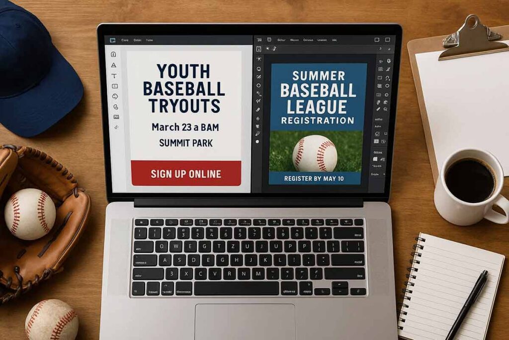
Here are a few baseball tryout flyer examples that demonstrate clear hierarchy and responsive-friendly design for both print and digital use:
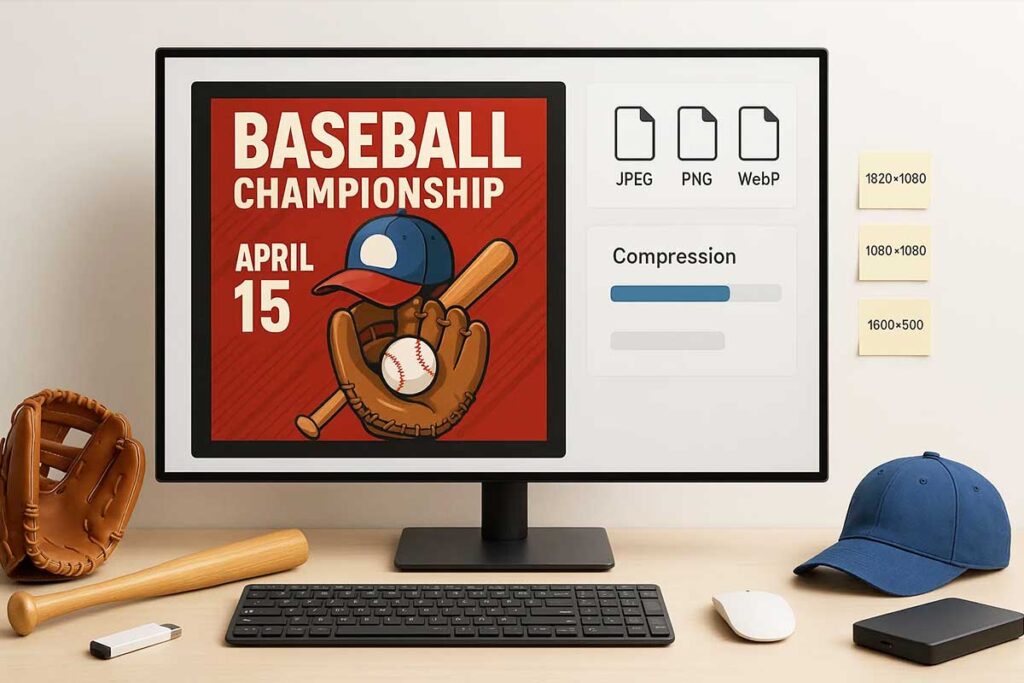
How do I optimize file formats and resolution settings for both digital sharing and professional printing?
File format optimization requires output-specific preparation, resolution standard understanding, and quality preservation through systematic technical specification management. Effective optimization balances file size efficiency with quality maintenance across digital and print applications through strategic format selection and setting configuration. Successful how to design baseball flyers projects depend on proper technical specifications that ensure professional results across all distribution channels.
Digital Format Optimization Framework
Web-optimized formats include JPEG compression for photographs and PNG transparency for graphics with alpha channels. Social media platforms require specific dimensions: Facebook events need 1920×1080 pixels, Instagram posts require 1080×1080 squares, and Twitter headers demand 1500×500 ratios. Email-friendly optimization features file size reduction under 1MB and attachment compatibility across different email systems.
JPEG quality settings between 80-90% provide optimal balance between file size and visual quality for baseball flyer photography. PNG format preserves transparency for logos and graphics requiring clean backgrounds. WebP format offers superior compression for modern browsers but requires JPEG fallbacks for compatibility. RGB color space ensures accurate digital display across devices and platforms.
Compression techniques include lossless optimization tools that reduce file sizes without quality degradation. Batch processing streamlines format conversion for multiple baseball flyer variations. Cloud storage integration enables efficient file sharing and collaborative editing workflows.
Print Quality Management
Resolution standards require 300 DPI minimum for professional printing and quality assurance protocols. Color profile management features CMYK conversion and print color accuracy verification through ICC profiles. Bleed and margin specifications include 0.125-inch bleed extensions and 0.25-inch safe zones for text elements.
Professional printing demands different technical requirements than digital distribution. Offset printing requires CMYK color conversion, while digital printing accepts RGB with automatic conversion. Paper stock considerations affect ink absorption and color vibrancy, requiring format adjustments for different substrates.
PDF creation preserves fonts, graphics, and layout integrity across different systems and printers. Vector graphics maintain scalability without resolution loss, ideal for logos and simple graphics. High-resolution photography requires careful compression balancing to maintain print quality while managing file sizes.
Workflow Integration System
Master file management includes high-resolution original preservation and version control systems using systematic naming conventions. Output preparation protocols feature format-specific optimization and quality verification procedures through automated checking systems. Distribution coordination includes file naming conventions and organized delivery systems for efficient project management.
Automated workflow solutions streamline repetitive optimization tasks. Photoshop actions and batch processing eliminate manual format conversion for projects. Template systems enable consistent technical specifications across different design variations.
Quality control integration includes proof review processes and final output verification before distribution. Color calibration ensures consistency between screen display and print output. File backup procedures protect against data loss during complex optimization workflows.
Cloud-based collaboration enables team members to access optimized files across different devices and locations. Version tracking prevents confusion between draft and final files. Automated delivery systems can distribute optimized files to multiple platforms simultaneously, reducing manual distribution errors and ensuring consistent quality standards across all output channels.
What design workflow and organization systems enable efficient baseball flyer creation and revision management?
Design workflow optimization requires systematic project organization, version control management, and revision tracking that enables efficient creation while maintaining quality standards. Effective workflow balances creative flexibility with organized documentation through systematic process development and time management integration. Professional baseball flyer creation benefits from structured approaches that eliminate confusion and accelerate delivery times through proven organizational systems.
Project Organization Framework
File structure development forms the foundation of efficient baseball flyer creation workflows. Create dedicated project folders with logical naming conventions: “2025BaseballFlyers/TeamName/VersionDate” structure prevents file confusion and enables quick asset location. Establish separate subfolders for source images, fonts, final outputs, and client communications to maintain clear project boundaries.
Asset management systems streamline resource access through centralized libraries. Build reusable template collections with standardized baseball imagery, approved fonts, and brand elements that accelerate new project initiation. Organize assets by category: action shots, team photos, equipment images, and logo files with consistent naming conventions that enable rapid retrieval.
Timeline planning integrates project phases with realistic deadlines. Document client requirements, design phases, review periods, and final delivery dates in shared calendars or project management tools. Build buffer time into schedules for unexpected revisions and technical issues that commonly arise during baseball flyer projects.
Version Control System
Revision tracking prevents confusion through systematic version numbering and change documentation. Implement consistent naming: “BaseballFlyerv01Initial”, “BaseballFlyerv02ClientReview”, “BaseballFlyerv03_Final” with date stamps and change summaries. Maintain revision logs documenting modifications, approval status, and outstanding issues for each version iteration.
Collaboration management facilitates smooth approval processes through clear file sharing protocols. Use cloud storage platforms with permission controls that allow stakeholders to review designs without editing capabilities. Establish comment systems where feedback gets consolidated rather than scattered across multiple communication channels.
Backup procedures protect project investment through automatic saving and redundant storage. Configure design software for frequent auto-saves and maintain local plus cloud backup copies. Store final approved versions in multiple locations to prevent data loss from technical failures or corrupted files.
Efficiency Optimization Strategy
Template development accelerates project initiation through reusable design elements and systematic customization procedures. Create master baseball flyer templates with placeholder content that speeds new project setup. Develop standardized color palettes, typography hierarchies, and layout grids that maintain consistency while reducing decision-making time.
Quality checklist integration ensures consistent output through systematic review processes. Document essential verification points: image resolution, text accuracy, contact information, color profiles, and file format requirements. Create printable checklists that prevent common errors and reduce revision cycles.
Time management techniques maximize productive creation periods through focused work sessions and distraction elimination. Schedule dedicated design blocks without interruptions for complex creative work. Use time-tracking tools to identify workflow bottlenecks and optimize resource allocation across project phases.
Process refinement drives continuous improvement through systematic workflow evaluation. Track project completion times, revision frequency, and client satisfaction metrics to identify optimization opportunities. Document successful approaches and eliminate inefficient practices that slow delivery or compromise quality standards.
Automation integration reduces repetitive tasks through software shortcuts and batch processing capabilities. Configure design software templates, color swatches, and style presets that eliminate manual setup time. Use batch export functions for multiple file formats and sizes required for different distribution channels.
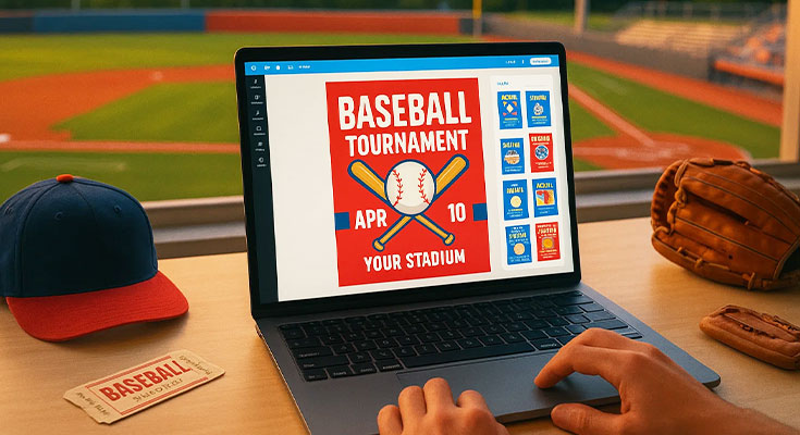
To streamline your process even further, explore ready-made baseball tryout flyer templates designed for quick customization and multi-format export:
How can I incorporate feedback and approval processes without compromising design quality and timeline adherence?
Feedback integration requires systematic collection methods, quality preservation protocols, and timeline management that improves design effectiveness while maintaining project momentum. Effective feedback processes balance stakeholder input with design integrity through structured communication and revision management that protects both creative vision and delivery schedules.
Feedback Collection Framework
Establish structured review processes using specific questionnaires rather than open-ended requests. Create standardized feedback forms that address design hierarchy, readability, and message clarity while avoiding subjective aesthetic preferences. Set clear review windows—typically 48-72 hours for initial drafts and 24 hours for revisions—to maintain momentum without rushing stakeholder evaluation.
Coordinate multiple stakeholders through consolidated input collection. Designate a single point person to gather comments from various reviewers and present unified feedback, preventing conflicting directives that compromise design coherence. Use visual annotation tools that allow precise feedback placement rather than vague written descriptions.
Focus feedback requests on functional elements: information accuracy, target audience appropriateness, and call-to-action effectiveness. Guide reviewers away from personal design preferences toward objective evaluation criteria that serve project goals.
Revision Management Strategy
Prioritize changes using a three-tier system: essential corrections (factual errors, legal compliance), important improvements (clarity enhancements, hierarchy adjustments), and optional refinements (aesthetic preferences). Address essential items immediately while batching less critical changes to minimize design disruption.
Limit revision rounds to maintain quality and timeline integrity. Establish maximum revision cycles—typically two rounds for standard projects—with clear scope definitions for each phase. Document all approved changes before implementation to prevent scope creep.
Protect design integrity by explaining the rationale behind creative decisions when stakeholders request changes that compromise functionality. Offer alternative solutions that address concerns while maintaining design effectiveness, such as adjusting color contrast instead of changing established hierarchy systems.
Here are some baseball flyer designs that demonstrate how strong layout and color choices support both aesthetics and functionality, even when adapting to stakeholder input.
Professional Communication System
Manage expectations through upfront timeline communication and revision limit establishment. Present clear project phases with specific review windows and revision opportunities, preventing last-minute change requests that jeopardize delivery dates.
Document all feedback and approvals using written confirmation systems. Email summaries of verbal discussions and require written approval for significant changes, creating accountability and preventing miscommunication that leads to project delays.
Develop conflict resolution protocols for situations where feedback contradicts design best practices. Prepare design rationale explanations that connect creative decisions to project objectives, helping stakeholders understand how proposed changes might impact effectiveness.
Create final approval checkpoints with systematic sign-off processes that formally close revision phases. Use approval forms that confirm stakeholder satisfaction and authorize project completion, preventing post-delivery change requests that disrupt workflow and compromise future project timelines.
Establish communication schedules that balance accessibility with focused work time. Set specific hours for feedback discussion and revision presentation while protecting design development periods from interruption, ensuring quality work completion within established timelines.
People Also Ask
- What beginner-friendly approach creates professional baseball flyers without extensive design experience?
Start with template customization using DesignWiz or similar platforms. Focus on typography hierarchy and color consistency. Practice with simple layouts before attempting complex designs. Prioritize clarity over creativity initially. - Should novice creators start with templates or attempt original design development?
Begin with templates for faster results and learning foundation. Gradually customize elements to develop skills. Original design requires significant time investment and advanced knowledge. Templates provide professional structure while enabling personalization. - How do free design tools compare to premium software for baseball flyer creation?
Free tools like DesignWiz offer sufficient capability for most baseball flyer needs. Premium software provides advanced features but requires significant learning investment. Evaluate project complexity and skill level before choosing platform. - What learning investment produces competent baseball flyer design skills most efficiently?
Focus on typography basics, color theory fundamentals, and layout principles. Invest 10-15 hours in structured learning before attempting complex projects. Practice with simple designs and gradually increase complexity as skills develop. - How much design complexity can beginners handle without compromising flyer effectiveness?
Limit initial projects to single-purpose flyers with clear hierarchy. Avoid multiple fonts, complex graphics, or busy layouts. Simple, clean designs often outperform complex alternatives for promotional effectiveness. - What mistake avoidance strategy prevents amateur-looking baseball flyer design problems?
Use high-resolution images, maintain consistent spacing, and limit font variety. Avoid centering all text and ensure adequate contrast. Follow established design principles rather than experimental approaches initially. - Should DIY creators invest in design courses or rely on online tutorials?
Combine both approaches for comprehensive learning. Free YouTube tutorials provide practical skills while structured courses offer systematic foundation. Invest in paid education only after confirming genuine interest and aptitude.
FAQs
- What design software learning curve should beginners expect for professional baseball flyer creation?
DesignWiz requires 2-3 hours for basic competency, 10-15 hours for advanced features. GIMP needs 20-30 hours for functional capability. Adobe alternatives require 15-25 hours for proficiency. Expect 3-6 months of regular practice for consistent professional results. - What color theory basics help non-designers choose effective baseball flyer color schemes?
Learn complementary color relationships and traditional baseball palettes. Use 60-30-10 rule: dominant color, secondary color, accent color. Ensure sufficient contrast for readability. Test colors for colorblind accessibility. Stick to 3-4 colors maximum to maintain professional appearance. - Should beginner flyer creators start with templates or design from scratch?
Begin with template customization to learn design principles and software functionality. Templates provide professional structure and proportion guidance. Gradually modify elements to develop personal style. Original design requires advanced skills and significant time investment better suited for experienced creators. - How do typography choices impact readability for different age groups viewing baseball flyers?
Use larger fonts (14pt minimum) for senior audiences and clear sans-serif fonts for children. Script fonts reduce readability for all ages. Maintain high contrast between text and background. Consider viewing distance when selecting font sizes. - What file format and resolution settings ensure quality across digital and print applications?
Create master files at 300 DPI in print dimensions. Export JPEG at 80-90% quality for digital sharing. Use PNG for graphics with transparency. Save print-ready PDF with embedded fonts. Maintain separate web and print versions to optimize file sizes and quality appropriately. - What printing options provide cost-effective quality for homemade baseball flyer designs?
Online printing services like Vistaprint offer competitive pricing and quality. Local print shops provide quick turnaround and consultation. Office supply stores offer immediate availability for small quantities. Compare pricing, quality samples, and turnaround times. - How do beginner designers develop consistent style guidelines for multiple baseball flyer projects? Create brand guide including color palette, font selections, and logo usage standards. Develop template library with consistent layouts and element positioning. Document design decisions and maintain style reference materials.
Conclusion
In conclusion, learning how to design baseball flyers effectively requires a structured approach that builds skills progressively. Start with basic template customization before advancing to typography and color theory applications. Choose tools that match your skill level, from beginner-friendly platforms to professional design software. Implement quality checks and organized workflows to maintain high standards throughout the creation process. With consistent practice and attention to design fundamentals, anyone can develop the ability to create a flyer that capture attention and communicate effectively. This systematic method transforms beginners into confident designers capable of producing excellent promotional materials.
Reference
- RIT College of Art and Design. (2011). Typographic Hierarchy. Rochester Institute of Technology.
- Texas A&M University Libraries. (2022). Four Principles of Document Design. Howdy or Hello? Technical and Professional Communication.
- Borough of Manhattan Community College. (2019). Typographic Hierarchy – MMP 240 Web Design. CUNY OpenLab.