Creating effective Labor Day flyer designs requires understanding patriotic color psychology, American cultural symbols, and promotional timing strategies. This comprehensive guide covers design principles, color schemes, typography choices, and layout techniques that make Labor Day flyers both visually appealing and commercially effective.
As one of the biggest shopping weekends of the year, Labor Day is a prime opportunity for businesses to drive engagement through eye-catching flyers. Whether you’re promoting community events, retail sales, or restaurant specials, your flyer design can significantly impact customer response and business results.
This guide will teach you how to create flyers that capture attention, communicate effectively, and drive action. You’ll discover color psychology principles, typography guidelines, step-by-step design processes, and industry-specific strategies that professional designers use to create high-converting flyers.
What Makes Labor Day Flyers Effective?
Labor Day flyers achieve maximum effectiveness through three critical factors: strategic use of patriotic color psychology, clear hierarchical messaging, and cultural relevance that resonates with American values of hard work and celebration.
Design Psychology and Consumer Behavior
Effective Labor Day flyers leverage this psychology through:
- Visual Hierarchy Principles: The most successful designs follow the Z-pattern reading flow, placing the most important information (event title, date, primary offer) in the top-left and bottom-right corners. According to the Interaction Design Foundation, effective visual hierarchy achieved through techniques such as size, color, contrast, and spacing, significantly improves user focus, readability, and engagement by guiding the viewer’s attention in a logical order.1
- Cultural Symbol Integration: Successful flyers incorporate recognizable American symbols without overwhelming the core message. Stars, stripes, eagles, and flag elements should support, not dominate, the primary promotional content.
- Emotional Trigger Implementation: Beyond patriotic themes, effective Labor Day flyers tap into end-of-summer emotions, nostalgia for summer activities, excitement for fall beginnings, and appreciation for relaxation time.
Conversion Elements That Drive Action
High-converting Labor Day flyers include specific elements that guide readers toward desired actions:
- Clear Value Proposition: The benefit must be immediately apparent within 3 seconds of viewing. Whether it’s “50% Off Labor Day Sale” or “Family BBQ All Day,” the core value should dominate the visual hierarchy.
- Urgency and Scarcity: Limited-time offers specific to Labor Day weekend create natural urgency. Phrases like “This Labor Day Weekend Only” or “While Supplies Last” significantly increase response rates.
- Contact Information Prominence: Essential details, date, time, location, phone number, must be easily readable from 3 feet away for print distribution and clearly visible on mobile devices for digital sharing.nciples while maintaining focus on your specific business goals and target audience needs.
How Do You Choose the Most Effective Colors for Labor Day Flyers?
Labor Day color selection should balance patriotic tradition with modern design aesthetics, ensuring accessibility while maximizing emotional impact through strategic red, white, and blue variations that align with your brand identity.
Traditional Patriotic Palette Psychology
The classic red, white, and blue combination remains powerful because each color triggers specific psychological responses:
- Red Psychology: Creates urgency, excitement, and appetite stimulation. Perfect for sales, food promotions, and event announcements.
- Blue Psychology: Conveys trust, stability, and professionalism. Ideal for business communications, community events, and service promotions.
- White Psychology: Represents cleanliness, simplicity, and sophistication. Essential for readability and creating visual breathing room that prevents overcrowded designs.
Modern Patriotic Alternatives
Contemporary Labor Day designs successfully modernize traditional palettes:
- Navy and Cream Sophistication: Deep navy (#1B365D) paired with cream (#F7F3E9) creates upscale, sophisticated alternatives perfect for fine dining, luxury retail, or professional services.
- Burgundy and Gold Elegance: Rich burgundy (#800020) with gold accents (#FFD700) appeals to premium audiences while maintaining patriotic undertones.
- Slate Blue and Silver Contemporary: Modern slate blue (#6A5B8C) with silver accents (#C0C0C0) provides fresh takes on patriotic themes for tech companies, modern restaurants, or contemporary retail.
Industry-Specific Color Considerations
Different industries benefit from tailored color approaches:
- Food Service: Warm reds and oranges stimulate appetite while maintaining patriotic themes. Adding touches of green can suggest freshness and quality.
- Retail: High contrast combinations ensure sale prices and offers remain prominent. Black text on yellow backgrounds increases readability.
- Community Events: Softer, family-friendly versions of traditional colors appeal to broader age ranges while remaining recognizably patriotic.
Color Accessibility Standards
Effective Labor Day flyers meet WCAG AA accessibility standards:
- Contrast Ratios: Text requires minimum 4.5:1 contrast against backgrounds. Red text on blue backgrounds often fails this standard.
- Color Blindness Considerations: Approximately 8% of men have red-green color blindness. Always test designs using Color Oracle or similar tools.
- Print vs. Digital Optimization: Colors appear differently in print versus digital formats. CMYK colors often appear muted compared to RGB versions.
Remember that colors appear differently in print versus digital formats. Test your chosen palette across both mediums to ensure consistency and effectiveness.
According to USC’s Applied Psychology blog, consumers often make decisions within 90 seconds of first encountering a product, and up to 90% of that decision is influenced by color.2
Interactive Labor Day Color Scheme Generator
Generate professional patriotic color schemes instantly with accessibility compliance
This interactive tool specifically, helps you create professional patriotic color combinations for your Labor Day flyer designs. Simply select your industry, design style preference, and target audience to generate customized color palettes with specific HEX codes and usage recommendations.
Features
- 12+ pre-built Labor Day color combinations
- Industry-specific color recommendations (restaurant, retail, events)
- Accessibility contrast checker ensuring readability compliance
- Export options for design software (HEX, RGB, CMYK values)
- Real-time preview showing colors in the flyer layout context
How to Use
- Select your business type from the dropdown menu
- Choose your preferred design style (traditional, modern, elegant, bold)
- Specify your target audience (families, professionals, general public)
- Click “Generate Palette” to see customized color recommendations
- Test different combinations and export your chosen palette
This tool generates color schemes that maintain patriotic appeal while optimizing for your specific business needs and audience preferences. Moreover, each generated palette includes primary colors, accent colors, and neutral backgrounds with professional color theory principles applied.
What Typography Choices Make Labor Day Flyers More Readable and Impactful?
Typography selection for Labor Day flyers should prioritize readability at various distances while incorporating fonts that convey appropriate patriotic sentiment without sacrificing professionalism or modern appeal.
Patriotic Font Styles Without Clichés
Effective Labor Day typography avoids overused “Western” or “stencil” fonts that appear amateur:
- Modern Serif Options: Fonts like Playfair Display or Crimson Text provide sophisticated patriotic feel without appearing outdated. These work particularly well for upscale events or professional services.
- Clean Sans-Serif Choices: Montserrat, Open Sans, or Poppins offer excellent readability while maintaining contemporary appeal. These fonts work across all industries and age demographics.
- Script Accent Fonts: Limited use of elegant scripts like Dancing Script or Pacifico can add personality to headlines without overwhelming the design.
Typography Hierarchy Principles
Successful Labor Day flyers employ three-level typography hierarchy:
- Primary Headlines (H1): 36-48pt for print, 28-36pt for digital. Should be readable from 10 feet for posted flyers.
- Secondary Information (H2): 24-30pt for print, 20-24pt for digital. Include date, time, location, or primary offer details.
- Body Text and Details (H3): 12-16pt for print, 14-18pt for digital. Contact information, terms, additional details.
Readability Standards and Testing
Typography effectiveness depends on viewing conditions:
- Distance Viewing: For flyers posted on community boards, text must be readable from 6 feet minimum. This requires larger fonts and higher contrast.
- Mobile Optimization: Most of flyer sharing happens via mobile devices. Font sizes must remain legible on 5-inch screens.
- Aging Population Considerations: Larger fonts benefit older demographics who represent significant Labor Day weekend spending power.
Font Pairing Guidelines
Successful combinations balance contrast with harmony:
- Serif + Sans-Serif: Classic pairing that works universally. Use serif for headlines, sans-serif for body text.
- Two Sans-Serif Weights: Different weights of the same font family create cohesive yet hierarchical designs.
- Script + Sans-Serif: Limited script use for emphasis paired with clean sans-serif for readability.
What Are the Most Effective Creative Approaches for Labor Day Flyer Design?
The most effective Labor Day flyer designs balance patriotic recognition with modern aesthetics, utilizing contemporary interpretations of American themes that appeal to diverse audiences while maintaining a clear promotional focus.
Modern Patriotic Design Approach
Contemporary Labor Day designs move beyond literal flag imagery toward sophisticated patriotic elements:
- Geometric Patriotic Patterns: Subtle stripe patterns, star-inspired shapes, or abstract red, white, and blue elements create patriotic atmosphere without overwhelming promotional content. This approach works particularly well for professional services, modern retail, or tech companies.
- Photography Integration: High-quality lifestyle photography featuring diverse families, outdoor activities, or food imagery paired with patriotic color overlays creates emotional connections while maintaining modern appeal.
- Minimalist Patriotic Elements: Single patriotic elements one star, subtle stripe, or small flag icon provide patriotic context without dominating the design. This approach appeals to younger demographics and modern businesses.
Vintage Americana Design Style
Retro-inspired Labor Day designs tap into nostalgia while remaining relevant:
- 1950s-60s Aesthetic: Bold colors, vintage typography, and classic American imagery appeal to multiple generations. This style works exceptionally well for diners, barbershops, automotive services, or vintage-themed retail.
- Distressed and Weathered Elements: Subtle texture overlays, distressed edges, or vintage paper backgrounds add authentic aged appearance without sacrificing readability.
- Classic American Symbols: Vintage-style eagles, classic cars, retro diners, or historical American imagery create strong emotional connections with traditional values.
- Hand-Lettered Typography: Custom lettering or fonts that mimic hand-drawn styles add authentic, artisanal feel that appeals to craft-focused businesses or local establishments.
Industry-Specific Design Themes
Different business types benefit from tailored creative approaches:
- Retail and Sales: High-energy designs with bold sale percentages, dynamic layouts, and attention-grabbing elements. Movement and excitement should dominate while maintaining patriotic elements.
- Restaurants and Food Service: Food-focused designs emphasizing appetite appeal, family dining, and outdoor eating experiences. Warm colors and mouth-watering imagery should dominate patriotic elements.
- Community Events: Family-friendly designs emphasizing inclusivity, safety, and community spirit. Approachable typography and welcoming imagery should create broad appeal.
Minimalist Patriotic Design
Clean, modern approaches that suggest rather than declare patriotic themes:
- Negative Space Utilization: Strategic use of white space with minimal patriotic accents creates sophisticated, upscale appeal perfect for professional services or luxury retail.
- Single Color Focus: Designs featuring primarily one patriotic color deep blue with white text, or red with cream accents maintain patriotic recognition while achieving elegant simplicity.
- Typography-Focused Designs: Layouts where beautiful typography carries the entire design, with minimal patriotic elements serving as subtle accents rather than dominant features.
How Do You Create a Professional Labor Day Flyer from Concept to Completion?
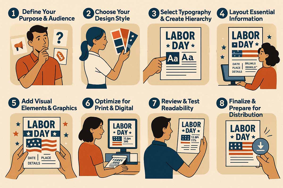
Creating professional Labor Day flyers requires a systematic 8-step process that ensures both visual appeal and marketing effectiveness, from initial audience analysis through final distribution preparation.
Step 1: Define Your Purpose & Audience (Planning Foundation)
Every successful Labor Day flyer begins with a clear purpose definition and audience understanding:
- Goal Identification: Determine specific objectives increase sales, drive event attendance, promote special offers, or build brand awareness. This affects every subsequent design decision.
- Audience Analysis: Consider demographics, interests, spending habits, and media consumption patterns. Labor Day appeals differently to families, young professionals, seniors, and business owners.
- Success Metrics: Establish measurable goals foot traffic increase, sales targets, event attendance, or social media engagement. This guides design choices toward conversion-focused elements.
- Budget Parameters: Understanding budget constraints for printing, distribution, and design time helps prioritize design elements and distribution strategies.
Step 2: Choose Your Design Style & Colors (Visual Foundation)
Style selection should align with brand identity while appealing to target audience:
- Style Alignment: Match design approach to business personality, modern patriotic for contemporary brands, vintage Americana for traditional businesses, minimalist for upscale services.
- Color Psychology Application: Select patriotic color variations that support emotional goals, energetic reds for sales, trustworthy blues for services, sophisticated navy for professional communications.
- Brand Consistency: Ensure patriotic elements complement existing brand colors and don’t conflict with established visual identity.
- Competition Differentiation: Research competitor designs to ensure your approach stands out while remaining appropriate for the industry.
Step 3: Select Typography & Create Hierarchy (Information Structure)
Typography choices directly impact readability and professional appearance:
- Font Selection Process: Choose primary fonts that remain readable at various sizes and distances. Test legibility on both print and digital devices.
- Hierarchy Planning: Establish clear information importance, event name/offer (largest), date/location (medium), details/contact (smallest but readable).
- Contrast Testing: Ensure sufficient contrast between text and background colors, especially with patriotic color combinations that may reduce readability.
- Accessibility Compliance: Verify designs meet WCAG accessibility standards for diverse audiences including those with visual impairments.
Step 4: Layout Essential Information (Content Organization)
Information organization determines flyer effectiveness:
- Critical Information Priority: Labor Day date/time, location, offer details, and contact information must be immediately visible and prominent.
- Visual Flow Design: Arrange elements to guide eye movement through information logically headline to details to action steps.
- White Space Utilization: Adequate spacing prevents overcrowded appearance and improves readability, especially important for complex promotional information.
- Call-to-Action Placement: Position primary action (visit, call, attend) prominently with clear visual emphasis.
Step 5: Add Visual Elements & Graphics (Design Enhancement)
Visual elements should support, not overshadow, essential information:
- Patriotic Element Integration: Add stars, stripes, or flag elements subtly to reinforce Labor Day theme without overwhelming content.
- Photography Selection: Choose high-quality images that represent target audience and support promotional goals families for community events, food for restaurants, products for retail.
- Graphic Balance: Ensure decorative elements enhance rather than compete with text readability and information hierarchy.
- Brand Element Inclusion: Incorporate logos, brand colors, and design elements that maintain brand recognition while embracing patriotic themes.
Step 6: Optimize for Print & Digital (Technical Preparation)
Technical optimization ensures professional results across distribution methods:
- Resolution Requirements: 300 DPI minimum for print applications, 72 DPI for digital sharing. Vector graphics scale better than raster images.
- Color Mode Selection: CMYK for print production, RGB for digital distribution. Colors appear differently between modes.
- Bleed and Margin Setup: Include 0.125″ bleed for professional printing, maintain 0.25″ margin for essential text elements.
- File Format Preparation: PDF for print, JPG/PNG for digital sharing, with appropriate compression settings maintaining quality.
Step 7: Review & Test Readability (Quality Assurance)
Comprehensive testing prevents costly mistakes:
- Distance Testing: Print draft versions and test readability from various distances 3 feet for handheld viewing, 10 feet for posted displays.
- Device Testing: View digital versions on multiple screen sizes and devices to ensure mobile compatibility.
- Feedback Collection: Gather input from target audience representatives to identify unclear elements or missed opportunities.
- Proofing Process: Check spelling, grammar, date accuracy, and contact information multiple times. Labor Day date verification is crucial.
Step 8: Finalize & Prepare for Distribution (Launch Preparation)
Final preparation ensures smooth distribution and maximum impact:
- File Organization: Create organized file systems with multiple format versions, backup copies, and distribution-ready files.
- Distribution Planning: Coordinate print quantities, digital sharing schedules, and posting locations for maximum exposure.
- Performance Tracking: Establish systems for measuring flyer effectiveness unique phone numbers, website landing pages, or promotional codes.
- Launch Timing: Schedule distribution for optimal impact typically 2-3 weeks before Labor Day for maximum awareness and planning time.
How Should Different Industries Approach Labor Day Flyer Design?
Different industries require tailored design approaches to effectively communicate with their specific audiences and achieve their business objectives. Therefore, Understanding industry-specific best practices helps create more targeted and effective flyers.
Community Events & Celebrations Design Strategy
Community-focused Labor Day events require inclusive, family-friendly designs that emphasize safety, fun, and broad appeal:
- Accessibility and Inclusivity: Designs should welcome diverse families and age groups through inclusive imagery, clear information hierarchy, and accessible color contrasts that work for various visual abilities.
- Safety and Family Focus: Emphasize family-friendly activities, safety measures, and age-appropriate entertainment. Parents prioritize these factors when selecting Labor Day activities.
- Community Pride Elements: Incorporate local landmarks, community symbols, or regional pride elements alongside patriotic themes to create stronger local connections.
- Activity Highlighting: Feature specific activities games, food, entertainment with visual icons or imagery that helps families plan attendance and set expectations.
For comprehensive guidance on creating engaging community event materials, our complete guide to designing Labor Day party flyers covers family-friendly design strategies and community engagement techniques.
Retail Sales & Promotions Design Approach
Retail Labor Day flyers must balance patriotic themes with strong sales messaging that creates urgency and drives immediate action:
- Sale Prominence: Discount percentages and sale terms should dominate visual hierarchy while maintaining patriotic elements as supporting themes rather than primary focus.
- Product Showcasing: Feature specific items, categories, or brands on sale with high-quality product photography that demonstrates value and quality.
- Urgency Creation: Limited-time language specific to Labor Day weekend creates natural urgency “This Weekend Only” or “Labor Day Exclusive” drives immediate response.
- Clear Terms Communication: Sale conditions, exclusions, and fine print must be readable and legally compliant while maintaining design appeal.
Discover retail-specific design strategies that maximize sales conversion in our comprehensive retail Labor Day flyer guide, which covers promotion-focused techniques and psychological triggers.
Restaurant & Food Service Marketing Design
Food service Labor Day promotions require appetite appeal, family dining emphasis, and outdoor dining celebration:
- Appetite Stimulation: High-quality food photography, warm color palettes, and mouth-watering imagery should dominate design elements while incorporating patriotic themes subtly.
- Family Dining Emphasis: Showcase family-friendly menu options, kids’ meals, and group dining experiences that appeal to Labor Day family gatherings.
- Outdoor Dining Celebration: Highlight patio seating, BBQ options, or outdoor dining experiences that align with Labor Day outdoor celebration traditions.
- Special Menu Promotion: Feature limited-time Labor Day menu items, drink specials, or dining packages with clear pricing and availability information.
Discover restaurant-specific design techniques, including food photography integration and menu promotion strategies, in our labor day restaurant flyer design guide.
What Are the Trending Design Approaches for Labor Day 2025?
Labor Day 2025 design trends emphasize authentic patriotism over performative displays, sustainable messaging, inclusive imagery, and technology-integrated experiences that reflect contemporary American values.
Authentic Patriotism Movement
2025 Labor Day designs move toward genuine celebration of American values rather than superficial flag imagery:
- Worker Appreciation Focus: Designs celebrating actual laborers, essential workers, and blue-collar contributions align with Labor Day’s original purpose while maintaining contemporary relevance.
- Community Building Emphasis: Patriotic themes that highlight local community strength, neighborhood connections, and grassroots American values resonate more authentically than generic national symbols.
- Diverse Representation: Inclusive imagery showing diverse Americans celebrating together reflects contemporary understanding of national identity and appeals to broader audiences.
- Substance Over Symbols: Designs emphasizing American ideals equality, opportunity, hard work rather than just visual patriotic elements create deeper emotional connections.
Sustainable and Eco-Conscious Design
Environmental awareness influences 2025 Labor Day design approaches:
- Eco-Friendly Messaging: Designs incorporating environmental stewardship alongside patriotic themes appeal to environmentally conscious consumers who see conservation as patriotic duty.
- Digital-First Strategies: Reduced print reliance reflects both environmental consciousness and changing media consumption patterns, especially among younger demographics.
- Local Sourcing Emphasis: Promoting locally-sourced materials, American-made products, or community-based services aligns environmental and patriotic values.
- Sustainable Color Palettes: Earth-toned variations of patriotic colors forest green, sky blue, terra cotta, maintain patriotic recognition while suggesting environmental awareness.
Technology Integration and Interactive Elements
Modern Labor Day flyers incorporate digital interaction even in print formats:
- QR Code Integration: Seamless QR codes linking to additional information, exclusive offers, or interactive experiences extend flyer functionality without cluttering design.
- Social Media Amplification: Design elements optimized for social sharing, including hashtag integration and shareable graphics that extend reach beyond initial distribution.
- Augmented Reality Elements: Progressive businesses experiment with AR-enabled flyers that reveal additional content when viewed through mobile apps.
- Multi-Platform Consistency: Designs optimized for seamless experience across print, digital, and social media platforms maintain consistency while leveraging each medium’s strengths.
Inclusive Design and Accessibility
2025 trends prioritize universal accessibility and broad appeal:
- Universal Design Principles: Color choices, typography, and layout decisions consider various visual abilities, age ranges, and cultural backgrounds.
- Language Accessibility: Bilingual designs or clear visual communication that transcends language barriers reflect American diversity.
- Cultural Sensitivity: Patriotic themes that welcome rather than exclude, acknowledging diverse definitions of American identity and celebration.
- Multi-Generational Appeal: Design approaches that resonate with different age groups simultaneously, crucial for family-focused Labor Day activities.
According to Section 508’s universal design guidelines, flyers should use high-contrast colors (minimum 4.5:1 ratio), clear sans-serif fonts at least 3/16″ (≈16 pt) tall for readability, and ensure information is perceptible to individuals with visual impairments.3
Timeless vs. Trendy Balance
Successful 2025 designs balance contemporary trends with enduring appeal:
- Classic Foundation: Strong design fundamentals ensure flyers remain effective beyond immediate trend cycles.
- Subtle Trend Integration: Incorporating current design trends in accent elements rather than foundational choices maintains longevity.
- Brand Consistency: Maintaining established brand identity while embracing appropriate trends ensures recognition and trust.
- Forward-Thinking Approach: Designs that anticipate near-future trends while remaining immediately relevant and effective.
What Technical Requirements Ensure Professional Labor Day Flyer Quality?
Professional Labor Day flyer production demands specific technical standards for print resolution, color accuracy, accessibility compliance, and digital optimization that ensure consistent quality across all distribution methods.
Print Production Specifications
Professional print quality requires precise technical setup:
- Resolution Standards: 300 DPI minimum for all print applications ensures crisp text and clear images. Lower resolutions appear pixelated or blurry in print format.
- Color Mode Requirements: CMYK color mode for print production produces accurate color reproduction. RGB colors often appear different when printed.
- Bleed Setup: 0.125″ bleed on all sides prevents white edges if cutting isn’t perfectly aligned. Essential for professional appearance.
- Margin Safety: 0.25″ margins for all essential text and elements ensure nothing important gets cut during the trimming process.
- Paper Size Standards: Common flyer sizes include 8.5″x11″ (standard letter), 5.5″x8.5″ (half sheet), and 4.25″x5.5″ (quarter sheet). Size affects design approach and printing costs.
Digital Format Optimization
Digital distribution requires different technical considerations:
- File Format Selection: JPG for photographs and complex designs, PNG for designs with transparency, PDF for print-ready files that maintain quality.
- Compression Balance: Optimize file sizes for fast loading while maintaining visual quality. Target under 500KB for easy email sharing and social media posting.
- Device Compatibility: Test viewing on various screen sizes smartphones, tablets, desktops to ensure readability across devices.
- Social Media Specifications: Different platforms require specific dimensions, Instagram Square (1080×1080), Facebook Post (1200×630), Twitter Card (1200×675).
Accessibility Standards Implementation
Professional designs meet accessibility requirements:
- Color Contrast Ratios: WCAG AA standards require 4.5:1 contrast ratio for normal text, 3:1 for large text. Particularly important with patriotic color combinations.
- Font Size Minimums: 12pt minimum for print body text, 14pt minimum for digital text ensures readability for users with visual impairments.
- Color Blindness Considerations: Approximately 8% of men have red-green color blindness. Test designs using tools like Color Oracle or Stark.
- Alternative Text Preparation: For digital versions, prepare descriptive alt text for screen readers and accessibility compliance.
Quality Control and Testing
Comprehensive testing prevents distribution problems:
- Print Test Runs: Always print test versions on similar paper stock to verify color accuracy and readability before full production runs.
- Device Testing: View digital versions on multiple devices, operating systems, and screen resolutions to ensure consistent appearance.
- Distance Testing: Test readability from various viewing distances arm’s length for handheld, 6 feet for posted displays.
- Feedback Integration: Collect input from target audience representatives to identify technical issues or improvement opportunities.
How Do You Effectively Distribute and Promote Labor Day Flyers?
Effective Labor Day flyer distribution combines strategic physical placement with digital amplification, timing optimization, and performance tracking that maximizes exposure while minimizing costs.
Strategic Physical Distribution
Physical distribution success depends on location selection and timing:
- High-Traffic Location Analysis: Identify locations where target audience naturally gathers grocery stores, community centers, libraries, coffee shops, fitness centers.
- Permission and Partnerships: Establish relationships with location managers for consistent posting privileges. Offer reciprocal promotion when appropriate.
- Weather Protection: Use protective sleeves or lamination for outdoor postings to maintain professional appearance through weather exposure.
- Timing Optimization: Begin distribution 2-3 weeks before Labor Day for maximum awareness. Refresh or replace as needed to maintain visibility.
- Community Board Strategy: Utilize official community boards, apartment complexes, and neighborhood gathering spaces for targeted local reach.
Digital Amplification Strategies
Digital distribution extends reach and enables tracking:
- Social Media Optimization: Create platform-specific versions optimized for Facebook, Instagram, Twitter, and LinkedIn, sharing with appropriate dimensions and messaging.
- Email Marketing Integration: Include flyer images in email campaigns, newsletters, and automated sequences for the existing customer base.
- Website Integration: Feature flyers prominently on homepages, dedicated landing pages, and relevant blog posts for SEO benefits and customer awareness.
- QR Code Implementation: Bridge physical and digital by including QR codes linking to additional information, exclusive offers, or sign-up forms.
Hybrid Distribution Approaches
Combining physical and digital maximizes effectiveness:
- Social Media Documentation: Photograph physical flyer placements and share on social media to demonstrate community involvement and extend reach.
- User-Generated Content: Encourage customers to share photos with flyers for broader organic distribution and social proof.
- Cross-Promotion Partnerships: Collaborate with complementary businesses for mutual flyer distribution and shared audience exposure.
- Event Distribution: Utilize relevant community events, farmers markets, or festivals for direct audience engagement and flyer distribution.
Performance Tracking and Optimization
Measure distribution effectiveness for continuous improvement:
- Unique Tracking Methods: Use specific phone numbers, promotional codes, or dedicated landing pages to track response from different distribution channels.
- Geographic Analysis: Monitor which locations generate most response to optimize future distribution efforts and budget allocation.
- Timing Analysis: Track response patterns to identify optimal distribution timing for different audience segments and location types.
- Cost-Per-Response Calculation: Analyze distribution costs versus response rates to identify most efficient channels and optimize budget allocation.
According to a publication in Science, distribution strategy involves critical decisions on delivery channels, timing, and geographic coverage to effectively reach and engage target audiences.4
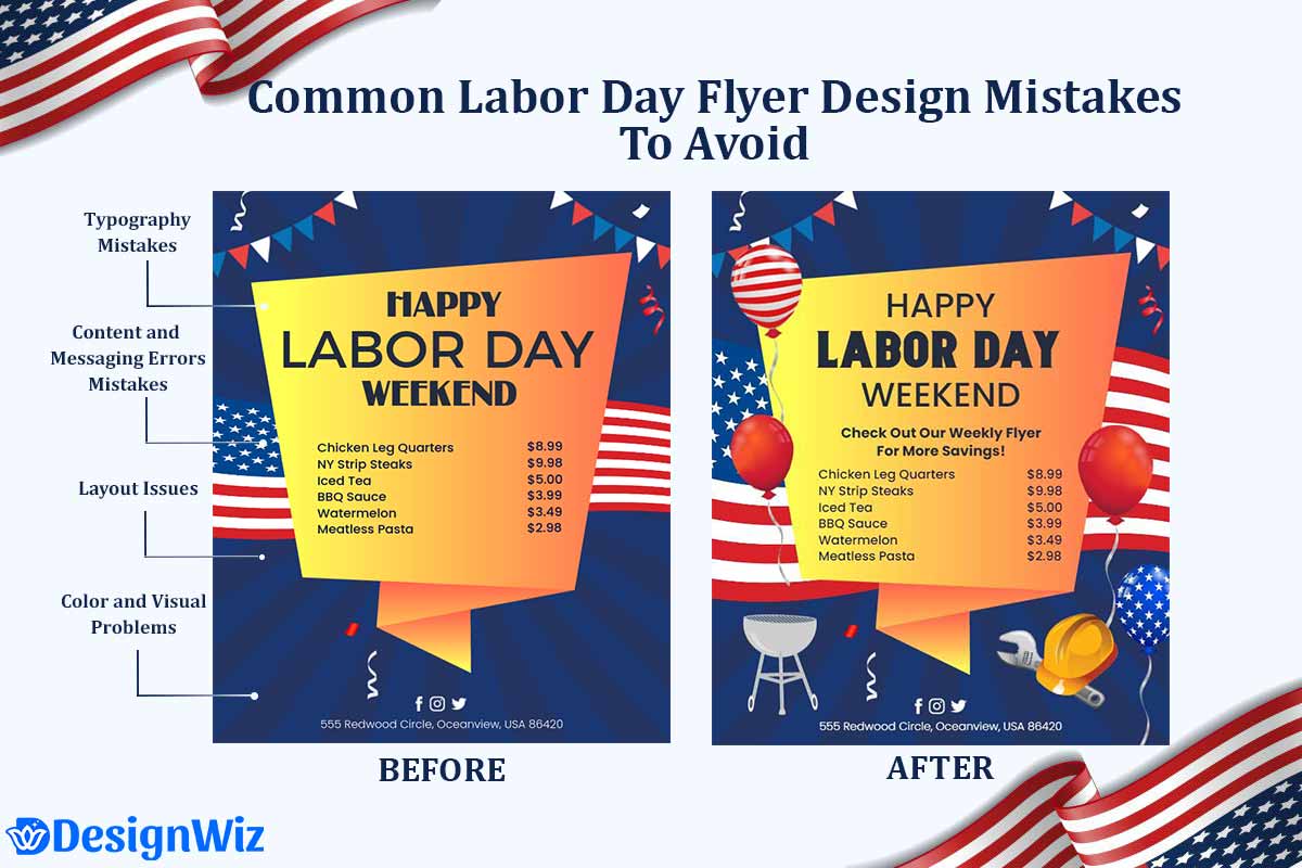
What Are Common Labor Day Flyer Design Mistakes To Avoid?
Even well-intentioned designers frequently make critical errors that undermine their flyer’s effectiveness. Understanding these common pitfalls helps you create more professional, engaging designs that achieve better results.
Typography Mistakes
- Using more than 3 font families creates visual chaos
- Choosing decorative fonts that sacrifice readability
- Insufficient contrast between text and background colors
- Making all text the same size without hierarchy
Color and Visual Problems
- Overwhelming designs with too many patriotic elements
- Ignoring brand colors completely for patriotic themes
- Using only bright colors without neutral balance
- Not testing how colors look in print vs. digital
Content and Messaging Errors
- Information overload that overwhelms readers
- Weak calls-to-action like “Come celebrate with us”
- Missing essential details (dates, times, contact info)
- Generic messaging that doesn’t differentiate from competitors
Layout Issues
- Poor visual hierarchy where everything competes for attention
- Inadequate white space making designs feel cramped
- Inconsistent alignment and spacing
- Ignoring printer margins and bleed requirements
Technical Problems
- Using low-resolution images (below 300 DPI for print)
- Wrong file formats for intended use
- Not consulting printer requirements before finalizing
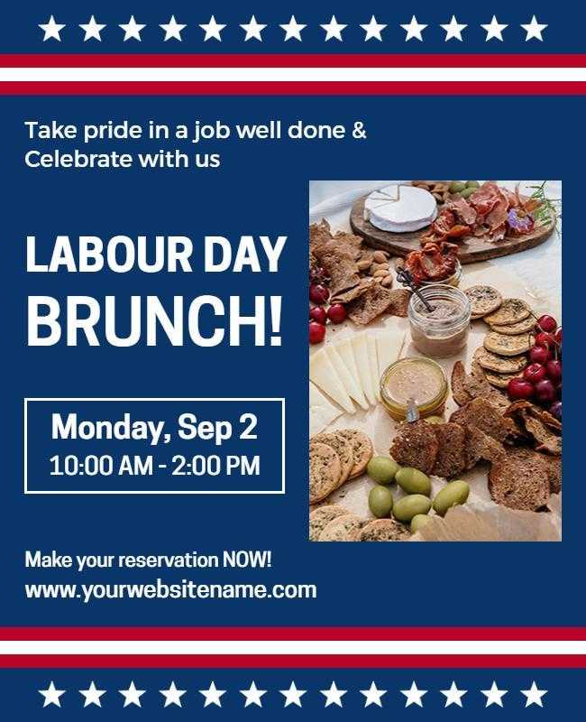
Labor Day Flyer Design Gallery: Professional Examples & Inspiration
This curated collection as a result showcases 50+ professional Labor Day flyer designs across different industries, styles, and approaches. Each example demonstrates specific design principles and techniques you can adapt for your own promotional materials.
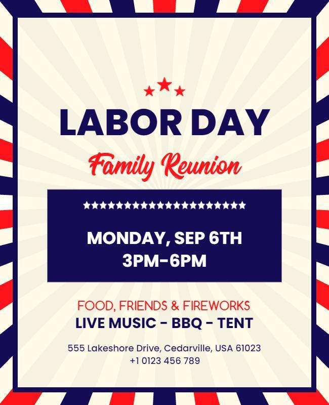
Minimalist Labor Day Flyers
- Patriotic Labor Day Celebration Flyer
- Labor Day Real Estate Sale Flyer
- Labor Day Foam Party Event Flyer
- Patriotic Red White and Blue Labor Day Celebration Flyer
- Patriotic Red White and Blue Labor Day Closure Flyer
Explore more minimalist flyer for Labor Day events, from parades to workplace celebrations.
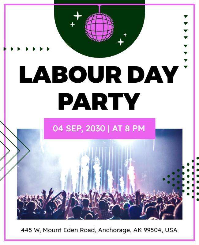
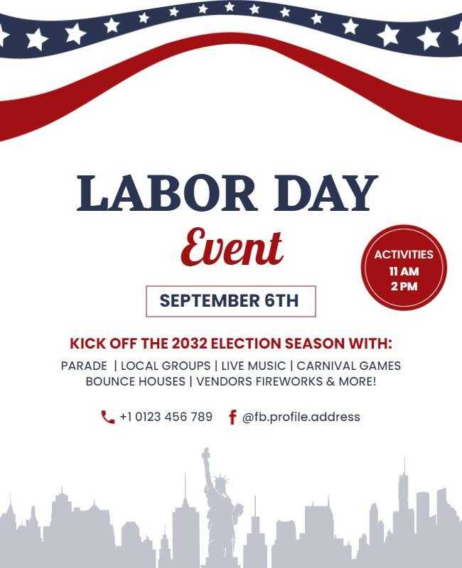
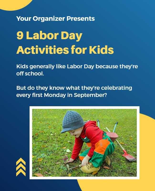
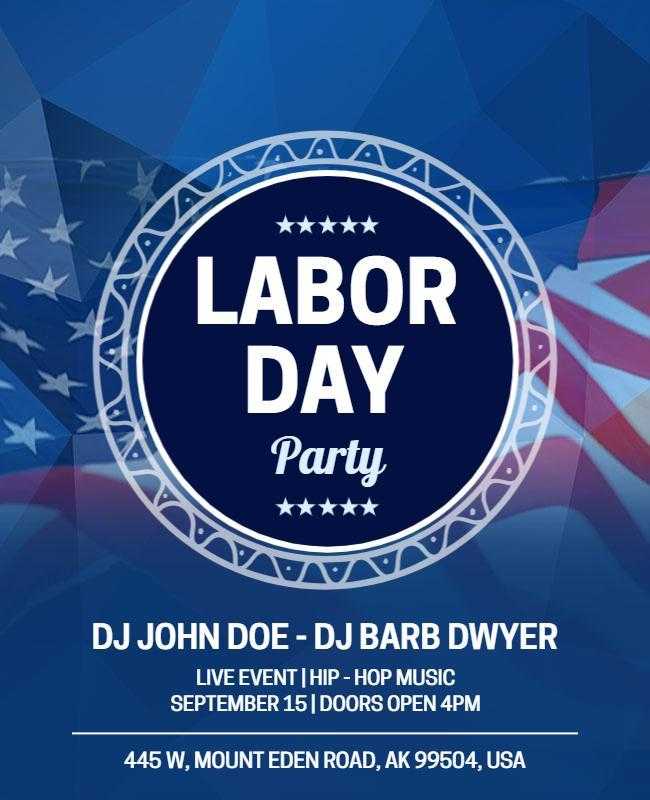
Community Event Labor Day Flyers
- Patriotic Red White and Blue Labor Day Celebration Flyer
- Labor Day Celebration Event Flyer
- Labor Day Community Cookout Event Flyer
- Labor Day Party Event Announcement Flyer
- Labor Day Kids Activities Event Flyer
Explore more Labor Day flyers for the community event, from local celebrations to large-scale festivities.”
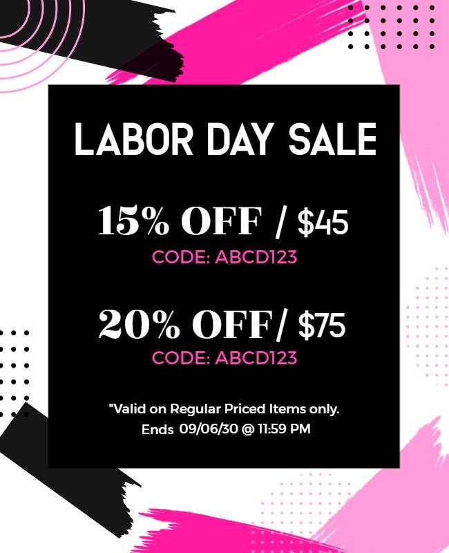
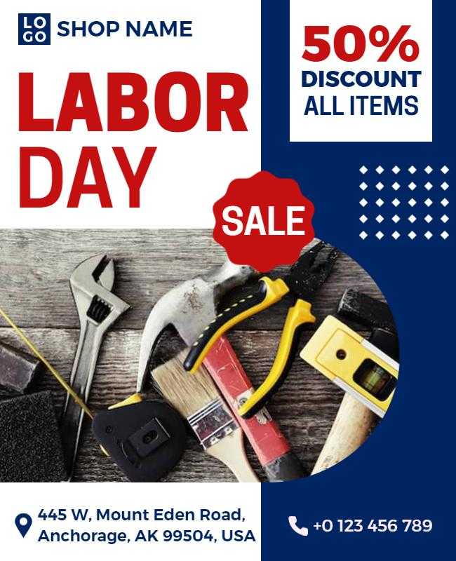
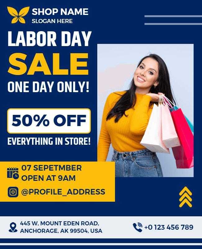
Retail Business Labor Day Flyers
- Labor Day Sale Discount Offer Flyer
- Labor Day Storewide Sale Promotion Flyer
- Labor Day Hardware Sale Flyer
- Labor Day Dessert Special Offer Flyer
- Festive Red Labor Day Sale with Fireworks Flyer
Explore more retail business labor day flyers, perfect for sales, promotions, and store events
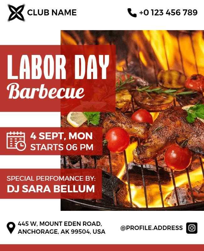
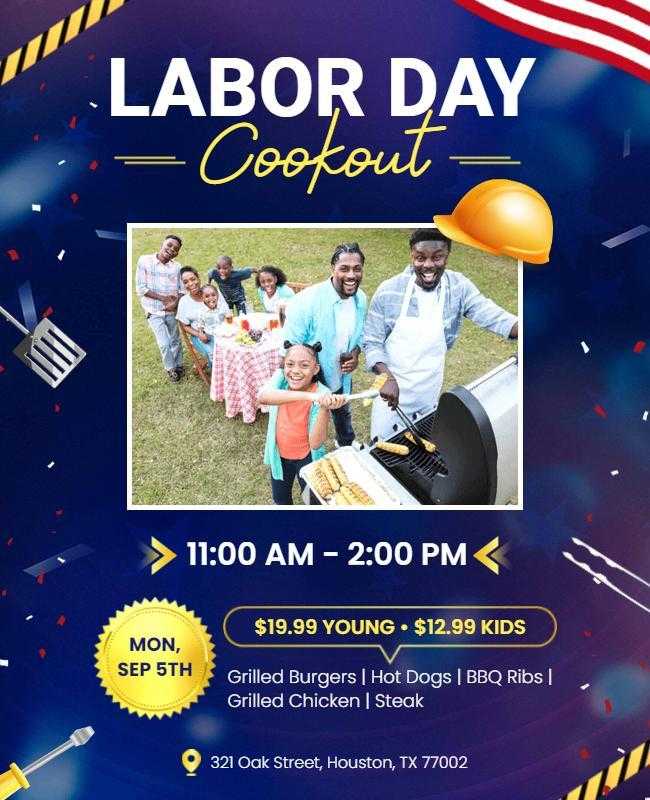
Restaurant & Food Service Flyers
- Labor Day Bbq Cookout Celebration Flyer
- Labor Day Bbq Party Celebration Flyer
- Patriotic Red, White, and Blue Labor Day BBQ Flyer
- Labor Day Cookout Barbecue Event Flyer
- Labor Day Backyard Barbecue Invitation Flyer
Explore more Labor day Restaurant & Food Service Flyers , made for unforgettable grill-outs and family feasts.
FAQs About Labor Day Flyer Design
Traditional red, white, and blue combinations work best for Labor Day flyers as they evoke patriotic feelings and cultural recognition. However, you can also use modern interpretations like navy and cream, or burgundy and gold for sophisticated approaches while maintaining patriotic spirit. The key is ensuring sufficient contrast for readability while staying true to American color associations.
Start designing your Labor Day flyer 4-6 weeks before the holiday to allow time for design revisions, printing, and distribution. This timeline ensures you can secure prime advertising locations, coordinate with printing services, and avoid rush fees. Digital-only flyers can be created closer to the event, but earlier preparation allows for better strategic planning and testing.
Standard flyer sizes include 8.5×11 inches (letter size) for posting and handouts, 5.5×8.5 inches (half letter) for direct mail and compact distribution, and 4.25×5.5 inches (quarter letter) for budget-conscious campaigns. Choose based on your content volume, distribution method, and budget constraints. Larger sizes provide more design space but cost more to print and distribute.
Only use images you own, have purchased licenses for, or that are available under Creative Commons or public domain licenses. Avoid copying images from Google searches or other websites without permission, as this violates copyright law and can result in legal issues. Stock photo services, free image websites like Unsplash, or your own photography provide safe alternatives.
Essential information includes your event name or business offer, date and time details, location address with directions if needed, contact information (phone, website, email), and clear call-to-action telling readers what to do next. For business promotions, include specific offer terms, expiration dates, and any restrictions or conditions that apply.
Focus on unique value propositions, use high-quality design and imagery, choose distinctive color combinations within patriotic themes, include compelling headlines that address customer needs, and offer clear benefits rather than just features. Professional typography, adequate white space, and strategic visual hierarchy also help your flyer appear more credible and attractive than amateur designs.
Design for your primary distribution method first, then adapt for secondary channels. If you’re printing flyers, start with print specifications (300 DPI, CMYK colors, bleed areas) then create digital versions. If you’re primarily sharing online, start with digital formats (72 DPI, RGB colors) then adapt for print. This approach prevents quality loss and ensures optimal results for your main distribution channel.
Show your design to representatives from your target audience and ask for honest feedback about clarity, appeal, and understanding. Test readability from typical viewing distances (arm’s length for handouts, 3-6 feet for posted flyers). Print a sample to check color accuracy and paper quality. Consider A/B testing different versions if you have the budget and timeline to compare response rates.
People Also Ask
How much should I budget for Labor Day flyer printing and distribution?
Budget approximately $0.10-$0.50 per flyer for basic color printing, with premium paper adding $0.05-$0.15 more. Distribution costs vary widely: door-to-door services charge $0.08-$0.25 per piece, while strategic posting locations may be free or cost $10-$50 per location. Digital distribution through email lists and social media is cost-effective but requires existing audience engagement.
What Labor Day messaging resonates most with customers?
Messages focusing on “honoring hard work,” “celebrating achievements,” and “enjoying well-deserved breaks” resonate strongly. Avoid overly commercial language; instead, frame sales as “appreciation offers” or “thank you discounts.” Emphasize community, family gathering, and patriotic pride while connecting these themes to your business value proposition.
How do I measure the success of my Labor Day flyer campaign?
Track specific metrics like increased foot traffic, phone inquiries, website visits, and sales during the campaign period. Use unique promo codes, dedicated phone numbers, or QR codes to directly attribute responses to your flyers. Survey customers about how they heard about your business, and compare results to previous years or other marketing channels.
What paper types work best for Labor Day flyers?
Standard 70-80 lb paper works well for most applications, providing durability without excessive cost. Glossy paper enhances color vibrancy for image-heavy designs, while matte paper offers a more sophisticated, professional appearance. For outdoor posting, consider weather-resistant synthetic papers or laminated options to withstand elements.
Conclusion
Creating effective Labor Day flyers requires balancing patriotic appeal with clear promotional messaging, professional design execution, and strategic distribution that reaches your target audience when they’re making holiday plans.
This comprehensive guide provides the foundation for successful Labor Day flyer design through proven color psychology, typography principles, layout strategies, and industry-specific approaches. The interactive tools, downloadable resources, and extensive gallery of editable flyer templates offer practical support for implementation regardless of your design experience level.
Key takeaways for Labor Day flyer success:
- Use patriotic colors strategically while maintaining readability and brand consistency
- Follow the 8-step design process to ensure professional results and avoid common mistakes
- Adapt your approach based on your specific industry and target audience needs
- Test your designs with real users before finalizing and distributing
Reference
- “What is Visual Hierarchy?” Retrieved June 16, 2025. Interaction Design Foundation.
- “Color Psychology: See the Value for Marketing”. Retrieved April 16, 2025. USC Applied Psychology Degree. (2023).
- “Universal Design and Accessibility; Accessible Fonts and Typography.” Retrieved June 16, 2025. Section508.gov. (2025).
- “Marketing I, Distribution Strategy: Part XIV of Learnings from My MBA Series.” Retrieved June 16, 2025. Science. (2024).