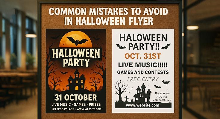
Creating a Halloween flyer but worried it won’t grab attention? Common mistakes in Halloween flyer design include unclear calls-to-action, cluttered layouts, and poor visual quality that reduce engagement and event turnout. Whether designing Halloween club flyers for nightlife venues, party flyers for social gatherings, or event flyers for community celebrations, avoiding these seven critical pitfalls ensures your spooky promotions capture audience interest and drive participation. This guide identifies the most damaging Halloween flyer mistakes and provides actionable solutions to create a flyer that stand out during the competitive Halloween season and effectively convert viewers into attendees.
Why Do Halloween Flyer Mistakes Hurt Your Promotion?
Halloween flyer mistakes like unclear CTAs or cluttered designs reduce engagement and turnout. For Halloween party flyers, missing event details confuses audiences; for club flyers, generic visuals fail to stand out, hurting your promotion’s impact and wasting marketing efforts. Poor design choices directly translate to fewer attendees and reduced event success.
How Do Mistakes Reduce Halloween Flyer Effectiveness?
Design errors create immediate barriers between your event and potential attendees. Cluttered layouts overwhelm viewers, making them skip your promotion entirely. Poor color contrast renders text unreadable, while generic stock photos fail to convey your event’s unique atmosphere. These common mistakes in flyer design reduce click-through rates by up to 40% compared to well-designed alternatives. Visual design principles research at Ohio university confirms that poor layout and contrast issues significantly impact marketing material effectiveness1.
Ineffective flyers waste your marketing budget and miss conversion opportunities. When audiences can’t quickly understand your event details or feel motivated to attend, your promotional reach shrinks dramatically.
Why Does Clarity Matter in Halloween Flyers?
Clear communication builds trust and drives action. Audiences need immediate answers about date, time, location, and ticket information. Vague descriptions or missing contact details create friction that prevents conversions. Halloween club flyers require specific entry requirements, while costume contest flyers need clear participation rules.
Clarity extends beyond text to visual hierarchy. Important information should dominate the design, with supporting details organized logically. This structure guides readers naturally toward your call-to-action.
How Do Design Errors Affect Audience Appeal?
Visual mistakes immediately signal unprofessionalism and reduce credibility. Font choices that sacrifice readability for style alienate audiences, while color combinations that clash or lack contrast make flyers difficult to process. Generic Halloween imagery fails to differentiate your event from competitors.
Poor image quality or inappropriate visuals can actively repel target audiences. Halloween potluck flyers using scary imagery might deter families, while professional networking events need sophisticated design elements.
Read More: Halloween Flyer Design Elements
What Are the Consequences of Ignoring Audience Needs?
Misaligned messaging wastes promotional efforts and reduces attendance. Corporate Halloween events require different tone and imagery than college parties. Ignoring demographic preferences creates disconnect between your flyer and audience expectations.
Failed audience targeting leads to low engagement rates and poor word-of-mouth marketing. When flyers don’t resonate with intended viewers, promotional reach stagnates. Professional Halloween flyer templates address these challenges by matching design elements to specific audience needs, ensuring maximum promotional impact and event success.
Read More: Best Local Spots to Pin Halloween Flyer
What Are the 7 Common Mistakes in Halloween Flyer Design?
Creating an effective Halloween club flyer requires more than just spooky graphics and bold fonts. Many businesses and event organizers fall into predictable traps when designing their promotional materials, resulting in flyers that fail to capture attention or drive attendance. The most common mistakes in Halloween flyer design often stem from overlooking fundamental design principles, poor typography choices, and inadequate understanding of target audience preferences. Whether you’re promoting a haunted house, costume party, or seasonal sale, your marketing collateral needs to strike the perfect balance between thematic elements and professional presentation. This section examines seven critical errors that plague Halloween promotional design, from cluttered layouts to ineffective color schemes. By identifying these common mistakes in Halloween flyer creation, you’ll be better equipped to develop compelling marketing materials that stand out in a crowded seasonal marketplace and effectively communicate your message to potential customers.
Mistake 1: Unclear Call-to-Action (CTA)
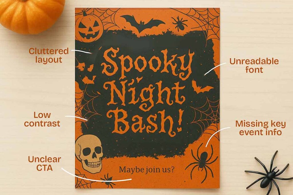
One of the most common mistakes in Halloween flyer design involves burying your call-to-action among decorative elements. When creating a Halloween club flyer, your CTA should be the most prominent feature, not hidden behind spooky graphics or competing text.
Key CTA Problems:
- Weak action words like “maybe join us” instead of “Reserve Your Spot Now”
- Multiple competing messages confusing your audience
- Poor contrast making text unreadable against dark Halloween backgrounds
Strong marketing materials feature one clear, compelling action that drives immediate response from potential attendees. According to research in digital marketing, it emphasizes that effective call-to-action design requires clear hierarchy and visual prominence2.
Mistake 2: Cluttered Layouts
Cramming excessive information creates one of the most common mistakes in Halloween flyer design. Overcrowded marketing materials overwhelm viewers and dilute your core message.
Key cluttered layout problems:
- Too many fonts, colors, and graphic elements competing for attention
- Insufficient white space between design components
- Multiple call-to-action buttons confusing the primary objective
Effective Halloween club flyer designs prioritize hierarchy and breathing room. Focus on one primary message, limit your color palette, and ensure promotional design elements complement rather than compete with each other.
Mistake 3: Poor Visual Quality
Visual quality directly impacts your halloween club flyer’s effectiveness. Poor resolution images, pixelated graphics, and blurry text create unprofessional marketing materials that fail to attract audiences. Marketing research demonstrates that visual quality standards directly influence audience perception and engagement rates3.
- Low-resolution images make promotional flyers appear amateurish and reduce credibility
- Pixelated graphics distract from your message and diminish overall design impact
- Blurry text hampers readability and weakens your marketing collateral
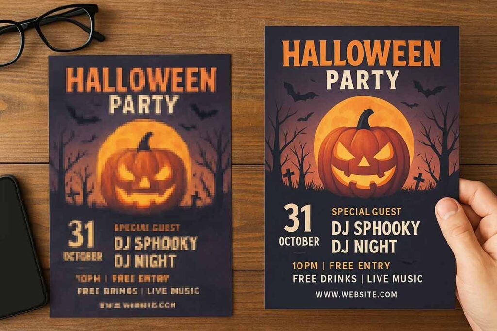
Quality visuals separate professional promotional design from amateur attempts. Invest in high-resolution images and crisp graphics to avoid these common mistakes in Halloween flyer creation.
Read More: Designer vs Free Halloween Flyer Template Cost Analysis
Mistake 4: Missing Key Event Details
Event details are the foundation of effective promotional flyers. Common mistakes in Halloween flyer design include omitting crucial information that guests need to make attendance decisions.
Essential details to include:
- Date, time, and exact venue location
- Ticket prices and purchase methods
- Age restrictions or dress code requirements
- Contact information for inquiries
Missing these elements creates confusion and reduces attendance. Your halloween club flyer should answer basic questions immediately. Marketing materials that leave guests guessing about logistics fail to convert interest into actual participation.
Mistake 5: Generic or Off-Theme Designs
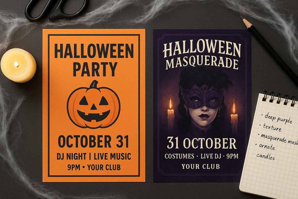
Generic Halloween club flyer designs fail to capture your event’s unique atmosphere. Common mistakes in Halloween flyer design include using overused stock images, standard orange-and-black color schemes, and cookie-cutter templates that blend into the crowd.
Your promotional flyers should reflect your specific Halloween event theme. A gothic masquerade ball requires different marketing materials than a family-friendly pumpkin patch party.
- Match design elements to your event’s personality and target audience
- Create distinctive marketing collateral that stands out from generic promotional design
- Use unique color palettes and custom graphics instead of standard Halloween imagery
Mistake 6: Unreadable Fonts
Typography can make or break your Halloween club flyer effectiveness. Common mistakes in Halloween flyer design include selecting decorative fonts that sacrifice readability for style.
- Overly Ornate Fonts: Spooky script fonts may look atmospheric but become illegible at smaller sizes
- Poor Color Contrast: Orange text on black backgrounds creates eye strain and reduces readability
- Multiple Font Conflicts: Mixing too many typefaces creates visual chaos in your marketing materials
Choose clean, bold fonts for essential information while reserving decorative elements for headers only.
Read More: Typography Tips for Halloween Flyer
Mistake 7: Ignoring Audience Preferences
Creating promotional flyers without understanding your target demographic leads to ineffective marketing materials. Common mistakes in Halloween flyer design include using inappropriate imagery for family events or overly mature themes for children’s parties.
Consider your audience’s age, interests, and cultural background when developing Halloween club flyer concepts. Teen-focused events require different design templates than corporate Halloween gatherings or community festivals.
Successful marketing collateral speaks directly to its intended audience. Research your demographic’s preferences for colors, fonts, and messaging tone. Property marketing for Halloween events should reflect the venue’s character while appealing to expected attendees through targeted promotional design elements.
How Do These Mistakes Impact Specific Halloween Flyer Types?
Understanding how design flaws affect different types of promotional materials is crucial for creating effective marketing campaigns during the Halloween season. While many common mistakes in Halloween flyer design appear universal, their impact varies significantly depending on whether you’re creating a halloween club flyer, residential property advertisement, or retail promotion. Each flyer type serves distinct audiences with unique expectations, making certain design errors more damaging to specific marketing materials than others. A cluttered layout might devastate a professional property marketing piece while barely affecting a playful party invitation. Similarly, font choices that work perfectly for entertainment venues could undermine the credibility of business promotional flyers. This section examines how the same common mistakes in Halloween flyer design manifest differently across various flyer categories, helping you identify which errors pose the greatest threat to your specific marketing collateral and audience engagement goals.
How Do Mistakes Affect Different Halloween Flyer Types?
Event Flyers: Common mistakes in Halloween flyer design particularly impact party invitations through cluttered layouts and unreadable fonts, reducing RSVP rates significantly.
Business Promotions: Halloween club flyer designs suffer when overcrowded with competing promotional elements, diminishing the primary message effectiveness.
Community Announcements: Neighborhood Halloween events lose participation when essential details like dates and locations get buried in excessive decorative elements.
Each flyer type requires targeted design approaches to avoid these pitfalls.
Read More: Halloween Flyer Ideas for Small Businesses
What Mistakes Should You Avoid in Halloween Club Flyer Templates?
Common mistakes in Halloween flyer design can sabotage your club’s promotional efforts:
- Overcrowded layouts – Cramming too much text and imagery into halloween club flyer templates creates visual chaos
- Poor contrast – Dark Halloween themes often hide essential event details
- Missing key information – Omitting venue, time, or RSVP details in marketing materials
- Generic stock imagery – Using overused Halloween graphics instead of original promotional design elements
These common mistakes in Halloween flyer creation reduce engagement and attendance for your halloween club flyer campaigns.
Compare with these well-structured club flyer templates that avoid overcrowding and highlight key event details effectively:
How Do Mistakes Hurt Halloween Party Flyer Templates?
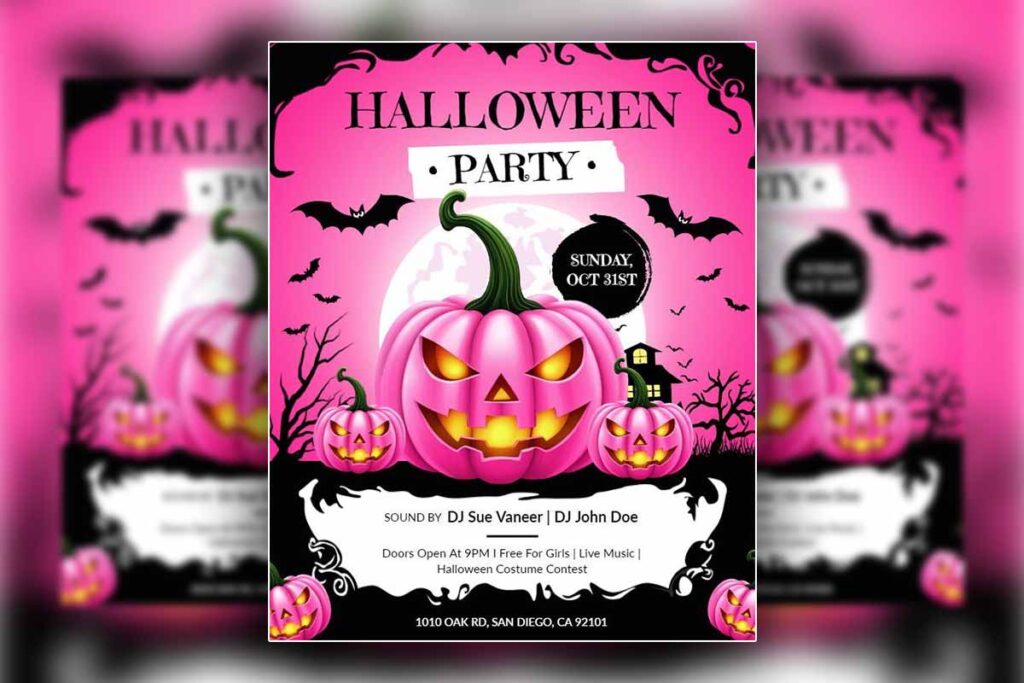
Common mistakes in Halloween party flyer design severely impact party templates by creating visual chaos that repels potential attendees. Poor color choices and cluttered layouts make halloween club flyer templates appear unprofessional and difficult to read.
Key damage includes:
- Overcrowded design elements obscuring essential party details
- Illegible fonts preventing guests from understanding event information
- Missing contact information leaving interested parties unable to respond
These promotional design errors reduce marketing effectiveness and attendance rates.
These party flyer examples demonstrate clean layouts, readable fonts, and complete information that drive better results:
What Errors Weaken Halloween Event Flyer Templates?
Event flyers suffer from overcrowded layouts that overwhelm viewers with excessive text and competing visual elements. Common mistakes in Halloween flyer design include poor font choices that sacrifice readability for theme, inadequate contrast between text and spooky backgrounds, and missing essential details like venue or RSVP information.
Halloween club flyer templates particularly struggle with balanced information hierarchy, often burying critical event details beneath decorative elements that weaken promotional effectiveness.
Explore event flyer designs that successfully prioritize readability and clarity without sacrificing Halloween flair:
How Do Mistakes Impact Halloween Potluck Flyer Templates?
Common mistakes in Halloween flyer design severely compromise potluck event success. Poor readability makes dish coordination impossible, while cluttered layouts confuse attendees about contribution requirements.
- Information Hierarchy Issues: Critical details like date, location, and food assignments get lost in decorative elements
- Contact Problems: Missing RSVP information prevents proper meal planning and attendance tracking
- Design Overcrowding: Excessive graphics overshadow essential potluck logistics and dietary considerations
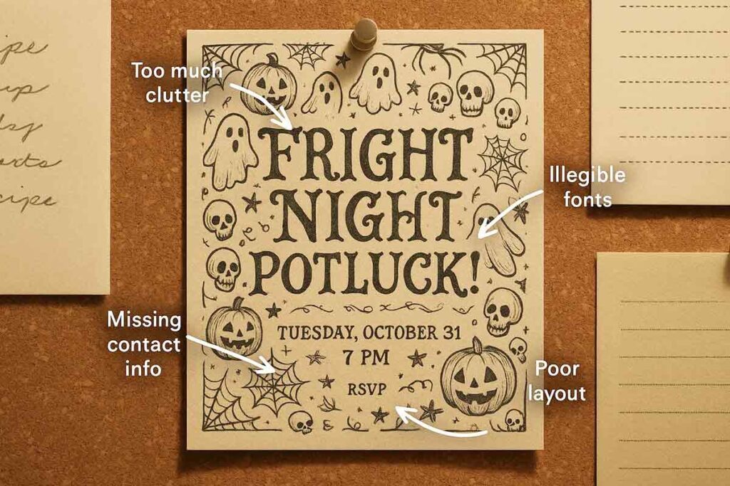
These potluck flyer templates show how to balance seasonal charm with clear, well-organized event information:
What Pitfalls Harm Halloween Costume Contest Flyer Templates?
Costume contest flyers suffer from overcrowded design elements that obscure essential details like judging criteria and prize information. Common mistakes in Halloween flyer design include poor font hierarchy that makes contest rules unreadable and inadequate white space around critical information. Marketing materials must balance festive graphics with functional contest details. Promotional flyers failing to highlight entry deadlines and category specifications create participant confusion, undermining event success.
See examples of costume contest flyers that strike the right balance between festive appeal and practical contest details:
How Can You Fix Halloween Flyer Mistakes?
Fix Common Mistakes in Halloween Flyer designs by using clear CTAs, clean layouts, high-quality visuals, complete details, spooky themes, readable fonts, and audience-targeted designs. For halloween club flyer templates, add bold visuals and neon accents; for party flyers, ensure clear text and festive colors to boost engagement and event success.
How Can You Improve CTAs in Halloween Flyers?
Replace vague phrases with action-oriented CTAs like “Join the Spooky Fun!” or “Reserve Your Spot Now!” Position CTAs prominently using contrasting colors and bold fonts. Test different CTA placements—above the fold works best for halloween club flyer designs targeting nightlife audiences. Include urgency with phrases like “Limited Space Available” or “Register by October 25th.”
Create multiple CTAs throughout your flyer—primary action at top, secondary reminders near event details. Use button-style CTAs rather than plain text links for better visibility and click-through rates.
How Do You Simplify Flyer Layouts?
Remove unnecessary graphics and focus on essential elements: event title, date, time, location, and CTA. Use white space effectively to prevent visual overwhelm. Limit color schemes to 2-3 Halloween colors like orange, black, and purple. Apply the rule of thirds—divide your flyer into nine sections and place key information at intersection points.
Group related information together using visual hierarchy. Headlines should be largest, followed by event details, then contact information. Avoid cramming multiple fonts or conflicting design elements that confuse viewers.
What Enhances Visual Quality in Halloween Flyers?
Use high-resolution images (300 DPI minimum) with Halloween themes like pumpkins, ghosts, or autumn leaves. Source professional graphics from quality libraries rather than pixelated web images. Ensure color consistency throughout your design—all oranges should match, all blacks should be true black.
Choose thematically appropriate visuals that match your event type. Halloween club flyers need edgy, modern graphics while family events require friendly, approachable imagery.
How Do You Ensure All Details Are Included?
Create a checklist covering essential information: event name, date, day of week, start/end times, full address with cross streets, parking details, dress code, age requirements, contact phone/email, and RSVP instructions. Include special notes like “Costume Contest Prizes” or “Food Provided.”
Proofread dates and times twice—October 31st falls on different weekdays each year. Add QR codes linking to event pages for additional details or registration. Include backup contact methods in case primary contact becomes unavailable.
How Can You Test and Refine Your Halloween Flyer?
Test Halloween flyers by sharing drafts with small groups, gathering feedback, and using A/B testing. Refine Halloween club flyers with bold visuals, party flyers with clear CTAs, and event flyers with complete details to ensure maximum engagement and event success.
Testing prevents Common Mistakes in Halloween Flyer design before distribution. Start by collecting feedback from target audiences who match your event demographics. Share draft versions with 5-10 people representing your ideal attendees. Ask specific questions about clarity, appeal, and whether they’d attend based on the flyer alone.
How Can Audience Feedback Improve Flyers?
Share drafts with target audiences for actionable insights. Show your Halloween party flyer to friends who attend similar events, or test your Halloween club flyer with nightlife enthusiasts. Focus feedback sessions on three key areas: visual appeal, information clarity, and call-to-action effectiveness.
Ask targeted questions: “What catches your eye first?” and “Is the event information clear?” Document feedback patterns. If multiple people mention small text, increase font sizes. If they miss the date, make it more prominent. This approach identifies blind spots you might miss as the designer.
What Is A/B Testing for Halloween Flyers?
Test two flyer versions to compare effectiveness objectively. Create variations with different headlines, images, or layouts. For Halloween club flyers, test bold neon colors against traditional orange and black themes. For party flyers, compare playful fonts with readable sans-serif options.
Post both versions on social media simultaneously or distribute equal quantities in different locations. Track responses through unique QR codes, phone numbers, or promotional codes. Test one element at a time for clear results. If Version A gets 60% more responses, you’ve found your winner.
Read More: Comparing Free vs Premium Halloween Flyer
How Do You Refine Flyer Designs Post-Testing?
Adjust designs based on concrete feedback and performance data. If testing reveals your Halloween event flyer’s CTA is weak, strengthen it with action words like “Join the Spook-tacular Fun!” Replace confusing elements with clearer alternatives. Simplify busy layouts that overwhelm viewers.
Make refinements systematically. Address the most commonly mentioned issues first, then tackle smaller improvements. Update template files with successful elements to improve future halloween club flyer designs.
Why Monitor Flyer Performance After Distribution?
Track engagement to measure success and gather insights for future flyers. Monitor social media shares, website traffic spikes, and actual event attendance. Use QR codes linking to [LINK-TO-TEMPLATES] to track digital engagement rates.
Document what works: Did your Halloween potluck flyer generate more RSVPs than expected? Note successful color schemes, layouts, and messaging for future reference. This data helps refine your flyer design process and avoid repeating Common Mistakes in Halloween Flyer creation.
Performance monitoring transforms each flyer into a learning opportunity, building expertise for increasingly effective promotional materials.
People Also Ask
Common Halloween flyer mistakes include unclear CTAs, cluttered layouts, and poor visuals, reducing engagement.
Unclear CTAs and generic designs in Halloween club flyers reduce nightlife appeal.
Cluttered layouts and unreadable fonts in Halloween party flyers lower social engagement.
Missing details and poor visuals in Halloween event flyers confuse community audiences.
Unreadable fonts and off-theme designs in Halloween costume contest flyers alienate families.
Generic designs and ignored family preferences reduce Halloween potluck flyer engagement.
Use clear CTAs, clean layouts, and spooky visuals to fix Halloween flyer mistakes
Generic designs and poor visuals in Halloween club flyers reduce party-goer interest.
Use A/B testing and audience feedback to refine Halloween flyer designs for impact.
Avoiding Halloween flyer mistakes like unclear CTAs ensures engaging, effective promotions.
Cluttered layouts and small fonts in Halloween party flyers lower social appeal.
What Are the Top FAQs About Halloween Flyer Mistakes?
Cluttered layouts and small fonts in Halloween party flyers lower social appeal.
Avoiding Halloween flyer mistakes like unclear CTAs ensures engaging, effective promotions.
Generic designs and poor visuals in Halloween club flyers reduce party-goer interest.
Test with A/B testing and feedback to refine Halloween flyer designs for success.
Missing details and bland designs in Halloween event flyers confuse audiences.
Off-theme designs in Halloween potluck flyers fail to attract family audiences.
Unreadable fonts in Halloween costume contest flyers reduce family engagement.
Use bold CTAs, clean layouts, and spooky visuals for error-free Halloween flyers.
Conclusion: How Do You Create an Error-Free Halloween Flyer?
In conclusion, to create an error-free Halloween flyer, avoid common pitfalls like unclear calls-to-action, cluttered layouts, low-quality visuals, missing event details, generic themes, unreadable fonts, and ignoring audience preferences. Use bold, specific CTAs like “Join the Spooky Fun!” placed prominently, simplify layouts by focusing on essential information, and select high-quality, Halloween-themed images. Ensure all event details—date, time, location, and contact—are included to prevent confusion. Apply spooky colors and fonts to capture the Halloween spirit, choose clear, readable typefaces, and tailor designs to your audience, such as distinct styles for clubs or family events. Test flyers with focus groups to ensure clarity and appeal before distribution.
Reference
- Ohio University. (2024). The central principles of design.
- Western Governors University. (2024). Integrating visual communication in digital marketing.
- Oklahoma State University Extension. (2017). Helpful tips for improving the visual appeal of marketing materials.
