Poor typography kills softball flyer effectiveness before parents finish reading here’s how strategic font choices drive 10x more registrations.
Softball flyer typography involves strategic font choices, sizing, contrast, and hierarchy to boost readability and parent engagement. Whether you’re designing from scratch or using softball flyer templates, focus on age-appropriate fonts, clear text sizing, and layout structure that works across print and digital. The most effective flyers pair bold headlines with clean body text, following consistent typography standards that reflect league professionalism and build parent trust.
This guide covers comprehensive softball flyer typography strategies, helping coaches and league organizers create flyers that attract families and drive registration success through strategic font selection, sizing, and hierarchy implementation.
What Are The Best Fonts For Softball Flyers?
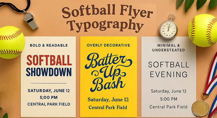
The best fonts for softball flyers combine bold, attention-grabbing headlines with clean, readable body text. Successful designs pair one display font for headlines with one sans-serif font for body text, maintaining consistency throughout. Age-appropriate selection varies by division: playful fonts for T-ball, professional fonts for competitive leagues, and classic fonts for adult recreational divisions.
According to WWU’s accessibility guidelines, typography should be flexible and readable, with at least 1.5 line spacing, letter spacing of 0.12 em, and relative units (like em/rem) to allow text enlargement, best practices that ensure fonts remain legible and adaptable across viewing conditions on softball flyers.1
High-Impact Softball Flyer Fonts for Headlines and Titles
Choosing the right font for your softball flyer headline sets the tone and grabs attention instantly. Here are top font picks that balance impact, readability, and the right vibe for each event type.
Bold Headlines That Command Attention:
- Impact – maximum visual impact for tournament announcements
- Bebas Neue – modern sans-serif appeal for youth tournaments
- Oswald – contemporary look for competitive divisions
- Times New Roman Bold – traditional authority for established leagues
- Georgia Bold – classic serif credibility
Dynamic Energy Fonts for Special Events:
- Brush Script – camp promotions and fun events (headlines only)
- Pacifico – casual tournament atmosphere
- Varsity – authentic sports excitement
- College Block – high school and adult league materials
Avoid overly decorative fonts that sacrifice readability. Thin strokes disappear in outdoor conditions, while complex display fonts become illegible when printed small or viewed from distance.
Professional Softball Flyer Body Text Fonts for Maximum Readability
Clear, readable body text is essential for delivering key details on your softball flyer. The fonts below are trusted for their legibility, versatility, and professional appearance across print and digital formats.
Universal Readability Options:
- Arial – clean scanning across all ages
- Helvetica – professional standard for registration details
- Open Sans – modern clarity for digital distribution
- Roboto – web-optimized performance
- Lato – versatile for various flyer types
Formal Communications:
- Times New Roman – traditional authority for league communications
- Georgia – readable serif for formal announcements
Sans-serif fonts outperform serif fonts for outdoor posting and quick information scanning. Web-safe fonts guarantee consistent display across digital platforms from design software to email newsletters.
Vision Australia emphasizes that sans-serif typefaces are generally more accessible than serif, script, monospaced, or display fonts for both digital and print formats, supporting the use of fonts like Arial, Helvetica, Open Sans, Roboto, and Lato for clear, inclusive communication in softball flyers.2
Free vs. Premium Font Options for Budget-Conscious Leagues
Balancing design quality with budget is key for league flyers. Here’s how free and premium font options compare when creating standout designs without overspending.
Google Fonts (Free Professional Options):
- Open Sans – versatile across flyer types
- Roboto – modern readability
- Lato – professional without licensing fees
- Oswald – bold headline impact
- Bebas Neue – display font quality
Adobe Fonts subscriptions unlock premium typography for distinctive branding, but most successful softball flyers achieve professional results using free alternatives with strategic design choices.
Font licensing matters for commercial softball leagues charging registration fees. Google Fonts allow commercial use without restrictions, while premium fonts may require additional licensing for business applications.
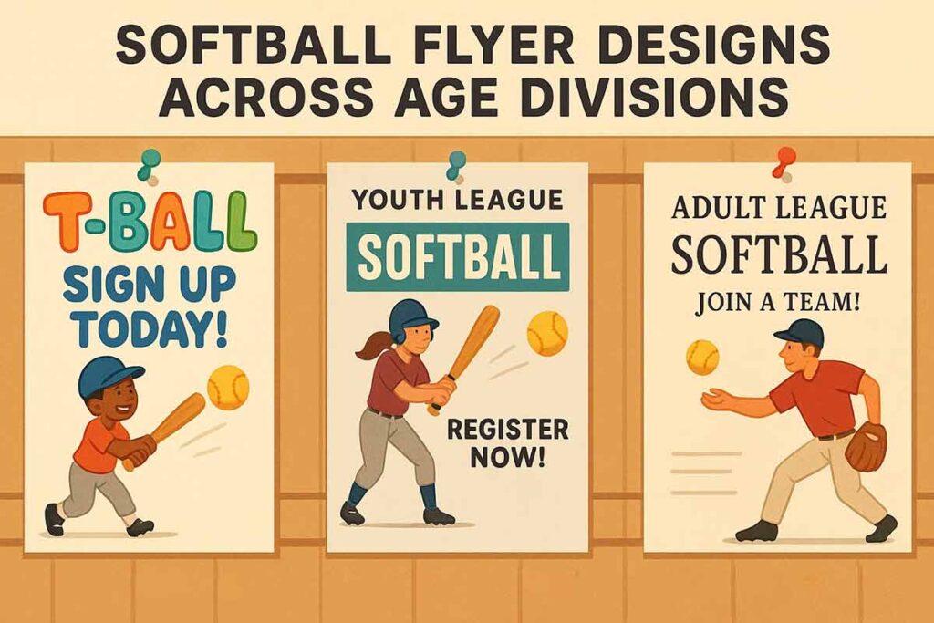
Age-Appropriate Softball Flyer Font Selection by Division
Font choice should align with the age group and tone of your league. Use styles that reflect the experience level, audience expectations, and inclusivity across all divisions.
T-ball and Coach-Pitch (Ages 4-8):
- Comic Sans – parent-friendly association with child content
- Comfortaa – rounded, welcoming appearance
- Fredoka One – playful but readable
- Quicksand – modern kid-friendly appeal
Competitive Youth and Teen Leagues:
- Helvetica – coaching expertise and program quality
- Arial Bold – skill development emphasis
- Open Sans – professional credibility
- Roboto – modern competitive edge
Adult Recreational Leagues:
- Times New Roman – mature, established impression
- Georgia – traditional appeal for co-ed leagues
- Helvetica – professional without intimidation
- Open Sans – clean, approachable authority
Gender-neutral typography ensures inclusive appeal. Avoid overly feminine script fonts or aggressively masculine display fonts that might alienate potential players.
Discover flyer templates designed to appeal to specific age groups, from playful youth flyers built for 6-10-year-olds to more skill-focused layouts for pre-teens and teens.
- Dynamic Green 8U Softball Tryouts Registration Flyer
- Join Our 12U Softball Team Tryouts Flyer
- Dynamic Purple Softball Tryouts for Grades 7 and 8 Flyer
- Playful Cartoon Softball Tournament Event Flyer
- Youth Softball Summer Camp Flyer
Strategic Font Pairing for Maximum Impact
Strategic font pairing helps your softball flyer look polished and perform effectively. Follow these proven rules to create clear, visually engaging layouts that boost readability and response.
Effective Combination Rules:
- Limit to two fonts maximum
- Pair bold condensed headlines with regular-weight body fonts
- Create contrast without overwhelming design
- Maintain visual cohesion throughout
Size Hierarchy for Visibility:
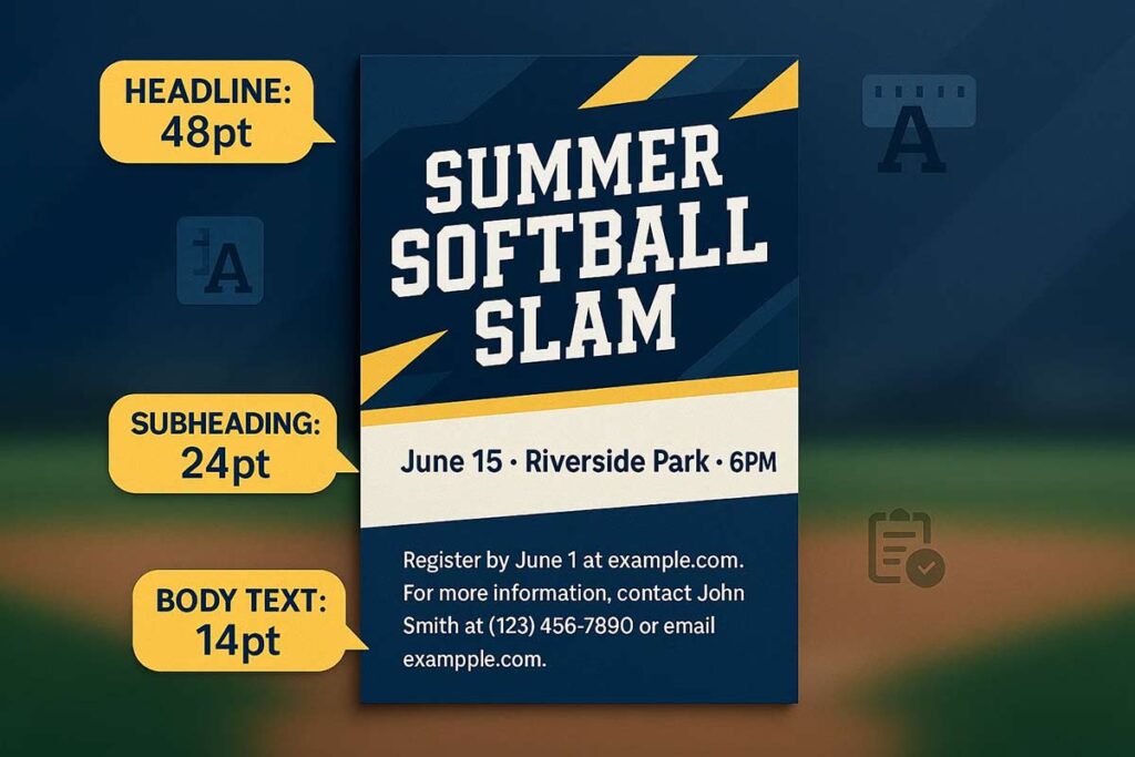
- Headlines: 36-72pt for bulletin board visibility
- Subheadings: 20-24pt for organization
- Body text: 14-16pt for comfortable reading
Weight Distribution:
- Bold headlines capture attention
- Semi-bold subheadings organize information
- Regular body text delivers details
Color coordination enhances font effectiveness. High-contrast combinations like black text on white backgrounds ensure readability across all conditions. Team colors work for headlines when paired with neutral body text.
Test font combinations at actual viewing distances before final selection. Fonts clear on computer screens may lose impact when printed or viewed from parking lots. Always prioritize readability over aesthetics for critical registration information.
Smart font choices transform basic softball flyers into professional marketing materials that drive registration success through clear communication and trustworthy design.
How To Choose Font Sizes For Softball Flyer Readability?
Choose font sizes for softball flyer readability based on viewing distance, information hierarchy, and distribution method. Headlines should be 36–72pt for strong impact, subheadings 18–24pt for structure, and body text 12–16pt for easy reading. Distance-based sizing matters use at least 24pt body text for bulletin boards and 36pt+ headlines for flyers displayed on cars.
For digital distribution, ensure mobile-friendly design with scalable text sizes. The most effective softball flyers follow a consistent size progression: main headline (48–72pt), subheadings (20–24pt), body text (14–16pt), and fine print (10–12pt) to meet accessibility standards.
Calculate Distance-Based Font Size Requirements for Softball Flyer
Start with intended viewing distance to determine minimum readable sizes. For bulletin board posting (3-5 feet), use 24pt minimum for body text and 48pt for headlines. Fence displays require 36pt body text and 60pt headlines for 8-10 foot viewing. Car windshield displays need 48pt body text and 72pt headlines for parking lot visibility.
The formula: viewing distance in feet × 12 = minimum point size for readable text. A 6-foot viewing distance requires 72pt text for clarity. This ensures parents can read registration details from typical distances.
Research from Washington University establishes that the formula for viewing distance calculations should consider that at 2.4 feet distance, 16pt is the minimum comfortable font size, while 5.0 feet requires 32pt minimum for readability.3
Establish Information Hierarchy Through Size Progression in Softball Flyer
Create clear visual hierarchy with consistent size relationships. Main headlines (league name, “REGISTRATION OPEN”) should be 48-72pt to capture attention. Tournament names and division information use 24-36pt for secondary importance. Body text containing schedules, pricing, and details requires 14-16pt for comfortable reading. Contact information and fine print need 10-12pt minimum for accessibility compliance.
Maintain proportional relationships: headlines should be 3-4 times larger than body text, subheadings 1.5-2 times body text size. This creates natural reading flow from attention-grabbing headlines to detailed information.
Optimize Font Sizes for Print vs Digital Softball Flyer Distribution
Print materials require different sizing than digital versions. Print body text performs best at 12-14pt with 18-24pt subheadings. Digital screens need 16pt minimum body text for mobile readability. Social media sharing requires 20pt+ text for thumbnail visibility.
Email newsletters need 16-18pt body text for mobile reading. Website integration requires responsive sizing that scales from desktop (14pt) to mobile (16pt+). PDF downloads should use 12pt body text with high contrast for printing clarity.
Apply Accessibility Standards for Inclusive Softball Flyer Design
Follow ADA compliance guidelines for public sports materials. Use 12pt minimum for all readable text, 14pt preferred for body content. High contrast ratios (4.5:1 minimum) ensure visibility for vision impairments. Dyslexia-friendly spacing requires 1.5x line height and adequate letter spacing.
Consider color blindness by avoiding color-only information differentiation. Use size variations alongside color coding for division information. Bold formatting should supplement, not replace, adequate font sizing.
Research indicates that people with low vision typically use magnification settings optimized for standard body text of 11-12pt, and smaller fonts require users to zoom in more, breaking reading flow.4
Test Softball Flyer Readability at Multiple Viewing Distances
Validate font choices through real-world testing. Print sample softball flyers and view from intended distances. Check mobile display on various devices and screen sizes. Gather feedback from parents and coaches about readability concerns.
Test outdoor lighting conditions for posted flyers. Bright sunlight reduces perceived text size, requiring 20% larger fonts than indoor viewing. Shadowed areas may need higher contrast and bolder weights for clarity.
Balance Font Size with Available Space in Softball Flyer
Optimize font sizes within space constraints without compromising readability. Prioritize essential information with larger sizes, reduce less critical details. Use strategic white space to enhance perceived readability rather than cramming text.
Consider text hierarchy when space is limited. Registration deadlines and contact information should maintain readable sizes even when condensing other elements. Abbreviations can save space while maintaining font size standards.
Mobile Optimization Considerations for Softball Flyers
Ensure softball flyer text remains readable on mobile devices where parents increasingly view and share information. Use 16pt minimum body text for mobile screens, 20pt for subheadings, and 24pt+ for headlines. Test responsiveness across devices to verify scalability.
Social media sharing requires larger text sizes due to thumbnail compression. Facebook and Instagram posts need 18pt+ body text for feed visibility. WhatsApp and text message sharing may require 20pt+ for group chat readability.
What Makes Softball Flyer Text Stand Out and Pop?
Make softball flyer text stand out through strategic color contrast, typography hierarchy, and selective text effects. Use high-contrast combinations like black on white or white on dark backgrounds for maximum visibility. Establish visual hierarchy using font weights, sizes, and spacing to guide the reader’s attention effectively.
Apply text effects sparingly, drop shadows can improve visibility, gradients add a modern touch, and outlines help clarify text placed over images. The most effective flyers combine bold typography with strategic white space, consistent color schemes, and selective emphasis to highlight key details without overwhelming the design.
Color Contrast Techniques for Maximum Visibility
High-contrast color combinations grab attention immediately. Black text on white backgrounds provides maximum readability, while white text on dark navy or forest green backgrounds creates dramatic impact. Use team colors strategically without sacrificing readability – bright yellow text on white backgrounds fails, but yellow accents on dark backgrounds succeed.
Test color combinations outdoors where softball flyers often appear. Bright sunlight washes out low-contrast combinations, making purple text on blue backgrounds invisible. Instead, choose combinations that maintain visibility in various lighting conditions.
Seasonal color schemes resonate with target audiences. Spring tournaments benefit from fresh greens and bright blues, while summer camps use energetic oranges and yellows. Fall leagues incorporate warm reds and golds that reflect the season’s energy.
Colorado State University’s accessibility research confirms that “effective color contrast improves content visibility across different devices and lighting conditions.5
xplore a curated selection of softball flyers that are thoughtfully crafted with color psychology in mind to suit different event types, tryouts, games, fundraisers, camps, and more.
- Twine and Whiskey Softball Tryout Flyer
- Nero and Inch Worm Softball Tryout Flyer
- Apple and White Softball Tryout Flyer
- Colorful Softball Summer Camp with Palm Tree Flyer
- Energetic Green Softball Tournament Event Flyer
Typography Hierarchy and Visual Weight Distribution
Create clear information hierarchy through strategic font weight distribution. Use bold typography for headlines (48-72pt), semi-bold for subheadings (20-24pt), and regular weight for body text (14-16pt). This progression guides reader attention from primary information to supporting details.
Bold, italic, and regular weights serve different purposes. Bold headlines grab attention, italic text provides gentle emphasis, and regular text delivers readable information. Avoid mixing too many weights – limit to three maximum for professional appearance.
Balance multiple font weights without overwhelming design. Use the 60-30-10 rule: 60% regular text, 30% bold emphasis, 10% italic accents. This creates visual interest while maintaining readability.
Text Effects and Styling for Dynamic Appeal
Drop shadows enhance text visibility, especially when placing text over images. Use subtle shadows (2-3px offset) in dark colors for professional appearance. Avoid heavy shadows that create cluttered designs or reduce readability.
Gradient text effects provide modern, eye-catching appeal for headlines. Apply gradients sparingly – one gradient element per flyer maximum. Choose colors that transition smoothly and maintain readability throughout the gradient range.
Text outlines work effectively for text-on-image overlays. Use contrasting outline colors – white outlines on dark text, dark outlines on light text. Keep outline thickness minimal (1-2px) to maintain text clarity.
Avoid effect overuse that reduces readability. Multiple effects on single text elements create visual chaos. Choose one effect per text element and apply consistently throughout the design.
White Space and Text Spacing Optimization
Line spacing (leading) improves readability significantly. Use 1.2-1.5 times font size for optimal reading comfort. Tight spacing makes text appear cramped, while excessive spacing breaks visual connections between related information. Harvard’s Digital Accessibility guidelines emphasize that “readability and legibility are key considerations for all users. For people with disabilities, these attributes can be essential to a successful user experience.6
Letter spacing (kerning) adjustments enhance text flow. Increase letter spacing slightly for all-caps headlines to improve readability. Decrease spacing for condensed fonts to maintain professional appearance.
Paragraph spacing organizes information clearly. Use consistent spacing between paragraphs (1.5-2 times line height) to separate ideas without creating excessive white space. Group related information through strategic spacing patterns.
Margin and padding considerations ensure clean design. Maintain minimum 0.5-inch margins for printed flyers, with larger margins for bulletin board displays. Digital versions need responsive padding that adapts to screen sizes.
Strategic white space draws attention to important elements. Surround key information (registration deadlines, contact details) with white space to create visual emphasis without additional effects.
Implementation for Maximum Impact
Combine these techniques systematically. Start with high-contrast color schemes, establish clear typography hierarchy, add selective text effects, and optimize white space distribution. Test designs at intended viewing distances to ensure effectiveness.
Priority order for implementation: contrast first, hierarchy second, white space third, effects last. This approach ensures readable, professional results that capture parent attention and drive registration success.
Typography Strategies For Different Softball Flyer Types
Typography strategies for different softball flyer types require tailored approaches based on purpose and audience urgency. Tournament flyers need bold, competitive fonts with a strong date/time hierarchy to capture immediate attention. Tryout flyers should use professional, authoritative typography to build trust and confidence. Fundraiser flyers work best with friendly, approachable fonts that encourage community participation.
Camp and clinic flyers benefit from educational, trustworthy typography suited for instructional content, while game flyers call for high-energy, eye-catching fonts to make an instant impact. League flyers, on the other hand, need consistent and professional fonts that support long-term branding. Each flyer type serves a unique role, requiring thoughtful font selection, sizing, and hierarchy for effective communication.
What Typography Works Best for Softball Tournament Flyers?
Tournament flyers require bold, competitive typography that conveys excitement and urgency. Use high-impact display fonts like Impact, Bebas Neue, or Oswald for tournament names and headlines (48-72pt). These fonts create immediate visual impact and communicate competitive energy effectively. Bold fonts grab attention in crowded tournament environments where multiple flyers compete for parent attention.
Before/After Typography Example:
- Poor Choice: Times New Roman, 24pt headline, mixed font weights
- Effective Choice: Impact, 60pt headline, consistent bold hierarchy
Create clear information hierarchy emphasizing critical tournament details. Primary tournament name gets largest font size, followed by date/time information (24-36pt), then registration deadlines (20-24pt). Use bold weights for all essential information to ensure quick scanning by busy parents.
Color-coded division information helps families identify relevant age groups quickly. Apply consistent typography styling within each division while using strategic color changes to separate categories. Bold call-to-action typography for registration buttons demands immediate response with contrasting colors and prominent placement.
Here’s a handpicked selection of Softball Tournament Flyer designs that showcase bold, energetic layouts and eye-catching visuals.
Read More: Softball Tournament Flyer Design: Complete Promotion Guide
How Should Typography Look on Softball Tryout Flyers?
Tryout flyers need professional, authoritative fonts that build confidence and credibility. Choose clean, established fonts like Helvetica, Arial, or Open Sans that reflect coaching expertise and program professionalism. Avoid decorative or playful fonts that might undermine serious athletic evaluation. Professional typography signals program quality and attracts serious athletes seeking competitive development.
Before/After Typography Example:
- Poor Choice: Comic Sans, decorative script fonts, inconsistent sizing
- Effective Choice: Helvetica Bold, structured hierarchy, professional spacing
Emphasize skill requirements and evaluation criteria with clear, readable typography. Use structured formatting with bullet points and consistent spacing to present tryout information logically. Contact information requires prominence with trustworthy, professional typography that encourages parent communication.
Achievement and success story sections benefit from strategic font weight variations. Use bold formatting for standout accomplishments while maintaining readable body text for detailed information. This approach builds program credibility through professional presentation.
Here’s a handpicked selection of Softball Tryout Flyer designs, clean, bold, and made to recruit top talent.
Read More: How to Create Softball Tryout Flyer That Attract the Best Players
What Typography Approach Works for Softball Fundraiser Flyers?
Fundraiser flyers require friendly, approachable fonts that encourage community participation. Select welcoming fonts like Open Sans, Roboto, or Source Sans Pro that create inclusive, community-focused messaging. These fonts balance professionalism with accessibility, making fundraising requests feel collaborative rather than demanding.
Before/After Typography Example:
- Poor Choice: Aggressive bold fonts, corporate-style typography, small donation text
- Effective Choice: Open Sans, warm hierarchy, prominent donation levels
Goal amount and fundraising purpose need clear, prominent typography. Use larger font sizes (36-48pt) for fundraising goals and medium sizes (20-24pt) for purpose explanations. This hierarchy helps families understand fundraising objectives quickly.
Donation level information requires readable pricing hierarchy. Present different contribution levels with consistent formatting, using bold typography for amounts and regular weight for descriptions. Sponsor recognition typography builds credibility through professional acknowledgment formatting.
Kickstart your fundraising efforts with professionally crafted Softball Fundraiser Flyer templates tailored for events like team fundraisers, raffles, charity games, and community drives.
Read More: How to Create Softball Fundraiser Flyers That Drive Results
How Should Typography Look on Softball Camp Educational Flyers?
Educational flyers need trustworthy fonts that convey learning value and instructor expertise. Professional fonts like Helvetica, Arial, or Roboto communicate educational quality while maintaining excellent readability across age groups. Clean typography suggests organized, professional instruction that delivers promised skill development.
Before/After Typography Example:
- Poor Choice: Playful, childish fonts throughout, inconsistent spacing
- Effective Choice: Roboto, age-appropriate hierarchy, structured learning sections
Skill development information benefits from clear, organized typography with structured formatting. Use consistent heading hierarchy (H2: 24pt, H3: 18pt, Body: 14pt) to present camp curriculum and learning objectives logically. This approach helps parents evaluate educational value effectively.
Age-appropriate font selection varies by target camper demographics. Younger divisions (8-12 years) can incorporate slightly more playful elements while maintaining readability. Older divisions (13+ years) require more mature, professional typography that appeals to competitive athletes.
Here’s a handpicked selection of Softball Camp Flyer designs vibrant, educational, and built to attract young athletes and their families.
Read More: Softball Camp Flyer Design Guide: Attract More Participants This Season
What Typography Creates Impact for Softball Game Flyers?
Game flyers demand high-energy, attention-grabbing fonts for immediate impact. Bold, dynamic fonts like Impact, Bebas Neue, or Athletic fonts create excitement and urgency. Use maximum contrast and large sizing (48-72pt headlines) for game announcements. High-energy typography matches the competitive atmosphere parents expect at important games.
Before/After Typography Example:
- Poor Choice: Elegant serif fonts, muted sizing, low contrast
- Effective Choice: Impact, 60pt headlines, high contrast colors
Clear date, time, and location hierarchy enables quick information processing. Apply bold formatting to essential game details with consistent spacing patterns. Team name and opponent information requires prominent typography with contrasting weights to build anticipation.
Excitement-building language benefits from energetic font choices and strategic spacing. Use action-oriented typography with adequate white space to create visual energy without overwhelming essential information.
Discover a vibrant selection of Softball Game Flyer designs crafted to spotlight individual matchups, rivalry games, and fan-focused promotions.
How Should Typography Look on Softball League Registration Flyers?
League flyers require consistent, professional fonts for ongoing branding and long-term engagement. Establish brand-consistent typography standards using fonts like Helvetica, Arial, or Open Sans that build recognition across multiple communications throughout the season. Consistent typography creates professional league identity that parents trust for seasonal commitments.
Before/After Typography Example:
- Poor Choice: Multiple font families, inconsistent sizing, cluttered layout
- Effective Choice: Single font family, consistent hierarchy, clean organization
Season-long information needs organized, hierarchical text structure. Present registration processes with step-by-step typographic guidance using numbered formatting and consistent spacing. This approach reduces parent confusion and improves registration completion rates.
Multi-division information requires clear categorization with readable organization. Use consistent typography styling within divisions while applying strategic formatting changes to separate age groups effectively. This system helps families navigate complex league structures efficiently.
Discover eye-catching Softball League Registration Flyer designs tailored for promoting season sign‑ups, registration deadlines, and league structure.
What Are the Best Typography Choices for Outdoor Flyers?
The best typography choices for outdoor flyers prioritize thick, bold fonts that stay clear in sunlight, wind, and weather. Fonts like Impact, Oswald, and Bebas Neue are ideal for headlines, while Arial and Helvetica offer strong readability for body text.
Use high-contrast color combinations, black on white or white on dark backgrounds, for maximum visibility from parking lots and bulletin boards. Font sizes should scale with distance: use at least 36pt for headlines, 24pt for body text, and 48pt or larger for windshield displays.
Weather-Resistant Typography Fundamentals
Outdoor conditions demand fonts that resist visual degradation. Thick, bold fonts maintain clarity when viewed through car windshields, while thin fonts disappear in bright sunlight. Sans-serif fonts like Impact and Oswald perform better than decorative fonts that lose detail outdoors.
Weather resistance extends to font weight selection. Medium and bold weights remain readable when materials get wet or dirty, while light weights become illegible. Choose fonts with consistent stroke width to prevent character distortion in varying light conditions.
High-Contrast Color Strategies
Color contrast determines outdoor readability success. Black text on white backgrounds provides maximum visibility in all lighting conditions. White text on dark navy or black backgrounds works well for evening visibility and creates professional appearance.
Avoid color combinations that fail outdoors: yellow text on white backgrounds disappears in sunlight, while red text on green backgrounds creates strain. Team colors work when they provide sufficient contrast, test readability in bright sunlight before finalizing designs.
Consider background material reflectivity. Glossy surfaces create glare that reduces text visibility, while matte finishes maintain consistent readability. Choose paper stocks that support your color contrast strategy.
Distance-Based Font Sizing
Calculate minimum font sizes based on intended viewing distance. For close viewing (3-5 feet), use 24pt minimum for body text and 36pt for headlines. Medium distance viewing (10-15 feet) requires 36pt body text and 48pt headlines. Far viewing distances (20+ feet) demand 48pt+ for all text elements.
Parking lot visibility requires special consideration. Drivers moving at 10-15 mph need larger text to process information quickly. Use 60pt+ headlines for car-readable flyers, with minimal text to prevent information overload.
Test readability at actual distances. Print samples and view from intended distances to verify font size adequacy. What appears readable on screen often fails in real-world conditions.
Outdoor-Specific Typography Techniques
Avoid decorative fonts that lose detail when printed on outdoor materials. Script fonts become illegible when viewed from distance, while block letters maintain clarity. Condensed fonts save space but sacrifice readability choose normal width fonts for better visibility.
Text effects require careful application outdoors. Drop shadows can improve text visibility on busy backgrounds, but avoid thin shadows that disappear in sunlight. Outline effects work well for text-on-image applications but increase minimum font size requirements.
Material and Production Considerations
Paper stock affects typography performance. Heavier stocks (100lb+) prevent text bleed-through and maintain crisp edges. UV-resistant inks prevent fading that makes text illegible over time.
Lamination improves durability but can create glare. Matte lamination maintains readability while protecting against weather. Consider viewing angle when selecting protective coatings.
Weather exposure time influences font choices. Short-term posting (1-2 weeks) allows broader font selection, while long-term outdoor display requires the most durable typography choices.
Read More: How to Create a Softball Flyer: A Complete Step-by-Step Guide
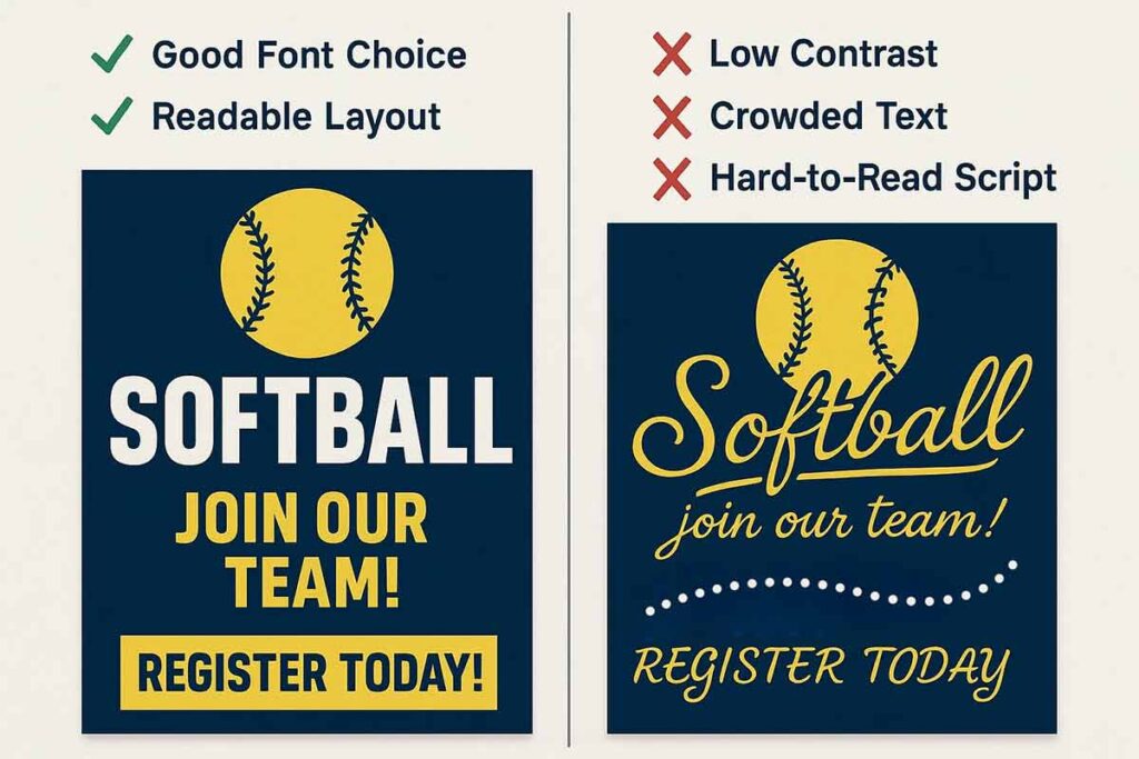
Typography Mistakes That Hurt Softball Flyer Effectiveness
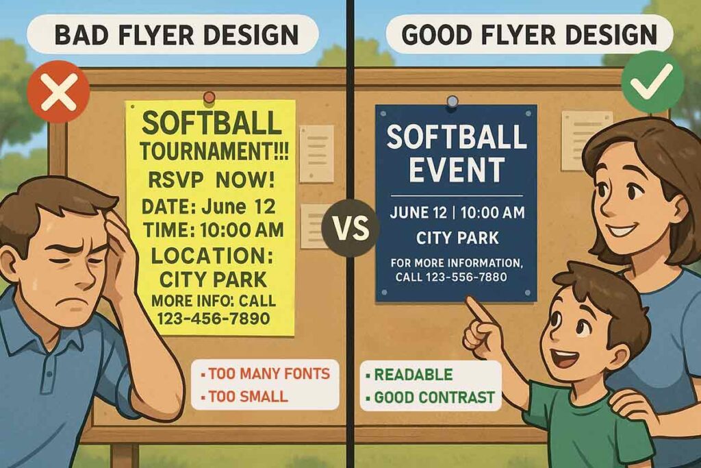
Common typography mistakes that reduce softball flyer effectiveness include using too many fonts, relying on decorative fonts for key information, selecting font sizes that don’t suit viewing distance, and applying poor color contrast that strains the eyes. Other issues include overusing all-caps, inconsistent styling, misaligned text, and using font sizes that aren’t mobile-friendly.
The most damaging errors combine multiple decorative fonts, make text too small for quick scanning, and overlook accessibility standards. Successful softball flyers avoid these pitfalls by sticking to a two-font maximum, prioritizing readability, maintaining consistent styles, and ensuring optimization for both print and digital formats.
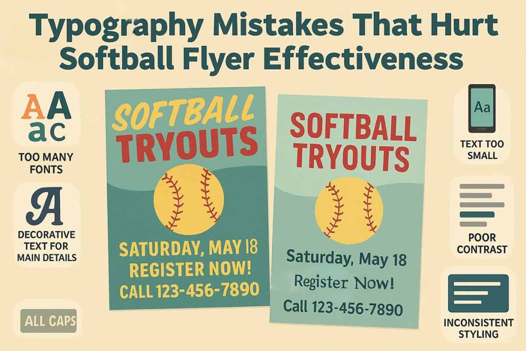
Using Too Many Fonts Creates Softball Flyer Chaos
The biggest typography mistake in softball flyer design is using multiple fonts that compete for attention. Coaches often combine three or four different fonts thinking it creates excitement, but this approach confuses readers and reduces professional credibility. Effective softball flyers use one bold font for headlines and one clean font for body text. Impact or Bebas Neue work well for headlines, while Arial or Helvetica ensure body text readability. This two-font system creates visual hierarchy without overwhelming parents scanning for registration information.
Decorative Fonts Hurt Critical Information Readability
Choosing decorative or script fonts for essential details like dates, times, and contact information reduces scanning efficiency. Parents need to quickly locate registration deadlines and practice schedules. Decorative fonts work for team names or event titles but should never be used for phone numbers, addresses, or pricing information. Reserve creative typography for attention-grabbing elements while maintaining Arial or Helvetica for all functional text that requires immediate comprehension.
Poor Font Size Selection Reduces Viewing Distance Impact
Selecting inappropriate font sizes for intended viewing distance significantly impacts flyer effectiveness. Body text smaller than 14pt becomes unreadable when posted on bulletin boards or car windows. Headlines need 36pt minimum for parking lot visibility, while outdoor displays require 48pt or larger. Many coaches use 12pt body text that works for hand-to-hand distribution but fails completely for distance viewing. Calculate font sizes based on where flyers will be posted, not just how they look on screen.
High-Contrast Color Problems Strain Reader Eyes
Low-contrast color combinations create eye strain and reduce information retention. Light gray text on white backgrounds, yellow text on light backgrounds, or any combination that requires squinting hurts flyer performance. Effective softball tournament flyers use black text on white backgrounds or white text on dark backgrounds for maximum readability. Team colors should accent headlines and borders, not compromise essential information visibility.
All-Caps Text Overuse Reduces Reading Speed
Using all-caps text throughout softball flyers dramatically reduces reading speed and appears aggressive to parents. All-caps text is 13% slower to read than properly formatted text, making parents less likely to finish reading important details. Reserve all-caps formatting for short headlines or team names only. Use bold formatting, larger sizes, or strategic color changes for emphasis instead of relying on all-caps text that hurts overall readability.
Inconsistent Typography Destroys Professional Credibility
Inconsistent font styling, mixed alignment choices, and varying text treatments throughout flyers destroy professional credibility that parents expect from organized leagues. Successful softball flyers maintain consistent font sizes for similar information types, uniform color schemes, and aligned text blocks. Create style guidelines specifying headline fonts, body text fonts, and color usage to ensure every flyer maintains professional standards that build parent trust.
Read More: Complete Guide to Softball Flyer Design
What’s the Right Typography Hierarchy for a Softball Flyer?
Create typography hierarchy in softball flyers using strategic font size progression, weight distribution, and color coding. Define three text levels: primary headlines (48–72pt), secondary subheadings (20–24pt), and body text (14–16pt). Use font weights intentionally, bold for headlines, semi-bold for subheadings, and regular for body text.
Apply color coding to separate content types: use team colors for headlines, dark tones for key details, and accent colors for calls to action. An effective hierarchy combines consistent sizing, spacing, and visual flow to guide readers smoothly from the headline down to the registration information.
Information Priority and Visual Organization
Establish clear information layers with league name and event title as primary elements (48-72pt bold). Registration deadlines and costs require secondary emphasis (24-36pt semi-bold), while contact details and fine print use tertiary sizing (12-16pt regular). Create visual flow by positioning critical information in reading order: event name, dates, registration details, contact information.
Priority information demands immediate attention through size and placement. Use the largest fonts for event names and key dates, ensuring these elements capture attention first. Group related information under clear subheadings that organize content logically.
Font Weight and Size Progression Systems
Implement consistent size relationships across all text elements. Primary headlines should be 3-4 times larger than body text, with subheadings falling between at 1.5-2 times body text size. This creates natural visual stepping that guides readers through information.
Bold weights work best for headlines and critical information like registration deadlines. Semi-bold weights effectively highlight subheadings and secondary information. Regular weights provide comfortable reading for detailed information and contact details.
Color-Coded Information Categories
Use color strategically to organize information types. Team colors work well for headlines and branding elements, creating immediate association. High-contrast colors (black on white) ensure essential information remains readable. Accent colors can highlight calls-to-action and urgent deadlines.
Avoid using color as the only differentiator – combine with size and weight changes for accessibility. Reserve bright colors for actionable elements like registration buttons or contact information.
Layout Techniques That Support Text Hierarchy
Grid systems organize typography effectively by creating consistent alignment and spacing. Use generous white space between sections to prevent information overload. Align text consistently – left alignment typically works best for body text, while centered alignment suits headlines.
Spacing patterns should remain consistent throughout the flyer. Maintain uniform margins, line spacing, and section breaks. This consistency builds professional credibility and improves readability across all information levels.
Effective hierarchy guides readers naturally from attention-grabbing headlines to actionable next steps, ensuring your softball flyer communicates clearly and drives registration success.
Read More: Where and How to Distribute Your Softball Flyer for Maximum Sign-Ups
People Also Ask: Softball Flyer Typography Questions
What font is best for a softball tournament flyer?
Use bold, dynamic fonts like Bebas Neue or Impact for tournament flyer headlines to convey excitement. Pair with readable Arial or Helvetica for body text. Emphasize dates and times with large, high-contrast typography for quick scanning.
How should typography differ for a softball tryout flyer?
Tryout flyers need professional fonts like Helvetica or Arial to build credibility. Use bold headlines (36-48pt) for tryout dates and clean body text (14-16pt) for evaluation criteria, ensuring a trustworthy, authoritative design.
What colors enhance readability on a softball fundraiser flyer?
Use high-contrast colors like black on white or white on navy for fundraiser flyers. Highlight donation goals with bold, community-friendly fonts like Open Sans in team colors for approachable readability.
How do I make a softball camp flyer text pop?
Use bold, educational fonts like Roboto for camp flyers. Apply high-contrast colors and clear hierarchy (48pt headlines, 20pt subheadings) to emphasize schedules and skills, ensuring text stands out for parents.
What font size works for a softball game flyer outdoors?
Game flyers need 36pt+ headlines and 24pt body text for outdoor readability. Use thick fonts like Oswald and high-contrast colors (black on white) to ensure visibility from parking lots or fences.
How many fonts for a softball league flyer?
Limit league flyers to two fonts: a bold headline font like Impact and a readable body font like Arial. Consistent typography builds brand recognition and ensures scannable season-long information.
What’s the best typography for a softball recruiting flyer?
Recruiting flyers require professional fonts like Helvetica for credibility. Use bold, 36-48pt headlines to highlight team achievements and clean, 14-16pt body text for contact details and tryout information.
FAQs About Softball Flyer Typography
Always verify font licensing for commercial use. Google Fonts are free, Adobe Fonts need a subscription, and premium fonts may require fees, especially for league flyers with registration or sponsorship revenue.
Use a maximum of two fonts, one for headlines and one for readable body text. More fonts can cause visual clutter and reduce professionalism.
Sans-serif fonts like Arial and Helvetica are easier to read at small sizes and ideal for digital use. Serif fonts add tradition but are harder to read outdoors or on mobile devices.
Sports fonts like Varsity or College Block add energy, but readability comes first—a clear Arial headline is better than a hard-to-read decorative font.
Use at least 24pt for body text and 36pt for headlines outdoors. For distant viewing (e.g., parking lots), use 48pt+ headlines. Always test readability from the intended distance.
Use high-contrast colors, at least 14pt font, clear fonts for key info, and enough white space. For inclusivity, consider dyslexia-friendly fonts like OpenDyslexic.
Use black text on white for maximum contrast, and white text on dark backgrounds. Avoid low-contrast combos like red on green or yellow on white that strain the eyes.
Use high-contrast colors, bold fonts over thin ones, and avoid light gray text. Test readability in various lighting, bold fonts work best in sunlight.
Conclusion
Your softball flyer typography strategy succeeds by applying proven design principles systematically. Prioritize readability over decoration, keep styling consistent, and ensure optimization for both print and digital formats. Professional typography builds trust, enhances engagement, and drives registrations by presenting your league as organized and credible.
Start with these core principles and adjust based on parent feedback and registration results. When done right, typography turns simple details into powerful marketing that draws families in and supports program success. Using editable flyer templates can help streamline the design process while keeping your typography polished and effective.
Reference
- Ensure typography is readable and customizable. Western Washington University – University Communications and Marketing.
- Typography in Inclusive Design Part 2: Choosing typefaces. Vision Australia.
- Fonts & Posters: Reading Distance & Font Size Guidelines. Washington University in St. Louis. Washington University Knight Alzheimer Disease Research Center. (2024).
- Understanding Accessible Fonts and Typography for Section 508 Compliance. Section508.gov. (2024). U.S. General Services Administration.
- Color Contrast – Accessibility by Design. Colorado State University.
- Design for readability – Digital Accessibility. Harvard University.