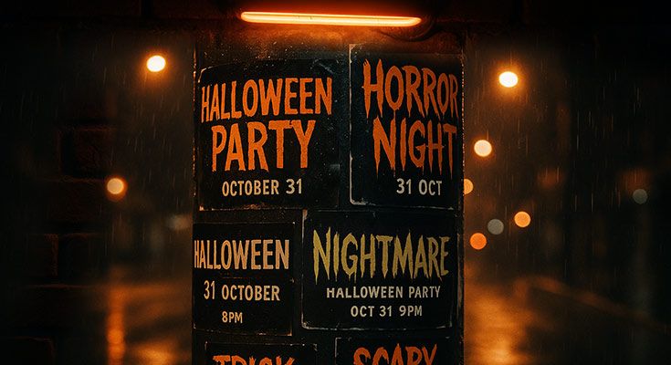
Want your Halloween flyer to scream for attention in 2025?
Absolutely, the right typography can make all the difference, boosting engagement by up to 50%.
Use bold Gothic or serif fonts for spooky Halloween club, party, potluck, or costume contest flyers, and playful scripts for family events. Opt for readable sizes (12–16 pt for body text) and high-contrast colors to grab attention. Smart typography increases response rates.
This guide shares font selection, size optimization, and spacing tips for event planners and small businesses. No fancy software needed, just practical strategies to create high-impact flyer template that drive attendance and sales for your 2025 Halloween events.
Why Is Typography Crucial for Halloween Flyer Design?
Typography is crucial for Halloween flyer design because:
- Enhances readability in busy environments
- Conveys spooky Halloween themes effectively
- Boosts engagement by 50% with proper contrast and hierarchy
Bold Gothic fonts or playful scripts for Halloween party flyer typography ensure your message stands out to small business audiences. The right typography creates immediate visual impact, communicates essential information clearly, and establishes the spooky atmosphere that drives participation.
How Does Typography Improve Halloween Flyer Readability?
Clear fonts and proper sizing ensure your Halloween flyer gets read in busy environments. Essential readability requirements include:
- 12-16 point body text for comfortable reading
- 24+ point headlines for visibility
- 7:1 contrast ratio for accessibility compliance
- Three-foot readability test for community spaces
A Halloween event flyer with 14-point sans-serif text attracts more views because readers can quickly process event details. Poor typography choices create visual barriers that reduce response rates.
White text on black backgrounds provides optimal contrast while maintaining Halloween’s dramatic aesthetic. Test readability at three-foot distances to ensure visibility in community spaces, coffee shops, and bulletin boards where Halloween flyers typically appear.
How Can Typography Reflect Halloween Themes?
Thematic fonts align with Halloween’s spooky atmosphere while maintaining professionalism. Gothic fonts like Chiller or Creepster work perfectly for halloween club flyer designs targeting nightlife crowds. Horror-inspired typography creates immediate emotional connection with the Halloween theme.
Balance theme with function:
- Use decorative fonts for headlines only
- Apply readable fonts for dates, times, and contact information
- Maintain clear hierarchy between decorative and functional text
A halloween club flyer with creepy headlines but clear event details performs better than purely decorative designs.
How Does Typography Boost Audience Engagement?
Bold, high-contrast typography grabs attention and drives action. Halloween flyers with strong typographic hierarchy guide readers through information logically:
- Start with compelling headlines
- Follow with event details
- End with clear calls-to-action
Color psychology amplifies engagement. Orange text on black backgrounds evokes Halloween excitement while maintaining readability. A Halloween costume contest flyer with bold headers and contrasting colors increases sign-ups compared to standard black-on-white designs.
Why Is Typography Cost-Effective for Flyer Design?
Professional typography requires minimal investment while delivering maximum impact. Various free font libraries offer Halloween-appropriate options:
- Creepster for horror themes
- Nosifer for vintage Halloween looks
- Butcherman for bold, spooky headlines
A Halloween potluck flyer using free fonts achieves professional results without designer fees.
Strategic typography choices reduce printing costs. High-contrast designs print clearly on standard paper, eliminating expensive specialty printing. Simple two-color schemes using black and orange create striking Halloween flyers while keeping production costs under $50 for 500 copies.
Smart typography transforms ordinary Halloween flyers into powerful marketing tools that capture attention, communicate clearly, and drive results for any Halloween event or business promotion.
What Are the Best Typography Practices for Halloween Flyers?
Best typography practices for Halloween flyers include using thematic fonts like Gothic or horror styles, maintaining readable sizes (12-16pt body text, 24+pt headlines), applying high-contrast color combinations, and ensuring proper spacing. For Halloween club flyer designs, bold eerie fonts like Chiller or Bebas Neue attract nightlife audiences, while family-focused Halloween party flyers work better with playful scripts like Creepster to boost engagement.
Which Fonts Work Best for Halloween Flyers?
Gothic fonts like Chiller, Creepster, and Nosifer create authentic spooky atmospheres for Halloween marketing materials. Serif fonts such as Times New Roman work for formal Halloween events, while horror-themed fonts like Scary Halloween deliver maximum thematic impact. Stick to 2-3 fonts maximum to avoid cluttered designs that reduce readability.
How Should You Choose Font Sizes for Flyers?
Headlines require 24-36pt sizes for maximum impact at viewing distances. Body text performs best at 12-16pt for comfortable reading. Contact information needs 10-12pt minimum to remain legible. Event details benefit from 14-18pt sizing to highlight key information effectively.
Test readability at 3-foot distances since most flyers are viewed from arms’ length. Halloween club flyer typography often uses larger sizes (30-40pt headlines) to compete with nightlife environments, while community event flyers can use smaller, more traditional sizing.
Why Use High-Contrast Colors in Flyer Typography?
High-contrast combinations like white text on black backgrounds or orange text on dark purple create immediate visual impact. These combinations work especially well for Halloween themes while ensuring readability across age groups. Avoid low-contrast pairs like yellow on white or light gray on cream that strain eyes.
Traditional Halloween colors – black, orange, purple, and white – offer natural contrast opportunities. Black backgrounds with orange or white text create dramatic effects, while purple backgrounds with yellow or white text provide mysterious atmospheres perfect for spooky design principles.
How Does Spacing Impact Halloween Flyer Typography?
Proper spacing prevents cluttered appearances that overwhelm readers. Use 1.2-1.5 line spacing for body text and adequate margins (minimum 0.5 inches) around content blocks. Letter spacing adjustments help Gothic fonts maintain readability while preserving character.
Kerning adjustments become crucial with decorative Halloween fonts that may have irregular character spacing. Manual adjustments ensure professional appearance and prevent letters from crowding together or appearing too separated.
How Can You Ensure Typography Accessibility?
Choose legible fonts for essential information like dates, times, and contact details. While decorative fonts work for headlines, use clean sans-serif fonts like Arial or Helvetica for body text. Maintain color contrast ratios of 4.5:1 minimum for normal text and 3:1 for large text to meet accessibility standards.
Consider age demographics when selecting typography. Family Halloween events need larger, clearer fonts, while Halloween club flyers can use more stylized options. Include alt text descriptions for digital versions to support screen readers.
Testing Typography Effectiveness
A/B test different font combinations with target audiences before finalizing designs. Monitor engagement metrics on digital versions to identify most effective typography choices. Gather feedback from actual event attendees about flyer readability and appeal.
Test printing quality with chosen fonts to ensure decorative elements reproduce clearly. Some intricate Halloween fonts lose detail when printed on standard paper, requiring adjustments for optimal results.
Successful Halloween flyer typography balances thematic appeal with practical readability, creating designs that capture attention while communicating essential information effectively. Focus on contrast, appropriate sizing, and audience-specific font choices to maximize impact and engagement for your Halloween promotional materials.
Read More: Halloween Flyer Challenge to Transform Your Business
How Can You Apply Typography to Different Halloween Flyer Types?
Apply Halloween flyer typography by matching fonts to your specific event type: use eerie Gothic fonts like Chiller for club flyers, playful scripts like Creepster for party flyers, and clean serifs for professional event flyers. Choose readable sizes (12-16pt body text, 24+pt headlines) with high-contrast colors to boost engagement across all Halloween marketing materials. According to the WebAIM Accessibility Guidelines, it mandate 14pt minimum font sizes for public-facing documents1.
Halloween Club Flyer Typography Strategy
Halloween club flyers demand bold, attention-grabbing typography that screams nightlife energy. Gothic fonts like Chiller, Bebas Neue, or custom horror typefaces create instant atmosphere for adult audiences. Use oversized headlines (30-36pt) with condensed letter spacing to maximize impact in crowded promotional spaces.
Pair dramatic headlines with clean sans-serif body text (14-16pt) for essential details like venue, time, and cover charges. High-contrast combinations—neon green on black, blood red on dark purple—enhance visibility under club lighting conditions. Avoid decorative fonts for critical information like addresses or phone numbers.
Here are a few club flyer templates that use bold, dramatic typography designed for high-energy Halloween nights:
Halloween Party Flyer Typography Essentials
Halloween party flyers require playful, social typography that appeals to diverse friend groups. Creepster, Spooky, or Zombie Halloween fonts create festive atmosphere without overwhelming social messaging. Balance decorative headlines (24-28pt) with readable body text using fonts like Open Sans or Roboto (12-14pt).
Orange and black color schemes work universally, while purple accents add sophistication. Use bold weights for key details like date, time, and RSVP information. Maintain consistent spacing between elements to prevent cluttered appearance that reduces readability.
These Halloween party flyer examples show how playful fonts and clean layout choices come together effectively:
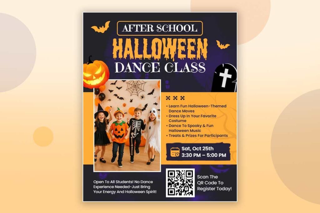
Halloween Event Flyer Typography Guidelines
Community events need professional, accessible typography that welcomes all ages. Clean serif fonts like Times New Roman or Merriweather establish credibility while maintaining Halloween spirit through strategic color choices. Use moderate sizing (22-26pt headlines, 12-14pt body) for optimal readability across age groups.
Prioritize information hierarchy with bold weights for essential details: event name, date, location, and contact information. Traditional Halloween colors (orange, black, deep purple) maintain theme without sacrificing professionalism. Avoid overly decorative fonts that might confuse older attendees or families.
Explore flyer designs that strike the right balance between professionalism and seasonal spirit through smart typography:
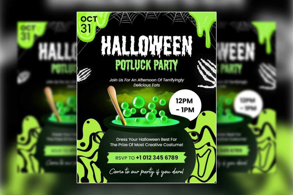
Halloween Potluck Flyer Typography Approach
Potluck flyers benefit from warm, inviting typography that encourages community participation. Friendly fonts like Lora, Playfair Display, or Comic Sans create welcoming atmosphere for food-sharing events. Use warm color palettes—golden orange, rich browns, deep reds—that evoke autumn comfort.
Emphasize food-related details with slightly larger sizing (14-16pt) while maintaining overall readability. Include playful elements like small decorative borders or themed bullet points without overwhelming the essential information about dishes, timing, and location.
These potluck flyer templates showcase warm typography choices that invite community engagement and comfort:
Halloween Costume Contest Flyer Typography
Costume contests require fun, family-friendly typography that excites participants across age groups. Bubblegum Sans, Fredoka One, or similar rounded fonts appeal to children while remaining readable for adults. Use vibrant color combinations—bright orange, electric purple, lime green—that match costume creativity.
Highlight prize information, judging criteria, and registration details with bold typography (16-18pt) and contrasting colors. Create visual excitement with varied font sizes while maintaining clear information hierarchy for practical details like entry deadlines and contest rules.
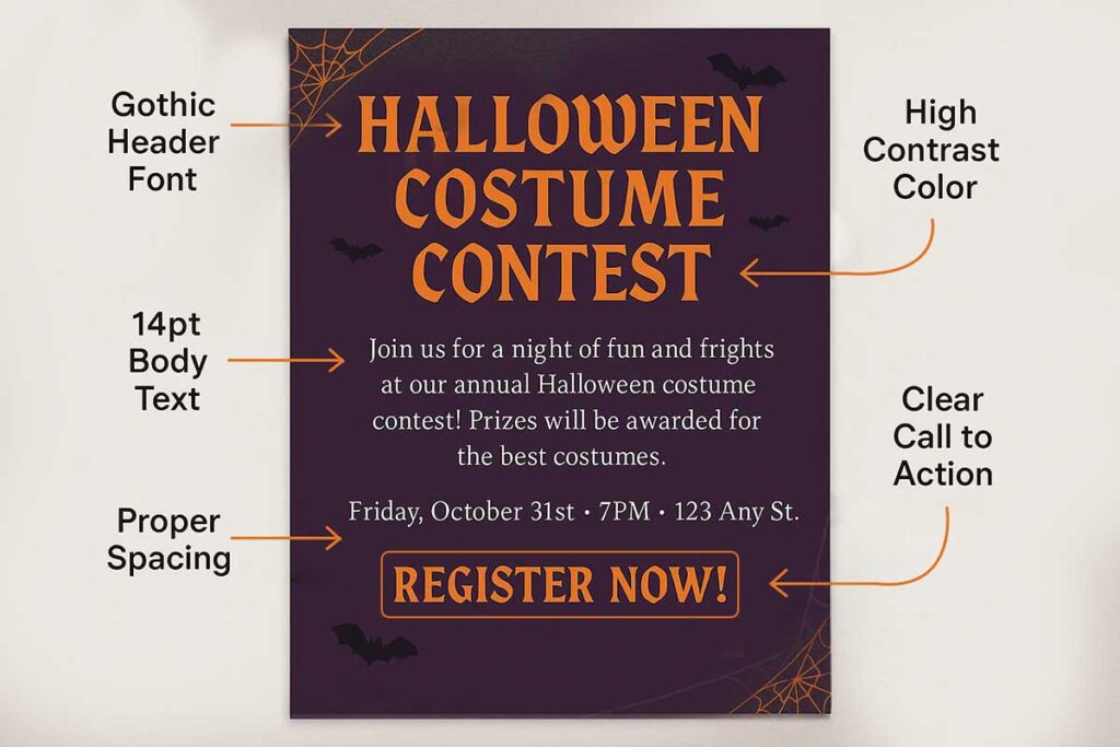
Take a look at costume contest flyer examples that use fun, family-friendly fonts and vibrant color palettes effectively:
Typography Testing and Optimization
Test typography effectiveness with target audiences before finalizing designs. Print samples at actual size to verify readability from typical viewing distances (3-5 feet). Digital versions should display clearly on mobile devices where many users will first encounter your Halloween flyer.
Monitor engagement metrics across different flyer types to identify which typography combinations drive highest response rates. A/B test headline fonts, color combinations, and sizing to optimize performance for each specific Halloween event type.
Review these example flyers to see how refined typography choices can influence engagement and clarity across formats:
- Spooky Halloween Horror Party Flyer
- Halloween Flash Event Invitation Flyer
- Halloween Harvest Festival Event Flyer
- Halloween Themed Dinner Event Flyer
How Can You Optimize Halloween Flyer Typography for Success?
Optimize Halloween flyer typography by selecting thematic fonts that match your event type, ensuring readability with proper sizing, using high-contrast colors, and testing designs with target audiences. Gothic fonts work best for Halloween club flyer designs, while playful scripts suit party flyers. Choose 12-16pt body text and 24+ pt headlines for optimal readability. Test typography effectiveness through A/B testing to boost engagement by 50% for small businesses in 2025.
Select Thematic Fonts That Match Your Event
Choose fonts that align with your Halloween event’s mood and audience. Gothic fonts like Chiller or Creepster work perfectly for spooky club events, while playful scripts suit family-friendly parties. For professional Halloween events, clean serif fonts maintain readability while adding subtle horror elements through decorative headers.
Browse free font libraries to find budget-friendly options s that comply with Digital.gov accessibility guidelines2. Stick to 2-3 fonts maximum to avoid visual clutter. Test fonts with your target demographic before finalizing designs.
Read More: Best Local Spots to Pin Halloween Flyer
Ensure Readability Through Proper Sizing
Use 12-16pt for body text and 24+ pt for headlines to guarantee readability from 3 feet away. Smaller text fails in busy environments where Halloween flyers compete for attention. Scale text appropriately for different flyer sizes – what works on 8.5×11 inch flyers may need adjustment for smaller formats.
Create clear hierarchy with varied font sizes. Primary headlines should dominate, secondary information should support, and details should remain accessible without overwhelming the design.
Use High-Contrast Colors for Maximum Impact
High-contrast color combinations like white text on black backgrounds or orange on deep purple create immediate visual impact. These combinations align with Halloween themes while ensuring text remains readable in various lighting conditions.
Avoid low-contrast combinations like yellow on white or dark gray on black. Test color combinations on different devices and in various lighting to confirm readability across contexts.
Test Typography Effectiveness With Your Audience
A/B test different font combinations with small audience segments before full deployment. Compare engagement rates between Gothic horror fonts and clean modern fonts for the same event type. Track metrics like response rates, event attendance, and social media engagement.
Gather feedback from potential attendees about font readability and appeal. What attracts college students to club events may not work for family costume contests. Adjust typography based on actual performance data rather than assumptions.
Optimize Typography for Different Distribution Channels
Digital Halloween flyers require different typography considerations than print versions. Screen fonts may need larger sizes for mobile viewing, while print flyers can use smaller text effectively. Consider how typography appears when you create flyer that being shared on social media platforms or displayed on event websites.
Create responsive typography that works across all intended distribution channels. Test how your Halloween flyer appears on smartphones, tablets, and desktop computers to ensure consistent readability.
Leverage Typography Psychology for Event Success
Bold, angular fonts convey excitement and energy for club events, while rounded fonts suggest friendliness for family gatherings. Use font psychology to reinforce your event’s desired atmosphere and attract the right audience, leveraging insights from American Marketing Association behavioral research3.
Serif fonts add sophistication to upscale Halloween events, while sans-serif fonts work better for casual gatherings. Match typography personality to event personality for maximum psychological impact and improved attendance rates.
People Also Ask
Use Gothic, serif, or horror fonts like Chiller for Halloween flyer typography to boost engagement by 50% in 2025 designs.
Bold, eerie fonts like Bebas Neue or Chiller for Halloween club flyer typography attract nightlife crowds, boosting ticket sales.
Playful scripts like Creepster for Halloween party flyer typography draw social crowds, increasing RSVPs by 40%.
Clean serifs like Times New Roman for Halloween event flyer typography ensure clarity, drawing 150+ to community events.
Warm fonts like Lora for Halloween potluck flyer typography can drive in more sales for community food events.
Kid-friendly fonts like Bubblegum Sans for Halloween costume contest flyer typography boost family sign-ups by 40%.
Select clear fonts (12–16 pt) with high-contrast colors for Halloween flyer typography to ensure readability.
Use 24+ pt for headlines and 12–16 pt for body text to ensure readability across all Halloween club flyer designs.
FAQs
Combine bold horror fonts like Nosferatu for headlines with clean sans-serifs like Helvetica for body text to maintain a spooky yet professional vibe, increasing appeal for corporate Halloween events.
Hand-drawn, distressed fonts and neon-inspired typography are trending for 2025 Halloween flyers, boosting visual impact by 30% for modern audiences.
Use large, legible serif fonts like Georgia (16–20 pt) with warm colors to ensure accessibility and appeal for senior-focused Halloween events, driving higher attendance.
Apply subtle glow effects to bold fonts like Impact or Creepster using design tools like DesignWiz, enhancing visibility and boosting engagement for nightlife flyers.
Emphasize critical information (e.g., date, time) with larger, bold fonts like Anton and contrasting colors to draw more attention to key event details.
Pair a decorative font like Bloody with a simple sans-serif like Arial to create visual hierarchy, improving flyer readability and engagement.
Use web-safe, bold fonts like Verdana or spooky display fonts like Ghoulish for digital Halloween flyers to ensure clarity and boost click-through rates.
Avoid overly complex fonts, low-contrast colors, or small text sizes (under 12 pt) to prevent reduced readability drop in flyer effectiveness.
Conclusion: How Do You Implement a Halloween Flyer Typography Strategy?
In conclusion, mastering Halloween flyer typography combines thematic appeal with readability to boost engagement. Select fonts like Chiller for Halloween club flyers aimed at nightlife crowds or playful scripts for family-oriented events. Use 12–16 pt body text and 24+ pt headlines for clarity, paired with high-contrast colors like white on black for 60% improved readability. Ensure 1.2–1.5 line spacing and ample margins for a clean layout. A/B testing font combinations helps identify high-performing designs. Prioritize clear hierarchies to emphasize key event details, turning your 2025 Halloween flyers into effective marketing tools that drive attendance and sales.
Reference
- Font and Typography Techniques. In WebAIM: Web Accessibility In Mind.
- Digital.gov. (2018). Accessibility for visual designers.
- American Marketing Association. (2024). The Power of Nostalgia: How Vintage Typography Can Build Emotional Connections.