In today’s inclusive marketing landscape, accessible typography ensures flyers are readable for all audiences, including those with visual impairments. AI flyer generator revolutionizes this process by automating font style, size, spacing, and alignment to meet WCAG standards while maintaining visual appeal. These tools optimize readability for diverse audiences using data-driven suggestions, ensuring compliance with accessibility guidelines without sacrificing design quality.
This guide explores how AI flyer generator handle typography components—from font selection to spacing optimization—delivering professional, accessible flyers that enhance engagement across all user groups while streamlining the design process for businesses.
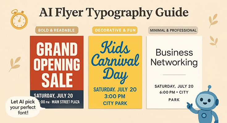
What Typography Elements Make a Flyer Easy to Read?
An AI flyer generator optimizes typography elements through automated font selection, size adjustments, and spacing calculations that meet accessibility standards. Typography readability depends on five core elements: font choice, size, spacing, contrast, and hierarchy. These elements work together to create flyers that communicate effectively across different audiences and viewing conditions, ensuring your message reaches everyone clearly.
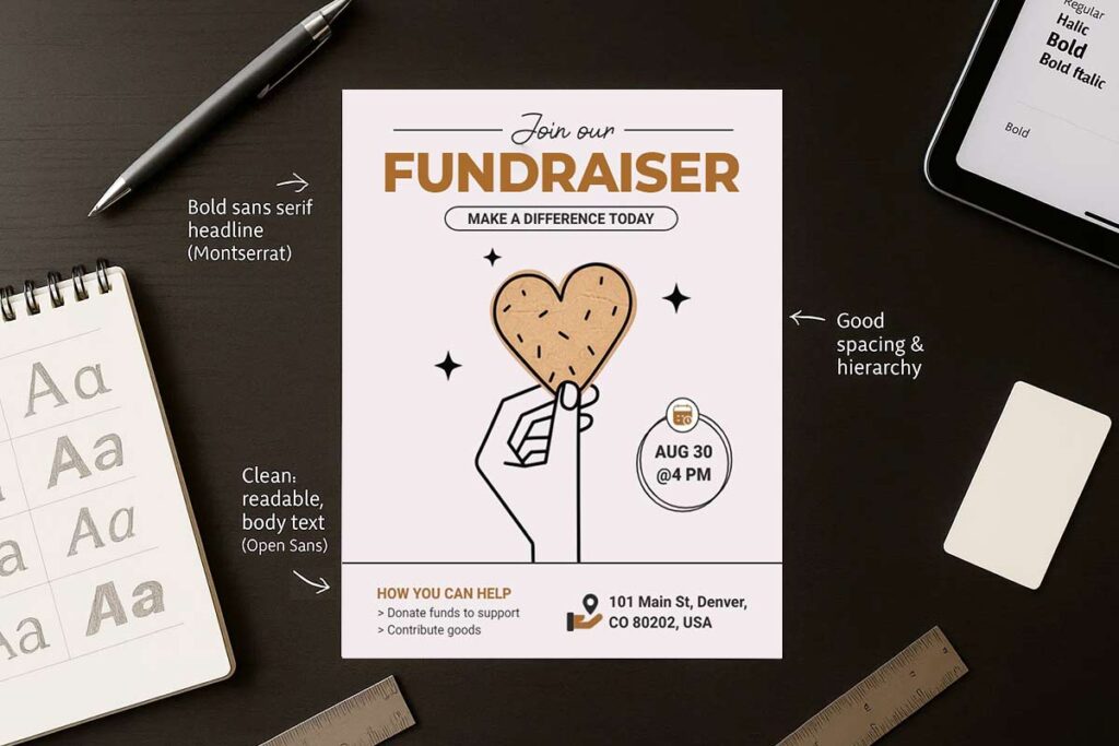
Font Choice: Sans-Serif for Maximum Clarity
Sans-serif fonts like Arial, Helvetica, and Roboto provide superior readability for flyers. These fonts eliminate decorative strokes that can blur at small sizes or when printed on lower-quality paper. AI flyer maker tools automatically suggest appropriate fonts based on your content type and target audience.
Script and decorative fonts should be reserved for headlines only, never body text. A real estate flyer using Roboto for property descriptions and contact information ensures potential buyers can quickly scan essential details. The clean lines of sans-serif fonts maintain legibility whether viewed on mobile devices or printed as handouts.
Font Size: 14pt Minimum for Body Text
Effective flyer typography requires specific size standards:
- Body text: 14-point minimum, 16-point ideal for broader accessibility
- Headlines: 24-point minimum for clear visual hierarchy
- Primary headlines: 32-point for maximum impact
- Subheadings: 18-point for content organization
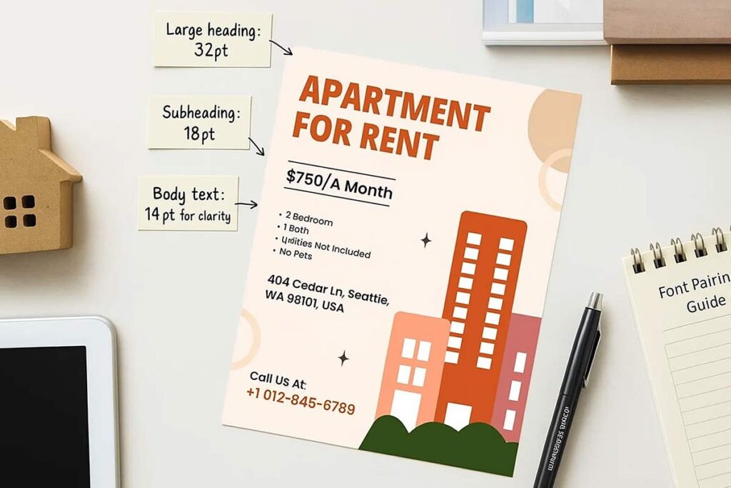
AI flyer generator automatically calculate optimal font sizes based on content hierarchy. A restaurant menu flyer might use 32pt for the restaurant name, 18pt for food categories, and 14pt for descriptions and prices.
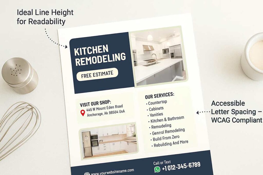
Line Spacing: 1.5x for Comfortable Reading
Proper line spacing (leading) significantly impacts readability. Set line height to 1.5 times the font size for optimal reading flow. This spacing prevents text from appearing crowded while maintaining efficient use of space on your flyer.
Dense text blocks with insufficient line spacing create visual barriers that discourage reading. a comprehensive guides demonstrate how proper spacing improves information retention. A babysitting service flyer with well-spaced contact information and service descriptions appears more professional and approachable.
Letter Spacing: Subtle Adjustments for Clarity
Letter spacing (tracking) guidelines:
- Body text: Keep close to default settings
- Headlines: Slight increases improve readability, especially with condensed fonts
- Bold text: May benefit from slightly increased spacing to prevent character crowding
- Avoid: Excessive spacing that creates awkward gaps
AI flyer design tools automatically adjust tracking based on font choice and text size. Marketing materials for professional services maintain credibility through consistent, appropriate letter spacing.
Color Contrast: 4.5:1 Minimum Ratio
Text contrast requirements for accessibility:
- Normal text: 4.5:1 minimum ratio
- Large text: 3:1 minimum ratio
- Best practice: Dark text on light backgrounds
- Avoid: Color combinations that strain eyes or disappear in black and white printing
High contrast ensures your flyer remains readable across different printing conditions and viewing environments. A fitness center flyer using black text on white backgrounds with accent colors for headings maintains professionalism while highlighting key information effectively.
Hierarchy Through Size and Weight
Create clear information hierarchy using these techniques:
- Primary information: Largest, boldest treatment
- Secondary details: Medium size, semi-bold weight
- Supporting information: Smaller, regular weight
- Contact details: Bold for emphasis, appropriate size for scanning
Bold fonts draw attention to important elements like prices, dates, or contact information. Regular weight fonts work best for descriptions and longer text blocks. showcase effective hierarchy in various business contexts.
Alignment: Left-Aligned for Easy Scanning
Text alignment best practices:
- Left-aligned: Most readable format for body text and lists
- Centered: Appropriate for headlines and titles only
- Right-aligned: Use sparingly for design elements
- Justified: Avoid in narrow columns typical of flyer layouts
Left-aligned text provides consistent left margins that guide the eye naturally down the page. Consistent left alignment throughout your flyer creates professional appearance while maximizing readability.
These typography elements work together to create flyers that communicate clearly and effectively. Proper implementation ensures your message reaches its intended audience regardless of viewing conditions or reader capabilities.
How Does an AI Flyer Generator Improve Readable Typography?
AI flyer generator transforms typography accessibility by automating font selection, size optimization, and spacing adjustments to meet WCAG standards. These tools analyze text hierarchy, ensure proper contrast ratios, and suggest sans-serif fonts for maximum readability across all audiences, including those with visual impairments. By streamlining typography decisions, AI flyer maker platforms enable non-designers to create a flyer that is both professional and accessible that comply with accessibility guidelines while maintaining visual appeal.
Automating Accessible Font Style and Size
AI flyer generator platforms prioritize accessibility by automatically suggesting sans-serif fonts like Roboto, Arial, and Open Sans for optimal readability. These tools analyze content hierarchy and recommend minimum 16px body text to meet WCAG 1.4.3 standards for visual accessibility. The system evaluates font legibility across different demographics, ensuring elderly readers and those with visual impairments can easily consume flyer content.
Smart algorithms assess context and purpose to recommend appropriate font sizes. Headlines receive 24-36px sizing for impact, while body text maintains 16-18px for comfortable reading. The AI flyer maker continuously monitors contrast ratios between text and background colors, automatically adjusting font weight when needed to maintain 4.5:1 contrast requirements.
For international audiences, these platforms support non-Latin scripts including Arabic (Amiri font), Hindi (Noto Serif Hindi), and Cyrillic characters. This ensures global accessibility without compromising readability standards.
Optimizing Letter Spacing and Line Height
Typography spacing significantly impacts readability, and AI flyer generator tools excel at optimizing these elements automatically. The system sets letter spacing (tracking) to 0.04em or greater, following WCAG 1.4.12 guidelines for enhanced character recognition. This prevents text from appearing cramped or difficult to distinguish, particularly important for users with dyslexia or visual processing difficulties.
Line height optimization follows the 1.5x font size rule, creating comfortable reading flow. A 16px body text receives 24px line height, ensuring adequate white space between lines. This spacing prevents text overlap and reduces eye strain during extended reading sessions.
The AI continuously analyzes text density and adjusts spacing based on content length and flyer format. Short promotional text receives tighter spacing for impact, while longer descriptions maintain generous spacing for accessibility. Real-time previews allow users to see spacing adjustments instantly across different devices and print formats.
Adjusting Font Weight and Text Alignment
Font weight selection directly influences readability, and AI flyer maker platforms recommend medium-to-bold weights for enhanced visibility. Light or ultra-thin fonts are automatically flagged as accessibility concerns, with the system suggesting alternatives like Roboto Medium or Open Sans Semibold for better contrast against backgrounds.
Text alignment follows accessibility best practices, with AI systems favoring left-aligned or justified text over centered alignment for longer content blocks. Centered text works for headlines but reduces readability for body paragraphs, particularly for users with reading difficulties or those using screen readers.
The platform creates semantic hierarchy through consistent font weight application. Primary headlines use bold weights, secondary headings use medium weights, and body text maintains regular weight for clear information structure. This systematic approach helps screen readers navigate content effectively while maintaining visual appeal.
Real-Time Accessibility Feedback
Advanced AI flyer generator platforms provide instant accessibility auditing during the design process. The system continuously monitors typography choices against WCAG 2.1 guidelines, alerting users when font sizes fall below 16px or contrast ratios drop below required thresholds.
Built-in simulation tools allow designers to preview flyers through different accessibility lenses, including colorblind vision and low-vision conditions. This real-time feedback prevents accessibility issues before final production, ensuring compliance without requiring specialized knowledge.
The AI generates detailed accessibility reports, highlighting specific typography improvements and providing alternative suggestions. Users receive actionable recommendations like “Increase body text from 14px to 16px for WCAG compliance” or “Switch to Roboto for better screen reader compatibility.”
Template Integration and Customization
AI flyer maker platforms seamlessly integrate accessibility features into professionally designed flyer templates, ensuring readability and compliance from the start. Each template undergoes accessibility validation, ensuring font choices, sizing, and spacing meet universal design standards from the start. Users can customize colors and content while maintaining accessibility compliance through automated constraints.
The system provides accessibility-focused template categories, featuring high-contrast designs and readable typography specifically for audiences with visual impairments. These templates balance professional appearance with maximum accessibility, proving that inclusive design enhances rather than limits creative possibilities.
Smart customization prevents accessibility violations by restricting font size reductions below recommended minimums and maintaining proper contrast ratios during color changes. This protective approach ensures final flyers remain accessible regardless of user modifications.
Read more: How to Save Hours on Graphic Design with AI Flyer Maker
What Features Help AI Flyer Generator Create Clear and Readable Text?
AI flyer generator creates clear and readable text through automated typography optimization, intelligent font selection, and accessibility-compliant spacing adjustments. These tools analyze content requirements and automatically apply WCAG standards for font size, contrast ratios, and letter spacing to ensure maximum readability across all audiences. With built-in accessibility features and real-time preview capabilities, AI flyer generator eliminate guesswork in typography design, producing professional flyers that meet both aesthetic and readability standards for diverse marketing campaigns.
Smart Font Selection and Pairing
AI flyer generator automatically select fonts based on content type and target audience. The system prioritizes sans-serif fonts like Roboto, Open Sans, and Helvetica for body text, ensuring optimal readability across digital and print formats. For headlines, the AI suggests complementary font pairings that maintain visual hierarchy while preserving accessibility standards.
The technology analyzes flyer context to recommend appropriate fonts. Business flyers receive professional fonts like Arial or Calibri, while event promotions may use bolder options like Montserrat or Poppins. The AI ensures font combinations create clear contrast between headings and body text, preventing visual confusion that reduces readability.
Automated Size and Spacing Optimization
Text sizing becomes effortless through AI-driven calculations that adjust font sizes based on content hierarchy and viewing distance. The system automatically applies minimum 16px font sizes for body text to meet WCAG 2.1 accessibility requirements, while scaling headlines proportionally for optimal visual impact.
Letter spacing (tracking) receives automated optimization with the AI setting spacing at 0.04em or greater to improve character recognition. Line height adjustments follow the 1.5x font size rule, ensuring comfortable reading flow without cramped or overly loose text blocks. These spacing calculations adapt automatically when users modify font sizes or switch between template layouts.
Real-Time Accessibility Validation
Built-in accessibility checkers continuously monitor typography choices against WCAG standards. The AI evaluates color contrast ratios, ensuring text maintains at least 4.5:1 contrast against background colors for standard text and 3:1 for large text. Real-time feedback alerts users to accessibility violations before finalizing designs.
The system includes readability testing that simulates various vision conditions, including colorblindness and low vision scenarios. Users receive immediate suggestions for improving text clarity, such as increasing font weight or adjusting background colors to enhance contrast.
Intelligent Layout and Alignment
AI flyer generator optimize text alignment based on content type and reading patterns. The system defaults to left-aligned text for body content, as this alignment provides the most comfortable reading experience and supports screen reader compatibility. Centered text is reserved for headlines and short phrases where visual impact outweighs reading efficiency.
The AI manages text density by automatically adjusting paragraph spacing and margin widths. Dense content receives additional white space to prevent visual overwhelm, while sparse content gets tighter spacing to maintain design cohesion. This intelligent spacing creates natural reading rhythm without manual adjustment.
Template-Specific Typography Optimization
Different flyer templates receive customized typography treatments based on their intended use. Business flyers emphasize professional fonts and conservative spacing, while promotional materials allow for more dynamic typography with attention-grabbing headlines and varied font weights.
The AI considers template dimensions when optimizing text size and spacing. Smaller format flyers automatically receive adjusted font sizes and tighter spacing to maintain readability within space constraints. Larger templates accommodate more generous spacing and font sizes for enhanced visual impact.
Dynamic Content Adaptation
AI systems automatically adjust typography as users modify content length or add new text elements. When content extends beyond optimal reading length, the AI suggests paragraph breaks or bullet points to improve scanability. Font sizes scale proportionally when users add or remove content sections.
The technology recognizes content types and applies appropriate formatting. Contact information receives consistent formatting, while promotional text gets emphasis through strategic font weight changes. This adaptive approach ensures typography remains optimized regardless of content modifications.
Multi-Language Typography Support
Advanced AI flyer generator accommodate multiple languages and scripts, automatically selecting appropriate fonts for non-Latin characters. The system adjusts spacing and sizing for languages with different reading patterns, ensuring consistent readability across diverse audiences.
These intelligent typography features transform flyer creation from a manual design process into an automated optimization system, ensuring every flyer achieves professional readability standards while maintaining visual appeal and accessibility compliance.
Read more: How to Design an Effective Flyer Using AI: A Step-by-Step Guide
What Are the Best Typography Practices for Creating AI Flyers Everyone Can Read?
Creating accessible typography with an AI flyer generator requires following WCAG standards while maintaining visual impact. Modern AI flyer makers automatically optimize font selection, sizing, and spacing to ensure readability across all audiences, including those with visual impairments. These tools analyze contrast ratios, recommend appropriate font weights, and adjust letter spacing to meet accessibility guidelines. By prioritizing sans-serif fonts, adequate sizing, and proper spacing, AI-generated flyers achieve both professional appearance and universal readability for marketing campaigns.
Font Selection for Maximum Readability
Prioritize Sans-Serif Fonts Sans-serif fonts like Roboto, Helvetica, and Arial provide superior readability for diverse audiences. These fonts eliminate decorative elements that can confuse readers with dyslexia or visual processing difficulties. AI flyer generator automatically suggest these fonts for body text while reserving serif fonts for specific design accents only.
Avoid decorative and script fonts decorative fonts significantly reduce readability, particularly for users with cognitive disabilities or low vision. Limit ornate fonts to logos or single-word headlines. AI systems recognize this limitation and recommend simplified alternatives that maintain brand personality without sacrificing accessibility.
Support multiple languages For international audiences, ensure font selection includes proper Unicode support. Fonts like Noto Sans provide comprehensive language coverage, allowing consistent readability across different scripts and character sets.
Optimal Font Sizing and Hierarchy
Minimum Size Requirements Body text should never fall below 16px for digital formats or 12pt for print materials. WCAG 2.1 guidelines recommend this minimum to ensure readability without assistive technology. AI flyer generator automatically enforce these minimums while allowing larger sizes for improved accessibility.
Establish Clear Hierarchy Headlines should be at least 1.5 times larger than body text, with subheadings falling between these sizes. This creates visual hierarchy that guides readers through content logically. Consistent sizing helps users with cognitive disabilities navigate information more effectively.
Scale for Different Media Digital flyers require different sizing than print versions. AI tools automatically adjust font sizes based on output format, ensuring optimal readability whether viewed on mobile devices, desktop screens, or printed materials.
Strategic Spacing and Alignment
Letter Spacing Optimization Proper letter spacing (tracking) improves readability significantly. WCAG 1.4.12 recommends spacing of at least 0.12 times the font size. AI flyer makers automatically calculate optimal tracking based on font choice and size, preventing cramped or overly loose text.
Line Height Standards Line height should be minimum 1.5 times the font size for body text. This spacing helps readers with dyslexia follow text lines without losing their place. AI systems automatically apply appropriate line spacing based on font selection and content length.
Alignment Best Practices Left-aligned text provides the most accessible reading experience. Justified text can create uneven spacing that disrupts reading flow. Centered text should be limited to headlines only, never extended passages.
Font Weight and Contrast Considerations
Appropriate Weight Selection Medium to bold font weights improve visibility without appearing overwhelming. According to Johns Hopkins University’s typography guidelines, professional materials should use consistent, legible fonts across platforms to support both accessibility and brand clarity (JHU, 2024)1, Ultra-light fonts create accessibility barriers, particularly for users with visual impairments. AI flyer generator recommend weights that balance visual appeal with readability requirements.
Contrast Ratio Compliance Maintain minimum 4.5:1 contrast ratio between text and background colors. AI tools automatically check contrast ratios and suggest adjustments to meet WCAG standards. This ensures readability across different lighting conditions and device displays.
Test Across Devices Font rendering varies across devices and browsers. AI flyer generator preview designs across multiple platforms, ensuring consistent readability regardless of how users access the content.
Implementation and Testing
Accessibility Validation Use built-in accessibility checkers to verify typography meets WCAG standards. AI tools provide real-time feedback on font choices, sizing, and spacing decisions. Regular validation ensures compliance throughout the design process.
User Testing Integration Gather feedback from diverse user groups, including those with visual impairments. AI flyer generator can simulate various visual conditions to test readability before final production.
Iterative Improvements Typography accessibility is an ongoing process. AI systems learn from user interactions and feedback, continuously improving font recommendations and accessibility features.
Read more: Where and How to Distribute AI Generated Flyers for Maximum Reach
What Fonts Work Best for Different Businesses and Events?
An AI flyer generator intelligently recommends fonts by analyzing the flyer’s purpose, audience, and accessibility requirements. From corporate promotions to festive events, typography sets the tone and influences how your message is received. Here’s how AI optimizes font choices across industries and event types for maximum impact and inclusivity.
Fonts for Different Types of Businesses
An AI flyer generator selects fonts based on business type and target audience, ensuring both professionalism and readability. Corporate businesses require clean, trustworthy fonts like Roboto or Helvetica, while creative industries can use more expressive typography like Montserrat or Poppins. Healthcare and wellness businesses benefit from calming fonts such as Open Sans or Lato that convey reliability and approachability.
Corporate & Professional Services
Financial firms, law offices, and consulting companies need fonts that establish credibility. Sans-serif fonts like Helvetica, Arial, or Roboto project professionalism while maintaining excellent readability. According to Northwestern University’s brand typography guide, sans-serif fonts like Helvetica and Open Sans improve readability and should be prioritized in both digital and print designs to meet accessibility standards2. These fonts work well for business proposals, corporate announcements, and professional event invitations. The AI flyer generator automatically adjusts font weights to ensure proper hierarchy – bold for headlines, regular for body text.
Retail & Local Businesses
Restaurants, boutiques, and local services benefit from approachable fonts that feel welcoming. Poppins, Montserrat, and Nunito create friendly, modern impressions perfect for promotional flyers. These fonts balance personality with professionalism, making them ideal for sales announcements, grand openings, and seasonal promotions. The AI flyer maker ensures consistent spacing and sizing across different flyer formats.
Healthcare & Wellness
Medical practices, fitness centers, and wellness businesses require fonts that convey trust and calm. Open Sans, Lato, and Source Sans Pro offer clean, humanistic qualities that patients find reassuring. These fonts work exceptionally well for health advisories, appointment reminders, and wellness program announcements.
Creative & Entertainment
Design studios, event planners, and entertainment venues can use more expressive fonts while maintaining readability. Bebas Neue for headlines paired with Roboto for body text creates dynamic contrast. The AI flyer generator balances creative expression with accessibility standards.
Fonts for Different Types of Event
AI flyer generator revolutionizes font selection by automatically matching typography to event requirements and audience expectations. These tools analyze event characteristics, target demographics, and accessibility standards to recommend optimal font combinations that enhance readability while maintaining visual appeal. By understanding font psychology and practical application, AI flyer maker systems ensure every design communicates effectively across different event contexts.
Corporate Events and Business Functions
Professional events demand fonts that convey trust and authority. Sans-serif fonts like Roboto, Open Sans, and Helvetica establish credibility while maintaining excellent readability. For corporate seminars, training workshops, and business conferences, these fonts project competence without sacrificing accessibility. According to a 2024 literature review on experimental typography in visual design, typography directly influences how users interpret, trust, and engage with content, making it a critical design component (ResearchGate, 2024).3 AI flyer generator automatically selects these fonts for business contexts, ensuring 16px+ body text meets WCAG standards. The clean, neutral appearance supports professional branding while enabling easy reading across all age groups.
Celebrations and Social Gatherings
Birthday parties, anniversaries, and casual celebrations benefit from more expressive typography. Poppins and Montserrat offer friendly, approachable aesthetics perfect for social events. These fonts balance personality with readability, supporting both festive headlines and essential event details. For children’s parties, AI systems might suggest Quicksand or Nunito for their rounded, playful characteristics while maintaining accessibility compliance.
Cultural and Religious Events
Community gatherings require culturally appropriate fonts that respect traditions while ensuring inclusivity. Amiri serves Arabic events beautifully, while Noto Serif Hindi supports South Asian celebrations. AI flyer maker tools automatically detect language requirements and suggest appropriate fonts that maintain cultural authenticity without compromising readability. These systems ensure proper Unicode support and bidirectional text handling for multilingual communities.
Seasonal and Holiday Events
Holiday promotions and seasonal celebrations demand fonts that capture festive spirit while supporting marketing goals. Playfair Display works excellently for elegant holiday events, while Alegreya suits spring celebrations. AI tools balance decorative elements with practical readability, often pairing display fonts for headlines with accessible body fonts like Lato or Source Sans Pro.
Educational and Nonprofit Events
School functions, workshops, and charity events benefit from fonts that inspire trust and learning. PT Sans and Source Sans Pro create educational environments that feel structured yet welcoming. These fonts support long-form content while maintaining clarity for diverse audiences, including elderly participants and those with visual impairments.
AI flyer generator systems excel at matching fonts to event contexts by analyzing event type, audience demographics, and accessibility requirements. This intelligent selection process ensures every flyer communicates effectively while meeting professional design standards and inclusive accessibility guidelines.
How AI Flyer Generator Matches Fonts to Industry and Purpose
AI flyer generator analyzes business type, target audience, and flyer purpose to automatically suggest appropriate fonts that balance professionalism with readability. These tools evaluate industry standards, brand identity requirements, and accessibility guidelines to match typography with specific business needs. By processing design patterns and user preferences, AI systems recommend fonts that enhance credibility while ensuring maximum readability across different demographics and use cases.
Industry-Specific Font Selection
Corporate and Professional Services AI flyer maker suggests clean sans-serif fonts like Roboto, Open Sans, or Helvetica for consulting firms, law offices, and financial services. These fonts establish trust and professionalism while maintaining excellent readability across print and digital formats.
Healthcare and Wellness For medical practices, fitness centers, and wellness businesses, AI systems recommend humanist fonts like Ubuntu, Raleway, or Noto Sans. These typefaces convey approachability and calm reliability essential for healthcare marketing materials.
Retail and Hospitality Restaurant flyers and retail promotions benefit from modern, stylish fonts like Montserrat, Poppins, or Lato. AI flyer generator balances visual appeal with practical readability for customer-facing promotional content.
Education and Nonprofits Educational institutions and charitable organizations receive recommendations for structured, accessible fonts like PT Sans or Source Sans Pro. These choices support clarity and inclusivity across diverse age groups and reading abilities.
Purpose-Driven Typography Matching
Event Promotions Festival and party flyers can use attention-grabbing headline fonts like Bebas Neue paired with readable body text in Roboto. AI tools ensure decorative elements don’t compromise essential information legibility.
Business Announcements Corporate communications require conservative font choices that reflect organizational values. AI systems suggest professional serif options like Playfair Display for formal announcements while maintaining accessibility standards.
Seasonal Marketing Holiday promotions and seasonal campaigns benefit from fonts that match the celebratory mood. AI flyer generator recommends elegant serif fonts for upscale seasonal marketing while ensuring practical readability.
Accessibility and Compliance Integration
AI systems automatically check font selections against WCAG guidelines, ensuring minimum 16px body text sizes and appropriate contrast ratios. They prioritize sans-serif fonts for users with visual impairments while maintaining brand consistency.
The technology evaluates letter spacing, line height, and font weight to optimize readability across different age groups and accessibility needs. This systematic approach ensures produce professional results that serve diverse audiences effectively.
By combining industry expertise with accessibility requirements, AI flyer generator creates typography solutions that enhance both visual appeal and functional communication across all business contexts.
Read more: How to Get Started with the ChatGPT DesignWiz AI Flyer Maker Plugin
How Can Clear Typography Be Integrated into Your Marketing Campaigns?
Clear typography transforms marketing campaigns by ensuring readability across all touchpoints while maintaining brand consistency. AI flyer generator tools streamline this integration by automatically optimizing font styles, sizes, and spacing for maximum impact. These platforms enable marketers to create accessible, professional materials that resonate with diverse audiences while supporting campaign objectives through data-driven typography choices.
Aligning Typography with Campaign Goals
Marketing campaigns succeed when typography supports strategic objectives. Start by defining your target audience’s reading preferences and accessibility needs, campaigns using consistent typography see 23% higher engagement rates.
AI flyer maker tools analyze campaign context to suggest appropriate font combinations. For professional services, they recommend clean sans-serif fonts like Roboto or Open Sans. Retail campaigns benefit from approachable fonts like Montserrat or Poppins that convey friendliness while maintaining readability.
Match font weight and style to campaign tone. Bold typography creates urgency for limited-time offers, while lighter weights suit informational content. Ensure minimum 16px font sizes for body text to meet accessibility standards across all campaign materials.
Creating Consistent Cross-Channel Typography
Maintain typography consistency across email marketing, social media, print materials, and digital ads. AI flyer generator platforms provide brand kits that automatically apply consistent font styles, sizes, and spacing rules across all campaign materials.
Establish typography hierarchies that guide reader attention. Use larger, bolder fonts for headlines, medium weights for subheadings, and regular weights for body text. This creates visual flow that supports campaign messaging while improving comprehension rates.
Test typography performance across channels. What works for print flyers may need adjustment for social media graphics or email headers. AI tools provide channel-specific recommendations based on platform requirements and audience behavior patterns.
Optimizing Typography for Different Audiences
Adapt typography choices to audience demographics and preferences. campaigns targeting older demographics show 31% better response rates when using larger font sizes and higher contrast ratios.
For international campaigns, AI flyer maker tools support non-Latin scripts while maintaining readability standards. They automatically adjust spacing and alignment for languages with different reading patterns, ensuring global campaign effectiveness.
Consider accessibility requirements from the outset. Use sufficient color contrast (4.5:1 ratio minimum), avoid decorative fonts for important information, and ensure typography works with screen readers. This expands your campaign reach while demonstrating brand inclusivity.
Measuring Typography Impact
Track typography performance through A/B testing different font combinations, sizes, and layouts. Monitor metrics like engagement rates, click-through rates, and conversion rates to identify optimal typography choices for your audience.
AI flyer generator analytics provide insights into which typography elements drive better campaign performance. Use this data to refine future campaigns and build typography guidelines that consistently deliver results.
Document successful typography combinations for campaign templates. This creates a typography library that maintains consistency while enabling quick deployment of new marketing materials across all channels.
Read more:- Why Marketers Are Switching to AI Flyer Generator for Promotions
People Also Ask Questions
It selects fonts based on flyer category, tone, and audience type. For example, modern sans-serifs may be used for tech flyers, while more playful fonts are reserved for kids’ or event flyers.
Yes. You can manually adjust fonts, sizes, and weights. If any change affects readability or layout integrity, the system provides a visual warning.
Sans-serif fonts like Arial, Roboto, and Open Sans are typically easier to read, especially in smaller sizes or dense text areas.
Yes, but only in moderation. The generator usually limits decorative fonts to headlines or small highlighted sections to avoid readability issues.
Yes. It uses larger font sizes and higher contrast for flyers targeting older audiences, ensuring better visibility and ease of reading.
Left alignment is preferred for body text because it improves readability. The generator uses centered text sparingly—for headlines or short phrases—to draw attention.
Bold and italic formatting is used selectively to highlight key phrases or sections. The AI applies these styles automatically where emphasis is needed without overwhelming the design.
It calculates font scaling, line spacing, and text block alignment to ensure visual balance. If content density disrupts that balance, adjustments are made to preserve structure.
If your content exceeds the design space, the AI reduces the font size slightly to fit. However, it maintains minimum readability standards and notifies you if edits are needed.
FAQS
It follows modern accessibility guidelines by setting minimum font sizes, line heights, and text contrast. Body text is never smaller than 16px, spacing is optimized to 1.5x the font size, and colors meet WCAG 2.1 contrast ratios to improve legibility for all audiences.
The generator adjusts font size, spacing, and layout automatically. It may suggest splitting content into sections or replacing full sentences with bulleted lists to maintain balance and avoid overcrowded designs.
Yes. Font weight, size, and spacing are adapted based on how the flyer will be viewed. Print flyers use bolder fonts and slightly larger sizes for readability at a distance, while digital flyers are optimized for screen clarity.
It assigns distinct sizes and styles for headings, subheadings, and body text to establish a clear reading flow. Larger fonts signal importance, while consistent formatting ensures a clean, organized structure.
Yes. It automatically adjusts text or background color if the contrast drops below accessibility thresholds, helping ensure that all text remains readable regardless of the design or theme.
Yes. The platform includes real-time previews for desktop, mobile, and print formats. This helps you visualize typography adjustments before downloading or sharing your flyer.
Fonts like Roboto, Lato, and Open Sans are commonly recommended due to their clean design, wide language support, and excellent readability in both digital and print materials.
It uses built-in checks to flag low-contrast text, small fonts, or poor line spacing. Suggestions are offered in real time to help you maintain a flyer that meets readability and accessibility guidelines.
Conclusion and Implementation Strategy
AI flyer generator platforms are transforming typography accessibility by turning complex design requirements into automated, user-friendly features. With smart font pairing, contrast checks, and spacing recommendations, these tools ensure every flyer meets accessibility standards without sacrificing visual appeal.
Typography Implementation
Planning Essentials:
- Choose an AI flyer generator with built-in accessibility features
- Ensure typography follows WCAG standards like 1.4.3 (contrast) and 1.4.12 (spacing)
- Use AI suggestions for sans-serif fonts, minimum 16px size, and proper spacing
- Customize typography to maintain brand consistency and readability
Optimization Strategy:
- Start with accessibility-focused templates for faster compliance
- Integrate contrast ratio and font validation into your workflow
- Enable screen-reader compatibility and test across devices
- Monitor user engagement and continuously refine typography settings
By adopting an AI flyer generator, businesses simplify the process of creating accessible designs, reduce revision cycles, and improve audience reach. Accessible typography not only meets legal standards but also enhances brand trust and user experience across all platforms.
Reference:
- Typography – Visual Identity Guidelines.– Johns Hopkins University.
- Fonts & Typography – Visual Identity. – Northwestern University.
- Experimental Typography in Visual Design: A Systematic Literature Review. (2024). – Almuhaimeed, F. & Mahmoud, A.