After working on restaurant menus, I’ve realized that creating one is often much harder than people expect. Most restaurant owners know exactly what they want to serve, but turning that list into a menu that’s easy to read, visually appealing, and profitable is where many get stuck.
A menu does much more than display dishes. The way it’s organized influences what customers notice first, how quickly they decide, and which items they order. That’s why successful restaurants put just as much thought into menu structure as they do into the food itself.
In this guide, I’ll walk you through the same process I use when creating menus using DesignWiz Menu Maker – from choosing the right layout and organizing categories to writing clear descriptions and designing a menu that looks professional without needing advanced design skills.
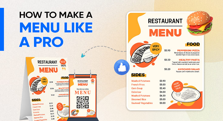
Step-by-Step Guide to Make a Menu Like a Pro
To make a restaurant menu, follow these 7 steps: define your audience, list and categorize your items, choose the right format, apply visual hierarchy, write selling descriptions, structure pricing smartly, and design using a tool like DesignWiz. Most people skip straight to design before the content is ready — that is the number one reason menus end up cluttered, confusing, and unprofessional.
Define Your Audience and Purpose
The first step to making a menu is defining who it is for and what it needs to achieve. A fine dining guest reads a menu very differently from someone ordering at a fast-casual counter — your audience determines your tone, language, and layout before a single design decision is made.
Answer these three questions before opening any design tool, including DesignWiz:
| Question | Why It Matters |
|---|---|
| Who is your target customer? | Shapes tone, language, and item presentation |
| What is your restaurant’s personality? | Guides font, color, and layout choices |
| How will the menu be used? | Determines format: print, digital, or display |
Once you have clear answers, write down your top 3 menu goals — for example: speed up ordering, highlight your best-selling dishes, or increase average order value. Every design and copy decision in DesignWiz should point back to these goals.
List and Categorize Your Items
Before designing anything in DesignWiz, write out your complete item list — every dish, drink, and special. Then group them into clear categories that customers can scan without thinking. The goal is zero confusion about where to look.
Limit each category to 6–8 items. More than 8 options per section triggers decision fatigue, which lowers the chance customers order at all.
| Category | What Goes Here | Ideal Count |
|---|---|---|
| Starters / Appetizers | Small plates, soups, salads | 4–6 items |
| Mains / Entrées | Core dishes, signature meals | 6–8 items |
| Sides | Add-ons, accompaniments | 3–5 items |
| Desserts | Sweet dishes, pastries | 4–6 items |
| Drinks / Beverages | Hot, cold, alcoholic, non-alcoholic | 6–10 items |
| Chef’s Specials | Seasonal, limited, high-margin | 2–4 items |
When you add your items into DesignWiz, use these category names exactly as shown. Simple, familiar labels reduce reading time and keep customers focused on ordering, not navigating.
Choose the Right Menu Format
The right menu format depends on your restaurant type and how customers interact with the menu. DesignWiz offers ready-to-use templates for all major formats — pick the one that matches your service style, not just the one that looks good.
| Format | Best For | Key Advantage |
|---|---|---|
| Single-Page Menu | Cafés, food trucks, minimal concepts | Fast to read, easy to update |
| Bi-Fold Menu | Mid-size restaurants with varied offerings | Clean section separation |
| Tri-Fold Menu | Larger menus, multiple categories | Compact yet detailed |
| Digital / QR Menu | Modern restaurants, fast-casual | Instant updates, no reprinting |
| Chalkboard Menu | Bakeries, coffee shops, daily specials | Visual charm, personal feel |
If you are making your first menu with DesignWiz, start with a single-page or bi-fold template. These formats force you to keep content focused, which leads to a better customer experience and a faster design process.
Apply Visual Hierarchy to Your Layout
Visual hierarchy means arranging your menu so customers’ eyes land on the most important items first. This is where most DIY menus fail — without hierarchy, every item competes equally for attention, and high-margin dishes get ignored.
DesignWiz templates are built with these layout principles already applied. Here is what each one does:
- The Golden Triangle Rule: Customers naturally look top-right first, then top-left, then bottom center. Place your highest-margin items in these three zones. DesignWiz highlights these zones during layout so you always know where to put your best items.
- The Anchor Pricing Technique: Place one premium-priced item at the top of each section. Every item below it automatically feels more reasonably priced by comparison, which lifts overall order value.
- Whitespace Is Not Wasted Space: Generous spacing between sections signals quality and makes a menu easier to scan. Dense, cluttered layouts feel cheap. DesignWiz enforces consistent spacing across every template.
- Column Structure: Use 1–2 columns for upscale menus and 2–3 columns for larger everyday menus. More than 3 columns creates visual noise that slows down ordering.
Write Descriptions That Sell
A strong menu description creates appetite before the food arrives. The rule is simple: use sensory words, name the cooking technique, and specify key ingredients — all in under 20 words. Vague descriptions reduce orders; specific descriptions increase them.
| ✅ Strong Description | ❌ Weak Description |
|---|---|
| Herb-marinated grilled chicken, crispy romaine, smoky chipotle aioli on toasted brioche | Grilled chicken sandwich |
| Warm dark chocolate fudge cake with a molten center, served with vanilla bean ice cream | Chocolate cake |
| Slow-cooked Bolognese with handmade tagliatelle, finished with aged Parmesan and fresh basil | Pasta |
When entering descriptions into DesignWiz, follow this formula: [Texture or Temperature] + [Cooking Method] + [Hero Ingredient] + [Accompaniment]. Keep every description under 20 words to maintain clean layout spacing across all template formats.
Structure Your Pricing Smartly
How you display prices affects what customers order. These five pricing techniques are supported by menu psychology research and are easy to apply in any DesignWiz Menu Templates:
- Remove currency symbols: Menus without ₹ or $ signs result in higher average spend because the purchase feels less transactional. DesignWiz lets you toggle currency symbols off in one click.
- Never use right-aligned price columns: A neat column of prices invites customers to scan cheapest-to-most-expensive and order accordingly. Embed prices at the end of each item description instead.
- Embed prices naturally: Placing the price directly after the description keeps the customer’s focus on the dish, not the cost. All DesignWiz templates use inline pricing by default.
- Use strategic bundles: Combo meals make total value feel higher and guide customers toward higher-margin combinations. Add combo sections easily using DesignWiz’s bundle layout blocks.
- Round numbers feel premium: For upscale restaurants, ₹850 reads as more confident and intentional than ₹849. Save charm pricing for fast-casual formats only.
Design Visually and Export with DesignWiz
With your content planned, open DesignWiz and select a professionally built menu template that matches your chosen format. Add your items, apply your brand colors and fonts, and export a print-ready PDF or shareable digital link — no advanced design skills needed.
Once you are satisfied with the layout, export directly from DesignWiz as a high-resolution PDF for print, or generate a shareable QR menu link for digital use — both available in one click from the DesignWiz export panel.
✨ Quick Summary
The key to making a menu like a pro is following a clear process: define your audience, organize your items, choose the right format, apply visual hierarchy, write strong descriptions, and structure pricing smartly to bring everything together effectively.
Menu Design Tips for Better Customer Experience
A menu that looks good is only half the job. The other half is how it actually feels to use, and that’s the part most people forget about. Whether you’re figuring out how to make a menu for the first time or refreshing an existing one, these tips make a real difference.
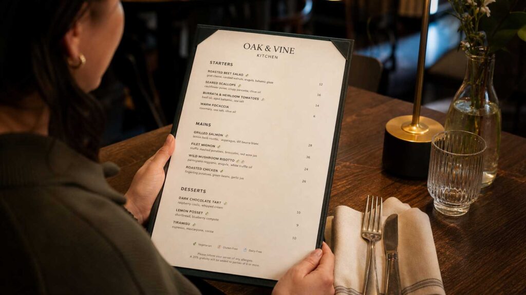
- Make your text easy to read, always: For printed menus, don’t go below 10–11pt for body text and 14–18pt for headings. Never shrink your font just to squeeze in one more item; in dim restaurant lighting, small text is genuinely frustrating. For digital menus, 14–16px body text with nice big tap targets on mobile is the sweet spot.
- Test it in your actual lighting: A menu that looks crisp and clear on your laptop screen can be a nightmare to read under warm, low restaurant lighting. Always print a test copy and check it in the real space before you finalise anything. If your restaurant is on the darker side, bump up your contrast significantly.
- Make allergen info impossible to miss: A small icon legend for common allergens takes up barely any space but makes a huge difference. Customers with dietary needs feel genuinely welcomed when they can find this information at a glance, and your staff won’t have to answer the same questions all night.
- Keep it fresh and up to date: Nothing kills professionalism faster than a menu with crossed-out dishes or handwritten price corrections. It looks rushed and careless. Updates take just a few minutes. Get into the habit of reviewing your menu every quarter.
- Go easy on the decorative stuff: One or two design accents per section add character and personality. But borders, patterns, and decorative elements everywhere? It starts looking cluttered fast. Every visual detail should either guide the eye or reinforce your brand; if it’s doing neither, cut it.
Best Practices for Professional Menu Design
These are the habits that separate a menu that looks decent from one that genuinely performs. If you want to design a menu online for free, these are the principles worth building into every template you touch.
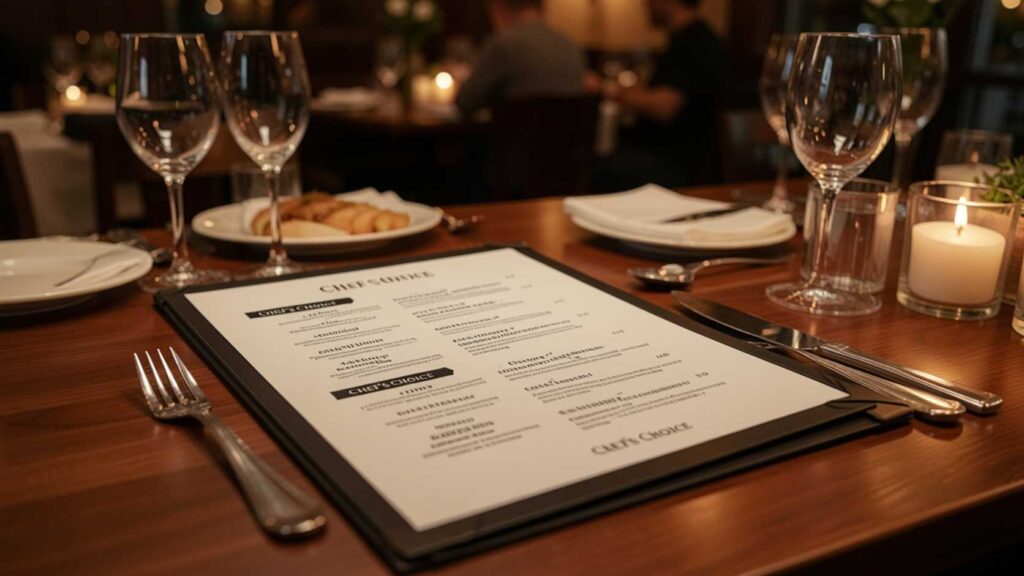
- Use menu psychology to your advantage: Your best dishes, the ones that are both popular and high-margin, deserve the best spots on the page. Pair that with subtle nudges like “Chef’s Choice” or “Most Popular” badges, and you’re guiding customers without ever feeling pushy. Descriptive, well-written language also makes dishes feel more valuable before anyone’s even tasted them.
- Stay consistent with your brand: Your menu should feel like it belongs to your restaurant. Fonts, colors, paper stock, photo style, all of it should tell the same story. When something feels off or mismatched, customers notice it even if they can’t explain why.
- Design for your format, not against it: Print and digital are completely different beasts. Print menus need CMYK color mode and images at 300 DPI minimum. Digital menus need to reflow cleanly across different screen sizes. Never just export your print PDF and call it your digital menu; the experience will suffer, and it’ll show.
- Always test before you commit: Print 2–3 test copies and hand them to a team member or a trusted regular. Ask them to actually “order” from it and watch where their eyes go first. You’ll almost always catch at least one thing worth fixing before doing a full print run.
Common Menu Design Mistakes to Avoid
Everyone makes these at first, especially when trying to create a menu quickly without a clear plan. The good news? Now you know what to watch out for.
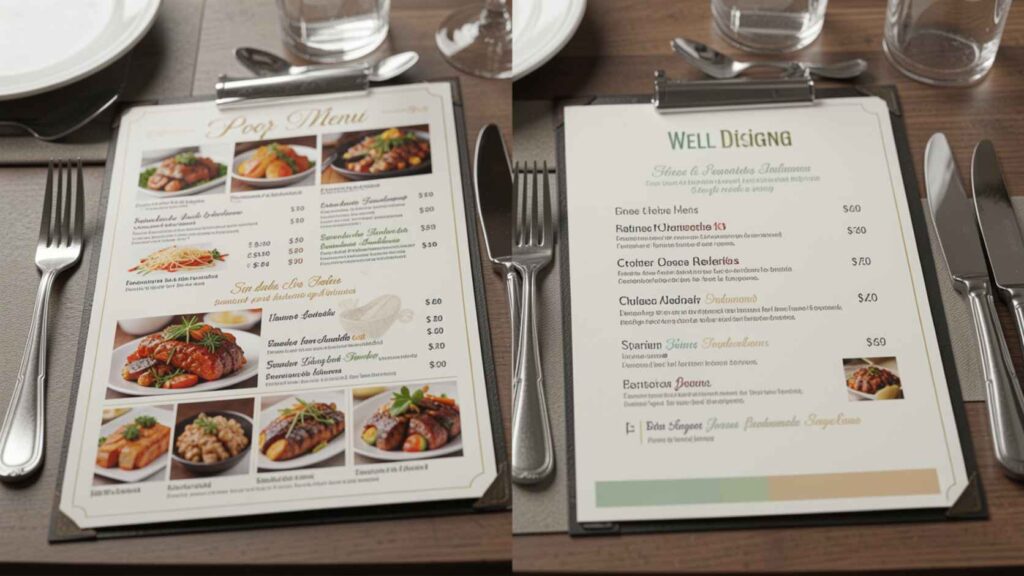
- Overcrowding the layout: Trying to fit absolutely everything onto one page creates a dense, stressful read. Simplify ruthlessly. A tight menu with 25 well-chosen items will always outperform a sprawling one with 80 average ones. Less really is more.
- Wrong font choices: Script and decorative fonts are lovely for headings. In body text or item descriptions? They’re a nightmare to read. Always check how your chosen font looks at smaller sizes before you commit; what looks beautiful at 24pt can be unreadable at 11pt.
- Inconsistent pricing: Mixing styles throughout some prices with currency symbols, some without, some right-aligned, some inline, looks unfinished and unprofessional. Pick one approach and apply it consistently from start to finish.
- Low-quality food photos: This one surprises people, but blurry or badly lit food images actually hurt your menu more than having no photos at all. If professional photography isn’t an option right now, skip the images entirely and let your descriptions do the heavy lifting instead.
- Too many colors: More than 3–4 colors on a single menu tip quickly into visual chaos. Stick to your brand palette and use it with purpose. Every color should be there for a reason.
What Your Menu Says About You (Before Anyone Orders a Thing)
Your customers are making judgments the moment your menu lands on the table. Not about the food, about you. Before they’ve read a single dish name, your menu is already telling a story. The question is whether it’s the story you want to tell.
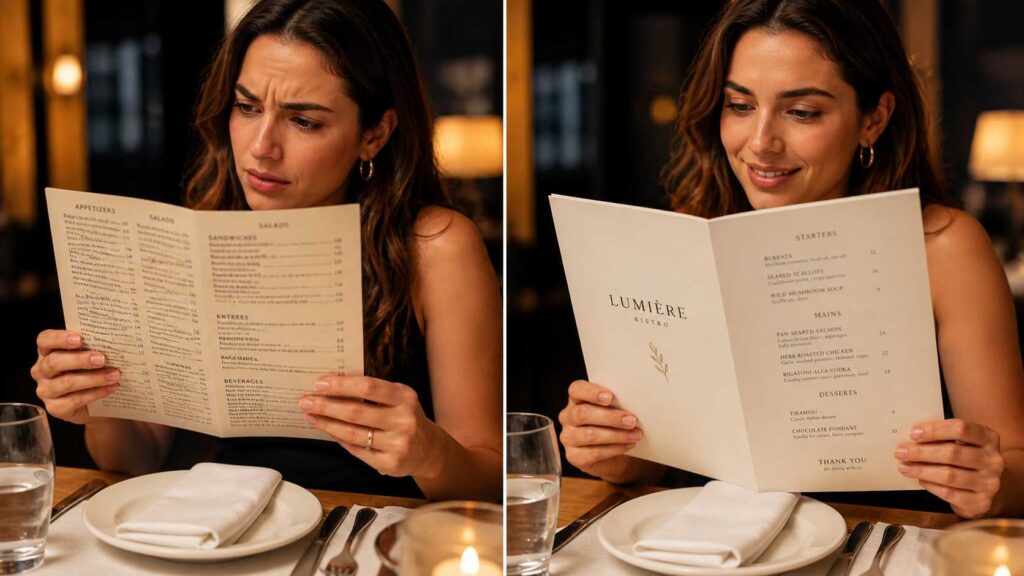
- A cluttered menu says, “We couldn’t decide either”: When everything is on the menu, nothing feels special. Customers pick up on that uncertainty without even realising it. A focused, well-edited menu signals confidence; it says you know your food, you know your strengths, and you’re not trying to be everything to everyone.
- A hard-to-read menu says “we didn’t think about you”: Tiny fonts, low contrast, cramped sections, these feel like small design choices, but customers experience them as friction. Anything that makes ordering feel like work damages the mood before the meal even starts.
- A generic-looking menu says “we’re just another option”: If your menu could belong to any restaurant on the street, it’s doing nothing for your brand. Whether you’re working with a free menu layout or a fully custom design, your fonts, colors, and tone of voice should feel like an extension of your space, consistent, considered, and unmistakably yours.
- A well-designed menu says “you’re in good hands”: When a menu is easy to navigate, beautifully laid out, and clearly written, customers relax. They trust the place. They explore more. They spend more. And they leave feeling like the whole experience was just a little bit better than expected.
Your menu isn’t just a list. It’s a first impression, a sales tool, and a reflection of how much you care, all rolled into one piece of paper or one screen. Make it say the right things.
Frequently Asked Questions
Start with a free menu layout template; this removes the hardest part of the process. Focus on clarity: readable fonts, logical categories, and a 2–3 color palette. Follow the visual hierarchy principles in this guide. Menu design for beginners becomes very manageable with the right tools and a proven structure.
A single-page or bi-fold format with clear category headings, 6–8 items per section, and a consistent font and color scheme is the best starting point. Most tools that let you design a menu online for free offer templates in these formats. Start simple, then refine.
Identify your brand colors and font style and apply them consistently throughout. Many menu design tools let you customize menu elements by inputting hex color codes and uploading custom fonts. Consistency across every element is what separates a polished menu from an amateur one.
A good menu design is clear, easy to navigate, visually consistent with your brand, and organized to guide customers toward your best items. It uses appropriate whitespace, readable typography, strong descriptions, and a menu format optimized for whether the menu is printed, digital, or wall-mounted.
Yes. You can create, edit, and share professional menus directly from your smartphone. It’s especially useful for making quick updates to pricing or item availability without needing a desktop.
Final Thoughts
Making a great menu isn’t about being a designer; it’s about understanding a few key principles and applying them with intention. Know your audience, curate your items, choose the right format, guide the eye, write descriptions that sell, price smartly, and use a good tool to bring it all together.
Follow these steps and your menu won’t just look professional, it’ll work harder for your business every single day.