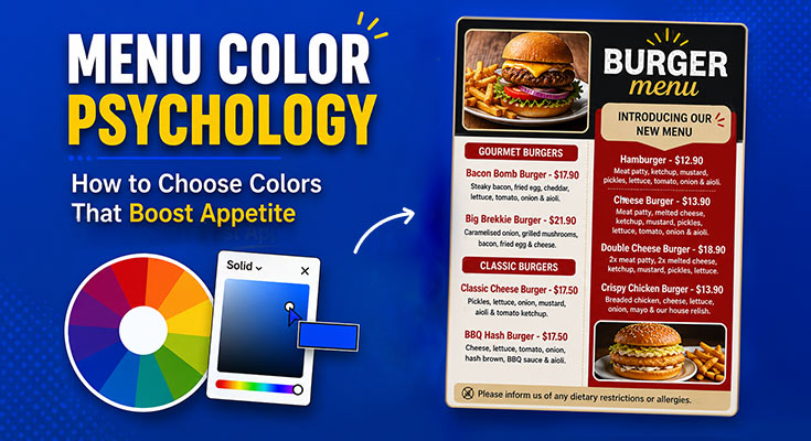
Most restaurant owners spend hours perfecting their recipes. But very few stop to think about how the colors on their menus quietly influence every order their customers place. Color is one of the most powerful and most underestimated tools in menu design. It affects how hungry customers feel, how they perceive your prices, how long they stay engaged, and which dishes catch their eye first. All of this happens before a single word is read.
If your menu isn’t performing the way you want, if customers seem confused, indifferent, or quick to default to the cheapest option, your color choices may be part of the problem. This guide breaks down menu color psychology in plain language. You’ll learn which colors stimulate appetite, which ones kill it, how to build menu color combinations that work for your brand, and the most common color mistakes that hurt sales without you realizing it.
How Menu Colors Influence Appetite and Customer Behavior
Color affects the human brain faster than words or images. Research in consumer menu color psychology consistently shows that color accounts for a significant portion of a customer’s first impression of a product or space, and menus are no different.
When a customer picks up your menu or scans a digital menu board, their brain is already processing color signals before they’ve consciously registered a single dish name. Those signals influence several things at once.
Appetite stimulation
Certain colors, particularly warm tones like red, orange, and yellow, are associated with hunger and energy. This is why so many fast food environments lean heavily on these hues. They create a sense of urgency and excitement that nudges people toward ordering quickly and often.
Perceived value
Color communicates price positioning more subtly than you might expect. Dark, muted tones like deep navy, charcoal, and burgundy signal sophistication and premium quality. Bright, high-contrast palettes feel more casual and accessible. Customers form pricing expectations based on color before they even look at the numbers.
Trust and comfort
Earth tones, greens, and soft neutrals feel grounding and natural. They build the kind of quiet confidence that makes a customer feel they’re in good hands, particularly important for health-focused, organic, or farm-to-table concepts.
Attention and hierarchy
Color contrast directs the eye. When you use a bold accent color against a neutral background, you’re essentially telling customers where to look first. This is visual hierarchy in practice, and it’s one of the most effective ways to highlight high-margin dishes or signature items.
Once you’ve decided on the right color palette, the next step is putting those choices into a real menu layout. Instead of starting from a blank page, you can use our menu maker to experiment with different color combinations, typography, and layouts until you find a design that matches your restaurant’s brand.
Best Colors That Boost Appetite in Menus
Not all colors are created equal when it comes to food environments. The best colors for menus are those that naturally stimulate appetite and encourage purchasing behavior, while others can have the opposite effect. Here’s a breakdown of the colors that tend to perform best in menu design and why.
Red
Orange
Yellow
Green
Earthy Browns & Warm Neutrals
Deep Blue
Colors to Avoid in Menu Design
Just as some colors boost appetite and purchasing behavior, others can work against you, sometimes without you realizing it.
Pure Blue and Gray
Blue in its pure form tends to suppress appetite. Gray is similarly neutral and emotionally flat, it doesn’t stimulate any of the warmth or energy associated with food enjoyment. While gray can work as a typography color or subtle background element, a primarily gray menu feels cold and uninviting. If you want a cool, sophisticated aesthetic, pair deep navy or slate blue with warm gold or cream accents to avoid the sterile effect.
Black Backgrounds (for full menus)
A full black background can feel dramatic and high-end in small doses, like a cocktail list or dessert menu, but as the dominant choice for a full restaurant menu, it’s hard to read, reduces perceived warmth, and can make food descriptions feel heavy and inaccessible. If you want a dark, moody aesthetic, use very deep charcoals or dark navy instead, and ensure your typography contrast is high enough to remain comfortably readable.
Overly Pastel Color Schemes
Light, washed-out pastels can feel delicate and charming in the right context, a patisserie or afternoon tea room, for instance. But for most food businesses, pastels reduce visual contrast, make menus harder to scan, and don’t stimulate appetite in the way warmer tones do. If you love a softer aesthetic, keep your body text dark and reserve pastels for background tints or decorative elements only.
Neon and Fluorescent Colors
Fluorescent greens, electric pinks, and neon yellows might grab attention, but they signal cheapness and artificiality. They overwhelm the eye quickly and make it harder to read text, which directly hurts the customer experience and readability of your menu. In food environments specifically, neon colors can make dishes look synthetic or unappetizing, which is the exact opposite of what you want.
How to Match Colors with Your Brand
Choosing colors for your menu isn’t just about psychology; it’s about consistency. Your menu color palette should feel like a natural extension of your brand identity, not a separate design decision made in isolation.
Here’s how to think through color selection in the context of your restaurant or food business:
Start with Your Existing Brand Colors
If you already have a logo, website, signage, or packaging, your menu colors should align with those. When exploring menu color ideas, start with your existing brand palette to maintain consistency across all touchpoints. Customers who encounter your brand online before visiting in person will expect this visual continuity. Any mismatch between your digital presence and physical menu can create a subtle sense of disconnect that erodes trust.
For example, A specialty coffee shop with a deep green and cream logo redesigned its menu to match, swapping a mismatched black-and-white layout for a warm ivory background with forest green headings. The result felt cohesive, reinforced the brand’s artisan identity, and increased perceived quality among first-time visitors.
Match Colors to Your Concept and Cuisine
Different types of food businesses have different color associations baked in through decades of consumer experience. A sushi restaurant that uses red and orange feels more aligned than one that uses bright purple. A fine dining establishment with neon accents will feel incongruous to customers expecting sophistication.
Use these natural associations as a guide:
| Concept Type | Recommended Colors | Why It Works |
|---|---|---|
| Fast casual / street food |
|
Energy & appetite |
| Health / vegan / organic |
|
Natural & trustworthy |
| Fine dining |
|
Premium & refined |
| Café / bakery |
|
Comfort & warmth |
| Seafood / coastal |
|
Freshness & environment |
| Cocktail bar |
|
Drama & sophistication |
Color is only one element of an attractive menu. The layout style, typography, spacing, imagery, and overall visual theme all contribute to the customer experience. If you’re exploring different styles before designing your own, browse these menu design ideas for inspiration across cafés, restaurants, bars, bakeries, and more.
Use a Maximum of Three to Four Colors
One of the most common menu design color mistakes is using too many different colors across the layout. A busy, multi-color menu feels chaotic, making it harder for customers to navigate, and diluting the visual impact of your accent colors.
A strong menu color palette typically includes one dominant background color, one or two primary brand colors used for headings and section markers, and one accent color reserved for highlights, specials, and calls to action.
If you’re unsure how these color combinations look in a finished design, browsing professionally designed menu templates can give you practical inspiration. You can customize an existing layout instead of designing everything from scratch while still keeping your branding consistent.
For example, A family restaurant was using six different colors across its menu, a different shade for each section. After simplifying to a warm cream background, dark brown headings, and orange accent highlights for featured dishes, average order value increased because customers could navigate the menu faster and find high-margin items more easily.
Color Combinations That Improve Menu Readability
Even beautiful colors fail if the combination is hard to read. Readability, the ease with which customers can scan, process, and act on your menu, depends heavily on contrast, balance, and the relationship between your chosen hues.
Even beautiful colors fail if the combination is hard to read. Readability, the ease with which customers can scan, process, and act on your menu, depends heavily on contrast, balance, and the relationship between your chosen hues.
High-Contrast Text and Background
The most important rule in menu color selection is that your text must be readable against its background. Light text on a dark background and dark text on a light background both work, as long as the contrast is strong enough.
Avoid these common readability traps:
Effective Color Combinations for Menus
These pairings work well across a range of food service contexts:
Typography and Color Working Together
Color selection affects how typography reads on the page. Beyond contrast, consider how your font weight and size interact with your color choices. A thin, light-weight font in a mid-tone color on a medium background will disappear. A bold heading in a deep contrast color against a neutral background will command attention.
For body text, your dish descriptions, pricing, and section content, stick to high-contrast, neutral pairings (dark on light or light on dark) for maximum legibility. Reserve your accent colors for headings, highlights, and calls to action where visual impact matters most.
Common Color Psychology Mistakes in Menu Design
Even well-intentioned menus fall into predictable color traps. Here are the most common mistakes and what to do instead.
Using Too Many Colors
Ignoring Brand Consistency
Prioritizing Aesthetics Over Function
Using Color to Disguise Pricing
Neglecting Digital Menu Color Differences
Choosing Colors Based on Personal Preference Alone
Frequently Asked Questions
Warm colors, particularly red, orange, and yellow, are most strongly associated with appetite stimulation and energy in menu color psychology. Green works well for health-forward concepts. Earth tones create comfort and warmth. The best color for your menu depends on your concept and customer expectations.
Understanding menu color psychology means knowing what to avoid: heavy use of pure blue (naturally appetite-suppressing), neon or fluorescent tones (feel artificial and cheap), and flat gray as a dominant color. Full black backgrounds can work in limited contexts but are generally too harsh for full menus.
Most effective menus use three to four colors: one dominant background, one or two brand colors for headings and structure, and one accent color for highlights and calls to action. More than four colors create visual clutter and reduce readability.
Yes. Dark, muted tones like deep navy, burgundy, and charcoal communicate premium quality and justify higher price points. Bright, high-energy color schemes for menus feel more casual and accessible. Customers form price expectations based on color before they read a single number.
Start with your existing brand colors for consistency. Then apply menu color psychology by considering your cuisine type and dining concept; each maps naturally to certain color associations. Build a palette of three to four colors with strong contrast for readability, and test it under your restaurant’s actual lighting before printing
Final Thoughts
Color is one of the most powerful tools in menu design. It influences appetite, sets price expectations, communicates your brand, and guides attention to key dishes, often before customers read a single word. You don’t need to be a designer to use color effectively. A basic understanding of menu color psychology goes a long way: warm colors can boost appetite, strong contrast improves readability, and consistent palettes build trust. With these principles, your choices become intentional rather than guesswork.
Choosing the right colors is only one part of creating a successful restaurant menu. Layout, pricing, category organization, typography, and item placement all work together to influence customer decisions. If you’re starting from scratch, our complete guide on How to Make a Menu walks through the entire process step by step.
Whether you’re creating a new menu or improving an existing one, start with color first. Small, thoughtful changes inspired by menu color ideas can turn a menu from something customers skim into one that drives real orders.