You spent months perfecting your recipes. Your space looks great. Your staff is trained and ready. But customers are still hesitating at the table, scanning the menu, looking confused, and defaulting to “just the usual.”
The culprit? Your menu design. Most restaurant owners and café managers underestimate how much menu design problems impact sales. A poorly organized layout, inconsistent pricing structure, or the wrong font can quietly kill your average order value, without you ever noticing why.
The good news: most menu errors are completely fixable. You don’t need a full rebrand or a professional design agency. You just need to know what to look for. Whether you’re redesigning an existing menu or building one from scratch, this guide gives you a practical, problem-solving roadmap.
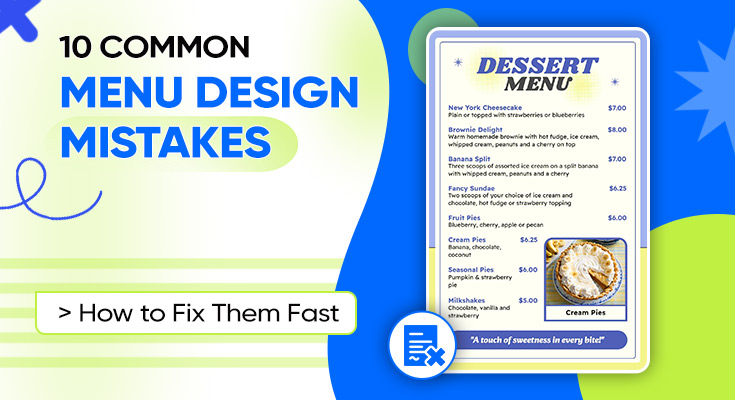
10 Common Menu Design Mistakes & How to Fix All of Them Quickly
Avoiding these common mistakes is much easier when you’re working with a tool designed specifically for restaurant menus. Instead of adjusting fonts, spacing, and layouts manually, you can use our online menu maker tool to create a clean, professional menu while following proven design best practices.
Mistake 1: Overcrowding the Menu With Too Many Items
The Problem
More options feel like more value, but research in menu psychology consistently shows the opposite. When customers face too many choices, they experience decision fatigue. They slow down, feel overwhelmed, and often default to the safest, cheapest, or most familiar option.
A menu crammed with 60+ items across 8 categories doesn’t inspire confidence. It signals a kitchen that tries to do everything and masters nothing.
One of the easiest ways to avoid clutter is to start with professionally designed menu templates. They’re built with balanced spacing, clear visual hierarchy, and organized sections, giving you a strong foundation instead of a blank canvas.
The Fix
Audit your menu and apply the bestseller filter. Identify your top 20–30% of items by sales volume and customer satisfaction. Build your menu around those.
- Limit each category to 5–8 items
- Remove items that rarely sell or are difficult to execute consistently
- Use a Chef’s Special or Featured section to spotlight high-margin items
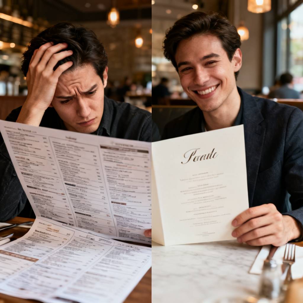
A focused menu is easier to read, faster to order from, and actually increases average spend because customers feel confident in their choices.
Mistake 2: Using Fonts That Are Hard to Read
The Problem
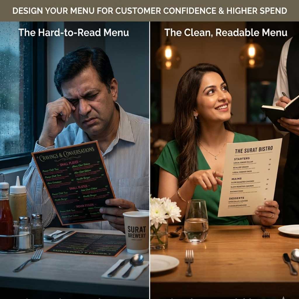
Decorative fonts look stylish in a logo, but they’re a disaster on a menu. Cursive scripts, thin typefaces, and novelty display fonts reduce readability dramatically, especially in low-light restaurant settings.
Small font sizes (under 10pt) compound this problem, particularly for older guests.
The Fix
Choose legibility over personality for body text. A clean sans-serif font (like a geometric or humanist style) works well for item names and descriptions. You can reserve a display font for your section headers or restaurant name only.
Follow these typography rules:
- Item names: 11–14pt, bold or medium weight
- Descriptions: 9–11pt, regular weight, slightly lighter color
- Prices: match the item name size, consistent alignment
- Minimum contrast ratio of 4.5:1 between text and background
Test your menu in the actual lighting conditions of your dining space before printing.
Mistake 3: Ignoring Visual Hierarchy
The Problem
Visual hierarchy is how design guides a reader’s eye, from the most important element to the least. When every item looks the same size, weight, and color, nothing stands out.
Customers end up reading the entire menu top to bottom rather than being guided naturally toward your high-value items. This is one of the most expensive menu design problems because it directly affects what people order.
The Fix
Use size, weight, contrast, and spacing to create a clear visual hierarchy:
- Make section headings larger and bolder than item names
- Use a box, highlight, or icon to draw attention to featured or high-margin items
- Place your best items in the “golden triangle,” the top-right, top-center, and center of the menu, where eyes naturally land first
- Use white space to separate sections and let each item breathe
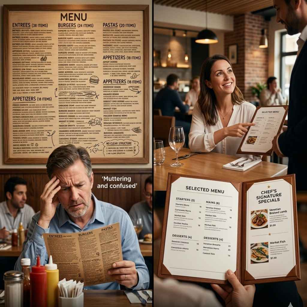
Think of your menu like a landing page. You’re guiding the reader toward a decision, not just listing options.
Once you’ve fixed the usability issues, it’s worth exploring different visual styles that match your restaurant’s personality. Browse these 25+ Menu Design Ideas for inspiration on layouts, typography, colors, and branding across different restaurant concepts.
Mistake 4: Poor Color Choices That Clash With Your Brand
The Problem
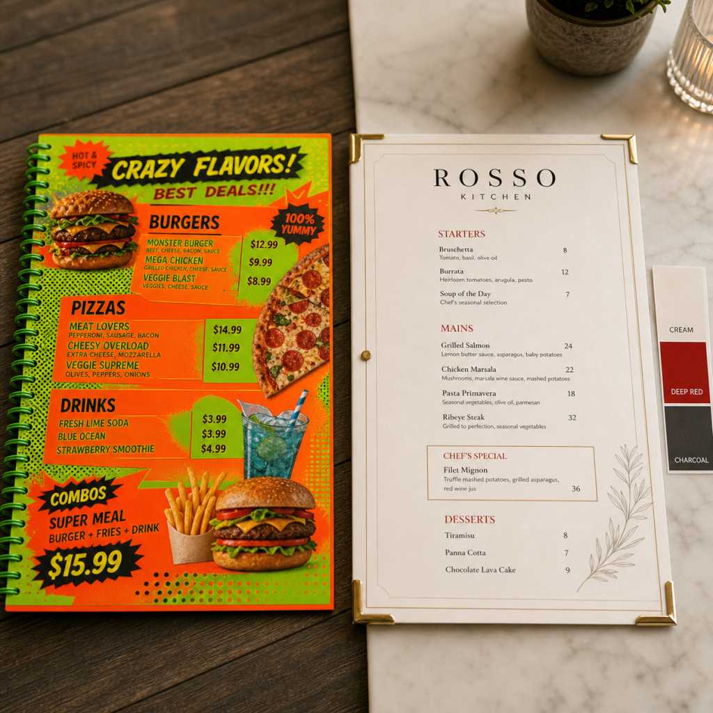
Color does more than decorate; it triggers emotional responses and signals your brand identity. A fine-dining restaurant using neon green and orange creates cognitive dissonance. A playful kids’ café using dark navy and gold feels cold and uninviting.
Worse, poor color choices reduce contrast, making text harder to read.
The Fix
Build your menu color palette around your restaurant branding. Start with 2–3 core colors: A background color (white, cream, dark, or textured). A primary accent color for headings and highlights (aligned with your brand). A secondary text color for descriptions (a muted or gray tone)
Apply color psychology deliberately:
- Red and orange: stimulate appetite, great for fast-casual and food-forward brands
- Green: signals freshness, health, and sustainability
- Black and gold: communicate luxury and premium positioning
- Earthy tones (brown, tan, beige): suggest comfort, warmth, and artisan quality
Always check contrast ratios before finalizing your design.
Mistake 5: Skipping Menu Sections and Category Labels
The Problem
A menu without clear sections is like a grocery store without aisle signs. Customers have to hunt for what they want, which creates frustration and slows down table turnover.
Many small food businesses make this common design error by treating their menu as a simple list, no categories, no logic, no flow.
The Fix
Organize your menu into a logical flow that mirrors how customers eat:
- Appetizers / Starters
- Soups & Salads
- Mains / Entrées
- Sides
- Desserts
- Beverages
Use clear, styled H2-level headings for each section. You can also add a short “section intro” (one line) to guide customers, for example, “Small plates designed to share” under Starters.
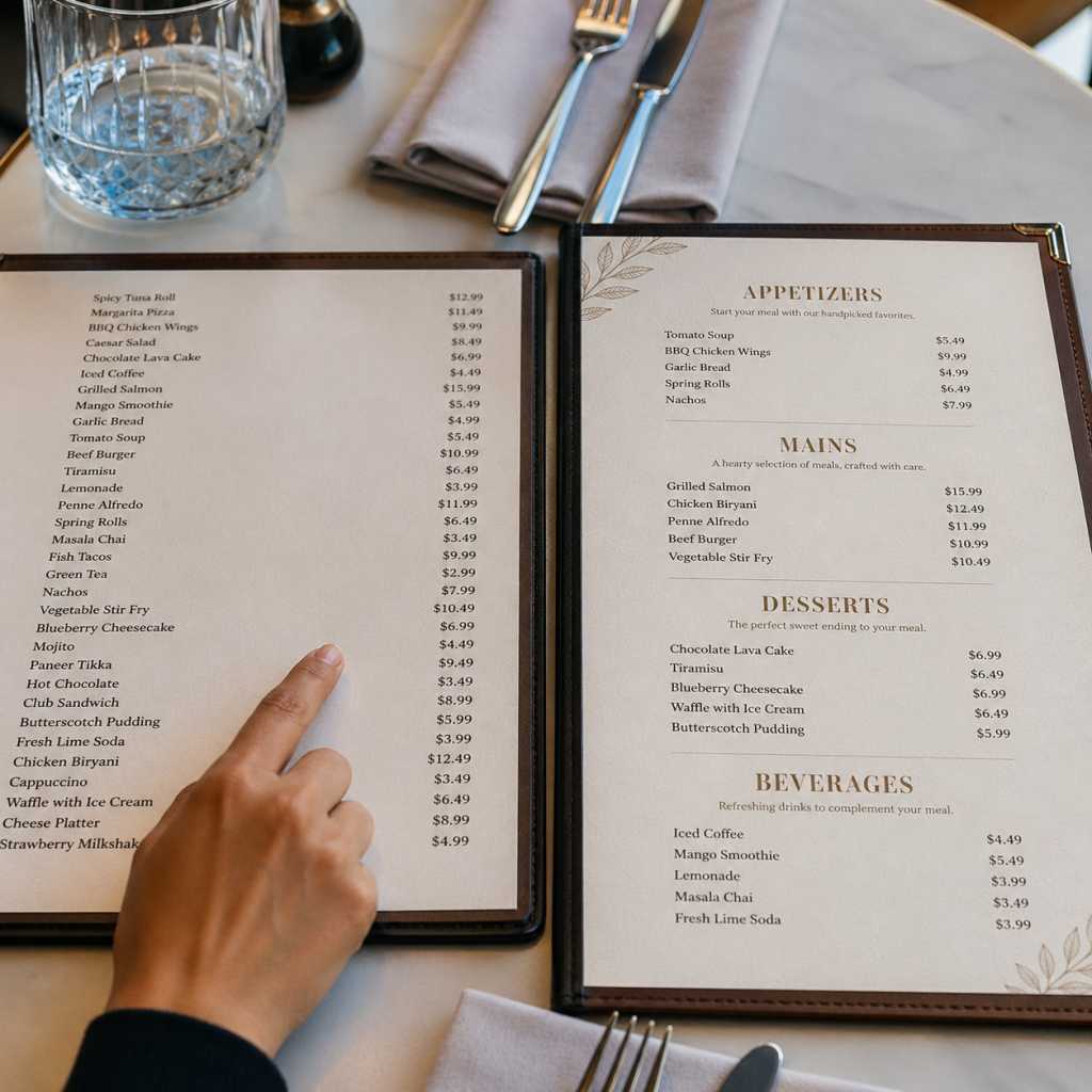
Group related items together. Don’t scatter pasta dishes across three different sections. Consistency in section organization reduces confusion and speeds up ordering.
Mistake 6: Not Optimizing the Menu Layout for Readability and Flow
The Problem
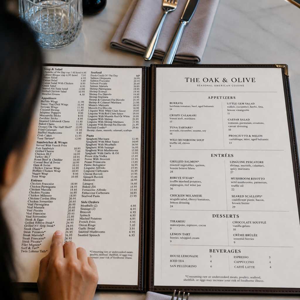
Layout is about more than aesthetics; it’s about the physical experience of reading. Common menu layout mistakes include:
- Text running edge-to-edge with no margins
- Using multiple columns with inconsistent widths
- Mixing landscape and portrait orientations awkwardly
- No white space between items
These menu design problems make the reading experience feel taxing, even when the content itself is fine.
The Fix
Apply these layout principles:
- Margins: Minimum 0.5–0.75 inches on all sides
- Column width: For two-column layouts, keep columns equal and separated by clear gutter space
- White space: Add spacing between items and between sections; crowding reduces readability
- Page flow: For multi-page menus, keep a consistent page grid so customers always know where to look
- Single-page menus: Prioritize a vertical flow with 1–2 columns
Test your layout by printing a physical proof and reading it at arm’s length in normal dining lighting. If anything feels cramped or hard to follow, it needs more space.
Mistake 7: Forgetting Mobile and Digital Menu Readability
The Problem
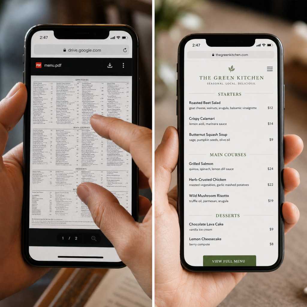
Digital menus, whether QR-code-based, online ordering pages, or display boards, have their own design challenges. A menu designed for print often fails on screen.
Common digital menu design problems include:
- Images that don’t scale on mobile
- Small text that’s hard to read without zooming
- PDF menus that open slowly or aren’t mobile-friendly
- Horizontal layouts that don’t work on portrait-orientation phones
The Fix
If you’re offering a digital menu, design it natively for screen:
- Use a responsive format, not a scanned PDF
- Minimum font size of 16px for body text on the web
- Stick to a single-column layout for mobile
- Compress images to ensure fast loading (under 200KB per image)
- Test your digital menu on both Android and iOS before launching
- Ensure sufficient tap target size (44x44px minimum) for any interactive elements
For digital menu boards (in-restaurant displays), ensure fonts are large enough to read from 6–10 feet away and rotate featured items periodically to maintain attention.
Mistake 8: Using Low-Quality or Irrelevant Images
The Problem
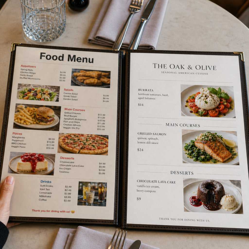
Images can be a powerful tool or a serious liability. Blurry, poorly lit, or unappetizing food photos actually reduce customer confidence. So do generic stock images that don’t represent your actual dishes.
At the same time, overloading a menu with images gives it a fast-food feel that may conflict with your brand positioning.
The Fix
If you use food photography on your menu, do it right:
- Use professional or high-quality smartphone photography with proper lighting
- Show real dishes from your kitchen, not stock photos
- Limit images to 1–3 featured items per page; strategic use increases impact
- Keep image sizes consistent and aligned with your grid
If photography isn’t in your budget yet, skip images entirely. A clean, well-typeset menu with no photos is far better than a cluttered menu with low-quality images.
Mistake 9: No Clear Pricing Structure
The Problem
How you display prices has a massive psychological impact on ordering behavior. Two of the most common menu errors here are:
- Using dollar signs: research in menu psychology shows that “$” symbols activate the pain of paying, which makes customers more price-conscious
- Price columns: aligning all prices in a right-justified column makes it easy to scan prices without looking at the actual items, pushing customers toward the cheapest option
The Fix
Use “price anchoring” and integrated pricing:
- Remove dollar signs or reduce their visual prominence
- Place prices at the end of item descriptions, in the same font size and weight, not bolded or separated
- Avoid right-aligned price columns
- Include at least one anchor price, a premium item priced significantly higher than the rest. It makes mid-range items feel like a better value
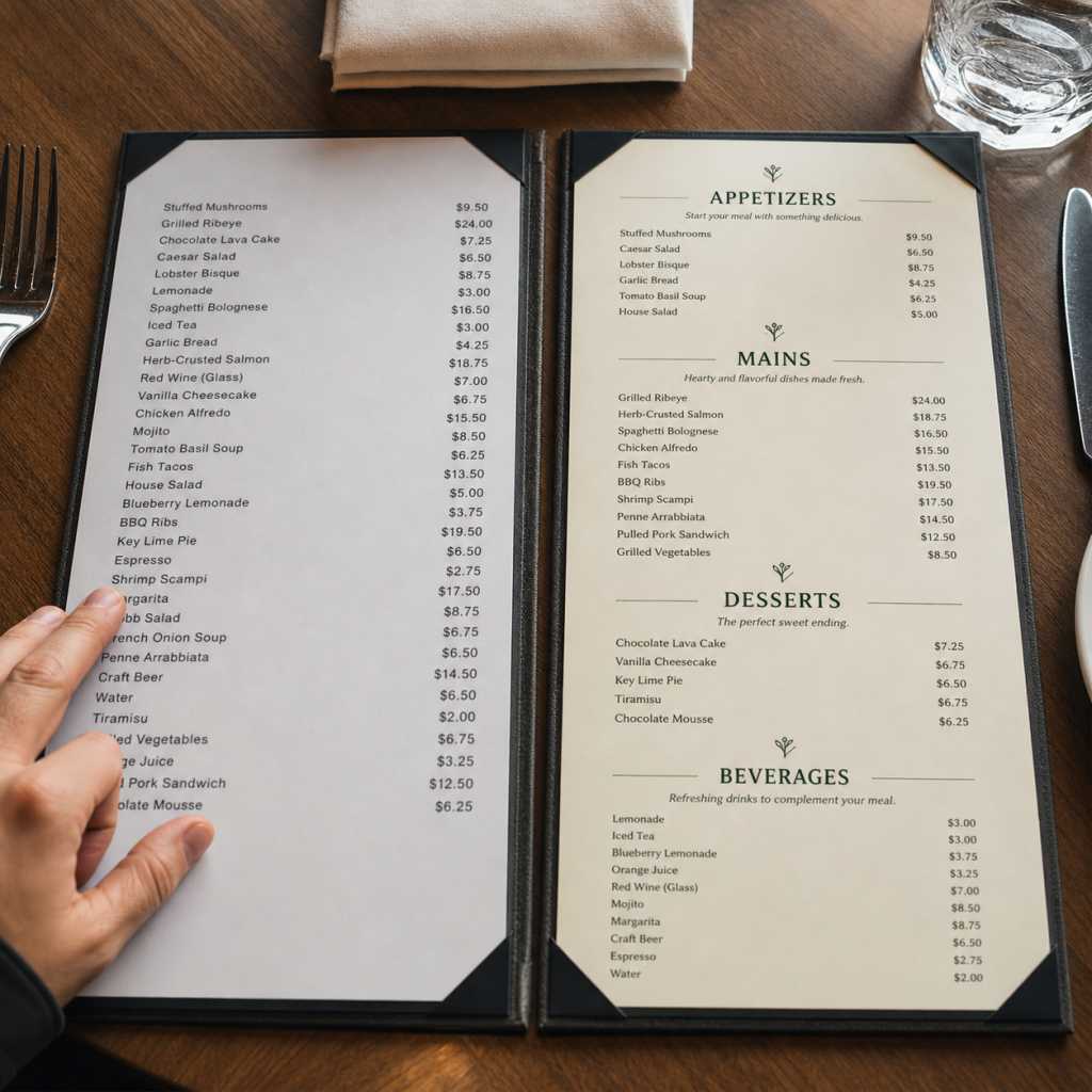
This simple change in pricing structure can increase average order value without changing a single item on your menu.
Organizing a menu isn’t just about grouping appetizers and desserts. It also involves deciding the right layout, writing clear descriptions, pricing items effectively, and creating a logical flow. Our complete guide on how to make a menu walks through each of these steps in detail.
Mistake 10: Writing Vague or Unhelpful Item Descriptions
The Problem
“Grilled Chicken” tells a customer almost nothing. Is it spicy? What’s the sauce? Does it come with sides? Vague descriptions create hesitation, and hesitation leads to under-ordering or asking too many questions.
On the flip side, descriptions that are too long turn reading a menu into a chore.
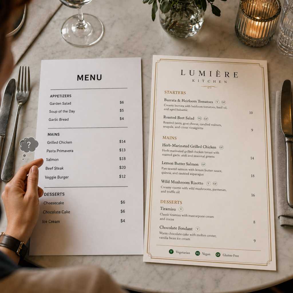
The Fix
Write descriptions that are specific, sensory, and concise, ideally 1–2 lines (15–25 words):
- Mention key ingredients, cooking method, and one flavor note
- Use sensory language: crispy, smoky, tangy, slow-braised, wood-fired
- Highlight what makes the item special: house-made, locally sourced, signature recipe
- Call out allergens or dietary notes clearly (GF, V, VG) with a simple icon system
How to Test Your Menu Before You Print It
Most menu design mistakes survive because they’re never properly tested before going to print or going live. A quick review at your desk looks nothing like how a customer experiences your menu at the table.
Print a physical proof first
Even if your final version is digital, print a full-size copy and read it under your restaurant’s actual lighting conditions. Shadows, warm bulbs, and dim ambiance expose readability problems that look fine on a bright monitor.
The stranger test
Hand the printed proof to someone unfamiliar with your menu design — a friend, neighbor, or family member. Give them 60 seconds, then ask: What would you order? What’s the most expensive item? What’s the most popular? If they struggle to answer, your visual hierarchy isn’t working.
Time your read
A well-designed menu should allow a customer to reach a decision in under 3 minutes. If your test reader takes longer, you likely have too many items, poor section flow, or weak visual cues guiding attention.
Check it on mobile
If your menu design is available as a QR code or online, open it on both an iPhone and an Android device. Pinching to zoom, slow loading, and cut-off text are immediate trust killers.
Ask your staff
Your front-of-house team hears the same customer questions every shift. If guests constantly ask “what’s good here?” or “what comes with this?”, those are direct signals of description or hierarchy problems your design needs to solve.
Testing takes less than an hour and can save you the cost of a reprint, or worse, weeks of lost sales from a menu that quietly works against you.
Best Practices to Avoid Menu Design Errors
Once you’ve fixed your current menu design problems, the goal is to build habits and standards that prevent them from creeping back in. Here’s a checklist of best practices every food business should follow:
Typography
Layout & Visual Hierarchy
Color & Branding
Pricing Structure
Descriptions & Content
Review & Update Schedule
Frequently Asked Questions
The most common menu design mistakes include overcrowded item lists, unreadable fonts, missing visual hierarchy, right-aligned price columns, vague item descriptions, and poor section organization. These errors reduce readability, slow ordering, and decrease average spend. Most can be fixed quickly with targeted layout and typography changes.
Signs your menu layout has problems include: customers frequently asking staff for recommendations, long order times, low uptake on high-margin items, and staff reporting repeated questions about what’s available. If customers aren’t naturally finding your best items, your layout is working against you.
Most menu design experts recommend limiting a restaurant menu to 30–45 items total, with 5–8 items per category. Fewer choices reduce decision fatigue, speed up ordering, and allow your kitchen to maintain quality and consistency across all dishes.
Yes, color has a measurable impact on customer behavior and appetite. Red and orange tones stimulate appetite and urgency. Green signals health and freshness. Dark backgrounds with gold accents communicate premium positioning. Choosing the wrong colors for your brand creates cognitive dissonance and undermines trust.
Review your menu design at least once a year, and after any major menu change. Treat it as a living document. Track which items sell well after design changes, gather feedback from both staff and customers, and make incremental improvements rather than waiting for a full overhaul.
Final Thoughts
A great menu does not just list your food; it sells it. Every choice, from fonts to pricing layout, shapes how customers experience your brand and what they order. The most common menu design mistakes are easy to fix; you do not need a big budget, just clarity on what is wrong and how to improve it.
Start with high-impact changes: simplify your items, improve visual hierarchy, refine pricing layout, and sharpen descriptions. Then build further with better typography, smarter colors, and cleaner organization. Your menu is often the first real interaction at the table; make it count.