You have about three seconds. That is how long a customer spends scanning your menu before deciding what to order, or whether to order at all. A poorly designed menu is more than an aesthetic problem; it is a sales problem. Restaurant owners, café managers, and small food business operators often put enormous effort into the food itself, only to present it in a cluttered, hard-to-read, or visually uninspiring layout. The result? Customers choose the cheapest item, skip high-margin dishes, or feel confused and frustrated before they even take a bite.
Good creative menu design changes that. The right mix of layout, typography, color, and visual hierarchy can guide choices, increase average order value, and strengthen your brand, without extra sales copy. In this guide, you will discover 25+ menu design ideas for 2026, key trends, practical steps, and real-world examples. Whether you need fresh menu inspiration or a full redesign, these stylish menu approaches and menu concept ideas will help you create something that truly works.
Top Menu Design Trends Shaping 2026
Menu design does not exist in a vacuum. It reflects broader shifts in customer expectations, technology, and dining culture. Here are the biggest trends defining creative menu design in 2026.
1. Minimalist Layouts with Maximum Impact
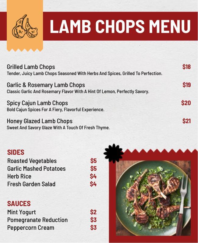
Less is more, and menus are finally catching up. Overcrowded pages filled with dozens of items are being replaced by focused, curated layouts that spotlight your best offerings. White space is used intentionally to give each item room to breathe, making it easier for customers to focus and decide.
The trend is toward quality over quantity: fewer items, described with more care, presented with more visual clarity. This minimalist direction is one of the most consistent threads running through modern menu design right now.
2. Bold, Expressive Typography
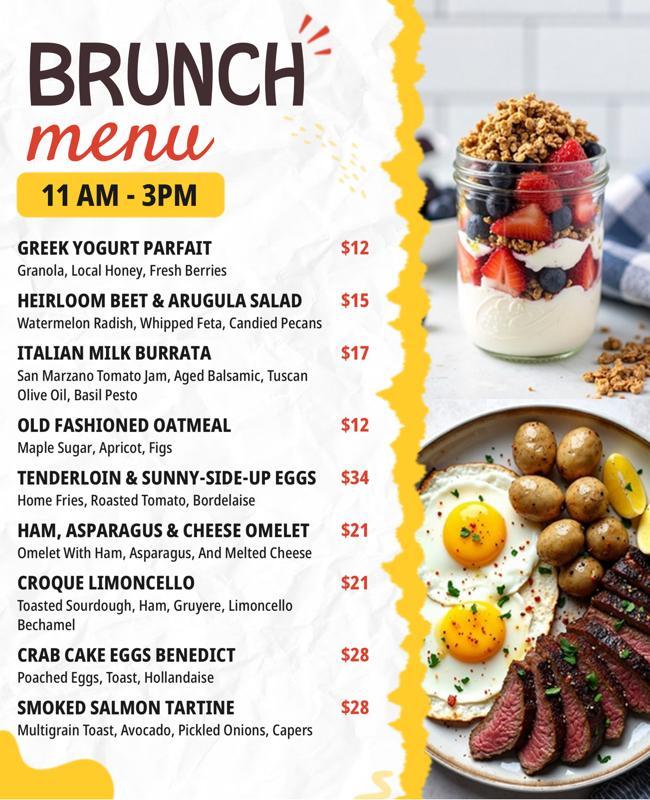
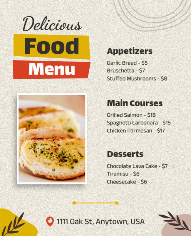
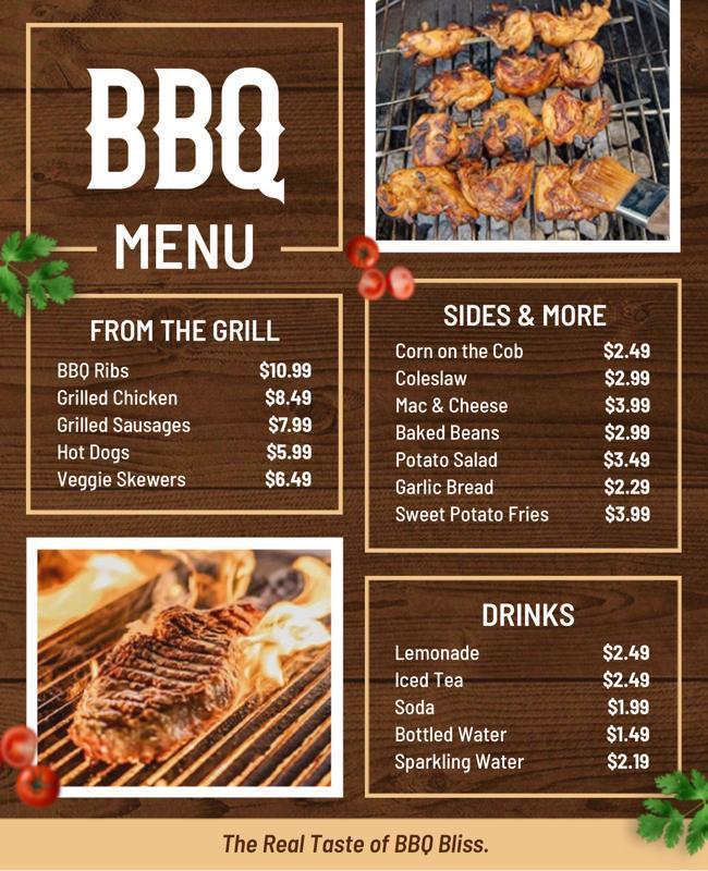
Typography has moved from a background element to a design statement. In 2026, forward-thinking menus are using oversized serif headings, handwritten section labels, and high-contrast font pairings to create personality and visual punch.
The font you choose communicates your brand before the customer reads a single word. A slim sans-serif says modern and clean. A thick slab serif says hearty and confident. A flowing script says artisanal and handcrafted. Typography-led menus are among the most powerful sources of menu design inspiration available today.
3. Storytelling Through Design
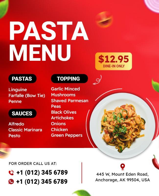
Customers are not just buying food, they are buying an experience. Menus in 2026 are increasingly incorporating origin stories, producer names, and short narrative descriptions that make each item feel meaningful. This storytelling approach builds emotional connection and justifies premium pricing.
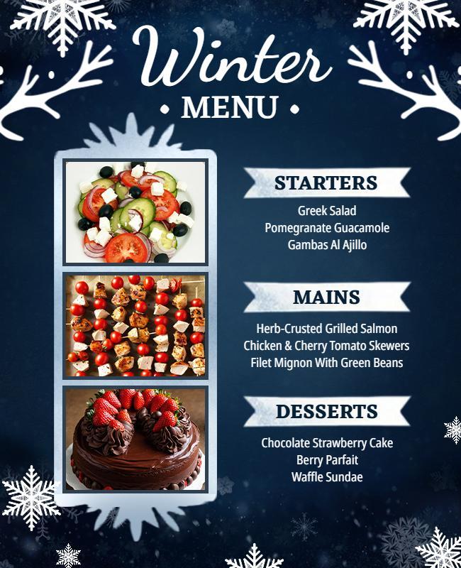
4. Digital-First Thinking
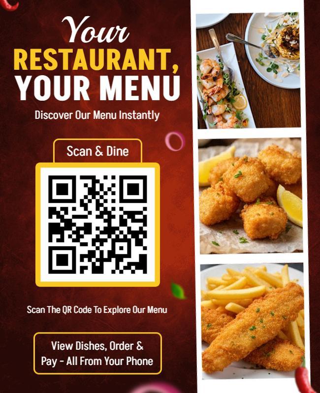
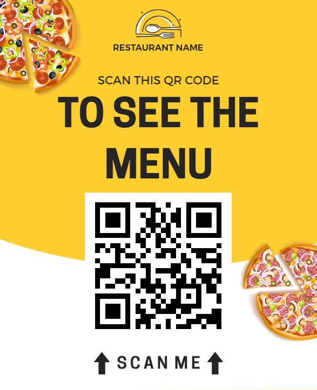
QR code menus, digital menu boards, and web-based restaurant menus are now mainstream. The best menu design ideas in 2026 consider how a layout will look on a screen just as much as on paper. Responsive design principles, thumb-friendly navigation, and high-contrast digital typography are all essential for modern menu design.
5. Strategic Use of Photography
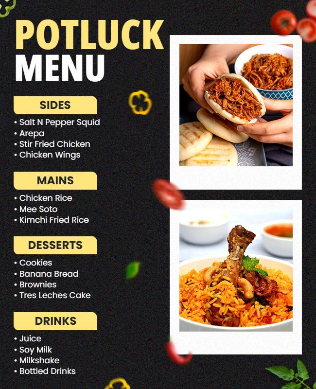
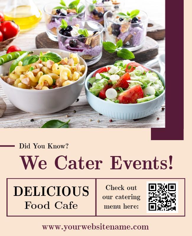
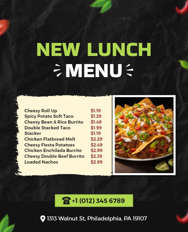
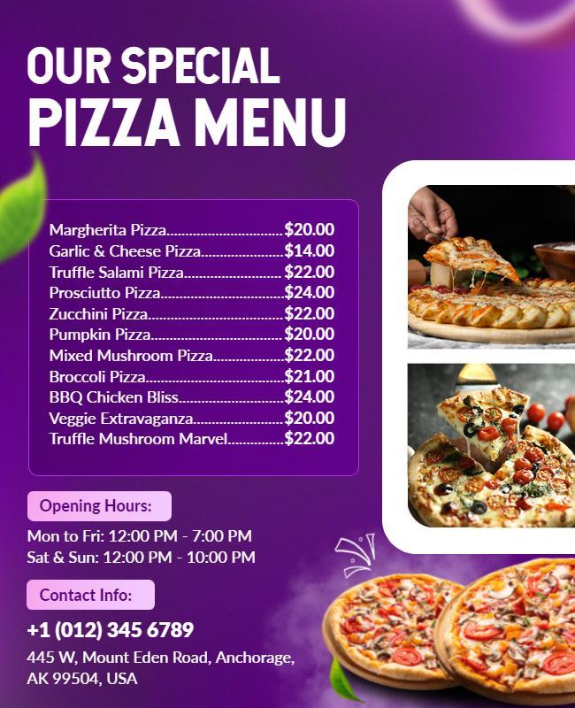
Not every item needs a photo; over-photography can cheapen a menu’s feel. The trend in innovative menu layouts is selective, high-quality imagery: one or two hero shots per section that anchor the visual experience and make the most craveable items unmistakable.

6. Color as a Communication Tool
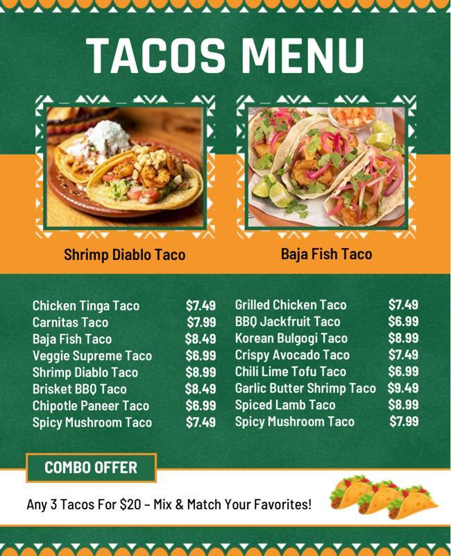
Color is no longer just decoration. In 2026, trendy menu design uses color intentionally to signal categories, highlight signature items, create warmth or urgency, and align with brand identity. Understanding basic color psychology is now a practical skill for anyone creating a unique menu design that stands apart from the competition.
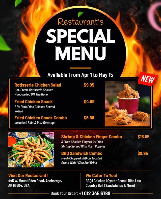
25+ Creative Menu Design Ideas for Inspiration
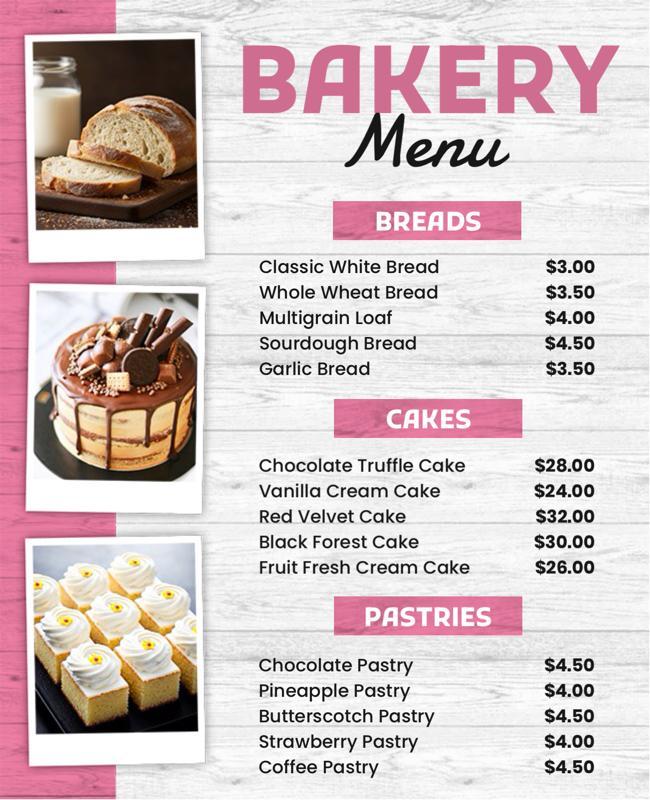
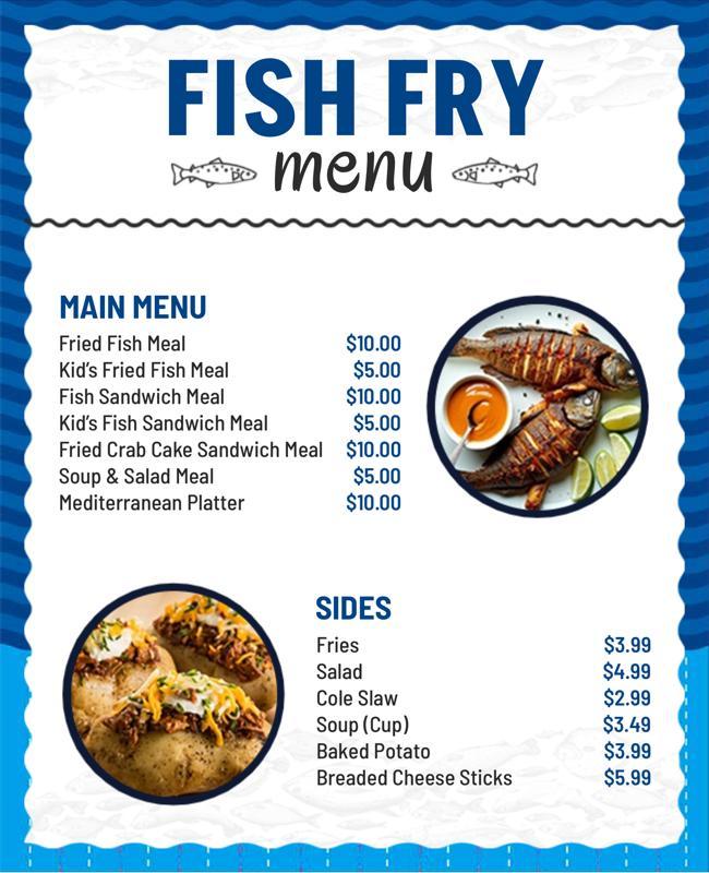
Here are over 25 specific menu design ideas, organized by theme, to spark your creativity and give you practical directions to explore. If you find a style you like, start with professional menu design templates instead of creating every element from scratch. They provide a solid foundation that you can easily customize with your own branding, menu items, and colors.
Layout & Structure
- 1Single-page focused menuLimit items to one side of a single sheet for maximum clarity and a premium feel.
- 2Trifold card layoutA three-panel design that separates starters, mains, and desserts with clean visual breaks.
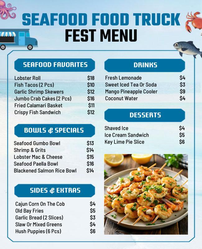
- 3Grid-based layoutOrganize items in a structured grid to create a sense of order and make scanning effortless.
- 4Column hierarchyTwo-column layout with category names on the left and items on the right.
- 5Chalkboard-style designA handwritten aesthetic on dark backgrounds. One of the most enduring stylish menu formats in the industry.
- 6Full-bleed photo sectionsEdge-to-edge photography between sections creates visual momentum and category separation.
- 7Magazine-style spreadsTreat your menu like an editorial layout. A strong source of menu design inspiration for high-end concepts.
- 8Strip menusA long, narrow vertical format that works brilliantly for drinks lists and tapas bars.
Typography-Driven
- 9Oversized category headingsLarge, bold type for section headers creates an immediate visual hierarchy.
- 10Handwritten accent fontsMix a clean body font with a hand-lettered style for section labels or specials.
- 11Monochrome typography-only layoutNo images, just beautifully crafted type with varying weights and sizes. Defines some of the most admired unique menu designs of recent years.
- 12All-caps names, lowercase descriptionsCreates contrast and draws the eye naturally to key information.
- 13Inline price formattingPrices at the end of the description line, discourages price-scanning behavior.
Color & Visual Concept
- 14Warm earth tonesTerracotta, burnt sienna, and sand create a cozy atmosphere ideal for bistros and brunch spots.
- 15Deep, moody palettesNavy, forest green, and charcoal with gold accents. A recurring feature in trendy menu design for fine dining.
- 16High-contrast black and whiteA timeless combination that communicates confidence across almost every cuisine type.
- 17Seasonal color rotationsUpdate your palette quarterly to reflect seasonal offerings and create freshness without a full redesign.
- 18Branded accent colorOne signature color used consistently for category headers, borders, and key callouts.
- 19Pastel minimalismSoft, muted tones with generous white space, one of the strongest directions in modern menu design right now.
Unique & Innovative
- 20Newspaper-inspired layoutBroadsheet grid structure with column rules and headline-style item names. Few menu concept ideas make as immediate a statement.
- 21Icon-based category markersSimple line icons improve scanability and add personality without clutter.
- 22Ingredient callout boxesSmall sidebar boxes highlight a key ingredient, its origin, or a health benefit.
- 23Chef’s pick badgesA simple visual badge on signature items guides customers toward high-margin choices.
- 24Illustrated borders and dividersHand-drawn botanical or geometric elements, a popular feature in stylish menu design across independent restaurants.
- 25Folded booklet with cover storyA brief brand story on the inside cover before the food pages begin.
- 26QR-linked digital extensionOne of the most practical innovative menu layouts, printed menus that link to video, allergens, or daily specials.
- 27Side-stapled zine formatA small, staple-bound booklet that communicates indie character and creative brand personality.
How to Apply These Menu Design Ideas to Your Menu
Inspiration is only half the work. Here is a step-by-step process for turning these ideas into a real, working menu.
Define your menu structure and categories
Map out what will actually be on your menu before touching fonts or colors. Group items into logical categories: starters, mains, sides, drinks, desserts. A focused menu of 20–30 items nearly always outperforms a sprawling one of 60+. These questions should anchor all of your menu concept ideas from the start.
Choose a color scheme that matches your brand
Pick two or three core colors. A restrained palette is almost always what separates a polished, stylish menu from one that feels busy and amateur. Avoid using more than three colors in a single menu.
Select readable fonts and sizes
A maximum of two font families. At least 10pt for printed menus and 16px for digital menus. Test in the actual context, dim restaurant lighting changes everything.
Organize items using visual hierarchy
Your signature and high-margin dishes should occupy the top-left or center of each section. Use spacing, dividers, and callout boxes to create clear, effortless reading paths.
Add pricing with clear, non-disruptive formatting
Avoid right-aligned price columns. Place prices at the end of each description. Removing the currency symbol entirely is a well-documented technique to reduce price sensitivity.
Optimize layout for readability and flow
Print a physical proof and read it as a customer would, across the table, potentially in low light. Iterate until the experience feels effortless. A good menu design guides the customer through it without them noticing the design itself. Once you’ve finalized your layout, colors, and typography, the easiest way to bring everything together is with online menu maker. Instead of building your menu from scratch, you can customize layouts, update your branding, and export a print-ready or digital menu in minutes.
Typography-Based Menu Inspiration
Typography is arguably the single most powerful tool in your menu design toolkit. The right typographic choices communicate your brand’s personality instantly, before the customer has read a single item name. For businesses seeking genuine menu design inspiration, studying great typographic menus is one of the most educational exercises available.
- The Power of Font Pairing
The most effective menus use a deliberate contrast between two typefaces. A common approach is to pair a decorative display font for headings with a neutral, highly readable font for item names and descriptions.
A thick condensed serif heading paired with a clean light-weight sans-serif body creates energy and clarity simultaneously. The heading draws attention; the body delivers detail without visual fatigue. - Size Hierarchy in Typography
A reliable framework for printed menus: category headings at 18–22pt, item names at 11–13pt, and descriptions at 9–10pt. This creates three clear reading levels, scan, choose, and read, that customers can move through in seconds. - Spacing and Letter-Spacing
Tight letter-spacing on headings creates a modern, confident feel. Looser spacing on uppercase text adds an elegant, upscale quality. For body text, a line height of 1.4–1.6 times the font size is a practical starting point. - When to Use Handwritten Fonts
Handwritten or script fonts add a human, artisanal quality that works well for independent restaurants and specialty cafés. However, they should only ever be used for section labels, special call-outs, or decorative accents, never for body text or item descriptions. Readability always wins over style.
Color-Based Menu Design Ideas
Color is one of the most immediate and emotional elements in any design. In menu design, color choices influence mood, appetite, perceived quality, and even how much customers are willing to spend. Getting this right is central to any creative menu design process.
Frequently Asked Questions
Divide items into 4–6 clear categories with strong headers. Place high-margin dishes in top-left or top-center positions for visibility. Avoid price-based ordering and limit each section to about 7 items.
Start with content, list items, group them into categories, and highlight 3–5 high-margin dishes. Choose a brand-aligned color palette, two fonts, and a clean layout. Review creative menu design examples and test a printed version before finalizing. If you’re looking for a complete walkthrough, our guide on how to make a menu explains every step in detail—from planning your menu structure and writing descriptions to choosing layouts, pricing, and final design.
Use warm colors (red, orange) to boost appetite and cool tones (teal, sage) for a calm feel. Neutral backgrounds like cream or white ensure readability, while dark themes suit upscale menus. Consistency matters more than specific colors.
Overcrowding, too many items, fonts, colors, or images. This overwhelms customers and slows decisions. Simplifying your layout improves clarity and works across both trendy menu design and classic styles.
For print: 11–13pt for item names, 9–10pt for descriptions, and 18–22pt for headers. For digital: 16–18px body text and 28–32px headers. Always test readability in real conditions.
Final Thoughts
Menu design is not a cosmetic afterthought; it directly influences customer behavior, communicates brand identity, and increases revenue without changing a single item. The 25+ menu design ideas in this guide span layout, typography, color, and concept. Some may fit immediately, while others can be adapted. The goal is not to copy trends, but to apply principles in a way that feels authentic, whether through unique and modern menu design or innovative menu layouts.
No matter the approach, the fundamentals stay the same: edit ruthlessly, organize logically, and design for the reader’s eye. A well-crafted, stylish menu works quietly to guide decisions and improve results. Start small, test, observe, and refine, because effective menu design evolves with your business.