A logo is a visual symbol that represents a business or brand and helps people recognize it instantly.
But not every logo is designed in the same way.
Understanding the different types of logos can help businesses choose a visual identity that fits their name, personality, audience, industry, and intended applications.
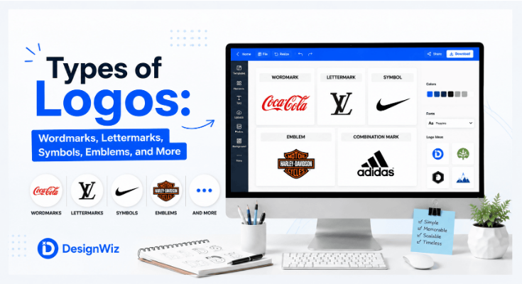
In this guide, we’ll explore the major types of logos, including wordmarks, lettermarks, monograms, pictorial marks, abstract marks, mascot logos, emblems, combination marks, and responsive logos.
What Are the Different Types of Logos?
A logo can be categorized according to the primary visual elements it uses.
Some rely almost entirely on typography, while others use symbols or illustrations. Combination logos bring multiple elements together.
The major logo types include:
- Wordmarks
- Lettermarks
- Monograms
- Pictorial marks
- Abstract marks
- Mascot logos
- Emblem logos
- Combination marks
- Dynamic and responsive logos
There is no universally “best” logo type. The appropriate choice depends on factors such as the brand name, audience, industry, personality, recognition goals, and where the logo will be displayed.
Read More: How to Make a Logo: A Step-by-Step Guide for Beginners
1. Wordmark Logos
A wordmark logo uses the brand’s name as the primary visual element.
Instead of relying on a separate symbol, the design focuses on typography, letterforms, spacing, proportions, and overall presentation of the name.
Well-known examples include brands such as Google, Coca-Cola, and FedEx.
What makes a wordmark different?
The brand name itself becomes the identifier.
Because there is no separate icon required, typography plays a particularly important role. A customized type treatment can make an otherwise ordinary business name visually distinctive.
When do wordmarks work well?
Wordmarks can be effective when:
- The business has a short or distinctive name.
- The brand wants to build name recognition.
- The name is easy to remember.
- The company wants a straightforward visual identity.
- Typography can provide sufficient differentiation.
For example, a fictional company called Northstar could use a customized wordmark where the typography creates the primary visual personality.
Advantages of wordmark logos
- Strong emphasis on the brand name
- Easy association between logo and business name
- Straightforward visual structure
- Can work well across many applications
- No separate symbol needs to be learned
Limitations
A long or complicated business name can make a wordmark difficult to use in small spaces.
A wordmark may also require careful typography to avoid looking generic.
When should you consider a wordmark?
Consider a wordmark when the name itself is an important part of the brand identity and can be presented clearly and distinctively through typography.
Explore Wordmark Logo Templates
Get started with a professionally designed wordmark logo templates and customize it to match your brand.

2. Lettermark Logos
A lettermark logo uses one or more initials from a brand or organization as the primary visual element.
Instead of displaying the complete business name, the logo simplifies it into recognizable letters.
For example, a company with a long name such as Global Business Technology Solutions could use the initials GBTS as its primary mark.
Why use a lettermark?
Long business names can be difficult to use consistently in compact applications.
A lettermark can provide a shorter visual identifier while maintaining a connection to the company’s name.
Common applications
Lettermarks can work particularly well for:
- Professional organizations
- Corporations
- Agencies
- Institutions
- Companies with long names
- Brands commonly referred to by initials
Advantages
- Compact
- Easy to use in smaller spaces
- Can simplify long names
- Creates a distinctive abbreviation
- Works well in digital environments
Limitations
A lettermark may not immediately tell new audiences what the company does or what the initials represent.
This can be addressed through supporting brand communication and consistent use.
Lettermark example
Imagine a business named Modern Architecture & Design Studio.
Instead of displaying the complete name everywhere, it might use:
as its primary lettermark, while the full business name can still appear elsewhere when necessary.
Explore Letter Logo Templates
Get started with a professionally designed letter logo templates and customize it to match your brand.
3. Monogram Logos
A monogram logo combines or stylizes multiple letters into a single visual mark.
Monograms and lettermarks are closely related, and the terms are sometimes used interchangeably. However, a monogram generally places greater emphasis on the interconnection or visual treatment of the letters.
For example, the initials A and R could be intertwined to create a single distinctive symbol.
How monograms differ from simple lettermarks
A basic lettermark may present initials as separate or clearly readable characters.
A monogram may transform those characters into a unified visual form.
This can involve:
- Interlocking letters
- Overlapping characters
- Custom letterforms
- Geometric arrangements
- Negative space
When do monograms work well?
Monograms can be useful for:
- Personal brands
- Fashion brands
- Luxury businesses
- Creative professionals
- Businesses with distinctive initials
Advantages
- Compact
- Visually distinctive
- Can create a sophisticated appearance
- Works well as a standalone brand mark
- Can be effective for small applications
Limitations
Overly complex letter combinations can reduce readability.
If the letters become too abstract, viewers may not recognize the original initials.
Explore Monogram Logo Templates
Get started with a professionally designed monogram logo templates and customize it to match your brand.
4. Pictorial Mark Logos
A pictorial mark uses a recognizable visual symbol or image as the primary logo element.
The symbol usually represents something concrete rather than an abstract shape.
For example, a business might use a:
- Leaf
- Bird
- Mountain
- Animal
- Object
- Geometric representation of a recognizable item
The symbol becomes an important visual identifier for the brand.
Pictorial vs. literal imagery
A pictorial mark doesn’t necessarily have to show exactly what the business sells.
Instead, the image can become associated with the brand through consistent use.
For example, a travel company could use a stylized mountain rather than literally depicting an airplane or suitcase.
Advantages
- Strong visual recognition potential
- Can work without text after brand recognition develops
- Useful across languages
- Can create memorable visual associations
Limitations
A literal symbol can sometimes feel predictable, particularly when many businesses in the same industry use similar imagery.
For example, using a generic house icon for a real estate company may not create much differentiation.
When should you consider a pictorial mark?
Consider one when a recognizable symbol can communicate an important aspect of the brand without making the design overly literal or generic.
5. Abstract Logo Marks
An abstract logo mark uses a non-literal shape or visual composition to represent a brand.
Unlike a pictorial mark, an abstract mark does not necessarily depict a recognizable object.
Instead, it can communicate ideas through:
- Shape
- Movement
- Geometry
- Color
- Negative space
- Composition
The meaning may become associated with the brand over time.
Abstract vs. pictorial marks
Consider the difference:
Pictorial mark:
A recognizable visual representation of something.
Abstract mark:
A distinctive shape that communicates an idea or creates a visual association without directly depicting an object.
Why use an abstract mark?
An abstract logo can give a brand more freedom to develop a unique visual identity without being tied to a literal object.
For example, a technology company might use an abstract geometric form to communicate:
Connection + Innovation + Movement
rather than using a literal computer or circuit icon.
Advantages
- Potentially highly distinctive
- Flexible interpretation
- Can communicate broader concepts
- Less dependent on literal imagery
- Can create a strong standalone brand asset
Limitations
An abstract mark may require more time and brand exposure before audiences understand its association with the company.
Poorly constructed abstract marks can also appear arbitrary or visually confusing.
When should you consider an abstract mark?
Consider one when the brand needs a distinctive visual identity and can support the symbol through consistent branding and marketing.
Explore Abstract Logo Templates
Get started with professionally designed abstract logo templates and customize them to match your brand.


6. Mascot Logos
A mascot logo uses a character or illustrated figure as the central visual element.
The character can represent the brand’s personality and create a more approachable relationship with its audience.
Mascots can range from highly detailed illustrations to simple, stylized characters.
Where are mascot logos commonly used?
They can be particularly effective for:
- Sports teams
- Food and beverage businesses
- Children’s brands
- Entertainment companies
- Gaming brands
- Community organizations
- Consumer-focused businesses
Why do mascots work?
Characters can communicate emotions and personality more directly than many abstract symbols.
A friendly character may communicate:
Approachability + Energy + Fun
while a bold character may communicate:
Strength + Confidence + Competition
Advantages
- Strong personality
- Memorable visual character
- Can support storytelling
- Useful for marketing campaigns
- Can create an emotional connection
Limitations
Detailed mascot designs may be difficult to reproduce at very small sizes.
They can also require more illustration work and may not fit brands that need a highly minimal visual identity.
When should you consider a mascot?
A mascot can work well when personality and emotional connection are important parts of the brand experience.
Explore Mascot Logo Templates
Get started with professionally designed mascot logo templates and customize them to match your brand.

7. Emblem Logos
An emblem logo places text and imagery within an enclosed shape or structured composition.
Common visual characteristics include:
- Badges
- Seals
- Crests
- Shields
- Circular designs
- Decorative borders
Emblems are often associated with tradition, authority, heritage, or institutional identity.
Where are emblem logos commonly used?
Examples include:
- Schools
- Universities
- Sports organizations
- Government-related organizations
- Clubs
- Automotive brands
- Traditional businesses
Traditional vs. modern emblems
Traditional emblems may contain considerable detail, decorative typography, and multiple visual elements.
Modern emblem designs often simplify those elements to improve readability and digital usability.
Advantages
- Strong sense of tradition
- Can communicate authority
- Works well for organizations and institutions
- Can create a badge-like identity
- Provides a structured visual composition
Limitations
Highly detailed emblems may become difficult to read at small sizes.
Text-heavy designs can also lose clarity when used as small social media icons or mobile interface elements.
When should you consider an emblem?
An emblem can be appropriate when the brand wants to communicate heritage, authority, community, tradition, or institutional identity.
8. Combination Mark Logos
A combination mark combines a symbol with text.
The two elements may appear:
- Side by side
- Stacked
- Integrated
- Within a flexible layout
For example:
[Symbol] + [Brand Name]
can form a combination mark that allows the business to build recognition around both its name and visual symbol.
Why are combination marks popular?
They provide flexibility.
A new business can initially use the symbol and brand name together. As recognition grows, the symbol may eventually be used independently in selected applications.
Advantages
- Combines name recognition with visual recognition
- Flexible across applications
- Can work in multiple configurations
- Useful for newer brands
- Allows gradual recognition of a symbol
Limitations
The complete lockup can become difficult to use in very small spaces.
Designers may therefore create compact or responsive versions for smaller applications.
Common combination mark structures
Horizontal
[Symbol] [Brand Name]
Stacked
[Symbol][Brand Name]
Integrated
[Symbol + Text as one composition]
The right structure depends on the brand and intended applications.
9. Dynamic and Responsive Logos
Not every modern brand uses exactly the same logo configuration everywhere.
A responsive logo is designed to adapt to different sizes, layouts, and digital environments while maintaining recognizable brand characteristics.
For example, a brand might have:
Full logo
Symbol + full brand name
↓
Compact logo
Symbol + shortened name
↓
Small logo
Symbol only
This approach is especially useful when a brand needs to work across websites, mobile applications, social media, advertising, and other digital interfaces.
What is a dynamic logo?
A dynamic logo can change or adapt depending on context while maintaining a recognizable relationship with the core brand identity.
The changes might involve:
- Layout
- Size
- Color treatment
- Animation
- Content
- Composition
The goal isn’t to create unrelated logos. The variations should still feel like parts of the same visual identity.
When do responsive logos make sense?
They are particularly useful for brands that appear across:
- Websites
- Mobile applications
- Social platforms
- Digital advertisements
- Small interface elements
- Large physical displays
Logo Type Comparison: Which Types Are Most Common?
There is no single logo type that is best for every business.
Each approach solves a different branding problem.
| Logo Type | Primary Element | Main Strength | Potential Limitation |
|---|---|---|---|
| Wordmark | Full brand name | Builds name recognition | Long names can be difficult to use |
| Lettermark | Initials | Compact representation | May require brand awareness |
| Monogram | Stylized initials | Distinctive and compact | Can reduce letter readability |
| Pictorial Mark | Recognizable symbol | Strong visual association | Can become generic if overly literal |
| Abstract Mark | Abstract shape | Distinctive identity | Meaning may require brand exposure |
| Mascot | Character | Personality and storytelling | Can be complex at small sizes |
| Emblem | Enclosed text and imagery | Heritage and authority | Detail can affect scalability |
| Combination Mark | Text + symbol | Flexible and recognizable | Full version can be space-intensive |
| Responsive Logo | Multiple adaptable versions | Cross-platform flexibility | Requires a consistent logo system |
So which logo type is most common?
Combination marks are widely used because they allow businesses to communicate both their name and visual identity.
However, wordmarks, symbols, lettermarks, emblems, and other types can all be effective depending on the brand.
The right question isn’t:
“Which logo type is the most popular?”
It is:
“Which logo structure best supports this brand’s identity and applications?”
How Logo Types Work Across Different Applications
A logo doesn’t exist in only one environment.
The same brand may need to use its identity across dozens of touchpoints.
Websites
A horizontal wordmark or combination mark can work well in website headers where there is enough horizontal space.
A compact symbol may be useful for smaller navigation areas.
Social media profiles
Social platforms often display logos in small square or circular spaces.
A symbol, lettermark, or compact version can therefore be more practical than a long wordmark.
Mobile apps
App icons usually provide limited space.
A simplified symbol or monogram may work better than a full logo containing extensive text.
Business cards
Business cards provide more flexibility, allowing businesses to use a full combination mark, wordmark, or emblem depending on the layout.
Packaging
Packaging can support larger and more detailed logo applications, but the logo still needs to remain clear among other visual elements.
Signage
Large signage provides room for larger logo treatments, but viewing distance and environmental conditions should still be considered.
Advertising
Advertisements may allow different logo configurations depending on available space.
A full logo can establish the brand, while a simplified version can work in compact placements.
Merchandise
T-shirts, mugs, bags, and other merchandise may require simplified or alternate versions depending on printing requirements.
Read More: What Makes a Good Logo? 10 Essential Design Principles
Common Mistakes When Choosing a Logo Type
Choosing a logo type should be based on the brand—not simply on what looks fashionable.
Here are some common mistakes to avoid.
1. Choosing a logo type because it is trendy
Design trends change.
A logo should have enough relevance and flexibility to remain useful beyond a short trend cycle.
2. Using a complex logo in a small application
A detailed emblem or mascot may look excellent on a large poster but become unreadable as a social profile image.
Always consider the smallest important application.
3. Making text difficult to read
Creative typography should not compromise basic legibility.
This is especially important for wordmarks and lettermarks.
4. Choosing a generic symbol
A symbol that is too common may make the brand difficult to distinguish from competitors.
For example, several businesses in the same industry using nearly identical generic icons can create weak differentiation.
5. Choosing a symbol without brand relevance
A visually attractive symbol isn’t automatically a meaningful logo.
The symbol should support the brand’s positioning or visual personality.
6. Ignoring future applications
Don’t choose a logo structure based only on where it will appear today.
Consider how the business may use the logo in the future.
7. Copying familiar brands
A logo shouldn’t imitate another company’s distinctive visual identity simply because that style is successful.
Research should inform differentiation—not replication.
Read More: Logo Size Guide: What Size Should a Logo Be?
How to Choose a Logo Type for Your Brand
There isn’t a universal formula for selecting a logo type.
Instead, evaluate several aspects of the brand.
1. Consider the brand name
Ask:
- Is the name short or long?
- Is it distinctive?
- Are the initials recognizable?
- Does the name itself need strong visual emphasis?
A short, distinctive name may work well as a wordmark.
A long business name may benefit from a lettermark or combination of abbreviated and full-name treatments.
2. Consider your audience
Think about what your audience expects from the category.
A playful mascot may work well for a children’s brand, while a financial institution may require a more restrained visual approach.
These are not strict rules, but audience expectations are useful context.
3. Consider the industry
Some industries have established visual conventions.
Research them—but don’t automatically follow them.
Understanding industry conventions can help you identify where your brand can conform appropriately and where it can differentiate.
4. Consider recognition requirements
Ask whether the brand needs people to remember:
The name
or primarily:
The visual symbol
A new business may benefit from showing the name alongside a symbol until recognition develops.
5. Consider where the logo will appear
Think about:
- Website
- Mobile app
- Social media
- Packaging
- Signage
- Merchandise
- Advertising
The logo should remain usable across the most important applications.
6. Consider whether your brand needs multiple versions
Many businesses don’t need to choose only one visual configuration.
A brand identity can include:
- Primary logo
- Secondary logo
- Symbol
- Monogram
- Horizontal version
- Stacked version
- Small-size version
The important thing is that these versions share a consistent visual language.
Conclusion
Understanding the different types of logos is an important part of building a strong visual identity. Wordmarks emphasize the brand name. Lettermarks and monograms simplify longer names into compact visual forms. Pictorial and abstract marks create standalone symbols, while mascot logos add personality and storytelling. Emblems communicate structure and heritage, and combination marks bring text and symbols together. Responsive logo systems help brands adapt these identities across different platforms and sizes.