A logo can look attractive and still fail to work as a brand asset.
A professional-looking logo is not necessarily a good logo. An effective logo needs to be recognizable, relevant to the brand, distinctive from competitors, readable, scalable, and usable across different situations.
So, what makes a good logo?
The answer goes beyond choosing the right font, color, or symbol. A strong logo is built around a clear idea and designed to perform consistently across real-world applications.
In this guide, we’ll explore 10 essential logo design principles and practical ways to evaluate whether a logo is actually working.
What Makes a Good Logo?
A good logo does more than identify a business. It creates a recognizable visual cue that people can associate with the brand.
Think about a logo as a communication tool rather than simply a graphic.
When someone encounters it, the logo should help establish an association with the brand without creating unnecessary visual friction.
A strong logo typically has several characteristics:
- Simple enough to understand
- Distinctive enough to recognize
- Relevant enough to fit the brand
- Clear enough to read
- Flexible enough to use in different contexts
- Scalable enough to work at different sizes
- Balanced enough to feel intentional
- Consistent enough to support a wider identity
- Durable enough to remain useful as the brand evolves
However, these principles should not be treated as rigid rules.
For example, simplicity does not mean every logo needs to be minimal. A mascot or emblem can contain more visual detail and still be effective if the design is appropriate for its purpose.
The better question is:
Does every design decision help the logo perform its intended job?
The 10 Essential Logo Design Principles
Before exploring each principle in detail, here’s a quick overview:
| Principle | What It Helps Achieve |
|---|---|
| Simplicity | Faster recognition and clearer communication |
| Memorability | Stronger visual recall |
| Relevance | Better connection with the brand |
| Distinctiveness | Differentiation from competitors |
| Legibility | Clear communication |
| Scalability | Usability at different sizes |
| Versatility | Performance across different contexts |
| Visual Balance | A more intentional composition |
| Consistency | Stronger brand recognition |
| Longevity | Continued usefulness over time |
Let’s look at each principle in detail.
Read More: Logo Size and Dimensions: A Practical Guide for Print and Digital
1. Keep the Logo Simple
Simplicity is one of the most important logo design principles, but it is also one of the most misunderstood.
A simple logo isn’t necessarily a logo with only one shape or one color.
Instead, simplicity means that the logo has a clear visual idea without unnecessary complexity.
A viewer should be able to identify the primary form or message without having to decode a collection of competing elements.
Why simplicity matters
People often encounter logos quickly.
A logo might appear:
- In a website header
- On a social media feed
- On packaging
- On a storefront
- In an advertisement
- On a mobile screen
There may be only a moment to recognize it.
If the design contains too many competing elements, the viewer may struggle to identify what matters.
Simple doesn’t mean generic
This distinction is important.
A logo can be extremely simple and still be distinctive.
The goal isn’t to remove everything until the logo becomes an ordinary circle, letter, or generic icon.
The goal is to remove unnecessary elements while preserving the distinctive idea.
Practical simplicity test
Try removing one visual element at a time.
Ask:
Does removing this element make the logo weaker?
If the answer is no, the element may not be necessary.
Explore Minimalist Logo Templates
Get started with a professionally designed minimalist logo templates and customize it to match your brand.


2. Make It Memorable
A logo should ideally leave a recognizable visual impression.
Memorability doesn’t come from adding unusual details simply to make a logo look different.
It usually comes from having a clear and distinctive visual idea.
What can make a logo memorable?
Factors can include:
- Distinctive shapes
- Unusual but appropriate visual relationships
- Strong silhouettes
- Custom letterforms
- Meaningful negative space
- Consistent visual characteristics
- A focused concept
The goal is to give the viewer something specific to remember.
Avoid visual overload
Suppose a logo contains:
- Three symbols
- Five colors
- Multiple fonts
- Several decorative elements
- A long tagline
There may be many things to look at, but nothing specific to remember.
A stronger design may have one dominant visual idea.
The memory test
Look at a logo for a few seconds.
Then look away.
Ask yourself:
- What do I remember?
- Was there one dominant shape?
- Could I describe the main visual element?
- Would I recognize it if I saw it again?
If the answer is no, the design may need a stronger visual focus.
3. Make It Relevant to the Brand
A good logo should make sense for the brand it represents.
However, relevance does not mean literal representation.
A restaurant doesn’t necessarily need a fork.
A technology company doesn’t necessarily need a computer icon.
A fitness company doesn’t necessarily need a dumbbell.
Instead, the logo can communicate characteristics such as:
- Energy
- Reliability
- Innovation
- Precision
- Creativity
- Trust
- Luxury
- Simplicity
- Tradition
Understand the brand first
Before evaluating a logo, consider:
- What does the company stand for?
- Who is its audience?
- What personality should it communicate?
- What makes it different?
- What position does it occupy in its market?
A logo for a children’s educational brand and a logo for a corporate law firm may follow the same fundamental principles, but their visual expression will be very different.
Relevance vs. literal design
There is an important difference:
Literal:
A bakery uses an illustration of a loaf of bread.
Relevant:
A bakery uses typography and visual forms that communicate warmth, craftsmanship, and tradition without directly illustrating bread.
Neither approach is automatically better.
The important question is whether the design supports the intended brand perception.
4. Make It Distinctive
A logo needs to be distinguishable from the visual environment around it.
This is particularly important when competitors operate in the same category.
Imagine opening a page containing ten businesses in the same industry.
If eight logos use:
- The same color
- The same icon
- Similar typography
- Similar composition
then even technically well-designed logos may struggle to create differentiation.
Conduct a competitor visual audit
Collect the logos of several direct competitors.
Look for patterns:
Colors
- Which colors appear repeatedly?
Symbols
- Are certain icons overused?
Typography
- Are competitors using similar font styles?
Composition
- Are most logos horizontal?
- Are symbols positioned in similar ways?
Now identify where the visual category is crowded.
This doesn’t mean your logo must deliberately look completely different.
It means you should understand the visual landscape before making design decisions.
Distinctive doesn’t mean strange
A logo doesn’t need to be unusual just for the sake of being unusual.
A distinctive logo can come from a subtle combination of:
- Shape
- Typography
- Proportion
- Negative space
- Composition
- Color
The objective is recognizable differentiation, not novelty for its own sake.
5. Prioritize Legibility and Clarity
A logo can have an interesting concept and still fail if people can’t read or understand it.
This is especially important for wordmarks, lettermarks, and logos containing supporting text.
Common legibility problems
Watch for:
- Overly decorative typography
- Poor letter spacing
- Weak contrast
- Overlapping characters
- Extremely thin strokes
- Tiny text
- Crowded compositions
Creative typography should support the brand rather than interfere with basic communication.
Read More: How to Make a Logo: A Step-by-Step Guide
Don’t evaluate a logo only at full size
Zoom out.
View it at a smaller size.
Look at it from a distance.
Try to understand it quickly.
A logo that looks perfect at 200% zoom may not work when displayed at 100 pixels wide.
The quick-glance test
Show the logo briefly.
Ask:
Can I identify the brand name or main symbol without studying the design?
If not, revisit the typography, spacing, contrast, or composition.
6. Design for Scalability
A logo may need to work at dramatically different sizes.
Consider these situations:
Large
- Building signage
- Billboard
- Event backdrop
Medium
- Website
- Flyer
- Packaging
- Business card
Small
- Social profile
- Mobile interface
- Favicon
- Small promotional placement
The design needs to survive these changes without losing its essential characteristics.
What happens when a logo is reduced?
Small details may:
- Disappear
- Merge together
- Become difficult to distinguish
- Make text unreadable
- Turn into visual noise
This is why scalability should be considered during the design process rather than after the logo is finished.
A practical rule
Design with the smallest important application in mind.
Then test the logo at larger sizes.
If the core idea remains recognizable at the smallest useful size, the design has a stronger foundation.
7. Make It Versatile
Scalability and versatility are related, but they aren’t the same thing.
Scalability asks:
Can the logo work at different sizes?
Versatility asks:
Can the logo work in different contexts?
A logo might scale perfectly but still fail when placed on a dark background or in a narrow layout.
Test different situations
A good logo should be evaluated against:
- Light backgrounds
- Dark backgrounds
- Colored backgrounds
- Simple photographic backgrounds
- Print applications
- Digital interfaces
- Horizontal layouts
- Compact layouts
Consider logo variations
A brand may need:
- Primary logo
- Secondary logo
- Symbol-only version
- Monochrome version
- Light version
- Dark version
- Compact version
These variations shouldn’t look like unrelated designs.
They should feel like parts of the same visual system.
Important distinction
Scalable ≠ versatile
A logo can be scalable without being versatile.
A strong logo system considers both.
8. Create Visual Balance
Balance affects how stable and intentional a logo feels.
It involves relationships between:
- Shapes
- Typography
- Negative space
- Visual weight
- Proportion
- Alignment
Mathematical balance vs. optical balance
A common misconception is that everything needs to be mathematically centered.
But visual elements don’t always have equal perceived weight.
For example, a heavy symbol may visually pull a composition toward one side even when the mathematical measurements are perfectly centered.
Designers may therefore make small optical adjustments.
Check spacing
Look at:
- Space between symbol and text
- Space inside letters
- Space around the logo
- Distance between major visual elements
Negative space is not empty space that needs to be filled.
It is part of the composition.
9. Build Consistency Into the Logo System
A modern brand may not use exactly one logo configuration everywhere.
Instead, it may have a family of related assets.
For example:
Primary Logo
Symbol + Brand Name
↓
Compact Logo
Symbol + Shortened Name
↓
Symbol
Symbol only
The important thing is that these versions share recognizable characteristics.
What creates consistency?
Consistency can come from:
- Shape language
- Typography
- Color
- Proportions
- Symbol design
- Spacing
- Visual relationships
This allows the brand to adapt without becoming visually inconsistent.
Consistency doesn’t mean repetition
You don’t necessarily need to place the exact same logo in every location.
A website header may need a horizontal logo, while a social profile may require a square symbol.
The goal is to preserve the recognizable identity, not force one configuration into every space.
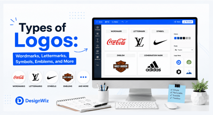
Read More: Types of Logos: Wordmarks, Lettermarks, Symbols, Emblems, and More
10. Design for Longevity
A logo should be able to remain useful as the brand grows.
This doesn’t mean every logo needs to look completely “timeless.”
Design trends naturally change.
The better goal is to avoid making the logo dependent on trends that have little connection to the brand.
Be careful with short-lived trends
Examples can include:
- Overused visual effects
- Trend-specific gradients
- Excessive 3D effects
- Temporary typography trends
- Decorative styles strongly associated with a particular period
A trend can be appropriate when it supports the brand.
The problem is designing primarily to follow a trend.
Longevity doesn’t mean changing
Brands sometimes need to update their visual identity.
A logo may be refreshed when:
- The business changes direction
- The audience changes
- The existing design feels outdated
- Digital applications require a simpler system
- The brand expands into new markets
A strong brand can evolve while retaining recognizable elements from its existing identity.
Common Characteristics of a Bad Logo
A “bad” logo isn’t necessarily one that looks ugly.
Sometimes a logo can look attractive but perform poorly.
Watch for these warning signs.
1. Too many competing ideas
If the logo tries to communicate everything, the viewer may struggle to identify the main idea.
2. Generic visual symbols
Using the most obvious icon in an industry can make differentiation difficult.
3. Poor typography
If the business name is difficult to read, the logo loses one of its most important communication functions.
4. Weak contrast
Poor contrast can make a logo difficult to see against certain backgrounds.
5. Tiny details
Small decorative elements may disappear in real-world applications.
6. Overdependence on trends
A logo designed entirely around a temporary style may age quickly.
7. Poor small-size performance
A logo that only works when displayed large isn’t practical for many modern applications.
8. Similarity to competitors
A logo that is too visually similar to competing brands may create confusion.
9. No clear visual hierarchy
If everything has equal visual importance, nothing stands out.
10. Designing for a mockup instead of reality
A logo can look excellent inside a polished presentation mockup but fail when used on an actual website, printed document, or small screen.
Logo Design Principles in Practice
Let’s see how these principles can work together. Imagine a fictional coffee brand called NorthPeak Coffee.
The brand wants to communicate:
Independent + Premium + Adventurous
Instead of using a generic coffee cup icon, the brand could explore a visual concept based on a mountain peak.
Now evaluate the concept using the 10 principles.
| Principle | Design Decision |
|---|---|
| Simplicity | Use one clear peak shape instead of a detailed mountain illustration |
| Memorability | Create a distinctive peak silhouette |
| Relevance | Connect the visual concept with exploration and the brand name |
| Distinctiveness | Avoid generic coffee imagery used by competitors |
| Legibility | Ensure “NorthPeak Coffee” remains readable |
| Scalability | Test the mountain mark at small sizes |
| Versatility | Prepare versions for light and dark backgrounds |
| Balance | Adjust the relationship between symbol and typography |
| Consistency | Use the same visual language across brand assets |
| Longevity | Avoid temporary effects that could quickly date the design |
Notice that no single principle determines the final design. The strength comes from how the principles work together.
Conclusion
So, what makes a good logo? It’s not simply a beautiful font, an attractive color palette, or an interesting icon. A strong logo is built around a clear idea and performs its job effectively.