You created a banner, published it, and expected results. But instead of clicks and conversions, it barely got noticed.
The problem usually isn’t the offer—it’s the banner itself. A cluttered design, weak message, or unclear CTA can make people scroll right past it.
The good news? With DesignWiz banner maker and the right strategy, creating a professional banner is easier than ever.
In this guide, you’ll learn how to make a banner that grabs attention, communicates your message, and gets results.
How to Make a Professional Banner in 5 Simple Steps
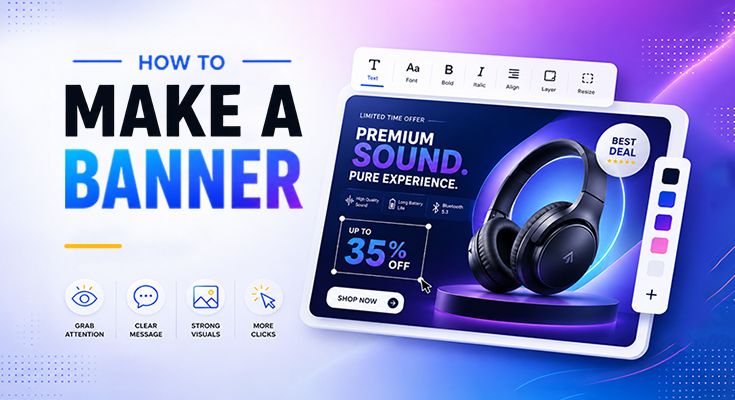
Creating a professional banner doesn’t have to start with a blank canvas. With ready-made banner templates, you can create eye-catching designs in minutes by simply customizing a template that fits your needs.
Know Your Goal Before You Start
Before selecting a banner template, decide what you want your banner to achieve. A clear objective will help you choose the right design and message.
- Promote a sale or special offer
- Announce an event
- Drive traffic to a website
- Increase brand awareness
- Encourage sign-ups or registrations
The more focused your goal is, the more effective your banner will be.
Choose the Right Banner Template
Instead of starting from scratch, browse professionally designed banner templates and choose one that matches your purpose.
- Select a template designed for your industry or niche
- Choose a layout that matches your promotion or campaign
- Look for styles that fit your brand identity
- Pick a template that works well for your target platform
Customize Your Banner
After choosing a template, personalize it to match your brand and campaign goals.
- Replace the placeholder text with your own message
- Upload your images or product photos
- Change colors to match your brand
- Add your logo and contact details
- Update the call-to-action text
Create Versions for Other Platforms
Different platforms use different banner dimensions. Once your design is ready, create additional versions using pre-sized templates.
- Website banners
- Social media banners
- Promotional campaign banners
- Display advertising banners
Using ready-made sizes helps maintain a consistent brand appearance across all platforms.
Download & Share
When you’re satisfied with your design, download it and publish it wherever you need it.
- PNG – Great for high-quality graphics
- JPG – Smaller file size for quick sharing
- WebP – Optimized for websites and fast loading
What Makes a Banner “Clickable”? (The 3-Second Rule)
When someone lands on a page, they don’t read it. They scan it. Studies consistently show that a visitor decides whether to engage with a visual element within 3 seconds or less.
A clickable banner does one thing really well: it makes the viewer feel like clicking is the obvious next step.
The message is instantly clear, no guessing what it’s about
The visual draws the eye before anything else on the page
The CTA tells them exactly what happens when they click
The whole thing feels relevant to where they are and what they want
The 5 Core Elements Every High-Click Banner Needs
Think of these as your non-negotiables. Every high-performing banner has all five. Miss one and you’re leaving clicks on the table.
Sharp Headline
Short, direct, and benefit-focused. The first thing people read (if they read anything at all).
Relevant Visual
Use product photos, lifestyle images, or bold illustrations, not generic stock photos that could belong to anyone.
Clear CTA
One button. One action. No confusion. Specific beats generic every time.
Strong Color Contrast
Your banner must stand out from the page it lives on. Use contrast intentionally.
Visual Hierarchy
The viewer’s eye should travel naturally: headline → visual → CTA. If everything competes, nothing wins.
How to Write a Banner Headline That Stops the Scroll
The headline is 80% of your banner’s job. A beautiful design with a weak headline will still kill your CTR.
Lead with the benefit, not the feature
Use numbers when you can
Numbers create instant specificity and trust. “Up to 50% off” outperforms “Big Sale” every single time.
Power words that increase clicks
- Free, New, Limited, Exclusive, Instant
- You / Your (makes it personal)
- Today, Now, Last Chance (urgency)
- Proven, Guaranteed, Trusted (credibility)
Choosing the Right Colors and Fonts for Your Banner
The contrast rule
Your CTA button and headline must have at least a 4.5:1 contrast ratio against the background. If you can’t read it easily in bright sunlight on your phone, it won’t get clicked.
Font choices that work
- Stick to 2 fonts maximum: one for the headline (bold, display), one for body or subtext (clean, readable)
- Avoid decorative or script fonts for headlines, they’re hard to read at a glance
- Font size for headlines: 28pt minimum on desktop, 20pt minimum on mobile
- Never put light text on a light background or dark text on a dark background
CTA Design: What to Say and Where to Put It
Your CTA is the finish line. Everything in your banner exists to get the viewer to this button.
| Weak CTA | Strong CTA |
|---|---|
| Click Here | Shop the Collection |
| Learn More | See How It Works |
| Submit | Get My Free Quote |
| Buy Now | Grab 30% Off Today |
Where to place your CTA
- Bottom right of the banner, natural endpoint of eye movement
- Centre, works well for minimal, text-focused banners
- Never overlap the CTA with the main image or headline
- Leave breathing room (white space) around the button
CTA button design rules
- Minimum size: 44 × 44px (tappable on mobile)
- High contrast, the button should “pop” off the banner background
- Rounded corners feel more friendly and clickable than sharp edges
- Add a subtle hover effect if it’s a digital banner
Banner Sizes That Actually Get Clicks (By Platform)
Common Banner Design Mistakes (And How to Fix Them)
Visitors don’t read banners; they glance. Walls of text get ignored.
Stick to a headline (max 8 words), a 1-line subtext (optional), and a CTA. That’s it.
When everything is trying to be the hero, the viewer doesn’t know where to look.
Pick ONE hero element, either a bold headline or a strong image, and build everything else around it.
Smiling people in generic office settings signal “not authentic.” Visitors tune them out.
Use real product photos, custom illustrations, or images that directly relate to your offer.
If the CTA button looks like part of the background, no one will find it.
Use a contrasting accent color specifically for CTA buttons. It should be the most visually distinct element on the banner.
A desktop banner often collapses badly on mobile, text becomes unreadable, images get cropped.
Always create separate mobile and desktop versions, or design in a stacked format that works at any width.
Quick Checklist: Is Your Banner Ready to Go Live?
FAQs
The headline. If your message isnt clear in the first 2 seconds, nothing else matters. A strong, benefit-driven headline is the single highest-leverage element in any banner.
Yes, significantly. High contrast between the banner background and CTA button is one of the strongest predictors of CTR. Red and orange buttons tend to perform well for urgency-driven offers, while blue and green work better for trust-based actions.
An informational banner builds awareness (new category, new product). A conversion banner drives action (sale, sign-up, limited offer). For conversion banners, every element should create a single focused path to clicking. Remove anything that doesnt serve that one goal.
If youre looking for a fast and easy way to create professional banners, Designwiz is a great choice. With AI-powered tools, customizable templates, and an intuitive editor, it simplifies the design process from start to finish. Whether youre creating website banners, social media graphics, or promotional ads, Designwiz helps you produce professional-quality visuals in minutes, no advanced design experience required.
Used carefully, animation can increase CTR by drawing the eye. Keep it subtle; a gentle fade or slide is enough. Avoid flashing or complex animations that distract from the message or slow down page load.
The best CTAs are specific and action-oriented. Instead of Click Here or Learn More, try Shop the Sale, Get My Free Quote, or See Whats New. The CTA should tell users exactly what will happen when they click.
Final Thoughts
Good banner design isn’t about being the most creative person in the room. It’s about being the clearest. The banners that get clicks are the ones that respect the viewer’s time. They say what they mean, show what they’re selling, and make it easy to take the next step.
If you’re learning how to make a banner, focus on clarity before creativity. Start with the process, run the checklist before every publish, and test one element at a time, headline first, then CTA, then color. Small improvements compound quickly. The goal isn’t to win a design award. The goal is to earn the click. Now build something clickable.