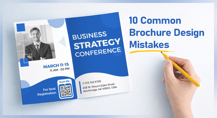
Many businesses use a brochure maker to create brochures to promote their products, services, or brands to potential customers. But if the brochure design is not done well, people may ignore it or toss it aside – wasting your time and money. Often, common brochure design mistakes like too much text, cluttered layouts, poor image quality, or weak calls-to-action can make a big difference in how your brochure is received. By understanding where things usually go wrong, you can avoid these mistakes and ensure your brochure gets noticed and read.
10 Common Mistakes to Avoid When Designing Brochures
Designing an effective brochure requires more than just good visuals; it’s about avoiding common pitfalls that can reduce its impact. Here are the most frequent brochure design mistakes and how you can avoid them.
Mistake 1: Overloading the Brochure with Too Much Text
Why does it happen?
Brochures often get overloaded with long paragraphs and excessive information, which overwhelms readers. Since most people skim brochures rather than reading every word, important details get lost or ignored.
How to Avoid?
Keep your content simple and focused. Include only the most essential elements:
A Clear, Bold Headline
This grabs attention immediately and tells the reader what the brochure is about at a single glance.
The Essentials
Clearly state only the most important information:
- What? (Your product, service, or offer)
- Why? (The benefit to the reader)
- Where? (Location, website, or platform)
- How? (Next steps or instructions to act)
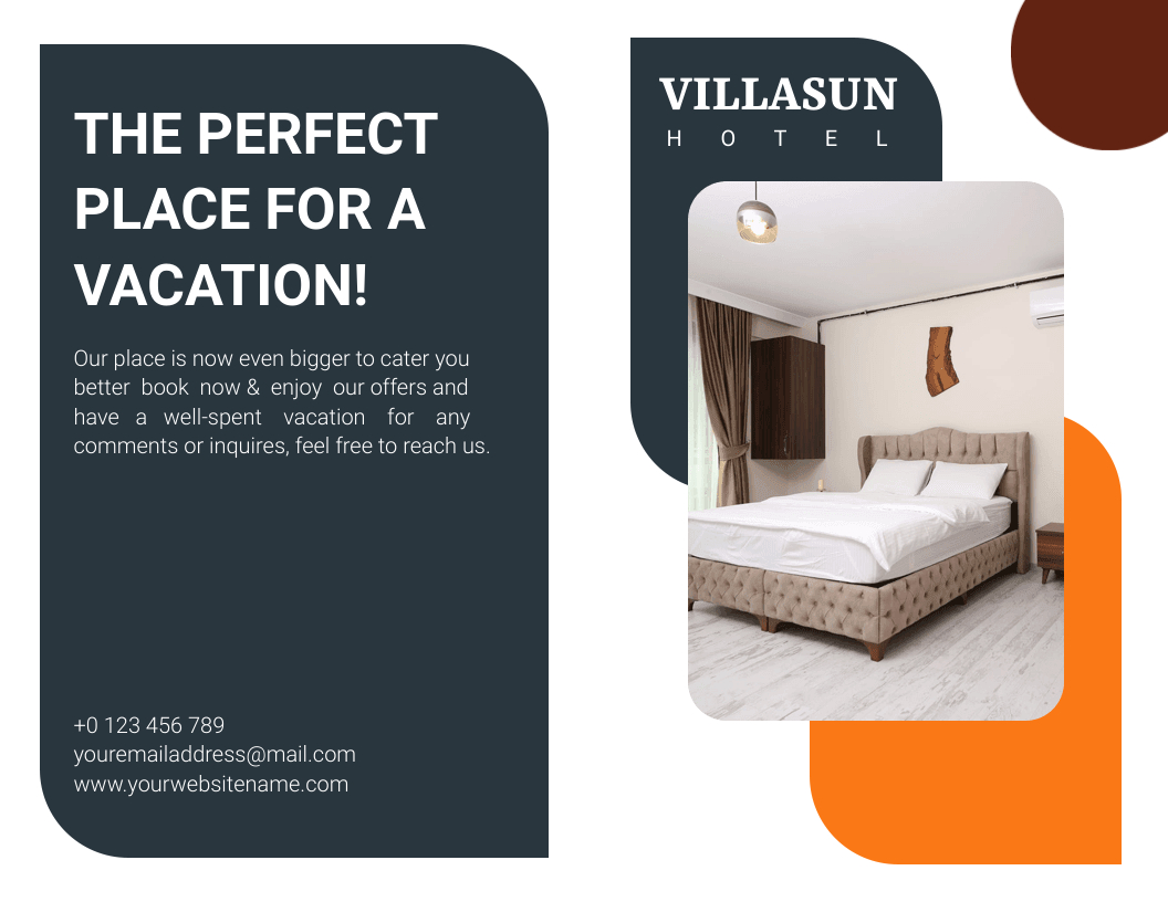
Apply the five-second rule. If a new reader cannot understand your main message within five seconds of picking up your brochure, there is too much text. Simplify until they can.
Mistake 2: Poor Font Choices and Typography
Why It Happens
Designers sometimes choose decorative or novelty fonts to make the brochure look unique, not realizing these fonts hurt readability. Using too many font styles in one document also creates visual chaos that makes the brochure look amateurish.
How to Avoid It
Limit your brochure to a maximum of two or three fonts – one for headlines and one for body text. Choose typefaces that are clean and easy to read, especially at smaller sizes. Avoid fonts that look stylish on screen but become unreadable in print.
| ✅ Good Font Choices | ❌ Fonts to Avoid |
|---|---|
| Montserrat | Comic Sans |
| Poppins | Papyrus |
| Open Sans | Overly decorative script fonts |
| Roboto | Curlz MT |
| Lato | Any font below 9pt in body text |
Use bold and size variation within the same font family to create visual hierarchy instead of switching to multiple different typefaces.
Learn more: Understand proper brochure sizes and print settings before finalizing your design
Mistake 3: Bad Color Combinations
Why does it happen?
Applying clashing colors makes your brochure difficult to read and uncomfortable to look at. Poor color choices draw attention away from your message and leave a negative impression on the reader.
How to Avoid?
Employ a balanced color palette that reflects your brand identity. Stick to two or three primary colors throughout the brochure for consistency.
Use Contrasting Colors
Choose colors that make text stand out clearly against the background. High contrast improves readability and ensures key information gets noticed first.
Maintain a Consistent Color Scheme
Select a color palette that aligns with your brand identity. Sticking to two or three brand colors throughout the brochure creates a professional and cohesive appearance.
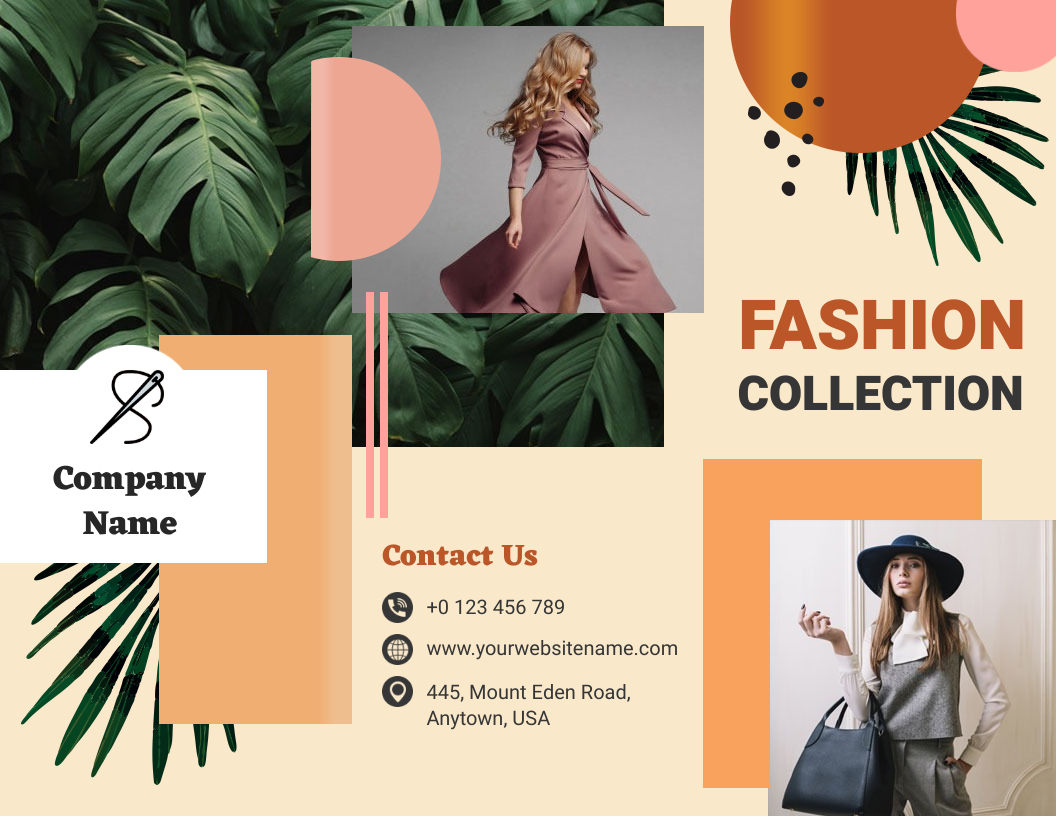
Use a color palette generator to find combinations that are harmonious, on-brand, and accessible – including for colorblind readers.
Mistake 4: Using Low-Quality Images
Why It Happens
Images are often sourced quickly – pulled from a website, screenshotted from a PDF, or grabbed from a low-resolution file. In print, these images look blurry, pixelated, and cheap, which directly damages your brand credibility.
How to Avoid It
Always use high-resolution images for print brochures. Make sure images are relevant to your message and avoid overused stock photos that look generic.
Use High-Resolution Images
Always use images at 300 DPI (dots per inch) for print brochures and at least 150 DPI for digital formats. This ensures your visuals are sharp, clear, and professional in the final printed piece.
Ensure Relevance
Choose images that directly relate to your brochure’s purpose and audience. Relevant visuals strengthen your message and make the reader feel understood.
Avoid Overused Stock Photos
Stay away from clichéd or generic stock photos like the standard handshake image. These make your brochure look unoriginal and can weaken brand credibility.
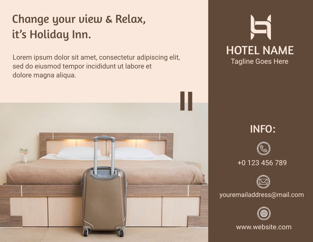
When in doubt, go larger. A high-resolution image scaled down always looks better than a low-resolution image scaled up.
Mistake 5: No Clear Call-to-Action (CTA)
Why It Happens
Designers focus so much on making the brochure look good that they forget to tell the reader what to do next. Without a clear call-to-action, even the most beautiful brochure fails to convert readers into customers.
How to Avoid It
Every brochure must include at least one strong, specific, and visible call-to-action. Your CTA should tell the reader exactly what step to take and why they should take it right now.
Weak CTA
Strong CTA
Place your CTA in a visually prominent location on the back cover, inside the final panel, or inside a colored box that draws the eye immediately.
Mistake 6: Cluttered Layout and Ignoring White Space
Why It Happens
The instinct to fill every inch of a brochure with content comes from wanting to maximize value. But white space is not wasted space; it is a design tool that improves readability, guides the eye, and makes key information stand out.
How to Avoid It
Embrace white space as an active design element, not an empty gap to fill. A clean layout communicates professionalism and confidence.
- Use a grid system to align elements consistently across all panels
- Leave generous margins around text blocks and images
- Do not feel pressured to fill every panel completely
- Group related information visually and separate sections clearly

Look at premium brand brochures and notice how much space they leave empty. Restraint in layout is a sign of design maturity.
Mistake 7: Inconsistent or Missing Branding
Why It Happens
Brochures are sometimes designed in isolation, without referencing the company’s existing brand guidelines. The result is a brochure that looks like it belongs to a different business, using wrong colors, inconsistent fonts, or a logo version that does not match other materials.
How to Avoid It
Your brochure should be an extension of your brand identity, not a standalone design experiment. Use your official brand colors, approved logo files, and consistent tone of voice throughout.
- Always use vector logo files (.ai, .eps, or .svg) for print
- Match the color values from your brand style guide exactly
- Maintain the same tone, formal, friendly, or bold, as your other marketing materials
- Include your tagline, social media handles, and website URL consistently

Create a one-page brand checklist before designing any brochure. Run the final design against this checklist before sending to print.
Mistake 8: Designing Without Knowing Your Target Audience
Why It Happens
Many brochures are designed based on what the business wants to say rather than what the audience actually needs to hear. This leads to content and visuals that feel disconnected from the reader’s reality, making the brochure easy to ignore.
How to Avoid It
Before opening any design software, define your target audience clearly. Ask yourself who will pick up this brochure, what problem they are trying to solve, and what language resonates with them.
- Use language your audience uses – avoid internal jargon
- Choose images that reflect your audience’s lifestyle or industry
- Highlight benefits over features, tell them what is in it for them
- Test a draft with a small sample of your actual audience before finalizing
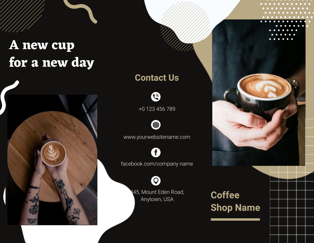
Write a one-line audience profile before you start: for example, “This brochure is for small business owners aged 30 to 50 who are looking for affordable branding solutions.” Keep it visible while you design.
Mistake 9: Skipping Proofreading
Why It Happens
After spending hours designing a brochure, it is easy to overlook typos, grammatical errors, or incorrect contact details. These mistakes seem small, but they immediately undermine the professionalism of your brand.
How to Avoid It
Build a mandatory proofreading step into every brochure project. Do not rely on the designer to proofread – they have been staring at the content too long to catch errors effectively.
- Have at least two different people review the final content
- Check all phone numbers, email addresses, URLs, and social handles
- Verify dates, pricing, and any facts or statistics cited
- Print a physical proof copy before approving the final run
Read the content out loud. Your ear will catch errors that your eye has learned to ignore.
Mistake 10: Ignoring Print Specifications (Bleed, Resolution, and Paper)
Why It Happens
This is the brochure design mistake that most digital designers overlook entirely. Designing for print without setting up the correct file specifications, bleed area, resolution, color mode, and paper choice can result in white edges, blurry images, or colors that look completely different in print than on screen.
How to Avoid It
Before you start designing, confirm the print specifications with your printing service. Set up your document correctly from the beginning, not as an afterthought.
Always request a printed proof or a digital soft proof from your printer before approving the full run. What looks perfect on screen can print very differently.
Before moving on, it’s worth noting that these design issues are not limited to brochures. Similar mistakes often appear in other print materials as well. If you’re also working on flyers, you can explore these common flyer design mistakes.
Learn more: Learn how to create a brochure that drives action and conversions
What Are the Benefits of a Well-Designed Brochure?
Avoiding these brochure design mistakes is not just about aesthetics; it directly impacts how your brand is perceived and how effectively your brochure drives results. Here is what a professionally designed brochure delivers:
1. Increased Brand Visibility: A visually compelling brochure catches the eye and makes people stop and look. When the design is clean, the colors are on-brand, and the layout is balanced, your brochure stands out and leaves a memorable impression.
2. Clearer Communication: A well-structured brochure communicates your message quickly and clearly. Readers should be able to understand what you offer, why it matters, and what to do next – all within the first few seconds of reading.
3. Stronger Brand Credibility: A polished, professional brochure signals that your business takes quality seriously. Potential customers associate the quality of your printed materials with the quality of your products and services. A poorly designed brochure can create doubt even before a conversation begins.
4. Higher Engagement and Action: Brochures with a strong call-to-action, relevant visuals, and audience-focused content are far more likely to drive real results, whether that means a phone call, a website visit, or a purchase decision.
5. Cost-Effective Marketing: When a brochure is designed correctly the first time, it avoids costly reprints due to errors, missing information, or print specification failures. A well-designed brochure also has a longer shelf life because the content and design do not become dated quickly.
6. Consistent Brand Identity: A brochure that aligns with your logo, website, and other marketing materials builds brand recognition over time. Consistency across all touchpoints makes your business more memorable and trustworthy.
FAQs
Overloading the brochure with too much text. Readers skim printed materials, and a wall of text makes them stop reading immediately. Keep your content concise, focused, and broken up with headers, bullet points, and strong visuals – these are the brochure design mistakes.
Stick to a maximum of two or three fonts – one for headlines, one for body text, and optionally one for accent elements. Using too many different typefaces creates visual noise and makes the brochure look unprofessional.
Bleed is the extra margin added beyond the intended trim edge of the brochure. When brochures are cut during printing, small variations can reveal white edges if there is no bleed. Always add at least 3mm of bleed on all sides to avoid this issue.
Focus on four fundamentals: use high-quality images at 300 DPI, maintain consistent branding with your official colors and logo, keep the layout clean with adequate white space, and proofread every piece of text at least twice before printing.
Absolutely. Without a clear call-to-action, your brochure informs but does not convert. Tell readers exactly what you want them to do next – call, scan, visit, or book and make that instruction impossible to miss.
Conclusion
A successful brochure isn’t just about looks; it’s about making smart design choices that drive results. From clear text and readable fonts to proper print setup and strong calls-to-action, every detail matters. By avoiding these brochure design mistakes, you can create brochures that engage your audience and strengthen your brand instead of hurting it.
Key Takeaways:
- Keep content clear and concise
- Use 2–3 readable fonts
- Choose high-contrast, on-brand colors
- Use 300 DPI images
- Include a clear call-to-action
- Use white space effectively
- Stay consistent with branding
- Design for your target audience
- Proofread carefully and print a sample