A logo is often one of the first visual elements people associate with a business. It can appear on a website, social media profile, business card, product packaging, storefront, advertisements, and countless other brand touchpoints.
But creating an effective logo is more than putting a business name next to an icon.
A good logo starts with understanding the brand, identifying the right visual direction, developing a strong concept, refining the design, and making sure the finished logo works across different sizes and applications.
If you’re wondering how to make a logo, this guide walks you through the complete logo design process from the initial idea to the final files.
Whether you’re a small business owner, marketer, entrepreneur, freelancer, or beginner exploring logo design, you can use these steps to create a logo that is recognizable, practical, and aligned with your brand.
What You Need Before Making a Logo
Before you start drawing symbols or choosing fonts, collect some basic information about the brand.
A logo should support the identity of the business rather than exist independently from it.
Start by answering:
- What does the business do?
- Who are its customers?
- What makes the business different?
- What personality should the brand communicate?
- Where will the logo be used?
- Are there existing brand colors, fonts, or visual elements?
- Who are the main competitors?
For example, a children’s education company may want its identity to feel approachable and energetic, while a financial consulting firm may need a more structured and professional visual direction.
Explore Logo Templates
Get started with a professionally designed logo template and customize it to match your brand.



Step-by-Step Guide to Design a Logo Like a Pro
To make a logo, follow these 9 steps: research the brand and its audience, decide what the logo should represent, choose a logo direction, sketch and develop initial concepts, build the logo design, refine and simplify the design, test your logo in real-world situations, prepare the final logo files, and review ownership and usage rights.
Research the Brand and Its Audience
The first practical step in the logo design process is research.
Before you create a logo, understand the business and the people it is trying to reach.
Understand the brand
Look beyond the business name.
Identify:
- Products or services
- Brand values
- Unique selling proposition
- Brand personality
- Industry
- Target market
- Positioning
A useful exercise is to describe the brand using three to five words.
For example:
Modern + Reliable + Simple + Professional
These words can become a reference point throughout the design process.
Research the target audience
The same visual style can communicate very different things to different audiences.
Consider:
- Age group
- Preferences
- Expectations
- Buying behavior
- Industry familiarity
- Cultural context
Your goal isn’t to design a logo that everyone likes. It’s to design one that is appropriate for the people the brand wants to reach.
Research competitors
Look at competing brands and identify patterns.
Ask:
- What colors appear frequently?
- Are competitors primarily using text, symbols, or both?
- What visual conventions are common?
- Where could your brand look different?
Competitor research should help you identify opportunities for differentiation—not provide something to copy.
Decide What Your Logo Should Represent
Once you understand the brand, decide what the logo needs to communicate.
A logo does not need to visually explain everything a business does.
Instead, identify the one or two strongest ideas you want the visual identity to reinforce.
A fitness brand might want to communicate:
Energy + Strength
A technology company might focus on:
Innovation + Simplicity
A luxury brand might emphasize:
Elegance + Exclusivity
This makes the design process more focused.
Turn brand ideas into visual concepts
Now translate those ideas into possible visual directions.
- Strength
- bold forms
- strong geometry
- stable compositions
- Innovation
- modern forms
- abstract symbols
- unexpected combinations
- Elegance
- refined typography
- controlled spacing
- minimal composition
The objective isn’t to find a literal symbol for every word.
Instead, think about how visual elements can create the desired impression.
Choose a Logo Direction
Before you design a logo, decide what kind of visual structure fits the brand.
Some businesses work well with a wordmark, while others may benefit from a symbol, monogram, emblem, or combination mark.
The right choice depends on the brand name, audience, industry, and intended applications.
Learn More: Types of Logos: 9 Logo Types, Examples & Uses
That article provides a deeper explanation of different logo types and when each approach may be appropriate.
Consider where the logo will appear
Think about the logo’s future applications:
- Website
- Social media profile
- Mobile app
- Business card
- Product packaging
- Signage
- Advertising
- Merchandise
- Email signature
A logo that looks good in one environment may not work equally well everywhere.
This is why it is better to think about the logo as a system of usable visual assets, rather than a single image.
Sketch and Develop Initial Concepts
Now it’s time to turn your ideas into visual concepts.
You don’t need to create the perfect design immediately.
Start with several rough directions.
Explore multiple concepts
Try variations in:
- Composition
- Symbol shape
- Letter arrangement
- Proportion
- Negative space
- Text placement
At this stage, focus on the underlying idea rather than small details.
You might create five or ten rough concepts and gradually eliminate weaker directions.
Don’t polish too early
A common mistake is spending too much time perfecting the first concept.
Instead:
- Generate multiple ideas.
- Compare them.
- Identify the strongest concept.
- Develop that direction further.
This makes it easier to evaluate the idea objectively.
Avoid copying existing logos
Research is useful, but your final concept should be original.
Avoid recreating a competitor’s symbol, copying distinctive visual elements, or making only superficial changes to an existing logo.
Your logo should give the brand its own visual identity.
Build the Logo Design
Once you have a strong concept, develop the actual logo.
This is where the rough idea becomes a coherent visual identity.
Focus on:
- Composition
- Proportion
- Shape
- Typography
- Color
- Spacing
- Visual hierarchy
The goal is not to add as many elements as possible.
The goal is to make every element serve a purpose.
Keep the concept clear
If someone has to study the logo for several seconds to understand its basic structure, the design may need simplification.
A strong logo should have a clear visual idea that remains recognizable even when viewed quickly.
Choose typography deliberately
Typography can influence how people perceive a brand.
A typeface can feel:
- Traditional
- Modern
- Friendly
- Technical
- Elegant
- Bold
- Playful
Don’t choose a font simply because it looks attractive in isolation. Consider whether it supports the brand’s personality and remains readable in practical applications.
Use color with purpose
Color can influence brand perception and help establish visual consistency.
However, the logo should not depend entirely on color to remain recognizable.
A useful test is to view the design in a single color.
If the underlying form still works, you have a stronger foundation.
Refine and Simplify the Design
The first completed version is rarely the final version.
Now evaluate the logo critically.
Ask:
- Is anything unnecessary?
- Is the composition balanced?
- Is the text readable?
- Are the proportions appropriate?
- Does the symbol work independently?
- Is the visual hierarchy clear?
- Does the logo still work when reduced in size?
Remove unnecessary details
One of the most effective ways to improve a logo is often to remove rather than add.
Complex gradients, excessive decorative elements, tiny details, and unnecessary shapes can make a logo harder to reproduce and recognize.
Simplification can improve:
- Recognition
- Scalability
- Reproduction
- Versatility
- Long-term usability
Use your logo principles as a final design-quality check rather than treating them as a list of decorative rules.
Test Your Logo in Real-World Situations
A logo isn’t finished simply because it looks good on your design screen.
Test it in the environments where customers will actually encounter it.
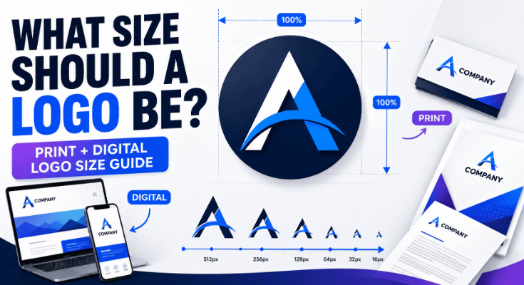
Test different sizes
View the logo:
- At large sizes
- At medium sizes
- At small sizes
- As a social profile image
- As a website header
- As a small digital icon
Look for details that disappear or text that becomes difficult to read.
Test different backgrounds
Place the logo against:
- Light backgrounds
- Dark backgrounds
- White
- Black
- Brand-colored backgrounds
- Simple photographic backgrounds
Make sure you have appropriate versions for different applications.
Test print and digital use
If the logo will appear in print, preview it in realistic applications such as:
- Business cards
- Flyers
- Brochures
- Packaging
- Signage
For digital use, test:
- Websites
- Social media
- Mobile interfaces
- Digital advertisements
Prepare the Final Logo Files
After the design has been approved, prepare the final assets.
A professional logo package may include different file formats and variations for different use cases.
You may need:
- Vector version
- Transparent-background version
- Full-color version
- One-color version
- Light-background version
- Dark-background version
- Horizontal version
- Stacked or compact version
The exact requirements depend on how the logo will be used.
Choose the appropriate file format
Different formats serve different purposes.
For example, SVG is often useful for scalable digital graphics, while PNG can be useful when transparency is required for raster-based digital use.
Print workflows may require other formats depending on the printer or production process.
Check dimensions and scalability
Don’t assume that one exported image will work everywhere.
The logo should remain usable across different applications and sizes.
Review Ownership and Usage Rights
Before publishing or commercially using a logo, make sure you understand the ownership and usage rights associated with the design.
Consider:
- Who created the logo?
- Who owns the final design?
- Are any third-party assets included?
- Are fonts, icons, or graphics licensed for the intended use?
- Are there restrictions on commercial use?
- Does the business need trademark protection?
If you’re using an online logo maker or design platform, review its terms regarding generated designs, templates, graphics, fonts, and ownership.
Legal requirements can vary by jurisdiction, so businesses with important brand assets should obtain appropriate legal advice when necessary.
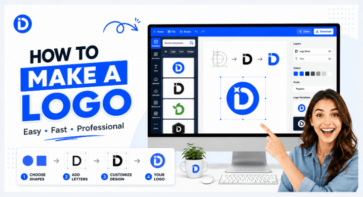
How to Create a Logo With DesignWiz Logo Maker
You don’t necessarily need advanced graphic design software to create a logo.
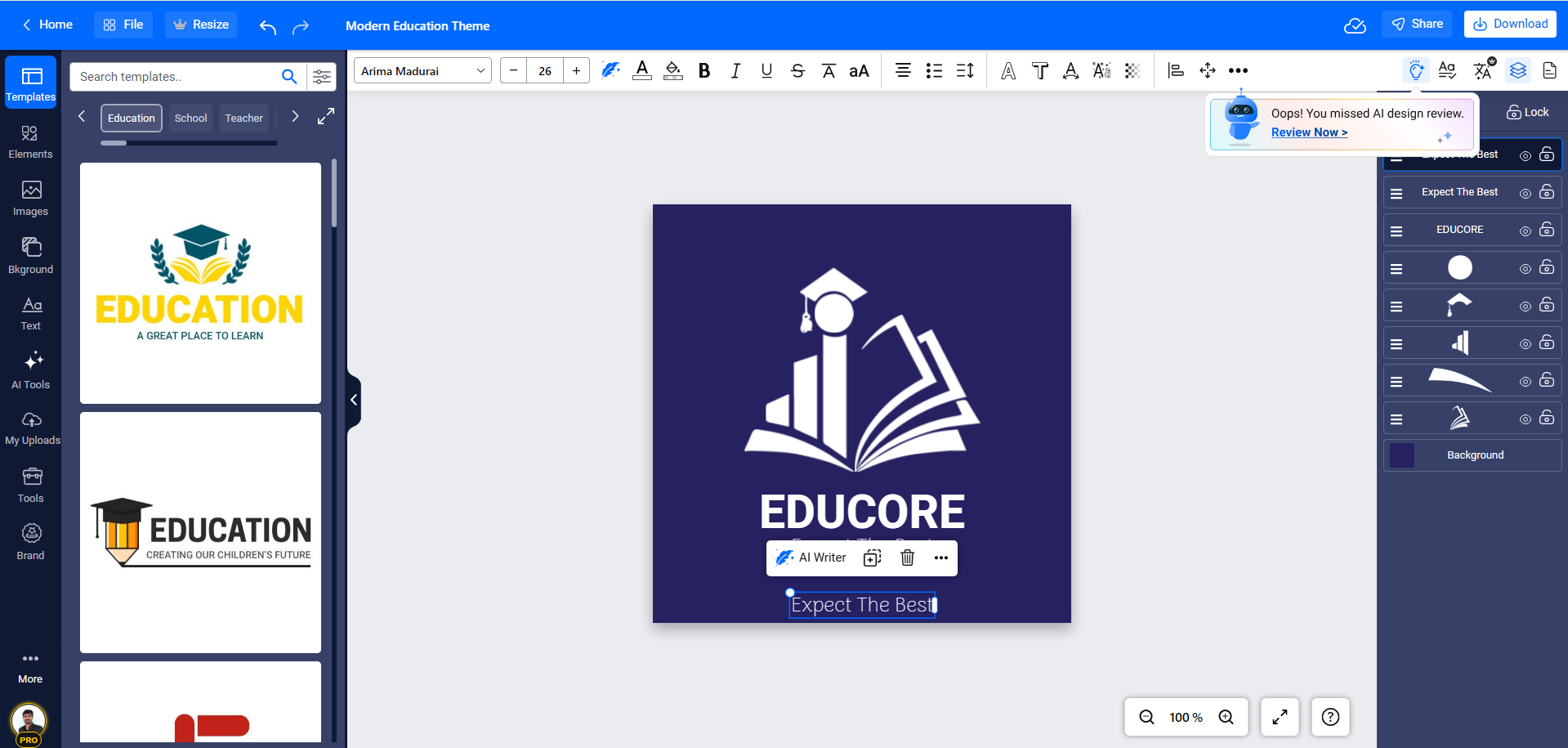
An online logo maker can simplify the process by providing templates, design elements, editing tools, and automated assistance.
For beginners, the process can look like this:
Sign up with DesignWiz Free
Create your free DesignWiz account to get started. No design experience is required—just enter your basic details and access the logo maker instantly.
Choose a professional logo template
Browse a wide collection of professionally designed logo templates. Select a style that matches your brand personality, industry, and visual direction.
Customize your logo design
Make the template your own using the easy drag-and-drop editor. Adjust elements such as:
- Brand name and tagline
- Typography and font style
- Colors and gradients
- Icons and shapes
- Layout and alignment
- Spacing and positioning
Explore advanced features
Enhance your logo using DesignWiz features like icon libraries, smart suggestions, color palettes, and style variations to refine your design and make it more unique.
Preview and refine your logo
Check how your logo looks in real-world scenarios. Test it on different backgrounds, sizes, and mockups to ensure it remains clear, balanced, and professional.
Export and download your logo
Once you’re satisfied, export your logo in high-quality formats suitable for web, print, and social media. Download all necessary variations for complete brand usage.
Common Logo-Making Mistakes to Avoid
Learning how to make a logo is not just about knowing what to do. It also means knowing what to avoid.
1. Designing before understanding the brand
Starting with colors, icons, or fonts before defining the brand direction can lead to a visually attractive but strategically weak logo.
2. Trying to communicate everything
A logo doesn’t need to explain every product, service, feature, and brand value.
Choose a focused concept.
3. Copying competitors
A logo that looks too similar to another brand can create confusion and weaken differentiation.
4. Adding too many details
Excessive detail can disappear when the logo is reduced and make reproduction more difficult.
5. Designing for only one application
A logo designed exclusively for a website header may not work well on packaging, social media, or print.
6. Choosing visual elements without purpose
Every major element should contribute to the brand’s identity or usability.
7. Ignoring small-size performance
Always check how the logo performs when reduced.
8. Keeping only one final file
A single low-resolution image isn’t a complete logo asset package.
Prepare the formats and variations needed for actual use.
Frequently Asked Questions
Yes. Beginners can create a professional logo by following a clear process, understanding the brand, and keeping the design simple, focused, and consistent. Good decisions matter more than advanced tools.
It depends on research, concepts, and revisions. A simple logo may take a few hours, while a complete professional identity can take several days or weeks to refine properly.
A logo can include a wordmark, symbol, monogram, or combination. The structure depends on the brand’s identity, industry, and where the logo will be used.
Not always. Some brands use only text, while others combine text and symbols. The choice depends on clarity, recognition, and how the logo performs across different platforms.
Vector formats like SVG are best for scaling, while PNG works well for digital use with transparency. Print and professional use may require additional formats like PDF or EPS.
Yes. Online tools make it easy to create a logo without experience. However, understanding basic design principles like balance, spacing, and simplicity improves the final result.
Use a logo maker for quick, affordable needs. Hire a designer for complex branding or when you need a highly customized, strategic identity.
Conclusion
Creating a logo is a structured process that combines research, creativity, and refinement. When you focus on clarity, simplicity, and brand alignment, you can design a logo that is both memorable and effective across all platforms.