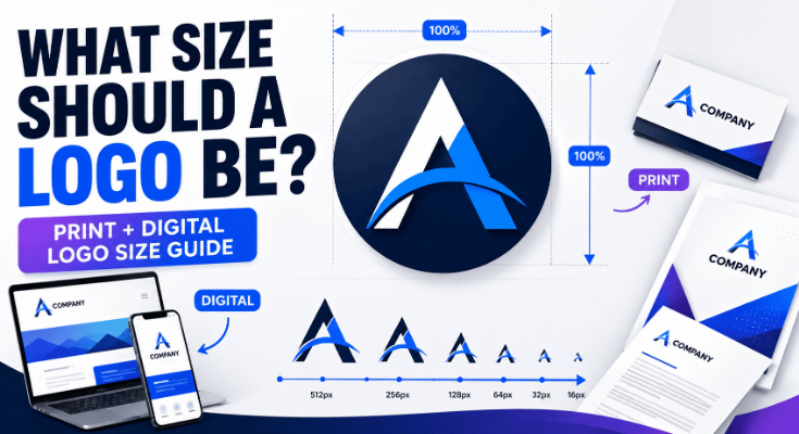
There is no single standard logo size that works everywhere. A website, business card, social profile, flyer, and storefront all require different dimensions and display conditions. The right approach is to keep a high-quality master logo and prepare versions for specific applications. This guide explains practical logo sizes for digital and print, how dimensions and resolution differ, and how to test a logo before using it.
What Size Should a Logo Be?
A logo should be large enough to remain readable and recognizable in its final application, but not so large that it overwhelms the available space.
For digital use, logo dimensions are generally measured in pixels. For physical materials, dimensions are usually measured in inches or millimeters. A vector logo can scale between these applications without losing sharpness.
Here are practical starting points:
| Application | Practical Starting Size |
|---|---|
| Website header | 200 to 400 px wide |
| Website favicon | 16 to 48 px |
| Social media profile | 400 to 800 px |
| Email signature | 150 to 300 px wide |
| Business card | 0.75 to 1.5 in wide |
| Flyer | 1.5 to 4 in wide |
| Brochure | 1 to 3 in wide |
| Poster | 2 to 6+ in wide |
| Signage | Depends on viewing distance |
| Large-format printing | Use vector artwork |
These are starting points, not universal specifications. The correct size depends on the available space, logo complexity, viewing distance, and whether the logo contains small text or fine details.
Logo Size vs. Dimensions vs. Resolution: What’s the Difference?
These terms are often used interchangeably, but they describe different things.
Logo dimensions
Dimensions describe the physical or digital size of an image.
For example:
- 500 × 500 px
- 1200 × 400 px
- 3 × 2 inches
- 75 × 50 mm
The first number represents width and the second represents height.
Resolution and DPI
DPI means dots per inch. It is primarily relevant to printed output.
A common print standard is 300 DPI, especially for photographs and raster graphics. However, DPI is not the main limitation when working with a true vector logo.
Pixel dimensions
Pixels describe the size of a digital image.
For example, a logo that is 800 × 800 px contains 800 pixels across and 800 pixels vertically.
Pixel dimensions matter when the logo will be displayed on websites, social platforms, apps, or other screens.
Physical dimensions
Physical dimensions describe how large a printed logo will appear.
For example:
- 1 inch wide on a business card
- 3 inches wide on a flyer
- 12 inches wide on packaging
- Several feet wide on signage
Why vector logos don’t have a fixed pixel size
SVG, EPS, and other vector formats describe artwork using mathematical paths rather than a fixed grid of pixels.
This means the same logo can be used:
- As a small website graphic
- On a business card
- On a large poster
- On a storefront sign
Without the artwork itself becoming pixelated.
Read More: How to Make a Logo: Step-by-Step Guide
What Size Should a Logo Be for Digital Use?
Digital logos are normally specified in pixels. However, the correct dimensions depend on where the logo will appear.
Website Logo Size
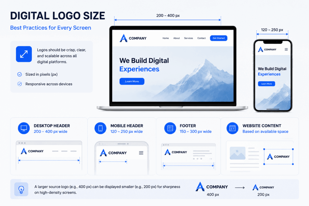
For a typical website header, a logo around 200 to 400 pixels wide is a useful starting point.
The actual displayed size may be smaller because websites commonly use responsive layouts.
For example:
| Website Location | Suggested Starting Size |
|---|---|
| Desktop header | 200 to 400 px wide |
| Mobile header | 120 to 250 px wide |
| Footer | 150 to 300 px wide |
| Website content | Based on available space |
Do not confuse the image’s source dimensions with its displayed dimensions. A 400 px wide logo can be displayed at 200 px wide while retaining additional image data for higher-density screens.
Favicon and Browser Icons
Favicons are much smaller than normal website logos.
Common favicon sizes include:
- 16 × 16 px
- 32 × 32 px
- 48 × 48 px
A logo with a long brand name may not work well at this size. An icon, monogram, or simplified symbol is often more appropriate.
For example, a full logo reading “Green Valley Coffee House” may become difficult to recognize at 16 × 16 px. A simple coffee cup symbol or “GVC” monogram may work better.
Social Media Profile Pictures
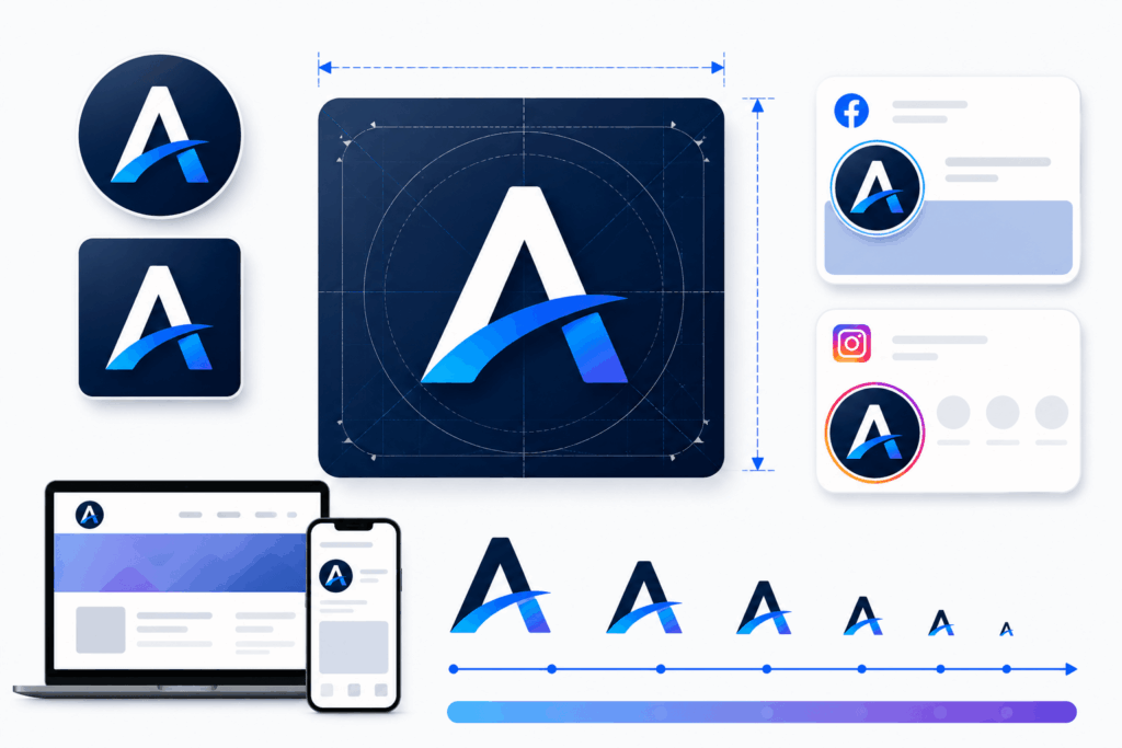
Social platforms commonly display profile images inside circular or square containers.
A practical approach is to start with a relatively large square canvas, such as 800 × 800 px, and keep the important logo elements toward the center.
| Use | Suggested Working Canvas |
|---|---|
| Social profile image | 400 × 400 to 800 × 800 px |
| Square social graphic | 1080 × 1080 px |
| Video channel branding | Use the platform’s current specifications |
Platform requirements can change, so check the specific platform’s current upload specifications before publishing.
Email Signatures
For email signatures, a logo around 150 to 300 pixels wide is usually sufficient.
Large logos can increase email size and may take longer to load. The logo should also remain recognizable when viewed on a phone.
Apps and Digital Products
For an app or software interface, logo size depends on where the mark appears:
- App icon
- Login screen
- Navigation bar
- Splash screen
- Account area
- In-product branding
An application may require several assets rather than one resized file.
What Size Should a Logo Be for Print?
Print sizing depends on the physical area available and the surrounding design.
There is no universal rule such as “every printed logo should be 3 inches wide.”
A logo on a business card may need to be less than 2 inches wide, while a logo on a poster may need to be several inches wide.
Business Cards
A logo around 0.75 to 1.5 inches wide is a practical starting range for many business cards.
The available space depends on:
- Card orientation
- Logo proportions
- Contact information
- Margins
- Brand layout
Avoid making the logo so large that it competes with the person’s name or contact information.
Flyers and Posters
For flyers and posters, a logo often appears between 1.5 and 4 inches wide, but the appropriate size depends heavily on the overall layout.
A promotional flyer may place the logo near the top, while a poster may use it in a corner.



Brochures
A logo on a brochure commonly ranges from about 1 to 3 inches wide.
For multi-panel brochures, consider whether the logo appears on:
- Front cover
- Back panel
- Interior pages
- Footer
The same logo does not necessarily need to occupy the same physical width in every location.
Letterheads and Documents
For letterheads, a logo is usually kept relatively compact so that there is enough room for the document’s main content.
A logo around 1 to 2.5 inches wide is a reasonable starting point for many layouts.
Packaging and Product Labels
Packaging requires more attention to available space.
Consider:
- Label dimensions
- Product shape
- Printing method
- Required legal information
- Brand hierarchy
- Viewing distance
A logo may need to work at both a small label size and a larger packaging application.
Banners and Signage
For signage, logo size should be determined partly by viewing distance.
A logo that looks readable from 5 feet away may be too small when viewed from 50 feet away.
For large-format applications, use vector artwork whenever possible.
Read More:What Makes a Good Logo? 10 Essential Design Principles
What Resolution Should a Logo Be for Printing?
For raster graphics, 300 DPI is a common target for high-quality print work.
However, the situation is different for vector logos.
A vector logo can be scaled to different physical dimensions without introducing pixelation because its shapes are mathematically defined.
For example, an SVG logo can be used on:
- A 1-inch business card
- A 12-inch sign
- A large poster
- A storefront graphic
Without changing the underlying vector artwork.
When 300 DPI matters
300 DPI is particularly relevant when your logo has been exported as a raster image such as PNG or JPG.
For example, if you want to print a logo at 4 inches wide at 300 DPI:
4 × 300 = 1,200 pixels
So the raster image should have approximately 1,200 pixels of width at the intended print size.
The calculation is:
Required pixels = print size in inches × DPI
When DPI is less important
If you are supplying a genuine vector file such as SVG or EPS, you do not need to define the logo around a fixed pixel resolution in the same way.
This is one reason professional brand assets commonly include both vector and raster versions.
Does a Logo Need Different Sizes for Different Uses?
Yes, but that does not necessarily mean creating completely different logos.
A brand can maintain one core identity and prepare several versions for different contexts.
Common variations include:
Primary logo
The complete version of the brand mark, often including the business name.
Horizontal logo
Useful for:
- Website headers
- Business cards
- Email signatures
- Wide layouts
Stacked logo
Useful when horizontal space is limited.
Icon or symbol
Useful for:
- Favicons
- App icons
- Social profile images
- Small digital interfaces
Simplified small-size version
Some brands remove small details or tiny text when the logo must be displayed at a very small size.
The important point is that these versions should still feel like the same brand.
What Is the Best Aspect Ratio for a Logo?
There is no universal best aspect ratio.
The right shape depends on the logo and where it will be used.
Horizontal logos
A horizontal logo is useful for:
- Website headers
- Business cards
- Letterheads
- Email signatures
Square logos
Square compositions work well for:
- Social profile images
- App icons
- Avatars
- Compact digital spaces
Vertical or stacked logos
Stacked versions can work well when vertical space is available, but horizontal space is restricted.
Rather than forcing the main logo into every space, maintain appropriate logo variations.
Should You Design a Logo in Pixels or Inches?
The answer depends on where the logo will be used.
| Requirement | Useful Measurement |
|---|---|
| Website | Pixels |
| Social media | Pixels |
| Digital interface | Pixels |
| Business card | Inches or mm |
| Flyer | Inches or mm |
| Brochure | Inches or mm |
| Packaging | Inches or mm |
| Large-format print | Physical dimensions + vector |
For the master logo, vector artwork is usually the most flexible option.
When exporting the logo for a specific application, choose dimensions appropriate to that application.
What Logo File Should You Use at Different Sizes?
The correct file format depends on both the application and whether you need transparency or scalability.
| Situation | Recommended Format |
|---|---|
| Website | SVG or PNG |
| Favicon | PNG or ICO |
| Social media | PNG or JPG |
| Professional printing | PDF, EPS, or SVG |
| Large-format printing | SVG, EPS, or PDF |
| Transparent background | PNG or SVG |
A PNG may be perfectly suitable for a social profile, while an SVG or EPS is generally more useful when the same logo needs to be resized for different applications.
How to Choose the Right Logo Size: A Simple 5-Step Method
Instead of memorizing dozens of dimensions, use this process.
Step 1: Identify where the logo will appear
Start with the actual application.
Is it going on:
- A website?
- A business card?
- A flyer?
- A social profile?
- Packaging?
- A sign?
Step 2: Determine the available space
Measure the area where the logo will be placed.
The logo should have enough surrounding space to remain visually clear.
Step 3: Check the logo’s details
Look for:
- Small text
- Thin strokes
- Fine details
- Complex illustrations
The more detailed the logo, the more difficult it may be to use at small sizes.
Step 4: Select the appropriate dimensions and format
Use pixels for digital applications and physical measurements for print.
Use vector artwork when scalability is important.
Step 5: Test the logo at actual size
This is the step most often skipped.
Do not judge the logo only at 200% or 400% zoom in your editor.
View it at its intended final size.
Logo Size Cheat Sheet
Use this table as a quick reference when preparing logo assets.
| Application | Practical Starting Point | Key Consideration |
|---|---|---|
| Website header | 200 to 400 px wide | Available header space |
| Mobile website | 120 to 250 px wide | Limited horizontal space |
| Favicon | 16 to 48 px | Use a simple mark |
| Social profile | 400 to 800 px square | Keep key elements centered |
| Email signature | 150 to 300 px wide | Keep file size reasonable |
| Business card | 0.75 to 1.5 in | Maintain clear spacing |
| Letterhead | 1 to 2.5 in | Leave room for content |
| Flyer | 1.5 to 4 in | Match the design hierarchy |
| Brochure | 1 to 3 in | Consider panel dimensions |
| Poster | 2 to 6+ in | Match viewing distance |
| Packaging | Application dependent | Consider label and product size |
| Signage | Application dependent | Viewing distance is critical |
| Large-format print | Vector preferred | Confirm printer specifications |
These ranges are not production specifications for every situation. Treat them as starting points, then test the actual design.
Common Logo Sizing Mistakes to Avoid
1. Using one fixed size everywhere
A 300 px website logo should not simply be reused as the final asset for every print application.
Different contexts require different dimensions and sometimes different logo variations.
2. Enlarging a low-resolution PNG
If a small PNG is enlarged significantly, the result may appear blurry or pixelated.
Keep the original vector artwork whenever possible.
3. Ignoring the actual display size
A logo may look perfect at 500% zoom but become unreadable at its actual size.
Always inspect the final application.
4. Making small logos too detailed
Small text and intricate shapes can disappear when the logo is reduced.
Use a simplified version when necessary.
5. Ignoring aspect ratio
Stretching a logo to fit a space distorts the brand identity.
Resize proportionally instead.
6. Using the wrong background
A transparent logo may be needed when placing the mark over a colored design.
Prepare appropriate light-background and dark-background versions when necessary.
7. Designing only for large applications
A logo that looks excellent on a poster may not work as a favicon or social profile image.
Check both extremes.
8. Not checking production requirements
Printers, sign manufacturers, apparel suppliers, and other vendors may have specific file and dimension requirements.
Always confirm their specifications before final production.
Conclusion
The best logo size is the size that keeps the mark clear, recognizable, and properly proportioned in its final application. Instead of maintaining one fixed dimension, keep a high-quality master logo and prepare suitable versions for digital, print, small-scale, and large-format use.
When in doubt, identify the application, measure the available space, choose the right format, and test the logo at its actual size. This approach is more reliable than following a single universal pixel or inch measurement.