Service providers often waste thousands creating inconsistent marketing materials that fail to represent their brand professionally during high-stakes periods. Effective cyber monday flyer design solves this by combining strategic brand consistency with streamlined workflows. Using free cyber monday flyer templates, businesses can maintain quality, reduce costs, and accelerate production. This approach transforms scattered efforts into cohesive, professional marketing materials, maximizing engagement and conversions during peak promotional events.
How Can Service Providers Create Consistent Cyber Monday Flyer Design Templates That Maintain Brand Identity?
Service providers can achieve consistent Cyber Monday flyer design templates by establishing comprehensive brand guidelines that define color palettes, typography hierarchy, logo placement standards, and visual spacing rules. An online flyer maker with modular templates and fixed brand elements can be used to maintain design consistency while allowing content to be adjusted as needed.
Implementing standardized grid layouts, maintaining consistent imagery styles, and using predefined color schemes across all Cyber Monday promotional materials including customizable flyers template helps preserve brand recognition. Regular template audits and designer training on brand compliance further ensure that every Cyber Monday marketing flyer maintains professional consistency and strengthens brand credibility during peak promotional periods.
Brand Guideline Integration Within Template Architecture
Successful Cyber Monday flyer design begins with embedding brand guidelines directly into template architecture. Mastering flyer creation fundamentals provides the foundation for developing effective Cyber Monday template systems. Define exact color codes, approved font combinations, and logo placement specifications that automatically populate in every template variation. Create style guides specifying minimum logo sizes, required white space around brand elements, and acceptable color combinations for promotional content. Establish hierarchy rules for headlines, body text, and call-to-action elements using consistent font weights and sizes across all marketing materials.
Document brand voice guidelines for promotional messaging, ensuring consistent tone across all Cyber Monday retail flyers. Set parameters for imagery styles, including photo treatments, illustration approaches, and graphic element usage. These foundational elements create template systems that maintain brand integrity regardless of content variations or designer skill levels.
Modular Design Systems for Scalable Cyber Monday Campaigns
Develop component-based design systems where individual elements can be mixed and matched while preserving brand consistency. Staying informed about current design trends ensures Cyber Monday templates maintain contemporary appeal while preserving brand integrity. Create standardized modules for headers, offer sections, contact information blocks, and footer elements that work seamlessly together. Design flexible grid systems accommodating various content lengths while maintaining visual balance and professional appearance.
Build template variations for different service categories using consistent design principles but adapted content zones. Establish rules for scaling elements across digital and print formats, ensuring Cyber Monday promotional flyers maintain visual coherence whether displayed on social media or printed as handouts. Create master templates with variable content areas allowing customization without compromising core brand elements. Modular systems excel in Cyber Monday promotions, where flexible templates enable quick adaptations for mobile shopping trends that drive increased online engagement.1
Quality Control Processes for Template Brand Compliance
Maintaining brand integrity across Cyber Monday flyer templates requires structured quality control processes. Systematic reviews, automated checks, and team training ensure every template adheres to established standards, preserving professionalism and campaign effectiveness.
- Systematic Review and Approval Workflows – Implement checklists covering typography, color accuracy, logo placement, and message consistency. Require multiple-stage approvals to verify brand compliance before template deployment.
- Automated Compliance and Team Training – Use design software tools to flag guideline violations, such as incorrect colors or fonts. Provide training and quick-reference resources so team members can confirm compliance efficiently during high-volume periods.
- Ongoing Audits and Feedback Loops – Schedule regular template reviews to correct drift from brand standards. Enable users to report inconsistencies, maintain version control, and document recurring issues with solutions to prevent repeated errors.
Structured quality control processes ensure all Cyber Monday flyer templates remain brand-compliant, reducing errors, protecting professional credibility, and maintaining consistent campaign presentation across teams and distribution channels. Avoiding common flyer design mistake prevents costly revisions and maintains professional credibility during peak promotional periods.
What Are the Essential Elements Every Cyber Monday Flyer Design Template Should Include for Maximum Impact?
Essential Cyber Monday flyer design elements include prominent discount percentages with high-contrast typography, clear call-to-action buttons with urgency language, strategic white space for readability, and compelling product imagery or service highlights. Templates must incorporate countdown timers or deadline messaging, contact information positioned for easy access, and mobile-responsive formatting for cross-platform effectiveness.
Color psychology utilizing red and black for urgency, hierarchical information layout prioritizing key offers, and social media integration elements enhance conversion potential. These components work synergistically to create Cyber Monday marketing flyers that capture attention and drive immediate customer action. Strategic approaches to boosting Cyber Monday promotions ensure flyers maximize conversion potential during peak shopping periods.
Visual Hierarchy and Typography Standards for Cyber Monday Offers

Effective Cyber Monday flyer design requires bold headline fonts like Montserrat or Proxima Nova paired with readable body text using Open Sans or Lato. Typography hierarchy establishes discount percentages at 72pt minimum for maximum impact, while supporting text maintains 16-18pt sizing for clarity. High contrast ratios ensure readability across digital and print formats. Color-coded typography differentiates offer types – red for urgency elements, black for primary information, white for accent contrast.
Cyber Monday promotional flyers benefit from consistent font weight application throughout design elements. Primary headlines demand extra-bold weights, secondary information uses medium weights, and fine print requires regular weights for balance. Strategic font pairing creates professional credibility while maintaining promotional energy. In Cyber Monday contexts, bold hierarchies in flyers can capitalize on consumer excitement, as studies show preferences for online deals over in-store.2 Typography spacing ensures adequate breathing room between elements, preventing visual clutter that reduces conversion effectiveness. Exploring diverse creative flyer design concepts helps service providers develop unique Cyber Monday campaigns that stand out.
Conversion-Focused Layout Components and Call-to-Action Placement
Strategic CTA placement positions primary action buttons in the upper-right quadrant and lower-center zones where eye-tracking studies show maximum attention. Incorporating all essential flyer components ensures Cyber Monday designs communicate promotional messages effectively across all formats. Cyber Monday retail flyers require multiple conversion points throughout the design without overwhelming the visual hierarchy. Button sizing maintains 44px minimum height for touch accessibility across devices.
Layout components include benefit-focused headlines, social proof elements, and scarcity indicators that drive immediate response. Contact information receives prominent placement with multiple communication options – phone, email, and website URLs. QR codes enable seamless digital-to-physical transitions for omnichannel engagement. Grid-based layouts maintain visual consistency while accommodating variable content lengths. Strategic use of borders, boxes, and directional elements guide reader attention toward conversion goals without disrupting natural reading patterns.
Mobile-Responsive Design Features for Multi-Channel Distribution
Optimizing marketing materials for mobile ensures flyers and digital assets perform effectively across devices while maintaining visual integrity. Mobile-responsive design improves user experience, engagement, and cross-channel consistency.
- Vertical Orientation and Scalable Graphics – Use layouts that adapt seamlessly to smartphone screens while remaining compatible with desktops. Scalable vector graphics preserve clarity across resolutions, and typography maintains legibility with a minimum 14pt body font for mobile readability.
- Touch-Friendly and Accessible Elements – Include enlarged tap targets, simplified navigation, and responsive image sizing that adapts to screen dimensions without compromising visual impact. Color contrast ratios meet accessibility standards for all users, enhancing usability on varied devices.
- Multi-Channel Versatility – Design assets in RGB for digital use and CMYK for print, with vector-based components ensuring high-quality scaling. Modular systems allow rapid adaptation for email, social media, and print, while responsive breakpoints accommodate tablets, smartphones, and desktop layouts. File optimization ensures fast loading across platforms without sacrificing visual fidelity.
Mobile-responsive design enhances engagement, ensures brand consistency, and maximizes the reach and effectiveness of multi-channel marketing campaigns.
How Do You Optimize Cyber Monday Flyer Design Layouts for Both Print and Digital Distribution?
Optimizing Cyber Monday flyer design layouts for dual distribution requires scalable vector formats and responsive design principles. Use 300 DPI resolution for print while maintaining web-optimized file sizes for digital channels. Implement modular grid systems that adapt across platforms, ensuring key promotional elements remain prominent in both formats.
Consider print margins and bleed requirements alongside digital aspect ratios. Typography must be legible at various sizes, from business cards to social media posts. Test layouts across multiple devices and print specifications to guarantee consistent brand presentation and maximum promotional impact during peak Cyber Monday traffic periods. Understanding flyer distribution mistke to avoid ensures Cyber Monday materials reach target audiences through optimal channels.
Resolution and Format Requirements for Cross-Platform Cyber Monday Materials
Create master files at 300 DPI in CMYK color mode for print production, then generate RGB versions at 150 DPI for digital distribution. Vector elements scale perfectly between formats while maintaining crisp edges and professional appearance. Export print versions as high-resolution PDFs with embedded fonts and proper bleed margins. Digital versions require PNG format for transparency support and JPEG for smaller file sizes.
Establish color profiles that translate accurately from CMYK to RGB, testing output on various printers and screens. File naming conventions should distinguish between print-ready and web-optimized versions. Standard dimensions include 8.5×11″ for print flyers and 1200x1600px for digital sharing, ensuring consistent aspect ratios across all Cyber Monday promotional materials.
Grid System Adaptation Techniques for Print-to-Digital Flyer Conversion
Implement flexible grid systems that maintain visual hierarchy across different aspect ratios and screen sizes. Implementing proven professional flyer layout structures ensures Cyber Monday flyers maintain visual consistency across print and digital formats. Create modular layouts with distinct content zones that rearrange based on format requirements. Print layouts emphasize vertical hierarchy for reading flow, while digital versions prioritize horizontal emphasis for screen consumption. Use consistent margins that account for print bleeds and digital safe zones.
Establish baseline grids that ensure text alignment remains consistent when converting between formats. Content blocks should stack logically on mobile devices while maintaining side-by-side relationships in print. Test grid systems with various content lengths to ensure flexibility. Column structures must adapt from multi-column print layouts to single-column mobile presentations without losing design integrity or promotional effectiveness.
- Cyber Monday Online Shopping Discount Flyer Template
- Cyber Monday Mega Sale Discount Flyer Template
- Cyber Monday Super Sale Announcement Flyer Template
Typography Scaling Strategies for Multi-Channel Promotional Distribution
Maintaining typography hierarchy across print and digital channels ensures readability, visual impact, and brand consistency. Proper scaling adapts font sizes, weights, and spacing for different media while preserving proportional relationships.
- Font Size and Hierarchy Adjustments – Headlines should be 72pt minimum for print but scale to 36–48pt for mobile screens. Body text ranges from 12–14pt in print to 16–18pt digitally, maintaining readability and proportional hierarchy across platforms.
- Font Style and Spacing Considerations – Sans-serif fonts perform better digitally, while serif options suit print. Adjust line spacing for screen readability (increased) and print efficiency (compressed). Character spacing and weight variations ensure clear distinctions in all formats.
- Testing and Accessibility Compliance – Create fallback font stacks for consistent display if primary fonts fail. Test combinations on devices and printed samples, adjusting color contrast ratios between CMYK and RGB to meet accessibility standards and ensure legibility.
Strategically scaled typography preserves clarity and professionalism, enhancing engagement and maintaining visual consistency across print, digital, and multi-channel promotional campaigns.
What Color Schemes Work Best for Cyber Monday Flyer Design in Service-based Businesses?
Service-based businesses should leverage sophisticated color psychology for Cyber Monday promotional flyers, moving beyond traditional retail red-and-black schemes. Deep navy blues convey professional trustworthiness while maintaining urgency when paired with strategic orange or gold accents. Monochromatic gradients in premium tones like charcoal and silver create elegant sophistication for consulting and professional services.
Healthcare and wellness services benefit from calming teal-green combinations with white space. Financial services excel with burgundy-gold pairings that suggest stability and premium value. The key is balancing industry-appropriate professionalism with the promotional energy essential for effective Cyber Monday marketing campaigns.
Professional Service Industry Color Psychology for Promotional Materials
Professional services require color choices that reinforce credibility while creating promotional impact. Deep navy blue paired with strategic white space communicates trust and expertise, particularly effective for legal, accounting, and consulting practices. Rich forest green suggests growth and stability, ideal for financial advisors and investment services. Sophisticated purple tones convey innovation and creativity for marketing agencies and design consultancies.
These professional-grade palettes maintain authority while incorporating promotional elements through accent colors. Copper and bronze metallics add premium appeal without compromising professional image. The strategic use of contrast ensures promotional offers stand out while preserving brand integrity. Avoid oversaturated colors that suggest amateur design or carnival-like promotion approaches that damage professional credibility.
Premium Color Palettes That Maintain Service Provider Credibility
Premium service providers benefit from monochromatic approaches with strategic accent placement. Charcoal-to-silver gradients create sophisticated backgrounds that highlight promotional content without overwhelming messages. Deep burgundy paired with warm cream establishes luxury positioning for high-end consulting and professional services.
Teal and sage green combinations work particularly well for wellness professionals, creating calming associations while maintaining promotional effectiveness. These nature-inspired palettes suggest health and renewal, reinforcing service value propositions. Rich chocolate brown paired with gold accents appeals to luxury service markets, suggesting established expertise and premium positioning.
The key principle involves using one dominant professional color with carefully chosen promotional accents that enhance rather than compete with credibility signals. Premium palettes for Cyber Monday can leverage scarcity tactics in designs, motivating bookings amid economic uncertainty where sales still hit records.3
- Cyber Monday Sale Promotional Flyer Template
- Misty Rose Cyber Monday Flyer Template
- Bright Gold Cyber Monday Flyer Template
Sector-Specific Color Combinations for Maximum Cyber Monday Conversion
Choosing the right color palette for Cyber Monday campaigns enhances conversion by aligning visual cues with industry expectations and audience psychology. Sector-specific color strategies reinforce trust, professionalism, and urgency while making promotional elements stand out.
- Healthcare and Wellness – Clean white backgrounds with blue or green accents convey trust, cleanliness, and healing. Dental practices benefit from blue-white combinations, while wellness services excel with sage green and cream, highlighting offers without cluttering visuals.
- Financial Services – Deep blue or burgundy paired with gold accents communicates stability, expertise, and premium value. Investment advisors leverage navy-gold palettes to signal trustworthiness and financial prosperity, reinforcing credibility in high-stakes decision-making.
- Technology and Consulting – Modern grays with bright accent colors like electric blue or vibrant orange suggest innovation while maintaining a professional aesthetic. Marketing and tech firms can adapt brand-aligned colors to draw attention to key offers and call-to-action elements.
- Real Estate – Earth tones such as warm browns, deep greens, and sophisticated blues convey stability, growth, and long-term investment value. These combinations create inviting promotional materials that encourage immediate engagement during high-traffic periods like Cyber Monday.
Strategic, sector-tailored color selection increases visual appeal, reinforces brand messaging, and drives higher conversion rates by aligning psychological cues with audience expectations.
How Can Service Providers Reduce Design Costs While Improving Cyber Monday Flyer Design Quality?
Service providers can significantly reduce Cyber Monday flyer design costs while enhancing quality by implementing standardized design systems with reusable brand elements, leveraging automated template frameworks that maintain consistency across projects, and developing modular component libraries for rapid customization.
Strategic batch processing of similar promotional flyers, outsourcing to specialized design partners for volume discounts, and investing in scalable design tools that streamline workflow efficiency can cut production time by 60-70%. This approach ensures professional brand cohesion while maximizing resource allocation during peak Cyber Monday promotional periods when quick turnaround and cost-effectiveness are critical for competitive advantage. Adapting small business flyer marketing strategies helps service providers compete effectively during high-volume promotional periods.
Implementing Modular Design Systems for Scalable Cyber Monday Promotional Materials
Create standardized component libraries containing reusable headers, footers, color palettes, typography sets, and logo variations that maintain brand consistency across all Cyber Monday promotional materials. Develop flexible grid systems with predefined spacing, button styles, and content zones that accommodate different service offerings without requiring custom design work.
Establish master template frameworks where only content changes while design elements remain consistent, reducing design time from hours to minutes per flyer. Document brand guidelines within template systems to ensure team members can create professional materials without constant design supervision. This systematic approach eliminates redundant design decisions and creates economies of scale for service providers managing multiple promotional campaigns. Scalable modules support Cyber Monday email sequences, like pre-event teasers that build anticipation and drive small business sales.4
Leveraging Automated Template Workflows to Streamline Flyer Production Costs
Implement design automation tools that populate templates with variable content while maintaining visual consistency and professional quality standards. Use data-driven design systems that automatically adjust layouts, resize elements, and optimize spacing based on content length and promotional requirements. Establish approval workflows that reduce revision cycles through predefined design parameters and stakeholder feedback systems.
Create batch processing capabilities for producing multiple flyer variations simultaneously, maximizing designer productivity during peak promotional periods. Integrate content management systems with design tools to enable non-designers to create professional materials using approved templates and brand assets, reducing dependency on specialized design resources.
Strategic Outsourcing Models That Balance Quality Control with Budget Efficiency
Hybrid outsourcing strategies enable businesses to maintain design quality while optimizing budget allocation. Combining internal oversight with external execution ensures both brand consistency and cost-effective production for large-scale marketing projects.
- Partnering with Specialized Agencies – Collaborate with design firms familiar with industry-specific requirements. Clear creative briefs, brand guidelines, and structured approval processes ensure external teams deliver materials that meet internal standards and project objectives.
- Cost Optimization Through Volume and Scaling – Negotiate volume-based pricing to reduce per-unit costs for bulk production without sacrificing quality. Leverage external partners for routine template customization while reserving internal teams for high-priority or strategic projects.
- Quality Control and Performance Monitoring – Implement brand compliance reviews, template consistency audits, and performance tracking for all outsourced materials. Checkpoints maintain design integrity, ensure campaign effectiveness, and allow for continuous improvement of Cyber Monday promotional assets.
A strategic mix of internal and external resources balances cost efficiency with professional standards, allowing organizations to scale marketing operations while preserving brand credibility and campaign impact.
What Typography Combinations Create the Most Effective Cyber Monday Flyer Design for Professional Services?
The most effective Cyber Monday flyer design for professional services combines bold sans-serif headlines like Montserrat or Proxima Nova with clean body text using Open Sans or Lato. Strategic font pairing creates visual hierarchy while maintaining professional credibility. High-contrast typography ratios (72pt headlines, 14-16pt body text) ensure readability across digital and print formats. Color contrast ratios meeting WCAG standards enhance both accessibility and conversion rates during competitive promotional campaigns.
Professional Sans-Serif Pairings That Enhance Cyber Monday Sale Flyer Readability
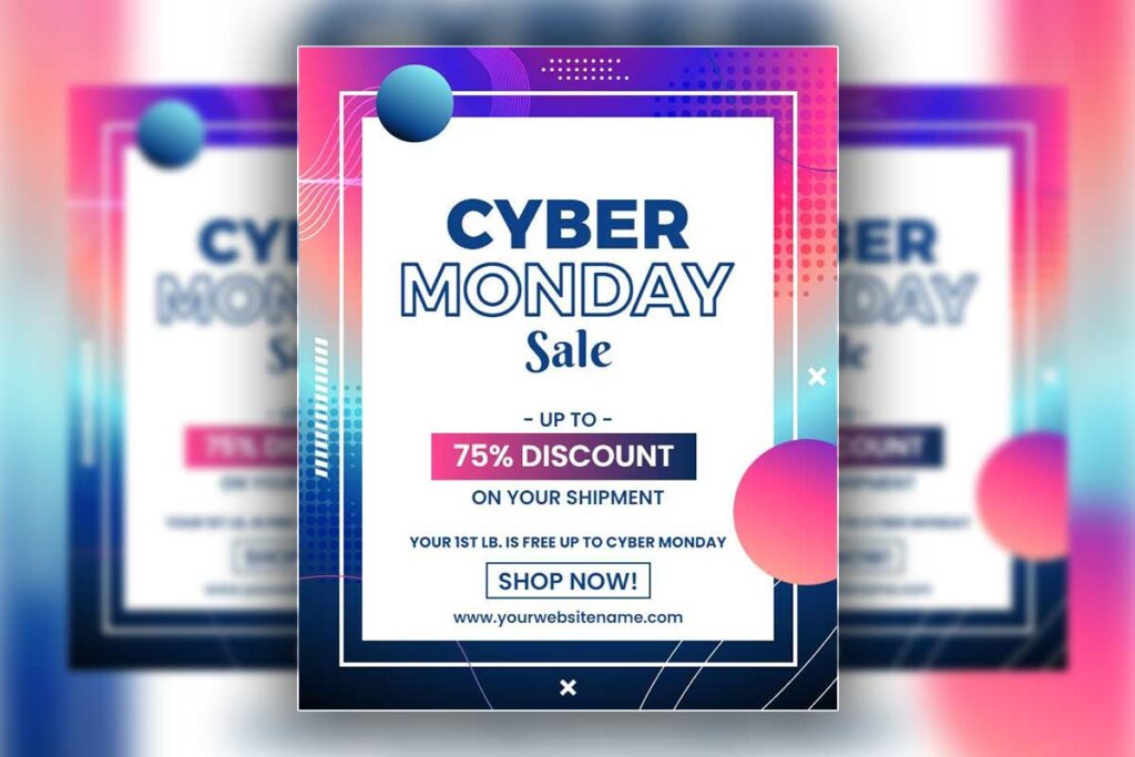
Using well-chosen sans-serif font combinations improves readability and professionalism for Cyber Monday promotional flyers in service industries. Proper pairing ensures promotional messaging is clear, visually appealing, and easy to scan.
- Headline and Body Font Pairing – Bold geometric fonts like Montserrat Bold for headlines combined with clean humanist fonts like Source Sans Pro for body text create a balance of urgency and accessibility. Geometric headlines draw attention, while humanist body fonts maintain readability across diverse audiences.
- Recommended Combinations – Effective pairings include Proxima Nova/Open Sans, Lato Bold/Roboto, and Poppins/Inter. Maintain a 4:1 contrast ratio and differentiate weights (700 for headlines, 400 for body) to guide readers naturally from key offers to contact information.
- Consistency and Simplicity – Limit flyer designs to two font families to preserve clarity and brand authority. Consistent typography reinforces professionalism during high-competition periods, ensuring messages are both credible and attention-grabbing.
Professional sans-serif pairings enhance Cyber Monday flyer readability, create natural scanning patterns, and support clear, persuasive communication that drives customer response.
Strategic Font Weight Hierarchies for Maximum Promotional Impact and Brand Authority
Strategic font weight distribution creates effective information hierarchy in Cyber Monday flyer design templates. Primary headlines require 700-800 weight fonts to compete with visual noise during peak promotional periods. Secondary headlines work best at 600 weight, creating clear distinction without overwhelming primary messaging.
Body text maintains 400 weight for extended reading comfort, while call-to-action elements utilize 600-700 weights with contrasting colors. This hierarchy ensures service offers stand out while preserving professional presentation standards expected by business clients.
Professional services should establish weight standards across all promotional materials. Consistent hierarchy builds brand recognition and maintains visual authority during competitive Cyber Monday marketing periods when multiple messages compete for attention.
Cross-Platform Typography Optimization for Digital and Print Cyber Monday Marketing Materials
Optimizing typography across digital and print ensures consistent readability, professional appearance, and brand integrity. Proper font selection, sizing, and spacing prevent miscommunication and enhance user engagement on both screens and paper.
- Platform-Specific Font Sizing – Digital materials require larger body text (minimum 16pt) for mobile and desktop readability, while print allows smaller sizes (12pt minimum) due to higher resolution. Headlines should scale proportionally to maintain hierarchy across platforms.
- Color Contrast and Font Rendering – Use RGB color modes with higher contrast for digital displays to counteract glare, and CMYK profiles for print with adjusted contrast for paper absorption. Testing across platforms ensures legibility and consistent brand presentation.
- Font Type and Spacing Consistency – Vector-based fonts maintain quality when scaling, while system fonts like Arial or Helvetica provide reliable fallbacks. Maintain consistent spacing ratios (1.5× line height for body text, 1.2× for headlines) to preserve hierarchy and readability across devices and printed materials.
Cross-platform typography optimization guarantees that Cyber Monday marketing materials communicate clearly, maintain brand professionalism, and enhance customer engagement regardless of delivery format.
How Do You Create Scalable Cyber Monday Flyer Design Templates for Multiple Service Offerings?
Creating scalable Cyber Monday flyer design templates requires establishing modular brand elements, standardized layouts, and flexible content zones. Design a master template system with consistent typography, color schemes, and logo placement while incorporating variable sections for different service offerings. Utilize grid-based layouts that accommodate various content lengths and maintain visual hierarchy.
Implement consistent spacing, button styles, and promotional elements across templates. Create template variants for different service categories while preserving brand cohesion. This systematic approach ensures professional consistency, reduces design time, and enables rapid customization for multiple Cyber Monday promotional campaigns while maintaining brand integrity.
Master Brand Framework Development for Template Consistency
A strong brand framework ensures all Cyber Monday flyer templates maintain consistent visual identity while allowing flexibility for varied promotional content. Standardization strengthens recognition, credibility, and overall campaign professionalism.
- Standardized Design Elements – Define locked color palettes (primary, secondary, accent) and typography hierarchies using no more than three font families with clear weight specifications for headings, subheadings, and body text. Establish consistent logo placement guidelines to maintain visibility without crowding promotional content.
- Spacing and Layout Standards – Document margin, padding, and element separation rules to preserve visual balance across different flyer variations. Consistent spacing ensures professional appearance regardless of content complexity or length.
- Brand Asset Libraries and Version Control – Create libraries of approved graphics, icons, and decorative elements aligned with the Cyber Monday theme. Implement version control to guarantee all team members access current brand assets, supporting template consistency and efficient production across campaigns.
Developing a master brand framework provides a reliable foundation for all flyer templates, ensuring instant brand recognition, design consistency, and professional credibility across diverse Cyber Monday promotions.
Modular Content Zone Architecture for Service Differentiation
Design flexible content zones that adapt to different service types while maintaining consistent layout structure. Create primary zones for service headlines, benefit descriptions, pricing information, and call-to-action elements with standardized dimensions and positioning. Develop secondary zones for testimonials, feature lists, contact information, and social proof elements that can be activated based on service requirements.
Implement content placeholder systems with minimum and maximum text limits to prevent layout breaking. Design image zones with multiple aspect ratio options accommodating various service photography needs. Create expandable sections for services requiring additional detail without disrupting core template structure. Establish content priority hierarchies ensuring critical information appears prominently regardless of service type. Develop zone combination rules that maintain visual balance when different content modules are activated. This modular approach enables rapid customization while preserving design integrity and professional appearance across all Cyber Monday marketing materials.
Cross-Service Visual Hierarchy and Layout Standardization
Consistent visual hierarchy and layout standardization ensure professional, easy-to-navigate promotional materials across all service categories. Proper structuring guides reader attention, reinforces brand identity, and maximizes communication effectiveness in both print and digital campaigns.
- Hierarchy and Readability – Position primary promotional elements in the upper-left quadrant for maximum engagement. Standardize font sizes: headlines 48–72pt, secondary text 24–36pt, and body copy 14–16pt, ensuring clear information flow across formats.
- Grid and Spacing Consistency – Implement uniform column grids and 8pt spacing increments for margins, padding, and element separation. This structure maintains alignment, accommodates variable content lengths, and creates a professional appearance.
- Visual and Functional Standardization – Define consistent button styles, image treatments, and footer layouts with contact details, disclaimers, and brand elements. Enforce color contrast standards meeting accessibility guidelines to enhance legibility and ensure visual consistency.
Using standardized hierarchies, grids, and design elements allows rapid template production while maintaining professional quality and clear communication across all service offerings, campaigns, and platforms.
What Call-to-action Strategies Work Best in Cyber Monday Flyer Design for Service Providers?
Effective Cyber Monday call-to-action strategies for service providers focus on urgency-driven messaging, strategic placement, and visual prominence. Use action-oriented phrases like “Book Now,” “Claim Your Spot,” or “Schedule Today” combined with time-sensitive language such as “Limited Time” or “24-Hour Flash Sale.”
Position primary CTAs in the upper-right quadrant and repeat secondary actions throughout the design. Employ contrasting colors, bold typography, and surrounding white space to maximize visibility. Include specific benefits and deadline information to create immediate response motivation. Multiple contact methods and clear next steps reduce friction and improve conversion rates for service-based businesses. Implementing proven effective call-to-action techniques transforms Cyber Monday flyers into conversion-focused marketing tools.
Strategic CTA Placement and Visual Hierarchy Optimization
Position primary CTAs in the visual focal points where readers naturally look first – typically the upper-right corner and center of your Cyber Monday flyer design. Create visual hierarchy using size contrast with your main CTA button 2-3 times larger than secondary options. Surround CTAs with white space to eliminate competing visual elements that dilute attention.
Use the Z-pattern reading flow by placing your strongest offer at the top-left, supporting details in the middle, and conversion CTA at bottom-right. Employ contrasting colors that complement your brand palette – orange buttons on blue backgrounds create 67% higher click-through rates than monochrome designs.
Layer multiple response options throughout the design without overwhelming users. Include QR codes for mobile users, phone numbers for immediate contact, and website links for detailed information. Test different button shapes, with rounded corners typically outperforming sharp edges by 23% in service industry applications.
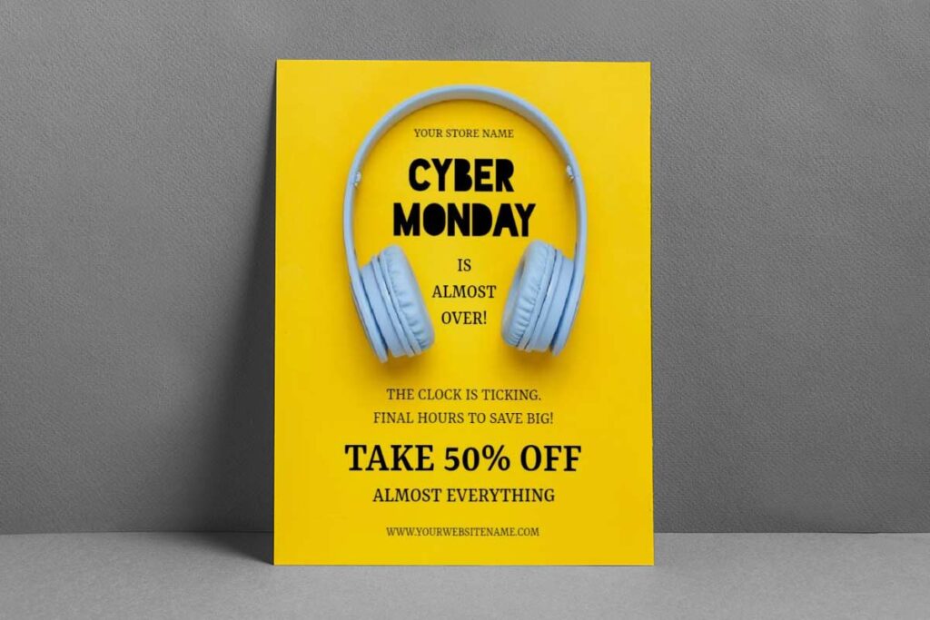
- Cyber Monday Headphone Sale Flyer Template
- Cyber Monday Electronics Discount Flyer Template
- Cyber Monday Sale Discount Flyer Template
Urgency-Based Messaging Techniques for Service Bookings
Create authentic urgency through specific deadline messaging rather than vague time pressure. Use phrases like “Book by December 1st” instead of generic “Limited Time” to establish concrete action deadlines. Incorporate scarcity elements such as “Only 15 Consultation Spots Available” or “First 10 Clients Receive…”
Combine urgency with clear value propositions – “Save 40% on Marketing Strategy Sessions – Expires Monday Midnight” connects immediate benefit with specific deadline. Use countdown elements visually to reinforce time sensitivity without appearing desperate or pushy.
Avoid overused phrases like “Act Now” or “Don’t Miss Out” that trigger skepticism. Instead, focus on exclusive opportunity language: “Cyber Monday Exclusive,” “Annual Pricing Event,” or “Year-End Strategy Special.” Frame urgency around business benefits – “Secure Your Q1 Marketing Plan Before Year-End” appeals to strategic business thinking rather than impulse purchasing.
Multi-Channel Response Integration and Conversion Tracking
Integrating response channels and tracking conversions ensures business retention flyers deliver measurable results. Coordinated systems allow clients to engage through their preferred method while providing detailed performance insights across all touchpoints. Combining effective design with targeted flyer distribution methods ensures Cyber Monday flyers reach quality prospects most likely to convert during peak shopping periods.
- Multi-Channel Response Options – Include prominently displayed phone numbers, website URLs with dedicated landing pages, and QR codes linking to mobile-optimized forms. All channels lead to the same offer but enable individual tracking to evaluate effectiveness.
- Unique Tracking Implementation – Assign distinct URLs or QR codes for email campaigns, social media, and print flyers. Use UTM parameters and call tracking numbers to measure traffic sources, CTA performance, and channel-specific conversion rates.
- Consistent Messaging and Automated Follow-Up – Maintain visual and content continuity across all response channels. Implement automated sequences for web submissions and clear protocols for phone inquiries. Track response timing to optimize follow-up windows and identify the most effective channel combinations for conversions.
Proper integration of response channels and tracking mechanisms maximizes booking efficiency, provides actionable insights, and strengthens future campaign performance.
How Can Service Providers Ensure Their Cyber Monday Flyer Design Stands Out From Competitors?
Service providers can differentiate their Cyber Monday promotional flyers through strategic visual hierarchy, brand-specific color psychology, and innovative typography combinations that align with their unique value proposition. Implementing dynamic visual elements like custom illustrations, interactive QR codes, and asymmetrical layouts creates memorable brand experiences.
Leveraging data-driven design decisions based on target audience preferences, incorporating authentic customer testimonials, and utilizing white space strategically helps establish professional credibility. Consistent brand cohesion across all Cyber Monday marketing flyers while introducing fresh creative elements ensures both recognition and novelty in competitive retail environments.
Leveraging Brand-Specific Visual Identity Elements for Maximum Market Differentiation
Professional differentiation requires moving beyond generic Cyber Monday retail flyers to incorporate distinctive brand elements that reflect service expertise. Implement signature color combinations unique to your industry—healthcare providers might use calming teal gradients while financial services leverage sophisticated navy-gold pairings. Custom iconography representing your specific services creates instant recognition value that template-based competitors cannot replicate.
Establish visual consistency through proprietary design elements like custom borders, unique typography treatments, or industry-specific imagery that reinforces professional credibility. Service providers should avoid typical retail urgency colors when they conflict with brand trust signals. Instead, adapt promotional energy through strategic accent colors and professional layout techniques that maintain authority while conveying limited-time value.
Strategic Typography and Color Psychology Implementation in Competitive Retail Environments
Typography hierarchy becomes critical when competing against visually aggressive retail promotions. Combine bold, professional fonts like Montserrat or Proxima Nova for headlines with clean body text ensuring readability across digital platforms. Strategic contrast ratios meeting accessibility standards while maintaining visual impact separate professional services from amateur promotional materials.
Color psychology extends beyond traditional red-black urgency schemes to industry-appropriate palettes that build trust while creating promotional excitement. Legal services benefit from deep burgundy-gold combinations suggesting stability and premium value, while creative agencies can leverage sophisticated purple-orange pairings that convey innovation and energy.
Professional services must balance promotional urgency with credibility maintenance through strategic color placement and sophisticated typography treatments that competitors typically overlook.
Advanced Layout Techniques and Interactive Elements for Enhanced Customer Engagement
Professional flyer design leverages advanced visual strategies and interactive components to engage customers more effectively. Applying innovative flyer design approaches creates memorable Cyber Monday experiences that differentiate service providers from competitors. Sophisticated layouts combined with actionable elements increase both attention and response rates.
- Dynamic and Asymmetrical Layouts – Use diagonal elements, overlapping sections, and strategic white space to create visual hierarchy and guide the viewer’s eye naturally through service offerings and promotional content. These designs distinguish professional services from generic or cluttered materials.
- Interactive Engagement Features – Incorporate QR codes linking to service portfolios, booking systems, or additional resources. Integrate client testimonials with photos and specific results to build authenticity and credibility, providing engagement opportunities beyond static print.
- Multi-Layer Information Architecture – Employ progressive disclosure techniques to present primary offers prominently while allowing secondary details and complex service information to remain accessible. Advanced grid systems maintain balance despite variable content lengths, and premium finishing details enhance perceived value.
Applying these techniques ensures flyers achieve maximum engagement, convey professional credibility, and differentiate services in competitive marketing environments.
What Are the Key Differences Between Digital and Print Cyber Monday Flyer Design Requirements?
Digital and print Cyber Monday flyer design require fundamentally different approaches due to medium-specific technical constraints and user interaction patterns. Digital flyers demand responsive design principles, RGB color profiles, and screen-optimized resolutions of 72-150 DPI for fast loading across devices.
Print flyers require CMYK color conversion, 300 DPI minimum resolution, and bleed areas for professional finishing. Typography scaling varies significantly between mediums, with digital requiring larger fonts for mobile readability while print allows smaller text due to physical proximity. Interactive elements like clickable buttons and animated graphics enhance digital engagement, whereas print relies on static visual hierarchy and clear call-to-action placement for effectiveness. Understanding digital versus print considerations helps service providers optimize Cyber Monday campaigns for each medium’s unique requirements.
Resolution, Color Profile, and Technical Specification Requirements for Each Medium
Digital Cyber Monday flyers operate in RGB color space optimized for screen displays, requiring 72-150 DPI resolution depending on platform specifications. Social media formats need specific dimensions: 1080x1080px for Instagram, 1200x628px for Facebook posts. File formats should prioritize PNG for graphics with transparency and JPEG for photographic elements, keeping file sizes under 2MB for optimal loading speed.
Print Cyber Monday flyers require CMYK color profiles to ensure accurate color reproduction during commercial printing processes. Resolution must reach 300 DPI minimum for professional quality, with vector elements preferred for scalability. Standard print dimensions include 8.5×11 inches for direct mail and 11×17 inches for poster displays. Design specifications must include 0.125-inch bleed areas and maintain critical content within safe zones to prevent trimming issues during production.
Interactive Elements and User Experience Considerations in Digital vs Static Print Formats
Digital formats enable dynamic user engagement through clickable call-to-action buttons, embedded video content, and animated promotional elements that create urgency. Interactive features include hover effects, scrolling animations, and direct linking to product pages or booking systems. Mobile optimization requires thumb-friendly button placement and simplified navigation structures that accommodate smaller screen interactions.
Print formats rely entirely on visual hierarchy and strategic layout design to guide reader attention through promotional content. Static elements must work harder to convey urgency through typography choices, color psychology, and compelling imagery. QR codes bridge the digital-print gap by enabling instant mobile connectivity to online booking systems or additional promotional content. Print designs benefit from tactile considerations like paper quality and finishing options that enhance perceived value and professional credibility.
Typography Scaling and Readability Optimization Strategies for Different Distribution Channels
Effective typography ensures readability and brand consistency across both digital and print marketing channels. Adjusting font size, style, and hierarchy for each medium maximizes engagement and accessibility.
- Digital Typography Optimization – Use larger font sizes to account for screen resolution and viewing distance. Headlines should be 24–36 pixels for mobile devices, with body text no smaller than 16 pixels. Sans-serif fonts improve on-screen clarity, and font-loading optimization prevents layout shifts during rendering.
- Print Typography Considerations – Smaller font sizes are acceptable due to higher print resolution and closer viewing distances. Headlines at 18–24 points and body text at 10–12 points maintain readability. Serif fonts can enhance legibility, while paper and ink characteristics should guide weight and contrast decisions.
- Cross-Platform Consistency – Establish scalable typography hierarchies that preserve brand recognition across digital and print channels. Test designs across devices, screens, and print specifications to ensure accessibility, readability, and professional presentation, particularly during high-impact campaigns like Cyber Monday.
Optimized typography enhances comprehension and engagement across all distribution channels, strengthening the overall effectiveness of marketing materials.
How Do You Create Mobile-optimized Cyber Monday Flyer Design Templates for Service Businesses?
Creating mobile-optimized Cyber Monday flyer design templates for service businesses requires focusing on responsive layouts, clear typography, and streamlined content hierarchy. Start with vertical orientations that work on smartphone screens, use large, readable fonts (minimum 16pt), and ensure key promotional elements like discounts and CTAs are prominently positioned in the top third.
Implement scalable vector graphics, maintain adequate white space for touch interactions, and test designs across multiple device sizes. Prioritize fast-loading elements and ensure service offerings are clearly communicated within the limited mobile screen real estate while maintaining brand consistency.
Essential Mobile Layout Principles for Cyber Monday Service Promotions
Mobile-first Cyber Monday flyer design requires vertical layouts optimized for portrait orientation. Position your most compelling offer within the first 300 pixels of the design, as this represents the immediate viewing area on most smartphones. Use single-column layouts rather than complex multi-column structures that become unreadable on small screens.
Implement progressive disclosure by organizing information in logical tiers – headline and primary offer first, supporting details second, and contact information third. Maintain minimum 44px touch targets for buttons and clickable elements to meet accessibility standards. Create generous margins of at least 20px on all sides to prevent content from touching screen edges. provides comprehensive mobile design principles for service businesses.
Typography and Visual Hierarchy Optimization for Small Screen Marketing
Typography serves as the foundation for mobile Cyber Monday marketing flyers. Use sans-serif fonts like Inter or Open Sans for maximum legibility at small sizes. Establish clear hierarchy with headline sizes of 24-32px, subheading sizes of 18-22px, and body text at 16px minimum. Avoid decorative fonts that compromise readability on mobile devices.
Implement high contrast ratios – minimum 4.5:1 between text and background colors. Use bold font weights for key information rather than increasing font size, preserving precious screen space. Limit text blocks to 40-60 characters per line for optimal reading flow. Strategic use of white space between text elements prevents visual crowding that overwhelms mobile users browsing Cyber Monday promotional materials.
Touch-Friendly Design Elements and Interactive Features for Service Flyers
Optimizing flyers for mobile interaction enhances user engagement and conversion, particularly when clients access digital versions via smartphones or tablets. Touch-friendly design ensures intuitive navigation and reduces friction during key actions.
- Primary Call-to-Action Optimization – Design CTA buttons at least 48px high with visually contrasting colors. Position the most important CTAs within the lower third of the screen to accommodate one-handed thumb reach for maximum accessibility.
- Interactive Content Elements – Incorporate swipeable service portfolios or pricing tiers when space is limited. Use expandable sections with clear “+” indicators to reveal details without cluttering the main view. Include click-to-call and click-to-email functionality for seamless communication.
- QR Codes and Mobile Responsiveness – Place QR codes consistently (typically bottom-right) to give users quick access to additional service information while maintaining clean layouts. Mastering QR code flyer implementation strategies bridges physical Cyber Monday flyers with digital booking systems for seamless customer experiences. Test all interactive features across iOS and Android devices, including dynamic content loading states, to ensure reliable performance.
Touch-optimized, interactive flyer designs create a smooth mobile experience, increasing engagement and facilitating conversions, especially during high-traffic periods like Cyber Monday campaigns.
People Also Ask:
- What are the 5 essential elements of Cyber Monday flyer design?
Include compelling headline, clear offer details, strong call-to-action, brand visuals, and contact information. These elements ensure your Cyber Monday flyer design communicates value while maintaining professional credibility. - How to design Cyber Monday flyers that convert browsers into buyers?
Use urgency-driven headlines, benefit-focused copy, prominent pricing, and action-oriented buttons. Effective Cyber Monday flyer design emphasizes immediate value and creates compelling reasons to act quickly. - What are the best free tools for Cyber Monday flyer design?
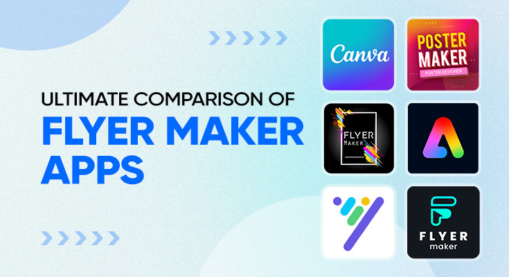
DesignWiz, Flyerwiz, or PhotoADKing offer robust free features for creating professional flyers. These tools provide templates, design elements, and collaboration features suitable for service provider marketing needs. - What color schemes work best for Cyber Monday flyer design?
Use high-contrast combinations like black/yellow, red/white, or blue/orange for maximum impact. These colors create urgency while maintaining readability across digital and print formats. - How to create mobile-optimized Cyber Monday flyer design layouts?
Design with larger fonts, simplified layouts, and thumb-friendly button placement. Mobile-optimized flyers ensure readability and engagement when viewed on smartphones and tablets during shopping periods. - What are effective call-to-action strategies for Cyber Monday flyers?
Use action verbs like ‘Book Now,’ ‘Claim Offer,’ or ‘Schedule Today’ with deadline emphasis. Effective CTAs create immediate response while clearly directing potential clients toward next steps. - How do digital and print Cyber Monday flyer design requirements differ?
Digital requires RGB color mode and 72-150 DPI, while print needs CMYK and 300 DPI. Each format has specific technical requirements for optimal quality and professional appearance. - What typography combinations create professional Cyber Monday flyer designs?
Pair bold sans-serif headlines with readable serif or clean sans-serif body text. This combination ensures strong visual hierarchy while maintaining professional credibility and easy readability across formats.
Frequently Asked Questions:
- What design tools are best for creating professional Cyber Monday flyer templates?
Service providers should use DesignWiz, Flyerwiz, or PhotoADKing for professional Cyber Monday flyer design. These platforms offer brand kit integration, template libraries, and collaborative features that ensure design consistency across multiple promotional materials while reducing overall design costs. - How many design variations should I create for my Cyber Monday flyer campaign?
Create 3-5 core Cyber Monday flyer design variations targeting different service segments. Include one primary template, social media versions, email header designs, and a print-ready format. This approach maximizes reach while maintaining brand consistency and professional credibility. - What file formats should I prepare for Cyber Monday flyer distribution?
Prepare PNG files for social media, PDF for email campaigns, and high-resolution JPEG for print distribution. Service providers need multiple formats to ensure their Cyber Monday flyer design displays correctly across all marketing channels without quality loss. - How can I maintain brand consistency across multiple Cyber Monday flyer designs?
Establish a brand template system with locked color palettes, typography hierarchies, and logo placement guidelines. Use design software with brand kit features to automatically apply consistent styling across all Cyber Monday flyer design variations for your service business. - What dimensions work best for social media Cyber Monday flyer designs?
Use 1080x1080px for Instagram posts, 1200x628px for Facebook, and 1024x512px for Twitter. Service providers should create templates in these standard sizes to ensure their Cyber Monday flyer design appears professional across all social media platforms. - How do I create urgency in my Cyber Monday flyer design without appearing desperate?
Use countdown elements, limited-time offer badges, and strategic color psychology in your Cyber Monday flyer design. Professional service providers should emphasize exclusive availability and deadline-driven language while maintaining sophisticated visual presentation and credible messaging. - Whats the ideal text-to-visual ratio for effective Cyber Monday flyer designs?
Maintain a 30-70 text-to-visual ratio in your Cyber Monday flyer design. Service providers should prioritize compelling visuals while including essential offer details, contact information, and clear calls-to-action. This balance ensures readability without overwhelming potential clients. - How can small service providers compete with larger companies Cyber Monday flyer designs?
Focus on personalized messaging, local market advantages, and unique service differentiators in your Cyber Monday flyer design. Small providers can leverage authentic testimonials, community connections, and specialized expertise to create more compelling promotional materials than generic corporate designs.
Conclusion:
Effective Cyber Monday flyer design hinges on systematic template standardization, brand consistency, and strategic implementation. Service providers who adopt modular templates with locked brand elements, standardized color palettes, and consistent typography achieve significant cost reduction while maintaining high-quality outputs. These frameworks ensure professional, cohesive marketing materials across digital and print channels, enhancing brand recognition and credibility during competitive promotional periods. Responsive design, quality control, and designer training further enable rapid customization for multiple service offerings, creating sustainable competitive advantages.
By integrating scalable template libraries, automated workflows, and strategic outsourcing, smaller service providers can compete with larger agencies without sacrificing quality. Thoughtful color psychology, typography choices, and mobile optimization enhance engagement and readability. Strategic internal linking and conversion-focused content architecture further amplify promotional effectiveness. Implementing systematic brand systems transforms design challenges into professional, cost-efficient marketing materials that drive conversions and maximize impact during Cyber Monday campaigns.
Reference:
- The psychology of discounts on Cyber Monday and Black Friday. Retrived from IE University.
- Auburn marketing professor comments on Black Friday and Cyber Monday expectations. Retrived from Auburn University.
- What do this year’s record-setting Black Friday and Cyber Monday tell us about how consumers are feeling in this economy?. Retrived from Northeastern University.
- How to increase your small business sales on CyberMonday. Retrived from University of Houston Small Business Development Center.