


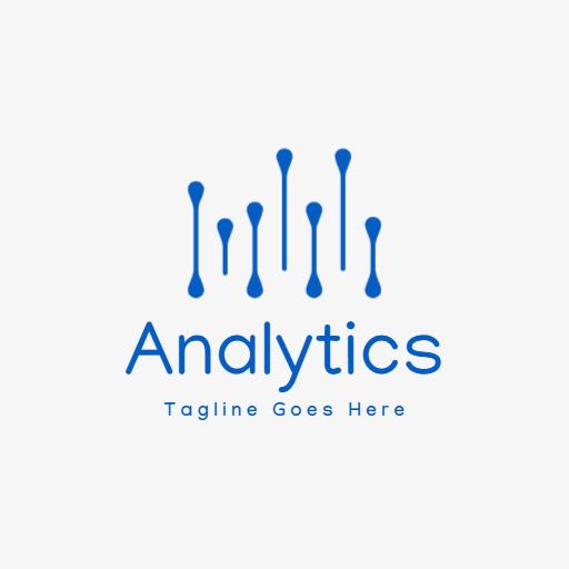
Dynamic Blue Data Representation for Detailed Analytics Logo Template
Transform your brand identity with this versatile Data Analytics logo template. Perfect for tech professionals.
No
design skills needed
We
promise your satisfaction
Limitless
Customization
Millions
of images, icons, and graphics
Edit
and download on the go
Template details :
Designed By:
DesignWiz TeamIndustry:
TechnologyFonts:
ManjariTheme:
Data AnalyticsFormat:
SquareStyle:
ModernColors:
You might also like
["https:\/\/resource.designwiz.com\/designwiz\/compressed\/colorful-bar-graph-signifying-growth-in-analytics-logo-template-5upjg1fb47ce68.jpg"]
Show all keywords
Colorful Bar Graph Signifying Growth in Analytics Logo Template
512 x 512 px
analytics
growth
Colorful Bar Graph Signifying Growth in Analytics Logo Template
["https:\/\/resource.designwiz.com\/designwiz\/compressed\/cloud-design-with-circuit-elements-for-data-analytics-logo-template-3fzrivfb473d62.jpg"]

Show all keywords
Cloud Design with Circuit Elements for Data Analytics Logo Template
512 x 512 px
analytics
cloud
Cloud Design with Circuit Elements for Data Analytics Logo Template
["https:\/\/resource.designwiz.com\/designwiz\/compressed\/modern-data-growth-visualization-for-analytics-insights-logo-template-j2n83gfb129b57.jpg"]

Show all keywords
Modern Data Growth Visualization for Analytics Insights Logo Template
512 x 512 px
analytics
data
Modern Data Growth Visualization for Analytics Insights Logo Template
["https:\/\/resource.designwiz.com\/designwiz\/compressed\/dynamic-orange-data-visualization-for-analytics-growth-logo-template-q27ojxfb5b2abe.jpg"]

Show all keywords
Dynamic Orange Data Visualization for Analytics Growth Logo Template
512 x 512 px
analytics
data
Dynamic Orange Data Visualization for Analytics Growth Logo Template
Trusted by Thousands
 Tata Consultancy Services
 Boston Consulting
 AT&T
AT&T
 Avelo Airlines
 Procter & Gamble
 Ministry Of Health, Malaysia
 Veterans Affairs
 Detroit Government
 New York University
 Texas A&M University
 Decathlon America
 Warby Parker
Tata Consultancy Services
Boston Consulting
AT&T
Avelo Airlines
Procter & Gamble
Ministry Of Health, Malaysia
Veterans Affairs
Detroit Government
New York University
Texas A&M University
Decathlon America
Warby Parker
Warby Parker
Tata Consultancy Services
Boston Consulting
AT&T
Avelo Airlines
Procter & Gamble
Ministry Of Health, Malaysia
Veterans Affairs
Detroit Government
New York University
Texas A&M University
Decathlon America
Warby Parker



Describe what you want to create with AI