



A presentation is a structured visual and oral communication tool used to deliver information, pitch ideas, explain concepts, or persuade an audience. Typically broken down into sequential slides or frames, presentations blend text, graphics, and narration to make complex data easily digestible.


They break up dense blocks of text into digestible visual elements, dramatically increasing audience attention and memory retention.
The slide-by-slide layout forces speakers to organize their thoughts logically, preventing rambling and keeping the audience focused.

A single deck can be repurposed for live public speaking, virtual webinars, email attachments, or printed corporate handouts.
They support text, high-resolution imagery, complex data graphs, embedded videos, and live interactive elements seamlessly.
A brilliant deck is only effective if it reaches your audience smoothly. Here, we break down modern presentation delivery methods, including live speaking, virtual webinars, and asynchronous digital sharing, alongside the best ways to distribute your files safely.


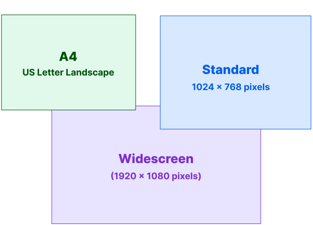
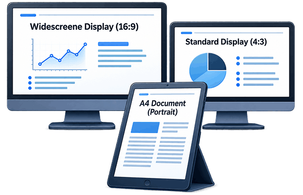
Formatting mistakes can quickly ruin a great piece of content. This technical guide explains the standard layout sizes, pixel counts, and aspect ratios you need to know to ensure your slides look crisp on any projector, monitor, or printout.
Every successful deck starts with a clear point. Determine the main takeaway you want your audience to remember before creating your outline.
Storyboard your slides in a logical sequence. Ensure there is a clear introduction, an analytical body, and an actionable conclusion.
Your opening slide needs to set the stage. Use a bold, clear presentation title and clean visual design to capture immediate attention.
Avoid overcrowding your canvas. Use short bullet points and leave ample breathing room to prevent your slides from looking messy.
Make your most important data pop out first. Use large, heavy header typography for core points and lighter font weights for contextual details.
Ditch generic stock photography. Utilize professional charts, customized data icons, and crisp graphics that directly support your spoken words.
Stick to a maximum of two complimentary font faces and three core colors across the entire presentation to ensure it looks cohesive.
Never let a presentation just fade out. Conclude your last slide with an explicit call to action, clear contact information, or a prompt for questions.

Presentations are the universal language of communication across almost every modern industry. Explore real-world examples of how corporate executives, startup founders, creative designers, and educators use slide decks to achieve daily success.

Managers and department leaders use slide decks to present quarterly performance metrics, operational updates, and strategic growth plans to executive boards and internal stakeholders.

Founders use highly polished, data-backed presentations to showcase their business model, market opportunity, and traction when raising capital from venture capitalists or angel investors.

Marketing and product teams deploy high-impact visual decks to introduce new features, highlight unique selling propositions, and demonstrate product value to prospective clients or public audiences.

Teachers, professors, and corporate trainers use instructional slides to structure complex lesson plans, simplify technical training modules, and improve information retention for students and new hires.

Creative agencies, architects, and project managers use presentations to pitch design concepts, layouts, structural timelines, and detailed project budgets to clients during the bidding phase.