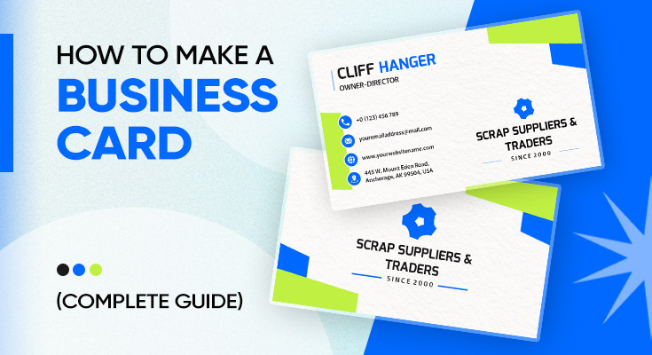
A business card is the first physical impression of your brand, and in 2026, it still matters more than most people think. Whether you’re a freelancer, small business owner, or corporate professional, a well-designed card communicates professionalism, builds trust, and makes it easy for people to reach you long after the conversation ends.
This complete guide covers everything you need to know about how to make a business card from scratch, what information to include, the right size and print specs, design tips, finish options, and the most common mistakes to avoid. By the end, you’ll have everything you need to create a card that people actually keep.
How to Make a Business Card: Step-by-Step Guide
Making a professional business card doesn’t require a graphic design degree. By following these steps in order, you’ll have a digital or print-ready business card that represents your brand with confidence.
Define Your Purpose and Audience
Before you open any design tool, get clear on what you want your business card to do. Ask yourself:
- Who will receive this card?
- What action do I want them to take after receiving it?
- What impression does my brand need to make?
A freelance photographer’s card will look and feel very different from a financial advisor’s. A creative brand might go with a bold, textured card, while a law firm would lean toward a clean, minimal design on premium stock. Defining your purpose upfront saves you time during the design phase and ensures your card aligns with your brand identity.
Learn more: A freelance photographer’s card will look and feel very different from a financial advisor’s, depending on the types of business cards best suited to their industry and branding.
Decide What Information to Include
The most effective business cards contain only what’s necessary. Every piece of information should earn its place. Less truly is more — research shows that cards with five or fewer contact methods receive significantly more follow-ups than cluttered ones.
Essential Information (Always Include)- Full Name – Use the name people actually call you.
- Job Title or Role – Keep it short and clear (e.g., “Marketing Consultant”, not “Chief Synergy Officer”).
- Company Name and Logo – Your logo acts as a visual anchor.
- Phone Number – One number only. Pick your most responsive line.
- Email Address – Professional email only ([email protected]).
- Website URL – Drop the “www” and “https://” – just print yourdomain.com.
- QR Code – Links to your portfolio, booking page, or LinkedIn. Always label it (e.g., “Scan to Book a Call”).
- One Social Handle – Only if it’s your primary business channel (e.g., LinkedIn for B2B, Instagram for creatives).
- City/State or Service Area – Full street address is only needed for walk-in businesses like retail stores or clinics.
- License or Registration Number – Tradies, builders, real estate agents, and healthcare providers should include this as a trust signal.
| Remove This | Why |
|---|---|
| Fax number | No longer relevant in 2026 |
| Multiple phone numbers | Too many options cause confusion |
| Personal social media | Blurs professional boundaries |
| Inspirational quotes | Takes up space without adding value |
| Home address | Privacy risk: use city/state only |
| Dense paragraphs of text | Cards are not brochures |
| http:// or www. | Outdated – just use yourdomain.com |
Choose Your Card Size and Orientation
The standard business card size in the US is 3.5 x 2 inches. This is the size most print services and templates are built around, so it’s the safest choice.
You also have two orientation options:
- Horizontal (Landscape): The most traditional layout. Works well for most industries.
- Vertical (Portrait): Modern, minimalist, and increasingly popular – especially in creative fields.
Pick whichever fits your brand personality and content layout best.
Learn more: To avoid printing issues and ensure proper alignment, it’s worth understanding dimensions in detail. Refer to this business card size guide before finalizing your design.
Design Your Business Card
With your content and dimensions locked in, it’s time to design. You don’t need to be a professional graphic designer to create a polished card; the right tools and principles will get you there.
Choose a Design Tool| Tool | Best For |
|---|---|
| DesignWiz | Easy-to-use online tool with ready-made business card templates and custom branding options |
| Vistaprint | Design and print in one place. Good for ordering physical cards. |
| Figma | UI-savvy designers – export carefully, no native print bleed setting |
| Adobe Illustrator | Professional designers – full control over vector graphics and CMYK output |
Before placing a single element, configure your canvas:
- Set the document size to your full bleed size (e.g., 3.75 x 2.25 inches for a US card).
- Set colour mode to CMYK.
- Set resolution to 300 DPI.
- Draw guides at the trim line and safe zone edges.
- Extend all background elements to the bleed edge.
Two-sided business cards give you significantly more space to work with and are an excellent way to add depth without clutter.
- Front: Focus on identity. Your name, job title, logo, and brand. This is the first thing people see, make it visually strong and immediately clear who you are.
- Back: Focus on action. Your phone number, email, website, QR code, and call to action. The back drives the next step.
Learn more: You don’t need to be a professional graphic designer to create a polished card, and using AI business card design can simplify the process and improve results.
Select Paper and Finish Options
The physical feel of your card is part of the message. Premium materials communicate quality before a single word is read.
Paper Type| Paper Type | Best For |
|---|---|
| Standard card stock (300–350 gsm) | Everyday professional cards – affordable and reliable |
| Cotton paper | High-end feel with a refined, substantial texture |
| Kraft / recycled paper | Eco-friendly brands, artisan businesses, and sustainable messaging |
| Plastic / PVC | Durable, waterproof – great for tradespeople and outdoor industries |
| Metal cards | Ultra-premium, bold statement – luxury brands and executives |
- Matte – Soft, non-reflective finish. Feels premium and modern.
- Glossy – Shiny and vibrant. Makes colours pop.
- Soft-touch / Velvet – Ultra-smooth, tactile luxury feel.
- Spot UV – Glossy highlights on select areas over a matte base.
- Foil stamping – Metallic accents for a high-end look.
Add a QR Code or NFC Feature
In 2026, the smartest business cards bridge the physical and digital worlds. Two technologies make this easy:
QR CodesA QR code on your business card can link to your portfolio, booking page, LinkedIn profile, or a digital vCard that saves your contact info directly to a smartphone. To make it effective:
- Use a dynamic QR code (so you can update the destination URL without reprinting).
- Always label the QR code with a short instruction like “Scan to Book” or “Scan to Connect” so people know why they should scan it.
- Test it on multiple devices before printing.
- Place it on the back of the card so it doesn’t clutter your front design.
NFC cards contain a tiny embedded chip. When someone taps your card against their smartphone, your digital profile, website, or contact details open instantly – no scanning required. NFC cards are ideal for tech-savvy professionals and sales teams who attend frequent networking events. They can be ordered through specialized NFC card providers, often as a companion to a printed card.
Proofread Everything
Before you send anything to print, do a thorough final review. One typo means an entire batch is wasted. Run through this checklist:
- Is every piece of contact information current and correct?
- Is your name spelled correctly? (It sounds obvious – double-check anyway.)
- Does your email address work? Send a test email.
- Does your QR code scan correctly on both iOS and Android?
- Is all important text within the safe zone?
- Does your background extend to the full bleed area?
- Is the file saved in CMYK colour mode and at 300 DPI?
- Have you had someone else review it with fresh eyes?
Download, Print & Share Your Cards
You’re almost done! Here’s what comes next, depending on whether you want a digital or physical card:
- Download your design as a high-quality PDF, PNG, or JPEG
- Share instantly via email, text, WhatsApp, or a clickable link
- Create a live digital link or NFC-enabled card — just tap to share
- Upload your print-ready file to Vistaprint, MOO, Printful or your local printer
- Choose luxurious finishes: matte • glossy • soft-touch
- Select premium cardstock — heavier weight feels more professional & luxurious
- Proofread one final time, then place your order with confidence
With online tools, you can also create business cards instantly using custom fonts, colors, and layouts.
Design Tips for Better Business Cards
A technically correct card can still fall flat if the design doesn’t work. These proven principles will help you create a card that people actually keep.
Follow the 60-30-10 Rule
The most readable, professional business cards follow a clear spatial ratio: 60% of the card should be white space, 30% should be text and content, and 10% should be visual design elements. White space is not wasted space – it’s what makes the card feel clean, premium, and easy to read.
Use a Clear Visual Hierarchy
Your card should guide the reader’s eye in a natural order. The hierarchy should be: your name first (largest element, 14–18pt), company name second (12–14pt), job title third, and contact details last (10–12pt minimum). Everything should lead back to one clear point of focus.
Choose Fonts Carefully
Never use more than two fonts on a business card. One for headings, one for body text. Sans-serif fonts like Arial, Helvetica, or Montserrat are reliable choices for clean readability. Keep all text at a minimum of 8pt – anything smaller will be difficult to read.
Use Colour Strategically
Colour communicates personality and emotion before words do. Blue builds trust and is widely used in finance and tech. Black conveys luxury and authority. Green suggests growth and eco-consciousness. Avoid using more than two or three colours on a single card.
Match Your Brand Identity
Your business card should look like it belongs to the same family as your website, social media profiles, and email signature. Use the same logo, the same brand colours, and the same fonts. Inconsistency between your card and your other brand materials undermines trust.
Design for the Industry
| Industry | Design Approach |
|---|---|
| Creative (Design, Photography, Art) | Let the card itself be a portfolio piece. Bold visuals, unique finish, striking back-side design |
| Professional Services (Law, Finance, Consulting) | Clean, minimal, premium stock. Trust is built through restraint |
| Healthcare / Medical | Soft colours, clear hierarchy, calm and approachable feel |
| Trades (Construction, Plumbing, etc.) | Durable materials, practical layout, license number prominently displayed |
| Real Estate | High-quality headshot optional, property imagery, QR code to listings |
| Technology / Startups | NFC or QR integration, modern sans-serif fonts, clean grid layout |
Beginners can save time by starting with editable business card templates that are easy to customize for any profession.
Common Mistakes to Avoid When Designing a Business Card
Frequently Asked Questions
At a minimum, your business card should include your full name, job title, company name, phone number, email address, and website. You can also add social media handles, a QR code, or a short tagline, depending on your industry and personal brand.
The standard business card size in the US is 3.5 x 2 inches. In Europe, the standard is slightly different at 85 x 55mm. Most online templates are already set to the correct size.
Yes! Tools like Adobe Express and Designwiz offer free plans that let you design and download a business card at no cost. Some print services include free design tools when you order cards through them.
Use a clean layout with plenty of white space, stick to two or three colors, choose legible fonts (at least 8pt), include a high-resolution logo, and keep your information minimal and focused. Printing on quality cardstock also makes a big difference.
Only include social media if it’s relevant to your business and something you regularly maintain. For example, a designer might include their Behance or Instagram. A consultant might prefer LinkedIn. Avoid listing every platform – choose the one that best showcases your work.
Choose clean, readable fonts like Inter, Montserrat, Helvetica, Open Sans, or Lato. Use one font for your name/headings and a second, lighter weight for your contact details. Avoid decorative or script fonts at small sizes.
Final Thoughts
Making a business card doesn’t have to be complicated or expensive. With the right tool, a clear sense of your brand, and the steps outlined above, you can design something professional in less than an hour. The key is to keep it simple, make it readable, and let your personality come through. A great business card isn’t just a piece of paper – it’s the beginning of a relationship.
Ready to make yours? Start designing your business card for free and put your best foot forward – every time you hand one out.