
Service providers often lose corporate prospects when marketing materials appear unprofessional. Professional Cyber Monday flyers offer a critical opportunity to showcase design competency while generating immediate business results, serving as portfolio pieces that establish credibility with enterprise clients. A free online flyer design tool allows service providers to create materials with consistent visuals without requiring advanced design experience, while maintaining standard presentation quality across campaigns.
Effective corporate materials combine strategic typography, color psychology, and clean layouts reflecting Fortune 500 standards. These free Cyber Monday flyer templates convert decision-makers through polished design, value-focused messaging, and executive-level visual communication, positioning services competitively while driving measurable conversion outcomes.
How Do Professional Cyber Monday Flyers Establish Credibility for Graphic Design Services?
Professional Cyber Monday flyers establish credibility through sophisticated visual hierarchy, consistent brand application, and enterprise-level design standards. They demonstrate expertise by showcasing complex typography systems, strategic color psychology, and polished layouts that mirror Fortune 500 marketing materials. Corporate Cyber Monday flyers prove design capabilities through meticulous attention to spacing, professional imagery selection, and seamless integration of business messaging. Service providers gain credibility by using editable flyers that maintain design consistency while allowing quick customization for each client, ensuring premium-quality presentation and efficient production for high-stakes corporate projects.
Portfolio Integration Through Cyber Monday Business Campaign Showcases
Professional Cyber Monday flyers function as live portfolio pieces that demonstrate real-world design capabilities to prospective clients. Service providers leverage these promotional materials to showcase their mastery of corporate color schemes and professional layouts while targeting specific business audiences. The complexity of Cyber Monday business flyers requires balancing promotional urgency with professional sophistication, proving the designer can handle corporate marketing demands.
Successful portfolio integration incorporates diverse industry applications, showing adaptability across financial consulting, business services, and corporate environments. Each flyer variant demonstrates different design challenges—from premium positioning to corporate credibility standards, establishing the service provider’s versatility.
The strategic use of white space, typography hierarchy, and brand consistency within these materials directly correlates with client confidence in the provider’s ability to deliver enterprise-level design solutions for year-round marketing needs. Utilizing Cyber Monday flyer design strategies helps maintain this professional consistency while allowing rapid customization that strengthens visual impact and reinforces brand authority across campaigns.
Typography Mastery and Corporate Brand Consistency in Holiday Marketing Materials
Typography excellence separates professional Cyber Monday promotional flyers from amateur attempts through sophisticated font pairing, precise spacing systems, and strategic hierarchy management. Corporate decision-makers immediately recognize premium typography choices that reflect enterprise-level attention to detail and brand consistency standards. Understanding the key elements of a flyer helps designers prioritize which components deserve the most visual emphasis in corporate Cyber Monday materials.
Professional designers demonstrate expertise through subtle typography adjustments that enhance readability while maintaining promotional impact. Research demonstrates that optimal letter spacing, consistent line heights, and strategic font weights directly impact reading speed and user preference, making these subtle adjustments critical for professional credibility.1 This includes optimal letter spacing for headlines, consistent line heights throughout body content, and strategic font weights that guide reader attention without overwhelming the message.
The integration of corporate fonts with holiday-appropriate styling showcases technical proficiency and brand awareness. Cyber Monday marketing flyers succeed when typography serves both promotional urgency and professional credibility. Service providers establish trust by maintaining consistent brand voice through font selections, ensuring promotional materials align with existing corporate identity guidelines while achieving maximum impact during competitive holiday marketing periods.
Client Testimonial Integration Within Cyber Monday Promotional Design Frameworks
Client testimonials in Cyber Monday flyers instantly boost trust and credibility. Featuring real results and recognizable brands proves service reliability. This approach blends authenticity with promotion, turning flyers into powerful client-winning tools.
- Integrate testimonials strategically: Position client feedback within Cyber Monday flyers to establish immediate credibility without disrupting promotional design balance.
- Highlight measurable results: Use data-driven statements like “increased conversions by 40%” or “generated 200 qualified leads” to reinforce tangible success metrics.
- Prioritize relevance: Feature testimonials from similar industries or service categories to enhance audience trust and connection.
- Incorporate visual authenticity: Use professional headshots, verified company logos, and clean typography to emphasize real-world credibility and design professionalism.
- Blend with promotional design: Maintain aesthetic harmony by aligning testimonial layout, color scheme, and tone with the overall Cyber Monday visual framework.
- Showcase dual value: Combine success stories with current template previews to demonstrate both proven results and modern creative capabilities.
- Position for impact: Place testimonials near key CTAs or offer sections to strengthen conversion confidence and reinforce trust at decision points.
Explore Cyber Monday flyer templates for graphic design services that combine professional credibility, portfolio integration, and client testimonial-driven trust to elevate brand authority.
- Cyber Monday Sale Discount Flyer Template
- Dark Indigo Cyber Monday Flyer Template
- Cyber Monday Super Sale Announcement Flyer Template
What Design Elements Make Professional Cyber Monday Flyers Convert Corporate Clients?
Converting corporate clients requires design elements that signal enterprise readiness and strategic thinking. Professional Cyber Monday flyers utilize restrained color palettes, sophisticated geometric layouts, and data-driven visual messaging that appeals to C-suite decision-makers. Key conversion elements include premium typography choices, strategic white space usage, and professional photography that reflects corporate environments. Corporate Cyber Monday flyers succeed by incorporating ROI-focused headlines, clear value propositions, and design elements that demonstrate understanding of corporate purchasing processes, budget considerations, and multi-stakeholder approval systems that define enterprise sales cycles.
Executive-Level Visual Communication Through Strategic Color Psychology
Corporate decision-makers respond to sophisticated color schemes that convey trustworthiness and premium positioning. Navy blue paired with metallic silver or gold accents creates immediate credibility while maintaining promotional energy. Charcoal gray with strategic burgundy highlights suggests established business authority without appearing overly commercial. Professional Cyber Monday flyers avoid oversaturated consumer colors like electric blue or bright yellow that signal amateur design.
Successful incorporate sufficient white space to prevent overwhelming busy executives who scan materials quickly. Selecting an appropriate flyer background sets the professional tone before any content is added, establishing credibility from the first glance. Color psychology research shows B2B buyers associate monochromatic schemes with reliability and consistent service delivery. Corporate color schemes should align with existing brand guidelines while introducing subtle promotional elements through accent colors rather than complete design overhauls.
Strategic contrast ratios ensure readability across digital and print formats, while consistent color application throughout marketing materials reinforces brand recognition. Premium positioning requires restraint – using two primary colors with one accent creates more sophisticated presentations than multiple competing hues that dilute professional credibility.
ROI-Focused Messaging Architecture in Corporate Cyber Monday Campaigns
Corporate clients evaluate Cyber Monday promotional flyers through ROI lenses, requiring specific financial justifications and quantifiable benefits. Effective messaging architecture leads with percentage-based savings, implementation timelines, and budget impact statements. Headlines should emphasize “Investment Reduction” or “Strategic Savings” rather than generic “Sale” language that appears unprofessional.
Cyber Monday marketing flyers convert through multi-tier offer structures addressing different corporate approval levels. Executive summaries highlight total cost savings, department-level benefits focus on operational improvements, and implementation details address technical considerations. Corporate purchasing processes require multiple stakeholder buy-in, necessitating messaging that satisfies financial, operational, and technical decision-makers simultaneously.
Professional messaging includes specific deadline language creating urgency without desperation. “Limited-time 25% investment reduction through December 2nd” provides clear action parameters while maintaining sophisticated tone. Corporate clients need sufficient information for internal approval processes, requiring detailed benefit explanations rather than emotional appeals used in consumer marketing. Beyond acquiring new clients, businesses can leverage Cyber Monday sale flyers to reactivate clients by offering compelling year-end value propositions that reignite previous relationships.
Premium Brand Positioning Through Sophisticated Layout Hierarchy Systems
Sophisticated layout hierarchy elevates Cyber Monday flyers to premium brand standards. Grid-based alignment, balanced white space, and clear typography create executive-level readability. This structured design approach communicates professionalism, credibility, and high-value service positioning.
- Establish structured layout hierarchy: Use grid-based design systems to ensure precise alignment, balanced spacing, and professional visual order that reflects corporate-level attention to detail.
- Define clear typographic hierarchy: Maintain headline sizes between 28–32pt, subheadings at 18–22pt, and body text at 11–12pt with generous spacing to ensure clarity and readability for executive audiences.
- Segment content by decision-maker role: Create dedicated content zones—executive summaries for leadership, technical specifications for evaluators, and financial value sections for procurement teams.
- Integrate credibility elements: Feature verified client testimonials, certifications, and industry-relevant case studies to build immediate trust and reinforce high-end service quality.
- Leverage sophisticated white space: Maintain balanced open areas that enhance readability, reduce clutter, and visually communicate professionalism aligned with enterprise marketing standards.
- Ensure visual flow and logical progression: Design layouts that naturally guide the reader from headline to key benefits, concluding with clear and persuasive calls to action.
- Reinforce premium perception through consistency: Align every margin, element, and color choice with Fortune 500 design expectations, ensuring your Cyber Monday flyer exudes confidence, capability, and conversion power.
How Can Service Providers Create Professional Cyber Monday Flyers That Compete With Agencies?
Service providers can compete with agencies by leveraging strategic design principles, advanced digital tools, and corporate-grade templates. Focus on premium typography, sophisticated color palettes, and clean layouts that mirror Fortune 500 aesthetics. Utilize professional design software like Adobe Creative Suite or Canva Pro, incorporate data-driven messaging with specific discount percentages, and ensure consistent branding across all Cyber Monday promotional materials.
Study successful agency work, implement white space effectively, and create multiple format variations for different platforms while maintaining professional credibility throughout your holiday marketing campaigns. Once designed, establishing effective Cyber Monday flyer distribution networks ensures these professionally crafted materials reach the right corporate decision-makers.”
Strategic Design Framework for Agency-Level Cyber Monday Business Flyers
Agency-level designs follow systematic approaches that service providers can replicate through structured frameworks. Start with comprehensive brand guidelines that define color palettes, typography hierarchies, and spacing standards. Create design systems using grid-based layouts that ensure consistency across multiple promotional materials. Understanding how to make a flyer that allows service providers to produce professional, high-impact marketing materials that maintain visual harmony across campaigns.
Establish visual hierarchy through strategic element placement, prioritizing offers and calls-to-action. Professional Cyber Monday flyers utilize restrained color schemes that convey authority while maintaining promotional impact. Implement the 60-30-10 color rule: 60% primary corporate colors, 30% neutral backgrounds, 10% accent colors for highlights. Corporate Cyber Monday flyers succeed by balancing promotional urgency with sophisticated aesthetic standards that corporate clients expect from premium service providers.
Premium Typography and Layout Techniques for Corporate Cyber Monday Flyers
Professional typography elevates amateur designs through sophisticated font pairing and precise hierarchy systems. Use serif fonts for headlines to establish credibility, complemented by clean sans-serif fonts for body content. Maintain consistent sizing: headlines 24-36pt, subheadings 16-20pt, body text 10-12pt with proper letter spacing and line height adjustments. Service providers targeting niche markets can benefit from exploring Cyber Monday flyer templates for print services that demonstrate typography excellence across different service categories.
Layout techniques focus on strategic white space utilization that guides reader attention naturally through content flow. Professional layouts employ asymmetrical balance and strategic content grouping that creates visual interest without sacrificing readability. Cyber Monday marketing flyers achieve agency quality through meticulous attention to alignment, consistent margins, and purposeful element positioning that demonstrates design expertise to potential corporate clients.
Advanced Digital Tools and Workflow Systems for Professional Cyber Monday Marketing Materials
Advanced digital tools streamline Cyber Monday flyer creation through professional-grade design and workflow systems. Adobe Creative Suite and cloud-based platforms enable efficient, high-quality production with built-in collaboration and version control. These tools ensure consistency, speed, and professionalism across every campaign touchpoint.
- Leverage professional software ecosystems: Use Adobe Creative Suite for industry-standard quality—InDesign for layouts, Photoshop for imagery, and Illustrator for vector design precision.
- Adopt flexible template-based tools: Incorporate Canva Pro for rapid customization and scalable template workflows, ideal for developing efficient professional-grade Cyber Monday marketing materials.
- Optimize workflows through automation: Implement template libraries, brand asset management systems, and automated design processes to reduce turnaround time and maintain design consistency.
- Maintain strict version control: Use organized file structures, standardized naming conventions, and revision tracking systems that support multi-format exports and client approval efficiency.
- Integrate quality assurance protocols: Include checkpoints for print accuracy, color management, and digital optimization to ensure each deliverable meets professional production standards.
- Enable real-time collaboration: Utilize cloud-based tools for client feedback, proofing, and secure file sharing while protecting design integrity throughout the review cycle.
- Demonstrate enterprise-level capability: Combine automation, organization, and consistency to showcase operational professionalism that appeals to corporate clients seeking reliability and scalability.
Explore professional Cyber Monday flyer templates that help service providers achieve agency-level design quality with efficient, scalable production workflows.
- Cyber Monday Special Offer Sale Flyer Template
- Pink Cyber Monday Online Shopping Discount Flyer Template
- Cyber Monday Mega Sale Discount Flyer Template
What Corporate Branding Standards Should Professional Cyber Monday Flyers Maintain?
Professional Cyber Monday flyers must maintain strict corporate branding standards including consistent logo placement, approved color palettes, standardized typography hierarchies, and official brand guidelines compliance. Ensure proper logo sizing and spacing, use designated corporate fonts, maintain brand voice consistency in promotional messaging, and follow established visual identity protocols. Include required legal disclaimers, maintain accessibility standards, and ensure all Cyber Monday promotional materials align with existing corporate marketing materials while preserving premium positioning throughout holiday campaigns.
Logo Integration and Visual Identity Consistency for Cyber Monday Promotional Flyers
Corporate logos require precise placement following brand guidelines, typically positioned in upper corners or headers with minimum clear space requirements maintained. Professional brand standards establish that maintaining prescribed clear space rules around logos is necessary to ensure consistent presentation and maximize impact, as insufficient spacing between marks and other elements can cause confusion about visual identity, reinforcing the importance of adhering to corporate placement specifications.2
Professional Cyber Monday flyers preserve logo integrity through consistent sizing ratios, avoiding distortion or color modifications that compromise brand recognition. Visual identity elements including brand symbols, taglines, and signature graphics must appear exactly as specified in corporate style guides. Maintain consistent visual hierarchy across all promotional materials by placing company identification prominently while balancing promotional messaging.
Professional service providers demonstrate expertise through meticulous attention to brand standard compliance, establishing credibility with corporate decision-makers who expect enterprise-level design precision. Avoiding common flyer design mistakes like improper logo sizing or inconsistent brand application separates professional materials from amateur attempts.
Typography Standards and Brand Voice Guidelines for Professional Holiday Marketing
Corporate typography standards dictate specific font families, sizing hierarchies, and spacing requirements that Professional Cyber Monday flyers must preserve without exception. Primary brand fonts should dominate headings and key messaging while supporting fonts handle body text and disclaimers. Maintain established line spacing, letter spacing, and margin specifications to ensure professional consistency across all marketing collateral.
Brand voice guidelines determine messaging tone, language choices, and communication style throughout Cyber Monday campaigns. Professional materials balance promotional urgency with corporate sophistication, avoiding overly casual language that undermines business credibility. Corporate messaging frameworks guide offer presentation, ensuring promotional content aligns with established brand personality while maintaining professional authority.
Color Palette Compliance and Corporate Aesthetic Maintenance in Cyber Monday Materials
Maintaining strict color palette compliance preserves brand integrity across Cyber Monday marketing materials. Designers must follow official hex, RGB, and Pantone codes while subtly integrating holiday tones that enhance, rather than override, corporate aesthetics. Consistent visual treatment reinforces professionalism, trust, and brand recognition across all promotional assets.
- Ensure exact color specification adherence: Use brand-approved hex codes, RGB values, or Pantone numbers to maintain visual integrity and consistent brand representation across all Cyber Monday materials.
- Prioritize brand hierarchy in color usage: Apply primary brand colors for major design elements and use secondary tones for accents, maintaining clear visual alignment with corporate identity standards.
- Avoid unauthorized color modifications: Prevent dilution of brand credibility by eliminating unapproved shades or saturation adjustments that disrupt established corporate recognition.
- Integrate holiday themes subtly: Introduce festive tones or effects only through secondary design details, such as icons, textures, or borders—to enhance seasonal relevance without compromising brand balance.
- Maintain corporate aesthetic consistency: Align layout, imagery, typography, and tone with the company’s established visual identity to reinforce professionalism and market positioning.
- Implement rigorous quality control processes: Verify brand compliance, print color accuracy, and accessibility adherence before approval to ensure flawless execution across media formats.
- Observe legal and partnership branding standards: Include required disclaimers, maintain co-branding rules, and demonstrate disciplined attention to brand compliance that reflects enterprise-level professionalism.
How Do Professional Cyber Monday Flyers Demonstrate Enterprise-level Design Capabilities?
Professional Cyber Monday flyers showcase enterprise-level design through sophisticated visual hierarchies, consistent brand integration, and strategic layout optimization. They demonstrate advanced typography systems, cohesive color palettes that align with corporate identity standards, and precise spacing that reflects attention to detail. These flyers incorporate professional photography, custom graphics, and seamless integration of complex promotional information without visual clutter. The design quality signals to prospects that the service provider can handle large-scale corporate projects with the same level of precision and professionalism, establishing credibility for enterprise-level engagements and higher-value client relationships.
Advanced Typography Systems That Signal Corporate Design Expertise
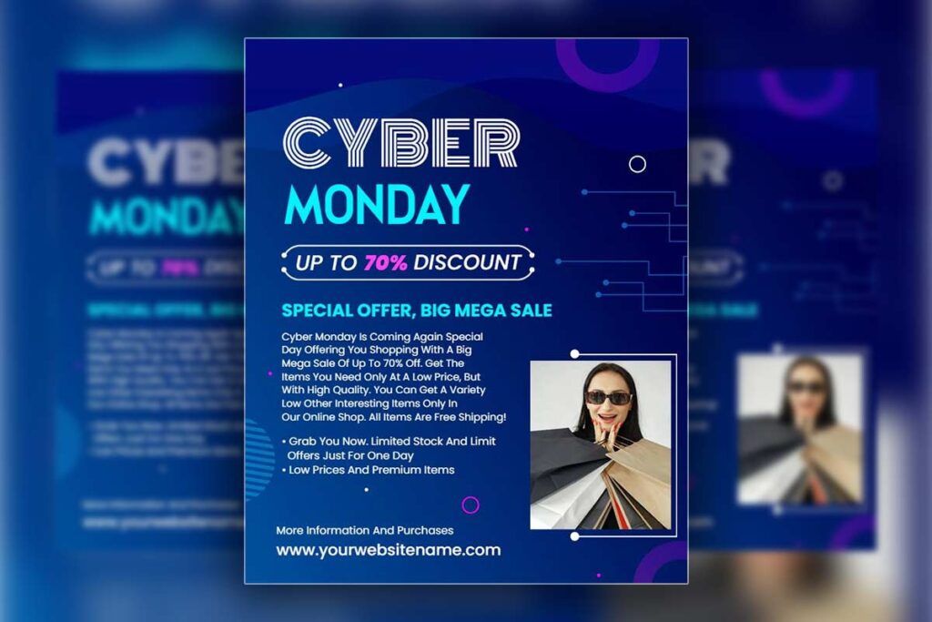
Corporate-grade Professional Cyber Monday flyers utilize sophisticated font hierarchies that mirror Fortune 500 marketing materials. Primary headlines employ weighted serif typefaces at 28-36 point sizes, while supporting text uses clean sans-serif fonts maintaining 12-14 point readability standards. Professional designers demonstrate expertise through precise kerning adjustments, optimal line spacing ratios of 1.4-1.6, and strategic font pairing that balances authority with accessibility.
Letter spacing receives meticulous attention, with headlines expanded by 2-4% for premium positioning while body text maintains standard spacing for readability. Color contrast ratios exceed WCAG AA standards, ensuring accessibility while supporting brand recognition. These typography choices communicate reliability and expertise essential for while distinguishing professional service providers from amateur competitors. Exploring diverse flyer design ideas expands creative possibilities while maintaining the corporate sophistication required for B2B Cyber Monday campaigns.
Strategic Visual Hierarchy Management for Complex Promotional Content
Enterprise-level Cyber Monday promotional flyers manage multiple information layers through structured grid systems and deliberate content prioritization. Professional layouts establish clear reading patterns using the Z-pattern for Western audiences, positioning primary offers in top-left quadrants while balancing secondary content across remaining sections.
Visual weight distribution follows the 60-30-10 rule: 60% primary content focus, 30% supporting elements, and 10% accent details. White space utilization reaches 40-50% of total design area, preventing cognitive overload while maintaining professional aesthetics. Corporate Cyber Monday flyers employ consistent alignment systems with 12-column grids ensuring precise element positioning.
Professional service providers leverage color psychology strategically, using cooler tones for trust-building while incorporating measured accent colors for urgency without compromising credibility standards expected by seeking sophisticated design solutions.
Brand Consistency Standards That Meet Enterprise Client Expectations
Enterprise-level Cyber Monday flyers demand flawless brand consistency to reflect professionalism and trust. Adhering to exact logo placement, typography, and color specifications ensures alignment with corporate identity. Precision in execution signals reliability and high-standard service expected by enterprise clients.
- Follow strict corporate brand guidelines: Maintain exact logo placement, sizing, and clear space standards—minimum 200% of logo height—to preserve professional visual integrity across all Cyber Monday materials.
- Ensure color palette accuracy: Use official brand hex codes and CMYK values to achieve consistent print and digital color reproduction, reinforcing visual trust and corporate identity.
- Integrate complementary secondary colors: Support Cyber Monday themes with accent tones that enhance rather than overpower the primary corporate palette, maintaining brand recognition.
- Apply standardized typography hierarchies: Use only licensed corporate fonts and approved text styles to preserve uniformity in tone, hierarchy, and brand voice across all promotional content.
- Maintain messaging consistency: Align all marketing copy and visual communication with established corporate brand voice and stylistic principles for cohesive brand presentation.
- Meet all legal and accessibility requirements: Include required disclaimers, protect trademarks, and ensure ADA-compliant design to meet enterprise-level regulatory expectations.
- Demonstrate enterprise readiness through precision: Showcase expertise in guideline implementation, reflecting the detail-oriented professionalism enterprise clients expect in high-quality promotional execution.
Explore professional Cyber Monday flyer templates engineered with enterprise-grade typography, visual hierarchy, and brand consistency standards that communicate precision, trust, and corporate excellence.
What Color Schemes Work Best for Professional Cyber Monday Flyers Targeting B2B Clients?
Professional Cyber Monday flyers targeting B2B clients require sophisticated color palettes that balance promotional urgency with corporate credibility. Deep navy blues paired with metallic gold accents establish premium positioning while maintaining professional legitimacy. Monochromatic charcoal schemes with strategic burgundy highlights create urgency without appearing overly commercial. These Corporate Cyber Monday flyers avoid consumer-oriented bright yellows or electric blues that undermine business credibility. The key lies in respecting B2B decision-makers’ preference for subdued sophistication while preserving promotional impact through strategic accent placement and typography contrast.
Premium Metallic Accent Integration for High-Value B2B Positioning

Premium metallic accents elevate Professional Cyber Monday flyers above standard business communications through strategic color psychology application. Gold foil effects signal luxury service positioning, while copper tones suggest innovation and reliability. Silver accents convey modern technological expertise perfect for consulting and financial services.
These metallics work best as 10-15% accent colors against neutral base palettes rather than dominant elements. Research demonstrates that people make decisions within 90 seconds of their first impression of a product, and color alone contributes up to 90 percent of the information forming that decision, underscoring why metallic color choices are critical for positioning premium services in competitive B2B markets.3 Successful Cyber Monday business flyers utilize metallic accents for call-to-action buttons, section dividers, and logo treatments without overwhelming the professional aesthetic.
The restraint demonstrates design sophistication that corporate decision-makers associate with premium service providers. Metallic integration requires careful balance – too much appears gaudy, too little loses impact. Strategic placement on headlines, borders, and key statistics creates visual hierarchy while maintaining executive-level credibility essential for professional marketing materials.
Trust-Building Navy and Burgundy Combinations for Corporate Credibility
Navy blue foundations establish immediate trust associations with financial stability and professional competence in Cyber Monday promotional flyers. Paired with deep burgundy accents, these combinations suggest established business heritage and premium service quality. This palette particularly resonates with C-suite executives who value conservative aesthetics over flashy marketing approaches.
The navy-burgundy combination allows promotional elements to stand out through strategic burgundy highlighting while maintaining overall professional presentation. Headlines in burgundy against navy backgrounds create necessary contrast for Cyber Monday urgency without sacrificing corporate appropriateness. This sophisticated approach to Cyber Monday marketing flyers demonstrates understanding of executive preferences for understated excellence. White space integration with these colors prevents visual overwhelm while ensuring readability across digital and print applications, crucial for professional template effectiveness.
Strategic Color Psychology for B2B Decision-Maker Preferences
B2B color psychology focuses on credibility and professionalism over emotion-driven appeal. Executives respond to balanced palettes that convey trust, stability, and expertise. Strategic use of neutral tones with subtle corporate accents creates sophistication while guiding attention effectively.
- Understand B2B color psychology principles: Recognize that executive decision-makers respond to colors reflecting stability, trust, and professionalism rather than emotional appeal common in B2C marketing.
- Use colors that signal competence and growth: Apply deep forest greens to represent prosperity and strategic expansion, and charcoal grays to convey sophistication and precision.
- Maintain balanced color ratios: Follow the proven B2B formula—60–70% neutral base tones, 20–30% corporate accent colors, and up to 10% promotional highlights—to ensure professional visual balance.
- Apply strategic color temperature contrast: Combine warm burgundies with cool navy blues to create depth and guide attention effectively without disrupting corporate seriousness.
- Ensure accessibility and readability compliance: Maintain strong text-to-background contrast ratios that meet accessibility standards for executives reviewing digital and print materials.
- Optimize color translation across formats: Choose palette systems that reproduce accurately across high-resolution digital displays and standard print outputs for brand consistency.
- Reinforce professional credibility through color control: Use disciplined color selection and consistent application to reflect expertise, reliability, and enterprise-level presentation quality.
How Should Service Providers Format Professional Cyber Monday Flyers for Maximum Impact?
Professional Cyber Monday flyers require strategic formatting that balances visual hierarchy with corporate credibility. Service providers should prioritize clean layouts with consistent margins, strategic white space, and logical content flow. Essential elements include prominent headlines, clear offer sections, professional imagery placement, and strong call-to-action positioning. Corporate color schemes should dominate over flashy holiday colors. Grid-based layouts ensure alignment and professionalism. Typography hierarchy must guide reader attention through headline, subheadline, body content, and contact information. Professional formatting distinguishes enterprise-level service providers from amateur designers, directly impacting client perception and conversion rates.
Strategic Grid Systems and Alignment Principles for Corporate Cyber Monday Materials
Professional Cyber Monday flyers utilize structured grid systems that create visual consistency and corporate credibility. Implement 12-column grids for flexible content arrangement, ensuring all elements align to invisible gridlines. This systematic approach demonstrates design expertise to corporate clients who recognize professional layout standards.
Service providers should maintain consistent margins of 0.5-1 inch on all sides, creating breathing room that enhances readability. Content blocks must align vertically and horizontally, preventing the chaotic appearance that undermines professional credibility. Use modular spacing between sections—typically 20-30 pixels digitally or 0.25 inches in print. This mathematical precision signals attention to detail that corporate decision-makers associate with quality service delivery.
Grid systems also enable responsive design across multiple formats, ensuring consistency whether clients view flyers digitally or in print. This systematic approach to layout demonstrates the technical competency corporate clients require from service providers handling enterprise-level design projects.
White Space Management and Content Hierarchy in Business Holiday Promotions
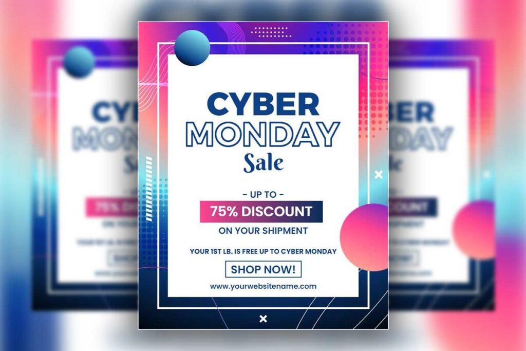
Effective white space management transforms cluttered amateur designs into sophisticated professional materials that command corporate respect. Allocate 30-40% of total layout space to white space, allowing content elements to breathe and creating focal points that guide reader attention naturally.
Typography hierarchy establishes clear information priority: headlines at 28-36 points, subheadings at 18-22 points, and body text at 11-12 points. This size relationship ensures readability while maintaining professional appearance standards expected in corporate communications.
Content grouping uses proximity principles, clustering related information while separating distinct sections. Strategic line spacing—1.2x for headlines, 1.4x for body text—enhances readability without appearing unprofessional. Bullet points and numbered lists break complex information into scannable formats that busy executives appreciate.
Professional white space usage demonstrates design sophistication that separates qualified service providers from amateur competitors. This visual competency directly correlates with perceived service quality in corporate client decision-making processes.
Professional Color Balance Between Corporate Identity and Cyber Monday Themes
Balancing Cyber Monday energy with corporate professionalism requires careful color control. Core brand colors should dominate the design, while accent hues like deep red or gold add subtle urgency. This restrained balance preserves credibility and sophistication while enhancing promotional impact.
- Maintain corporate dominance in design: Prioritize official brand colors for 60–70% of the overall palette, ensuring brand consistency and preserving professional visual tone across Cyber Monday materials.
- Use Cyber Monday accents strategically: Limit accent shades—such as red, orange, or metallic gold—to 15–20% of the layout, applying them to CTAs, deadlines, and promotional highlights for subtle urgency.
- Reinforce professional identity through foundational tones: Utilize navy blues, charcoal grays, and burgundies to project expertise, reliability, and corporate credibility in all marketing collateral.
- Avoid overly consumer-centric hues: Exclude bright yellows, neons, or electric blues that create casual or retail-oriented perceptions inconsistent with B2B communication standards.
- Incorporate refined festive accents: Employ sophisticated metallic or deep jewel tones that align with premium aesthetics while maintaining subtle seasonal relevance.
- Ensure accessibility and legibility compliance: Maintain high-contrast ratios between text and background colors for readability across digital and print formats.
- Achieve professional harmony between brand and promotion: Balance long-term brand identity with limited seasonal flair to communicate urgency without compromising corporate integrity.
What Typography Choices Elevate Professional Cyber Monday Flyers Above Amateur Designs?
Professional typography in Cyber Monday business flyers requires sophisticated font pairing, appropriate sizing hierarchy, and consistent spacing systems. Corporate-grade designs utilize serif fonts for credibility with sans-serif accents for modern appeal. Font sizes should follow established hierarchies: headlines 24-36pt, subheadings 16-20pt, body text 10-12pt. Letter spacing and line height adjustments enhance readability while maintaining professional appearance. Avoid decorative or novelty fonts that undermine corporate credibility. Color contrast must meet accessibility standards while supporting brand recognition. Professional Cyber Monday flyers distinguish service providers through typography choices that communicate expertise and attention to detail essential for enterprise client acquisition.
Corporate Font Pairing Strategies for Holiday Marketing Materials
Professional Cyber Monday flyers leverage strategic font combinations that balance authority with accessibility. Pair classic serif fonts like Times New Roman or Georgia for headlines with clean sans-serif options like Helvetica or Arial for body content. Research reviewing more than 50 empirical studies on typography reveals that while there is no consensus about which is more readable between serif or sans serif fonts, any alleged differences in readability are so peripheral to the reading process that they are not even worth measuring, confirming that pairing these typefaces is primarily about establishing professional credibility through traditional design conventions rather than measurable readability advantages.4
This combination establishes credibility through traditional typography while maintaining modern readability. Corporate Cyber Monday flyers benefit from limiting font families to two maximum, creating visual consistency across marketing materials. Advanced designers utilize font weights strategically, employing bold variants for emphasis while maintaining regular weights for extended reading. Professional layouts incorporate consistent font styling throughout promotional materials, ensuring brand recognition across multiple touchpoints. Cyber Monday promotional flyers succeed when typography choices reflect the sophistication expected in corporate communications rather than flashy consumer-oriented designs.
Hierarchy Sizing and Spacing Systems That Command Professional Respect
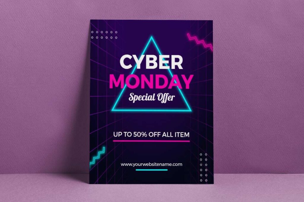
Professional typography hierarchy establishes clear information prioritization through systematic sizing and spacing. Primary headlines command attention at 28-36pt, secondary headings function at 18-24pt, and body text remains readable at 11-14pt. Line spacing (leading) should equal 120-140% of font size for optimal readability in Cyber Monday marketing flyers.
Consistent margins and padding create visual breathing room essential for professional presentation. White space usage distinguishes amateur designs from professional work by allowing content to breathe rather than cramming information together. Professional service providers understand that generous spacing conveys premium positioning.
Letter spacing adjustments, particularly for headlines, improve legibility and create sophisticated appearances. Professional designs maintain consistent baseline grids, ensuring text alignment across columns and sections creates polished, enterprise-level presentation standards that corporate clients expect from marketing materials.
Color Typography Integration for Maximum Corporate Cyber Monday Impact
Professional color typography merges corporate sophistication with Cyber Monday urgency through balanced color use. Dark primary text ensures clarity, while accent hues emphasize key actions or offers. Limiting colors to three, brand, accent, and neutral, creates elegant, high-impact communication for executive audiences.
- Prioritize readability and hierarchy: Use high-contrast black or dark gray for primary text to ensure clarity, allowing executives to process information quickly and confidently.
- Apply accent colors purposefully: Highlight only critical information, such as discount values, CTAs, or key service differentiators, using controlled accent color integration.
- Maintain brand color dominance: Ensure the corporate palette forms the visual foundation, allowing limited seasonal hues to enhance rather than overshadow brand identity.
- Leverage color psychology effectively: Incorporate deep blues for reliability, burgundy for prestige, and subtle metallic tones to evoke sophistication and trust in B2B contexts.
- Ensure accessibility compliance: Follow WCAG contrast standards (minimum 4.5:1) to guarantee legibility and maintain inclusivity across digital and print environments.
- Restrict palette complexity: Limit designs to three color categories, primary brand, secondary accent, and neutral base, to preserve visual coherence and corporate professionalism.
- Integrate typography color consistently: Apply color hierarchy across headings, subheads, and bullet points, guiding visual flow while reinforcing corporate credibility and strategic intent.
Explore professional Cyber Monday flyer templates crafted to showcase enterprise-level typography, visual hierarchy, and brand precision for corporate marketing success.
- Cyber Monday Sale Promotion Flyer Template
- Bright Gold Cyber Monday Flyer Template
- Tan Brown Cyber Monday Flyer Template
How Can Professional Cyber Monday Flyers Showcase Service Provider Expertise Effectively?
Professional Cyber Monday flyers showcase service provider expertise through strategic visual hierarchy, professional case study integration, and polished design execution. Incorporate client testimonials with specific metrics, display industry certifications prominently, and use premium typography that reflects corporate standards. Feature before/after project examples, highlight years of experience, and include recognizable client logos to build immediate credibility.
The flyer’s own design quality serves as a portfolio piece, demonstrating the service provider’s ability to create materials that meet enterprise-level expectations while driving Cyber Monday engagement. Service providers gain credibility by creating materials that corporate decision-makers immediately recognize as premium-quality work, eliminating concerns about design competency and positioning the provider as capable of handling high-stakes corporate projects.
Incorporating Client Success Metrics and Testimonials in Cyber Monday Marketing Materials
Client testimonials with quantifiable results demonstrate proven expertise in professional Cyber Monday flyers. Include specific metrics like “Increased client sales by 40%” or “Generated 500+ qualified leads” alongside client names and company logos. Position testimonials strategically within promotional content using professional formatting and consistent branding.
Use corporate color schemes and professional layouts that enhance testimonial credibility while maintaining premium positioning. Display client success stories prominently without overwhelming the primary promotional message. Include industry-specific achievements that resonate with target corporate audiences, demonstrating consistent results across different business sectors.
Cyber Monday promotional flyers succeed by incorporating testimonials that address specific business challenges while showcasing the service provider’s ability to deliver measurable outcomes for enterprise clients.
Strategic Logo Placement and Certification Display for Corporate Credibility
Professional Cyber Monday flyers require strategic placement of industry certifications, professional memberships, and client logos to establish immediate credibility. Position certification logos in header or footer areas using consistent sizing and spacing that maintains visual hierarchy without competing with promotional content.
Client logos should appear in dedicated sections with proper spacing and professional presentation that reflects partnership quality rather than cluttered display. Use corporate Cyber Monday flyers standards for logo treatment, ensuring proper brand guidelines compliance and professional appearance.
Include relevant industry associations, professional credentials, and technology partnerships that corporate decision-makers recognize and value. Cyber Monday business flyers benefit from subtle but prominent credential display that builds trust without appearing overly promotional.
Using Design Quality as Portfolio Evidence in Holiday Promotional Campaigns
Design quality transforms Cyber Monday flyers into living portfolio pieces that showcase professional skill. Sophisticated layouts and precise typography demonstrate enterprise-level capability. Every visual choice reinforces credibility, proving expertise through execution rather than claims.
- Showcase professionalism through visual execution: Use refined typography, balanced white space, and cohesive color palettes to communicate design mastery that clients associate with premium service quality.
- Demonstrate structural precision: Maintain consistent grid systems, alignment accuracy, and visual hierarchy to highlight the disciplined craftsmanship that defines enterprise-level design work.
- Use typography as a credibility tool: Select typefaces that reflect brand tone while ensuring readability and aesthetic balance, reinforcing your reputation for professional judgment and attention to detail.
- Leverage cohesive color integration: Combine corporate color schemes with seasonal enhancements that elevate sophistication without compromising brand alignment or visual harmony.
- Balance complexity and clarity: Present detailed promotional information in clean, visually organized layouts that demonstrate both creative and technical expertise.
- Position visual design as proof of capability: Allow flyer aesthetics to serve as tangible portfolio evidence, communicating quality and reliability more effectively than written claims.
- Establish enterprise credibility through execution quality: Ensure every design element—from spacing to imagery, reflects consistency, precision, and the elevated standards expected in high-value corporate projects.
What Call-to-action Strategies Work Best in Professional Cyber Monday Flyers for Services?
Effective call-to-action strategies in professional Cyber Monday flyers combine urgency with value proposition clarity. Understanding call to action for flyers principles helps service providers craft compelling CTAs that drive corporate decision-makers to take immediate action while maintaining professional tone. Use action-oriented language like “Schedule Your Strategic Consultation” rather than generic “Contact Us.”
Create tiered CTAs offering immediate value through free assessments, limited-time service packages, or exclusive year-end consulting rates. Position primary CTAs prominently with contrasting colors while maintaining professional aesthetics. Include multiple contact methods and deadline-specific language that emphasizes the limited nature of Cyber Monday offerings, compelling prospects to act while maintaining the sophisticated tone expected by corporate clients.
Crafting Value-Driven CTA Language That Appeals to Corporate Decision Makers

Corporate decision-makers respond to CTAs that emphasize business outcomes over discounts. Replace “Save 30%” with “Reduce Marketing Costs by 30%” or transform “Free Consultation” into “Complimentary Strategic Assessment.” Professional Cyber Monday flyers should focus on ROI-driven language that addresses specific pain points. Use terms like “accelerate growth,” “optimize efficiency,” or “maximize return on investment.”
Corporate language should reflect the service provider’s expertise level. “Schedule Your Digital Transformation Audit” commands more respect than “Book a Meeting.” Include specific deliverables in CTAs such as “Receive Your Custom Growth Strategy Blueprint” or “Download Your Industry-Specific Marketing Framework.” This approach demonstrates value while maintaining the professional tone that builds credibility with enterprise clients seeking legitimate business partnerships.
Strategic CTA Placement and Visual Hierarchy in Business Flyer Layouts
Position primary CTAs using the Z-pattern reading flow, placing the main action request at the visual endpoint where eyes naturally finish scanning. Corporate Cyber Monday flyers require multiple CTA placements without overwhelming the professional aesthetic. Use contrasting colors that align with brand guidelines while ensuring accessibility standards.
Visual hierarchy should guide readers from headline through value proposition to action request. Secondary CTAs can include phone numbers, website links, or social media connections, positioned strategically throughout the content. Size CTAs appropriately with primary actions 20% larger than secondary options. White space around CTAs increases click-through rates while maintaining the clean aesthetic that corporate clients expect from professional service providers.
Multi-Tiered Offer Structures for Year-End Service Promotions
Multi-tiered offers help service providers engage clients across varying budgets and timelines. Structuring “Good-Better-Best” packages adds clarity and flexibility to Cyber Monday promotions. Professional framing aligns urgency with corporate planning cycles, driving immediate yet credible year-end engagement.
- Develop professional value ladders: Structure Cyber Monday business flyers with tiered offerings—basic consultation, audit plus strategy, and full implementation packages—to appeal to varying budgets and decision timelines.
- Present clear “Good-Better-Best” distinctions: Define each tier with measurable benefits and deliverables, guiding clients toward higher-value service levels through transparent feature comparison.
- Incorporate professional scarcity messaging: Replace aggressive phrases like “LIMITED TIME ONLY” with refined alternatives such as “Year-End Investment Opportunity Available Through December 3rd,” emphasizing exclusivity without reducing credibility.
- Align with corporate planning cycles: Position offers within fiscal year-end frameworks, addressing business needs tied to 2024 evaluations, budget allocations, and 2026 initiative preparation.
- Use professional naming conventions: Label tiers with strategic, outcome-oriented titles that reflect service sophistication rather than promotional gimmicks or discount-driven language.
- Clarify actionable next steps: Provide simple progression pathways for each package level, minimizing friction and enabling swift corporate decision-making.
- Maintain credibility through structure and presentation: Design flyers with premium layouts, precise messaging, and consistent branding that reflect professionalism while supporting immediate year-end engagement decisions.
Explore Cyber Monday flyer templates with high-conversion, value-driven call-to-action strategies designed for professional service promotions and enterprise engagement.
- Rich Purple Cyber Monday Flyer Template
- Cyber Monday Sale Promotional Flyer Template
- Misty Rose Cyber Monday Flyer Template
People Also Ask: Design Professional Materials for Corporate Credibility Implementation Questions
- Best platforms for creating professional Cyber Monday flyers?
Adobe Creative Suite, Canva Pro, and Figma offer professional-grade templates and design tools. These platforms provide corporate-quality outputs that demonstrate service provider expertise to potential enterprise clients. - Professional Cyber Monday flyer conversion optimization techniques?
Use clear value propositions, prominent contact information, and single focused call-to-actions. A/B test headline variations and offer presentations to maximize response rates from corporate decision-makers. - Corporate branding requirements for professional Cyber Monday flyers?
Maintain consistent logo placement, approved color schemes, and official typography. Follow brand guidelines precisely to demonstrate professionalism and attention to detail that corporate clients expect from service providers. - Professional Cyber Monday flyer design tools comparison?
Adobe InDesign offers advanced layout control, Canva Pro provides quick professional templates, while Figma enables collaborative design processes. Choose based on complexity needs and client collaboration requirements. - B2B vs consumer approaches for professional Cyber Monday flyers?
B2B designs emphasize value propositions, ROI benefits, and professional credibility over emotional appeals. Use sophisticated color palettes and corporate language that resonates with business decision-makers rather than consumers. - Professional Cyber Monday flyer headline best practices?
Focus on specific benefits, use action-oriented language, and include urgency without appearing desperate. Headlines should communicate professional value while maintaining the sophisticated tone expected in corporate communications.
Frequently Asked Questions: Design Professional Materials for Corporate Credibility Implementation
- What dimensions work best for corporate Cyber Monday flyers?
8.5×11 inches for print or 1080×1350 pixels for digital ensure readability and professional presentation. - How can service providers align flyers with client brand identity?
Use client colors, fonts, logos, and spacing to maintain consistent visual hierarchy and corporate credibility. - Which corporate color palettes are most effective?
Navy, charcoal, and burgundy convey trust; gold or silver accents add a premium feel. Avoid bright consumer-style colors. - How should discounts be presented on professional flyers?
Use percentage-based offers with elegant wording, e.g., “Exclusive 25% Investment Reduction,” instead of consumer-style sale language. - What templates help with tight Cyber Monday deadlines?
Clean, minimal templates with placeholders for logos, offers, and contacts allow fast, consistent customization. - How can professional flyers boost brand trust?
Showcase testimonials, certifications, and experience. Use high-quality images, consistent branding, and professional typography. - What design brief elements are essential?
Include audience demographics, brand guidelines, key messaging, CTA goals, technical specs, deadlines, and approval process. - How should countdown timers be integrated?
Use subtle, elegant timers that match fonts and colors; animate digitally without compromising a professional look. - What holiday-themed design practices maintain professionalism?
Add seasonal cues subtly through color and minimal graphics; favor navy and silver over traditional Christmas colors. - How can print and digital flyer strategies be combined?
Keep designs consistent across formats; print includes QR codes linking to digital content, and digital versions can feature interactive elements.
Conclusion: Design Professional Materials for Corporate Credibility Success Framework
Professional Cyber Monday flyers elevate service providers’ credibility by transforming marketing materials into enterprise-grade communication tools. Through sophisticated visual hierarchy, premium color palettes, and polished layouts, these flyers immediately signal professionalism to corporate decision-makers. Strategic template integration ensures consistency across all marketing channels while highlighting practical capabilities, allowing service providers to present themselves as competent, trustworthy partners for high-stakes business engagements.
For graphic design and business service providers, achieving enterprise-level perception requires more than aesthetic appeal. Flyers must incorporate ROI-focused messaging, executive-friendly layouts, and advanced typography to communicate expertise effectively. Systematic implementation of style guides, template-driven designs, and quality control protocols eliminates amateur impressions, bridging the gap between actual capability and perceived professionalism. This approach ensures consistent corporate engagement, drives measurable business results, and establishes lasting authority in competitive B2B markets.
Reference
- Typography Research on Readability – Massachusetts Institute of Technology.
- Logo Positioning Standards: Clear Space – University at Buffalo Brand Standards.
- Color Psychology Used in Marketing: An Overview – University of Southern California.
- Typography Standards – University of Texas School of Law.