


Peacock Logos
Peacock Logo Templates built for standout small-business branding. Customize peacock logo designs for salons, boutiques, weddings, and restaurants in minutes.























How to design a peacock logo that scales and sells
Follow these focused steps to plan, style, and deliver a peacock mark that holds up in print and digital.
1. Clarify brand goals and audience
Decide what the peacock should convey—luxury, heritage, wellness, or celebration. Define target buyers and uses so style, weight, and detail fit signage, packaging, and profiles.
2. Sketch layout and symbol style
Choose a structure: emblem, wordmark with icon, or monogram. Test silhouettes from minimal line art to fuller plumage, making sure the tail reads cleanly at 24–32 px.
3. Build a color system with contrast
Select jewel tones like teal, sapphire, and gold, plus a neutral anchor. Create light and dark variants, and verify contrast for tiny avatars, menus, and reversed applications.
4. Refine type, spacing, and small-size proof
Pair a readable serif or modern sans with balanced tracking. Tighten alignment, simplify feather details, and proof embroidery or one-color outputs to prevent fill-ins.
5. Export, organize, and quality check
Export SVG for scale, PNG with transparency, and PDF for print. Save horizontal and stacked lockups, then test on receipts, signage, packaging, and social bios.
Trusted by Thousands
 Tata Consultancy Services
 Boston Consulting
 AT&T
AT&T
 Avelo Airlines
 Procter & Gamble
 Ministry Of Health, Malaysia
 Veterans Affairs
 Detroit Government
 New York University
 Texas A&M University
 Decathlon America
 Warby Parker
Tata Consultancy Services
Boston Consulting
AT&T
Avelo Airlines
Procter & Gamble
Ministry Of Health, Malaysia
Veterans Affairs
Detroit Government
New York University
Texas A&M University
Decathlon America
Warby Parker
Warby Parker
Tata Consultancy Services
Boston Consulting
AT&T
Avelo Airlines
Procter & Gamble
Ministry Of Health, Malaysia
Veterans Affairs
Detroit Government
New York University
Texas A&M University
Decathlon America
Warby Parker



Other Logo templates
Why a Peacock Logo Elevates Your Brand
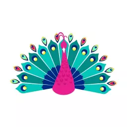
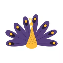
A Peacock Logo signals sophistication, color-rich storytelling, and cultural resonance. Whether you’re a boutique, beauty studio, event planner, or premium food brand, the peacock’s plume communicates artistry, confidence, and celebration. On DesignWiz, craft a mark that balances elegance with clarity: a refined monoline bird for minimalist brands, or a full-tail fan for dramatic impact. Jewel tones—teal, sapphire, emerald—suggest luxury; metallic gold accents add prestige. Symmetry conveys poise, while fluid curves feel welcoming. Pair with high-contrast typography to anchor the detail: classic serifs for heritage, sleek sans-serifs for modern polish, or expressive scripts for romance-focused services. With flexible icon scaling, negative space options, and clean grid-based layouts, your Peacock Logo stays legible on tags, social avatars, signage, and packaging—helping your brand look elevated, consistent, and unmistakably yours.
Use our logo maker to customize professionally designed logo templates. Create a unique logo for your business, brand, or personal project.
Design Cues for a Memorable Peacock Logo
Lean into symbolism that serves your niche. For luxury retailers or jewelers, a symmetrical crest or circular badge with a radiant tail reads premium; spas and wellness brands may prefer a softer silhouette with pastel peacock blues and gentle gradients. Event planners often win with dynamic motion lines or a lettermark fused with a single feather. On DesignWiz, fine-tune line weight, feather count, and icon-to-type proportions, then test colorways from opulent emerald–gold to modern teal–charcoal. Adjust kerning and uppercase styling to signal authority or charm. The result: a Peacock Logo that scales cleanly, differentiates instantly, and anchors every touchpoint.
Frequently Asked Questions (FAQs)
Peacock marks fit brands that emphasize elegance or celebration—think salons, boutiques, jewelry, event planners, restaurants, and cultural organizations. The birds form signals refinement and showmanship.
Pick detail by context: abstract or monoline works best for small digital uses and embroidery; fuller plumage suits signage and premium print. If you need both, create a primary and a simplified secondary mark.
Jewel tones like teal, sapphire, emerald, and subtle gold accents suggest luxury. Always build light/dark variants and test contrast for tiny avatars, menus, and reversed backgrounds to keep text readable.
Yes—use clean silhouettes, avoid hairline details, and set minimum sizes for the icon and type. Test at 24–32 px and trim feather complexity if shapes merge. Increase letter spacing for small text.
Export SVG for infinite scaling, PNG with transparent background for web, and PDF for print handoff. Keep RGB versions for digital and CMYK or spot-color versions for pro print workflows.
Commercial use depends on the license tied to the design—review it before publishing. Trademark eligibility depends on distinctiveness and availability; consult a trademark professional for clearance.
Use a simplified mark with fewer feather lines, avoid tiny gaps, and choose solid fills. Convert gradients to flat colors, increase stroke weight, and request a stitch or single-ink proof before production.
For luxury, try a high-contrast serif; for modern elegance, a geometric or humanist sans. Prioritize x-height and spacing for clarity, and test headline and caption sizes across print and social.
Yes. Build a one-color version with solid shapes and clear contrast. If gradients define your look, translate them into stepped shapes or single tones so the mark remains recognizable without color.
Most small teams can customize type, colors, and layout in under an hour. Add time for small-size testing, print proofs, and feedback rounds to ensure the mark scales cleanly across all touchpoints.